
Search results for "Deliberation" in Home Design Ideas
 Century Stair Company
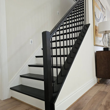
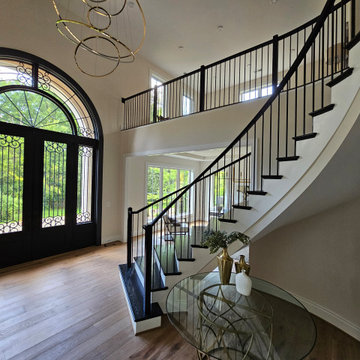
A single curve does a lot of work here. Rising from the main level to a wraparound balcony above, this staircase earns its place at the center of the home — not just structurally, but visually. Black iron balusters and handrails push against crisp white risers in a contrast that feels deliberate rather than decorative. The open floor plan gives it room to breathe, letting the curve read as architecture rather than furniture. The result is a staircase that creates movement even when no one is on it.
1976-2026 © Century Stair Company
 Design DCA
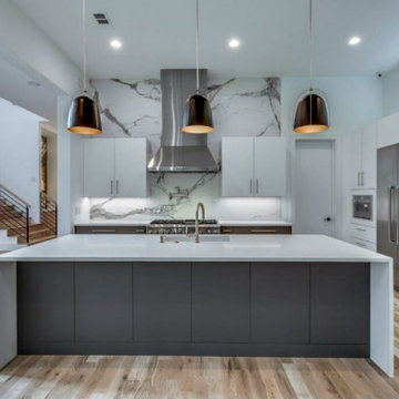
The professional dual fuel range with double ovens sits flush within the taupe lower cabinetry run beneath the marble slab backsplash, with the stainless hood above with the three bronze dome pendants forming a deliberate visual line between the two planes.
 Spaces Renewed
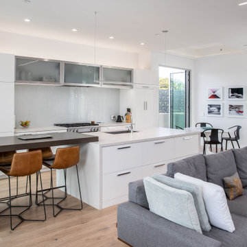
The open concept we used at the main level combined the kitchen, dining room, and 2 separate seating areas, all in one great space with sweeping ocean views. Even though each space is connected, the areas are well defined and are full of purpose. We deliberate on space planning and floor plan creation to ensure that ‘open concept’ is still refined and dignified.
Nana Wall Door systems were used in the kitchen, family, dining areas and master bedroom in order to bring in the view and create the ideal indoor/outdoor living experiences. At the coast, we needed to use a product that could withstand the weathering, as well as offer superior clear openings, access to the numerous patios, and the cleanest site lines possible. This door system was the perfect compliment to this amazing home.
Find the right local pro for your project
 Outdoor Lighting Design by Preferred Properties
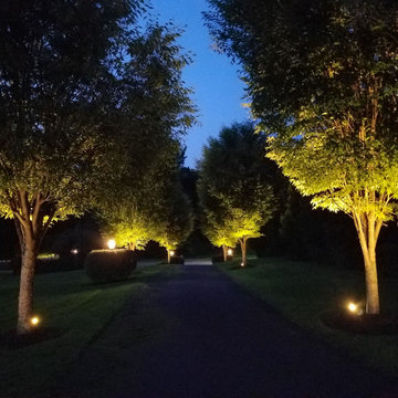
Towering Zelkova Trees with their inherit Vase like Shape and delicate leaves light up like a perfect 10 everytime. The results of this landscape lighting stems back to when our team did the landscaping and the ability to earmark the location of these trees to row up on each side of the driveway really contributes to proper orientation of the home on the plot especially deliberate at night to reach out and welcome guests to bring them into this sideways rear flag lot. The House and grounds are immaculate and show up well at night. Properly placed well and uplights on the trees surrounding the home really make it a welcome sight. The Lighting here is cohesive in dominance and controls the direction of the viewers point of view.
 Century Stair Company
A single curve does a lot of work here. Rising from the main level to a wraparound balcony above, this staircase earns its place at the center of the home — not just structurally, but visually. Black iron balusters and handrails push against crisp white risers in a contrast that feels deliberate rather than decorative. The open floor plan gives it room to breathe, letting the curve read as architecture rather than furniture. The result is a staircase that creates movement even when no one is on it.
1976-2026 © Century Stair Company
 STUDIO KONDE | Konrad Idaszewski Architect
Visit the full project: https://conde.pl/portfolio/projekt-loftowych-wnetrz-domu-w-rokietnicy/
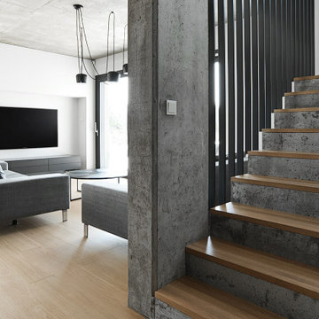
Concrete gives the staircase a strong structural presence, while warm oak treads soften its raw appearance.
Slim black steel rails run vertically along the stairs, creating a delicate graphic layer against the concrete.
A broad concrete column marks the transition between circulation and living space.
From this angle, the staircase reads as part of the architecture of the living room rather than a separate functional element.
Oak, concrete and black steel come together in a deliberately restrained material composition.
 Moss Building & Design
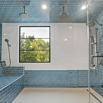
This Centreville, Virginia primary bath remodel completely transformed the space. The customers' goals were to update the bathroom to a more contemporary design from its traditional look and feel (original to the home). Their vision was to remove the large, walk up bathtub completely and replace it with a massive walk-in shower with steam shower capabilities and a completely tiled bench at one end. The choice of a bright blue tile for (almsot all the) walls, ceiling, bench and backsplash was done deliberately to complement the bright white cabinetry and the warm brown tiled floor. Previous to the remodel, the bathroom had a variety of somewhat ornate columns and heavy cabinetry which dominated the room. Now, the space is clean, bright, and spacious with just as much storage as before.
 YA Interiors
YA INTERIORS WISHES YOU A VERY HAPPY DIWALI
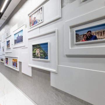
On this auspicious occasion, we are presenting the final project images of the residential property, a 2100 Sq.Ft. apartment inspired by contemporary style. Its simplicity, subtle sophistication, deliberate use of texture, and clean lines proving it to be a real contemporary output.
 lavish
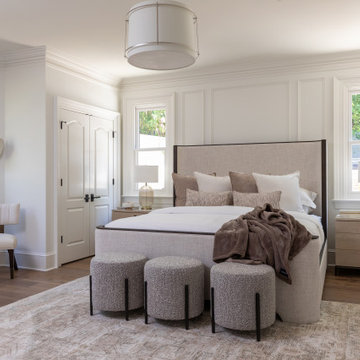
This Raleigh, NC home was reimagined from the ground up — not room by room, but as a single, cohesive expression of how a family lives, gathers, and rests.
The architecture drove every decision. Custom millwork and panel molding were carried through every space, creating a visual language that connects the entry to the living room, the dining room to the primary suite. It's what makes the home feel complete — not like a collection of individually finished rooms.
In the kitchen, a full marble slab backsplash reads as one uninterrupted surface — giving the room its presence without competing with the custom white inset cabinetry and brushed nickel hardware. The dining room lives in deliberate contrast: deep-toned oak table, delicate botanical wallpaper, antique mirror. Light and organic, yet entirely considered.
The living room was designed around its connection to the outside — French doors that open directly to a substantial outdoor kitchen and entertaining space, anchored on the interior by a cast stone fireplace with an arched surround that commands the room.
The entry sets the expectation for everything that follows: a double-height foyer, geometric pendants cascading from above, large-scale original artwork, and a carved console that makes the first impression without overstating it.
Designed and executed by Lavish — Raleigh, NC's full-service interior design and remodeling firm.
 Fiorito Interior Design
It’s rare when a client comes to me with a brief for a complete home from scratch, but that is exactly what happened here. My client, a professional musician and singer, was having a luxury three-story condo built and wanted help choosing not only all the hardscape materials like tile, flooring, carpet, and cabinetry, but also all furniture and furnishings. I even outfitted his new home with plates, flatware, pots and pans, towels, sheets, and window coverings. Like I said, this was from scratch!
We defined his style direction for the new home including dark colors, minimalistic furniture, and a modern industrial sensibility, and I set about creating a fluid expression of that style. The tone is set at the entry where a custom laser-cut industrial steel sign requests visitors be shoeless. We deliberately limited the color palette for the entire house to black, grey, and deep blue, with grey-washed or dark stained neutral woods.
The navy zellige tiles on the backsplash in the kitchen add depth between the cement-textured quartz counters and cerused cabinetry. The island is painted in a coordinating navy and features hand-forged iron stools. In the dining room, horizontal and vertical lines play with each other in the form of an angular linear chandelier, lighted acrylic light columns, and a dining table with a special faceted wave edge. Chair backs echo the shape of the art maps on the wall.
We chose a unique, three dimensional wall treatment for the living room where a plush sectional and LED tunable lights set the stage for comfy movie nights. Walls with a repeating whimsical black and white whale skeleton named Bruce adorn the walls of the powder room. The adjacent patio boasts a resort-like feeling with a cozy fire table, a wall of up-lit boxwoods, and a black sofa and chairs for star gazing.
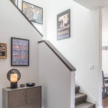
A gallery wall featuring a roster of some of my client’s favorite rock, punk, and jazz musicians adorns the stairwell. On the third floor, the primary and guest bathrooms continue with the cement-textured quartz counters and same cerused cabinetry.
We completed this well-appointed home with a serene guest room in the established limited color palette and a lounge/office/recording room.
All photos by Bernardo Grijalva
 Diane Stein Design for Sheffield Furniture
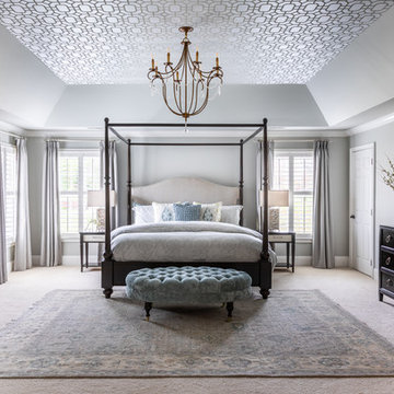
Stunning master bedroom design. Elegant, sophisticated and beautiful is what this room is all about. A color palette spa, taupe, cream and gray are the perfect setting for this busy couple to unwind and relax. Tones of soft warm gray lead up to the tray which is highlighted by the beautiful flocked iridescent wallpaper. A laying of textures, neutrals with subtle color along with deliberately placed accents are the key elements to this space. The homeowners are thrilled with our latest project!
 Ridgewood Home Construction
This mid-century modern Rockford home was updated in stages, and the kitchen needed a complete remodel. The homeowners desired a kitchen that felt current without breaking from the character that defined the rest of the house. That meant we needed to choose materials that fit the home and highlighted the home’s character.
Our team sourced pecky cypress and natural slate tile from non-traditional suppliers to get the exact look the home called for. The wood cabinetry was paired with a granite island, providing a gathering space in the kitchen without overpowering it. Because both materials required careful handling during installation, the crew worked more slowly and deliberately through this phase than a standard remodel. The result connected the kitchen directly to the living area, so the two spaces feel like one continuous room built in the same style as the rest of the home.
 FiveSTAR Landscape
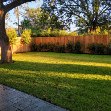
We recently finished this landscape design and installation project in the Tanglewood neighborhood of Houston, Texas. Our client, a Louisiana native who loves entertaining and wanted to stay connected to her NOLA roots, desired a space that could comfortably accommodate 30+ guests on a regular basis.
We deliberately designed the outdoor kitchen without a cover to preserve the view of the magnificent oak trees. Our aim was to create a kitchen that is both durable and visually appealing. The countertop is made of leathered granite, a material that can withstand the unpredictable Texas weather. All the appliances, including the grill, refrigerator, sink, and double side burner, were locally sourced and are made of stainless steel. Additionally, we utilized Austin limestone, which was quarried right here in Texas.
To infuse a touch of New Orleans charm into the backyard, we incorporated a fountain. The surrounding black star gravel was designed as a versatile space that can be used for additional dining, seating, or even as a meditation area.
To ensure privacy and shade as the plants mature, we strategically planted Eaglestone Holly and Japanese Yew along the fence line. Completing the landscape, we selected Amerishade grass for its excellent shade tolerance.
 Wendel Klein Builders, Inc.
This expansive Cambridge residence was ready for a new chapter, and Wendel Klein Design Build was honored to lead the transformation. By meticulously remodeling both the interior and exterior, we struck a deliberate balance between modern functionality and historic charm. The result is a home that feels entirely current while honoring its original soul.
 Metropolis Drafting and Construction Inc
Today’s investment landscape in California features a surge in transforming single-family lots into vibrant multi-family residences, facilitated by recent SB9 and ADU laws. This project exemplifies how a modest 6,750-square-foot lot can accommodate a 1,500-square-foot primary home alongside a 2,500-square-foot duplex, seamlessly integrating design, functionality, and neighborhood aesthetics.
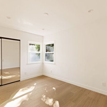
The primary residence underwent a meticulous interior transformation, evolving from a 3-bedroom, 1.5-bath layout into a spacious 4-bedroom, 2-bath home. Strategic reconfigurations centered around creating an expansive great room—an open-concept space adorned with vaulted ceilings—where the kitchen, dining, and living areas converge into a magnificent communal zone.
Exterior updates further distinguish the property. The front and side yards are enclosed with fencing and privacy hedges, linked by concrete pathways that enhance outdoor functionality while compensating for backyard space lost during renovations. The exterior façade was refreshed with darker tones, deliberately contrasting with the duplex to emphasize architectural separation.
Designed to preserve the suburban charm, the duplex visually mimics a single-family home from the street. Its facade creates an illusion of a two-story residence, maintaining harmony within the neighborhood fabric. The main unit, developed under SB9 guidelines, features three bedrooms and two bathrooms, with a luxurious parents’ suite situated upstairs. Downstairs, two bedrooms share a full bath, creating a balanced family-oriented layout.
The duplex’s interior boasts 9-foot ceilings throughout, elevating the sense of space and openness. The design thoughtfully places the kitchen at the front, inviting guests into the home, while stairs on the right lead to the private upstairs bedroom suite.
The ADU offers a two bedroom and two & half baths. the unit is accessible via a private side entrance with a dedicated walkway. Its layout includes a ground-floor living room, a galley kitchen, and a discreet powder room beneath the stairs, designed to contain guest traffic and maintain privacy upstairs. The upstairs bedrooms each feature luxurious bathrooms with expansive showers, adding an element of modern elegance.
Both units enjoy thoughtfully landscaped outdoor spaces—private patios, backyard areas, and gated front yards—creating welcoming environments for residents and visitors alike.
This project exemplifies innovative urban infill solutions, blending architectural elegance with legal compliance and community harmony—an inspiring blueprint for the future of residential development in California.
 Leicht Westchester-Greenwich
Grounded Aesthetic
Modern clean lines juxtaposed with natural texture and materials, create a warm and inviting kitchen that feels casual and luxurious at the same time.
Leicht Minera Kiruna cabinets with natural wood and woven elements define the kitchen in this vast open space. Floating wood shelves highlight the functional items that add character and personality to the space.
The distinctive large island includes the prestigious Gaggenau gas & induction combination cooktops for the homeowners’ culinary and entertainment lifestyle.
Bold Neutrals
The deliberate kitchen palette of natural neutral colors is a nod to the Modern Rustic high style. Textured deep grays and black hues combined with an organic natural wood palette, evokes sophistication and warmth.
Neolith Nero Zimbabwe Riverwashed countertop and low backsplash with its deep rich color and rough texture adds to the curated mix. Minera Kiruna panels complete the backsplash composition with its natural metal vibe.
 Fabco Sanctuary
The architect and designer Guy Derwent was approached by his client with a clear and compelling brief: to completely transform a grand Victorian terrace house they were planning to renovate. The client envisioned something far beyond a standard renovation – this was to be a bold and dramatic reimagining of a family home that could grow with them over time.
With the property having remained largely untouched for more than fifty years, the architects saw an opportunity to unlock its potential and deliver a contemporary design that would contrast beautifully with its Victorian heritage.
The existing layout consisted of a series of small, disconnected rooms to the rear of the house. To respond to the client’s need for openness and flexibility, the architect proposed a radical restructuring of the ground floor:
The rear rooms were completely removed
Suspended timber floors were lowered by up to two metres to align with the garden
Two bold extensions were added
The first extension filled in the side return with a London stock brick facade and a glazed roof, while the second – a striking black steel and glass pavilion was glazed on three sides and placed along the garden elevation.
This new pavilion redefined the building’s relationship with the garden. Its steel-framed glazing created a seamless dialogue between interior and exterior, offering a sense of immersion in the surrounding landscape.
At the heart of the plan sits a dramatic, five-metre-tall dining space that acts as a transition from the original entrance hall into the new addition. A large, circular cast-glass window, framed in steel, provides a visual and spatial link between old and new, allowing light and movement to travel through the depth of the home.
Throughout the project, a series of black metal elements were introduced as sculptural interventions – each marking moments of transformation within the house. These included the bespoke steel framed circular window, a custom metal staircase, a cylindrical support column, and the striking steel and glass garden pavilion. Together, they formed a coherent architectural language that underscored the project’s bold intent.
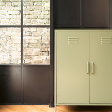
Our steel windows and doors played a vital role in delivering the project’s vision. The architects chose steel for its refined sight lines and distinctive material character, which helped bridge the gap between the historical context of the building and the bold new additions.
The black steel frames provided a crisp contrast to the pale London stock brick and added definition to the glazed pavilion, reinforcing the sense of architectural precision. In particular, the fine steel profiles of the garden room allowed the extension to feel both lightweight and immersive, blurring the boundary between the house and its garden.
The architect drew inspiration from the Bauhaus Movement, particularly the work of Walter Gropius, whose approach to functional beauty and industrial materials informed the design of the garden pavilion.
Here, our glazing system was used not just for transparency, but as an expressive architectural element. The carefully proportioned panels help to conceal the roof thickness and reinforce the pavilion’s industrial yet abstract character – a deliberate nod to product design and modernist detailing.
Sustainability was an important factor in the selection of materials. Our steel systems, made from 99% recycled content and 100% recyclable, aligned with the project’s broader environmental goals.
The architects noted that this commitment to material longevity and circularity was central to their decision to use steel. The durability and recyclability of the windows and doors ensured the project met both aesthetic and ethical criteria.
This London terrace house now stands as a celebration of contrast – between heritage and innovation, solidity and transparency, tradition and transformation. Our steel windows and doors were not simply components; they were essential tools in crafting a home that is as bold and expressive as it is functional.
The result is a home designed for modern family life, where light, space, and materiality come together in perfect harmony.
 T.Q.S. Construction LLC
Your kitchen should be the one place that you can go to get away from it all. If you can’t, that may be a sign that’s something is wrong. If you no longer love your kitchen, the way you once used to, then maybe it’s time you thought about hiring a New Jersey kitchen remodeling company. You can always get the best remodels from the construction experts at T.Q.S. Construction LLC.
There is a lot to know about kitchen remodeling and that’s why you should leave it to the professionals. You can’t just walk right into one and start ripping things out. You have to carefully deliberate how you want your kitchen set up so that the designers can carry the idea over to the remodeling crew.
 lavish
This Raleigh, NC home was reimagined from the ground up — not room by room, but as a single, cohesive expression of how a family lives, gathers, and rests.
The architecture drove every decision. Custom millwork and panel molding were carried through every space, creating a visual language that connects the entry to the living room, the dining room to the primary suite. It's what makes the home feel complete — not like a collection of individually finished rooms.
In the kitchen, a full marble slab backsplash reads as one uninterrupted surface — giving the room its presence without competing with the custom white inset cabinetry and brushed nickel hardware. The dining room lives in deliberate contrast: deep-toned oak table, delicate botanical wallpaper, antique mirror. Light and organic, yet entirely considered.
The living room was designed around its connection to the outside — French doors that open directly to a substantial outdoor kitchen and entertaining space, anchored on the interior by a cast stone fireplace with an arched surround that commands the room.
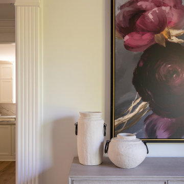
The entry sets the expectation for everything that follows: a double-height foyer, geometric pendants cascading from above, large-scale original artwork, and a carved console that makes the first impression without overstating it.
Designed and executed by Lavish — Raleigh, NC's full-service interior design and remodeling firm.
 Phoenix Home Remodeling
Ryan & Nicole took on the challenge to refresh their master bathroom. Their goal extended beyond mere looks to achieve a perfect balance between functionality and elegance.
The renovation kicked off with an in-depth demolition, removal, and cleanup process. The area, especially the shower walls, was completely cleared down to the studs, setting the stage for the installation of a custom shower.
Custom cabinets from Sollid Designer Series in Napa Iron Clear Alder were chosen for the vanity area, with a Fairy White quartz countertop and under-mount sinks. The thoughtful selection of finishes underscored their refined taste.
Special attention was paid to the shower, where new plumbing fixtures, a glass enclosure, and tailored niches for bath products were added.
The choice of materials was deliberate, with Tru Marmi Extra matte tiles for the walls, curb, and niche, and a combination of Hex Keystones for the shower floor, enhancing the bathroom's aesthetic appeal.
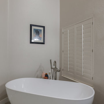
Central to their vision was a Wyndham Collection Juno 71" freestanding soaking tub, complemented by a sleek, freestanding ground-mounted tub filler faucet, embodying the dreamy oasis they envisioned.
old master bathroom remodel before and after photo
The renovation featured Shibusa Bianco 12" x 24" tile flooring across the bathroom and closet, complemented by new baseboards and a fresh paint job. Durability was ensured with a protective Hydroshield coating application.
31