
Search results for "Deliberation" in Home Design Ideas
 Design DCA
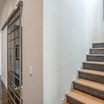
Stair treads in natural white oak with dark granite risers create a crisp two tone composition that is both durable and visually deliberate.
Inspiration for a transitional wooden spiral staircase remodel in Houston with concrete risers
Inspiration for a transitional wooden spiral staircase remodel in Houston with concrete risers
 HAC Arquitectura
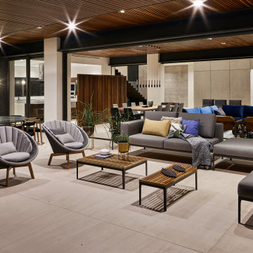
A145 features a specific program for a family whose main requirement was the versatility of the social space, having spaces wholly open and integrated and simultaneously being able to divide them for the comfort of each one of its members. The home is located in the Ayamonte Golf Club and its dividing line with the spring forest in Zapopan, with an East-West orientation, on a land of 1000m2. From an aesthetic point of view, the house was designed based on the spring forest’s primary setting. Special care was taken in the landscape design, integrating species of the region organically. Using natural materials in facades and interiors was a deliberate choice, with the intention that the construction, over the years, would become part of the natural setting and transform along with it. The residence is not just a home but a friend to the environment. It is equipped with solar panels for the house’s daily use and the pool’s heating, reducing its carbon footprint. Additionally, it has a water treatment plant, ensuring responsible water usage and management. The interior design style vividly reflects the residents’ personalities. Most of the pieces made in Mexico were designed and manufactured in a contemporary style.
 Madley Fine Cabinetry
This is the largest luxury penthouse in Old Town Scottsdale, and the cabinetry was designed to match that distinction.
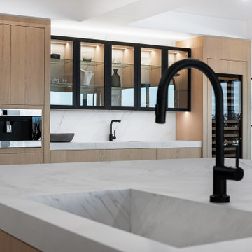
The kitchen anchors an expansive open-plan living space with flat-front white oak cabinetry running wall to wall, clean and uninterrupted against crisp white walls. A dramatic oversized island in white marble with bold veining commands the center of the room, its waterfall edge dropping cleanly to the floor on two sides. The scale of the island is deliberate: it holds its own against the floor-to-ceiling windows and the sweeping Scottsdale skyline beyond.
Black fixtures ground the design without adding weight. Integrated appliances maintain the clean line of the cabinetry wall. Under-cabinet lighting warms the stone backsplash at the perimeter, balancing the brightness of the natural light flooding the space.
Every decision in this kitchen was made at the scale of the property. The result is a space that leads the room rather than serving it.
Scope: Full kitchen cabinetry, oversized waterfall island
Material: White oak, white marble, black fixtures
Style: Contemporary luxury, minimalist modern
Location: Old Town Scottsdale, AZ
luxury kitchen cabinetry Scottsdale, white oak kitchen cabinets Scottsdale, marble waterfall island kitchen, custom penthouse cabinetry Scottsdale AZ, minimalist kitchen design Phoenix, floor to ceiling cabinetry, custom cabinet maker Scottsdale, luxury condo kitchen remodel Phoenix metro, frameless white oak cabinets, contemporary kitchen design Scottsdale, high end kitchen cabinetry Arizona
Find the right local pro for your project
 Bilal Rehman Studio | Interior Design
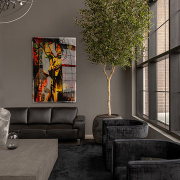
A HALLMARK OF OUR DESIGN PHILOSOPHY IS THE DELIBERATE CURATION OF TEXTURES THAT FLOW SEAMLESSLY THROUGH THE SPACE. FROM THE LUXURIOUS UPHOLSTERY TO THE REFINED WOODEN GRAINS, EACH TEXTURE IS SELECTED WITH INTENT. THIS THOUGHTFUL INTERPLAY OF TACTILE SENSATIONS CREATES A RICH, LAYERED ENVIRONMENT THAT TRANSFORMS AS ONE NAVIGATES THROUGH IT, OFFERING A CAPTIVATING MULTI-SENSORY EXPERIENCE.
ANCHORING THE SPACE IS A 12 FT OLIVE TREE IN A VINTAGE CEMENT POT. THE INTRODUCTION OF THE TREE WAS DONE WITH THE INTENTION OF BRINING THE OUTDOORS IN TO SOFTEN THE INDUSTRIAL AURA OF THE PENTHOUSE.
 Metropolis Drafting and Construction Inc
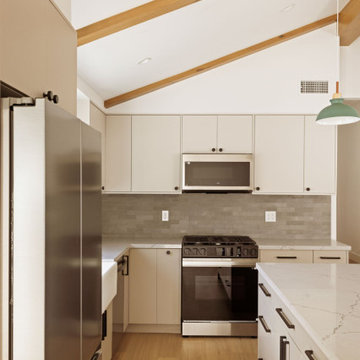
Today’s investment landscape in California features a surge in transforming single-family lots into vibrant multi-family residences, facilitated by recent SB9 and ADU laws. This project exemplifies how a modest 6,750-square-foot lot can accommodate a 1,500-square-foot primary home alongside a 2,500-square-foot duplex, seamlessly integrating design, functionality, and neighborhood aesthetics.
The primary residence underwent a meticulous interior transformation, evolving from a 3-bedroom, 1.5-bath layout into a spacious 4-bedroom, 2-bath home. Strategic reconfigurations centered around creating an expansive great room—an open-concept space adorned with vaulted ceilings—where the kitchen, dining, and living areas converge into a magnificent communal zone.
Exterior updates further distinguish the property. The front and side yards are enclosed with fencing and privacy hedges, linked by concrete pathways that enhance outdoor functionality while compensating for backyard space lost during renovations. The exterior façade was refreshed with darker tones, deliberately contrasting with the duplex to emphasize architectural separation.
Designed to preserve the suburban charm, the duplex visually mimics a single-family home from the street. Its facade creates an illusion of a two-story residence, maintaining harmony within the neighborhood fabric. The main unit, developed under SB9 guidelines, features three bedrooms and two bathrooms, with a luxurious parents’ suite situated upstairs. Downstairs, two bedrooms share a full bath, creating a balanced family-oriented layout.
The duplex’s interior boasts 9-foot ceilings throughout, elevating the sense of space and openness. The design thoughtfully places the kitchen at the front, inviting guests into the home, while stairs on the right lead to the private upstairs bedroom suite.
The ADU offers a two bedroom and two & half baths. the unit is accessible via a private side entrance with a dedicated walkway. Its layout includes a ground-floor living room, a galley kitchen, and a discreet powder room beneath the stairs, designed to contain guest traffic and maintain privacy upstairs. The upstairs bedrooms each feature luxurious bathrooms with expansive showers, adding an element of modern elegance.
Both units enjoy thoughtfully landscaped outdoor spaces—private patios, backyard areas, and gated front yards—creating welcoming environments for residents and visitors alike.
This project exemplifies innovative urban infill solutions, blending architectural elegance with legal compliance and community harmony—an inspiring blueprint for the future of residential development in California.
 Metropolis Drafting and Construction Inc
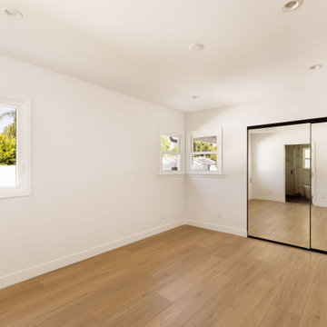
Today’s investment landscape in California features a surge in transforming single-family lots into vibrant multi-family residences, facilitated by recent SB9 and ADU laws. This project exemplifies how a modest 6,750-square-foot lot can accommodate a 1,500-square-foot primary home alongside a 2,500-square-foot duplex, seamlessly integrating design, functionality, and neighborhood aesthetics.
The primary residence underwent a meticulous interior transformation, evolving from a 3-bedroom, 1.5-bath layout into a spacious 4-bedroom, 2-bath home. Strategic reconfigurations centered around creating an expansive great room—an open-concept space adorned with vaulted ceilings—where the kitchen, dining, and living areas converge into a magnificent communal zone.
Exterior updates further distinguish the property. The front and side yards are enclosed with fencing and privacy hedges, linked by concrete pathways that enhance outdoor functionality while compensating for backyard space lost during renovations. The exterior façade was refreshed with darker tones, deliberately contrasting with the duplex to emphasize architectural separation.
Designed to preserve the suburban charm, the duplex visually mimics a single-family home from the street. Its facade creates an illusion of a two-story residence, maintaining harmony within the neighborhood fabric. The main unit, developed under SB9 guidelines, features three bedrooms and two bathrooms, with a luxurious parents’ suite situated upstairs. Downstairs, two bedrooms share a full bath, creating a balanced family-oriented layout.
The duplex’s interior boasts 9-foot ceilings throughout, elevating the sense of space and openness. The design thoughtfully places the kitchen at the front, inviting guests into the home, while stairs on the right lead to the private upstairs bedroom suite.
The ADU offers a two bedroom and two & half baths. the unit is accessible via a private side entrance with a dedicated walkway. Its layout includes a ground-floor living room, a galley kitchen, and a discreet powder room beneath the stairs, designed to contain guest traffic and maintain privacy upstairs. The upstairs bedrooms each feature luxurious bathrooms with expansive showers, adding an element of modern elegance.
Both units enjoy thoughtfully landscaped outdoor spaces—private patios, backyard areas, and gated front yards—creating welcoming environments for residents and visitors alike.
This project exemplifies innovative urban infill solutions, blending architectural elegance with legal compliance and community harmony—an inspiring blueprint for the future of residential development in California.
 Fiorito Interior Design
It’s rare when a client comes to me with a brief for a complete home from scratch, but that is exactly what happened here. My client, a professional musician and singer, was having a luxury three-story condo built and wanted help choosing not only all the hardscape materials like tile, flooring, carpet, and cabinetry, but also all furniture and furnishings. I even outfitted his new home with plates, flatware, pots and pans, towels, sheets, and window coverings. Like I said, this was from scratch!
We defined his style direction for the new home including dark colors, minimalistic furniture, and a modern industrial sensibility, and I set about creating a fluid expression of that style. The tone is set at the entry where a custom laser-cut industrial steel sign requests visitors be shoeless. We deliberately limited the color palette for the entire house to black, grey, and deep blue, with grey-washed or dark stained neutral woods.
The navy zellige tiles on the backsplash in the kitchen add depth between the cement-textured quartz counters and cerused cabinetry. The island is painted in a coordinating navy and features hand-forged iron stools. In the dining room, horizontal and vertical lines play with each other in the form of an angular linear chandelier, lighted acrylic light columns, and a dining table with a special faceted wave edge. Chair backs echo the shape of the art maps on the wall.
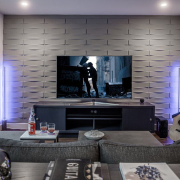
We chose a unique, three dimensional wall treatment for the living room where a plush sectional and LED tunable lights set the stage for comfy movie nights. Walls with a repeating whimsical black and white whale skeleton named Bruce adorn the walls of the powder room. The adjacent patio boasts a resort-like feeling with a cozy fire table, a wall of up-lit boxwoods, and a black sofa and chairs for star gazing.
A gallery wall featuring a roster of some of my client’s favorite rock, punk, and jazz musicians adorns the stairwell. On the third floor, the primary and guest bathrooms continue with the cement-textured quartz counters and same cerused cabinetry.
We completed this well-appointed home with a serene guest room in the established limited color palette and a lounge/office/recording room.
All photos by Bernardo Grijalva
 Ridgewood Home Construction
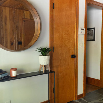
This mid-century modern Rockford home was updated in stages, and the kitchen needed a complete remodel. The homeowners desired a kitchen that felt current without breaking from the character that defined the rest of the house. That meant we needed to choose materials that fit the home and highlighted the home’s character.
Our team sourced pecky cypress and natural slate tile from non-traditional suppliers to get the exact look the home called for. The wood cabinetry was paired with a granite island, providing a gathering space in the kitchen without overpowering it. Because both materials required careful handling during installation, the crew worked more slowly and deliberately through this phase than a standard remodel. The result connected the kitchen directly to the living area, so the two spaces feel like one continuous room built in the same style as the rest of the home.
 YA Interiors
YA INTERIORS WISHES YOU A VERY HAPPY DIWALI
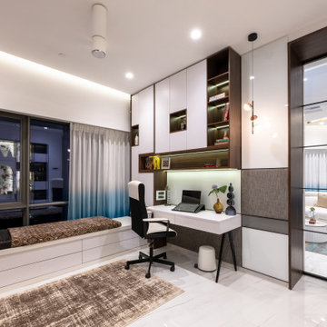
On this auspicious occasion, we are presenting the final project images of the residential property, a 2100 Sq.Ft. apartment inspired by contemporary style. Its simplicity, subtle sophistication, deliberate use of texture, and clean lines proving it to be a real contemporary output.
 George Ocampo
Upper Valley Estate Curb Appeal – El Paso, Texas
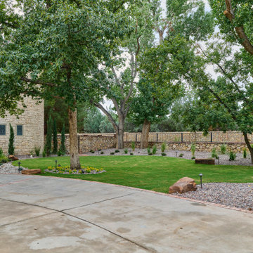
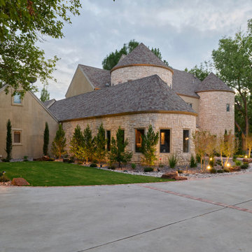
This curb appeal transformation was conceived as a deliberate sequence—an arrival experience where architecture, landscape, and lighting work together as one. Every element was designed to honor the home’s stone construction, turreted forms, and Old World character while responding precisely to the Upper Valley climate and lifestyle.
By day, the experience is grounded and composed. Brick-edged concrete drives establish order and permanence, guiding movement through the property with clarity and intention. Natural stone walls and columns anchor the architecture, while layered gravel beds, drought-tolerant plantings, and manicured turf soften transitions and connect the home to its desert setting. Mature trees were preserved and carefully integrated, providing scale, shade, and a sense of continuity.
As afternoon shifts toward sunset, the materials begin to speak differently. Stone warms, textures deepen, and sightlines subtly draw the eye toward the front entry. The landscape narrows the focus, creating a moment of pause before arrival—calm, quiet, and refined.
At night, the design reveals its final layer. Low-voltage lighting is integrated with precision, washing stone surfaces, tracing architectural curves, and uplighting specimen trees to create depth without glare. The drive, walkways, and entry feel safe, legible, and inviting, while the home itself glows with a restrained elegance. Coming home after dark feels intentional—protected, welcoming, and unmistakably yours.
What was created is more than curb appeal. It is a cohesive design-build solution where nothing is ornamental without purpose and nothing is built without intention. A daily experience of arrival that reflects craftsmanship, care, and the enduring character of the Upper Valley.
 George Ocampo
Upper Valley Estate Curb Appeal – El Paso, Texas
This curb appeal transformation was conceived as a deliberate sequence—an arrival experience where architecture, landscape, and lighting work together as one. Every element was designed to honor the home’s stone construction, turreted forms, and Old World character while responding precisely to the Upper Valley climate and lifestyle.
By day, the experience is grounded and composed. Brick-edged concrete drives establish order and permanence, guiding movement through the property with clarity and intention. Natural stone walls and columns anchor the architecture, while layered gravel beds, drought-tolerant plantings, and manicured turf soften transitions and connect the home to its desert setting. Mature trees were preserved and carefully integrated, providing scale, shade, and a sense of continuity.
As afternoon shifts toward sunset, the materials begin to speak differently. Stone warms, textures deepen, and sightlines subtly draw the eye toward the front entry. The landscape narrows the focus, creating a moment of pause before arrival—calm, quiet, and refined.
At night, the design reveals its final layer. Low-voltage lighting is integrated with precision, washing stone surfaces, tracing architectural curves, and uplighting specimen trees to create depth without glare. The drive, walkways, and entry feel safe, legible, and inviting, while the home itself glows with a restrained elegance. Coming home after dark feels intentional—protected, welcoming, and unmistakably yours.
What was created is more than curb appeal. It is a cohesive design-build solution where nothing is ornamental without purpose and nothing is built without intention. A daily experience of arrival that reflects craftsmanship, care, and the enduring character of the Upper Valley.
 CraftedWild Cabinetry
Photo credit: PDET Photography, Pawel Dmytrow
Designed for a home in the Chicago suburbs, this kitchen was created around the client’s desire for clean, minimal lines, visual balance, and highly functional storage.
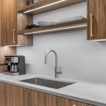
A warm, high-end European textured TFL brings depth and natural character to the cabinetry, with careful grain matching from panel to panel reinforcing the seamless, tailored appearance. Floating shelves were introduced to break up the cabinetry and create a lighter composition, while integrated dimmable lighting adds warmth and ambiance—especially important given the kitchen’s connection to the surrounding great room.
Function was considered at every level. A custom utensil storage solution was stained to coordinate with the cabinetry finish, while a concealed integrated outlet in the island keeps everyday power readily available without interrupting the clean exterior. Generous drawer and pantry storage maximize usability, including a reduced-depth pantry positioned near the window to provide additional capacity without unnecessarily projecting into the room or compromising natural light.
Every element—from proportions and lighting to storage, material transitions, and grain direction—was considered to create a kitchen that feels calm, cohesive, and deliberately understated.
 lavish
This Raleigh, NC home was reimagined from the ground up — not room by room, but as a single, cohesive expression of how a family lives, gathers, and rests.
The architecture drove every decision. Custom millwork and panel molding were carried through every space, creating a visual language that connects the entry to the living room, the dining room to the primary suite. It's what makes the home feel complete — not like a collection of individually finished rooms.
In the kitchen, a full marble slab backsplash reads as one uninterrupted surface — giving the room its presence without competing with the custom white inset cabinetry and brushed nickel hardware. The dining room lives in deliberate contrast: deep-toned oak table, delicate botanical wallpaper, antique mirror. Light and organic, yet entirely considered.
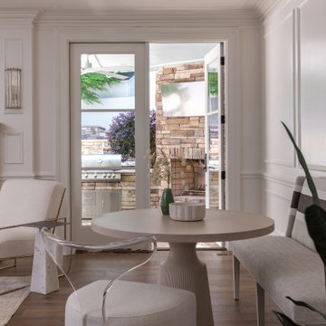
The living room was designed around its connection to the outside — French doors that open directly to a substantial outdoor kitchen and entertaining space, anchored on the interior by a cast stone fireplace with an arched surround that commands the room.
The entry sets the expectation for everything that follows: a double-height foyer, geometric pendants cascading from above, large-scale original artwork, and a carved console that makes the first impression without overstating it.
Designed and executed by Lavish — Raleigh, NC's full-service interior design and remodeling firm.
 Mount Construction
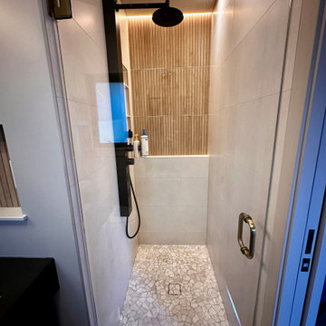
Two full bathroom remodels completed back to back in the same home — sequenced deliberately so the homeowner could stay comfortable and keep living in the house throughout the entire project. No displacement, no hotels, just smart scheduling and clean jobsite management.
Both bathrooms were taken down to the studs and rebuilt with a modern look and fully upgraded features — walk-in showers, heated floors, heated towel bars, and all new fixtures, tile, and finishes throughout. The kind of transformation where nothing from before carries over except the walls.
 Manomin Resawn Timbers
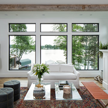
A single Weathered Antique Box Beam in silvered gray brown tones with deep checking and naturally aged surface texture runs across the ceiling of this bright, contemporary lake home living room as a deliberate and minimal accent. Against the white ceiling, black window frames, and expansive lake views, the one beam does exactly what great reclaimed wood does in a refined space: it adds just enough warmth and history to make the room feel complete.
This install is a perfect example of how even a single reclaimed wood beam can change the character of a contemporary interior without disrupting its clean, polished palette. At Manomin Resawn Timbers, every piece goes through a detailed process of denailing, kiln drying, and precision milling so that antique character is preserved while performing beautifully in a modern home.
Whether you are a homebuilder, a home remodeling contractor, or a homeowner looking to add a single reclaimed wood accent beam to a contemporary living room or lake home interior, Manomin Resawn Timbers has been helping people discover the antique charm of reclaimed wood since 2002. We serve homebuilders, contractors, and designers across the country. Visit our showroom in Hugo, MN or reach out to us with a call or a message to get started.
Mark D. Williams Custom Home
 Metropolis Drafting and Construction Inc
Today’s investment landscape in California features a surge in transforming single-family lots into vibrant multi-family residences, facilitated by recent SB9 and ADU laws. This project exemplifies how a modest 6,750-square-foot lot can accommodate a 1,500-square-foot primary home alongside a 2,500-square-foot duplex, seamlessly integrating design, functionality, and neighborhood aesthetics.
The primary residence underwent a meticulous interior transformation, evolving from a 3-bedroom, 1.5-bath layout into a spacious 4-bedroom, 2-bath home. Strategic reconfigurations centered around creating an expansive great room—an open-concept space adorned with vaulted ceilings—where the kitchen, dining, and living areas converge into a magnificent communal zone.
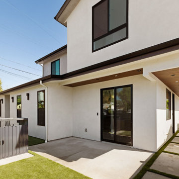
Exterior updates further distinguish the property. The front and side yards are enclosed with fencing and privacy hedges, linked by concrete pathways that enhance outdoor functionality while compensating for backyard space lost during renovations. The exterior façade was refreshed with darker tones, deliberately contrasting with the duplex to emphasize architectural separation.
Designed to preserve the suburban charm, the duplex visually mimics a single-family home from the street. Its facade creates an illusion of a two-story residence, maintaining harmony within the neighborhood fabric. The main unit, developed under SB9 guidelines, features three bedrooms and two bathrooms, with a luxurious parents’ suite situated upstairs. Downstairs, two bedrooms share a full bath, creating a balanced family-oriented layout.
The duplex’s interior boasts 9-foot ceilings throughout, elevating the sense of space and openness. The design thoughtfully places the kitchen at the front, inviting guests into the home, while stairs on the right lead to the private upstairs bedroom suite.
The ADU offers a two bedroom and two & half baths. the unit is accessible via a private side entrance with a dedicated walkway. Its layout includes a ground-floor living room, a galley kitchen, and a discreet powder room beneath the stairs, designed to contain guest traffic and maintain privacy upstairs. The upstairs bedrooms each feature luxurious bathrooms with expansive showers, adding an element of modern elegance.
Both units enjoy thoughtfully landscaped outdoor spaces—private patios, backyard areas, and gated front yards—creating welcoming environments for residents and visitors alike.
This project exemplifies innovative urban infill solutions, blending architectural elegance with legal compliance and community harmony—an inspiring blueprint for the future of residential development in California.
 HAC Arquitectura
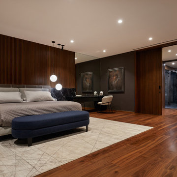
The unique design concept of A139 is rooted in the basic geometric idea of two interlocking rectangles. This distinctive feature, along with the incorporation of rectangular geometries into the natural environment, sets it apart. The deliberate placement of a few windows in the front enhances privacy, while the addition of wooded and water elements to the facade creates a sober and elegant aesthetic. The project maintains a common language in its materiality: apparent concrete, steel, and wood. The three materials are presented sincerely from the outside of the house and continue on a constant journey through the interior. A139 is adjacent to the spring forest, privileged in its geographical position. We considered that the project’s purpose was that from any point of the house, we would have panoramic views that would serve as ambiance for itself and thus generate “natural pictures.” Our design philosophy for A139 was to seamlessly integrate the forest into the house. To achieve this, we created interior courtyards and spaces, blurring the boundary between the exterior and the interior. This approach not only enhances the living experience but also fosters a harmonious relationship with the natural surroundings. The house’s program is characterized by its social areas on the first floor, which can be combined to generate larger spaces if necessary. On the first floor are four bedrooms, each with a dressing room, bathroom, and terraces overlooking the spring forest. Casa A139 speaks for itself and presents itself honestly, subtly setting the views and ample spaces in the hierarchy by the natural textures of the materials.
 Klopf Architecture
Built for the Bluff, A Sea Ranch Home is Remade from the Inside Out
The house had always been grounded, on an ocean bluff at The Sea Ranch. It sits unencumbered, adjacent to one of the most dramatic stretches of the Sonoma coast with protected commons meadow to the east, uninterrupted Pacific views to the west, and a bluff trail running alongside. What it lacked was the feeling of home, one that could hold up its own against the natural landscape.
The owners are entrepreneurs with deep involvement across tech, real estate, and development and they know how things are built. The Sea Ranch house had been in their lives for years, a second residence and a place for family to gather. Built for a different time, it felt more compromising than comfortable. Sitting in a closed off nook, the kitchen fit one cook at a time and turned its back on the rest of the house. The entry was dim and compressed, divided by a structural column that presented itself at exactly the wrong moment. The primary suite was small relative to the view outside it. A large rear bedroom sat behind a lowered ceiling with a bathroom that had never been added. The house was certainly worth the trouble of doing it right.
What followed was not one project but four, each with its own design challenge, each addressed over a period of time.
Where the House Meets the Ocean
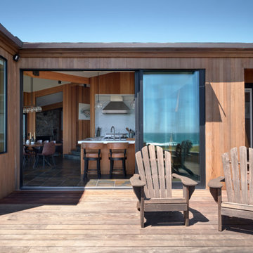
The most complex piece of the project, in both structural and spatial terms, was the kitchen expansion. The existing room was a single-person galley squeezed in as an afterthought with no meaningful connection to the dining room, the living space, or the deck outside. To make it useful for a family that cooks and gathers, it needed to grow outward into an existing patio and flow into the rooms around it.
A big challenge was the roofline. Several planes at different pitches and angles converged directly where additional volume was needed. A new form had to join that geometry without reading as a correction. The solution found the simplest possible connection between the existing angles, a roofline that from outside the structure, appears entirely original. From the bluff trail where the addition is visible, there is no discernible seam.
Inside, the kitchen is now open to the living and dining rooms without interruption. A large sliding glass door connects the space onto the rear deck. The deck itself was expanded and oriented so that the body of the house shields it from the coastal wind which is a common consideration that determines whether outdoor space at The Sea Ranch actually gets used. The result is a room that works for large family gatherings where no one feels cutoff, and one that makes the boundary between being inside and outside easy to ignore.
Welcoming Light
A structural column stood at the convergence of eight distinct roof planes in the entry. It was load-bearing, but it was also the reason the entry had always felt like a hallway rather than a welcoming arrival.
With the structural engineer, a custom steel connector was designed to receive beams from six separate directions, redistributing the load through a single new continuous beam. The column was surgically removed. Three triangular skylights were then cut into the roof above, their shapes drawn from the
existing geometry of the planes around them. The entry is now bright and open. The skylights feel native to the structure because they follow the logic already present in the roof.
Two Suites, Two Views
At opposite ends of the house, the two bedroom suites were each reconfigured, and each found a different way to introduce more of the landscape into the room.
An addition to the primary suite extended the structure outward to create a wraparound plan with a loop from the bedroom through bath and closet that had not been possible before. The expansion opened a slot view from the tub and shower toward the ocean. The view is precise and private. The ocean view is present and deliberate.
The rear bedroom absorbed an adjacent storage room to transform it into a full second suite with a vaulted ceiling, a large bathroom with a tub, a shower, and a sauna. A private fenced garden courtyard sits just beyond the glass bringing the outdoors inside. The tub was placed so that, looking past the courtyard and through the bedroom beyond, the ocean is visible at the far end. It is a long view and it makes the room feel larger and more settled than its footprint would suggest.
Glass on Four Sides, Fire at the Center
The main living and gathering room had always been caught between two competing facts: glass on four sides meant exceptional views but at The Sea Ranch, it also meant a cold room. A 360-degree cylindrical fireplace was added at the center on a raised stone base, providing radiant heat in every direction and giving the room a focal point around which a group naturally orients itself, whether that means two people at the end of the day or the whole family after dinner.
Owners Who Picked Up the Tools
The owner was not a passive client. they came with construction knowledge, specific ideas, and the desire to be an active part of the process, a dynamic that other architects may had found difficult, which Klopf Architecture accepted as an asset. They took it upon themselves to complete some of the work during construction, including the installation of a new radiant heating system beneath the floors.
The radiant system added to the older and less-desirable forced-air setup. At The Sea Ranch, that change matters as the house sits close enough to the ocean and moving air competes with the sound of it, where radiant heat does not. Solar panels were added to the roof as part of the new system. Insulation was upgraded throughout the walls, roof, and crawl space. The house that had always had the right setting now holds warmth the way a house on the bluff should.
They were also deeply involved in the design and selections throughout, and the finished house reflects both of them in ways that are specific rather than generic. The process took longer and moved through more iterations than a more arms-length relationship might have allowed. The result is more defined and personal because of it.
The Landscape Holds Priority
Every exterior decision was shaped by The Sea Ranch Design Standards, which require that buildings defer to the landscape around them rather than compete with it. Because this house sits on the bluff and is visible from the public trail, the additions faced a close review. Existing materials were matched. Geometries were resolved. The additions had to become indistinguishable from the original building.
From the trail, the house reads exactly as it always has — low, cedar-clad, secondary to the meadow and the water. The setting holds priority. Inside, the house has been remade.
Klopf Architecture Project Team: Geoff Campen and Trenton Jewett
Contractor: Shawn Bettega Construction
Photography: ©2025 Mariko Reed
Year Completed: 2023
Location: The Sea Ranch, CA
 LeichtUSA
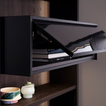
BAHIA is also convincing in terms of the overall appearance of the surface itself: the grooves are arranged asymmetrically and feature a sophisticated black finish, creating an exciting, vibrant, and contemporary look. The fanning out of the grooves is individually defined for each front width to create a harmonious transition between the individual furniture surfaces. The veneer selection is deliberately oriented towards dark-stained woods and is thus a perfect match for the black grooves and wooden edges. The resulting slight difference, in contrast, underlines the elegance of BAHIA on the one hand and defines the exclusion of light wood on the other.
 Eugene Pintail LLC
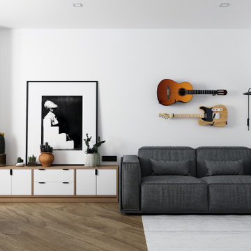
Gylden æra embraces the timeless elegance of Scandinavian minimalism in a compact apartment. By streamlining layout and materials, it creates a serene, deliberate environment where simplicity speaks volumes.
Every detail is intentionally crafted—from the seamless integration of functional areas to the uncluttered circulation paths. The design presents a visual calm that enhances both daily living and quiet reflection.
Soft woods, matte surfaces, and warm neutrals anchor the scheme. Subtle use of light tones amplifies natural light and expands spatial perception. Textural variations—like woven textiles, fine-grain wood, and matte finishes—add depth without compromising simplicity.
Minimalist lighting design—wall-mounted fixtures, linear pendants—complements the space's architectural rhythm without drawing attention away. Strategic layering of natural and ambient light enhances mood while maintaining visual clarity.
Gylden æra feels both peaceful and poised—moderated yet expressive. It captures a balance of restrained luxury and everyday comfort, honoring Scandinavian roots.
34