
Search results for "Departure" in Home Design Ideas
 Rooted By Design
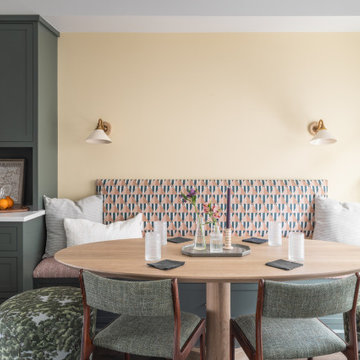
This Fishtown rowhome refresh started with a familiar challenge: a sea of flat, builder-grade finishes in predictable “millennial gray.” Our clients wanted a home that felt layered, lived-in, and full of personality. They desired something that reflected their style, not just a resale checklist.
We reworked two full floors to bring in warmth, character, and thoughtful details. On the main level, we introduced rich textures, vintage accents, and a more intentional palette that made a statement. Powerful punches of wallpaper, uniquely different but graciously coordinating, transformed key moments into standout spaces.
Upstairs, updates to the kitchen and dining area emphasized comfort, functionality, and bold sophistication. Throughout, we layered in materials with soul: natural woods, warm metals, and handcrafted touches, all while keeping the overall footprint and layout intact. Built-ins in the living area brought much-needed storage, style, and a grounded focal point to anchor the space.
The result is a home that feels personal yet timeless. A clear departure from the gray-washed norm.
 Cathie Hong Interiors
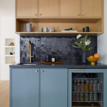
What started as a kitchen and two-bathroom remodel evolved into a full home renovation plus conversion of the downstairs unfinished basement into a permitted first story addition, complete with family room, guest suite, mudroom, and a new front entrance. We married the midcentury modern architecture with vintage, eclectic details and thoughtful materials.

 Tobin Dougherty Architects
The Portola Valley Residence and Pavilion is a composition of staggered and interlocking rectangular spaces that cling to the slope as it gradually wraps around the hillside. As the interior floor level slowly steps down, echoing the natural grade, it increases the floor-to-ceiling height, flooding the space with expanded views and abundant natural light. Carefully defined interior spaces with plaster and stone veneer walls offer a fitting backdrop for the owner's dramatic art collection. The home’s terraced roof design and careful selection of natural materials equally complement its human and natural environments.
In a stylistic departure from the main house, the 750 sf guest pavilion combines three small geometric elements to form a pleasant guest, entertainment space . . . and yard sculpture.
Find the right local pro for your project

 Morpurgo Architects
The English Tudor style of the historic Cheelcroft section of Hohokus is characterized by slate roofs, stucco, hand-cut siding, stonework and patterned brick. Morpurgo Architects incorporated each of these elements in a renovation that now embodies 1930's Old World charm in a new, cohesive composition designed for modern times.
Though this house has been significantly enlarged, the additions are kept to a scale that is sensitive to the Tudor style. The street facade remains true to the original footprint, so that it continues to be situated comfortably among its neighbors. Beyond the front entrance, the house evolves from existing rooms with traditionally low ceilings to unexpected heights.
As a departure from original Tudor houses, our firm crafted the additions to this house with tall cathedral spaces resembling the great halls of European manor houses. Large steel casement double-insulated windows and doors flood the rooms with light and integrate these spaces with the surrounding gardens that offer compelling vistas to the landscape through historic-styled leaded glass panes.
 Tobin Dougherty Architects
The Portola Valley Residence and Pavilion is a composition of staggered and interlocking rectangular spaces that cling to the slope as it gradually wraps around the hillside. As the interior floor level slowly steps down, echoing the natural grade, it increases the floor-to-ceiling height, flooding the space with expanded views and abundant natural light. Carefully defined interior spaces with plaster and stone veneer walls offer a fitting backdrop for the owner's dramatic art collection. The home’s terraced roof design and careful selection of natural materials equally complement its human and natural environments.
In a stylistic departure from the main house, the 750 sf guest pavilion combines three small geometric elements to form a pleasant guest, entertainment space . . . and yard sculpture.
 Tobin Dougherty Architects
The Portola Valley Residence and Pavilion is a composition of staggered and interlocking rectangular spaces that cling to the slope as it gradually wraps around the hillside. As the interior floor level slowly steps down, echoing the natural grade, it increases the floor-to-ceiling height, flooding the space with expanded views and abundant natural light. Carefully defined interior spaces with plaster and stone veneer walls offer a fitting backdrop for the owner's dramatic art collection. The home’s terraced roof design and careful selection of natural materials equally complement its human and natural environments.
In a stylistic departure from the main house, the 750 sf guest pavilion combines three small geometric elements to form a pleasant guest, entertainment space . . . and yard sculpture.
 Morpurgo Architects
The English Tudor style of the historic Cheelcroft section of Hohokus is characterized by slate roofs, stucco, hand-cut siding, stonework and patterned brick. Morpurgo Architects incorporated each of these elements in a renovation that now embodies 1930's Old World charm in a new, cohesive composition designed for modern times.
Though this house has been significantly enlarged, the additions are kept to a scale that is sensitive to the Tudor style. The street facade remains true to the original footprint, so that it continues to be situated comfortably among its neighbors. Beyond the front entrance, the house evolves from existing rooms with traditionally low ceilings to unexpected heights.
As a departure from original Tudor houses, our firm crafted the additions to this house with tall cathedral spaces resembling the great halls of European manor houses. Large steel casement double-insulated windows and doors flood the rooms with light and integrate these spaces with the surrounding gardens that offer compelling vistas to the landscape through historic-styled leaded glass panes.
 Rooted By Design
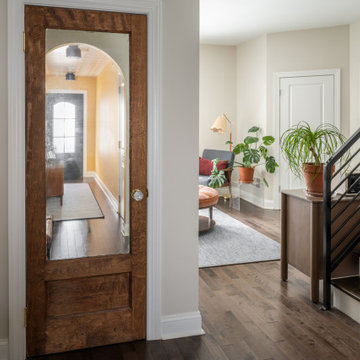
This Fishtown rowhome refresh started with a familiar challenge: a sea of flat, builder-grade finishes in predictable “millennial gray.” Our clients wanted a home that felt layered, lived-in, and full of personality. They desired something that reflected their style, not just a resale checklist.
We reworked two full floors to bring in warmth, character, and thoughtful details. On the main level, we introduced rich textures, vintage accents, and a more intentional palette that made a statement. Powerful punches of wallpaper, uniquely different but graciously coordinating, transformed key moments into standout spaces.
Upstairs, updates to the kitchen and dining area emphasized comfort, functionality, and bold sophistication. Throughout, we layered in materials with soul: natural woods, warm metals, and handcrafted touches, all while keeping the overall footprint and layout intact. Built-ins in the living area brought much-needed storage, style, and a grounded focal point to anchor the space.
The result is a home that feels personal yet timeless. A clear departure from the gray-washed norm.
 Rooted By Design
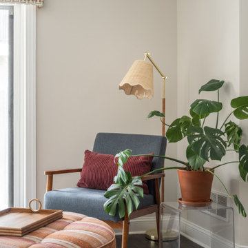
This Fishtown rowhome refresh started with a familiar challenge: a sea of flat, builder-grade finishes in predictable “millennial gray.” Our clients wanted a home that felt layered, lived-in, and full of personality. They desired something that reflected their style, not just a resale checklist.
We reworked two full floors to bring in warmth, character, and thoughtful details. On the main level, we introduced rich textures, vintage accents, and a more intentional palette that made a statement. Powerful punches of wallpaper, uniquely different but graciously coordinating, transformed key moments into standout spaces.
Upstairs, updates to the kitchen and dining area emphasized comfort, functionality, and bold sophistication. Throughout, we layered in materials with soul: natural woods, warm metals, and handcrafted touches, all while keeping the overall footprint and layout intact. Built-ins in the living area brought much-needed storage, style, and a grounded focal point to anchor the space.
The result is a home that feels personal yet timeless. A clear departure from the gray-washed norm.

 Simply Home Decorating
This 1990's home, located in North Vancouver's Lynn Valley neighbourhood, had high ceilings and a great open plan layout but the decor was straight out of the 90's complete with sponge painted walls in dark earth tones. The owners, a young professional couple, enlisted our help to take it from dated and dreary to modern and bright. We started by removing details like chair rails and crown mouldings, that did not suit the modern architectural lines of the home. We replaced the heavily worn wood floors with a new high end, light coloured, wood-look laminate that will withstand the wear and tear from their two energetic golden retrievers. Since the main living space is completely open plan it was important that we work with simple consistent finishes for a clean modern look. The all white kitchen features flat doors with minimal hardware and a solid surface marble-look countertop and backsplash. We modernized all of the lighting and updated the bathrooms and master bedroom as well. The only departure from our clean modern scheme is found in the dressing room where the client was looking for a more dressed up feminine feel but we kept a thread of grey consistent even in this more vivid colour scheme. This transformation, featuring the clients' gorgeous original artwork and new custom designed furnishings is admittedly one of our favourite projects to date!

 Soft Square-Modern & Contemporary Furniture Store
Ligne Roset - PRADO Sofa
by Christian Werner
Typically the design process surrounding a new sofa is heavily focused on aesthetic research. Prado represents a departure from this school of thought completely. Prado has first and foremost been designed based on the study of lifestyles and human nature. We find the same inspirations in Prado that brought us Smala in the earlier part of this century. Prado consists of a vast bench seat that can be combined and adjusted as desired and onto which back cushions may be placed at will, so that one can sit or lie down as they wish. It offers complete freedom as these cushions, weighted and equipped with a non-slip system, do not need to be rested against or attached to any object for support. They could, therefore, be arranged on the floor for a few leisurely moments around a low table, while the seat (cushion) could double as an occasional bed simply with a flip of its seat cushion to expose a side covered with mattress ticking. Collection includes and optional fitted sheet when using this option.
 Bakes & Kropp Fine Cabinetry
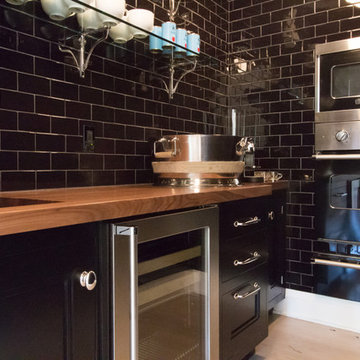
In addition to the "High, Wide & Handsome" Kitchen, Bakes & Kropp was commissioned to transform a narrow adjoining space into a wet bar and butlers pantry. A stark departure from the ever-popular white, the rich black Meridian-style custom cabinetry coordinates handsomely with the stunning black subway tile and provides a place for serving trays, utensils and more. It also conveniently houses an under-counter refrigerator to store drinks and hors d’oeuvres. Mirroring the reflective finishes of the appliances and shelving brackets, the cabinetry features Bakes custom polished nickel hardware.
*Interior Design, Karen Gorman, NYC
 Rooted By Design
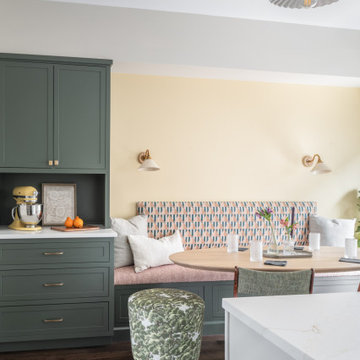
This Fishtown rowhome refresh started with a familiar challenge: a sea of flat, builder-grade finishes in predictable “millennial gray.” Our clients wanted a home that felt layered, lived-in, and full of personality. They desired something that reflected their style, not just a resale checklist.
We reworked two full floors to bring in warmth, character, and thoughtful details. On the main level, we introduced rich textures, vintage accents, and a more intentional palette that made a statement. Powerful punches of wallpaper, uniquely different but graciously coordinating, transformed key moments into standout spaces.
Upstairs, updates to the kitchen and dining area emphasized comfort, functionality, and bold sophistication. Throughout, we layered in materials with soul: natural woods, warm metals, and handcrafted touches, all while keeping the overall footprint and layout intact. Built-ins in the living area brought much-needed storage, style, and a grounded focal point to anchor the space.
The result is a home that feels personal yet timeless. A clear departure from the gray-washed norm.
 Rooted By Design
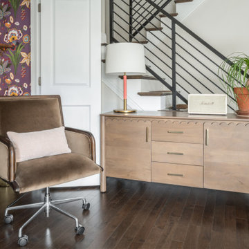
This Fishtown rowhome refresh started with a familiar challenge: a sea of flat, builder-grade finishes in predictable “millennial gray.” Our clients wanted a home that felt layered, lived-in, and full of personality. They desired something that reflected their style, not just a resale checklist.
We reworked two full floors to bring in warmth, character, and thoughtful details. On the main level, we introduced rich textures, vintage accents, and a more intentional palette that made a statement. Powerful punches of wallpaper, uniquely different but graciously coordinating, transformed key moments into standout spaces.
Upstairs, updates to the kitchen and dining area emphasized comfort, functionality, and bold sophistication. Throughout, we layered in materials with soul: natural woods, warm metals, and handcrafted touches, all while keeping the overall footprint and layout intact. Built-ins in the living area brought much-needed storage, style, and a grounded focal point to anchor the space.
The result is a home that feels personal yet timeless. A clear departure from the gray-washed norm.

 Susan Yeley Homes
A departure from the ordinary box, this angular home is nestled in a forest-like setting. This young professional couple fell for its big open living space and good bones, and made the house theirs when they moved to Bloomington in 2015. Though the space was defined by interesting angles and a soaring ceiling, natural light and that beautiful tall stone fireplace, it was outdated. Some spaces were oddly chopped off and others were too open to use well.In the end, SYI did what we don't usually do: put up walls instead of taking them down. (Well, to be fair, we put up some and took down others.) A brand new kitchen anchors the space for these avid cooks, while new walls define a walk-in pantry, office nook and reading space. The new walls also help define the home’s private spaces—they tuck a powder room and guest room away down a hall, so they aren't awkwardly right off the living space. Unifying floor and finishes but breaking up the palette with punches of color, SYI transformed the lofty room to a space that is timeless in both style and layout.

 Carolina Moncion Design
A client wanted to fix his guest bedroom and we were given two weeks to do it because guests were arriving for Thanksgiving Holiday. The room was all yellow - duvet, pillows, walls. There was no privacy except for the blinds that allowed light to filter in and disturb the rest of the guests that wanted to stay in bed late. We shopped locally for the bedding, secured the arched Bali blind to further conceal filter sunlight, made and installed custom draperies we designed with Fabricut fabrics, created the custom floral arrangement to add life to the space and dressed the bed with everything any guest would need to remain comfortable and warm throughout the year. After the holiday, we inquired about the guest's experience. The initial reveal was "Am I supposed to sleep in this bed? Are you sure?" and upon departure, the response was "It felt like a Spa. And I couldn't tell if it was time to wake because there was no daylight coming into the room. It was wonderful." In the end, our client said that was exactly what he wanted - a space that he could make his guests feel as though they were in a resort, comfortable, content and allowed privacy, with personalized style.
Photo Credit - Caroline Trinidad
 Simply Home Decorating
This 1990's home, located in North Vancouver's Lynn Valley neighbourhood, had high ceilings and a great open plan layout but the decor was straight out of the 90's complete with sponge painted walls in dark earth tones. The owners, a young professional couple, enlisted our help to take it from dated and dreary to modern and bright. We started by removing details like chair rails and crown mouldings, that did not suit the modern architectural lines of the home. We replaced the heavily worn wood floors with a new high end, light coloured, wood-look laminate that will withstand the wear and tear from their two energetic golden retrievers. Since the main living space is completely open plan it was important that we work with simple consistent finishes for a clean modern look. The all white kitchen features flat doors with minimal hardware and a solid surface marble-look countertop and backsplash. We modernized all of the lighting and updated the bathrooms and master bedroom as well. The only departure from our clean modern scheme is found in the dressing room where the client was looking for a more dressed up feminine feel but we kept a thread of grey consistent even in this more vivid colour scheme. This transformation, featuring the clients' gorgeous original artwork and new custom designed furnishings is admittedly one of our favourite projects to date!


 Simply Home Decorating
This 1990's home, located in North Vancouver's Lynn Valley neighbourhood, had high ceilings and a great open plan layout but the decor was straight out of the 90's complete with sponge painted walls in dark earth tones. The owners, a young professional couple, enlisted our help to take it from dated and dreary to modern and bright. We started by removing details like chair rails and crown mouldings, that did not suit the modern architectural lines of the home. We replaced the heavily worn wood floors with a new high end, light coloured, wood-look laminate that will withstand the wear and tear from their two energetic golden retrievers. Since the main living space is completely open plan it was important that we work with simple consistent finishes for a clean modern look. The all white kitchen features flat doors with minimal hardware and a solid surface marble-look countertop and backsplash. We modernized all of the lighting and updated the bathrooms and master bedroom as well. The only departure from our clean modern scheme is found in the dressing room where the client was looking for a more dressed up feminine feel but we kept a thread of grey consistent even in this more vivid colour scheme. This transformation, featuring the clients' gorgeous original artwork and new custom designed furnishings is admittedly one of our favourite projects to date!
 Coates Design Architecture + Interiors
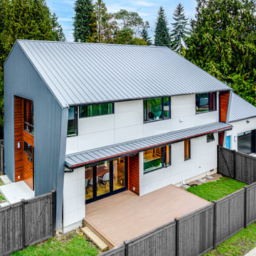
A testament to innovation, sustainability, and familial harmony nestled within the serene confines of a Seattle neighborhood near Dahl Playfield. An eager young family embarking on their first foray into homeownership with a vision for a home that's as unique as it is integrated.
In response to their aspirations, we crafted a residence that defies conformity—a departure from cookie-cutter designs while seamlessly blending into its surroundings. Our Dahl House features a distinctive slanted profile, subtly angled towards the sunlit south, optimizing natural light and solar panel efficiency.
With sustainability as our guiding principle, every facet of the design prioritizes eco-consciousness. From superior insulation surpassing code requirements to energy-efficient LED lighting and solar-ready infrastructure, the home epitomizes environmental stewardship without compromising on style or comfort.
Functionality meets charm in the heart of the home—the integrated kitchen, living, and dining areas—which serve as focal points for family interaction and engagement. Additionally, special provisions such as a dedicated study area for children and a whimsical loft enhance the home's livability and charm.
In essence, our design isn't just a structure—it's a canvas for vibrant family life, where innovation meets intimacy, and sustainability coexists with style. Welcome to our Dahl House—a haven designed for interactive living, where every detail fosters connection and coziness.
45