
Search results for "Departure" in Home Design Ideas

 Columbia Cabinets
Nature Reclaimed
Project Details
Designer: Columbia Cabinets
Cabinetry: Brookhaven I – Frameless Cabinetry
Wood: Maple
Finishes: Lightly distressed matte brown with black glaze
Door: Presidio Raised
Countertop: Perimeter – Ceasarstone Raven; Island – Antique Brown Quartzite
Awards
2014 Parade of Homes, Pinnacle Homes-Best Kitchen
This was a very special project and a very special home with a magnificent open floor plan and sweeping view of Saratoga Lake. Natural stone and reclaimed wood were used to bring the beauty of the surroundings into the house and the heartwood maple of the cabinets was finished with a lightly distressed matte brown with black glaze. This spectacular kitchen/great room truly defines the casual elegance of modern family living. The project was featured in the 2014 Parade of Homes and is a design award winner.

 Susan Yeley Homes
A departure from the ordinary box, this angular home is nestled in a forest-like setting. This young professional couple fell for its big open living space and good bones, and made the house theirs when they moved to Bloomington in 2015. Though the space was defined by interesting angles and a soaring ceiling, natural light and that beautiful tall stone fireplace, it was outdated. Some spaces were oddly chopped off and others were too open to use well.In the end, SYI did what we don't usually do: put up walls instead of taking them down. (Well, to be fair, we put up some and took down others.) A brand new kitchen anchors the space for these avid cooks, while new walls define a walk-in pantry, office nook and reading space. The new walls also help define the home’s private spaces—they tuck a powder room and guest room away down a hall, so they aren't awkwardly right off the living space. Unifying floor and finishes but breaking up the palette with punches of color, SYI transformed the lofty room to a space that is timeless in both style and layout.
 Hillcrest Construction
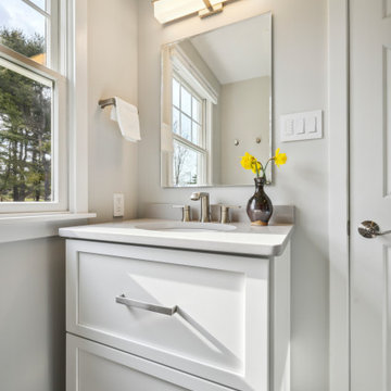
 designed and executed a complete facelift for these West Chester clients’ master bathroom. The sink/toilet/shower layout stayed relatively unchanged due to the limitations of the small space, but major changes were slated for the overall functionality and aesthetic appeal.
The bathroom was gutted completely, the wiring was updated, and minor plumbing alterations were completed for code compliance.
Bathroom waterproofing was installed utilizing the state-of-the-industry Schluter substrate products, and the feature wall of the shower is tiled with a striking blue 12x12 tile set in a stacked pattern, which is a departure of color and layout from the staggered gray-tome wall tile and floor tile.
The original bathroom lacked storage, and what little storage it had lacked practicality.
The original 1’ wide by 4’ deep “reach-in closet” was abandoned and replaced with a custom cabinetry unit that featured six 30” drawers to hold a world of personal bathroom items which could pulled out for easy access. The upper cubbie was shallower at 13” and was sized right to hold a few spare towels without the towels being lost to an unreachable area. The custom furniture-style vanity, also built and finished at the Hillcrest custom shop facilitated a clutter-free countertop with its two deep drawers, one with a u-shaped cut out for the sink plumbing. Considering the relatively small size of the bathroom, and the vanity’s proximity to the toilet, the drawer design allows for greater access to the storage area as compared to a vanity door design that would only be accessed from the front. The custom niche in the shower serves and a consolidated home for soap, shampoo bottles, and all other shower accessories.
Moen fixtures at the sink and in the shower and a Toto toilet complete the contemporary feel. The controls at the shower allow the user to easily switch between the fixed rain head, the hand shower, or both. And for a finishing touch, the client chose between a number for shower grate color and design options to complete their tailor-made sanctuary.
Find the right local pro for your project


 TKS Design Group
Free ebook, Creating the Ideal Kitchen. DOWNLOAD NOW
One of my favorite things to work on is older homes with a bit of history because I find it an interesting challenge to marry the historical architectural features of a home with modern design elements that work well for my client’s current lifestyle.
This home was particularly fun because it was the second kitchen we had done for this family and was quite a departure from the style of the first kitchen.
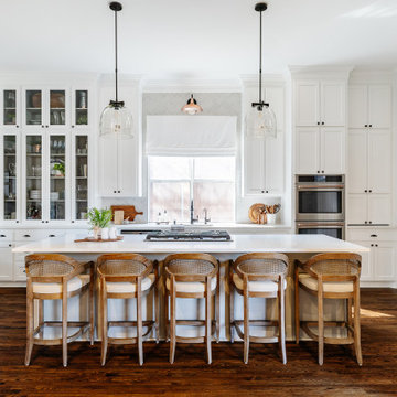
The before shot of the kitchen shows a view from the family room. See the dropped ceiling? We were curious, was this just part of the design or was the dropped ceiling there to hide mechanicals? Well we soon found out that it was mostly decorative (yay!), and with the exception of a little bit of work to some plumbing from an upstairs bathroom and rerouting of the ventilation system within the original floor joists, we were in the clear, phew! The shot of the completed kitchen from roughly the same vantage point shows how much taller the ceilings are. It makes a huge difference in the feel of the space. Dark and gloomy turned fresh and light!
Another serious consideration was what do we do with the skinny transom window above the refrigerator. After much back and forth, we decided to eliminate it and do some open shelving instead. This ended up being one of the nicest areas in the room. I am calling it the “fun zone” because it houses all the barware, wine cubbies and a bar fridge — the perfect little buffet spot for entertaining. It is flanked on either side by pull out pantries that I’m sure will get a ton of use. Since the neighboring room has literally three walls of almost full height windows, the kitchen gets plenty of light.
The gold shelving brackets, large pendant fixtures over the island and the tile mural behind the range all pay subtle homage to the home’s prairie style architecture and bring a bit of sparkle to the room.
Even though the room is quite large, the work triangle is very tight with the large Subzero fridge, sink and range all nearby for easy maneuvering during meal prep. There is seating for four at the island, and work aisles are generous.
Designed by: Susan Klimala, CKD, CBD
Photography by: LOMA Studios
For more information on kitchen and bath design ideas go to: www.kitchenstudio-ge.com

 Guggenheim Architecture + Design Studio
Josh Partee Photography
With sweeping views of the Willamette river and Mt. Hood, this Atwater Place condo was designed with a balance of minimalism and livability in mind. A complete kitchen remodel brought a dark interior kitchen to the light and a full furnishings package welcomed Los Angeles transplants home to their new modern and bright residence. Our clients, a retired camera operator for both feature films and television and a producer/production manager on numerous television series including Weeds and The Middle, relocated from their traditionally-styled LA bungalow to Portland in the Summer of 2014. The couple sought a design departure from their long-term California residence and a fresh start for their new life in the South Waterfront.
With only two pieces of sentimental furniture and a handful of artwork included in the plan, we set out to create a comfortable and clean-lined furnishings package complimenting the broad southeast views. Organically shaped upholstery pieces juxtaposed with angular steel and wood tables create a soft balance in the open floor plan. Several custom pieces, including a dining table designed by our studio and a custom hand-blown glass chandelier crafted by Scott Schiesel with Lightlite compliment timeless pieces from Knoll, Herman Miller, and B&B Italia.
The kitchen is designed to reflect light and create brilliance in a space that is otherwise naturally dark. A material balance of stainless steel, back painted glass, quartz composite, lacquer, and mirror all play their part in creating a vibrant cooking environment. We collectively decided to forgo the traditional island pendant for a linear commercial fixture that provides tremendous light to the prep surface and creates an unexpected architectural element. The mirrored prep island creates the illusion of open space while concealing casework and wine storage on the working side of the kitchen.
It is worth noting that this project was designed and installed almost entirely while our clients were still living in LA and wrapping up professional obligations and selling their home. This afforded us the tremendous opportunity to send our clients to showrooms not available in Portland to view key pieces before final specification. Textiles and finish samples were approved via mail and communication took place over e-mail, telephone, and an occasional office visit. This unique process lead to a successful result and a beautifully balanced living environment.
 Susan Yeley Homes
A departure from the ordinary box, this angular home is nestled in a forest-like setting. This young professional couple fell for its big open living space and good bones, and made the house theirs when they moved to Bloomington in 2015. Though the space was defined by interesting angles and a soaring ceiling, natural light and that beautiful tall stone fireplace, it was outdated. Some spaces were oddly chopped off and others were too open to use well.In the end, SYI did what we don't usually do: put up walls instead of taking them down. (Well, to be fair, we put up some and took down others.) A brand new kitchen anchors the space for these avid cooks, while new walls define a walk-in pantry, office nook and reading space. The new walls also help define the home’s private spaces—they tuck a powder room and guest room away down a hall, so they aren't awkwardly right off the living space. Unifying floor and finishes but breaking up the palette with punches of color, SYI transformed the lofty room to a space that is timeless in both style and layout.
 Hillcrest Construction
 designed and executed a complete facelift for these West Chester clients’ master bathroom. The sink/toilet/shower layout stayed relatively unchanged due to the limitations of the small space, but major changes were slated for the overall functionality and aesthetic appeal.
The bathroom was gutted completely, the wiring was updated, and minor plumbing alterations were completed for code compliance.
Bathroom waterproofing was installed utilizing the state-of-the-industry Schluter substrate products, and the feature wall of the shower is tiled with a striking blue 12x12 tile set in a stacked pattern, which is a departure of color and layout from the staggered gray-tome wall tile and floor tile.
The original bathroom lacked storage, and what little storage it had lacked practicality.
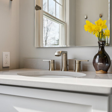
The original 1’ wide by 4’ deep “reach-in closet” was abandoned and replaced with a custom cabinetry unit that featured six 30” drawers to hold a world of personal bathroom items which could pulled out for easy access. The upper cubbie was shallower at 13” and was sized right to hold a few spare towels without the towels being lost to an unreachable area. The custom furniture-style vanity, also built and finished at the Hillcrest custom shop facilitated a clutter-free countertop with its two deep drawers, one with a u-shaped cut out for the sink plumbing. Considering the relatively small size of the bathroom, and the vanity’s proximity to the toilet, the drawer design allows for greater access to the storage area as compared to a vanity door design that would only be accessed from the front. The custom niche in the shower serves and a consolidated home for soap, shampoo bottles, and all other shower accessories.
Moen fixtures at the sink and in the shower and a Toto toilet complete the contemporary feel. The controls at the shower allow the user to easily switch between the fixed rain head, the hand shower, or both. And for a finishing touch, the client chose between a number for shower grate color and design options to complete their tailor-made sanctuary.
 Guggenheim Architecture + Design Studio
Josh Partee Photography
With sweeping views of the Willamette river and Mt. Hood, this Atwater Place condo was designed with a balance of minimalism and livability in mind. A complete kitchen remodel brought a dark interior kitchen to the light and a full furnishings package welcomed Los Angeles transplants home to their new modern and bright residence. Our clients, a retired camera operator for both feature films and television and a producer/production manager on numerous television series including Weeds and The Middle, relocated from their traditionally-styled LA bungalow to Portland in the Summer of 2014. The couple sought a design departure from their long-term California residence and a fresh start for their new life in the South Waterfront.
With only two pieces of sentimental furniture and a handful of artwork included in the plan, we set out to create a comfortable and clean-lined furnishings package complimenting the broad southeast views. Organically shaped upholstery pieces juxtaposed with angular steel and wood tables create a soft balance in the open floor plan. Several custom pieces, including a dining table designed by our studio and a custom hand-blown glass chandelier crafted by Scott Schiesel with Lightlite compliment timeless pieces from Knoll, Herman Miller, and B&B Italia.
The kitchen is designed to reflect light and create brilliance in a space that is otherwise naturally dark. A material balance of stainless steel, back painted glass, quartz composite, lacquer, and mirror all play their part in creating a vibrant cooking environment. We collectively decided to forgo the traditional island pendant for a linear commercial fixture that provides tremendous light to the prep surface and creates an unexpected architectural element. The mirrored prep island creates the illusion of open space while concealing casework and wine storage on the working side of the kitchen.
It is worth noting that this project was designed and installed almost entirely while our clients were still living in LA and wrapping up professional obligations and selling their home. This afforded us the tremendous opportunity to send our clients to showrooms not available in Portland to view key pieces before final specification. Textiles and finish samples were approved via mail and communication took place over e-mail, telephone, and an occasional office visit. This unique process lead to a successful result and a beautifully balanced living environment.

 Earth Elements Design Center
Rustic floors with modern fixtures
Freestanding bathtub - huge contemporary master dark wood floor freestanding bathtub idea with open cabinets, white walls, an integrated sink and solid surface countertops
Freestanding bathtub - huge contemporary master dark wood floor freestanding bathtub idea with open cabinets, white walls, an integrated sink and solid surface countertops


 Guggenheim Architecture + Design Studio
With sweeping views of the Willamette river and Mt. Hood, this Atwater Place condo was designed with a balance of minimalism and livability in mind. A complete kitchen remodel brought a dark interior kitchen to the light and a full furnishings package welcomed Los Angeles transplants home to their new modern and bright residence. Our clients, a retired camera operator for both feature films and television and a producer/production manager on numerous television series including Weeds and The Middle, relocated from their traditionally-styled LA bungalow to Portland in the Summer of 2014. The couple sought a design departure from their long-term California residence and a fresh start for their new life in the South Waterfront.
With only two pieces of sentimental furniture and a handful of artwork included in the plan, we set out to create a comfortable and clean-lined furnishings package complimenting the broad southeast views. Organically shaped upholstery pieces juxtaposed with angular steel and wood tables create a soft balance in the open floor plan. Several custom pieces, including a dining table designed by our studio and a custom hand-blown glass chandelier crafted by Scott Schiesel with Lightlite compliment timeless pieces from Knoll, Herman Miller, and B&B Italia.
The kitchen is designed to reflect light and create brilliance in a space that is otherwise naturally dark. A material balance of stainless steel, back painted glass, quartz composite, lacquer, and mirror all play their part in creating a vibrant cooking environment. We collectively decided to forgo the traditional island pendant for a linear commercial fixture that provides tremendous light to the prep surface and creates an unexpected architectural element. The mirrored prep island creates the illusion of open space while concealing casework and wine storage on the working side of the kitchen.
It is worth noting that this project was designed and installed almost entirely while our clients were still living in LA and wrapping up professional obligations and selling their home. This afforded us the tremendous opportunity to send our clients to showrooms not available in Portland to view key pieces before final specification. Textiles and finish samples were approved via mail and communication took place over e-mail, telephone, and an occasional office visit. This unique process lead to a successful result and a beautifully balanced living environment.
Josh Partee Photography
 Guggenheim Architecture + Design Studio
With sweeping views of the Willamette river and Mt. Hood, this Atwater Place condo was designed with a balance of minimalism and livability in mind. A complete kitchen remodel brought a dark interior kitchen to the light and a full furnishings package welcomed Los Angeles transplants home to their new modern and bright residence. Our clients, a retired camera operator for both feature films and television and a producer/production manager on numerous television series including Weeds and The Middle, relocated from their traditionally-styled LA bungalow to Portland in the Summer of 2014. The couple sought a design departure from their long-term California residence and a fresh start for their new life in the South Waterfront.
With only two pieces of sentimental furniture and a handful of artwork included in the plan, we set out to create a comfortable and clean-lined furnishings package complimenting the broad southeast views. Organically shaped upholstery pieces juxtaposed with angular steel and wood tables create a soft balance in the open floor plan. Several custom pieces, including a dining table designed by our studio and a custom hand-blown glass chandelier crafted by Scott Schiesel with Lightlite compliment timeless pieces from Knoll, Herman Miller, and B&B Italia.
The kitchen is designed to reflect light and create brilliance in a space that is otherwise naturally dark. A material balance of stainless steel, back painted glass, quartz composite, lacquer, and mirror all play their part in creating a vibrant cooking environment. We collectively decided to forgo the traditional island pendant for a linear commercial fixture that provides tremendous light to the prep surface and creates an unexpected architectural element. The mirrored prep island creates the illusion of open space while concealing casework and wine storage on the working side of the kitchen.
It is worth noting that this project was designed and installed almost entirely while our clients were still living in LA and wrapping up professional obligations and selling their home. This afforded us the tremendous opportunity to send our clients to showrooms not available in Portland to view key pieces before final specification. Textiles and finish samples were approved via mail and communication took place over e-mail, telephone, and an occasional office visit. This unique process lead to a successful result and a beautifully balanced living environment.
Josh Partee Photography
 Donald Lococo Architects
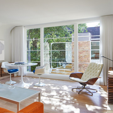
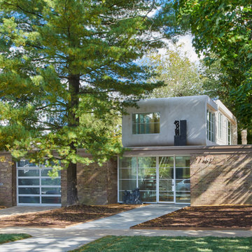
Designed in 1970 for an art collector, the existing referenced 70’s architectural principles. With its cadence of ‘70’s brick masses punctuated by a garage and a 4-foot-deep entrance recess. This recess, however, didn’t convey to the interior, which was occupied by disjointed service spaces. To solve, service spaces are moved and reorganized in open void in the garage. (See plan) This also organized the home: Service & utility on the left, reception central, and communal living spaces on the right.
To maintain clarity of the simple one-story 70’s composition, the second story add is recessive. A flex-studio/extra bedroom and office are designed ensuite creating a slender form and orienting them front to back and setting it back allows the add recede. Curves create a definite departure from the 70s home and by detailing it to "hover like a thought" above the first-floor roof and mentally removable sympathetic add.Existing unrelenting interior walls and a windowless entry, although ideal for fine art was unconducive for the young family of three. Added glass at the front recess welcomes light view and the removal of interior walls not only liberate rooms to communicate with each other but also reinform the cleared central entry space as a hub.
Even though the renovation reinforms its relationship with art, the joy and appreciation of art was not dismissed. A metal sculpture lost in the corner of the south side yard bumps the sculpture at the front entrance to the kitchen terrace over an added pedestal. (See plans) Since the roof couldn’t be railed without compromising the one-story '70s composition, the sculpture garden remains physically inaccessible however mirrors flanking the chimney allow the sculptures to be appreciated in three dimensions. The mirrors also afford privacy from the adjacent Tudor's large master bedroom addition 16-feet away.
 Donald Lococo Architects
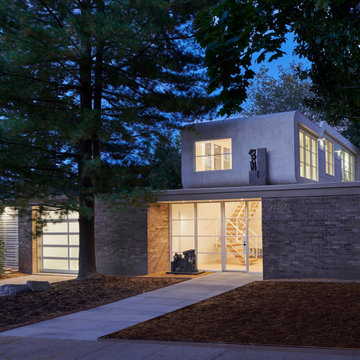
Designed in 1970 for an art collector, the existing referenced 70’s architectural principles. With its cadence of ‘70’s brick masses punctuated by a garage and a 4-foot-deep entrance recess. This recess, however, didn’t convey to the interior, which was occupied by disjointed service spaces. To solve, service spaces are moved and reorganized in open void in the garage. (See plan) This also organized the home: Service & utility on the left, reception central, and communal living spaces on the right.
To maintain clarity of the simple one-story 70’s composition, the second story add is recessive. A flex-studio/extra bedroom and office are designed ensuite creating a slender form and orienting them front to back and setting it back allows the add recede. Curves create a definite departure from the 70s home and by detailing it to "hover like a thought" above the first-floor roof and mentally removable sympathetic add.Existing unrelenting interior walls and a windowless entry, although ideal for fine art was unconducive for the young family of three. Added glass at the front recess welcomes light view and the removal of interior walls not only liberate rooms to communicate with each other but also reinform the cleared central entry space as a hub.
Even though the renovation reinforms its relationship with art, the joy and appreciation of art was not dismissed. A metal sculpture lost in the corner of the south side yard bumps the sculpture at the front entrance to the kitchen terrace over an added pedestal. (See plans) Since the roof couldn’t be railed without compromising the one-story '70s composition, the sculpture garden remains physically inaccessible however mirrors flanking the chimney allow the sculptures to be appreciated in three dimensions. The mirrors also afford privacy from the adjacent Tudor's large master bedroom addition 16-feet away.
 Donald Lococo Architects
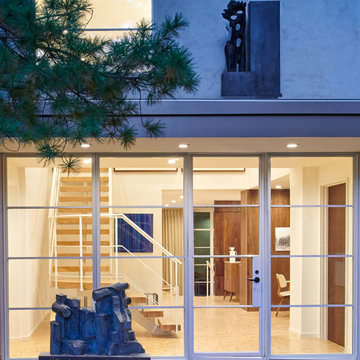
Designed in 1970 for an art collector, the existing referenced 70’s architectural principles. With its cadence of ‘70’s brick masses punctuated by a garage and a 4-foot-deep entrance recess. This recess, however, didn’t convey to the interior, which was occupied by disjointed service spaces. To solve, service spaces are moved and reorganized in open void in the garage. (See plan) This also organized the home: Service & utility on the left, reception central, and communal living spaces on the right.
To maintain clarity of the simple one-story 70’s composition, the second story add is recessive. A flex-studio/extra bedroom and office are designed ensuite creating a slender form and orienting them front to back and setting it back allows the add recede. Curves create a definite departure from the 70s home and by detailing it to "hover like a thought" above the first-floor roof and mentally removable sympathetic add.Existing unrelenting interior walls and a windowless entry, although ideal for fine art was unconducive for the young family of three. Added glass at the front recess welcomes light view and the removal of interior walls not only liberate rooms to communicate with each other but also reinform the cleared central entry space as a hub.
Even though the renovation reinforms its relationship with art, the joy and appreciation of art was not dismissed. A metal sculpture lost in the corner of the south side yard bumps the sculpture at the front entrance to the kitchen terrace over an added pedestal. (See plans) Since the roof couldn’t be railed without compromising the one-story '70s composition, the sculpture garden remains physically inaccessible however mirrors flanking the chimney allow the sculptures to be appreciated in three dimensions. The mirrors also afford privacy from the adjacent Tudor's large master bedroom addition 16-feet away.
 Root West Interiors
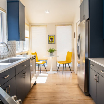
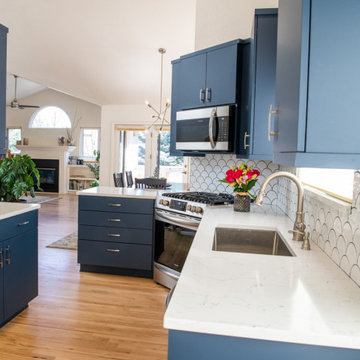
A blue flat-panel kitchen is a modern and stylish culinary space that embraces the serene and inviting qualities of the color blue while incorporating a streamlined and minimalist design.
The defining feature of this kitchen is the cabinetry, characterized by flat-panel doors and drawers. The cabinetry, often sleek and handleless, creates a clean and uncluttered appearance, lending a contemporary aesthetic to the room. The choice of blue as the cabinet color introduces a sense of calm and sophistication, making it a refreshing departure from more traditional kitchen colors.
The shade of blue can vary from soft and muted pastels to deeper and more vibrant blues, allowing for a range of design possibilities. The color choice may be influenced by personal preferences, and it can evoke different moods, from tranquil and coastal to vibrant and energetic.
Countertops in this kitchen are typically crafted from materials like quartz or solid surface, providing a sleek and easy-to-maintain workspace. The countertops may be in complementary colors, such as white, gray, or black, to balance and enhance the overall design.
Backsplashes can vary from classic subway tiles to more modern and colorful options, adding an element of style and texture to the space. These may also feature blue hues, creating a cohesive and harmonious design.
Flooring options include materials like light-colored tile or hardwood, which create a neutral foundation that complements the blue cabinetry while brightening the room. An area rug beneath the dining or cooking area can add a cozy and personal touch.
Pendant lights with contemporary designs provide both functional lighting and a decorative element, often adding a touch of metal or glass to the design. These fixtures contribute to the modern and stylish ambiance of the kitchen.
The walls are typically painted in neutral or light colors, allowing the blue cabinets to stand out and create a focal point. Natural light pouring in through windows enhances the bright and open atmosphere of the space.
A blue flat-panel kitchen is a contemporary and sophisticated setting for culinary creativity and social gatherings. The harmonious fusion of sleek design, the calming influence of the color blue, and functional elements creates a space that is both aesthetically pleasing and highly practical for modern living.
 Donald Lococo Architects
Designed in 1970 for an art collector, the existing referenced 70’s architectural principles. With its cadence of ‘70’s brick masses punctuated by a garage and a 4-foot-deep entrance recess. This recess, however, didn’t convey to the interior, which was occupied by disjointed service spaces. To solve, service spaces are moved and reorganized in open void in the garage. (See plan) This also organized the home: Service & utility on the left, reception central, and communal living spaces on the right.
To maintain clarity of the simple one-story 70’s composition, the second story add is recessive. A flex-studio/extra bedroom and office are designed ensuite creating a slender form and orienting them front to back and setting it back allows the add recede. Curves create a definite departure from the 70s home and by detailing it to "hover like a thought" above the first-floor roof and mentally removable sympathetic add.Existing unrelenting interior walls and a windowless entry, although ideal for fine art was unconducive for the young family of three. Added glass at the front recess welcomes light view and the removal of interior walls not only liberate rooms to communicate with each other but also reinform the cleared central entry space as a hub.
Even though the renovation reinforms its relationship with art, the joy and appreciation of art was not dismissed. A metal sculpture lost in the corner of the south side yard bumps the sculpture at the front entrance to the kitchen terrace over an added pedestal. (See plans) Since the roof couldn’t be railed without compromising the one-story '70s composition, the sculpture garden remains physically inaccessible however mirrors flanking the chimney allow the sculptures to be appreciated in three dimensions. The mirrors also afford privacy from the adjacent Tudor's large master bedroom addition 16-feet away.
 Root West Interiors
A blue flat-panel kitchen is a modern and stylish culinary space that embraces the serene and inviting qualities of the color blue while incorporating a streamlined and minimalist design.
The defining feature of this kitchen is the cabinetry, characterized by flat-panel doors and drawers. The cabinetry, often sleek and handleless, creates a clean and uncluttered appearance, lending a contemporary aesthetic to the room. The choice of blue as the cabinet color introduces a sense of calm and sophistication, making it a refreshing departure from more traditional kitchen colors.
The shade of blue can vary from soft and muted pastels to deeper and more vibrant blues, allowing for a range of design possibilities. The color choice may be influenced by personal preferences, and it can evoke different moods, from tranquil and coastal to vibrant and energetic.
Countertops in this kitchen are typically crafted from materials like quartz or solid surface, providing a sleek and easy-to-maintain workspace. The countertops may be in complementary colors, such as white, gray, or black, to balance and enhance the overall design.
Backsplashes can vary from classic subway tiles to more modern and colorful options, adding an element of style and texture to the space. These may also feature blue hues, creating a cohesive and harmonious design.
Flooring options include materials like light-colored tile or hardwood, which create a neutral foundation that complements the blue cabinetry while brightening the room. An area rug beneath the dining or cooking area can add a cozy and personal touch.
Pendant lights with contemporary designs provide both functional lighting and a decorative element, often adding a touch of metal or glass to the design. These fixtures contribute to the modern and stylish ambiance of the kitchen.
The walls are typically painted in neutral or light colors, allowing the blue cabinets to stand out and create a focal point. Natural light pouring in through windows enhances the bright and open atmosphere of the space.
A blue flat-panel kitchen is a contemporary and sophisticated setting for culinary creativity and social gatherings. The harmonious fusion of sleek design, the calming influence of the color blue, and functional elements creates a space that is both aesthetically pleasing and highly practical for modern living.
49