
Search results for "Depth background" in Home Design Ideas

 Infinite Home
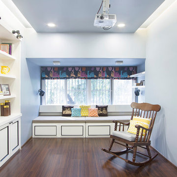
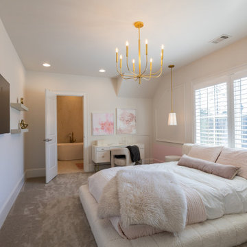
For this project, our clients wanted a home that reflected their elevated style and supported their growing family. With young daughters, a new baby on the way, and a nanny suite that needed both accessibility and privacy, this design was all about balancing sophistication with family-friendly functionality.
We reimagined multiple spaces, ensuring every room spoke to each other while maintaining its personality. Their daughters’ bedrooms feel more vibrant and personal, with thoughtful details like new lighting, fresh paint, and furniture that will transition with them as they grow. The nursery became a dreamy retreat featuring cloud-like textures and soft, celestial touches—an enchanting space designed for their newest addition.
The attic, once an afterthought, is now an extension of the home that feels as if it was always meant to be there. The office was designed with depth and refinement, incorporating a built-in library cabinet with a striking black slab background and moody furnishings that add a sense of sophistication.
This project was about creating a home that effortlessly evolves with their growing family—where elegance and practicality go hand in hand, and every space feels elevated and deeply livable.
 Ollin Stone
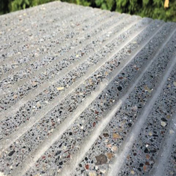
The cutting-edge technology and versatility we have developed over the years have resulted in four main line of Agglotech terrazzo — Unico. Small chips and contrasting background for a harmonious interplay of perspectives that lends this material vibrancy and depth.
Find the right local pro for your project
 Rocky Tops Granite & Marble LLC
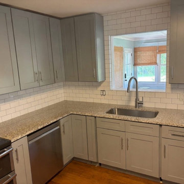
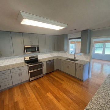
This West Columbia kitchen got new countertops in White Alpes granite, a stone with a light background scattered through with dark speckling and mineral flecks that catch the light differently depending on where you stand. It's the kind of pattern that reads calm from across the room and gets more interesting up close, which is exactly what you want on a surface you're going to be looking at every day.
Granite like this is quarried and cut into slabs, then polished to bring out that natural fleck and depth. It's dense, heat resistant, and about as tough a countertop material as you can put in a kitchen. You can set a hot pan on it without worrying, and it shrugs off the daily knife-and-cutting-board traffic that wears down softer stones. With a good sealer applied at install, it resists staining from wine, oil, and the usual kitchen spills for years before it needs to be redone.
We templated the space to fit around the existing gray shaker cabinets and stainless appliances, cutting the sink opening for the stainless steel sink and squaring up the seams so the pattern in the granite carries through cleanly from one run to the next. That's the part of the job that doesn't show up in a photo: getting the slab cut so the speckling doesn't look choppy at the seam, and getting the sink cutout dialed in so the reveal is even all the way around.
With the backsplash area still open, the countertop is doing a lot of the visual work right now, and it's holding its own. The light background of the White Alpes plays well against the gray cabinetry, and it'll give whatever backsplash goes in next a neutral, textured surface to build off of.
We do a lot of this kind of granite work around West Columbia and the rest of the Midlands. Kitchens like this one are a good reminder of why granite has stayed a go-to choice for so long: it looks good, it holds up, and it doesn't ask much of the homeowner once it's in.
 Rocky Tops Granite & Marble LLC
This West Columbia kitchen got new countertops in White Alpes granite, a stone with a light background scattered through with dark speckling and mineral flecks that catch the light differently depending on where you stand. It's the kind of pattern that reads calm from across the room and gets more interesting up close, which is exactly what you want on a surface you're going to be looking at every day.
Granite like this is quarried and cut into slabs, then polished to bring out that natural fleck and depth. It's dense, heat resistant, and about as tough a countertop material as you can put in a kitchen. You can set a hot pan on it without worrying, and it shrugs off the daily knife-and-cutting-board traffic that wears down softer stones. With a good sealer applied at install, it resists staining from wine, oil, and the usual kitchen spills for years before it needs to be redone.
We templated the space to fit around the existing gray shaker cabinets and stainless appliances, cutting the sink opening for the stainless steel sink and squaring up the seams so the pattern in the granite carries through cleanly from one run to the next. That's the part of the job that doesn't show up in a photo: getting the slab cut so the speckling doesn't look choppy at the seam, and getting the sink cutout dialed in so the reveal is even all the way around.
With the backsplash area still open, the countertop is doing a lot of the visual work right now, and it's holding its own. The light background of the White Alpes plays well against the gray cabinetry, and it'll give whatever backsplash goes in next a neutral, textured surface to build off of.
We do a lot of this kind of granite work around West Columbia and the rest of the Midlands. Kitchens like this one are a good reminder of why granite has stayed a go-to choice for so long: it looks good, it holds up, and it doesn't ask much of the homeowner once it's in.

 Vicostone Global
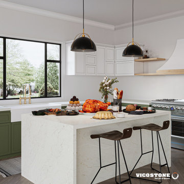
Layered grays create a background with depth and balance, while threads of white to dark veins create a striking mesh design with substantial visual depth. The look and complexity of VICOSTONE Camarina BQ6701 is reminiscent of Super White quartzite from Brazil, making it a bold choice for interior surfaces.

 Darlene Shaw Design Inc.
kwestimages.com
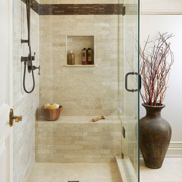
Inspiration for a transitional beige tile bathroom remodel in Toronto with a niche
Inspiration for a transitional beige tile bathroom remodel in Toronto with a niche
 Samantha Kleinknecht Landscape Design
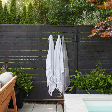
Design ideas for a contemporary backyard landscaping in Toronto.
 PI Photography Wall Art & Fine Art
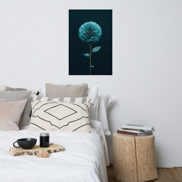
 https://pipafineart.com/products/azure-awakening-realism-painting-digital-artwork-loose-art-print. Immerse yourself in the captivating allure of "Azure Awakening," a mesmerizing artwork that showcases the ethereal beauty of a turquoise flower in full bloom. This photorealistic print captures the delicate intricacy of each petal, their velvety texture and subtle variations in hue creating a sense of depth and wonder. Set against a dramatic black background, the flower's vibrant color and graceful form are brought into sharp focus, evoking a sense of tranquility and mystery. Printed on high-quality photo paper with premium inks, "Azure Awakening" brings a touch of serene elegance to any space.
Hang "Azure Awakening" in your living room, bedroom, dining room, or office to create a captivating focal point that inspires contemplation and tranquility. This artwork is a celebration of the beauty and resilience of nature, a reminder of the delicate balance between strength and fragility. The cool, calming tones of the turquoise flower evoke a sense of peace and serenity, while the dramatic contrast with the dark background adds a touch of modern sophistication.
"Azure Awakening" is made in the USA and printed on demand, ensuring a high-quality piece that will be cherished for years to come. Available in a variety of sizes, it makes a perfect gift for nature lovers, art enthusiasts, and anyone who appreciates the beauty and elegance of the natural world.
 Infinite Home
 For this project, our clients wanted a home that reflected their elevated style and supported their growing family. With young daughters, a new baby on the way, and a nanny suite that needed both accessibility and privacy, this design was all about balancing sophistication with family-friendly functionality.
We reimagined multiple spaces, ensuring every room spoke to each other while maintaining its personality. Their daughters’ bedrooms feel more vibrant and personal, with thoughtful details like new lighting, fresh paint, and furniture that will transition with them as they grow. The nursery became a dreamy retreat featuring cloud-like textures and soft, celestial touches—an enchanting space designed for their newest addition.
The attic, once an afterthought, is now an extension of the home that feels as if it was always meant to be there. The office was designed with depth and refinement, incorporating a built-in library cabinet with a striking black slab background and moody furnishings that add a sense of sophistication.
This project was about creating a home that effortlessly evolves with their growing family—where elegance and practicality go hand in hand, and every space feels elevated and deeply livable.
 Susan Fisher Photography
Fisher Hart
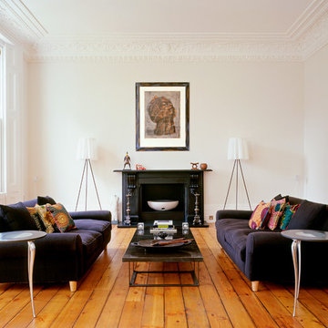
Example of a danish formal and enclosed light wood floor and orange floor living room design in New York with white walls and a standard fireplace
Example of a danish formal and enclosed light wood floor and orange floor living room design in New York with white walls and a standard fireplace


Sponsored
Columbus, OH

Hope Restoration & General Contracting
Columbus Design-Build, Kitchen & Bath Remodeling, Historic Renovations
 Studio TOOP
design: Studio TOOP, 2008
location: Vianen, NL
status: built in 2008, Tuinvreugd
photo: Jolanthe Lalkens, 2009
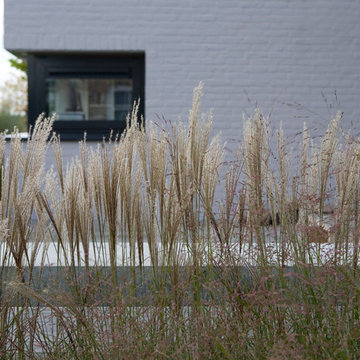
This front garden needed to make a link with the newly built contemporary home and its gorgeous view. The key was for the design not to compete with either. Strokes of three types of grass and textural interest and privacy while not distracting you from the main focus of the garden: the view!

 Olga Bakic Architect
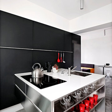
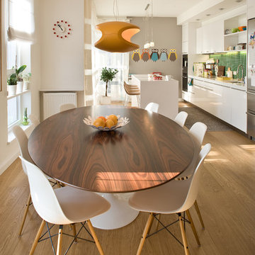
Kitchen/dining room combo - contemporary light wood floor kitchen/dining room combo idea in Other with white walls
 Sigmar
Petr Krejci
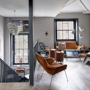
Example of a transitional loft-style light wood floor family room design in London with a media wall
Example of a transitional loft-style light wood floor family room design in London with a media wall


 Rocky Tops Granite & Marble LLC
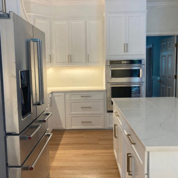
Spectrums Indulgence quartz, manufactured right here in Latta South Carolina, went into this kitchen in Columbia, and it's the kind of stone that works quietly hard in a room people actually cook and live in. It's engineered quartz, so what you're looking at is a mix of ground quartz and resin, blended and pressed to give a background that stays consistent slab to slab. That matters more than people think when you're trying to keep a kitchen looking pulled together across a run of cabinets, an island, and a backsplash.
The color reads as a soft, workable background with movement in it, enough character to give the room some depth without turning into something that fights with the cabinets or the floor. That's the appeal of a pattern like this one. It's not a plain solid, but it's not so busy that it limits what else goes in the space. Kitchens live a long time with the same countertop, and a stone that holds up visually over the years is worth choosing over something flashier that gets tiring.
Quartz like this is also just practical for a working kitchen. It doesn't need sealing the way natural stone does, it resists staining from wine, oil, and citrus, and it shrugs off the daily scratches from knives and pans that would show on a softer stone. Heat is the one thing we tell people to respect, a hot pan straight off the stove can shock the resin, so a trivet is the smart habit to build. Otherwise it's about as low-maintenance a surface as you can put in a kitchen.
We set the edge as eased, which is the clean, simple choice that lets the stone itself do the talking instead of the profile. Templating and fabrication on a job like this comes down to getting the seams tight and matching the pattern across the island and the runs so it reads as one continuous piece even where the slabs meet.
Jobs like this are what we like doing around Columbia and the rest of the Midlands, where a kitchen remodel means getting the material, the layout, and the fit all right in a space a family's going to use every single day.
 Rocky Tops Granite & Marble LLC
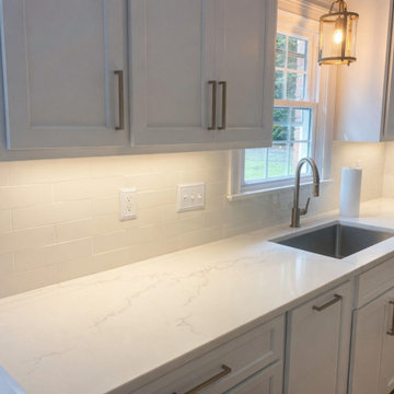
Spectrums Indulgence quartz, manufactured right here in Latta South Carolina, went into this kitchen in Columbia, and it's the kind of stone that works quietly hard in a room people actually cook and live in. It's engineered quartz, so what you're looking at is a mix of ground quartz and resin, blended and pressed to give a background that stays consistent slab to slab. That matters more than people think when you're trying to keep a kitchen looking pulled together across a run of cabinets, an island, and a backsplash.
The color reads as a soft, workable background with movement in it, enough character to give the room some depth without turning into something that fights with the cabinets or the floor. That's the appeal of a pattern like this one. It's not a plain solid, but it's not so busy that it limits what else goes in the space. Kitchens live a long time with the same countertop, and a stone that holds up visually over the years is worth choosing over something flashier that gets tiring.
Quartz like this is also just practical for a working kitchen. It doesn't need sealing the way natural stone does, it resists staining from wine, oil, and citrus, and it shrugs off the daily scratches from knives and pans that would show on a softer stone. Heat is the one thing we tell people to respect, a hot pan straight off the stove can shock the resin, so a trivet is the smart habit to build. Otherwise it's about as low-maintenance a surface as you can put in a kitchen.
We set the edge as eased, which is the clean, simple choice that lets the stone itself do the talking instead of the profile. Templating and fabrication on a job like this comes down to getting the seams tight and matching the pattern across the island and the runs so it reads as one continuous piece even where the slabs meet.
Jobs like this are what we like doing around Columbia and the rest of the Midlands, where a kitchen remodel means getting the material, the layout, and the fit all right in a space a family's going to use every single day.
 Reynard Architectural Designs
Architectural Partition & Open Flow
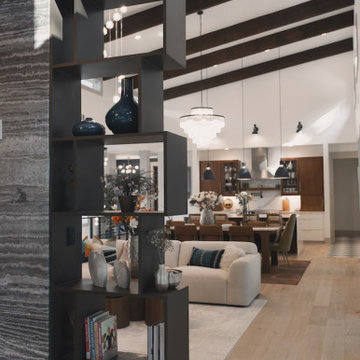
This perspective showcases how custom millwork is used to define spaces within the open-concept floor plan without sacrificing airiness.
Key Design Features:
Geometric Room Divider: A dark-stained, custom open shelving unit acts as a sophisticated partition, attached to the side of the massive stone fireplace wall. Its asymmetrical, cubist design adds modern architectural interest while preserving sightlines between the living area and the kitchen.
Curated Styling: The shelves are styled with navy blue glass vases, metallic accents, and books, adding pops of color and personality to the neutral palette.
Layered Depth: The image captures the impressive depth of the home, looking past the cream sofa in the living room toward the dining area's crystal chandelier and the kitchen's exposed wood beams in the background, unifying the distinct zones through consistent flooring and ceiling details.
9