
Search results for "Desperation" in Home Design Ideas
 Archadeck of Chicagoland
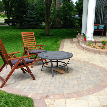
This front yard was in desperate need of a little curb appeal and we were up to the challenge! Wanting a unique look, we put a twist on the classic front stoop and walkway design by adding more patio space, an inset circle for a portable fire pit, and a seat wall to separate the patio space from the attached driveway.
The patio features Belgard's Laffit Rustic Slab pavers in London Grey with a soldiers course of Holland Stone in Ashbury Haze. The inset circle is comprised of Holland Stone in Bristol Beige. The contrasting colors create a stunning design element. The seat wall and raised flowerbed were built with Weston Wall bricks, also in Ashbury Haze. A simple, elegant, and unique design that would compliment any home.
~Palatine, IL
 Plain & Posh
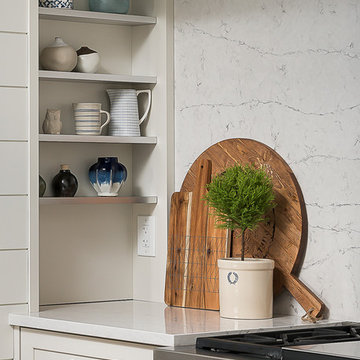
This large kitchen was desperately needing a refresh. It was far to traditional for the homeowners taste. Additionally, there was no direct path to the dining room as you needed to enter through a butlers pantry. I opened up two doorways into the kitchen from the dining room, which allowed natural light to flow in. The former butlers pantry was then sealed up and became part of the formerly to small pantry. The homeowners now have a 13' long walk through pantry, accessible from both the new bar area and the kitchen.
 Granite Grannies Hethmon
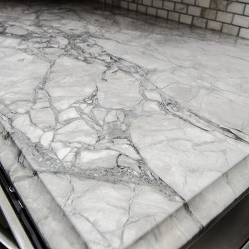
Super White Quartzite (also referred to as White Fantasy Quartzite) is a perfect stone for those who want the gorgeous look of marble, but not the maintenance. These homeowners decided to pair it with a Calacatta Gold Tile, running it all the way up the wall. The combination makes for a classic, crisp look.
Find the right local pro for your project
 TVL Creative Ltd.
This project was such an incredible design opportunity, and instilled inspiration and excitement at every turn! Our amazing clients came to us with the challenge of converting their beloved family home into a welcoming haven for all members of the family. At the time that we met our clients, they were struggling with the difficult personal decision of the fate of the home. Their father/father-in-law had passed away and their mother/mother-in-law had recently been admitted into a nursing facility and was fighting Alzheimer’s. Resistant to loss of the home now that both parents were out of it, our clients purchased the home to keep in in the family. Despite their permanent home currently being in New Jersey, these clients dedicated themselves to keeping and revitalizing the house. We were moved by the story and became immediately passionate about bringing this dream to life.
The home was built by the parents of our clients and was only ever owned by them, making this a truly special space to the family. Our goal was to revitalize the home and to bring new energy into every room without losing the special characteristics that were original to the home when it was built. In this way, we were able to develop a house that maintains its own unique personality while offering a space of welcoming neutrality for all members of the family to enjoy over time.
The renovation touched every part of the home: the exterior, foyer, kitchen, living room, sun room, garage, six bedrooms, three bathrooms, the laundry room, and everything in between. The focus was to develop a style that carried consistently from space to space, but allowed for unique expression in the small details in every room.
Starting at the entry, we renovated the front door and entry point to offer more presence and to bring more of the mid-century vibe to the home’s exterior. We integrated a new modern front door, cedar shingle accents, new exterior paint, and gorgeous contemporary house numbers that really allow the home to stand out. Just inside the entry, we renovated the foyer to create a playful entry point worthy of attention. Cement look tile adorns the foyer floor, and we’ve added new lighting and upgraded the entry coat storage.
Upon entering the home, one will immediately be captivated by the stunning kitchen just off the entry. We transformed this space in just about every way. While the footprint of the home ultimately remained almost identical, the aesthetics were completely turned on their head. We re-worked the kitchen to maximize storage and to create an informal dining area that is great for casual hosting or morning coffee.
We removed the entry to the garage that was once in the informal dining, and created a peninsula in its place that offers a unique division between the kitchen/informal dining and the formal dining and living areas. The simple light warm light gray cabinetry offers a bit of traditional elegance, along with the marble backsplash and quartz countertops. We extended the original wood flooring into the kitchen and stained all floors to match for a warmth that truly resonates through all spaces. We upgraded appliances, added lighting everywhere, and finished the space with some gorgeous mid century furniture pieces.
In the formal dining and living room, we really focused on maintaining the original marble fireplace as a focal point. We cleaned the marble, repaired the mortar, and refinished the original fireplace screen to give a new sleek look in black. We then integrated a new gas insert for modern heating and painted the upper portion in a rich navy blue; an accent that is carried through the home consistently as a nod to our client’s love of the color.
The former entry into the old covered porch is now an elegant glass door leading to a stunning finished sunroom. This room was completely upgraded as well. We wrapped the entire space in cozy white shiplap to keep a casual feel with brightness. We tiled the floor with large format concrete look tile, and painted the old brick fireplace a bright white. We installed a new gas burning unit, and integrated transitional style lighting to bring warmth and elegance into the space. The new black-frame windows are adorned with decorative shades that feature hand-sketched bird prints, and we’ve created a dedicated garden-ware “nook” for our client who loves to work in the yard. The far end of this space is completed with two oversized chaise loungers and overhead lights…the most perfect little reading nook!
Just off the dining room, we created an entirely new space to the home: a mudroom. The clients lacked this space and desperately needed a landing spot upon entering the home from the garage. We uniquely planned existing space in the garage to utilize for this purpose, and were able to create a small but functional entry point without losing the ability to park cars in the garage. This new space features cement-look tile, gorgeous deep brown cabinetry, and plenty of storage for all the small items one might need to store while moving in and out of the home.
The remainder of the upstairs level includes massive renovations to the guest hall bathroom and guest bedroom, upstairs master bed/bath suite, and a third bedroom that we converted into a home office for the client.
Some of the largest transformations were made in the basement, where unfinished space and lack of light were converted into gloriously lit, cozy, finished spaces. Our first task was to convert the massive basement living room into the new master bedroom for our clients. We removed existing built-ins, created an entirely new walk-in closet, painted the old brick fireplace, installed a new gas unit, added carpet, introduced new lighting, replaced windows, and upgraded every part of the aesthetic appearance. One of the most incredible features of this space is the custom double sliding barn door made by a Denver artisan. This space is truly a retreat for our clients!
We also completely transformed the laundry room, back storage room, basement master bathroom, and two bedrooms.
This home’s massive scope and ever-evolving challenges were thrilling and exciting to work with, and the result is absolutely amazing. At the end of the day, this home offers a look and feel that the clients love. Above all, though, the clients feel the spirit of their family home and have a welcoming environment for all members of the family to enjoy for years to come.

 Constantine Design Group, Inc.
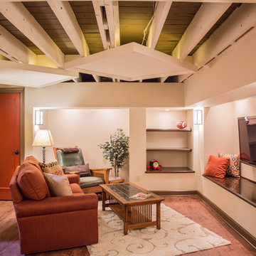
This early 20th century Indianapolis, IN basement remodel was in desperate need of help. The original and still operating hydronic radiant heating system had its plumbing configured without regard to any other use of the space. Fearful of harming the aged system and the high cost of doing so, these Clients were adamant that the existing system remain intact. Architect Lee Constantine developed a design that maintained the existing heating system while creating "niches" around the perimeter that would conceal the unsightly plumbing. Additionally, by removing free-standing structural supporting posts, amore flexible and inviting space was achieved. Because of an already low ceiling condition, the floor-ceiling structure above was kept exposed, painted and highlighted with indirect lighting to avoid further reducing the ceiling height. Constantine incorporated "clouds" on this ceiling to conceal certain existing components that either were cost prohibitive to relocate or couldn't be relocated. These "clouds"become a "visual element" through their geometry and hidden "indirect" light source rather than an undesirable complication. Now this family entertains frequently in the basement and reports "it doesn't feel like we're in a basement anymore"
 Tiffany Brooks, HGTV Host & Interior Designer
Inquire About Our Design Services
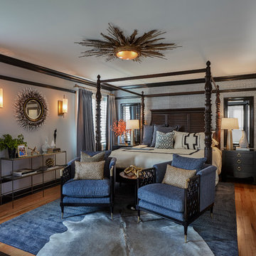
When we first started talking in the spring of 2015, I was impressed. She was witty, realistic, and understood that as much as she loves my shows on HGTV, design does not does not happen in 43 minutes! She told me about her space, and how she felt that her bedroom seemed “blah” to her. She had no retreat. Molly desperately longed for a place that she could spend time in, read in, play in and above all, relax in.
What we did:
Many people are terrified of hiring a designer. Rightfully so, they are investing a pretty penny in their homes. They want to make sure that everything, down to the last floral arrangement, is to their liking, because they will have to live it (and pay for it). Unfortunately, a client can unintentionally stifle a designer’s creativity through micro-management. This can produce lackluster results and ultimately cause more time (and money) to be spent on a project than is really necessary.
With Molly, that was never an issue. Before she even showed me the room in question, she said that I could have full creative license to do what I needed to do to her bedroom. SAY WHAAH!?
With Molly giving me complete creative freedom, I planned everything out and got down to business. The result: Bite-your-bottom-lip sexy. I don’t get jealous of too many of my clients’ spaces, but this one still takes my breath away every time I look at the pics!
The craziest part was that by adding more furniture, it actually made the space feel larger.
Molly and her husband Patrick loved the finished space, and promised me I will be back to finish the rest of the house!
Here’s the highlights of the rest of the project:
I came up with a space plan with three options.
Next, we reviewed mood boards and fabric schemes that would work for both Molly and her hubby Patrick.
We started with the bed. My goal was to add edge to its otherwise traditional style.
We decided to spice things up by painting the trim work in the room black.
We built in layers of lighting with dimmers. In a bedroom everything should be on dimmers, right? Right.
We designed and customized bedding, chairs and window treatments.
Together with Molly, we selected the most perfect wallpaper. This geometric “grasscloth” adds so much depth and dimension that was just missing before.
What I love:
That light fixture. I mean it is really, really amazing in person.
The porcupine mirror. This thing came packaged like it was the hope diamond, and everyone was terrified to handle it. But it really became a highlight of the room.
 Decorating Den Interiors - Bromberek Design Team
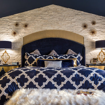
We began by suggesting a completely new accent wall for behind her king bed that would entirely transform the look of the room. We chose a white, stacked ledger stone that had a bit of crystal shimmer to it. We wanted to offset the angular peak of the ceiling, so we cut an arch shape into the stone look and inserted a gold, textured shimmer wallpaper in the insert that mimicked the shape of the curved headboard. A ceiling painted in navy blue adds drama to the room, while starburst wall accents add just a touch of detail to complete the stone accent wall.
We then selected a rich navy blue chenille, custom headboard and bed surround as the focal piece. White and navy blue bedding, accented by silver and gold pillows, complete the look for her bed.
Photo Credit: Nina Leone Photography
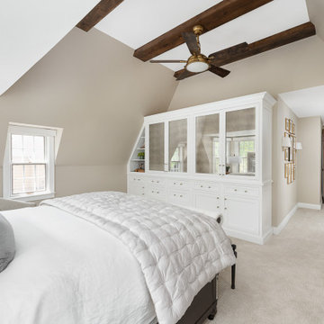
 Sarah Coe Design LLC
From out dated to high-end hotel, this master suite was brought from the 1980's to date both by look and by function.
Large elegant master carpeted and gray floor bedroom photo in Chicago with gray walls
Large elegant master carpeted and gray floor bedroom photo in Chicago with gray walls
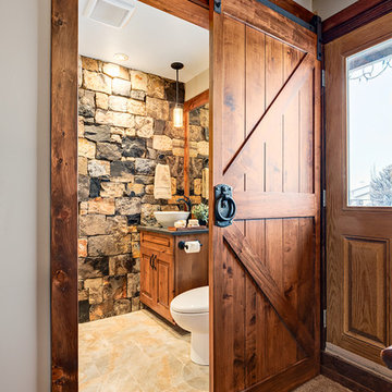
 Toro Renovations LTD
Calgary Photos
Example of a small mountain style 3/4 multicolored tile and stone slab ceramic tile doorless shower design in Calgary with furniture-like cabinets, medium tone wood cabinets, a one-piece toilet, beige walls, a pedestal sink and quartz countertops
Example of a small mountain style 3/4 multicolored tile and stone slab ceramic tile doorless shower design in Calgary with furniture-like cabinets, medium tone wood cabinets, a one-piece toilet, beige walls, a pedestal sink and quartz countertops
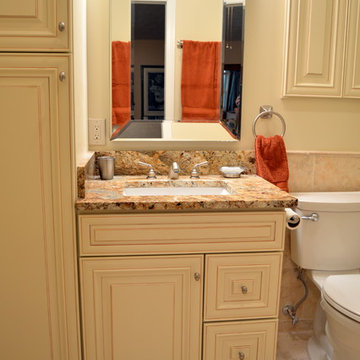
 Preteroti Consulting (Johnny Rhino Kit & Bath)
This master bathroom was in desperate need of a remodel. The compact master bathroom was cramped and out dated. Johnny Rhino stepped in to create a more open, bright, and comfortable space without knocking out walls. The installation of floor-to-ceiling cabinetry, a medicine cabinet inset into the wall, recessed lighting as well as wall-mounted lighting, and a pocket door helped to really open up this space!
Tabitha Stephens
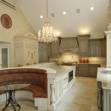
 At Home Design LLC
Custom cabinets with specialty paint finish.
Open concept kitchen - large traditional l-shaped limestone floor open concept kitchen idea in Bridgeport with an undermount sink, recessed-panel cabinets, gray cabinets, granite countertops, stone tile backsplash, paneled appliances, an island and multicolored backsplash
Open concept kitchen - large traditional l-shaped limestone floor open concept kitchen idea in Bridgeport with an undermount sink, recessed-panel cabinets, gray cabinets, granite countertops, stone tile backsplash, paneled appliances, an island and multicolored backsplash
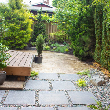
 Northwest Native Landscapes LLC
This compact, urban backyard was in desperate need of privacy. We created a series of outdoor rooms, privacy screens, and lush plantings all with an Asian-inspired design sense. Elements include a covered outdoor lounge room, sun decks, rock gardens, shade garden, evergreen plant screens, and raised boardwalk to connect the various outdoor spaces. The finished space feels like a true backyard oasis.
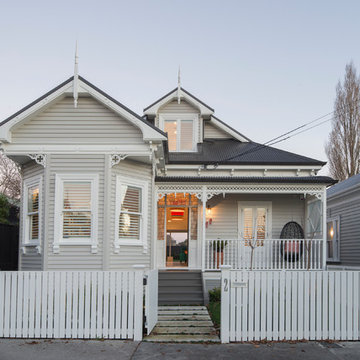

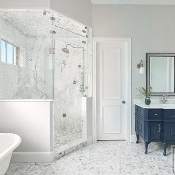
 Nicole Arnold Interiors
We transformed a Georgian brick two-story built in 1998 into an elegant, yet comfortable home for an active family that includes children and dogs. Although this Dallas home’s traditional bones were intact, the interior dark stained molding, paint, and distressed cabinetry, along with dated bathrooms and kitchen were in desperate need of an overhaul. We honored the client’s European background by using time-tested marble mosaics, slabs and countertops, and vintage style plumbing fixtures throughout the kitchen and bathrooms. We balanced these traditional elements with metallic and unique patterned wallpapers, transitional light fixtures and clean-lined furniture frames to give the home excitement while maintaining a graceful and inviting presence. We used nickel lighting and plumbing finishes throughout the home to give regal punctuation to each room. The intentional, detailed styling in this home is evident in that each room boasts its own character while remaining cohesive overall.
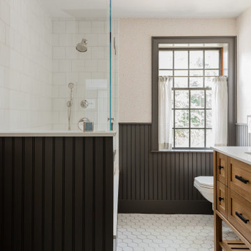
 MANDARINA STUDIO interior design
Summary of Scope: gut renovation/reconfiguration of kitchen, coffee bar, mudroom, powder room, 2 kids baths, guest bath, master bath and dressing room, kids study and playroom, study/office, laundry room, restoration of windows, adding wallpapers and window treatments
Background/description: The house was built in 1908, my clients are only the 3rd owners of the house. The prior owner lived there from 1940s until she died at age of 98! The old home had loads of character and charm but was in pretty bad condition and desperately needed updates. The clients purchased the home a few years ago and did some work before they moved in (roof, HVAC, electrical) but decided to live in the house for a 6 months or so before embarking on the next renovation phase. I had worked with the clients previously on the wife's office space and a few projects in a previous home including the nursery design for their first child so they reached out when they were ready to start thinking about the interior renovations. The goal was to respect and enhance the historic architecture of the home but make the spaces more functional for this couple with two small kids. Clients were open to color and some more bold/unexpected design choices. The design style is updated traditional with some eclectic elements. An early design decision was to incorporate a dark colored french range which would be the focal point of the kitchen and to do dark high gloss lacquered cabinets in the adjacent coffee bar, and we ultimately went with dark green.
 TOC design & construction inc.
DESIGNED BY TOC design
CONSTRUCTION BY TOC design & Construction inc.
PHOTOS BY : Tania Scardellato
I was fortunate to have a young family approach me in desperate need to renovate there only 3 piece bathroom. This space was In dire need of a remodel, with old brown wall to wall tiles and a dated bulky yellow brown single sink vanity.
Storage was a must, lighting a necessity, and proper accessibility to the shower bath area.
We had a tight budget to respect, but a full gut of this bathroom was required. And a good thing too, once we started doing the demolition we noticed that mildew and rotting floors and walls had accumulated throughout the years. Doing it right the first time is no joke when dealing with water and electrical issues.
We discarded all reminisce of old and built from scratch, new walls, new plumbing, new electrical ,new insulation and a new window, a new fan that actually exhausted outside ( I say this laughing as you would be amazed at how many fans are installed but don’t exhaust outside, and you the client would never know unless you go inside the attic space.
Once all the hard stuff was done, the rest is just a matter of smart design. If you have a small bathroom here are some tips to guide you.
10 tips for making a small bathroom feel larger
Is your tiny bathroom cramping your functionality and style, leaving you longing for the enormous bathrooms gracing the pages of design magazines? Even if your bathroom is a fraction of the size, all it takes is some design savvy to make the most of the space you have. Consider these 10 smart tips that will help your bathroom look, feel and function like those larger contenders.
1-Get creative with corners
Space is at a premium in small bathrooms, so it's important to maximize every inch. Corners, for example, provide extra space for shelving, storage units and even hooks. Get creative and install unique design solutions that are not only functional, but also eye-catching. If you love the airiness of floating cabinets, add baskets or decorative boxes under for extra storage. If you are installing floating cabinets insure that they are installed securely to studs or plywood at wall.
2- Let solid colors shine
Busy patterns have a shrinking effect and make small bathrooms seem even smaller. Conversely, light natural hues make a space feel more open. If you're itching to get creative with design, experiment with textures but keep overpowering patterns to a minimum. Tone on tone is the best to achieve this.
3 - Maximize your bathtub
A bathtub takes up a significant portion of the room, but modern, compact options with curved basins, can make the tub feel larger when in use, all while conserving space.
4 - Select a smaller faucet
A faucet is jewelry for the bathroom. And just as accessories can overpower an outfit, a big bulky faucet isn't flattering in a small bath. Single-handle designs conserve counter space, while a wall-mount installation frees it up all together and can create quite the wow-factor, if the budget can accommodate the required changes to plumbing behind the wall.
5 - Make vanity storage simple
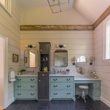
If you're in a storage war with your small bathroom, you're not alone in the battle. Toiletries and personal supplies without a place to call home only add clutter and chaos. Store smart with a space-saving vanity, the dual sink vanity shown here, looks quite simple, but in reality it has 4 sets of full extension drawers, and the vanity tower adds extra storage without overpowering the use of space.
6 - Show off the shower
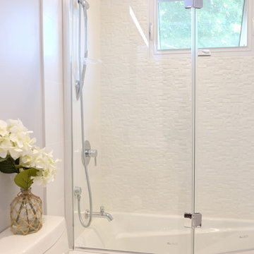
Shower curtains may be pretty, but they interrupt the visual flow of a bathing space and make it feel significantly smaller. In bathrooms with small footprints, opt for a clear glass sliding shower door that doesn't require the clearance of one with a hinged design. Or as shown in this design and for fraction less expensive a half hinged panel installed on a fixed tempered glass panel. If you're embarking on a big remodel, create the illusion of more space by using same tile in the shower that's used throughout; instead of seeing them as two separate zones, the eye will read them as one.
7 - Discover the treasure of hidden storage
Work with a contractor, and you just might find some serious storage potential hidden behind your walls. Whether it's utilizing space between the studs for shallow shelving or a creating a small linen closet by annexing space from an adjacent room, even small additions can make a big difference.
8 - Focal Point
Tile is a beautiful, durable addition to any bathroom. For dainty spaces, consider installing tile at a diagonal to accentuate the focal point or as in this bathroom I used an oversized textured pattern to bring depth to the space at the window wall.
9 - Choose the right lights
Strategically install light to reflect and brighten a small bathroom to make it appear larger. Recessed lighting is an affordable solution for tiny rooms, offering ample light while taking up little space. Wall sconces alongside a mirror also reflect off the walls and make a room feel bright and airy. I always recommend going with LED lighting at 2800 to 3000K.
10 – Accessorize
This is your time to shine in your decorating skills, have fun with your towels, you can change the color scheme daily just by adding pops of color in your accessories, make sure to get items that serve a dual purpose, like baskets, boxes they can always be used as hampers, storing of towels and even a nice display for your guest.
 Windhill+Co.
We gave this rather dated farmhouse some dramatic upgrades that brought together the feminine with the masculine, combining rustic wood with softer elements. In terms of style her tastes leaned toward traditional and elegant and his toward the rustic and outdoorsy. The result was the perfect fit for this family of 4 plus 2 dogs and their very special farmhouse in Ipswich, MA. Character details create a visual statement, showcasing the melding of both rustic and traditional elements without too much formality. The new master suite is one of the most potent examples of the blending of styles. The bath, with white carrara honed marble countertops and backsplash, beaded wainscoting, matching pale green vanities with make-up table offset by the black center cabinet expand function of the space exquisitely while the salvaged rustic beams create an eye-catching contrast that picks up on the earthy tones of the wood. The luxurious walk-in shower drenched in white carrara floor and wall tile replaced the obsolete Jacuzzi tub. Wardrobe care and organization is a joy in the massive walk-in closet complete with custom gliding library ladder to access the additional storage above. The space serves double duty as a peaceful laundry room complete with roll-out ironing center. The cozy reading nook now graces the bay-window-with-a-view and storage abounds with a surplus of built-ins including bookcases and in-home entertainment center. You can’t help but feel pampered the moment you step into this ensuite. The pantry, with its painted barn door, slate floor, custom shelving and black walnut countertop provide much needed storage designed to fit the family’s needs precisely, including a pull out bin for dog food. During this phase of the project, the powder room was relocated and treated to a reclaimed wood vanity with reclaimed white oak countertop along with custom vessel soapstone sink and wide board paneling. Design elements effectively married rustic and traditional styles and the home now has the character to match the country setting and the improved layout and storage the family so desperately needed. And did you see the barn? Photo credit: Eric Roth
 Dimensions in Wood Inc
This client’s vision for their kitchen/hearth room remodel was to create a harmonious space for gathering and socializing with family and friends. Without the before and after photos, you would scarcely believe this was the same home.
This huge home renovation perfectly illustrates that Dimensions In Wood’s expert team can handle every aspect of your remodeling project. Plumbing, flooring, electrical wiring, custom cabinets, structural engineering, appliances, windows, interior and exterior doors, entertainment and more. Contact us today to discuss Translating Your Visions into Reality
The client was interested in new appliance technology, cabinetry to the ceiling, and an Island large enough to seat 3. They also wanted a built-in breakfast nook, improved pantry space, more functional storage on either side of their fireplace, and a built-in appearance for the TV above the mantel. The original built-in desk was not used, and they preferred for that space to serve as a small bar area with refrigeration and a place to store their printer. We designed several plans for the space before selecting the final layout.
The new design required the removal of the soffit over the old sink, as well as a small wall beside the old refrigerator. The wall beside the stairwell had to be shortened 13 inches and a new beam installed to carry the load of the home’s 2nd story to gain enough space for the large central island. The existing closet pantry walls were also reconfigured as per the new plan.
This serves as a great reminder that Dimensions In Wood is much more than just custom cabinets.
Central to the entire custom kitchen is an 8-foot Walnut island. The huge island, which comfortably seats three, is topped with Essenza Blue quartzite. The stone’s natural striations are beautiful. Quartzite is harder than granite, and less likely to stain than other stones because of its density. The couple had to look through multiple slabs to find a piece they LOVED. The island’s custom Walnut cabinetry, built to resemble a piece of custom furniture, was stained Bronzed Walnut by Sherwin Williams.
The 4-foot Galley Workstation in the island, handles all the kitchen’s prep, serving, and cleanup needs. The Galley’s culinary tools include an upper tier cutting board, upper tier drying rack, 2 lower tier platforms, 11″ colander with non-slip handles, and 11” mixing bowl with lid and non-slip bottom. Learn more about the amazing Galley Workstation here. A Waterstone gantry faucet in a pewter finish combines a pull-down sprayer for maximum mobility and a articulated swivel spout. A water tap with reverse osmosis filter provides the highest quality drinking water. To keep a clean and sleek counter we installed a raised air switch for the garbage disposal and integrated soap dispenser. The island also houses the Thermador Sapphire 7-Program Dishwasher with a hidden touch control panel and a custom Walnut wood front. The cabinetry under the Galley Workstation features a trash roll out, as well as storage for the culinary tools.
Shortening the stairwell wall, and reframing around the stairs, which included shortening the handrail, also made room for a bi-fold door walk-in pantry with extra roll out storage and space for a small microwave. Above the panty doors is a remote controlled, electric motor powered, lift up cabinet door which hides a flat screen TV, used while the family is cooking.
To the right of the walk-in pantry is cold food storage. The Thermador, 30-inch Freedom Collection refrigerator and 24-inch built-in freezer column with internal ice maker are covered with matching cabinetry fronts. An open display space was designed above the units, creating an aesthetically beautiful wall. To the right of the refrigerator & freezer columns is a tall cabinet designed for the built-in Thermador steam and convection oven. The convention steam oven is a relatively new technology for homes, but its versatility and food quality is amazing. To the right of this is a pull-out appliance pantry which provides easy access and storage for a stand mixer, blender, and any other appliance you do not want to clutter the counter.
The most visible wall of the kitchen features the 36-inch Thermador Professional Series Harmony Gas Range with Griddle. Between the range and custom designed wood hood, a framed mosaic tile accent in the backsplash, creates a focal point. To clear the air, the Professional Series Thermador 42-inch ventilation insert provides excellent exhaust capabilities, as well as providing multi-level, vivid LED lights for beautiful illumination.
The wall cabinetry symmetrically flanks the custom hood, utilizing deeper wall cabinetry on each end, allowing for storage of oversized dishware. The base cabinetry on this wall is made up of drawers, except for the corner, which is a Kesseböhmer LeMans II. This specially designed shelf system allows ease of access in underutilized blind corners. The dual action articulation system with soft close mechanism ensures a smooth open and close.
Rounding the corner to the outside wall, the base cabinetry was built to a narrower depth, providing additional space for the island, as well as easier access to the new larger pass-thru window which serves the screen porch. The client selected Black Vermont granite countertops with an ogee edge to contrast the Linen White painted cabinetry.
The door to the screen porch was replaced with a Marvin Exterior Door with a raised panel at the bottom of the 3⁄4 glass door.
Marvin Windows replaced the other windows in the space increasing the energy efficiency and value of the home. To establish the breakfast nook, a bench with drawers and an upholstered seat was built into the bay area of the room.
Custom bookshelves were built with open shelves, cabinet doors, and drawers on either side of the fireplace. A new stone hearth and fireplace surround were installed. Above the existing mantel we built a recessed space for the flat screen television hiding all wiring inside the walls for a completely clean look.
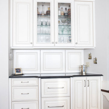
The space that was once a desk was transformed into a bar area. The glass shelves and glass cabinet front liquor cabinet stand out. But this bar area has hidden secrets. Tucked beneath the black granite is a Thermador under-counter double drawer refrigerator with matching wood front panels. They blend in perfectly with the cabinets. A wireless printer is easily accessed on a slide out drawer. Plus, what looks like merely wooden panels on the wall are concealing recessed storage for more bottles and glasses!
Overhead recessed lighting and speaker system provide illumination and entertainment through the entire space.
This luxury home had original, solid oak flooring through most of the first floor which the homeowner obviously wanted to keep but were in desperate need of repair and refinishing. Our master craftsmen wove in new wood flooring to match the old where needed, particularly where walls had been changed and where the floor was damaged. We sanded the floors, smoothing away years of wear and tear. The entire wood floor was then uniformly stained, making it impossible to differentiate where any repairs were made.
If this renovation has inspired you, then contact us today! There is no limit to our Dimensions.
 Johannings Custom Cabinets
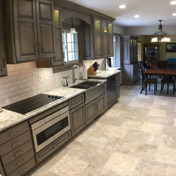
This complete kitchen renovation included removing an adjacent brick fireplace which allowed us to expand the kitchen and create a far more functional design that was desperately needed. The custom blended gray stained maple cabinetry, quartz counter-tops, beveled subway tile back-splash and luxury vinyl tile flooring created the design that our clients had only dreamed about. Notice the different counter-top heights due our clients unique accessibility challenges.
22