
Search results for "Detailed analyses" in Home Design Ideas

 Ronnette Riley Architect
This 10,000 sf townhouse sits on one of Manhattan’s most beautiful Upper East Side streets and so the goal of the project was to return the house to its original grandeur. Previously a Kips Bay designer showcase house, the rooms were each designed in a differing style and therefore the lack of cohesion and flow made the house seem choppy. In addition, much of the interior was superficial in the sense that plumbing fixtures were not all connected, walls were “false walls” built in front of existing and much of the construction had to be rebuilt.
The scope included creating a large gourmet kitchen in the rear of the ground floor by closing off the winding corridor and creating a new door opening centered on the main entry hall with a paneled arched pocket door mimicking the original detailing of the parlor floor. The kitchen has a Calacatta Gold stone center island and dinning area flanked by counters that run the length of the east and west walls with glass front upper cabinets. A built-in buffet on the south wall anchors the space. A mud room, with access to the delivery entrance and additional storage space was added off the kitchen. A new slim profile steel and glass French door provides access to a new steel rear deck and stairs to the rear yard. On the second floor, a new tile floor was added throughout and RRA designed new stone mantle pieces fabricated from England in the living and dining rooms.
On the 3rd floor, a new wall was constructed in the 11’ wide central hallway to allow a new 135 sf master closet with custom designed built-in storage units and accessories. This concept was carried through to the 4th floor on a smaller scale and 4 new storage closets were added in the hallway. The existing bathroom on the 4th Floor was gutted and redesigned including a new 5’x5’ extra deep soaking tub and new fixtures. Silver travertine tiles were used throughout to give the room a durable, waterproof finish while also providing a warm, luxurious feel.
The 5th floor was converted into a playroom and TV room for the family’s two young children and was outfitted with chalkboard paint along the entire east wall in the play area and a bold color block wall treatment in the TV room. A new cork floor was installed for durability and resilience to lots of activity yet providing a soft and sustainable floor treatment for its intended user. A full laundry room was also created floor with new cabinetry, plumbing, and floor and wall tile. Additionally, 3 full baths and a powder room were refitted with tumbled travertine tiles on the top two floors. The exterior of the building was refurbished and new lighting and painted doors and frames were installed in accordance with Landmark designation. An additional challenge on the project was that a previously built extension on the PH level was illegally overbuilt and the property had received a violation. A 9 month process of filing drawings, completing zoning analyses and meetings with the DOB Commissioners ensued to get the extension approved allowing us to obtain a permit for the remainder of the work and complete the Certificate of Occupancy.
In spite of the complex process and scattered program, the completed townhouse has a cohesive aesthetic throughout, with upgraded amenities befitting this grand representation of elite New York living.
 Ronnette Riley Architect
This 10,000 sf townhouse sits on one of Manhattan’s most beautiful Upper East Side streets and so the goal of the project was to return the house to its original grandeur. Previously a Kips Bay designer showcase house, the rooms were each designed in a differing style and therefore the lack of cohesion and flow made the house seem choppy. In addition, much of the interior was superficial in the sense that plumbing fixtures were not all connected, walls were “false walls” built in front of existing and much of the construction had to be rebuilt.
The scope included creating a large gourmet kitchen in the rear of the ground floor by closing off the winding corridor and creating a new door opening centered on the main entry hall with a paneled arched pocket door mimicking the original detailing of the parlor floor. The kitchen has a Calacatta Gold stone center island and dinning area flanked by counters that run the length of the east and west walls with glass front upper cabinets. A built-in buffet on the south wall anchors the space. A mud room, with access to the delivery entrance and additional storage space was added off the kitchen. A new slim profile steel and glass French door provides access to a new steel rear deck and stairs to the rear yard. On the second floor, a new tile floor was added throughout and RRA designed new stone mantle pieces fabricated from England in the living and dining rooms.
On the 3rd floor, a new wall was constructed in the 11’ wide central hallway to allow a new 135 sf master closet with custom designed built-in storage units and accessories. This concept was carried through to the 4th floor on a smaller scale and 4 new storage closets were added in the hallway. The existing bathroom on the 4th Floor was gutted and redesigned including a new 5’x5’ extra deep soaking tub and new fixtures. Silver travertine tiles were used throughout to give the room a durable, waterproof finish while also providing a warm, luxurious feel.
The 5th floor was converted into a playroom and TV room for the family’s two young children and was outfitted with chalkboard paint along the entire east wall in the play area and a bold color block wall treatment in the TV room. A new cork floor was installed for durability and resilience to lots of activity yet providing a soft and sustainable floor treatment for its intended user. A full laundry room was also created floor with new cabinetry, plumbing, and floor and wall tile. Additionally, 3 full baths and a powder room were refitted with tumbled travertine tiles on the top two floors. The exterior of the building was refurbished and new lighting and painted doors and frames were installed in accordance with Landmark designation. An additional challenge on the project was that a previously built extension on the PH level was illegally overbuilt and the property had received a violation. A 9 month process of filing drawings, completing zoning analyses and meetings with the DOB Commissioners ensued to get the extension approved allowing us to obtain a permit for the remainder of the work and complete the Certificate of Occupancy.
In spite of the complex process and scattered program, the completed townhouse has a cohesive aesthetic throughout, with upgraded amenities befitting this grand representation of elite New York living.

 Zelaya Properties LLC
We used: Custom cherry cabinetry in Arts & Crafts Shaker style by Kabinart in Boulder and Espresso stains. Liberty Hardware Venetian bronze 1-1/2" cabinet knobs. KitchenAid Architect II Series 22 CF counter-depth French door refrigerator. KitchenAid Architect Series II 27" convection single wall oven. KitchenAid 36" 6-burner dual fuel freestanding commercial-style range. KitchenAid Architect II Series 24" dishwasher. Sharp Insight Pro Series 24" built-in microwave drawer (Model #KB6524PS). Crystorama Solaris 12" wide pendant lights in English bronze. Granite countertops in Brown Fantasy. 3"x6" polished marble backsplash.
Paint colors:
Walls: Glidden Silver Cloud 30YY 63/024
Ceilings/Trims/Doors: Glidden Swan White GLC23
Robert B. Narod Photography
Find the right local pro for your project

 safe ZOnea
If you’re active on GardenWeb sharing plant photos, asking for advice, tracking seasonal progress you already understand how much detail goes into gardening. Soil pH, rainfall, emerging leaves, bloom counts, fertilizer schedules it adds up fast. But all that rich information often remains buried in posts, lists or memory. What if you could visualize that data and turn it into clear quick insights? That’s where a graph maker becomes a game-changer for your gardening workflow.
1. Why garden data belongs on a graph
On GardenWeb, you’ll find forums for everything from perennial care, vegetable gardening, patios, herbs, even cooking and craft projects. While plant lovers share observations and ask questions, many track progress manually in spreadsheets or memory. A graph maker flips that around:
Instead of a list of numbers (e.g., “Soil test: pH 6.4 in May, 6.1 in October”), you get a line graph showing the decline over time.
Instead of guessing which plant bloomed most, you see a bar chart comparing counts across plants.
Instead of manually calculating average rainfall effect, you plot scatter points of bloom count vs. rainfall.
By turning your data into visuals, you’re not just recording—you’re analysing, learning and improving. For GardenWeb users this means smarter decisions: Which fertilizer actually improves bloom count? Which shady spot recovers slower? A graph maker gives clarity.
2. What is a graph maker and how to use one
A graph maker is a web tool or software that lets you input raw data (numbers, dates, categories) and output visual charts like line graphs, bar charts, scatter plots, etc. It might allow you to import a spreadsheet, select chart type, customize colours, label axes, and export the image for your blog, forum post or personal log.
Here’s how you could apply it for gardening:
Log blooms per week for each rose plant.
Using the graph maker, choose line graph to track changes over weeks.
Label your y-axis “Number of Blooms”, x-axis “Week of Year”.
Add colour lines for each plant for easy comparison.
Export as PNG and embed it in a GardenWeb forum post: “See bloom trend for my ‘Peace’ vs ‘Knock Out’ roses”.
This isn’t just pretty-to-look-at: it makes the trend obvious, invites discussion (“Hey, your ‘Knock Out’ line dips after week 28—what changed?”) and helps you refine your routine.
3. Use these specific scenarios on GardenWeb
A. Soil pH and plant health tracking
After multiple tests you have pH values over time and bloom results. Upload both datasets into the graph maker, produce a dual-axis line graph: soil pH on one axis, bloom count on the other. Post your findings in the “Soil, Fertility & Nutrients” forum and get feedback.
B. Seasonal pest or disease appearance
Record number of aphids spotted each month and whether you used treatment. A bar chart via the graph maker can show pre- and post-treatment figures. Then ask the “Insect & Disease Control” forum for advice based on your visual data.
C. Yield comparison between varieties
You grow two zucchini varieties. You keep weekly yield in pounds. Use the graph maker for a side-by-side bar chart. Share in the “Vegetable Gardening” forum: “Which was better this year? See the chart”.
D. Rainfall vs growth rate
You log weekly rainfall and growth (in cm) of your tomato plants. Use scatter plot in graph maker. If a pattern emerges, you’re ready to post: “Is my growth plateau due to drought? Chart shows a clear correlation.”
4. Why this elevates your GardenWeb contributions
When you post with a chart made by a graph maker, you’re doing more than asking or showing off. You’re investigating. You’re analysing. You invite the community to give feedback on data, not just anecdotes. That elevates the discussion. Instead of “My plant died, any ideas?” you post “See this graph of pH drop and bloom count—what might be the limiting factor?” High-quality visuals raise your post’s value and garner more thoughtful responses.
Plus, your posts become useful references for others: someone else can say, “Cool graphic, can you share your data sheet?” You build credibility and help the forum become a learning hub—not just a Q&A board.
5. Tips for using a graph maker effectively in the GardenWeb context
Keep it simple: One chart, one insight. Don’t overcrowd.
Label clearly: Titles, axis labels, units (e.g., cm/week, mg/L, °F).
Use readable colours: Avoid faint tones that vanish on mobile.
Annotate when needed: Add notes like “Fertiliser switched week 12” or “Shade cloth added”.
Provide context in your post: Don’t leave the chart alone—write a few sentences explaining what it shows and what you’re seeking.
Embed carefully: Make sure your image displays properly in GardenWeb; check mobile view.
Share raw data: If possible link to your spreadsheet so others can replicate or comment.
Be open to feedback: The chart invites questions; embrace them.
6. Possible pitfalls and how to avoid them
Bad data = bad chart: If your measurements aren’t consistent, your graph will mislead. Use standardized data collection.
Too much complexity: Multi-axis charts, too many variables—confusing. Stick to one or two variables.
Overlooking mobile viewers: Many GardenWeb users browse via phones. Use large fonts and simple visuals.
Ignoring the narrative: Chart alone won’t answer. Explain what it means and what you need.
Outdated charts: If you update your data annually, keep your visuals current or label them clearly as “2024 data”.
7. Final thoughts
On GardenWeb you’ll find a vibrant community of gardeners, DIYers, cooks and design lovers.Using a graph maker for your posts and progress turns your experience from casual hobby-logging into smart data-driven gardening. You’ll not only learn more—your peers will learn more, too.
So next time you log your plant growth, record your yield, test your soil or track pests—don’t just note it. Plot it. Use a graph maker. Share it in the forum. Let your garden tell the story, and let the community help you write the next chapter.
 Dacotah Studio
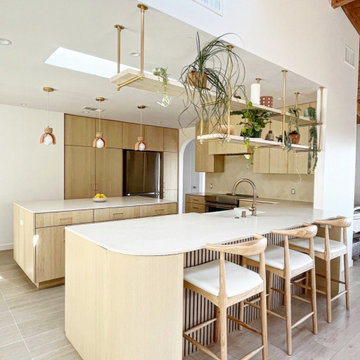
The overall aesthetic of this kitchen, prior to being remodeled, was dated, dark and un inviting. We decided to change all of that by removing the wall that separated the rooms, opening the kitchen to the living and dining space and also to the wonderful view of the city. Custom cabinets, brass overhead shelving, Ceaserstone countertops along with many additional custom features were added to really lighten the space making it more entertainment and family friendly!


Sponsored
Plain City, OH

The Creative Kitchen Company
Columbus Area Kitchen Remodeling and Refacing Professional

 L.Bonadies General Contracting
Joseph Narcisse
Mid-sized mountain style enclosed dark wood floor family room photo in New York with beige walls and a wall-mounted tv
Mid-sized mountain style enclosed dark wood floor family room photo in New York with beige walls and a wall-mounted tv
 Betty Wasserman Art & Interiors
Our NYC studio designed this gorgeous condo for a family of four with the goal of maximizing space in a modest amount of square footage. A custom sectional in the living room was created to accommodate the family without feeling overcrowded, while the son's bedroom features a custom Murphy bed to optimize space during the day. To fulfill the daughter's wish for fairy lighting, an entire wall of them was installed behind her bed, casting a beautiful glow at night. In the kitchen, we added plenty of cabinets below the island for maximum efficiency. Storage units were incorporated in the bedroom and living room to house the TV and showcase decorative items. Additionally, the tub in the powder room was removed to create an additional closet for much-needed storage space.

 T.A. French - Custom Builder
Example of a mid-sized transitional dark wood floor and brown floor double front door design in Austin with gray walls and a black front door


 Goehring & Morgan Construction
Example of a large transitional master beige tile and porcelain tile limestone floor and beige floor alcove shower design in Orlando with raised-panel cabinets, dark wood cabinets, beige walls, an undermount sink and a hinged shower door

 Smart Closets
WALK-IN CLOSET DESIGN
In Antique White finish combined with Etched White Chocolate finish. Transitional drawers.
Left wall include adjustable shelving, regular hanging, long hanging, 6 medium drawers and adjustable shoe shelves..
Sponsored
Fredericksburg, OH

High Point Cabinets
Columbus' Experienced Custom Cabinet Builder | 4x Best of Houzz Winner

 Charlen's Abstracts
This 30" x 24" abstract acrylic painting has been done in shades of cobalt blue, sky blue, citrine, chartreuse, white, soft sea green, and royal blue. Finished in gloss varnish to protect the piece from dust and UV light for years to come. Can be hung vertically or horizontally. Gorgeous vivid rich colors in a great contemporary style.


 TotalCare Orlando
Powder room - mid-sized transitional mosaic tile floor and multicolored floor powder room idea in Orlando with a one-piece toilet, brown walls, a console sink and solid surface countertops

 Mkw Surfaces LTD
MKW Surfaces
Home design - large traditional galley home design idea in London with a farmhouse sink, shaker cabinets, gray cabinets, quartz countertops, gray backsplash and an island
Home design - large traditional galley home design idea in London with a farmhouse sink, shaker cabinets, gray cabinets, quartz countertops, gray backsplash and an island
Sponsored
Plain City, OH
The Creative Kitchen Company
Columbus Area Kitchen Remodeling and Refacing Professional



 threshold interiors
Location: New York, NY, United States
This Loft was tastefully renovated back in the '90s, but was due for an update and an expansion of the kitchen and dining areas to accommodate the client's cooking skills and entertaining needs. EnlargIing the island and adding cabinetry to delineate the office, bar and dining areas was a priority. The bathroom was updated to feel like a tranquil spa with beautiful new tile, plumbing fixtures and cabinets. Our biggest challenge was coordinating the entire renovation while our client was out of town for the Summer!
Photographed by: James Salomon
6