
Search results for "Determine precisely" in Home Design Ideas

 Jennifer Gilmer Kitchen & Bath
Easton, Maryland Traditional Kitchen Design by #JenniferGilmer with a lake view
http://gilmerkitchens.com/
Photography by Bob Narod

 Advance Design Studio, Ltd.
When this suburban family decided to renovate their kitchen, they knew that they wanted a little more space. Advance Design worked together with the homeowner to design a kitchen that would work for a large family who loved to gather regularly and always ended up in the kitchen! So the project began with extending out an exterior wall to accommodate a larger island and more moving-around space between the island and the perimeter cabinetry.
Style was important to the cook, who began collecting accessories and photos of the look she loved for months prior to the project design. She was drawn to the brightness of whites and grays, and the design accentuated this color palette brilliantly with the incorporation of a warm shade of brown woods that originated from a dining room table that was a family favorite. Classic gray and white cabinetry from Dura Supreme hits the mark creating a perfect balance between bright and subdued. Hints of gray appear in the bead board detail peeking just behind glass doors, and in the application of the handsome floating wood shelves between cabinets. White subway tile is made extra interesting with the application of dark gray grout lines causing it to be a subtle but noticeable detail worthy of attention.
Suede quartz Silestone graces the countertops with a soft matte hint of color that contrasts nicely with the presence of white painted cabinetry finished smartly with the brightness of a milky white farm sink. Old melds nicely with new, as antique bronze accents are sprinkled throughout hardware and fixtures, and work together unassumingly with the sleekness of stainless steel appliances.
The grace and timelessness of this sparkling new kitchen maintains the charm and character of a space that has seen generations past. And now this family will enjoy this new space for many more generations to come in the future with the help of the team at Advance Design Studio.
Dura Supreme Cabinetry
Photographer: Joe Nowak

 Modern Organic Interiors
Photographer: Isabelle Eubanks
Interiors: Modern Organic Interiors, Architect: Simpson Design Group, Builder: Milne Design and Build
Bedroom - cottage carpeted bedroom idea in San Francisco
Bedroom - cottage carpeted bedroom idea in San Francisco
Find the right local pro for your project

 Universal Appliance and Kitchen Center
Miele Appliances at Universal Appliance and Kitchen Center
26767 Agoura Road, Calabasas, CA 91302
Phone 818.880.0011 Fax 818.880.0411
12050 Ventura Blvd.,Studio City, CA 91604
Phone 818.755.1111 Fax 818.755.9111
www.uakc.com
Miele Generation 6000 is bringing design and innovation that exceed expectations. It includes two distinct design styles - PureLine and ContourLine - as well as several color options including Brilliant White and Truffle Brown.
Design for Miele is not simply the exterior. Like the design principle, form follows function; the true beauty of the Generation 6000 series is highlighted by its intuitive user interface, which ensures unsurpassed performance and convenience in the kitchen. With these new color options and the uniform design of the Generation 6000 series, Miele has created a series of appliances that will seamlessly integrate into any kitchen or lifestyle. Whether appliances are installed vertically, horizontally, as a square or in a T-shape configuration, the design is fully resolved.
M Touch – Top-class technology with a special touch
Whether it’s creating a double cappuccino at the touch of a single button, finding the desired MasterChef automatic program on the Combi-Steam Oven in an instant or selecting the operating mode and temperature in just a few simple steps – Miele eliminates the guesswork. All of these operations are easier than ever because of M Touch. Reminiscent of smart phones and tablets, M Touch is an intuitive user interface that allows the user to swipe or scroll through the menu with the tip of a finger. A new high resolution control panel with white TFT (Thin Film Transistor) text brings a brilliant display. And because the interface is universal across all Gen 6000 appliances, the transition from appliance to appliance is easier than ever.
Oven Innovations: Moisture Plus, Gourmet Center and MultiSteam
Developed exclusively for Miele USA, Moisture Plus is a truly unique steam injection system featured in Miele M Touch 30” Convection Ovens. Moisture Plus automatically injects a burst of steam into the oven cavity at pre-determined points during the cooking process. The addition of moisture improves results when proofing dough, gives loaves of bread a crisp crust and glossy finish and makes cuts of meat particularly crisp on the outside and succulent inside.
Also new to the 30” Convection Oven is the addition of MasterChef Plus programs. Ideal for the consummate baker at home, this exclusive new menu system houses 14 automatic bread programs and replicates results seen in artisan bakeries. Included are programs for sourdough, whole grain, rolls and baguettes.
A pioneer in steam oven technology, Generation 6000 Steam and Combi-Steam Ovens are equipped with MultiSteam technology, a revolutionary new steam cooking generation. The addition of six steam inlets in the Steam Oven and eight steam inlets in the Combi-Steam Oven, delivers fast, even steam distribution and incredibly quick heat-up times for even cooking results through a more powerful steam generator.
Long regarded for its ingredient-driven menu, Miele MasterChef programs are now located within the Gourmet Center. Choose from more than 100 easy to use programs for grains, vegetables, meats, fish and poultry. At just the touch of a button, the program will deliver menu options that guide the user step by step - from the desired oven mode to temperature - all resulting in the perfect dish.
Generation 6000 Coffee Systems impress with comfort and innovation
There are several new highlights to the Generation 6000 Whole Bean Coffee System including a new CupSensor, EasyClick Milk System and One Touch for Two features. Exclusive to Miele, the CupSensor automatically adjusts the height of the spout to the optimum position for different cup and glass sizes. Whether a tall latté macchiato or a dainty espresso is being prepared, the central spout automatically adjusts to the cup’s rim and eliminates splashing. The CupSensor even reacts precisely to beverages made with milk by raising the spout slightly to make room for the incoming espresso.
Also new is the EasyClick milk system which is a dishwasher safe glass, milk flask that effortlessly clicks into place at the front of the machine. And for easy maintenance, the new Miele Coffee Systems now automatically rinse all milk spouts and hoses with water after each use.
The One Touch for Two feature allows the user to prepare two coffee specialties such as cappuccino and latté macchiato at the same time, thus reducing prep time when two or more drinks are being served.
Miele Generation 6000 series is distinguished by its elegant design and remarkable innovations to deliver unmatched results that can be seen, touched and tasted. German engineered and tested to last 20 years, Generation 6000 reinforces the Miele Design for Life philosophy and solidifies Miele at the forefront of residential culinary appliances.

 Studio41 Home Design Showroom
YOU DON'T CHANGE A CLASSIC. YOU REFINE IT. | Now Tara is the contemporary interpretation of a design icon for the kitchen as well. They are small changes, fine details. But it is precisely these details that determine the class of Tara. Tara looks even more elegant. The extended body formally straightens up the fitting. The rosettes and handles are more streamlined, and the overall contours are sharper. All this is done to put even greater emphasis on the perfectly geometric, symmetrical and clear use of form and to concentrate and refocus.
This refinement also puts Tara Classic in the kitchen back under the Tara umbrella, so that this will be the only program in the future – with lever or cross-handle options.
 Universal Appliance and Kitchen Center
Miele Appliances at Universal Appliance and Kitchen Center
26767 Agoura Road, Calabasas, CA 91302
Phone 818.880.0011 Fax 818.880.0411
12050 Ventura Blvd.,Studio City, CA 91604
Phone 818.755.1111 Fax 818.755.9111
www.uakc.com
Miele Generation 6000 is bringing design and innovation that exceed expectations. It includes two distinct design styles - PureLine and ContourLine - as well as several color options including Brilliant White and Truffle Brown.
Design for Miele is not simply the exterior. Like the design principle, form follows function; the true beauty of the Generation 6000 series is highlighted by its intuitive user interface, which ensures unsurpassed performance and convenience in the kitchen. With these new color options and the uniform design of the Generation 6000 series, Miele has created a series of appliances that will seamlessly integrate into any kitchen or lifestyle. Whether appliances are installed vertically, horizontally, as a square or in a T-shape configuration, the design is fully resolved.
M Touch – Top-class technology with a special touch
Whether it’s creating a double cappuccino at the touch of a single button, finding the desired MasterChef automatic program on the Combi-Steam Oven in an instant or selecting the operating mode and temperature in just a few simple steps – Miele eliminates the guesswork. All of these operations are easier than ever because of M Touch. Reminiscent of smart phones and tablets, M Touch is an intuitive user interface that allows the user to swipe or scroll through the menu with the tip of a finger. A new high resolution control panel with white TFT (Thin Film Transistor) text brings a brilliant display. And because the interface is universal across all Gen 6000 appliances, the transition from appliance to appliance is easier than ever.
Oven Innovations: Moisture Plus, Gourmet Center and MultiSteam
Developed exclusively for Miele USA, Moisture Plus is a truly unique steam injection system featured in Miele M Touch 30” Convection Ovens. Moisture Plus automatically injects a burst of steam into the oven cavity at pre-determined points during the cooking process. The addition of moisture improves results when proofing dough, gives loaves of bread a crisp crust and glossy finish and makes cuts of meat particularly crisp on the outside and succulent inside.
Also new to the 30” Convection Oven is the addition of MasterChef Plus programs. Ideal for the consummate baker at home, this exclusive new menu system houses 14 automatic bread programs and replicates results seen in artisan bakeries. Included are programs for sourdough, whole grain, rolls and baguettes.
A pioneer in steam oven technology, Generation 6000 Steam and Combi-Steam Ovens are equipped with MultiSteam technology, a revolutionary new steam cooking generation. The addition of six steam inlets in the Steam Oven and eight steam inlets in the Combi-Steam Oven, delivers fast, even steam distribution and incredibly quick heat-up times for even cooking results through a more powerful steam generator.
Long regarded for its ingredient-driven menu, Miele MasterChef programs are now located within the Gourmet Center. Choose from more than 100 easy to use programs for grains, vegetables, meats, fish and poultry. At just the touch of a button, the program will deliver menu options that guide the user step by step - from the desired oven mode to temperature - all resulting in the perfect dish.
Generation 6000 Coffee Systems impress with comfort and innovation
There are several new highlights to the Generation 6000 Whole Bean Coffee System including a new CupSensor, EasyClick Milk System and One Touch for Two features. Exclusive to Miele, the CupSensor automatically adjusts the height of the spout to the optimum position for different cup and glass sizes. Whether a tall latté macchiato or a dainty espresso is being prepared, the central spout automatically adjusts to the cup’s rim and eliminates splashing. The CupSensor even reacts precisely to beverages made with milk by raising the spout slightly to make room for the incoming espresso.
Also new is the EasyClick milk system which is a dishwasher safe glass, milk flask that effortlessly clicks into place at the front of the machine. And for easy maintenance, the new Miele Coffee Systems now automatically rinse all milk spouts and hoses with water after each use.
The One Touch for Two feature allows the user to prepare two coffee specialties such as cappuccino and latté macchiato at the same time, thus reducing prep time when two or more drinks are being served.
Miele Generation 6000 series is distinguished by its elegant design and remarkable innovations to deliver unmatched results that can be seen, touched and tasted. German engineered and tested to last 20 years, Generation 6000 reinforces the Miele Design for Life philosophy and solidifies Miele at the forefront of residential culinary appliances.

 Studio41 Home Design Showroom
YOU DON'T CHANGE A CLASSIC. YOU REFINE IT. | Tara is the contemporary interpretation of a design icon. Evolution in design, in architecture, new finishes and colors. These are small changes, fine details. But it is precisely these details that determine the class of Tara. Tara looks even more elegant. The extended body formally straightens up the fitting. The rosettes and handles are more streamlined, and the overall contours are sharper. All this is done to put even greater emphasis on the perfect, geometric, symmetric and clear use of form and to concentrate and refocus. TARA has set the standard for more than a decade. Tara will set the standard for the future. | Available at www.shopstudio41.com

 Susan Jablon
Shop this tile:
http://www.susanjablon.com/1-2-x-1-1-4-inch-mother-of-pearl-tiles-70965.html
"We found the experience in working with Susan Jablon to be perfect. Fast, gracious and considerate customer service throughout, plus the ability to get small sets of samples allowed us to determine precisely the right mother-of-pearl tile for our seaside-inspired fireplace. Thank you for such great service." -Stuart M.
 Studio41 Home Design Showroom
YOU DON'T CHANGE A CLASSIC. YOU REFINE IT. | Tara is the contemporary interpretation of a design icon. Evolution in design, in architecture, new finishes and colors. These are small changes, fine details. But it is precisely these details that determine the class of Tara. Tara looks even more elegant. The extended body formally straightens up the fitting. The rosettes and handles are more streamlined, and the overall contours are sharper. All this is done to put even greater emphasis on the perfect, geometric, symmetric and clear use of form and to concentrate and refocus. TARA has set the standard for more than a decade. Tara will set the standard for the future. | Available at www.shopstudio41.com
 Architect
Why Mattress Thickness Is One of the Most Misunderstood Specs
When most people shop for a memory foam mattress, they focus on firmness, materials, and brand. Thickness tends to be an afterthought — or worse, treated as a proxy for quality. The assumption goes: thicker equals better. That assumption is wrong in a meaningful number of cases, and getting it wrong means waking up with exactly the kind of stiffness, pressure pain, or lower back ache you bought a new mattress to avoid.
The right thickness for a memory foam mattress is not a single number. It is a combination of your body weight, your sleep position, and any specific health conditions you are managing. A 14-inch mattress that provides ideal support for a 250-pound side sleeper may cause a 115-pound stomach sleeper to experience spinal misalignment all night. A 10-inch mattress that works perfectly for a back sleeper of average build offers inadequate pressure relief for a heavier side sleeper whose hips need to sink further into the comfort layer before the support base engages.
This guide maps thickness to the factors that actually determine whether a mattress works for your body. It covers the science of mattress layers, the three primary variables (weight, position, condition), and a complete decision table so you can find your ideal thickness without guesswork.
Understanding Mattress Thickness: Layers, Not Just Height
A memory foam mattress’s total thickness is the sum of its individual layers, and those layers serve entirely different functions. Two mattresses that are both 12 inches thick may feel radically different because their comfort layer depths and support core thicknesses are distributed differently.
The Two Parts That Matter
Every memory foam mattress has two functional zones: the comfort layer at the top and the support core at the bottom. The comfort layer — which in quality mattresses consists of gel-infused viscoelastic foam, transition foam, and a cooling cover — is the zone that contours to your body, relieves pressure, and cushions the joints. The support core — high-density foam or pocketed springs in a hybrid — is the zone that keeps the spine aligned and prevents the entire body from sinking into the mattress.
The key relationship is this: the comfort layer must be deep enough for your body’s heaviest pressure points to sink in fully before the firmer support core pushes back. If it is too shallow, those pressure points press against a firm surface and cause localised pain. If the support core is too thin, the whole mattress sags under body weight and the spine loses alignment regardless of how comfortable the top feels.
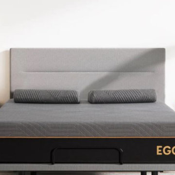
Here is how EGOHOME’s Black series layers map to these functions:
Layer
Material
Function
EGOHOME Technology
Cover (0.5–1")
Fabric + cooling tech
Temperature regulation, hygiene
Anti-heat™ Graphene Cooling Cover
Comfort layer (2–6")
Gel foam, AeroFusion™
Pressure relief, contouring
Copper Gel AeroFusion™ Foam
Transition layer (1–2")
Mid-density foam
Prevents sinkage past comfort zone
BraceSleeper™ Support Foam (upper)
Support core (6–12")
High-density foam or coils
Spinal alignment, edge support
BraceSleeper™ Support Foam (core)
Thickness alone does not tell you how a mattress will perform. A 14-inch mattress with a 2-inch comfort layer and a 12-inch support core will feel firm and supportive. A 14-inch mattress with a 6-inch comfort layer and an 8-inch support core will feel plush and contouring. Always check the comfort layer depth, not just the total inches.
Memory Foam Mattress Thickness Ranges: What Each Category Delivers
Here is a complete breakdown of what to expect from each thickness range and who each suits best:
Thickness
Profile
Best Use Case
Body Weight
Best Sleep Position
6–8"
Low profile
Children, bunk beds, guest rooms, adjustable bases
Under 130 lbs
Kids, lightweight, occasional use
8–10"
Standard-thin
Stomach sleepers, lightweight adults, budget setups
Under 130 lbs
Stomach, lightweight back sleepers
10–12"
Standard
Most adults, back sleepers, back pain relief
130–230 lbs
Back, stomach, combo sleepers
12–14"
High-profile
Side sleepers, plus-size, pressure relief
130–230 lbs+
Side sleepers, hip/shoulder pain
14"+
Premium
Plus-size sleepers, heavy duos, luxury setups
230 lbs+
Plus-size, side sleepers, chronic pain
6–8 Inches: Low-Profile (Specific Use Cases Only)
Low-profile mattresses in the 6 to 8 inch range are designed for specific applications rather than general adult use. They work well on bunk beds and trundle beds where height clearance is limited, for children’s beds where a lower sleep surface is safer, on adjustable bases where the mattress needs to flex significantly, and for lightweight individuals under 130 pounds who need minimal depth to reach the support core. For a standard adult of average build, a mattress under 8 inches is unlikely to provide adequate comfort layer depth for sustained pressure relief.
8–10 Inches: Standard-Thin (Stomach Sleepers and Lightweight Adults)
The 8 to 10 inch range is the practical starting point for most adult use. At this thickness, there is enough comfort layer to provide basic pressure relief without the excessive depth that allows heavier body sections to sink past the support zone. Stomach sleepers in particular benefit from this range: when sleeping face down, the goal is to keep the hips from sinking lower than the shoulders and chest, which would create a downward bow in the lumbar spine. A thinner mattress with a firmer feel prevents this hyperextension more reliably than a thicker, softer model. EGOHOME offers 8-inch memory foam options suited to this profile.
10–12 Inches: Standard (The Sweet Spot for Most Adults)
The 10 to 12 inch range is the most broadly appropriate thickness for adults of standard build. At this depth, a quality memory foam mattress contains enough comfort layer material to contour genuinely around the hips and shoulders without allowing the body to bottom out into the support core. It also contains enough support core depth to maintain spinal alignment under continuous body weight across seven or eight hours. Back sleepers of standard weight (130 to 230 pounds) typically find this range the most supportive, as the lumbar region receives adequate underlying resistance without the excessive softness that taller mattresses can develop under consistent pressure.
12–14 Inches: High-Profile (Side Sleepers and Plus-Size Sleepers)
The 12 to 14 inch range addresses two specific needs: side sleepers who require a deep enough comfort layer to allow the shoulder and hip to sink in while the waist remains supported, and heavier individuals whose body weight requires more foam depth before reaching full support core engagement. For a side sleeper of standard or higher body weight, a comfort layer of less than 4 to 6 inches is often not deep enough for the shoulder to sink fully into an aligned position. The result is an upward lateral bow in the thoracic spine that causes shoulder and upper back pain upon waking. The EGOHOME Black 14-inch Pro and Hybrid models are built specifically for this thickness range.
14 Inches and Above: Premium and Plus-Size
Mattresses at 14 inches or more are appropriate for plus-size sleepers over 230 pounds and for couples where one partner is significantly heavier. At higher body weights, a greater depth of both comfort material and support foam is required because the heavier load compresses the foam more aggressively. A support core that adequately resists a 160-pound sleeper may allow excessive sinkage under a 280-pound sleeper, causing the hips to drop past the point of lumbar support. EGOHOME’s Black 14-inch Firm model includes a 12-inch BraceSleeper™ Support Foam core specifically designed to resist this deep compression under higher body weights.
Thickness by Body Weight: The Primary Determining Factor
Body weight is the single most important variable in thickness selection because it directly determines how far the body sinks into the foam. The same mattress will feel completely different to a 120-pound sleeper versus a 240-pound sleeper, because the heavier person compresses the foam significantly more deeply.
Lightweight Sleepers (Under 130 lbs)
Lightweight sleepers do not need and often cannot benefit from thick mattresses. Because they exert less pressure on the foam, they may not compress a 14-inch mattress deeply enough to feel the support core at all, resulting in a floating sensation with insufficient underlying resistance. For lightweight sleepers, 8 to 10 inches provides adequate comfort layer depth for full pressure relief. The EGOHOME Black 10-inch Classic (medium feel) is the appropriate starting point for this weight category.
Standard-Weight Sleepers (130–230 lbs)
Standard-weight adults represent the broadest population of mattress buyers, and the 10 to 12 inch range was designed specifically for this group. At this weight range, the body compresses the comfort layer meaningfully enough for the foam to contour around pressure points, while the support core remains thick enough to prevent excessive sinkage. The EGOHOME Black 12-inch and the Black 10-inch ranges both address this category, with the 12-inch models being more appropriate for side sleepers who need the extra comfort layer depth.
Plus-Size Sleepers (Over 230 lbs)
Heavier sleepers require 12 to 14 inches at minimum to prevent bottoming out — the point at which body weight compresses through the comfort layer entirely and the sleeper feels the firm support core directly. Bottoming out eliminates pressure relief completely and can significantly worsen joint pain and lower back stiffness. EGOHOME recommends a suggested maximum of 300 pounds per person across their mattress range, and the 14-inch Hybrid and 14-inch Firm models are engineered with the deeper support cores required to handle higher body weights without performance degradation over time.
Thickness by Sleep Position: Matching Depth to Alignment Needs
Side Sleepers: 12 Inches or More
Side sleeping places the body’s heaviest pressure points — the shoulder and hip — in direct contact with the mattress. These points need to sink into the comfort layer deeply enough that the spine remains horizontal from head to toe. If the comfort layer is too thin or too firm, the shoulder cannot descend fully into the mattress, and the spine develops an upward lateral curve between the shoulder and the head. This causes the neck, shoulder, and upper back tension that many side sleepers report upon waking.
Side sleepers of standard weight need at least 12 inches, with a soft to medium-soft comfort layer. EGOHOME’s Black 12-inch Pro (soft feel, 7.5 out of 10 cooling score) is specifically recommended for side sleepers managing back, shoulder, or joint pain. The Black 14-inch Pro (medium-soft, 8 out of 10 cooling) adds additional comfort layer depth for those who need greater pressure relief.
Back Sleepers: 10–12 Inches
Back sleeping is the most spinal-alignment-friendly position because the body’s weight is distributed relatively evenly across the mattress. The primary challenge for back sleepers is lumbar support: the natural inward curve of the lower back creates a gap between the lumbar spine and the mattress surface that must be filled by the foam contouring upward into it. A mattress that is too soft allows the pelvis to sink excessively, flattening this curve and creating lower back compression. A mattress that is too firm cannot conform into the lumbar curve at all.
For back sleepers, 10 to 12 inches with a medium or medium-firm feel provides the optimal combination. EGOHOME’s Black 12-inch Hybrid (medium-firm, 6.5 out of 10 cooling) is specifically noted as ideal for back sleepers, combining pocketed spring zoned support with gel foam contouring for precise lumbar engagement.
Stomach Sleepers: 8–10 Inches
Stomach sleepers face the opposite alignment challenge from side sleepers. Rather than needing the mattress to yield deeply at the joints, they need the mattress to maintain a flat, firm surface that prevents the hips from sinking below the chest. If the hips drop lower than the upper body, the lumbar spine hyperextends into an arched position that compresses the posterior vertebral joints and causes significant lower back pain.
Stomach sleepers need a thinner mattress with a firmer feel. The EGOHOME Black 14-inch Firm is specifically recommended for stomach sleepers and heavier sleepers who need maximum surface resistance. Its 12-inch BraceSleeper™ Support Foam core provides the deep, unyielding base that prevents hip sinkage without requiring a thin mattress that compromises comfort.
Best Thickness for Back Pain: The Medium-Firm 10–12 Inch Principle
For people managing chronic lower back pain, herniated discs, sciatica, or general spinal stiffness, mattress thickness interacts with back health in a specific way that differs from general sleep comfort recommendations.
The key principle for back pain is controlled contouring. You need enough foam depth to relieve pressure at the hips and shoulders, but not so much depth that the foam develops a sag under the heavier sections of the body over time. Excessive thickness combined with a soft comfort layer is one of the most common causes of mattress-induced back pain — the sleeper sinks into a gentle hammock shape that feels comfortable initially but compresses the lumbar discs continuously throughout the night.
10–12 Inches: The Optimal Back Pain Range
A medium-firm mattress of 10 to 12 inches addresses both needs simultaneously. It provides adequate foam depth for genuine pressure relief at the hips and shoulders without the risk of comfort layer collapse that taller, softer mattresses can develop. The support core at this thickness is deep enough to maintain consistent lumbar support from the first night through years of regular use.
For side sleepers with lower back pain, the recommendation extends to 12 inches with a soft feel to ensure the hip can sink into full alignment. For back sleepers with lower back pain, 10 to 12 inches with a medium-firm feel is the target. For stomach sleepers with lower back pain, a firmer feel at any thickness is more important than depth — preventing hip sinkage is the priority.
⚠️ Mattresses over 14 inches with very soft comfort layers are a common hidden cause of lower back pain. The deep softness feels luxurious initially but allows the lumbar region to sag into misalignment through the night. If you sleep on a thick, very soft mattress and wake with lower back stiffness, the mattress — not your position — may be the cause.
Complete Thickness Decision Table: Your Position × Your Weight
Use this table to find your recommended thickness and the matching EGOHOME model:
Sleep Position
Body Weight
Ideal Thickness
EGOHOME Recommendation
Side sleeper
Under 130 lbs
12"
EGOHOME Black 12” Pro (soft, 7.5/10 cool)
Side sleeper
130–230 lbs
12–14"
EGOHOME Black 14” Pro (medium-soft, 8/10 cool)
Side sleeper
Over 230 lbs
14"
EGOHOME Black 14” Hybrid (medium-firm, 8.5/10 cool)
Back sleeper
Under 130 lbs
10"
EGOHOME Black 10” Classic (medium, 6/10 cool)
Back sleeper
130–230 lbs
10–12"
EGOHOME Black 12” Hybrid (medium-firm, 6.5/10 cool)
Back sleeper
Over 230 lbs
12–14"
EGOHOME Black 14” Hybrid (medium-firm, 8.5/10 cool)
Stomach sleeper
Under 130 lbs
8–10"
EGOHOME 8" Memory Foam (firm, standard support)
Stomach sleeper
130–230 lbs
10–12"
EGOHOME Black 10” Hybrid (medium-firm, 6.5/10 cool)
Stomach sleeper
Over 230 lbs
12–14"
EGOHOME Black 14” Firm (firm, 7/10 cool)
Combination
Any weight
10–14"
EGOHOME Black 14” Pro or 14” Hybrid
? If you are between two categories — for example, a 220-pound back sleeper with occasional side sleeping — choose the model suited to your heavier variable. A 12” hybrid model handles the heavier weight and still adapts to position changes. When in doubt, go medium-firm over soft.
EGOHOME Memory Foam Mattresses by Thickness
EGOHOME’s range spans 6 to 14 inches across memory foam and hybrid constructions, with every model carrying CertiPUR-US® and OEKO-TEX® Standard 100 certification, a 10-year warranty, a 100-night home trial, and free shipping and returns across the contiguous U.S.
For 8–10 Inch Needs
The EGOHOME 8-inch memory foam and Black 10-inch Classic and Hybrid models cover the lightweight and stomach sleeper range. The 10-inch Classic offers a medium feel suited to back and side sleepers under 130 pounds. The 10-inch Hybrid adds pocketed spring support for better lumbar engagement and airflow.
For 10–12 Inch Needs
The EGOHOME Black 12-inch range — Classic, Pro, and Hybrid — is the most widely applicable thickness tier. The 12-inch Classic (soft, cool 6/10) suits side sleepers and those with joint pain. The 12-inch Hybrid (medium-firm, cool 6.5/10) is specifically recommended for back sleepers and standard-weight adults across positions. The 12-inch Pro (soft, cool 7.5/10) is the top choice for side sleepers dealing with shoulder or hip pain.
For 12–14 Inch Needs
The EGOHOME Black 14-inch series is the flagship range. The 14-inch Pro (medium-soft, cool 8/10) is designed for side sleepers and pressure-relief-first buyers. The 14-inch Hybrid (medium-firm, cool 8.5/10) handles all sleep positions and is the strongest all-rounder in the range. The 14-inch Firm is built for stomach sleepers and heavier individuals, with a 12-inch BraceSleeper™ Support Foam core that resists sinkage under higher body weights.
Frequently Asked Questions
Is a thicker memory foam mattress always better?
No. Thickness should match your body weight and sleep position, not simply be maximised. A 14-inch mattress with a very soft comfort layer can cause back pain in lightweight sleepers or stomach sleepers by allowing excessive sinkage. A well-calibrated 10-inch mattress will consistently outperform an oversized 14-inch model for the wrong body type.
What thickness of memory foam is good for back pain?
A medium-firm mattress of 10 to 12 inches is the most widely recommended range for lower back pain. It provides enough foam depth for genuine pressure relief without the risk of comfort layer collapse that causes lumbar sagging. Side sleepers with back pain may benefit from 12 inches with a softer feel to ensure hip and shoulder alignment.
What is the minimum thickness for a memory foam mattress for adults?
For most adults, 8 inches is the practical minimum for sustained comfort. Below 8 inches, there is often insufficient comfort layer depth for pressure relief across a full night of sleep. The exception is stomach sleepers who may intentionally choose 8 inches for a firmer surface that prevents hip sinkage.
Does mattress thickness affect how long it lasts?
Yes, indirectly. A mattress that is too thin for the body weight it supports will experience faster comfort layer compression and develop sags and pressure indentations earlier than one appropriately sized for that load. Choosing the correct thickness for your weight extends the usable lifespan of the mattress. EGOHOME mattresses are expected to last 6 to 8 years with proper care, with regular rotation every 3 to 6 months recommended.
Can I use a thick mattress on an adjustable base?
Memory foam mattresses up to 14 inches are generally compatible with adjustable bases, though the mattress should be flexible enough to bend at the head and foot sections without cracking or deforming. EGOHOME mattresses are confirmed compatible with adjustable bases. For very thick or firm mattresses, check the specific flex requirements of your adjustable base before purchasing.
Final Thoughts
The best thickness for a memory foam mattress is not the thickest you can find or the most expensive number on the specification sheet. It is the thickness that aligns precisely with your body weight, your sleep position, and any specific conditions you are managing — then pairs that depth with a comfort layer and support core calibrated to work

 Ernest M. Ferizi
German Embassy in Pristina - Kosovo, contracted the architecture office “Ferizi + Ferizi Architects” to plan and implement an Annex Office building for their purposes. As detached part of this building is designed the waiting area, as alone standing structure.
This Office Building is constructed by assembling of Eight used office containers that were delivered on trucks and set up after only a few hours on the basis of the LEGO principle, according to the planning on strip foundations.
By removing the flexible exterior wall panels, a large room of 115 m² was created, with the counter wall as a room partition between two office spaces, each with seven workstations as well as three counters for agents on one side and a room for visitors on the other side.
With this system, room solutions can be easily implemented in all dimensions.
The container, seen as a geometric shape, is a simple, octagonal, solid box.
The standardized perfection of its dimensions is striking: 2.44 meters wide, 2.59 meters high and 6.06 meters or 12.19 meters long.
Since its introduction in 1956 by the American transport entrepreneur Malcom McLean, the container has become a standardized transport module worldwide, whether on ships, trucks or construction sites.
The shipping containers have additionally revolutionized the transport industry, pushed the globalization noticeably, and thus directly or indirectly influenced all our lives.
But after only a few years, when the first overseas containers wore out, many engineers recognized the positive properties of used shipping containers for building houses, especially since they are robust, flexible, multifunctional and second-hand relatively inexpensive to purchase. The time has long passed by to treat containers exclusively as transport objects.
As a "measure of all things", containers can hardly be ignored in construction.
Their use is no longer limited to temporary use since school containers, information containers, office containers or entire residential buildings are now part of our everyday life in the construction industry.
However, current examples of the container architecture prove that even the most demanding solutions for container building are feasible. For their specific aesthetic and spatial qualities, containers also serve as design parameters for the development of new forms of architecture and urbanity.
The office building as an extension of the visa section, characterized by modern materials and contemporary aesthetics has been designed and built mainly as a low-energy building.
Extensive insulation to achieve a comfortable and sustainable constant temperature in the interior, high window quality and low energy consumption make the building energy-efficient.
The sophisticated lighting technology, networks, heating systems and air-conditioning systems are also components of this equipment.
It creates an overall harmonic picture and guarantees the highest standard in sustainable construction, taking into consideration the fact that environmentally friendly recycling and reutilization have become an increasingly important issue in our society.
West and East side of the wooden facade is compact and has few openings, while the southern facade is completely open with lot of glass. Its spatial openness ensures a transparent, friendly work environment, which allows a lot of light into the space.
This openness allows an uninterrupted, pleasant and close-to-nature view from interior spaces into the beautiful garden. During the installation of sophisticated light sources in the garden, emphasis was not only put on functionality and security, but also on the beauty of the garden shown through the illumination in the evening.
Large, horizontal white “brisole” serve as external sun protection systems, mounted on the canopies of the entrance areas of the modular construction and the enclosure, adeptly cast shade on these areas and at the same time shape the entire architectural language.
While on one hand, the two quadratic ledges suspended in the air, are docked with steel stairs and match the wooden façade, lead the staff to their office space, the artful modern interior, on the other hand, perfectly unites the functionality, innovative technology, culture and positive effects on the employees' efficiency and wellbeing.
A lot of white, interjected by warm wooden and colored accents, determines the ambience.
In the case of the lighting solution, the mainly linear ceiling lighting is used as the overlapping design element both for the offices of the visa section as well as for the counters and the waiting area for the visitors.
They underline the puristic design in order to create a pleasant light for a desired general illumination and ensure optimal light conditions without causing disturbing reflections on the computer screens.
In addition, precisely positioned pendant luminaires are installed at the workstations, which ensure pleasant room brightness.
In the entrance area, the harmonic and uniform lighting effect from the ground highlights the integration of photography and architecture.
Photographs of landscapes, people, places, expressing unforgettable, impressive moments and memories have been lovingly engraved on 8 x 8cm square oak blocks.
The idea of an effective, impressive environment that stimulates and inspires the work was the premiss on which the whole design concept was based. Consequently, the modular construction was no longer viewed through its history of utilization and scars, but rather as a structure of work ambiance, art and elegance.
FERIZI + FERIZI Architects
Photo: Arben Llapashtica
1