
Search results for "Dial up models" in Home Design Ideas
 Architect
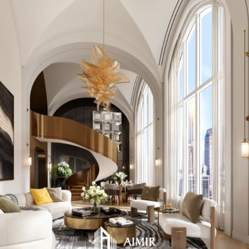
Not all architectural imagery is created equal. Some renderings look obviously computer-generated, with flat lighting and plastic-looking materials that fail to convince viewers. Others are so precise that they are indistinguishable from photographs. That second category, realistic architectural visualization rendering, has become the standard expectation for architects, developers, and marketers who need imagery capable of withstanding close scrutiny from investors, buyers, and planning authorities. As audiences grow more visually literate, the tolerance for obviously artificial, video-game-like imagery in professional presentations continues to shrink.
What Sets Realistic Visualization Apart
Realistic architectural visualization goes beyond simply modeling a building in three dimensions. It requires physically accurate lighting simulation, true-to-life material properties, and careful attention to the small imperfections that make real-world photography convincing, such as subtle reflections, ambient occlusion in corners, and natural depth of field. The goal is an image that a viewer would believe was captured by a camera on-site rather than generated by software. Achieving that level of believability typically means dozens of small adjustments layered on top of one another rather than any single dramatic setting.
Realistic Versus Stylized Rendering Approaches
Stylized or conceptual renderings still have their place, particularly in early design phases when a looser, more artistic representation helps convey mood without locking in every detail. But once a project moves toward marketing, investment, or permitting, stakeholders need to see exactly what they are getting. Realistic visualization removes ambiguity, showing true material colors, accurate proportions, and honest lighting conditions rather than idealized abstractions. Understanding which approach a project actually needs at each stage helps clients avoid paying for a level of polish that a given milestone does not yet require.
Why Realism Builds Client and Buyer Confidence
Buyers and investors are understandably skeptical of overly polished or unrealistic marketing images. When a rendering looks convincingly real, it builds trust rather than raising doubts about what the finished project will actually look like. This is especially important in real estate presales, where buyers are committing significant sums based largely on visual material rather than a finished physical space. A rendering that later turns out to have misrepresented the finished product can also create legal and reputational exposure for developers, making accuracy a genuine business risk rather than just an aesthetic preference.
The Technical Pillars Behind Every Realistic Scene
Achieving true realism depends on several technical disciplines working together: physically based rendering engines that simulate how light actually behaves, high-resolution texture libraries that replicate real materials like stone, wood, and glass, and careful camera work that mimics real photographic lenses and exposure. Post-production adds a final layer of color grading and atmospheric effects that ties everything together into a cohesive, believable image. Each of these pillars depends on the others; even flawless material work can be undermined by lighting that behaves in a physically implausible way.
Applications Across Residential, Commercial, and Institutional Projects
Realistic visualization serves a wide range of building types, from single-family homes and luxury condominiums to office towers, hotels, schools, and healthcare facilities. Each typology has its own material palette and lighting expectations, and an experienced studio adjusts its approach accordingly, whether that means warm, inviting tones for a residential lobby or crisp, professional lighting for a corporate headquarters. Institutional clients such as universities and hospitals often have additional requirements around accessibility signage and wayfinding, which need to be represented accurately alongside the architecture itself.
How AIMIR CG Delivers Photorealistic Accuracy
Our studio specializes in realistic architectural visualization rendering that holds up under close inspection. Every project moves through a disciplined pipeline of modeling, texturing, lighting, and post-production review, with artists cross-checking material references and lighting studies against real-world photography. This attention to detail is why clients consistently describe our end product as impressive and our process as easy to work with. A dedicated quality review stage before delivery catches inconsistencies that might otherwise slip through a faster, less structured pipeline.
Common Challenges in Achieving True Realism
Realistic rendering is technically demanding. Common obstacles include accurately simulating how light bounces between surfaces, matching material reflectivity to real product specifications, and avoiding the uncanny, slightly artificial look that comes from over-processed images. Overcoming these challenges requires experienced artists who understand both the science of light and the craft of photography, not just software proficiency. Rushed production schedules are often the real culprit behind unconvincing renderings, since realism typically requires several iterative passes rather than a single render.
What to Look for in a Realism-Focused Rendering Studio
When evaluating a rendering partner, review their portfolio critically. Do the images include convincing shadow detail and material variation, or do surfaces look uniformly smooth and artificial? Ask about their revision process and how closely they work with architects to source accurate material and lighting references, since realism is ultimately the product of disciplined collaboration, not a single software setting. It also helps to ask for examples of past projects in a similar building type, since a studio's strengths can vary across typologies.
Ready for Renderings That Look Real
If your project deserves imagery that can stand up to the scrutiny of investors, buyers, and planning boards, AIMIR CG is ready to help. Our team combines technical precision with artistic judgment to deliver visualization that looks and feels genuinely real. Contact us to discuss how photorealistic rendering can strengthen your next presentation or marketing campaign, and let us show you examples from projects similar to your own.
 ODS Architecture
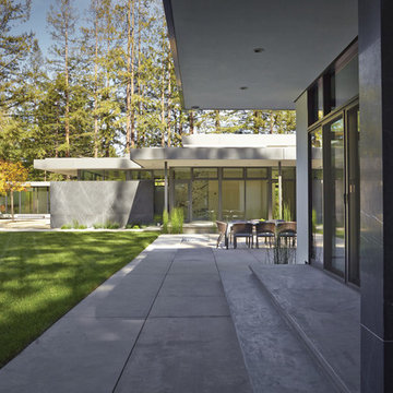
Atherton has many large substantial homes - our clients purchased an existing home on a one acre flag-shaped lot and asked us to design a new dream home for them. The result is a new 7,000 square foot four-building complex consisting of the main house, six-car garage with two car lifts, pool house with a full one bedroom residence inside, and a separate home office /work out gym studio building. A fifty-foot swimming pool was also created with fully landscaped yards.
Given the rectangular shape of the lot, it was decided to angle the house to incoming visitors slightly so as to more dramatically present itself. The house became a classic u-shaped home but Feng Shui design principals were employed directing the placement of the pool house to better contain the energy flow on the site. The main house entry door is then aligned with a special Japanese red maple at the end of a long visual axis at the rear of the site. These angles and alignments set up everything else about the house design and layout, and views from various rooms allow you to see into virtually every space tracking movements of others in the home.
The residence is simply divided into two wings of public use, kitchen and family room, and the other wing of bedrooms, connected by the living and dining great room. Function drove the exterior form of windows and solid walls with a line of clerestory windows which bring light into the middle of the large home. Extensive sun shadow studies with 3D tree modeling led to the unorthodox placement of the pool to the north of the home, but tree shadow tracking showed this to be the sunniest area during the entire year.
Sustainable measures included a full 7.1kW solar photovoltaic array technically making the house off the grid, and arranged so that no panels are visible from the property. A large 16,000 gallon rainwater catchment system consisting of tanks buried below grade was installed. The home is California GreenPoint rated and also features sealed roof soffits and a sealed crawlspace without the usual venting. A whole house computer automation system with server room was installed as well. Heating and cooling utilize hot water radiant heated concrete and wood floors supplemented by heat pump generated heating and cooling.
A compound of buildings created to form balanced relationships between each other, this home is about circulation, light and a balance of form and function.
Photo by John Sutton Photography.

Find the right local pro for your project
 London Bay Homes
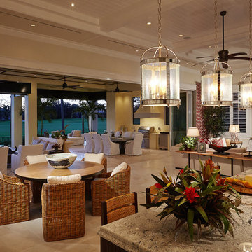
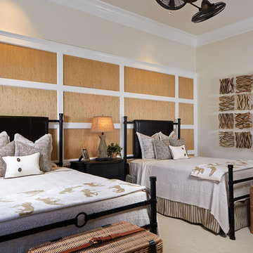
The Brighton is a 4 bedroom, 5 and one half bath model home with 6,326 square feet under air featuring a Great Room, Dining Room, Family Room, Kitchen with Cafe Area, and Study. The Family Room and Nook open up to the outdoor living area leading to the pool, spa, and Summer Kitchen, allowing for a total square footage of 9,954 square feet. The Master Suite also opens up to a Master Retreat for a cozy outdoor living experience.
Fully furnished by Romanza Interior Design, London Bay’s award-winning in-house design studio, the Brighton will feature a Classic American design highlighted by an artful mix of chic and rustic elements and textural fabrics in tonal neutrals.
Image © Advanced Photography Specialists
 CONTRACT SOURCE INTERIORS
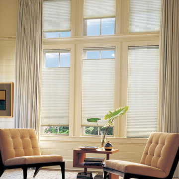
Featured here are Hunter Douglas Applause Honeycomb shades. Available in top down bottom up or standard bottom up shades, these energy saving shades are modestly priced for the budget conscience consumer.

 Beechwood Homes
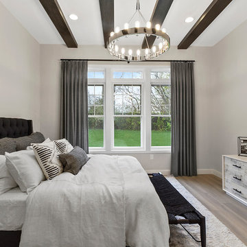
The C Model - Master Bedroom
Transitional medium tone wood floor and brown floor bedroom photo in New York with gray walls
Transitional medium tone wood floor and brown floor bedroom photo in New York with gray walls
Sponsored
Sunbury, OH

J.Holderby - Renovations
Franklin County's Leading General Contractors - 2X Best of Houzz!

 London Bay Homes
The Brighton is a 4 bedroom, 5 and one half bath model home with 6,326 square feet under air featuring a Great Room, Dining Room, Family Room, Kitchen with Cafe Area, and Study. The Family Room and Nook open up to the outdoor living area leading to the pool, spa, and Summer Kitchen, allowing for a total square footage of 9,954 square feet. The Master Suite also opens up to a Master Retreat for a cozy outdoor living experience.
Fully furnished by Romanza Interior Design, London Bay’s award-winning in-house design studio, the Brighton will feature a Classic American design highlighted by an artful mix of chic and rustic elements and textural fabrics in tonal neutrals.
Image © Advanced Photography Specialists
 ODS Architecture
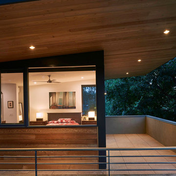
This new contemporary home was commissioned by a design-loving family in Boulder, Colorado who had just purchased a house on a corner lot and wanted to build something new and contemporary with views of the Flatiron mountain range beyond. Working over a distance was easy with extensive 3D modeling leading the way.
Though not on a super-busy corner, limited openings to the street were utilized counter-balanced by extensive glass and access to the side and rear yards. A detached garage was necessary because of off-street parking access from an existing alley that ran behind the house, so a breezeway connecting roof was designed to join the structures visually and provide cover in snow and rain.
Hydronic radiant heated floors run throughout and large windows reveal selective views to the neighborhood. Exposed steel beams and wood framing tell the story of structure inside. White-white kitchen and baths provide clean neutral environments for food and bathing. Upstairs high ceilings allow clerestory windows inviting light but not view. The master bedroom is aimed at the Flatiron Mountains as is the large wraparound walking deck with flying roof overhead, all clad in red cedar.
Much was learned about the local Colorado building environment along the way, guided by nearby structural engineers and contractor. Boulder has strict sun-shadow rules where 3D modeling was critical to show compliance. Energy and heat-loss concerns limited glazing at certain exposures but allowed us to open things up elsewhere. This home is a great example of working within a strict budget and achieve high design quality results. Built by Morningstar Homes with photos by Patterson Architecture + Interior Photography.
 Klopf Architecture
Klopf Architecture, Arterra Landscape Architects and Henry Calvert of Calvert Ventures Designed and built a new warm, modern, Eichler-inspired, open, indoor-outdoor home on a deeper-than-usual San Mateo Highlands property where an original Eichler house had burned to the ground.
The owners wanted multi-generational living and larger spaces than the original home offered, but all parties agreed that the house should respect the neighborhood and blend in stylistically with the other Eichlers. At first the Klopf team considered re-using what little was left of the original home and expanding on it. But after discussions with the owner and builder, all parties agreed that the last few remaining elements of the house were not practical to re-use, so Klopf Architecture designed a new home that pushes the Eichler approach in new directions.
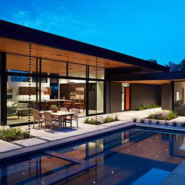
One disadvantage of Eichler production homes is that the house designs were not optimized for each specific lot. A new custom home offered the team a chance to start over. In this case, a longer house that opens up sideways to the south fit the lot better than the original square-ish house that used to open to the rear (west). Accordingly, the Klopf team designed an L-shaped “bar” house with a large glass wall with large sliding glass doors that faces sideways instead of to the rear like a typical Eichler. This glass wall opens to a pool and landscaped yard designed by Arterra Landscape Architects.
Driving by the house, one might assume at first glance it is an Eichler because of the horizontality, the overhanging flat roof eaves, the dark gray vertical siding, and orange solid panel front door, but the house is designed for the 21st Century and is not meant to be a “Likeler.” You won't see any posts and beams in this home. Instead, the ceiling decking is a western red cedar that covers over all the beams. Like Eichlers, this cedar runs continuously from inside to out, enhancing the indoor / outdoor feeling of the house, but unlike Eichlers it conceals a cavity for lighting, wiring, and insulation. Ceilings are higher, rooms are larger and more open, the master bathroom is light-filled and more generous, with a separate tub and shower and a separate toilet compartment, and there is plenty of storage. The garage even easily fits two of today's vehicles with room to spare.
A massive 49-foot by 12-foot wall of glass and the continuity of materials from inside to outside enhance the inside-outside living concept, so the owners and their guests can flow freely from house to pool deck to BBQ to pool and back.
During construction in the rough framing stage, Klopf thought the front of the house appeared too tall even though the house had looked right in the design renderings (probably because the house is uphill from the street). So Klopf Architecture paid the framer to change the roofline from how we had designed it to be lower along the front, allowing the home to blend in better with the neighborhood. One project goal was for people driving up the street to pass the home without immediately noticing there is an "imposter" on this lot, and making that change was essential to achieve that goal.
This 2,606 square foot, 3 bedroom, 3 bathroom Eichler-inspired new house is located in San Mateo in the heart of the Silicon Valley.
Klopf Architecture Project Team: John Klopf, AIA, Klara Kevane
Landscape Architect: Arterra Landscape Architects
Contractor: Henry Calvert of Calvert Ventures
Photography ©2016 Mariko Reed
Location: San Mateo, CA
Year completed: 2016

 Studio TOOP
design: Carrie Preston (Studio TOOP) and Jasper Helmantel (Cruydt Hoeck), 2011
location: Appeltern, NL
status: built in 2012 by Appeltern Model Garden Complex
photos: Olga van Saane, October 2013
Designed as assignment from both the Dutch gardening magazine Groei & Bloei and the television and radio nature program Vara's Vroege Vogels, this garden serves as a model of how homeowners can incorporate lots of plant life and wildlife into the design but without sacrificing practicality or aesthetics. The garden is deliberately contemporary in its style to emphasize that nature-rich gardens need not look a certain way - insects and birds don't care if the lines are straight or curved.
At the same time the garden makes use of affordable, simple, no-nonsense materials. The 40x60 cm paving stones are one of the most common and affordable paving options in the Netherlands, available en masse for free on the Internet. Conceptually we imagined a garden completely paved with the tiles (as to many gardens are) and what would happen if took out some of these stones, used them to build benches and structure and added plants where the tiles had been. In the construction of the benches we include other materials such as bamboo sticks and insulation bricks that create habitat for insects such as solitary bees.
The plant palette is based on a selection of native and host plants in combination with the 26 plants plan set up by Groei & Boei -- a list of plants aimed at making the use of more plants in gardens accessible and less intimidating. The choice for the number 26 corresponds with the number of letters in the alphabet in line with the famous Dutch garden designer Mien Ruy's comment that if we only need 26 letters to create a whole language, we should be able to combine and mix 26 plants to express far more than we think.
 Beechwood Homes
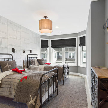
The C Model - Kid's Room
Kids' bedroom - transitional boy kids' bedroom idea in New York with gray walls
Kids' bedroom - transitional boy kids' bedroom idea in New York with gray walls

Sponsored
Columbus, OH

Structural Remodeling
Franklin County's Heavy Timber Specialists | Best of Houzz 2020!
 Green Mountain Builders
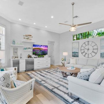
Green Mountain Builders has recently completed a luxury whole home remodel in Bonita Bay, a magnificent award-winning country club community in Bonita Springs, Florida. The remodel focused on opening up the interior space by removing walls that closed off rooms, restricting an open-concept layout. With the dining room wall removed, the home now is bathed in additional sunlight. Opening up the closed area, also makes the home seem much larger. New flooring and paint throughout and a beautiful Luxury Vinyl Plank (LVP) flooring enhance the beauty of this lovely golf course home. LVP is a wonderful wood-look flooring option that offers warmth and texture. The kitchen was completely renovated as were the bedrooms, including the master, and all bathrooms. Green Mountain creatively used shiplap boards in the family room effecting a stunning wall display. In addition, the lovely courtyard remodel has been updated to provide an outdoor space perfect for entertaining and family enjoyment.
 Robert Frank Interiors
Clark Dugger Photography
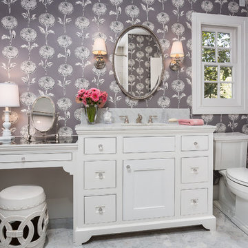
Example of a small classic kids' gray tile and mosaic tile mosaic tile floor bathroom design in Los Angeles with an undermount sink, recessed-panel cabinets, white cabinets, marble countertops, a two-piece toilet and gray walls
Example of a small classic kids' gray tile and mosaic tile mosaic tile floor bathroom design in Los Angeles with an undermount sink, recessed-panel cabinets, white cabinets, marble countertops, a two-piece toilet and gray walls
 Studio TOOP
design: Carrie Preston (Studio TOOP) and Jasper Helmantel (Cruydt Hoeck), 2011
location: Appeltern, NL
status: built in 2012 by Appeltern Model Garden Complex
photos: Jolanthe Lalkens, October 2012
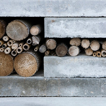
Designed as assignment from both the Dutch gardening magazine Groei & Bloei and the television and radio nature program Vara's Vroege Vogels, this garden serves as a model of how homeowners can incorporate lots of plant life and wildlife into the design but without sacrificing practicality or aesthetics. The garden is deliberately contemporary in its style to emphasize that nature-rich gardens need not look a certain way - insects and birds don't care if the lines are straight or curved.
At the same time the garden makes use of affordable, simple, no-nonsense materials. The 40x60 cm paving stones are one of the most common and affordable paving options in the Netherlands, available en masse for free on the Internet. Conceptually we imagined a garden completely paved with the tiles (as to many gardens are) and what would happen if took out some of these stones, used them to build benches and structure and added plants where the tiles had been. In the construction of the benches we include other materials such as bamboo sticks and insulation bricks that create habitat for insects such as solitary bees.
The plant palette is based on a selection of native and host plants in combination with the 26 plants plan set up by Groei & Boei -- a list of plants aimed at making the use of more plants in gardens accessible and less intimidating. The choice for the number 26 corresponds with the number of letters in the alphabet in line with the famous Dutch garden designer Mien Ruy's comment that if we only need 26 letters to create a whole language, we should be able to combine and mix 26 plants to express far more than we think.
 Almesedoors
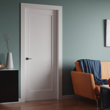
THE DOOR NAME ORIGIN - "SHAKER STYLE 1 PANEL"
How many panels should your interior door have? Well! If you’re looking for a truly no-frills product that is nonetheless elegant, this is an interior door you should consider first. This one-panel model is a truly minimal shaker-style design. While just as reliable as the interior doors in our other collections, these interior doors cost less. A lot less, in fact. Again, if simplicity is your thing, do consider this model. The original Shakers (or Shaking Quackers, as they were styled back in the Nineteenth Century) would be immensely pleased to have this product, as it most certainly adheres to their principle of utter simplicity combined with reliability. In its heyday, the community was highly influential when it came to matters of taste, not just in the United States, but in many other countries. The Baroque period that emphasized and worshipped unapologetic, insolent luxury had come to an end. Austere clas... Show more!
FINISH: WHITE
This is a bit tricky. Isn’t White the default finish that would look great on any interior door? Well, not quite.
W. is the color most often associated with perfection, honesty, cleanliness, newness, neutrality, and exactitude. The pigment has been known and used by humans since prehistoric times. In ancient Egypt, W. symbolized purity. Roman patricians paraded around in W. togas to distinguish themselves from the common folk. It was the color of choice of French monarchs. Architects of all epochs used W., with considerable enthusiasm, in various projects and for various reasons. In the United States, architects favored it when designing churches, capitols, and municipal buildings – which is, in fact, a tradition they inherited from classical and Renaissance architecture. According to some experts, most of the buildings in the celebrated Forum were either made of, or clad in, W. marble. In Taoism, it represents the yang or masculine energy, one of the two complementary natures of the universe. Many authors, both classical and contemporary, have referred to W. as a sign of purity, either physical (like William Shakespeare, whose treacherous usurper monarch wishes a heavenly rain would cleanse his blood-stained hand, washing it “white as snow”) or spiritual (like Tennessee Williams, who named his lead character Blanche (derived, incidentally, from the Germanic word blanc)) as a symbol of her innocent child-like spirit, perceptible from the moment she makes her first entrance (through the interior door stage-left).
Back in the Seventeenth Century, Sir Isaac Newton discovered that sunlight is composed of light with wavelengths across the visible spectrum which the human eye perceives as W. It is the lightest of the spectrum, and achromatic (hue-less) to boot, because it fully reflects and scatters all visible wavelengths of light, absorbing none. W. objects stand out in the dark. Depending on the surroundings, an interior door with W. finish might come off as emphatic or tactful, dominant or complementary. It blends seamlessly into most types of decor and, once the owner’s needs and disposition are taken into account, can symbolize - oh, so many different things, while bringing back a myriad memories: from those glorious snowy Alpine slopes and peaks to the fluffy tops of the wayward herd of cumulus cloud heap over the horizon on a balmy afternoon in the Caribbean. Tropical sand beaches are W. due to the high quantity of calcium carbonate they get from tiny bits of seashells ground to powder by the waves. In a number of cultures W. can also symbolize festivity, and be used lavishly to brighten up weddings, birthdays, and anniversaries. It is beautiful. Make sure it goes well with your interior door model, though.
Sponsored
Columbus, OH
Structural Remodeling
Franklin County's Heavy Timber Specialists | Best of Houzz 2020!
 King Home Design
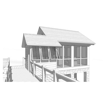
3D modeled side view of custom porch additon and outdoor bathroom space.
Inspiration for a contemporary porch remodel in Atlanta
Inspiration for a contemporary porch remodel in Atlanta
 TRG Architecture + Interior Design
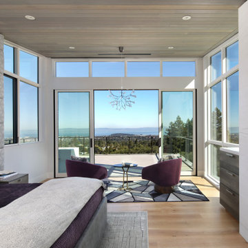
Master suite concept: A spa-like retreat from a busy world. Featuring floor-to-ceiling windows on three sides. The floor-to-ceiling headboard adds warmth, comfort and texture to the space. As Randy puts it, “You’re up in the sky up there. It’s not like a treehouse, it’s like a perch in the heavens.” Motorized shades on all 3 sides of the room retract into the wood-planked ceiling, stained a gentle gray. Honed Dolomite marble slab on fireplace façade and built-in dresser. Randy used combination of SketchUp model and Google Earth to ensure the owners they would still get an amazing view while lying in bed. The room opens up to an outdoor patio with a firepit and loveseat. The built-in dresser fills one window pane to block the view into the bedroom from below.
 Design West
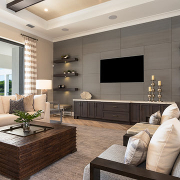
This Model Home showcases a high-contrast color palette with varying blends of soft, neutral textiles, complemented by deep, rich case-piece finishes.
31