
Search results for "Dictate" in Home Design Ideas
 Amanda Martocchio Architecture
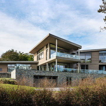
When a world class sailing champion approached us to design a Newport home for his family, with lodging for his sailing crew, we set out to create a clean, light-filled modern home that would integrate with the natural surroundings of the waterfront property, and respect the character of the historic district.
Our approach was to make the marine landscape an integral feature throughout the home. One hundred eighty degree views of the ocean from the top floors are the result of the pinwheel massing. The home is designed as an extension of the curvilinear approach to the property through the woods and reflects the gentle undulating waterline of the adjacent saltwater marsh. Floodplain regulations dictated that the primary occupied spaces be located significantly above grade; accordingly, we designed the first and second floors on a stone “plinth” above a walk-out basement with ample storage for sailing equipment. The curved stone base slopes to grade and houses the shallow entry stair, while the same stone clads the interior’s vertical core to the roof, along which the wood, glass and stainless steel stair ascends to the upper level.
One critical programmatic requirement was enough sleeping space for the sailing crew, and informal party spaces for the end of race-day gatherings. The private master suite is situated on one side of the public central volume, giving the homeowners views of approaching visitors. A “bedroom bar,” designed to accommodate a full house of guests, emerges from the other side of the central volume, and serves as a backdrop for the infinity pool and the cove beyond.
Also essential to the design process was ecological sensitivity and stewardship. The wetlands of the adjacent saltwater marsh were designed to be restored; an extensive geo-thermal heating and cooling system was implemented; low carbon footprint materials and permeable surfaces were used where possible. Native and non-invasive plant species were utilized in the landscape. The abundance of windows and glass railings maximize views of the landscape, and, in deference to the adjacent bird sanctuary, bird-friendly glazing was used throughout.
Photo: Michael Moran/OTTO Photography
 Belltown Design LLC
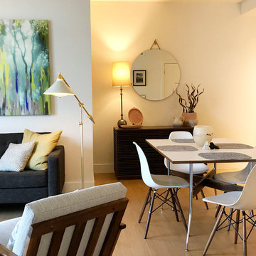
We were excited by the Maxim Articulating Lamp at Jonathan Adler which acted as an impetus for this room design. The decorative pillow fabrics dictated our color scheme with the MidCentury area rug setting the tone. Downtown High Rise Apartment, Stratus, Seattle, WA. Belltown Design. Photography by Robbie Liddane and Paula McHugh

Find the right local pro for your project
 Jones Custom Contracting
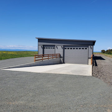
Height restrictions dictated this RV garage had to be sunk 5' in the ground. Overall size of the building is 2200 sq. ft. Fully heated and cooled with 2 baths
 Landis Architects | Builders
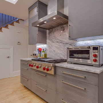
The original kitchen was an open galley with a wall of cabinets and a small island. It was also open above, under a balcony and bridge that lead to the roof deck. We enclosed the opening in the ceiling above the kitchen to create a home gym on the upper level. The back wall of the new kitchen is a few feet forward of the original wall. The reason for this is that there was an existing beam that dictated an 8-foot ceiling on that end. However, new kitchen ceiling is 9-feet high, which is the maximum height at the front of this floor. This also allowed us to build a pantry behind the new kitchen wall – which works fine with the lower ceiling.
To camouflage a duct, we built a tray ceiling around it and fitted it with LED lighting. The cabinets at the top maximize storage and have frosted glass and interior LEDs to keep a light feeling.
The kitchen has several layers of lights. Besides the tray ceiling and lighted cabinet interiors, we installed recessed lights and under cabinet lighting, allowing the clients to create a variety of moods.
HDBros
 Golden Fine Homes
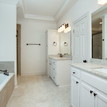
This was a whole house remodel done to prepare a 20 year old house for resale. Market comps for the neighborhood dictated the budget and we updated the house structurally with elements like a new roof, custom shower, counters, as well as aesthetically with new paint, carpet and fixtures.
This home is still the top seller for price per square foot over the past several years.
 Landis Architects | Builders
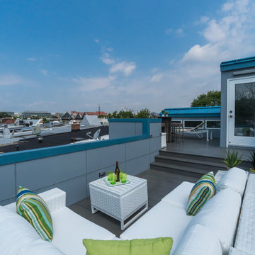
The owners of this Washington, D.C. row house wanted an outdoor area where they could entertain and enjoy views of the Washington Monument and Capitol Building. Our design team worked closely with the clients to help them maximize the usable deck space on the roof and create the relaxing vibe they wanted. As the deck is on a historic row house, we had to work with the Historic Review Board to make sure the design met their requirements. We constructed the supports for the new deck, walls, and provided comfortable access through a structure with a full size door.
Historic Review. Since the roof deck is on a house in the historic district, the city’s historic review board had to approve the design. Any roof structure could not be visible from the street. The roof pitch of the L-shaped structure at the front of the house is located along the sight lines of the building, so you can’t see it from the street. For the review, we actually framed a mock-up out of the structure and then checked if it was visible from the street. The shape and size of the access structure on the roof was dictated by both the historic rules listed above and structural/code issues.
Structural Review/Code. Our designer used every square foot available based on set back and historic requirements. This included creating a two-level deck with steps in between. The roof deck is actually treated as a penthouse, so it has to be set back a certain distance. Structurally, each of side party walls is a bearing wall. The structural beams are excluded as a part of the “structure” and are not included in the setback space. The horizontal setback had to equal the height of the floor above the existing structure. With a pitched roof, that ends up being at 2 levels. The step is as much zoning issue as it is an aesthetic one.
HDBros
 Etheredge Design Associates, Inc.
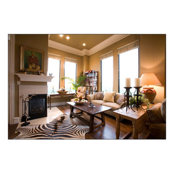
Using a "lifetime of collected pieces" from a sprawling ranch style home and introducing them into an urban mid-rise is an exciting challenge.
Designed for a couple down sizing from the sale of their home, the unit is quite small with a total of 1,807 square feet laid out in an open gallery floor plan with bedrooms at each end. The design was planned to accommodate the couple's extensive art collection, primitive antiques and textiles to maintain an atmosphere which replicated their former home. One of the challenges of this project was a requirement of the owners to incorporate the large scale antique pieces into this small space.
The window walls provide a dramatic view of the city and also dictate that the location for the taller antiques would be on the two remaining walls. The primary living space was divided into three separate areas: a dining area, a media area, and an area for reading and enjoying the fireplace on a winter day or evening. Hardwood flooring throughout creates continuity and an easy transition into the bedrooms adjacent to the primary space. To unify the suite and create the illusion of spaciousness, the walls throughout were painted the same rich yet neutral toast color, and all of the beautiful ceiling and floor molding are finished in a soft white. The finished space is all the owners desired in a residence that reflects their varied tastes, incorporates their interests and provides a comfortable home for entertaining family and friends.
 DIY Eze Breeze
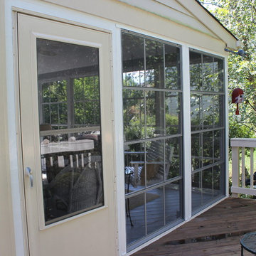
The perfect combination of a screened in porch and a sunroom. With Eze Breeze, you can quickly close and protect your porch or screen room when an unexpected thunderstorm pops up or when a major dusting of spring pollen threatens to invade your home. Eze Breeze allows you the ability to enjoy your porch when you want to enjoy it, not when weather dictates. Ezebreeze is available directly to homeowners for a DIY project or to contractors.
 TRUE TO FORM DESIGN
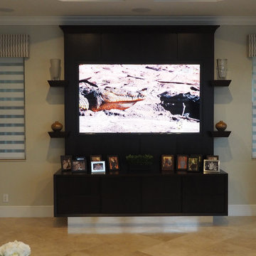
Simple & Elegant Wall Unit built in Espresso Rift cut Oak, Maple and polished chrome. Rift cut Oak has a very linear grain that telegraphs through a stained finish. I introduced the smooth surface of the Maple to give the eye a rest and the chrome base to accentuate a floating feeling by reflecting the floor. The A/V cabinets are framed in with a continual beveled top that dictates the angles of the floating shelves and crisp crown top. The reveals separating the doors and drawers are repeated and evenly placed in the large TV panel. They playfully mark the placement of the flat TV and echo the matching bar we built a few feet away on the adjacent wall.
 Shuler Architecture
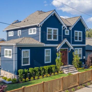
Completed in 2019, this is a home we completed for client who initially engaged us to remodeled their 100 year old classic craftsman bungalow on Seattle’s Queen Anne Hill. During our initial conversation, it became readily apparent that their program was much larger than a remodel could accomplish and the conversation quickly turned toward the design of a new structure that could accommodate a growing family, a live-in Nanny, a variety of entertainment options and an enclosed garage – all squeezed onto a compact urban corner lot.
Project entitlement took almost a year as the house size dictated that we take advantage of several exceptions in Seattle’s complex zoning code. After several meetings with city planning officials, we finally prevailed in our arguments and ultimately designed a 4 story, 3800 sf house on a 2700 sf lot. The finished product is light and airy with a large, open plan and exposed beams on the main level, 5 bedrooms, 4 full bathrooms, 2 powder rooms, 2 fireplaces, 4 climate zones, a huge basement with a home theatre, guest suite, climbing gym, and an underground tavern/wine cellar/man cave. The kitchen has a large island, a walk-in pantry, a small breakfast area and access to a large deck. All of this program is capped by a rooftop deck with expansive views of Seattle’s urban landscape and Lake Union.
Unfortunately for our clients, a job relocation to Southern California forced a sale of their dream home a little more than a year after they settled in after a year project. The good news is that in Seattle’s tight housing market, in less than a week they received several full price offers with escalator clauses which allowed them to turn a nice profit on the deal.
 Allison Smith Design
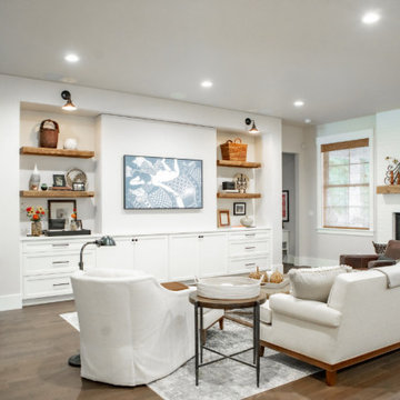
The desired mood for this home was a mix of approachable and comfortable, yet stylish. These clients love art, wine and travel, and have collected many treasures over the years that were important to include.
While we wanted to nod to both the Modern Farmhouse trend and a comfortable classic design, we did not want to be completely dictated by either style. We needed to seamlessly mesh design styles without scrapping everything they had ever loved. An important lesson here is that starting fresh (like with a new home) does not mean you have to start completely over! In fact, the best interiors surround you with what you genuinely love.
 Allbright Bullock Architects
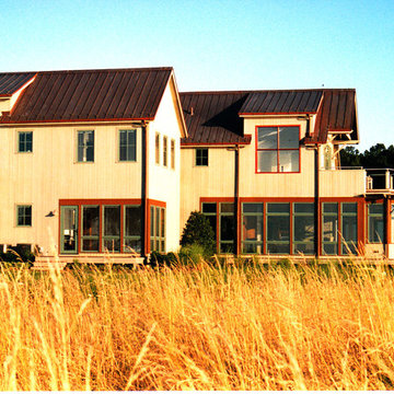
The windows are clad in three different colors to express the different window types: bronze for ganged windows, green for discrete windows and red for accent windows. The window patterns and sizes are dictated by their use from the interior for an honest aesthetic expression from the exterior.

 Etheredge Design Associates, Inc.
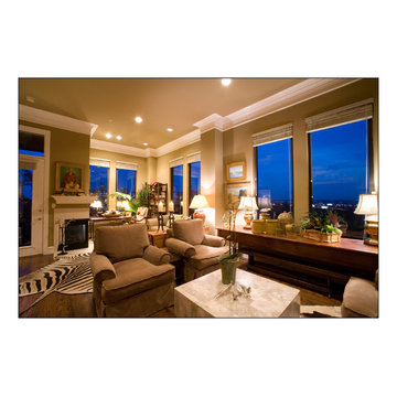
Using a "lifetime of collected pieces" from a sprawling ranch style home and introducing them into an urban mid-rise is an exciting challenge.
Designed for a couple down sizing from the sale of their home, the unit is quite small with a total of 1,807 square feet laid out in an open gallery floor plan with bedrooms at each end. The design was planned to accommodate the couple's extensive art collection, primitive antiques and textiles to maintain an atmosphere which replicated their former home. One of the challenges of this project was a requirement of the owners to incorporate the large scale antique pieces into this small space.
The window walls provide a dramatic view of the city and also dictate that the location for the taller antiques would be on the two remaining walls. The primary living space was divided into three separate areas: a dining area, a media area, and an area for reading and enjoying the fireplace on a winter day or evening. Hardwood flooring throughout creates continuity and an easy transition into the bedrooms adjacent to the primary space. To unify the suite and create the illusion of spaciousness, the walls throughout were painted the same rich yet neutral toast color, and all of the beautiful ceiling and floor molding are finished in a soft white. The finished space is all the owners desired in a residence that reflects their varied tastes, incorporates their interests and provides a comfortable home for entertaining family and friends.
 GeorgeArchitecture
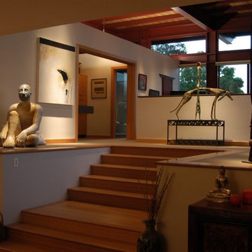
Adjacent to the Living Area are the steps leading up to the Master Suite and outdoor decks. The upper level beyond was dictated by the high ceiling (roof) over the existing Garage below. To the left is the interior Sculpture Plinth, with the sliding pocket doors (shown open) to the Master Bath and Closet in the center. This eight-foot privacy wall is open above, allowing light from the two-foot transoms to filter into the Master Bedroom The low wall to the center-right conceals the bed behind it, and the steel-and-glass framing can be seen in the background—including the continuous two-foot transom windows. Copyright 2015 kim@zielphoto.com
 Steve Lopes, Custom Metalwork Design & Fabrication
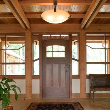
custom door hardware with steel and alabaster entry light
Entryway - craftsman entryway idea in Seattle
Entryway - craftsman entryway idea in Seattle

 Inviting Spaces By Kim
This centrally located intersection to a main thoroughfare a block away was a concern because of the corner lot visibility issue for cars making a turn driving in either direction. The Quince tree bloomed annually for just a short time and was originally planted by the prior home owners decades ago. Keeping it maintained to a height of 4’ maximum, dictated for safety reasons, was still obstructing and limiting the visibility of oncoming traffic at this busy intersection.
The existing roses planted in the same space as the Quince were a perfect backdrop to the new perennials and annuals planted to paint this corner with flowers. The project also included expanding the beautification to both corner areas in coordination with several other planting areas already seasonally updated on the property. With the Redwood Tree as a focal point and Roses, Daphnes, Iris, Azaleas, Fuchsias, Hydrangeas and Camilias highlighting the planting beds the addition of color, including around the driveway and side entrance, transformed the entire space.
Painting With Flowers Is Adding Beauty to Benefit Homeowners & Neighbors!
Kim Beber
 Shuler Architecture
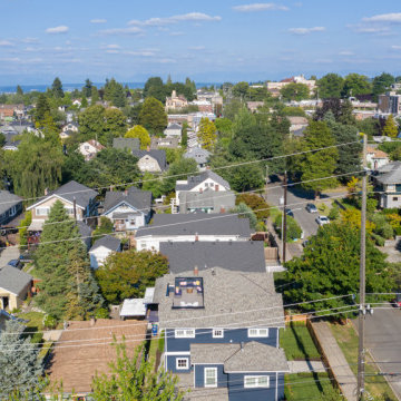
Completed in 2019, this is a home we completed for client who initially engaged us to remodeled their 100 year old classic craftsman bungalow on Seattle’s Queen Anne Hill. During our initial conversation, it became readily apparent that their program was much larger than a remodel could accomplish and the conversation quickly turned toward the design of a new structure that could accommodate a growing family, a live-in Nanny, a variety of entertainment options and an enclosed garage – all squeezed onto a compact urban corner lot.
Project entitlement took almost a year as the house size dictated that we take advantage of several exceptions in Seattle’s complex zoning code. After several meetings with city planning officials, we finally prevailed in our arguments and ultimately designed a 4 story, 3800 sf house on a 2700 sf lot. The finished product is light and airy with a large, open plan and exposed beams on the main level, 5 bedrooms, 4 full bathrooms, 2 powder rooms, 2 fireplaces, 4 climate zones, a huge basement with a home theatre, guest suite, climbing gym, and an underground tavern/wine cellar/man cave. The kitchen has a large island, a walk-in pantry, a small breakfast area and access to a large deck. All of this program is capped by a rooftop deck with expansive views of Seattle’s urban landscape and Lake Union.
Unfortunately for our clients, a job relocation to Southern California forced a sale of their dream home a little more than a year after they settled in after a year project. The good news is that in Seattle’s tight housing market, in less than a week they received several full price offers with escalator clauses which allowed them to turn a nice profit on the deal.
 Lincoln Lighthill Architect
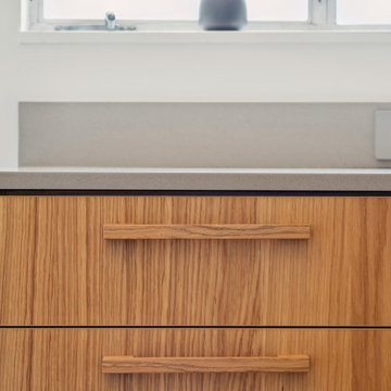
How do you modernize modernism on a budget? This house had charming midcentury character and lots of potential but had been neglected for many years and was sorely in need of a refresh to bring it up to modern standards of comfort, finish, and sustainability. The tight budget dictated that it would not be a down-to-the-studs, gut remodel, but more of a surgical intervention.
Built in 1955, the house had settled on the downhill side, making the floors slope almost 4” from the front to the back of the house. Using an innovative and inexpensive push-pile method, the foundation was reinforced and the house was jacked back up. It now sits solidly on bedrock and the floor is level to within a half-inch throughout.
Inside, the original kitchen was worn and needed replacement. This presented an opportunity to remove the walls separating it from the living and dining area and create a wide-open great room with a peninsula counter for guests to gather and an almost continuous wall of windows to take in views of the hills, trees, and bay.
Throughout the rest of the house, most finishes were restored, or replaced when necessary. Wood floors were refinished, and new cork flooring, a slightly less durable but much less expensive alternative to tile and similar materials, was used in all wet areas, with the added benefit of warmth and resiliency. The existing textured walls and ceilings were skim-coated smooth with plaster, dark beams painted white, and existing wood wall paneling in the living room was cleaned and color-matched where new pieces were required. All of the existing frameless, direct-glazed windows were replaced with double pane units, and a new floor-to-ceiling window on the south side of the living room provides a key source of natural light.
In the bathrooms, existing tile and vanities were saved, and a strangely colored tub and sinks were re-glazed. Flooring, toilets, lighting, double medicine cabinets, and paint in each space make these mostly unaltered rooms feel new again.
Sustainability and comfort upgrades include an induction range (step one of an eventual transition to full electrification), spray foam insulation under the floor, spray-in cellulose in the walls, and warm-dim LED lighting throughout on a simple whole-house control system. Combined with a modern thermostat, the house’s systems are all accessible via app from anywhere.
And the most sustainable feature of all? What we didn’t do: tear it down and start over. In a country that demolishes a million homes a year- 1% of our residential housing stock- reusing an existing home is the greenest solution of all.
29