
Search results for "Didn desire" in Home Design Ideas

 Denyne Designs
The old kitchen was outdated, cramped and had inefficient storage. It didn’t flow well with the rest of
the home nor serve the needs of the family of four, who like to entertain and host the neighborhood
kids on a regular basis.
The client desired a large open concept kitchen with multiple zones for cooking, prep and cleanup that
complimented the style of her home. She desired large pantry areas with easy access, a table area that
could seat 6, as well as separate snack zone for the kids.
The new kitchen design is an open concept space that combines the existing kitchen with a rarely used
dining area and large walk-in closet. Distinct and separate cook, cleanup and prep zones, appeal to the
cook while a separate snack area behind one of the barn doors is geared towards the children.
Convenience items such as dual refrigerator drawers at one end of the island and a wine fridge at the
other appeal to adults and kids alike.
White perimeter cabinetry with a subtle moldings and grey glaze adds softness and sophistication, while
stunning black painted islands ground the center of the space.
Texture is added in the warm wood floors, gorgeous Super White Quartz countertop and variegated
marble backsplash. The icing on the cake is brought in with a little glitz and shine thru the pendant
lighting and chrome accents.
The rays of the existing half circle window were the inspiration for the X detail which is repeated
throughout the space in the glass door mullions, pantry barn doors, and tile feature area over the
cooktop.

 Zelaya Properties LLC
We used: Custom cherry cabinetry in Arts & Crafts Shaker style by Kabinart in Boulder and Espresso stains. Liberty Hardware Venetian bronze 1-1/2" cabinet knobs. KitchenAid Architect II Series 22 CF counter-depth French door refrigerator. KitchenAid Architect Series II 27" convection single wall oven. KitchenAid 36" 6-burner dual fuel freestanding commercial-style range. KitchenAid Architect II Series 24" dishwasher. Sharp Insight Pro Series 24" built-in microwave drawer (Model #KB6524PS). Crystorama Solaris 12" wide pendant lights in English bronze. Granite countertops in Brown Fantasy. 3"x6" polished marble backsplash.
Paint colors:
Walls: Glidden Silver Cloud 30YY 63/024
Ceilings/Trims/Doors: Glidden Swan White GLC23
Robert B. Narod Photography

 Compass Outdoor Design
These clients spent the majority of their time outside and entertained frequently, but their existing patio space didn't allow for larger gatherings.
We added nearly 500 square feet to the already 225 square feet existing to create this expansive outdoor living room. The outdoor fireplace is see-thru and can fully convert to wood burning should the clients desire. Beyond the fireplace is a spa built in on two sides with a composite deck, LED step lighting, and outdoor rated TV, and additional counter space.
The outdoor grilling area mimics the interior of the clients home with a kitchen island and space for dining.
Heaters were added in ceiling and mounted to walls to create additional heat sources.
To capture the best lighting, our clients enhanced their space with lighting in the overhangs, underneath the benches adjacent the fireplace, and recessed cans throughout.
Audio/Visual details include an outdoor rated TV by the spa, Sonos surround sound in the main sitting area, the grilling area, and another landscape zone by the spa.
The lighting and audio/visual in this project is also fully automated.
To bring their existing area and new area together for ultimate entertaining, the clients remodeled their exterior breakfast room wall by removing three windows and adding an accordion door with a custom retractable screen to keep bugs out of the home.
For landscape, the existing sod was removed and synthetic turf installed around the entirety of the backyard area along with a small putting green.
Selections:
Flooring - 2cm porcelain paver
Kitchen/island: Fascia is ipe. Counters are 3cm quartzite
Dry Bar: Fascia is stacked stone panels. Counter is 3cm granite.
Ceiling: Painted tongue and groove pine with decorative stained cedar beams.
Additional Paint: Exterior beams painted accent color (do not match existing house colors)
Roof: Slate Tile
Benches: Tile back, stone (bullnose edge) seat and cap
Find the right local pro for your project

 KBK Interior Design
These clients, an entrepreneur and a physician with three kids, chose their Tudor home for the neighborhood, though it didn’t match their modern-transitional taste. They asked us to help them transform their into a place to play and entertain with clean lines and lively color, namely her favorites: bold purple and refreshing apple green.
Their previous layout had a stifled flow with a large sectional sofa that dominated the room, and an awkward assortment of furniture that they wanted to discard with the exception of a vintage stone dining table from her mother. The living room served as a pass through to both the family and dining rooms. The client wanted the living room to be less like a glorified hallway and become a destination. Our solution was to unify the design of this living space with the related rooms by using repetition of color and by creating usable areas for family game night, entertaining and small get togethers.
The generous proportions of the room enabled us to create three functional spaces: a game table with seating for four and adjacent pull up seating for family play; a seating area at the fireplace that accommodates a large group or small conversation; and seating at the front window that provides a view of the street (not seen in the photograph). The space went from awkward to one that is used daily for family activities and socializing.
As they were not interested in touching the existing architecture, transformations were made using new light fixtures, paint, distinctive furniture and art. The client had a strict budget but desired the highly styled look of couture design pieces with curves and movement. We accomplished this look by pairing a few distinctive couture items with inspired pieces that are budget balancers.
We combined the couture game table with more affordable chairs inspired by a classic klismos style, as one might pair Louboutins with stylish jeans. Right- and left-arm chairs with an interesting castle-like fret base detail flank windows.
To help the clients better understand the use of the color scheme, we keyed the floor plan to show how the greens and purples traveled in a balanced manner around the room and throughout the adjacent dining and family rooms. We paired apple green accents with layered hues of lavender, orchid and aubergine. Neutral taupe and ivory tones ground the bold colors.
The custom rug in ivory, aubergine, pale taupe, grey-lavender was inspired by a picture the client found, but we dramatically increased the scale of the pattern in proportion to our room size. This curvy movement is echoed in the sophisticated shapes of the furniture throughout the redesigned room—from the curved sofas to the circular cutouts in the cube end table.
At the windows the solid sateen panels with contrasting aubergine banding have the hand of silk, and are also cost conscious, creating room in the budget for the stunning custom pillows in Italian embroidered silk.
The distinctive color and shapes throughout provide the whimsy the clients' desired with the function they needed, creating an inviting living room that is now a daily destination.
Designed by KBK Interior Design
www.KBKInteriorDesign.com
Photo by Wing Wong

 Arizona Designs Kitchens and Baths
Really like the combination of angles and curves on this island! Knotty Alder cabinetry looks great with the granite this homeowner selected.
Transitional kitchen photo in Phoenix with granite countertops and an island
Transitional kitchen photo in Phoenix with granite countertops and an island

 Advance Design Studio, Ltd.
Mike and Stacy moved to the country to be around the rolling landscape and feed the birds outside their Hampshire country home. After living in the home for over ten years, they knew exactly what they wanted to renovate their 1980’s two story once their children moved out. It all started with the desire to open up the floor plan, eliminating constricting walls around the dining room and the eating area that they didn’t plan to use once they had access to what used to be a formal dining room.
They wanted to enhance the already warm country feel their home already had, with some warm hickory cabinets and casual granite counter tops. When removing the pantry and closet between the kitchen and the laundry room, the new design now just flows from the kitchen directly into the smartly appointed laundry area and adjacent powder room.
The new eat in kitchen bar is frequented by guests and grand-children, and the original dining table area can be accessed on a daily basis in the new open space. One instant sensation experienced by anyone entering the front door is the bright light that now transpires from the front of the house clear through the back; making the entire first floor feel free flowing and inviting.
Photo Credits- Joe Nowak
 LiLu Interiors
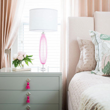
Our socially engaged, active client transplanted from the East Coast found a charming older home in Minneapolis that provided a home base in a new city. While the home had its charm, the dark interior didn’t provide the uplifting respite she desired. With a busy travel schedule and calendar full of after-hours social events, she was looking for a space to unwind at the end of a long day. She wanted to maximize her time at home, and a place to host friends pre-gala. We transformed an extra bedroom into a happy-hour type lounge with upholstered chairs and bar cart along with her Grandmother’s vanity and privacy screen for the ultimate pre-gala experience. In the kitchen, we replaced the dark cabinetry with open painted shelves to lighten the space and provide convenient access to her glassware, adding sparkle to the room. And perhaps most importantly, her bedroom is now a quiet, peaceful refuge with luxurious details that wrap her in warmth and relaxation.
-------
Project designed by Minneapolis interior design studio LiLu Interiors. They serve the Minneapolis-St. Paul area including Wayzata, Edina, and Rochester, and they travel to the far-flung destinations that their upscale clientele own second homes in.
------
For more about LiLu Interiors, click here: https://www.liluinteriors.com/
---
To learn more about this project, click here:
https://www.liluinteriors.com/blog/portfolio-items/deco-boutique-home/
 Twelve Stones Designs, LLC
The owners of this kitchen had spent the money to upgrade the finishes in their kitchen upon building the home 12 years ago, but after living in the space for several years they realized how nonfunctional the layout really was. The (then) two preschool aged children had grown into busy, hungry teenagers with many friends who also liked to hang out at the house. So the family needed a more functional kitchen with better traffic flow, space for daily activities revolving around the kitchen at different times of day, and a kitchen that could accommodate cooking for and serving large groups. Furthermore, the dark, traditional finishes no longer reflected the homeowners’ style. They requested a brighter, more relaxed, coastal style that reflected their love of the seaside cities they like to visit.
Originally, the kitchen was U-shaped with a narrow island in the middle. The island created narrow aisles that bottle-necked at the dishwasher, refrigerator, and cooktop areas. There was a pass-through from the foyer into the kitchen, but the owners never liked that the pass-through was also located so close to the powder room. The awkward proximity was unappealing and made guests feel uncomfortable.
The kitchen’s storage was made up of lots of narrow cabinets, apothecary drawers, clipped corner units, and very few drawers. It lacked useful storage for the larger items the family used on a daily basis. And the kitchen’s only pantry was small closet that had only builder-grade, narrow shelving with no illumination to be able to see the contents inside.
Overall, the kitchen’s lighting plan was poorly executed. Only six recessed cans illuminated the entire kitchen and nook areas. The under cabinet lighting was not evenly distributed either. In fact, the builder had mis-placed the under cabinet lighting around the decorative pilasters which made for choppy, dark cubbies. Further, the builder didn’t include any lighting over the sink or the bar area, which meant whoever was doing the dishes was always in their own shadow. That, coupled with the steep overhang of the game room above made the bar area feel like a dim, cavernous space that wasn’t inviting or task oriented. The kitchen looked out into the main living space, but the raised bar and a narrow wall (which held the only large cabinet in the kitchen) created more of a barrier than a relationship to the living room or breakfast nook. In fact, one couldn’t even see the breakfast nook from the cooktop or sink areas due to its orientation. The raised bar top was too narrow to comfortably sit to either dine at or chat from due to the lack of knee space. The the homeowners confided that the kitchen felt more like a dark, dirty prison than place where the family, or their guests, wanted to gather and commune.
The clients' needs and desires were:
➢ to create a kitchen that would be a space the family loved to be in; to relate to the adjacent spaces all around, and to have better flow for entertaining large groups
➢ to remove the walls between the breakfast nook and living area and to be able to utilize the natural light from the windows in both those areas
➢ to incorporate a functional chopping block for prepping fresh food for home cooked meals, an island with a large sink and drain board, 2 pull out trash cans, and seating for at least the 2 teens to eat or do homework
➢ to design a kitchen and breakfast nook with an airy, coastal, relaxed vibe that blended with the rest of the house's coastal theme
➢ to integrate a layered lighting plan which would include ample general illumination, specific task lighting, decorative lighting, and lots of illuminated storage
➢ to design a kitchen with not only more storage for all the husband’s kitchen gadgets and collection of oils and spices, but smart storage, including a coffee/breakfast bar and a place to store and conceal the toaster oven and microwave
➢ to find a way to utilize the large open space between the kitchen, pantry area, and breakfast nook
Twelve Stones Designs achieved the owner's goals by:
➢ removing the walls between the kitchen and living room to allow the natural light to filter in from the adjacent rooms and to create a connection between the kitchen, nook, and living spaces for a sense of unity and communion
➢ removing the existing pantry and designing 3 large pantry style cabinets with LED tape lights and rollout drawers to house lots of kitchen appliances, gadgets, and tons of groceries. We also took the cabinets all the way up to the 9’ ceiling for additional storage for seasonal items and bulk storage.
➢ designing 2 islands - 1 with a gorgeous black walnut chopping block that houses a drawer for chopping and carving knives and a custom double pull out trash unit for point of use utilization - and 1 that houses the dishwasher, a large Blanco Gourmet sink with integrated drain board, woven baskets for fresh root vegetables and kitchen towels, plenty of drawer storage for kitchen items, and bar seating for up to 4 diners.
➢ closing off the space between the kitchen and the powder room to create a beautiful new private alcove for the powder room as well as adding some decorative storage. This also gave us space to include more tall storage near the new range for precision placement of the husband’s extensive oil and spice collection as well as a location for a combo-steam oven the wife wanted for baking and cooking healthy meals.
The project is enhanced functionally by:
➢ incorporated USB and standard receptacles for the kids’ laptops and phone charging in the large island
➢ designing the small island to include additional open shelving for items used on a daily basis such as a variety of bowls, plates, and colanders. This set up also works well for the husband who prefers to “plate” his dinners in restaurant-style fashion before presenting them to the table.
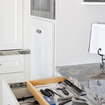
➢ the integration of specific storage units, such as double stacked cutlery drawers, a custom spice pull-out, a Kuerig coffee and tea pod drawer, and custom double stacked utensil drawers
➢ moving the refrigerator to the old oven location - this eliminated the bottle neck as well as created a better relationship to the eating table. It also utilizes the floor space between the pantry, nook, and kitchen
➢ creating a banquet style breakfast nook - this banquette seating not only doubles the amount of seating for large gatherings but it better utilizes the odd space between the kitchen and the previous nook area. It also helps to create a distinct pathway from the mudroom room through the pantry area, kitchen, nook, and living room.
➢ the coffee/breakfast bar area which includes the perfect location for the concealed microwave and toaster oven, convenient storage for the coffee pods and tea accoutrements. Roll-out drawers below also house the smoothie maker, hot water kettle, and a plethora of smoothie-making ingredients such as protein powders, smoothie additives, etc. Furthermore, the drawers below the Keurig house measuring utensil, cutlery, baking supplies and tupperware storage.
➢ incorporating lots of wide drawers and pullouts to accommodate large cookware.
➢ utilizing as much vertical space as possible by building storage to the ceiling which accommodates the family’s abundant amount of serving platters, baking sheets, bakeware, casserole dishes, and additional cutting boards.
The project is enhanced aesthetically by:
➢ new 5-piece Versailles pattern porcelain tile that now seamlessly joins the entire down stairs area together creating a bright, cohesiveness feeling instead of choppy separated spaces - it also adds a coastal feeling
➢ designing a cabinet to conceal the microwave and toaster oven
➢ the coastal influenced light fixtures over the nook table and island
➢ the sandy colors of the Langdon Cambria countertops. The swirling pattern and sparkling quartz pieces remind the homeowner of black-and-tan sandy beaches
➢ the striped banquet seating whose creamy white background and blue-green stripes were the inspiration for the cabinet and wall colors.
➢ All the interior doors were painted black to coordinate with the blacks and grays in the backsplash tile and countertop. This also adds a hint of tailored formality to an otherwise casual space.
➢ the use of WAC's Oculux small aperture LED units for the overhead lighting complimented with Diode LED strips for task lighting under the cabinets and inside the pantry and glass wall cabinets. All of the lighting applications are on separate dimmer switches.
Innovative uses of materials or construction methods by Realty Restoration LLC:
➢ Each 1-1/2” x 3” block of reclaimed end-grain black walnut that makes up the center island chopping block was hand milled and built in the shop. It was designed to look substantial and proportional to the surrounding elements, executed by creating the 4 inch tall top with a solid wood chamfered edge band.
➢ The metal doors on either side of the vent hood were also custom designed for this project and built in the Realty Restoration LLC shop. They are made 1x2, 11-gauge mild steel with ribbed glass. Weighing 60 lbs a piece, heavy duty cabinet hinges were added to support the weight of the door and keep them from sagging.
➢ Under-cabinet receptacles were added along the range wall in order to have a clean, uninterrupted backsplash.
Design obstacles to overcome:
➢ Because we were removing the demising walls between the kitchen and living room, we had to find a way to plumb and vent the new island. We did this by tunneling through the slab (the slab had post tension cables which prevented us from just trenching) to run a new wet vent through a nearby structural wall. We pulled the existing hot and cold lines between upper floor joists and ran them down the structural wall as well and up through a conduit in the tunnel.
➢ Since we were converting from wall overs to a gas range it allowed us to utilize the 220 feed for the wall ovens to provide a new sub panel for all the new kitchen circuits
➢ Due to framing deficiencies inherited from the original build there was a 1-1/2” differential in the floor-to-ceiling height over a 20 foot span; by utilizing the process of cutting and furring coupled with the crown moulding details on the cabinet elevations we were able to mask the problem and provide seamless transitions between the cabinet components.
Evidence of superior craftsmanship:
➢ uniquely designed, one-of-a-kind metal “X” end panels on the large island. The end panels were custom made in the Realty Restoration LLC shop and fitted to the exact dimensions of the island. The welding seams are completely indistinguishable - the posts look like they are cut from a single sheet of metal
➢ square metal posts on the small island were also custom made and designed to compliment and carry through the metal element s throughout the kitchen
➢ the beautiful, oversized end panels on the pantry cabinets which give the breakfast nook a tailored look
➢ integrating a large format 5 piece Versailles tile pattern to seamlessly flow from the existing spaces into the new kitchen space
➢ By constructing a custom cabinet that jogged around a corner we could not remodel (housing the entry way coat closet) we were able to camouflage the adjacent wall offset within the upper and lower cabinets. By designing around the existing jog in the structural walls we accomplished a few things: we were able to find the space to house, and hide, the microwave and toaster oven yet still have a clean cohesive appearance from the kitchen side. Additionally, the owners were able to keep their much needed coat closet and we didn’t have to increase the budget with unnecessary structural work.

 Moderne Builders
Gorgeous master bath with dramatic retro "wave" tile. Peak Photography
Example of a 1950s bathroom design in Los Angeles
Example of a 1950s bathroom design in Los Angeles

 GMI Design Group
Breezy Coastal-Inspired Hearth Room
Sustainable, natural, wholly engaging, and a showcase for their cultural pieces and art was the concept for this home. The couple wanted to use sustainable and environmentally friendly products throughout their home as much as possible.
Being from both California and Florida, they wanted a coastal influence that didn’t look contrived or over-stylized in a Midwestern home. Also, they desired a serene, peaceful space where all senses were engaged. Incorporating the Feng Shui elements of wood, fire, earth, metal and water in color, texture and product choice was used in this design.
A problem area with the original room was a large, blocky oak fireplace. The top half was removed and the hearth was painted white, opening up the space considerably. The back wall was painted a serene blue as an accent.
An overall neutral palette of taupe, blues and grey balanced the wood tones found in the flooring and teak accents the couple acquired on their travels. We recovered their existing love seat with taupe diamond-stripe cotton in a slipcover style, adding to the casual atmosphere of a beach house. Organic cotton, hand-blocked pillows with red cherry blossoms provide a pop of color to the seating. A swivel rocker gives flexibility to multiple focal points and conversation.
The 100% hemp rug has a turquoise oversized damask print and is a plush anchor to the hearth setting. A long grey-washed rattan bench serves as a cocktail table and woven Roman shades provide needed contrast to the back wall. A distressed, reclaimed bench sits below bold art as a bright accent area to an overall neutral space.
The centerpiece of the room is a large cerulean blue buffet with fretwork & glass doors. A large Buddha head serves as a meditative focal point with Asian-inspired art and lighting.
Julie Austin Photography

 Kestrel Shutters & Doors
These traditional closet doors feature smaller, fixed louvers in the top and colonial raised panels in the bottom and are custom sized to fit your openings.
To receive a quote on our Fixed Louver over Raised Panel doors follow the "Visit Store" link: below.

 Manderley Design Co.
La Luz Photography
Example of a small trendy master carpeted bedroom design in Seattle with multicolored walls
Example of a small trendy master carpeted bedroom design in Seattle with multicolored walls
 Crawford Practice
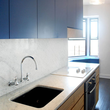
Located within a building constructed in 1937, this apartment retained many of the signature features of New York’s golden age of residential architecture when we first encountered it in 2012—a spacious foyer and living room, wide halls, and beautiful wood floors. Creative professionals keen to color and material, our clients took issue with the kitchen. Also emblematic of prewar apartment living, this room was tucked away in a dim, narrow space, and did not accommodate the couple’s love of entertaining. While they didn’t want to remove any walls separating the kitchen from the living room, our client desired a kitchen that would not only reflect their taste, but also feel larger and better connected to the rest of the apartment.
In response, we removed a wall between the kitchen and adjoining dining area, which enhanced the space’s volume and allowed daylight to penetrate more deeply into the kitchen. New cabinetry was designed to expand storage capacity and enclose new appliances, while expressing the client’s personality. We extended cabinetry into the dining area, to provide additional storage for dinnerware.
To maximize the sense of spaciousness, we removed the kitchen’s tile floor and replaced it with oak flooring similar to the original oak flooring installed throughout the apartment. All flooring was sanded, ebonized, and refinished to create a more seamless flow between spaces. The dark hue creates contrast with the white plaster walls, as well, engendering a new sense of drama and elegance in all the interiors.
 GMI Design Group
Breezy Coastal-Inspired Hearth Room
Sustainable, natural, wholly engaging, and a showcase for their cultural pieces and art was the concept for this home. The couple wanted to use sustainable and environmentally friendly products throughout their home as much as possible.
Being from both California and Florida, they wanted a coastal influence that didn’t look contrived or over-stylized in a Midwestern home. Also, they desired a serene, peaceful space where all senses were engaged. Incorporating the Feng Shui elements of wood, fire, earth, metal and water in color, texture and product choice was used in this design.
A problem area with the original room was a large, blocky oak fireplace. The top half was removed and the hearth was painted white, opening up the space considerably. The back wall was painted a serene blue as an accent.
An overall neutral palette of taupe, blues and grey balanced the wood tones found in the flooring and teak accents the couple acquired on their travels. We recovered their existing love seat with taupe diamond-stripe cotton in a slipcover style, adding to the casual atmosphere of a beach house. Organic cotton, hand-blocked pillows with red cherry blossoms provide a pop of color to the seating. A swivel rocker gives flexibility to multiple focal points and conversation.
The 100% hemp rug has a turquoise oversized damask print and is a plush anchor to the hearth setting. A long grey-washed rattan bench serves as a cocktail table and woven Roman shades provide needed contrast to the back wall. A distressed, reclaimed bench sits below bold art as a bright accent area to an overall neutral space.
The centerpiece of the room is a large cerulean blue buffet with fretwork & glass doors. A large Buddha head serves as a meditative focal point with Asian-inspired art and lighting.
Julie Austin Photography
 Phoenix Home Remodeling
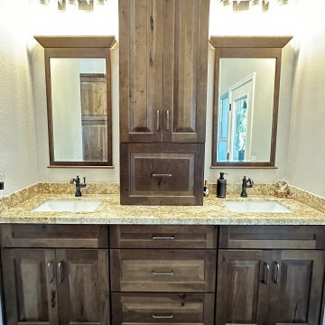
Erik and Pilar had always loved their home, but they wanted a new master bathroom with more functionality and updated style.
They found themselves dreaming of a space to unwind after long days of work, a serene area to escape from daily stress. Functionality aside, they wanted a new space to reflect their shared aesthetic—modern yet warm, with a touch of luxury.
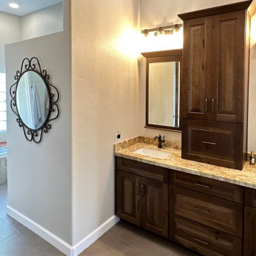
The first steps were to remove everything from the space, then we built a new wall for the shower so they didn't need to clean shower glass. Eric and Pilar decided on cream granite countertops that add the natural elegance desired.
Delta faucets, paired with the Kichler Barrington vanity lights, were fantastic selections to upscale their the space.
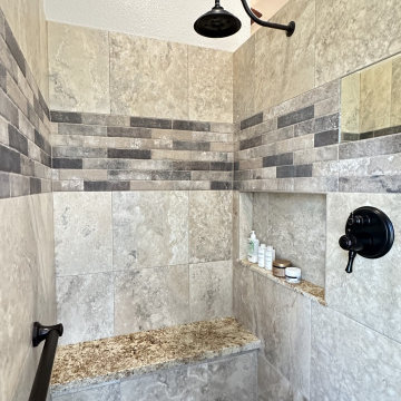
They chose both Nu Trav Walnut tile and Castle Brick Brown tile for the shower wall and completed the shower tile with Mica Pebble Mosaic for the shower flooring, continuing the natural and spa-like aesthetic.
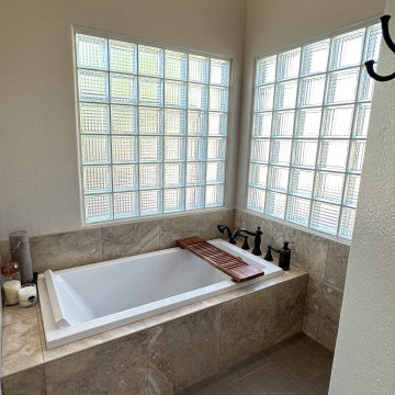
Their old bathtub was replaced with a new Duravit soaking tub with the walls surrounding the bathtub tiled to match the shower wall tile, creating a cohesive look.
Their new master bathroom is not just a functional space but a sanctuary—a place that represents both Eric and Pilar's style preferences for an updated and relaxing atmosphere. It wasn't just a renovation; it was a transformation of how they utilize and enjoy their home.
 Phoenix Home Remodeling
Erik and Pilar had always loved their home, but they wanted a new master bathroom with more functionality and updated style.
They found themselves dreaming of a space to unwind after long days of work, a serene area to escape from daily stress. Functionality aside, they wanted a new space to reflect their shared aesthetic—modern yet warm, with a touch of luxury.
The first steps were to remove everything from the space, then we built a new wall for the shower so they didn't need to clean shower glass. Eric and Pilar decided on cream granite countertops that add the natural elegance desired.
Delta faucets, paired with the Kichler Barrington vanity lights, were fantastic selections to upscale their the space.
They chose both Nu Trav Walnut tile and Castle Brick Brown tile for the shower wall and completed the shower tile with Mica Pebble Mosaic for the shower flooring, continuing the natural and spa-like aesthetic.
Their old bathtub was replaced with a new Duravit soaking tub with the walls surrounding the bathtub tiled to match the shower wall tile, creating a cohesive look.
Their new master bathroom is not just a functional space but a sanctuary—a place that represents both Eric and Pilar's style preferences for an updated and relaxing atmosphere. It wasn't just a renovation; it was a transformation of how they utilize and enjoy their home.

 Mosaik Design & Remodeling
This formerly cramped and outdated kitchen in one of Portland's most desirable neighborhoods, needed a complete remodel. By removing the chimney and widening the opening to the dining room, the kitchen increased twofold with room for a marble topped island and a second oven.
Stacked Shaker cabinets painted white, subway tile and Calacatta marble a farmhouse sink, Rejuvenation fixtures and bin pulls all add to the charm of this now beautiful light filled kitchen.
Lincoln Barbour Photography

 Audio Video Specialists
Large transitional enclosed ceramic tile home theater photo in Chicago with white walls, a ribbon fireplace, a stone fireplace and a projector screen
 Phoenix Home Remodeling
Erik and Pilar had always loved their home, but they wanted a new master bathroom with more functionality and updated style.
They found themselves dreaming of a space to unwind after long days of work, a serene area to escape from daily stress. Functionality aside, they wanted a new space to reflect their shared aesthetic—modern yet warm, with a touch of luxury.
The first steps were to remove everything from the space, then we built a new wall for the shower so they didn't need to clean shower glass. Eric and Pilar decided on cream granite countertops that add the natural elegance desired.
Delta faucets, paired with the Kichler Barrington vanity lights, were fantastic selections to upscale their the space.
They chose both Nu Trav Walnut tile and Castle Brick Brown tile for the shower wall and completed the shower tile with Mica Pebble Mosaic for the shower flooring, continuing the natural and spa-like aesthetic.
Their old bathtub was replaced with a new Duravit soaking tub with the walls surrounding the bathtub tiled to match the shower wall tile, creating a cohesive look.
Their new master bathroom is not just a functional space but a sanctuary—a place that represents both Eric and Pilar's style preferences for an updated and relaxing atmosphere. It wasn't just a renovation; it was a transformation of how they utilize and enjoy their home.
 Phoenix Home Remodeling
Erik and Pilar had always loved their home, but they wanted a new master bathroom with more functionality and updated style.
They found themselves dreaming of a space to unwind after long days of work, a serene area to escape from daily stress. Functionality aside, they wanted a new space to reflect their shared aesthetic—modern yet warm, with a touch of luxury.
The first steps were to remove everything from the space, then we built a new wall for the shower so they didn't need to clean shower glass. Eric and Pilar decided on cream granite countertops that add the natural elegance desired.
Delta faucets, paired with the Kichler Barrington vanity lights, were fantastic selections to upscale their the space.
They chose both Nu Trav Walnut tile and Castle Brick Brown tile for the shower wall and completed the shower tile with Mica Pebble Mosaic for the shower flooring, continuing the natural and spa-like aesthetic.
Their old bathtub was replaced with a new Duravit soaking tub with the walls surrounding the bathtub tiled to match the shower wall tile, creating a cohesive look.
Their new master bathroom is not just a functional space but a sanctuary—a place that represents both Eric and Pilar's style preferences for an updated and relaxing atmosphere. It wasn't just a renovation; it was a transformation of how they utilize and enjoy their home.
12