
Search results for "Didn desire" in Home Design Ideas
 Integrated Home Improvement
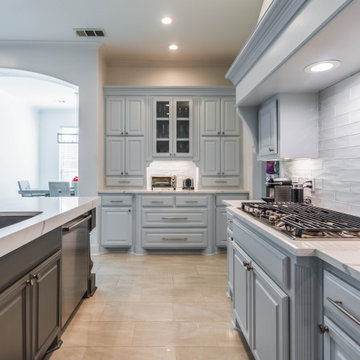
Wrapped up this kitchen for some very cool clients in Southlake, TX. Professional photos just came in. What do you think?
Project cost: ~$60K not including appliances
Scope:
- design (base design, 3d renders, turn-key material selection package)
- demolition (countertops, appliances, floor, plumbing fixtures, backsplash)
- plumbing: sink & faucet install, garbage disposal install
- electrical: under upper cabinet LED lights, retractable downdraft vent install, top of cabinet scope light install,
- cabinets: paint cabinets, create pull-out trash, modify cabinets to fit new ovens and coffee maker, 2 new glass doors, hardware install, new shoe molding
- countertops: Aviana Quartz from Arizona Tile, fab & install, island mitered edges, sink under mount, reverse osmosis hole
- flooring: Tigris ivory porcelain from the tile shop, floor installation
- painting: walls, ceiling, trim, doors
- project financing: 3%
Materials:
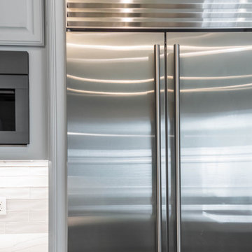
- SubZero Fridge
- Miele coffee maker (non-plumbed)
- Monogram oven and microwave
- Monogram cooktop
- Blanco Sink
- Moen faucet
Vision: clients purchased the house with existing Tuscan style, but they were wanting to make it their own in a style they coined as “new traditional”. They liked some of the more traditional elements of their existing home, but wanted to make it feel more new and fresh. And they didn’t want it to stand out too much from rest of home, though they plan on remodeling their bathrooms in the near future, and likely much of their home. They are very happy with the final product, and we achieved the “new traditional” look they desired. They were very impressed with our service and left an amazing, thorough review. They plan on using us for their future projects as well.
 Integrated Home Improvement
Wrapped up this kitchen for some very cool clients in Southlake, TX. Professional photos just came in. What do you think?
Project cost: ~$60K not including appliances
Scope:
- design (base design, 3d renders, turn-key material selection package)
- demolition (countertops, appliances, floor, plumbing fixtures, backsplash)
- plumbing: sink & faucet install, garbage disposal install
- electrical: under upper cabinet LED lights, retractable downdraft vent install, top of cabinet scope light install,
- cabinets: paint cabinets, create pull-out trash, modify cabinets to fit new ovens and coffee maker, 2 new glass doors, hardware install, new shoe molding
- countertops: Aviana Quartz from Arizona Tile, fab & install, island mitered edges, sink under mount, reverse osmosis hole
- flooring: Tigris ivory porcelain from the tile shop, floor installation
- painting: walls, ceiling, trim, doors
- project financing: 3%
Materials:
- SubZero Fridge
- Miele coffee maker (non-plumbed)
- Monogram oven and microwave
- Monogram cooktop
- Blanco Sink
- Moen faucet
Vision: clients purchased the house with existing Tuscan style, but they were wanting to make it their own in a style they coined as “new traditional”. They liked some of the more traditional elements of their existing home, but wanted to make it feel more new and fresh. And they didn’t want it to stand out too much from rest of home, though they plan on remodeling their bathrooms in the near future, and likely much of their home. They are very happy with the final product, and we achieved the “new traditional” look they desired. They were very impressed with our service and left an amazing, thorough review. They plan on using us for their future projects as well.
 Integrated Home Improvement
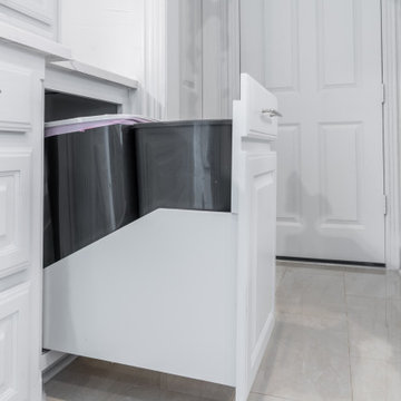
Wrapped up this kitchen for some very cool clients in Southlake, TX. Professional photos just came in. What do you think?
Project cost: ~$60K not including appliances
Scope:
- design (base design, 3d renders, turn-key material selection package)
- demolition (countertops, appliances, floor, plumbing fixtures, backsplash)
- plumbing: sink & faucet install, garbage disposal install
- electrical: under upper cabinet LED lights, retractable downdraft vent install, top of cabinet scope light install,
- cabinets: paint cabinets, create pull-out trash, modify cabinets to fit new ovens and coffee maker, 2 new glass doors, hardware install, new shoe molding
- countertops: Aviana Quartz from Arizona Tile, fab & install, island mitered edges, sink under mount, reverse osmosis hole
- flooring: Tigris ivory porcelain from the tile shop, floor installation
- painting: walls, ceiling, trim, doors
- project financing: 3%
Materials:
- SubZero Fridge
- Miele coffee maker (non-plumbed)
- Monogram oven and microwave
- Monogram cooktop
- Blanco Sink
- Moen faucet
Vision: clients purchased the house with existing Tuscan style, but they were wanting to make it their own in a style they coined as “new traditional”. They liked some of the more traditional elements of their existing home, but wanted to make it feel more new and fresh. And they didn’t want it to stand out too much from rest of home, though they plan on remodeling their bathrooms in the near future, and likely much of their home. They are very happy with the final product, and we achieved the “new traditional” look they desired. They were very impressed with our service and left an amazing, thorough review. They plan on using us for their future projects as well.
Find the right local pro for your project
 Integrated Home Improvement
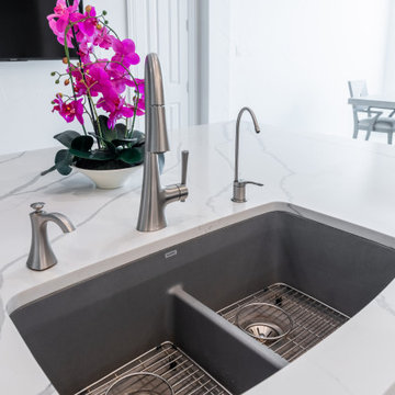
Wrapped up this kitchen for some very cool clients in Southlake, TX. Professional photos just came in. What do you think?
Project cost: ~$60K not including appliances
Scope:
- design (base design, 3d renders, turn-key material selection package)
- demolition (countertops, appliances, floor, plumbing fixtures, backsplash)
- plumbing: sink & faucet install, garbage disposal install
- electrical: under upper cabinet LED lights, retractable downdraft vent install, top of cabinet scope light install,
- cabinets: paint cabinets, create pull-out trash, modify cabinets to fit new ovens and coffee maker, 2 new glass doors, hardware install, new shoe molding
- countertops: Aviana Quartz from Arizona Tile, fab & install, island mitered edges, sink under mount, reverse osmosis hole
- flooring: Tigris ivory porcelain from the tile shop, floor installation
- painting: walls, ceiling, trim, doors
- project financing: 3%
Materials:
- SubZero Fridge
- Miele coffee maker (non-plumbed)
- Monogram oven and microwave
- Monogram cooktop
- Blanco Sink
- Moen faucet
Vision: clients purchased the house with existing Tuscan style, but they were wanting to make it their own in a style they coined as “new traditional”. They liked some of the more traditional elements of their existing home, but wanted to make it feel more new and fresh. And they didn’t want it to stand out too much from rest of home, though they plan on remodeling their bathrooms in the near future, and likely much of their home. They are very happy with the final product, and we achieved the “new traditional” look they desired. They were very impressed with our service and left an amazing, thorough review. They plan on using us for their future projects as well.
 Integrated Home Improvement
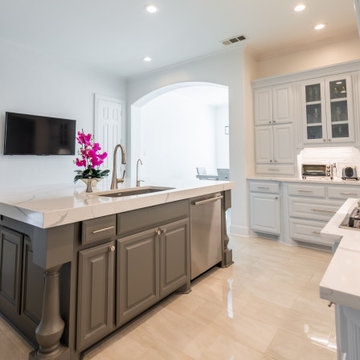
Wrapped up this kitchen for some very cool clients in Southlake, TX. Professional photos just came in. What do you think?
Project cost: ~$60K not including appliances
Scope:
- design (base design, 3d renders, turn-key material selection package)
- demolition (countertops, appliances, floor, plumbing fixtures, backsplash)
- plumbing: sink & faucet install, garbage disposal install
- electrical: under upper cabinet LED lights, retractable downdraft vent install, top of cabinet scope light install,
- cabinets: paint cabinets, create pull-out trash, modify cabinets to fit new ovens and coffee maker, 2 new glass doors, hardware install, new shoe molding
- countertops: Aviana Quartz from Arizona Tile, fab & install, island mitered edges, sink under mount, reverse osmosis hole
- flooring: Tigris ivory porcelain from the tile shop, floor installation
- painting: walls, ceiling, trim, doors
- project financing: 3%
Materials:
- SubZero Fridge
- Miele coffee maker (non-plumbed)
- Monogram oven and microwave
- Monogram cooktop
- Blanco Sink
- Moen faucet
Vision: clients purchased the house with existing Tuscan style, but they were wanting to make it their own in a style they coined as “new traditional”. They liked some of the more traditional elements of their existing home, but wanted to make it feel more new and fresh. And they didn’t want it to stand out too much from rest of home, though they plan on remodeling their bathrooms in the near future, and likely much of their home. They are very happy with the final product, and we achieved the “new traditional” look they desired. They were very impressed with our service and left an amazing, thorough review. They plan on using us for their future projects as well.
 Drury Design
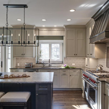
There were some druthers with the kitchen and there was a desire to make certain rooms more grown-up again. Unlike some of our clients who get rid of their formal dining rooms, this family wanted to keep theirs. They saw it as good space for entertaining and doing work – why not make it more stylish and purposeful?
THE REMODEL
Design Objectives
Keep the craftsman style of the home but make it more modern
Update the dining room to be more formal for entertaining and provide storage for china, stemware, wine, etc.
Open up the kitchen to improve flow
Incorporate new decorative lighting throughout the home to accent the home’s style
Transform the staircase into a statement piece that greets visitors – redesign it with arts & crafts details in the balusters, newel posts and handrails
Design Challenges:
Open up the dining room window for more light and a better view of the backyard. The previous window felt closed in with heavy shutters.
Improve kitchen flow without making the footprint larger
Make the entire home feel updated and cohesive while staying true to the house’s style.
THE RENEWED SPACES
We bumped out the dining room window to make a new bay window. The glass mullion design mimics the craftsman style, setting the tone for the room while letting plenty of light in. It really opened up that end of the dining room. The view of the backyard is much bigger now, too. It’s also a great nook for playing board games, doing puzzles and playing with Legos.
We actually got rid of a walk-in pantry that had cut off a corner of the kitchen, and were able to keep all the main walls intact. The old pantry room is where the fridge is now, as well as a tall pantry cabinet, some additional cabinets and a new countertop surface. The flow is much better and it’s roomy now, with a kitchen table that’s great for informal meals, homework and kids seating when adults are entertaining in the dining room.
The cabinet, tile and countertop colors are still neutral but offer a more muted palette. To bring in the craftsman style, simple architectural details were added such as the hood and window valance, decorative furniture toes, a shaker door on the perimeter cabinets and a more modern cabinet door style on the island, pantry and refrigerator areas. New decorative lighting was added in the kitchen, dining room, living room, foyer and second-floor hallway to make the entire first floor feel updated. Also, the entire staircase was revamped. The existing hardwood was kept in place but stained medium brown to bring in some warmth.
“The Drury process made this project turn out better than we imagined,” one of the homeowners told us during the final photoshoot. “There were so many features we didn’t know about – like charging drawers – and ways of going about the remodel that didn’t come to us naturally. We’re so glad Alicia had so much experience and so many checklists. We got to think through everything and arrive at the best possible design for our family.”

 TVL Creative Ltd.
This kitchen took a tired, 80’s builder kitchen and revamped it into a personalized gathering space for our wonderful client. The existing space was split up by the dated configuration of eat-in kitchen table area to one side and cramped workspace on the other. It didn’t just under-serve our client’s needs; it flat out discouraged them from using the space. Our client desired an open kitchen with a central gathering space where family and friends could connect. To open things up, we removed the half wall separating the kitchen from the dining room and the wall that blocked sight lines to the family room and created a narrow hallway to the kitchen. The old oak cabinets weren't maximizing storage and were dated and dark. We used Waypoint Living Spaces cabinets in linen white to brighten up the room. On the east wall, we created a hutch-like stack that features an appliance garage that keeps often used countertop appliance on hand but out of sight. The hutch also acts as a transition from the cooking zone to the coffee and wine area. We eliminated the north window that looked onto the entry walkway and activated this wall as storage with refrigerator enclosure and pantry. We opted to leave the east window as-is and incorporated it into the new kitchen layout by creating a window well for growing plants and herbs. The countertops are Pental Quartz in Carrara. The sleek cabinet hardware is from our friends at Amerock in a gorgeous satin champagne bronze. One of the most striking features in the space is the pattern encaustic tile from Tile Shop. The pop of blue in the backsplash adds personality and contrast to the champagne accents. The reclaimed wood cladding surrounding the large east-facing window introduces a quintessential Colorado vibe, and the natural texture balances the crisp white cabinetry and geometric patterned tile. Minimalist modern lighting fixtures from Mitzi by Hudson Valley Lighting provide task lighting over the sink and at the wine/ coffee station. The visual lightness of the sink pendants maintains the openness and visual connection between the kitchen and dining room. Together the elements make for a sophisticated yet casual vibe-- a comfortable chic kitchen. We love the way this space turned out and are so happy that our clients now have such a bright and welcoming gathering space as the heart of their home!

 Bilotta Kitchen & Home
For this expansive kitchen renovation, Designer, Randy O’Kane of Bilotta Kitchens worked with interior designer Gina Eastman and architect Clark Neuringer. The backyard was the client’s favorite space, with a pool and beautiful landscaping; from where it’s situated it’s the sunniest part of the house. They wanted to be able to enjoy the view and natural light all year long, so the space was opened up and a wall of windows was added. Randy laid out the kitchen to complement their desired view. She selected colors and materials that were fresh, natural, and unique – a soft greenish-grey with a contrasting deep purple, Benjamin Moore’s Caponata for the Bilotta Collection Cabinetry and LG Viatera Minuet for the countertops. Gina coordinated all fabrics and finishes to complement the palette in the kitchen. The most unique feature is the table off the island. Custom-made by Brooks Custom, the top is a burled wood slice from a large tree with a natural stain and live edge; the base is hand-made from real tree limbs. They wanted it to remain completely natural, with the look and feel of the tree, so they didn’t add any sort of sealant. The client also wanted touches of antique gold which the team integrated into the Armac Martin hardware, Rangecraft hood detailing, the Ann Sacks backsplash, and in the Bendheim glass inserts in the butler’s pantry which is glass with glittery gold fabric sandwiched in between. The appliances are a mix of Subzero, Wolf and Miele. The faucet and pot filler are from Waterstone. The sinks are Franke. With the kitchen and living room essentially one large open space, Randy and Gina worked together to continue the palette throughout, from the color of the cabinets, to the banquette pillows, to the fireplace stone. The family room’s old built-in around the fireplace was removed and the floor-to-ceiling stone enclosure was added with a gas fireplace and flat screen TV, flanked by contemporary artwork.
Designer: Bilotta’s Randy O’Kane with Gina Eastman of Gina Eastman Design & Clark Neuringer, Architect posthumously
Photo Credit: Phillip Ennis
 TVL Creative Ltd.
This kitchen took a tired, 80’s builder kitchen and revamped it into a personalized gathering space for our wonderful client. The existing space was split up by the dated configuration of eat-in kitchen table area to one side and cramped workspace on the other. It didn’t just under-serve our client’s needs; it flat out discouraged them from using the space. Our client desired an open kitchen with a central gathering space where family and friends could connect. To open things up, we removed the half wall separating the kitchen from the dining room and the wall that blocked sight lines to the family room and created a narrow hallway to the kitchen. The old oak cabinets weren't maximizing storage and were dated and dark. We used Waypoint Living Spaces cabinets in linen white to brighten up the room. On the east wall, we created a hutch-like stack that features an appliance garage that keeps often used countertop appliance on hand but out of sight. The hutch also acts as a transition from the cooking zone to the coffee and wine area. We eliminated the north window that looked onto the entry walkway and activated this wall as storage with refrigerator enclosure and pantry. We opted to leave the east window as-is and incorporated it into the new kitchen layout by creating a window well for growing plants and herbs. The countertops are Pental Quartz in Carrara. The sleek cabinet hardware is from our friends at Amerock in a gorgeous satin champagne bronze. One of the most striking features in the space is the pattern encaustic tile from Tile Shop. The pop of blue in the backsplash adds personality and contrast to the champagne accents. The reclaimed wood cladding surrounding the large east-facing window introduces a quintessential Colorado vibe, and the natural texture balances the crisp white cabinetry and geometric patterned tile. Minimalist modern lighting fixtures from Mitzi by Hudson Valley Lighting provide task lighting over the sink and at the wine/ coffee station. The visual lightness of the sink pendants maintains the openness and visual connection between the kitchen and dining room. Together the elements make for a sophisticated yet casual vibe-- a comfortable chic kitchen. We love the way this space turned out and are so happy that our clients now have such a bright and welcoming gathering space as the heart of their home!
 Drury Design
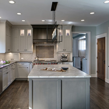
There were some druthers with the kitchen and there was a desire to make certain rooms more grown-up again. Unlike some of our clients who get rid of their formal dining rooms, this family wanted to keep theirs. They saw it as good space for entertaining and doing work – why not make it more stylish and purposeful?
THE REMODEL
Design Objectives
Keep the craftsman style of the home but make it more modern
Update the dining room to be more formal for entertaining and provide storage for china, stemware, wine, etc.
Open up the kitchen to improve flow
Incorporate new decorative lighting throughout the home to accent the home’s style
Transform the staircase into a statement piece that greets visitors – redesign it with arts & crafts details in the balusters, newel posts and handrails
Design Challenges:
Open up the dining room window for more light and a better view of the backyard. The previous window felt closed in with heavy shutters.
Improve kitchen flow without making the footprint larger
Make the entire home feel updated and cohesive while staying true to the house’s style.
THE RENEWED SPACES
We bumped out the dining room window to make a new bay window. The glass mullion design mimics the craftsman style, setting the tone for the room while letting plenty of light in. It really opened up that end of the dining room. The view of the backyard is much bigger now, too. It’s also a great nook for playing board games, doing puzzles and playing with Legos.
We actually got rid of a walk-in pantry that had cut off a corner of the kitchen, and were able to keep all the main walls intact. The old pantry room is where the fridge is now, as well as a tall pantry cabinet, some additional cabinets and a new countertop surface. The flow is much better and it’s roomy now, with a kitchen table that’s great for informal meals, homework and kids seating when adults are entertaining in the dining room.
The cabinet, tile and countertop colors are still neutral but offer a more muted palette. To bring in the craftsman style, simple architectural details were added such as the hood and window valance, decorative furniture toes, a shaker door on the perimeter cabinets and a more modern cabinet door style on the island, pantry and refrigerator areas. New decorative lighting was added in the kitchen, dining room, living room, foyer and second-floor hallway to make the entire first floor feel updated. Also, the entire staircase was revamped. The existing hardwood was kept in place but stained medium brown to bring in some warmth.
“The Drury process made this project turn out better than we imagined,” one of the homeowners told us during the final photoshoot. “There were so many features we didn’t know about – like charging drawers – and ways of going about the remodel that didn’t come to us naturally. We’re so glad Alicia had so much experience and so many checklists. We got to think through everything and arrive at the best possible design for our family.”
 Drury Design
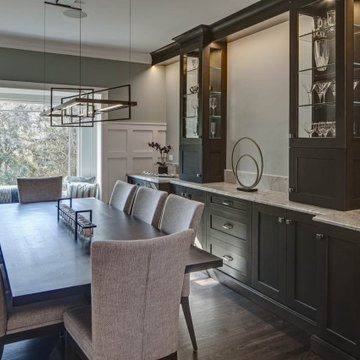
There were some druthers with the kitchen and there was a desire to make certain rooms more grown-up again. Unlike some of our clients who get rid of their formal dining rooms, this family wanted to keep theirs. They saw it as good space for entertaining and doing work – why not make it more stylish and purposeful?
THE REMODEL
Design Objectives
Keep the craftsman style of the home but make it more modern
Update the dining room to be more formal for entertaining and provide storage for china, stemware, wine, etc.
Open up the kitchen to improve flow
Incorporate new decorative lighting throughout the home to accent the home’s style
Transform the staircase into a statement piece that greets visitors – redesign it with arts & crafts details in the balusters, newel posts and handrails
Design Challenges:
Open up the dining room window for more light and a better view of the backyard. The previous window felt closed in with heavy shutters.
Improve kitchen flow without making the footprint larger
Make the entire home feel updated and cohesive while staying true to the house’s style.
THE RENEWED SPACES
We bumped out the dining room window to make a new bay window. The glass mullion design mimics the craftsman style, setting the tone for the room while letting plenty of light in. It really opened up that end of the dining room. The view of the backyard is much bigger now, too. It’s also a great nook for playing board games, doing puzzles and playing with Legos.
We actually got rid of a walk-in pantry that had cut off a corner of the kitchen, and were able to keep all the main walls intact. The old pantry room is where the fridge is now, as well as a tall pantry cabinet, some additional cabinets and a new countertop surface. The flow is much better and it’s roomy now, with a kitchen table that’s great for informal meals, homework and kids seating when adults are entertaining in the dining room.
The cabinet, tile and countertop colors are still neutral but offer a more muted palette. To bring in the craftsman style, simple architectural details were added such as the hood and window valance, decorative furniture toes, a shaker door on the perimeter cabinets and a more modern cabinet door style on the island, pantry and refrigerator areas. New decorative lighting was added in the kitchen, dining room, living room, foyer and second-floor hallway to make the entire first floor feel updated. Also, the entire staircase was revamped. The existing hardwood was kept in place but stained medium brown to bring in some warmth.
“The Drury process made this project turn out better than we imagined,” one of the homeowners told us during the final photoshoot. “There were so many features we didn’t know about – like charging drawers – and ways of going about the remodel that didn’t come to us naturally. We’re so glad Alicia had so much experience and so many checklists. We got to think through everything and arrive at the best possible design for our family.”

 GMI Design Group
Breezy Coastal-Inspired Hearth Room
Sustainable, natural, wholly engaging, and a showcase for their cultural pieces and art was the concept for this home. The couple wanted to use sustainable and environmentally friendly products throughout their home as much as possible.
Being from both California and Florida, they wanted a coastal influence that didn’t look contrived or over-stylized in a Midwestern home. Also, they desired a serene, peaceful space where all senses were engaged. Incorporating the Feng Shui elements of wood, fire, earth, metal and water in color, texture and product choice was used in this design.
A problem area with the original room was a large, blocky oak fireplace. The top half was removed and the hearth was painted white, opening up the space considerably. The back wall was painted a serene blue as an accent.
An overall neutral palette of taupe, blues and grey balanced the wood tones found in the flooring and teak accents the couple acquired on their travels. We recovered their existing love seat with taupe diamond-stripe cotton in a slipcover style, adding to the casual atmosphere of a beach house. Organic cotton, hand-blocked pillows with red cherry blossoms provide a pop of color to the seating. A swivel rocker gives flexibility to multiple focal points and conversation.
The 100% hemp rug has a turquoise oversized damask print and is a plush anchor to the hearth setting. A long grey-washed rattan bench serves as a cocktail table and woven Roman shades provide needed contrast to the back wall. A distressed, reclaimed bench sits below bold art as a bright accent area to an overall neutral space.
The centerpiece of the room is a large cerulean blue buffet with fretwork & glass doors. A large Buddha head serves as a meditative focal point with Asian-inspired art and lighting.
Julie Austin Photography
 TVL Creative Ltd.
This kitchen took a tired, 80’s builder kitchen and revamped it into a personalized gathering space for our wonderful client. The existing space was split up by the dated configuration of eat-in kitchen table area to one side and cramped workspace on the other. It didn’t just under-serve our client’s needs; it flat out discouraged them from using the space. Our client desired an open kitchen with a central gathering space where family and friends could connect. To open things up, we removed the half wall separating the kitchen from the dining room and the wall that blocked sight lines to the family room and created a narrow hallway to the kitchen. The old oak cabinets weren't maximizing storage and were dated and dark. We used Waypoint Living Spaces cabinets in linen white to brighten up the room. On the east wall, we created a hutch-like stack that features an appliance garage that keeps often used countertop appliance on hand but out of sight. The hutch also acts as a transition from the cooking zone to the coffee and wine area. We eliminated the north window that looked onto the entry walkway and activated this wall as storage with refrigerator enclosure and pantry. We opted to leave the east window as-is and incorporated it into the new kitchen layout by creating a window well for growing plants and herbs. The countertops are Pental Quartz in Carrara. The sleek cabinet hardware is from our friends at Amerock in a gorgeous satin champagne bronze. One of the most striking features in the space is the pattern encaustic tile from Tile Shop. The pop of blue in the backsplash adds personality and contrast to the champagne accents. The reclaimed wood cladding surrounding the large east-facing window introduces a quintessential Colorado vibe, and the natural texture balances the crisp white cabinetry and geometric patterned tile. Minimalist modern lighting fixtures from Mitzi by Hudson Valley Lighting provide task lighting over the sink and at the wine/ coffee station. The visual lightness of the sink pendants maintains the openness and visual connection between the kitchen and dining room. Together the elements make for a sophisticated yet casual vibe-- a comfortable chic kitchen. We love the way this space turned out and are so happy that our clients now have such a bright and welcoming gathering space as the heart of their home!

 Progressive Design Build
Transforming a Master Bathroom
When our clients purchased their beautiful home in South Fort Myers, FL they fell in love with the expansive, sweeping space. It wasn’t long, however, before they realized the master bathroom just didn’t suit their taste. The large walk-in shower was practically cave-like. Consequentially, it completely dwarfed the bathroom. Along with bland colors, outdated finishes, and a dividing wall in the middle of the room, the whole space felt smaller than its ample dimensions implied. There was no question about it – the bathroom needed an update.
Making Room for More
First, we demolished the existing finishes and cut the concrete slab for new underground plumbing. We minimized the imposing shower and moved it to the other side of the room. Moving the shower also allowed for the installation of our Dura Supreme Alectra style cabinetry in cocoa brown. For increased functionality, we created split his-and-hers vanities. Then we added towers to match the cabinets. With interior outlets, the towers added smart storage for bathroom appliances, helping to keep the counters clutter-free. For a finishing touch, we outlined the large mirrors with crown molding trim in a complimentary finish – an essential detail to tie all the cabinetry together.
The Spa
To bring the feel of the spa to this gorgeous home, we installed our luxurious drop-in 72”x42” Kohler Air Massage bathtub. We completely surrounded it with 3cm granite countertops in Delicatus green and added a tub deck with tile backsplashes for a sumptuous ambiance.
Lighting
On either side of the his-and-hers vanity, we installed George Kovach tube sconces. Vertical placement of the sconces provided ample lighting while enhancing the contemporary style of the space. To frame the room, we added a drop ceiling with recessed lighting and outlined the tray ceiling with crown molding to match the rest of the design. To complete the bath remodel, we installed the final element – a stunningly unique 10-light polished chrome chandelier from Maxim lighting.
A Complete Transformation
When we met with our clients, it was instantly clear to us why they were unhappy with their master bathroom. The cave-like shower and cumbersome dividing wall overpowered a room in dire need of a modernizing. Furthermore, with two small children and a busy lifestyle, we could sense our clients not only desired a bathroom renovation, they needed a relaxing retreat.
Ultimately, this project was nothing less than a complete transformation of space. In fact, by the time we had finished, the only original fixtures left were the windows! With beautifully updated finishes and an improved layout, we were able to achieve the functionality our clients craved along with a new, spa-like feel. The end result was nothing short of a haven at home – the perfect spot to recharge at the end of a long day.
 TVL Creative Ltd.
This kitchen took a tired, 80’s builder kitchen and revamped it into a personalized gathering space for our wonderful client. The existing space was split up by the dated configuration of eat-in kitchen table area to one side and cramped workspace on the other. It didn’t just under-serve our client’s needs; it flat out discouraged them from using the space. Our client desired an open kitchen with a central gathering space where family and friends could connect. To open things up, we removed the half wall separating the kitchen from the dining room and the wall that blocked sight lines to the family room and created a narrow hallway to the kitchen. The old oak cabinets weren't maximizing storage and were dated and dark. We used Waypoint Living Spaces cabinets in linen white to brighten up the room. On the east wall, we created a hutch-like stack that features an appliance garage that keeps often used countertop appliance on hand but out of sight. The hutch also acts as a transition from the cooking zone to the coffee and wine area. We eliminated the north window that looked onto the entry walkway and activated this wall as storage with refrigerator enclosure and pantry. We opted to leave the east window as-is and incorporated it into the new kitchen layout by creating a window well for growing plants and herbs. The countertops are Pental Quartz in Carrara. The sleek cabinet hardware is from our friends at Amerock in a gorgeous satin champagne bronze. One of the most striking features in the space is the pattern encaustic tile from Tile Shop. The pop of blue in the backsplash adds personality and contrast to the champagne accents. The reclaimed wood cladding surrounding the large east-facing window introduces a quintessential Colorado vibe, and the natural texture balances the crisp white cabinetry and geometric patterned tile. Minimalist modern lighting fixtures from Mitzi by Hudson Valley Lighting provide task lighting over the sink and at the wine/ coffee station. The visual lightness of the sink pendants maintains the openness and visual connection between the kitchen and dining room. Together the elements make for a sophisticated yet casual vibe-- a comfortable chic kitchen. We love the way this space turned out and are so happy that our clients now have such a bright and welcoming gathering space as the heart of their home!
 Lee Kimball
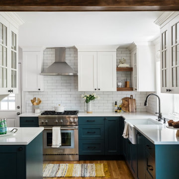
This 1940’s Colonial style home in Boston’s Jamaica Plain had strong bones and rich character but lacked the space, modern conveniences, and storage that our clients desired. While they wished to retain the look of the exterior, as well as some of the home’s unique original features,, the kitchen and dining room needed to be reimagined in design, layout, and functionality.
Key considerations were the compact size of the home and a smaller lot that didn’t give our client the flexibility of an addition. Without adding on to the existing floor plan, we needed to find a way to gain vital extra space in the kitchen, which, with walls enclosing it on all sides, was dark and disconnected from the rest of the house. Our design team coordinated with our client to reconfigure the space by opening up the wall between the dining room and the kitchen to add a few extra inches – just enough to create an open flow between the two rooms. With the removal of that wall, the formerly dark kitchen was flooded with the natural light coming from the existing dining room windows, making the entire space feel brighter and more cohesive.
The original kitchen dated back to the mid-20th century and lacked, among other conveniences, a dishwasher, enough storage, or even countertop space for food prep. In redesigning the kitchen, we visually expanded the space by incorporating white upper cabinetry, open shelving, and white subway tiles extending from the backsplash to the ceiling. A new, larger window featuring a deep stone sill brought in even more light, and the appliances and apron sink were selected to retain the traditional look of the home while delivering modern functionality.
Considering how our client would use this space, we focused on creating a purposeful workspace and storage, ensuring that there was ample countertop space and cabinetry between the sink and range. A multi-purpose cabinet and countertop which serves as a microwave station and food service area were added to the backside of the dining room wall, packing a lot of utility into a small space.
Prior to this renovation, our client had painted the dining room in Mount Saint Anne by Benjamin Moore, a tranquil blue-gray that suited the room well and allowed the original built-in corner cabinetry to stand out, highlighting the home’s charm. With the newly opened floor plan extending into the kitchen, we selected a deep custom color for the base cabinets, Yorktowne Green by Benjamin Moore, to complement the dining room and pull all of the elements together in a cohesive space.
This transformation was remarkable, both functionally and visually. The kitchen is now a bright and inviting space that flows seamlessly into the rest of the house. The homeowners are thrilled with the results, and the small changes we incorporated that made a big difference in the overall feel and functionality of the space.
 Drury Design
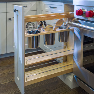
There were some druthers with the kitchen and there was a desire to make certain rooms more grown-up again. Unlike some of our clients who get rid of their formal dining rooms, this family wanted to keep theirs. They saw it as good space for entertaining and doing work – why not make it more stylish and purposeful?
THE REMODEL
Design Objectives
Keep the craftsman style of the home but make it more modern
Update the dining room to be more formal for entertaining and provide storage for china, stemware, wine, etc.
Open up the kitchen to improve flow
Incorporate new decorative lighting throughout the home to accent the home’s style
Transform the staircase into a statement piece that greets visitors – redesign it with arts & crafts details in the balusters, newel posts and handrails
Design Challenges:
Open up the dining room window for more light and a better view of the backyard. The previous window felt closed in with heavy shutters.
Improve kitchen flow without making the footprint larger
Make the entire home feel updated and cohesive while staying true to the house’s style.
THE RENEWED SPACES
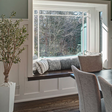
We bumped out the dining room window to make a new bay window. The glass mullion design mimics the craftsman style, setting the tone for the room while letting plenty of light in. It really opened up that end of the dining room. The view of the backyard is much bigger now, too. It’s also a great nook for playing board games, doing puzzles and playing with Legos.
We actually got rid of a walk-in pantry that had cut off a corner of the kitchen, and were able to keep all the main walls intact. The old pantry room is where the fridge is now, as well as a tall pantry cabinet, some additional cabinets and a new countertop surface. The flow is much better and it’s roomy now, with a kitchen table that’s great for informal meals, homework and kids seating when adults are entertaining in the dining room.
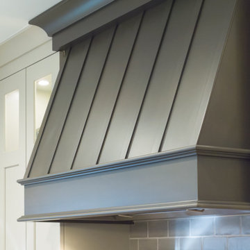
The cabinet, tile and countertop colors are still neutral but offer a more muted palette. To bring in the craftsman style, simple architectural details were added such as the hood and window valance, decorative furniture toes, a shaker door on the perimeter cabinets and a more modern cabinet door style on the island, pantry and refrigerator areas. New decorative lighting was added in the kitchen, dining room, living room, foyer and second-floor hallway to make the entire first floor feel updated. Also, the entire staircase was revamped. The existing hardwood was kept in place but stained medium brown to bring in some warmth.
“The Drury process made this project turn out better than we imagined,” one of the homeowners told us during the final photoshoot. “There were so many features we didn’t know about – like charging drawers – and ways of going about the remodel that didn’t come to us naturally. We’re so glad Alicia had so much experience and so many checklists. We got to think through everything and arrive at the best possible design for our family.”
 Drury Design
There were some druthers with the kitchen and there was a desire to make certain rooms more grown-up again. Unlike some of our clients who get rid of their formal dining rooms, this family wanted to keep theirs. They saw it as good space for entertaining and doing work – why not make it more stylish and purposeful?
THE REMODEL
Design Objectives
Keep the craftsman style of the home but make it more modern
Update the dining room to be more formal for entertaining and provide storage for china, stemware, wine, etc.
Open up the kitchen to improve flow
Incorporate new decorative lighting throughout the home to accent the home’s style
Transform the staircase into a statement piece that greets visitors – redesign it with arts & crafts details in the balusters, newel posts and handrails
Design Challenges:
Open up the dining room window for more light and a better view of the backyard. The previous window felt closed in with heavy shutters.
Improve kitchen flow without making the footprint larger
Make the entire home feel updated and cohesive while staying true to the house’s style.
THE RENEWED SPACES
We bumped out the dining room window to make a new bay window. The glass mullion design mimics the craftsman style, setting the tone for the room while letting plenty of light in. It really opened up that end of the dining room. The view of the backyard is much bigger now, too. It’s also a great nook for playing board games, doing puzzles and playing with Legos.
We actually got rid of a walk-in pantry that had cut off a corner of the kitchen, and were able to keep all the main walls intact. The old pantry room is where the fridge is now, as well as a tall pantry cabinet, some additional cabinets and a new countertop surface. The flow is much better and it’s roomy now, with a kitchen table that’s great for informal meals, homework and kids seating when adults are entertaining in the dining room.
The cabinet, tile and countertop colors are still neutral but offer a more muted palette. To bring in the craftsman style, simple architectural details were added such as the hood and window valance, decorative furniture toes, a shaker door on the perimeter cabinets and a more modern cabinet door style on the island, pantry and refrigerator areas. New decorative lighting was added in the kitchen, dining room, living room, foyer and second-floor hallway to make the entire first floor feel updated. Also, the entire staircase was revamped. The existing hardwood was kept in place but stained medium brown to bring in some warmth.
“The Drury process made this project turn out better than we imagined,” one of the homeowners told us during the final photoshoot. “There were so many features we didn’t know about – like charging drawers – and ways of going about the remodel that didn’t come to us naturally. We’re so glad Alicia had so much experience and so many checklists. We got to think through everything and arrive at the best possible design for our family.”
 TVL Creative Ltd.
This kitchen took a tired, 80’s builder kitchen and revamped it into a personalized gathering space for our wonderful client. The existing space was split up by the dated configuration of eat-in kitchen table area to one side and cramped workspace on the other. It didn’t just under-serve our client’s needs; it flat out discouraged them from using the space. Our client desired an open kitchen with a central gathering space where family and friends could connect. To open things up, we removed the half wall separating the kitchen from the dining room and the wall that blocked sight lines to the family room and created a narrow hallway to the kitchen. The old oak cabinets weren't maximizing storage and were dated and dark. We used Waypoint Living Spaces cabinets in linen white to brighten up the room. On the east wall, we created a hutch-like stack that features an appliance garage that keeps often used countertop appliance on hand but out of sight. The hutch also acts as a transition from the cooking zone to the coffee and wine area. We eliminated the north window that looked onto the entry walkway and activated this wall as storage with refrigerator enclosure and pantry. We opted to leave the east window as-is and incorporated it into the new kitchen layout by creating a window well for growing plants and herbs. The countertops are Pental Quartz in Carrara. The sleek cabinet hardware is from our friends at Amerock in a gorgeous satin champagne bronze. One of the most striking features in the space is the pattern encaustic tile from Tile Shop. The pop of blue in the backsplash adds personality and contrast to the champagne accents. The reclaimed wood cladding surrounding the large east-facing window introduces a quintessential Colorado vibe, and the natural texture balances the crisp white cabinetry and geometric patterned tile. Minimalist modern lighting fixtures from Mitzi by Hudson Valley Lighting provide task lighting over the sink and at the wine/ coffee station. The visual lightness of the sink pendants maintains the openness and visual connection between the kitchen and dining room. Together the elements make for a sophisticated yet casual vibe-- a comfortable chic kitchen. We love the way this space turned out and are so happy that our clients now have such a bright and welcoming gathering space as the heart of their home!
 Drury Design
There were some druthers with the kitchen and there was a desire to make certain rooms more grown-up again. Unlike some of our clients who get rid of their formal dining rooms, this family wanted to keep theirs. They saw it as good space for entertaining and doing work – why not make it more stylish and purposeful?
THE REMODEL
Design Objectives
Keep the craftsman style of the home but make it more modern
Update the dining room to be more formal for entertaining and provide storage for china, stemware, wine, etc.
Open up the kitchen to improve flow
Incorporate new decorative lighting throughout the home to accent the home’s style
Transform the staircase into a statement piece that greets visitors – redesign it with arts & crafts details in the balusters, newel posts and handrails
Design Challenges:
Open up the dining room window for more light and a better view of the backyard. The previous window felt closed in with heavy shutters.
Improve kitchen flow without making the footprint larger
Make the entire home feel updated and cohesive while staying true to the house’s style.
THE RENEWED SPACES
We bumped out the dining room window to make a new bay window. The glass mullion design mimics the craftsman style, setting the tone for the room while letting plenty of light in. It really opened up that end of the dining room. The view of the backyard is much bigger now, too. It’s also a great nook for playing board games, doing puzzles and playing with Legos.
We actually got rid of a walk-in pantry that had cut off a corner of the kitchen, and were able to keep all the main walls intact. The old pantry room is where the fridge is now, as well as a tall pantry cabinet, some additional cabinets and a new countertop surface. The flow is much better and it’s roomy now, with a kitchen table that’s great for informal meals, homework and kids seating when adults are entertaining in the dining room.
The cabinet, tile and countertop colors are still neutral but offer a more muted palette. To bring in the craftsman style, simple architectural details were added such as the hood and window valance, decorative furniture toes, a shaker door on the perimeter cabinets and a more modern cabinet door style on the island, pantry and refrigerator areas. New decorative lighting was added in the kitchen, dining room, living room, foyer and second-floor hallway to make the entire first floor feel updated. Also, the entire staircase was revamped. The existing hardwood was kept in place but stained medium brown to bring in some warmth.
“The Drury process made this project turn out better than we imagined,” one of the homeowners told us during the final photoshoot. “There were so many features we didn’t know about – like charging drawers – and ways of going about the remodel that didn’t come to us naturally. We’re so glad Alicia had so much experience and so many checklists. We got to think through everything and arrive at the best possible design for our family.”
22