
Search results for "Didn desire" in Home Design Ideas

 Randy Trainor
These homeowners decided to turn their ski home into a full-time home only to find that what was perfect as a vacation home, didn't function well for year-round living. In the master bathroom an unused tub was removed to make room for a larger vanity with storage. Using the same large format tiles on the floor and the walls provide the desired spa-like feel to the space. Floor to ceiling cabinets provide loads of storage for this kosher kitchen. Two dishwashers, two utensil drawers, a divided sink and two ovens are also included so that meat and dairy could be kept separated.

 Nancy Finneson | DeMane Design
The owners of this remodel desired a refreshing new master bathroom. The original layout was poorly designed with minimal storage, a small shower, a rarely used bathtub and a water closet that was difficult to access. The old vanity flanked a curved wall of glass block (the main challenge with this space) which didn’t allow for mirrors and was always cluttered because of limited storage.
With smart space planning and attention to detail this well-appointed bathroom is now a uniquely personal space that functions brilliantly and balanced for the homeowners.
Photo: DeMane Design

 TVL Creative Ltd.
This kitchen took a tired, 80’s builder kitchen and revamped it into a personalized gathering space for our wonderful client. The existing space was split up by the dated configuration of eat-in kitchen table area to one side and cramped workspace on the other. It didn’t just under-serve our client’s needs; it flat out discouraged them from using the space. Our client desired an open kitchen with a central gathering space where family and friends could connect. To open things up, we removed the half wall separating the kitchen from the dining room and the wall that blocked sight lines to the family room and created a narrow hallway to the kitchen. The old oak cabinets weren't maximizing storage and were dated and dark. We used Waypoint Living Spaces cabinets in linen white to brighten up the room. On the east wall, we created a hutch-like stack that features an appliance garage that keeps often used countertop appliance on hand but out of sight. The hutch also acts as a transition from the cooking zone to the coffee and wine area. We eliminated the north window that looked onto the entry walkway and activated this wall as storage with refrigerator enclosure and pantry. We opted to leave the east window as-is and incorporated it into the new kitchen layout by creating a window well for growing plants and herbs. The countertops are Pental Quartz in Carrara. The sleek cabinet hardware is from our friends at Amerock in a gorgeous satin champagne bronze. One of the most striking features in the space is the pattern encaustic tile from Tile Shop. The pop of blue in the backsplash adds personality and contrast to the champagne accents. The reclaimed wood cladding surrounding the large east-facing window introduces a quintessential Colorado vibe, and the natural texture balances the crisp white cabinetry and geometric patterned tile. Minimalist modern lighting fixtures from Mitzi by Hudson Valley Lighting provide task lighting over the sink and at the wine/ coffee station. The visual lightness of the sink pendants maintains the openness and visual connection between the kitchen and dining room. Together the elements make for a sophisticated yet casual vibe-- a comfortable chic kitchen. We love the way this space turned out and are so happy that our clients now have such a bright and welcoming gathering space as the heart of their home!
Find the right local pro for your project
 Nancy Finneson | DeMane Design
The owners of this remodel desired a refreshing new master bathroom. The original layout was poorly designed with minimal storage, a small shower, a rarely used bathtub and a water closet that was difficult to access. The old vanity flanked a curved wall of glass block (the main challenge with this space) which didn’t allow for mirrors and was always cluttered because of limited storage.
With smart space planning and attention to detail this well-appointed bathroom is now a uniquely personal space that functions brilliantly and balanced for the homeowners.
Photo: DeMane Design

 Compass Outdoor Design
These clients spent the majority of their time outside and entertained frequently, but their existing patio space didn't allow for larger gatherings.
We added nearly 500 square feet to the already 225 square feet existing to create this expansive outdoor living room. The outdoor fireplace is see-thru and can fully convert to wood burning should the clients desire. Beyond the fireplace is a spa built in on two sides with a composite deck, LED step lighting, and outdoor rated TV, and additional counter space.
The outdoor grilling area mimics the interior of the clients home with a kitchen island and space for dining.
Heaters were added in ceiling and mounted to walls to create additional heat sources.
To capture the best lighting, our clients enhanced their space with lighting in the overhangs, underneath the benches adjacent the fireplace, and recessed cans throughout.
Audio/Visual details include an outdoor rated TV by the spa, Sonos surround sound in the main sitting area, the grilling area, and another landscape zone by the spa.
The lighting and audio/visual in this project is also fully automated.
To bring their existing area and new area together for ultimate entertaining, the clients remodeled their exterior breakfast room wall by removing three windows and adding an accordion door with a custom retractable screen to keep bugs out of the home.
For landscape, the existing sod was removed and synthetic turf installed around the entirety of the backyard area along with a small putting green.
Selections:
Flooring - 2cm porcelain paver
Kitchen/island: Fascia is ipe. Counters are 3cm quartzite
Dry Bar: Fascia is stacked stone panels. Counter is 3cm granite.
Ceiling: Painted tongue and groove pine with decorative stained cedar beams.
Additional Paint: Exterior beams painted accent color (do not match existing house colors)
Roof: Slate Tile
Benches: Tile back, stone (bullnose edge) seat and cap
 McAdams Remodeling & Design
Lee & James wanted to update to their primary bathroom and ensuite closet. It was a small space that had a few pain points. The closet footprint was minimal and didn’t allow for sufficient organization of their wardrobe, a daily struggle for the couple. In addition, their ensuite bathroom had a shower that was petite, and the door from the bedroom was glass paned so it didn’t provide privacy. Also, the room had no bathtub – something they had desired for the ten years they’d lived in the home. The bedroom had an indent that took up much of one wall with a large wardrobe inside. Nice, but it didn’t take the place of a robust closet.
The McAdams team helped the clients create a design that extended the already cantilevered area where the primary bathroom sat to give the room a little more square footage, which allowed us to include all the items the couple desired. The indent and wardrobe in the primary bedroom wall were removed so that the interior of the wall could be incorporated as additional closet space. New sconces were placed on either side of the bed, and a ceiling fan was added overhead for ultimate comfort on warm summer evenings.
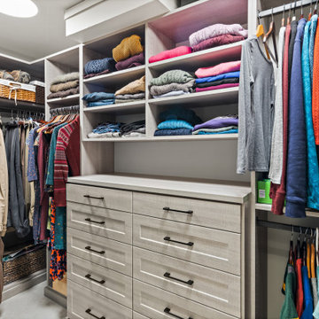
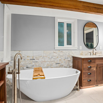
The former closet area was repurposed to create the couple’s new and improved (and now much larger) shower. Beautiful Bianco St. Croix tile was installed on the walls and floor of the shower and a frameless glass door highlighting the fabulous Brizo rainshower head and Delta adjustable handheld showerhead all combine to provide the ultimate showering experience. A gorgeous walnut vanity with a Calacutta Gold Honed Marble slab top (that coordinates with the kitchen) replaced the old cabinet. A matte black Pottery Barn Vintage Pill Shaped Mirror was placed above the undermount sink, while a striking LED pendant serves as the main light source. The newly added square footage allows for a Victoria and Albert stand-alone soaking tub with an adjacent towel warmer, all of which almost makes you forget you’re in a home and not a high-end spa. Finally, just past the new Toto toilet with bidet, the couple got their new, large walk-in closet with customized storage solutions for their individual needs. The transformation absolutely helped Lee and James love their home again!
 McAdams Remodeling & Design
Lee & James wanted to update to their primary bathroom and ensuite closet. It was a small space that had a few pain points. The closet footprint was minimal and didn’t allow for sufficient organization of their wardrobe, a daily struggle for the couple. In addition, their ensuite bathroom had a shower that was petite, and the door from the bedroom was glass paned so it didn’t provide privacy. Also, the room had no bathtub – something they had desired for the ten years they’d lived in the home. The bedroom had an indent that took up much of one wall with a large wardrobe inside. Nice, but it didn’t take the place of a robust closet.
The McAdams team helped the clients create a design that extended the already cantilevered area where the primary bathroom sat to give the room a little more square footage, which allowed us to include all the items the couple desired. The indent and wardrobe in the primary bedroom wall were removed so that the interior of the wall could be incorporated as additional closet space. New sconces were placed on either side of the bed, and a ceiling fan was added overhead for ultimate comfort on warm summer evenings.
The former closet area was repurposed to create the couple’s new and improved (and now much larger) shower. Beautiful Bianco St. Croix tile was installed on the walls and floor of the shower and a frameless glass door highlighting the fabulous Brizo rainshower head and Delta adjustable handheld showerhead all combine to provide the ultimate showering experience. A gorgeous walnut vanity with a Calacutta Gold Honed Marble slab top (that coordinates with the kitchen) replaced the old cabinet. A matte black Pottery Barn Vintage Pill Shaped Mirror was placed above the undermount sink, while a striking LED pendant serves as the main light source. The newly added square footage allows for a Victoria and Albert stand-alone soaking tub with an adjacent towel warmer, all of which almost makes you forget you’re in a home and not a high-end spa. Finally, just past the new Toto toilet with bidet, the couple got their new, large walk-in closet with customized storage solutions for their individual needs. The transformation absolutely helped Lee and James love their home again!

 Architectural Resource LLC
Our Clients, the proud owners of a landmark 1860’s era Italianate home, desired to greatly improve their daily ingress and egress experience. With a growing young family, the lack of a proper entry area and attached garage was something they wanted to address. They also needed a guest suite to accommodate frequent out-of-town guests and visitors. But in the homeowner’s own words, “He didn’t want to be known as the guy who ‘screwed up’ this beautiful old home”. Our design challenge was to provide the needed space of a significant addition, but do so in a manner that would respect the historic home. Our design solution lay in providing a “hyphen”: a multi-functional daily entry breezeway connector linking the main house with a new garage and in-law suite above.
 Nancy Finneson | DeMane Design
The owners of this remodel desired a refreshing new master bathroom. The original layout was poorly designed with minimal storage, a small shower, a rarely used bathtub and a water closet that was difficult to access. The old vanity flanked a curved wall of glass block (the main challenge with this space) which didn’t allow for mirrors and was always cluttered because of limited storage.
With smart space planning and attention to detail this well-appointed bathroom is now a uniquely personal space that functions brilliantly and balanced for the homeowners.
Photo: DeMane Design

 Advance Design Studio, Ltd.
Mike and Stacy moved to the country to be around the rolling landscape and feed the birds outside their Hampshire country home. After living in the home for over ten years, they knew exactly what they wanted to renovate their 1980’s two story once their children moved out. It all started with the desire to open up the floor plan, eliminating constricting walls around the dining room and the eating area that they didn’t plan to use once they had access to what used to be a formal dining room.
They wanted to enhance the already warm country feel their home already had, with some warm hickory cabinets and casual granite counter tops. When removing the pantry and closet between the kitchen and the laundry room, the new design now just flows from the kitchen directly into the smartly appointed laundry area and adjacent powder room.
The new eat in kitchen bar is frequented by guests and grand-children, and the original dining table area can be accessed on a daily basis in the new open space. One instant sensation experienced by anyone entering the front door is the bright light that now transpires from the front of the house clear through the back; making the entire first floor feel free flowing and inviting.
Photo Credits- Joe Nowak
 Randy Trainor
These homeowners decided to turn their ski home into a full-time home only to find that what was perfect as a vacation home, didn't function well for year-round living. In the master bathroom an unused tub was removed to make room for a larger vanity with storage. Using the same large format tiles on the floor and the walls provide the desired spa-like feel to the space. Floor to ceiling cabinets provide loads of storage for this kosher kitchen. Two dishwashers, two utensil drawers, a divided sink and two ovens are also included so that meat and dairy could be kept separated.

 Adam Gibson Design
The clients desired a modern, open-concept space to enjoy with their young family. The old kitchen was cramped and very dark. Since I love an infusion of natural light, in addition to removing the wall between the kitchen and dining room, it was a no-brainer to install a couple of Solatube tubular skylights, which magnify light more than conventional skylights. But we didn't want to discard some of the home's unique charms. The gorgeous art-deco glass tile backsplash was salvaged, and the curves where walls meet ceilings were delicately preserved. One of the clients, a gifted carpenter, milled the old-growth studs from the demolished wall and applied them as treatment to the back side of the island. The use of soapstone on the sink wall adds a touch of charm.
Photography by Adam Gibson

 Jonathan Miller Architects
Living room - craftsman open concept dark wood floor and brown floor living room idea with beige walls, a standard fireplace, a stone fireplace and a wall-mounted tv

 Lindsey Markel
An awkward island that housed the cooktop initiated this remodel. The homeowners live on a lake and love to entertain and cook. Their small outdated kitchen didn't give them the space they desired. There was a door wall to the existing deck that forced their kitchen to have an odd layout. Changing the door wall to a large window allowed us to rearrange the sink and appliances to give them the utmost function. This created a great working triangle with added counter space. The modern style in the kitchen flows right into the existing spaces of the home.
Photo By: Lindsey Neumann
 Adam Gibson Design
The clients desired a modern, open-concept space to enjoy with their young family. The old kitchen was cramped and very dark. Since I love an infusion of natural light, in addition to removing the wall between the kitchen and dining room, it was a no-brainer to install a couple of Solatube tubular skylights, which magnify light more than conventional skylights. But we didn't want to discard some of the home's unique charms. The gorgeous art-deco glass tile backsplash was salvaged, and the curves where walls meet ceilings were delicately preserved. One of the clients, a gifted carpenter, milled the old-growth studs from the demolished wall and applied them as treatment to the back side of the island. The use of soapstone on the sink wall adds a touch of charm.
Photography by Adam Gibson
 Adam Gibson Design
The clients desired a modern, open-concept space to enjoy with their young family. The old kitchen was cramped and very dark. Since I love an infusion of natural light, in addition to removing the wall between the kitchen and dining room, it was a no-brainer to install a couple of Solatube tubular skylights, which magnify light more than conventional skylights. But we didn't want to discard some of the home's unique charms. The gorgeous art-deco glass tile backsplash was salvaged, and the curves where walls meet ceilings were delicately preserved. One of the clients, a gifted carpenter, milled the old-growth studs from the demolished wall and applied them as treatment to the back side of the island. The use of soapstone on the sink wall adds a touch of charm.
Photography by Adam Gibson
 French Creek Designs Kitchen & Bath Design Center
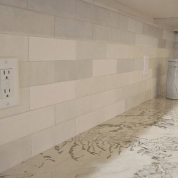
Subtle Kitchen Tile Designs was the purpose for this client. Client came into French Creek Designs Showroom looking for a nice accent for her kitchen, she didn’t want anything to bold just to add a little something. She fell in love with the white subway tile Cloe. Each tile was a different shade of white tying into her countertops and white cabinets. Just enough texture and variance in color to achieve her desired look. Soon to be finished with adding shelves just above her sink for easy access to necessities and beautiful accents. In addition, client chose metal trim to complete the edges of their tile design beautifully.
 Randy Trainor
These homeowners decided to turn their ski home into a full-time home only to find that what was perfect as a vacation home, didn't function well for year-round living. In the master bathroom an unused tub was removed to make room for a larger vanity with storage. Using the same large format tiles on the floor and the walls provide the desired spa-like feel to the space. Floor to ceiling cabinets provide loads of storage for this kosher kitchen. Two dishwashers, two utensil drawers, a divided sink and two ovens are also included so that meat and dairy could be kept separated.
 French Creek Designs Kitchen & Bath Design Center
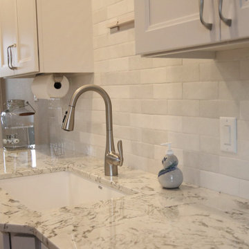
Subtle Kitchen Tile Designs was the purpose for this client. Client came into French Creek Designs Showroom looking for a nice accent for her kitchen, she didn’t want anything to bold just to add a little something. She fell in love with the white subway tile Cloe. Each tile was a different shade of white tying into her countertops and white cabinets. Just enough texture and variance in color to achieve her desired look. Soon to be finished with adding shelves just above her sink for easy access to necessities and beautiful accents. In addition, client chose metal trim to complete the edges of their tile design beautifully.
 Adam Gibson Design
The clients desired a modern, open-concept space to enjoy with their young family. The old kitchen was cramped and very dark. Since I love an infusion of natural light, in addition to removing the wall between the kitchen and dining room, it was a no-brainer to install a couple of Solatube tubular skylights, which magnify light more than conventional skylights. But we didn't want to discard some of the home's unique charms. The gorgeous art-deco glass tile backsplash was salvaged, and the curves where walls meet ceilings were delicately preserved. One of the clients, a gifted carpenter, milled the old-growth studs from the demolished wall and applied them as treatment to the back side of the island. The use of soapstone on the sink wall adds a touch of charm.
Photography by Adam Gibson
6