
Search results for "Didn expect" in Home Design Ideas
 Woodsmith Construction Inc
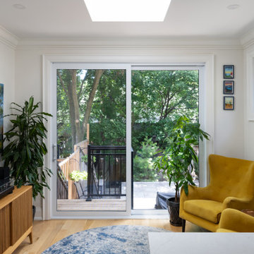
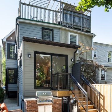
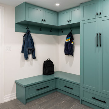
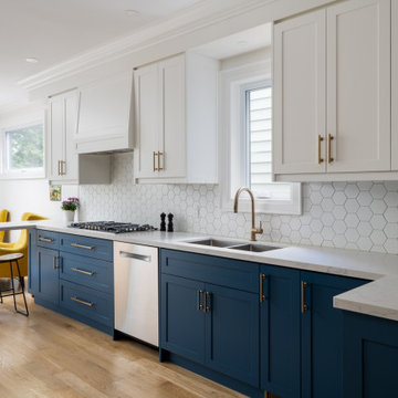
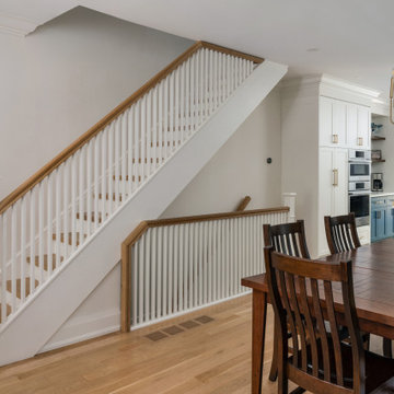
Transforming a classic Riverdale semi-detached home requires more than just good design—it demands precision, strategy, and a respect for how these older Toronto homes were originally built. This renovation on Withrow Ave came with all the challenges you’d expect from working in the city: restricted access for equipment, tight parking conditions, and trades working inches away from neighbouring homes. The homeowners didn’t want a cosmetic update—they wanted a home that felt brighter, more open, and easier to live in day-to-day. Achieving that meant removing structural walls, installing engineered beams, and pulling as much natural light through the space as possible. At the same time, they envisioned a new basement walkout that would change how they used the lower level, making it a real part of their everyday routine instead of a dark, overlooked space. The transformation is dramatic. The ground floor now feels like an entirely different home, with clean sightlines and a sense of openness that didn’t exist before. Light moves through the space naturally, and the new layout finally matches how a modern Toronto family wants to live. The basement walkout has become a functional everyday entry point—perfect for dropping off gear, coming and going effortlessly, and accessing ample storage space. This project is proof that even the most traditional Toronto semi can be completely reimagined when design and construction work hand in hand with purpose.
 Woodsmith Construction Inc
Transforming a classic Riverdale semi-detached home requires more than just good design—it demands precision, strategy, and a respect for how these older Toronto homes were originally built. This renovation on Withrow Ave came with all the challenges you’d expect from working in the city: restricted access for equipment, tight parking conditions, and trades working inches away from neighbouring homes. The homeowners didn’t want a cosmetic update—they wanted a home that felt brighter, more open, and easier to live in day-to-day. Achieving that meant removing structural walls, installing engineered beams, and pulling as much natural light through the space as possible. At the same time, they envisioned a new basement walkout that would change how they used the lower level, making it a real part of their everyday routine instead of a dark, overlooked space. The transformation is dramatic. The ground floor now feels like an entirely different home, with clean sightlines and a sense of openness that didn’t exist before. Light moves through the space naturally, and the new layout finally matches how a modern Toronto family wants to live. The basement walkout has become a functional everyday entry point—perfect for dropping off gear, coming and going effortlessly, and accessing ample storage space. This project is proof that even the most traditional Toronto semi can be completely reimagined when design and construction work hand in hand with purpose.
 Woodsmith Construction Inc
Transforming a classic Riverdale semi-detached home requires more than just good design—it demands precision, strategy, and a respect for how these older Toronto homes were originally built. This renovation on Withrow Ave came with all the challenges you’d expect from working in the city: restricted access for equipment, tight parking conditions, and trades working inches away from neighbouring homes. The homeowners didn’t want a cosmetic update—they wanted a home that felt brighter, more open, and easier to live in day-to-day. Achieving that meant removing structural walls, installing engineered beams, and pulling as much natural light through the space as possible. At the same time, they envisioned a new basement walkout that would change how they used the lower level, making it a real part of their everyday routine instead of a dark, overlooked space. The transformation is dramatic. The ground floor now feels like an entirely different home, with clean sightlines and a sense of openness that didn’t exist before. Light moves through the space naturally, and the new layout finally matches how a modern Toronto family wants to live. The basement walkout has become a functional everyday entry point—perfect for dropping off gear, coming and going effortlessly, and accessing ample storage space. This project is proof that even the most traditional Toronto semi can be completely reimagined when design and construction work hand in hand with purpose.
Find the right local pro for your project
 Woodsmith Construction Inc
Transforming a classic Riverdale semi-detached home requires more than just good design—it demands precision, strategy, and a respect for how these older Toronto homes were originally built. This renovation on Withrow Ave came with all the challenges you’d expect from working in the city: restricted access for equipment, tight parking conditions, and trades working inches away from neighbouring homes. The homeowners didn’t want a cosmetic update—they wanted a home that felt brighter, more open, and easier to live in day-to-day. Achieving that meant removing structural walls, installing engineered beams, and pulling as much natural light through the space as possible. At the same time, they envisioned a new basement walkout that would change how they used the lower level, making it a real part of their everyday routine instead of a dark, overlooked space. The transformation is dramatic. The ground floor now feels like an entirely different home, with clean sightlines and a sense of openness that didn’t exist before. Light moves through the space naturally, and the new layout finally matches how a modern Toronto family wants to live. The basement walkout has become a functional everyday entry point—perfect for dropping off gear, coming and going effortlessly, and accessing ample storage space. This project is proof that even the most traditional Toronto semi can be completely reimagined when design and construction work hand in hand with purpose.
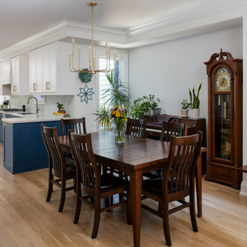 Woodsmith Construction Inc
Transforming a classic Riverdale semi-detached home requires more than just good design—it demands precision, strategy, and a respect for how these older Toronto homes were originally built. This renovation on Withrow Ave came with all the challenges you’d expect from working in the city: restricted access for equipment, tight parking conditions, and trades working inches away from neighbouring homes. The homeowners didn’t want a cosmetic update—they wanted a home that felt brighter, more open, and easier to live in day-to-day. Achieving that meant removing structural walls, installing engineered beams, and pulling as much natural light through the space as possible. At the same time, they envisioned a new basement walkout that would change how they used the lower level, making it a real part of their everyday routine instead of a dark, overlooked space. The transformation is dramatic. The ground floor now feels like an entirely different home, with clean sightlines and a sense of openness that didn’t exist before. Light moves through the space naturally, and the new layout finally matches how a modern Toronto family wants to live. The basement walkout has become a functional everyday entry point—perfect for dropping off gear, coming and going effortlessly, and accessing ample storage space. This project is proof that even the most traditional Toronto semi can be completely reimagined when design and construction work hand in hand with purpose.
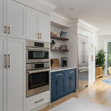 Woodsmith Construction Inc
Transforming a classic Riverdale semi-detached home requires more than just good design—it demands precision, strategy, and a respect for how these older Toronto homes were originally built. This renovation on Withrow Ave came with all the challenges you’d expect from working in the city: restricted access for equipment, tight parking conditions, and trades working inches away from neighbouring homes. The homeowners didn’t want a cosmetic update—they wanted a home that felt brighter, more open, and easier to live in day-to-day. Achieving that meant removing structural walls, installing engineered beams, and pulling as much natural light through the space as possible. At the same time, they envisioned a new basement walkout that would change how they used the lower level, making it a real part of their everyday routine instead of a dark, overlooked space. The transformation is dramatic. The ground floor now feels like an entirely different home, with clean sightlines and a sense of openness that didn’t exist before. Light moves through the space naturally, and the new layout finally matches how a modern Toronto family wants to live. The basement walkout has become a functional everyday entry point—perfect for dropping off gear, coming and going effortlessly, and accessing ample storage space. This project is proof that even the most traditional Toronto semi can be completely reimagined when design and construction work hand in hand with purpose.
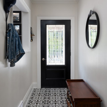 Woodsmith Construction Inc
Transforming a classic Riverdale semi-detached home requires more than just good design—it demands precision, strategy, and a respect for how these older Toronto homes were originally built. This renovation on Withrow Ave came with all the challenges you’d expect from working in the city: restricted access for equipment, tight parking conditions, and trades working inches away from neighbouring homes. The homeowners didn’t want a cosmetic update—they wanted a home that felt brighter, more open, and easier to live in day-to-day. Achieving that meant removing structural walls, installing engineered beams, and pulling as much natural light through the space as possible. At the same time, they envisioned a new basement walkout that would change how they used the lower level, making it a real part of their everyday routine instead of a dark, overlooked space. The transformation is dramatic. The ground floor now feels like an entirely different home, with clean sightlines and a sense of openness that didn’t exist before. Light moves through the space naturally, and the new layout finally matches how a modern Toronto family wants to live. The basement walkout has become a functional everyday entry point—perfect for dropping off gear, coming and going effortlessly, and accessing ample storage space. This project is proof that even the most traditional Toronto semi can be completely reimagined when design and construction work hand in hand with purpose.
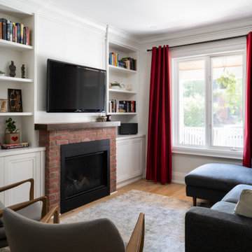 Woodsmith Construction Inc
Transforming a classic Riverdale semi-detached home requires more than just good design—it demands precision, strategy, and a respect for how these older Toronto homes were originally built. This renovation on Withrow Ave came with all the challenges you’d expect from working in the city: restricted access for equipment, tight parking conditions, and trades working inches away from neighbouring homes. The homeowners didn’t want a cosmetic update—they wanted a home that felt brighter, more open, and easier to live in day-to-day. Achieving that meant removing structural walls, installing engineered beams, and pulling as much natural light through the space as possible. At the same time, they envisioned a new basement walkout that would change how they used the lower level, making it a real part of their everyday routine instead of a dark, overlooked space. The transformation is dramatic. The ground floor now feels like an entirely different home, with clean sightlines and a sense of openness that didn’t exist before. Light moves through the space naturally, and the new layout finally matches how a modern Toronto family wants to live. The basement walkout has become a functional everyday entry point—perfect for dropping off gear, coming and going effortlessly, and accessing ample storage space. This project is proof that even the most traditional Toronto semi can be completely reimagined when design and construction work hand in hand with purpose.
 Woodsmith Construction Inc
Transforming a classic Riverdale semi-detached home requires more than just good design—it demands precision, strategy, and a respect for how these older Toronto homes were originally built. This renovation on Withrow Ave came with all the challenges you’d expect from working in the city: restricted access for equipment, tight parking conditions, and trades working inches away from neighbouring homes. The homeowners didn’t want a cosmetic update—they wanted a home that felt brighter, more open, and easier to live in day-to-day. Achieving that meant removing structural walls, installing engineered beams, and pulling as much natural light through the space as possible. At the same time, they envisioned a new basement walkout that would change how they used the lower level, making it a real part of their everyday routine instead of a dark, overlooked space. The transformation is dramatic. The ground floor now feels like an entirely different home, with clean sightlines and a sense of openness that didn’t exist before. Light moves through the space naturally, and the new layout finally matches how a modern Toronto family wants to live. The basement walkout has become a functional everyday entry point—perfect for dropping off gear, coming and going effortlessly, and accessing ample storage space. This project is proof that even the most traditional Toronto semi can be completely reimagined when design and construction work hand in hand with purpose.
 STEFANI STEIN
Tessa Neustadt
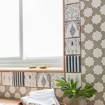
Home design - mid-sized eclectic dark wood floor home design idea in Los Angeles with shaker cabinets, gray cabinets, wood countertops, white walls and a stacked washer/dryer
Home design - mid-sized eclectic dark wood floor home design idea in Los Angeles with shaker cabinets, gray cabinets, wood countertops, white walls and a stacked washer/dryer

 User
UserThis amazing über contemporary loft space is located in the heart of the very trendy and oh so upscale Yonge and Eglinton district.
This loft oozes style and epitomizes the uptown lifestyle. It's raw industrial look really resonates with the uptown crowd.
The polished concrete floors, exposed sprinklers. ductwork and huge 9ft barn doors all helped to set the stage.
There was only one problem......it didn't sell!
We were called in by the Realtor to give this loft and urban trendy vibe.
We encouraged the clients to repaint utilizing a more current, trending palette. We choose a pallet of several grey tones.
Our list of suggested updates included, switching out the light fixtures, replacing old worn carpeting with a Berber and staging utilizing key pieces one would expect with the loft look. We brought in contemporary furnishings and decor pieces including a live edge coffee table and a cowhide rug. All of these updates translated to SOLD within weeks of staging! Another successful transformation.

 Advance Design Studio, Ltd.
Jennifer and Dan have lived in their Deer Park Illinois home for 15 years, slowly making minor fixes like painting and decorating; but they had a new plan for their kitchen the entire time. An awkwardly placed garage door, and an island cooktop with a terrible downdraft made a full-scale kitchen remodel an absolute must. Jennifer had many ideas in mind and wanted to work with a company that could provide high-end work, while partnering with a designer that would tailor the kitchen to her ideas.
She was intrigued by the phrase “Common Sense Remodeling” in Advance Design’s feature she discovered while perusing an issue of the community’s Quintessential Barrington Magazine. Doing further research on the company’s website, as she looked through project profiles and read about Advance Design’s “Common Sense Remodeling” philosophy, she promptly scheduled an appointment to see if the people and ideas she read about were truly who they said they were. The more she read, the more she knew that the “Common Sense” approach to remodeling they described was exactly the type of company she was looking for.
The partnership was sealed after an initial consultation with Owner Todd Jurs and Project Designer Michelle Lecinski. They displayed a combination of friendliness, professionalism and respect that was unmatched by any of the other companies Jennifer talked to. She knew that with Advance Design, she would be able to retain the vision that she had in mind with high-quality craftsmanship.
“I reached out to Advance Design because of the ‘Common Sense Remodeling’ tagline,” Jennifer said. “That’s what lingered for me”. “Advance Design was the most respectful- of the house and of my design ideas, and the most professional of the handful of companies that looked at my project”.
Soon after the meeting Jennifer began working with Michelle on the project design. They quickly developed chemistry. Jennifer loved how Michelle researched and located every detail that Jennifer wanted for the kitchen. Between the two of them, every concept and idea was worked through and perfected. “Jennifer had definite ideas about what she wanted the new kitchen to look like, she just didn’t know how to bring it all together. We worked together really well to make her ideas into the practical reality necessary for a well-functioning kitchen, with the look and feel that she had envisioned”, says Michelle.
“Michelle was wonderful in using the CAD system she would show me new drawings every time we changed the layout while working through the design,” Jennifer said. “She was a really wonderful partner in execution, she made sure everything happened quickly and easily.”
The finished design drew out elements of Jennifer’s style and personality. The pair call the look “sophisticated farmhouse” to describe the kitchen renovation to family and friends. The result was a beautifully crafted, authentic-feeling space that satisfied Jennifer’s dreams 15 years in the making. The whole project consisted of a kitchen remodel, mudroom upgrade with powder room, and garage entry relocation. “The projects I personally like the best, are the ones that put the client’s dreams on display,” Project Designer Michelle said. “And this is one of those projects.”
The main focal point of the kitchen is custom zinc and brass ventilation hood with a vintage sheen, which was hand made to order by a small company in Indiana named Vogler Metalworking. “It’s like sculpture, a true work of art”, says Jennifer. Your eye is immediately drawn towards this elegant yet practical hood that eliminated the home’s downdraft problem and added a striking conversation piece at the same time. The carpenters had to use special gloves when transporting and installing it, so they didn’t smudge it with fingerprints. The beautiful hood centers proudly over the stunning black enamel and brass LaCornue Range. “I had a friend who had a LaCornue range and after learning how easy it was to cook perfect meals, I was convinced I wanted to have one”, says Jennifer. This unique, breathtaking combination anchors the entire kitchen and is apparent immediately as you walk into the great room the surrounds the space.
DuraSupreme Crestwood cabinets with a Kendall Panel add function and sophistication. A custom gray paint color paired with a storm blue was developed so that the new kitchen looked like it belonged to the existing space. Unlacquered brass faucets and hardware were important to Jennifer because she wanted the living finishes to age over time. Remarkable brass diamond mesh cabinet door inserts imported from the UK continue to add this one-of-a-kind kitchen renovation; giving it a “you won’t see this everywhere” quality. The use of old railcar flooring for the coffee bar countertop and reclaimed oak for the open shelving gives an authenticity to the space uncommon in kitchens today.
Jennifer and Michelle fell in love with the Limestone Grey Stone while they were investigating unique island countertop ideas. They liked the fact that the limestone as a living finish will age and change over time. Calcutta Miel Quartz countertops made for an excellent pairing around the perimeter, as it’s durable and perfect for cooking preparations. A textured white subway tile backsplash that runs to the ceiling keeps your eye moving towards the open shelving, and to the main focal point of the stunning range hood combination.
“The kitchen functions beautifully, and it’s gorgeous,” beams Jennifer as she gestures with both hands while smiling ear to ear. “The most important thing was I wanted a kitchen that had a wonderful flow, cooked beautiful meals and was a great gathering place for family and friends, and this space does that perfectly! Beauty wise, it turned out exactly how I had envisioned. I felt the function part was the hardest part, and that was nailed”!
Relocating the garage entry to the new mudroom was a huge priority and has finally separated the family’s arriving home functions from their kitchen. Now coats and shoes and bags have their own area for dropping once members arrive home. Matching gray DuraSupreme cabinetry helped create gorgeous, purposeful lockers for the family. A reclaimed vintage sink and custom wall paper were added to the tiny powder room to beautify the once previously only functional space. Advance Design was even able to create a custom space for their dog to sleep while the family is away.
“It was unbelievable that a project of this size was completed in such a short time, and I think that’s because of the large amount of planning and preparation that went into it,” Jennifer marveled, “When we started, we were ready, and everything was prepared”.
When it came to execution, Project Manager Justin Davis and his crew were quick, accessible, and organized. Projects like this kitchen are typically completed in as little as 8-10 weeks. Jennifer’s kitchen however despite the relocation of some challenging HVAC in a soffit and moving of an exterior door was completed remarkably fast in part because the team was working with an existing tile floor that ran throughout the first floor that the client really loved.
“You get to know these people really well because they’re living in your house while you’re living in your house. They were so fast and really good, it didn’t take as long as even planned” reported Jennifer. “I would text Justin and he always responded almost immediately. I got to know all the guys who were working in our house and they were all wonderful people”.
Details in a customized kitchen like this one require skill and care from the people who install it. “All the guys on the job were skilled at what the did. I wanted small details like little feet to look like furniture, that is where their carpentry skill came in to make these all perfect”, said Jennifer. “The tile guys were wonderful. They even let me determine how I wanted the texture with the grout to appear for a salt and pepper look; now that is a very skilled trade person making it custom”.
In Jennifer’s interview, she continued to reference Advance Design’s “Common Sense Remodeling”, so I took a minute to ask her exactly what that phrase meant to her and how it played out in her experience with her project and the Advance Design team. Here is what she said: “I was intrigued about Common Sense Remodeling and in my head that there would be clear costs and prices, great communication between the design team, the execution team and me”, said Jennifer. They did deliver on that, it was so clear about the cost breakdown, what I could expect from everyone who came to my house, and everything that we had ordered. That to me is the Common Sense”!
It’s great to see a client take literally our assertion that a well-planned remodeling project is simply “Common Sense”! She anticipated each step of the way would be clear, concise, and predictable, all the while protecting the outcome due to the careful upfront planning. “Advance Design delivered on their ‘Common Sense Remodeling’ promise,” Jennifer said. “From the design team, to the execution team - everything was straight forward like I imagined. The project turned out exactly how I envisioned, I enjoyed this process and absolutely would recommend Advance Design Studio to anyone.”
 O'Hanlon Kitchen & Bath
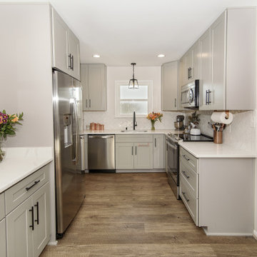
Nothing says "I love you" more than a kitchen renovation! These homeowners decided to celebrate their nuptials in the best possible way- with a new kitchen! We love how elegant the space is with the Pewter finish by Wolf Cabinetry, the classic white quartz, and herringbone tile backsplash. We wish you many years of beautiful memories- enjoy!
Cabinets: Wolf Classic Dartmouth 5 piece in Pewter.
Countertop: Calacatta Verona Q Stone
Backsplash: Herringbone- Emma White 3X6 Subway
Flooring: Mannington Vinyl plank- AduraMax Lakeview/Treeline MAX093
Additional project notes: Wolf soft close rollout, double trash pullout, wire tray divider
Thoughts from the customers:
1. What were you looking for in your remodel?
We were looking to completely redo the space. We knew we needed a new layout to accommodate the need for more storage, but also to update the extremely outdated cabinets, flooring, etc. to bring it out of 1960 and into 2020.
2. What do you love most about your remodel?
I obviously love that everything is brand new. My favorite physical feature is definitely the new backsplash and countertops that we chose! I also have never had soft close drawers so those are spectacular!
3. What was your main concern when deciding on a remodeling company?
We really just didn’t want it to take a long time! We were at home during the whole thing because of the pandemic, so it was not realistic to live without a kitchen for months.
4. What made you choose O’Hanlon Kitchens? Would you recommend O’Hanlon Kitchens?
Tracy was a great designer, and we ultimately went with O’Hanlon because she discovered some details about the kitchen and it’s functional space that others overlooked and even we didn’t notice. She was then able to render a very nice drawing of what we could expect our kitchen to look like, which was helpful. Yes, I would recommend O’Hanlon!
Photos & Video: Julia Transue
www.facebook.com/ThePhotoHouse.Art
www.thephotohouse.net
thephotohouse@comcast.net
 Simply Home Decorating
This beautiful North Vancouver home belongs to a nature-loving and health-conscious couple, Emma and Vince (names changed), their two young children, and their dog, Jasper. When they contacted us about renovating and furnishing their kitchen and family room, we walked in and saw a world of potential waiting to be uncovered.
Before: Larkhall Crescent Home:
Like many original North Vancouver homes, the interior was definitely dated. We encountered late ‘80s finishes in powder pink and teal green, old carpet, and a kitchen that wasn’t maximized to suit this family’s modern-day lifestyle. However, the size of the rooms offered us a ton of space with which to get creative.
Knowing our clients’ love of cooking, need for work spaces (Emma and Vince both work remotely), and growing family, we developed a design concept that would increase usable space, optimize storage, and create intimacy in this large area. As for the style, we were inspired by their European roots, inventing a new and modern take on “Belgian Farmhouse” style. Now, the home is truly one-of-a-kind.
After: Warm & Cozy Family Room:
Fresh, bright, and comfortable, this living area has been transformed! We started with the fireplace as a focal point, selecting aged brick tiles for added texture and a crisp wood mantle. The taupe-coloured sectional infuses the room with visual warmth and serves the added purpose of separating the family room from the kitchen.
Emma and Vince were also keen on using non-toxic materials in their home, and we were happy to oblige. To meet their needs, we sourced natural wood elements and sought out Canadian-made products - that adhere to high health standards - whenever possible.
Look closer at the elements of this space, and you will find this stunning, honeycomb-patterned rug in earthy gold, beige, and charcoal tones. It’s plush to the touch and full of visual texture that brings this room’s colour palette together. We sourced these two-tone chairs with caning, petrified wood side table, black sconces, and botanical prints in greyscale from local artist, Heather Johnston.
We topped off the space with this dark wood and rattan console that offers storage facing the kitchen and presents an opportunity to display cherished items. The result is a cozy lounging space brimming with comfort and functionality. It’s perfect for enjoying quality family time, or Emma can simply slide the coffee table away to make room for her morning yoga practice.
Now, let’s turn around and give some attention to the kitchen. Do you remember what the original kitchen looked like? If not, scroll back up, because the transformation is shocking…
Moody & Welcoming Kitchen for Healthy Living:
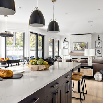
This kitchen looks very different from how it started, right? Though we didn’t touch any walls, the kitchen has almost doubled in usable space! We created a long, extended island with storage, an outlet for small appliances, and seating for comfortable prep, after-school snacking, or mingling among friends.
On the other side of the island, the family has even more storage and an integrated dishwasher within easy reach of the sink, perfect for quick clean-up. From this angle, you can also see the expansive custom Shaker cabinetry in white and the integrated double ovens. These facilitate their cooking experience and gave us the opportunity to add an additional surprise…
A coffee garage station and more hidden storage! Keeping these items located along the perimeter allows them to be accessed by the family or their guests without someone getting under the cook’s feet. These are the little details that make everyday life easier and more enjoyable.
Moving deeper into the kitchen, the seamless induction cooktop topped with a freestanding concealed hood fan commands attention in a soft yet prominent way. The natural wood accent mirrors the fireplace mantle, and the choice of off-black wood-grain cabinets not only continues our black-and-white colour palette but adds a sense of depth and contrast. The corner sink is located to the right and perfectly positioned with a view of their thriving backyard.
To invite more of this family’s character into the space, we mixed metals for interest — matte black, dark pewter, and warm brass — and created open shelves in white oak for their plants and decor. You can also glimpse the tumbled edge of the backsplash tile, which echoes the rustic brick of the fireplace. It adds that farmhouse charm while still feeling timeless and sophisticated.
Last but not least, we designed this dining banquette in the bay window (with integrated bench storage, of course), where the family can share a meal together, the kids can do homework, or Emma and Vince can work and enjoy a change of scenery from their offices. Like the other spaces in the home, it was designed to be beautiful, multi-functional, and long-lasting.
Praise from Our Clients:
It is clear that we love this home, but what did our clients have to say?
“Lori is a visionary and masters execution to the finest detail all at the same time. When she first met us to know more about who we are and how we live, she could right away envision how we could use the space in our kitchen and living room…The results exceeded our expectations.
Lori and her team were also a delight to work with — coordination with all the trades, fast problem-solving, regular updates, professional and friendly attitude of her entire team — made it the dream team. Thank you SHD for making our space so beautiful!”
In turn, we are so grateful for this family’s trust, their open communication, and for being wonderful people with whom to work. (So, thank you!)
 Joni Spear Interior Design
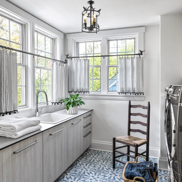
The homeowners were delighted at the prospect of having their poorly functioning laundry room reconfigured to allow for more hanging space and storage. What they didn’t expect was a year-long wait for cabinets delayed by the pandemic. Imported from Spain, the cabinets were selected for their modern slab-style doors and customizability; but marooned on a maritime vessel for what seemed an eternity, the project called for unparalleled patience from the clients. In the meantime, the washer and dryer were relocated to the opposite side of the room to allow for counter space on either side of the sink. Hardwood floors were replaced with Spanish-inspired encaustic tiles for a playful element while adding color. Blue and whited striped café window panels allow an abundance of natural light while adding privacy from neighboring houses. Pom-pom trim and perching bird finials adorn the drapery hardware. The Diego Grand Classical lantern in gilded iron completes the delightful composition. Cheers to improved sudsing and the virtue of patience!

 Custom Surface Solutions
Custom Surface Solutions (www.css-tile.com) - Owner Craig Thompson (512) 430-1215. This project shows the remodel of a small 1950's vintage home master bathroom. 8"" x 18" Calcutta gold marble tile was used on the shower walls and floor wall base and ceramic gray penny tile on the floor. Shower includes curbless pan / floor, dual shower boxes, frameless glass slider, trough duel fixture sink and chrome fixtures.

 TaylorPro Design and Remodeling, Inc.
"Since my husband works in the residential home building industry, our standards were very high on the contractor we chose to engage. Through referrals and Angie's List, my husband and I got a total of 6 bids from 6 different reputable San Diego contractors. We ultimately selected Kerry at TaylorPro Services for the following reasons:
1. His responsiveness. He was quick to respond on email and text, which is the format of communication that works best for me given that I'm a busy mom of two little kids and talking on the phone is challenging.
2. His detailed bid. A bunch of the contractors that gave us bids didn't include line item details but Kerry did. I knew exactly what to expect and what I was paying for. Before we engaged him, we sent him follow up questions to his bid and he answered them quickly. Kerry was also flexible in removing certain items that we wanted to do ourselves.
3. Price. While all the contractors came in around $15K of each other, Kerry was the lowest of them all. Kerry appreciated that we were priced in a $850K home and not a $3M Rancho Santa Fe home. I felt that he took our budget into consideration.
Kerry's crew came on time daily to our house. Since we were living in the house during construction, I felt that they were very considerate to cleaning up and being there on time. Additionally, since I personally didn't have experience with remodels, Kerry and his crew were courteous and polite to me and answered all of my questions no matter how mundane or redundant they were.
Going into the project, everyone (and their mother) kept telling me how (a) messy it was going to be and (b) how I would wind up hating my contractor in the end and feeling like I got screwed out of money. I can say that yes, it was messy because we pulled up 1200 sq feet of tile! and no, I did not hate Kerry at the end. In fact, I would highly recommend Kerry. His personality is suited well for this kind of stressful project and his honesty and attention to detail was extraordinary."
~ Carrie H, Client
Photos by: Kerry W. Taylor
 Simply Home Decorating
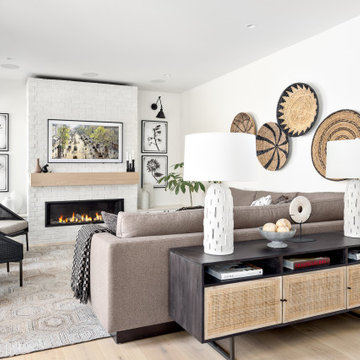
This beautiful North Vancouver home belongs to a nature-loving and health-conscious couple, Emma and Vince (names changed), their two young children, and their dog, Jasper. When they contacted us about renovating and furnishing their kitchen and family room, we walked in and saw a world of potential waiting to be uncovered.
Before: Larkhall Crescent Home:
Like many original North Vancouver homes, the interior was definitely dated. We encountered late ‘80s finishes in powder pink and teal green, old carpet, and a kitchen that wasn’t maximized to suit this family’s modern-day lifestyle. However, the size of the rooms offered us a ton of space with which to get creative.
Knowing our clients’ love of cooking, need for work spaces (Emma and Vince both work remotely), and growing family, we developed a design concept that would increase usable space, optimize storage, and create intimacy in this large area. As for the style, we were inspired by their European roots, inventing a new and modern take on “Belgian Farmhouse” style. Now, the home is truly one-of-a-kind.
After: Warm & Cozy Family Room:
Fresh, bright, and comfortable, this living area has been transformed! We started with the fireplace as a focal point, selecting aged brick tiles for added texture and a crisp wood mantle. The taupe-coloured sectional infuses the room with visual warmth and serves the added purpose of separating the family room from the kitchen.
Emma and Vince were also keen on using non-toxic materials in their home, and we were happy to oblige. To meet their needs, we sourced natural wood elements and sought out Canadian-made products - that adhere to high health standards - whenever possible.
Look closer at the elements of this space, and you will find this stunning, honeycomb-patterned rug in earthy gold, beige, and charcoal tones. It’s plush to the touch and full of visual texture that brings this room’s colour palette together. We sourced these two-tone chairs with caning, petrified wood side table, black sconces, and botanical prints in greyscale from local artist, Heather Johnston.
We topped off the space with this dark wood and rattan console that offers storage facing the kitchen and presents an opportunity to display cherished items. The result is a cozy lounging space brimming with comfort and functionality. It’s perfect for enjoying quality family time, or Emma can simply slide the coffee table away to make room for her morning yoga practice.
Now, let’s turn around and give some attention to the kitchen. Do you remember what the original kitchen looked like? If not, scroll back up, because the transformation is shocking…
Moody & Welcoming Kitchen for Healthy Living:
This kitchen looks very different from how it started, right? Though we didn’t touch any walls, the kitchen has almost doubled in usable space! We created a long, extended island with storage, an outlet for small appliances, and seating for comfortable prep, after-school snacking, or mingling among friends.
On the other side of the island, the family has even more storage and an integrated dishwasher within easy reach of the sink, perfect for quick clean-up. From this angle, you can also see the expansive custom Shaker cabinetry in white and the integrated double ovens. These facilitate their cooking experience and gave us the opportunity to add an additional surprise…
A coffee garage station and more hidden storage! Keeping these items located along the perimeter allows them to be accessed by the family or their guests without someone getting under the cook’s feet. These are the little details that make everyday life easier and more enjoyable.
Moving deeper into the kitchen, the seamless induction cooktop topped with a freestanding concealed hood fan commands attention in a soft yet prominent way. The natural wood accent mirrors the fireplace mantle, and the choice of off-black wood-grain cabinets not only continues our black-and-white colour palette but adds a sense of depth and contrast. The corner sink is located to the right and perfectly positioned with a view of their thriving backyard.
To invite more of this family’s character into the space, we mixed metals for interest — matte black, dark pewter, and warm brass — and created open shelves in white oak for their plants and decor. You can also glimpse the tumbled edge of the backsplash tile, which echoes the rustic brick of the fireplace. It adds that farmhouse charm while still feeling timeless and sophisticated.
Last but not least, we designed this dining banquette in the bay window (with integrated bench storage, of course), where the family can share a meal together, the kids can do homework, or Emma and Vince can work and enjoy a change of scenery from their offices. Like the other spaces in the home, it was designed to be beautiful, multi-functional, and long-lasting.
Praise from Our Clients:
It is clear that we love this home, but what did our clients have to say?
“Lori is a visionary and masters execution to the finest detail all at the same time. When she first met us to know more about who we are and how we live, she could right away envision how we could use the space in our kitchen and living room…The results exceeded our expectations.
Lori and her team were also a delight to work with — coordination with all the trades, fast problem-solving, regular updates, professional and friendly attitude of her entire team — made it the dream team. Thank you SHD for making our space so beautiful!”
In turn, we are so grateful for this family’s trust, their open communication, and for being wonderful people with whom to work. (So, thank you!)

 DKOR Interiors Inc.- Interior Designers Miami, FL
Miami Interior Designers - Residential Interior Design Project in Fort Lauderdale, FL. A classic Mediterranean home turns Contemporary by DKOR Interiors.
Photo: Alexia Fodere
Interior Design by Miami and Ft. Lauderdale Interior Designers, DKOR Interiors.
www.dkorinteriors.com
 O'Hanlon Kitchen & Bath
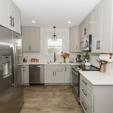
Nothing says "I love you" more than a kitchen renovation! These homeowners decided to celebrate their nuptials in the best possible way- with a new kitchen! We love how elegant the space is with the Pewter finish by Wolf Cabinetry, the classic white quartz, and herringbone tile backsplash. We wish you many years of beautiful memories- enjoy!
Cabinets: Wolf Classic Dartmouth 5 piece in Pewter.
Countertop: Calacatta Verona Q Stone
Backsplash: Herringbone- Emma White 3X6 Subway
Flooring: Mannington Vinyl plank- AduraMax Lakeview/Treeline MAX093
Additional project notes: Wolf soft close rollout, double trash pullout, wire tray divider
Thoughts from the customers:
1. What were you looking for in your remodel?
We were looking to completely redo the space. We knew we needed a new layout to accommodate the need for more storage, but also to update the extremely outdated cabinets, flooring, etc. to bring it out of 1960 and into 2020.
2. What do you love most about your remodel?
I obviously love that everything is brand new. My favorite physical feature is definitely the new backsplash and countertops that we chose! I also have never had soft close drawers so those are spectacular!
3. What was your main concern when deciding on a remodeling company?
We really just didn’t want it to take a long time! We were at home during the whole thing because of the pandemic, so it was not realistic to live without a kitchen for months.
4. What made you choose O’Hanlon Kitchens? Would you recommend O’Hanlon Kitchens?
Tracy was a great designer, and we ultimately went with O’Hanlon because she discovered some details about the kitchen and it’s functional space that others overlooked and even we didn’t notice. She was then able to render a very nice drawing of what we could expect our kitchen to look like, which was helpful. Yes, I would recommend O’Hanlon!
Photos & Video: Julia Transue
www.facebook.com/ThePhotoHouse.Art
www.thephotohouse.net
thephotohouse@comcast.net
7