
Search results for "Didnt desire" in Home Design Ideas
 French Creek Designs Kitchen & Bath Design Center
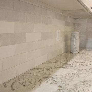
Subtle Kitchen Tile Designs was the purpose for this client. Client came into French Creek Designs Showroom looking for a nice accent for her kitchen, she didn’t want anything to bold just to add a little something. She fell in love with the white subway tile Cloe. Each tile was a different shade of white tying into her countertops and white cabinets. Just enough texture and variance in color to achieve her desired look. Soon to be finished with adding shelves just above her sink for easy access to necessities and beautiful accents. In addition, client chose metal trim to complete the edges of their tile design beautifully.
 French Creek Designs Kitchen & Bath Design Center
Subtle Kitchen Tile Designs was the purpose for this client. Client came into French Creek Designs Showroom looking for a nice accent for her kitchen, she didn’t want anything to bold just to add a little something. She fell in love with the white subway tile Cloe. Each tile was a different shade of white tying into her countertops and white cabinets. Just enough texture and variance in color to achieve her desired look. Soon to be finished with adding shelves just above her sink for easy access to necessities and beautiful accents. In addition, client chose metal trim to complete the edges of their tile design beautifully.
 Eccentricity Designs LLC
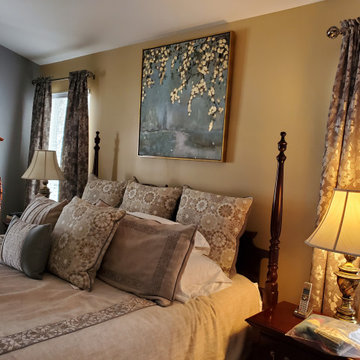
This client asked for help to upgrade her bedroom. She said her "safe" decorating style left something to be desired and she didn't know how to wake it up. The furniture was to remain however the room had great architectural lines to accent. I selected two colors that helped define the lines in the architecture. The bedding was added and we proceeded to move forward on the window treatments. The fabric is a rich cotton blend with a slight shimmer in the leaf pattern. With such short window walls I felt valances drew the eye down (shown in the before images) so they were not added to the new draperies. There is a custom cornice on the small window by the dressing area that coordinates with the draperies. The bench was reupholstered and a new centerpiece was added for the top of the television.
The client is soo pleased with the changes.
Find the right local pro for your project
 French Creek Designs Kitchen & Bath Design Center
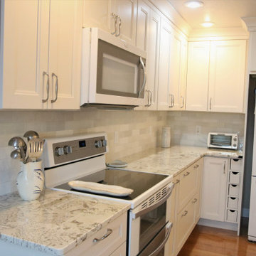
Subtle Kitchen Tile Designs was the purpose for this client. Client came into French Creek Designs Showroom looking for a nice accent for her kitchen, she didn’t want anything to bold just to add a little something. She fell in love with the white subway tile Cloe. Each tile was a different shade of white tying into her countertops and white cabinets. Just enough texture and variance in color to achieve her desired look. Soon to be finished with adding shelves just above her sink for easy access to necessities and beautiful accents. In addition, client chose metal trim to complete the edges of their tile design beautifully.
 Eccentricity Designs LLC
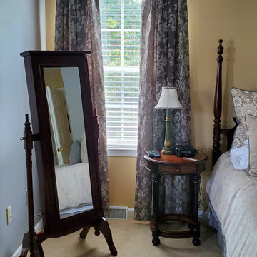
This client asked for help to upgrade her bedroom. She said her "safe" decorating style left something to be desired and she didn't know how to wake it up. The furniture was to remain however the room had great architectural lines to accent. I selected two colors that helped define the lines in the architecture. The bedding was added and we proceeded to move forward on the window treatments. The fabric is a rich cotton blend with a slight shimmer in the leaf pattern. With such short window walls I felt valances drew the eye down (shown in the before images) so they were not added to the new draperies. There is a custom cornice on the small window by the dressing area that coordinates with the draperies. The bench was reupholstered and a new centerpiece was added for the top of the television.
The client is soo pleased with the changes.
 Eccentricity Designs LLC
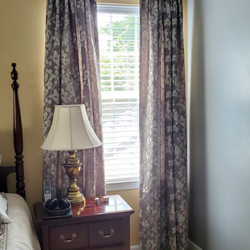
This client asked for help to upgrade her bedroom. She said her "safe" decorating style left something to be desired and she didn't know how to wake it up. The furniture was to remain however the room had great architectural lines to accent. I selected two colors that helped define the lines in the architecture. The bedding was added and we proceeded to move forward on the window treatments. The fabric is a rich cotton blend with a slight shimmer in the leaf pattern. With such short window walls I felt valances drew the eye down (shown in the before images) so they were not added to the new draperies. There is a custom cornice on the small window by the dressing area that coordinates with the draperies. The bench was reupholstered and a new centerpiece was added for the top of the television.
The client is soo pleased with the changes.
 French Creek Designs Kitchen & Bath Design Center
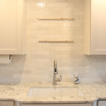
Subtle Kitchen Tile Designs was the purpose for this client. Client came into French Creek Designs Showroom looking for a nice accent for her kitchen, she didn’t want anything to bold just to add a little something. She fell in love with the white subway tile Cloe. Each tile was a different shade of white tying into her countertops and white cabinets. Just enough texture and variance in color to achieve her desired look. Soon to be finished with adding shelves just above her sink for easy access to necessities and beautiful accents. In addition, client chose metal trim to complete the edges of their tile design beautifully.
 French Creek Designs Kitchen & Bath Design Center
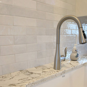
Subtle Kitchen Tile Designs was the purpose for this client. Client came into French Creek Designs Showroom looking for a nice accent for her kitchen, she didn’t want anything to bold just to add a little something. She fell in love with the white subway tile Cloe. Each tile was a different shade of white tying into her countertops and white cabinets. Just enough texture and variance in color to achieve her desired look. Soon to be finished with adding shelves just above her sink for easy access to necessities and beautiful accents. In addition, client chose metal trim to complete the edges of their tile design beautifully.

 Design Harmony
Reclaimed doors have so many uses as they are big pieces of solid wood, not like the hollow core doors you see in new construction homes today.
In this home there wasn't a door between the master bedroom and the master bath. We didn't have room for a traditional swing door or a pocket door but we knew we wanted to give the clients some privacy. By adding the sliding door we achieved not only the privacy we desired but added interest to the room.
We also took advantage of the tall ceilings and by adding a chandelier over the bed.
Holland Photography - Cory Holland - HollandPhotography.biz
 Eccentricity Designs LLC
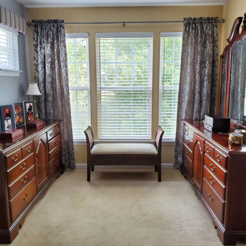
This client asked for help to upgrade her bedroom. She said her "safe" decorating style left something to be desired and she didn't know how to wake it up. The furniture was to remain however the room had great architectural lines to accent. I selected two colors that helped define the lines in the architecture. The bedding was added and we proceeded to move forward on the window treatments. The fabric is a rich cotton blend with a slight shimmer in the leaf pattern. With such short window walls I felt valances drew the eye down (shown in the before images) so they were not added to the new draperies. There is a custom cornice on the small window by the dressing area that coordinates with the draperies. The bench was reupholstered and a new centerpiece was added for the top of the television.
The client is soo pleased with the changes.
 French Creek Designs Kitchen & Bath Design Center
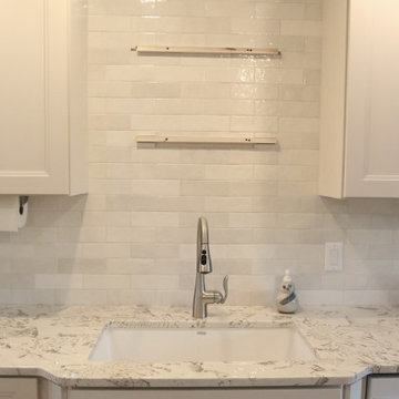
Subtle Kitchen Tile Designs was the purpose for this client. Client came into French Creek Designs Showroom looking for a nice accent for her kitchen, she didn’t want anything to bold just to add a little something. She fell in love with the white subway tile Cloe. Each tile was a different shade of white tying into her countertops and white cabinets. Just enough texture and variance in color to achieve her desired look. Soon to be finished with adding shelves just above her sink for easy access to necessities and beautiful accents. In addition, client chose metal trim to complete the edges of their tile design beautifully.
 French Creek Designs Kitchen & Bath Design Center
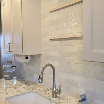
Subtle Kitchen Tile Designs was the purpose for this client. Client came into French Creek Designs Showroom looking for a nice accent for her kitchen, she didn’t want anything to bold just to add a little something. She fell in love with the white subway tile Cloe. Each tile was a different shade of white tying into her countertops and white cabinets. Just enough texture and variance in color to achieve her desired look. Soon to be finished with adding shelves just above her sink for easy access to necessities and beautiful accents. In addition, client chose metal trim to complete the edges of their tile design beautifully.

 Randy Trainor
These homeowners decided to turn their ski home into a full-time home only to find that what was perfect as a vacation home, didn't function well for year-round living. In the master bathroom an unused tub was removed to make room for a larger vanity with storage. Using the same large format tiles on the floor and the walls provide the desired spa-like feel to the space. Floor to ceiling cabinets provide loads of storage for this kosher kitchen. Two dishwashers, two utensil drawers, a divided sink and two ovens are also included so that meat and dairy could be kept separated.

Example of a mid-sized classic galley medium tone wood floor open concept kitchen design in Portland with a single-bowl sink, shaker cabinets, white cabinets, granite countertops, white backsplash, subway tile backsplash, stainless steel appliances and an island

 Nancy Finneson | DeMane Design
The owners of this remodel desired a refreshing new master bathroom. The original layout was poorly designed with minimal storage, a small shower, a rarely used bathtub and a water closet that was difficult to access. The old vanity flanked a curved wall of glass block (the main challenge with this space) which didn’t allow for mirrors and was always cluttered because of limited storage.
With smart space planning and attention to detail this well-appointed bathroom is now a uniquely personal space that functions brilliantly and balanced for the homeowners.
Photo: DeMane Design

 Progressive Design Build
Transforming a Master Bathroom
When our clients purchased their beautiful home in South Fort Myers, FL they fell in love with the expansive, sweeping space. It wasn’t long, however, before they realized the master bathroom just didn’t suit their taste. The large walk-in shower was practically cave-like. Consequentially, it completely dwarfed the bathroom. Along with bland colors, outdated finishes, and a dividing wall in the middle of the room, the whole space felt smaller than its ample dimensions implied. There was no question about it – the bathroom needed an update.
Making Room for More
First, we demolished the existing finishes and cut the concrete slab for new underground plumbing. We minimized the imposing shower and moved it to the other side of the room. Moving the shower also allowed for the installation of our Dura Supreme Alectra style cabinetry in cocoa brown. For increased functionality, we created split his-and-hers vanities. Then we added towers to match the cabinets. With interior outlets, the towers added smart storage for bathroom appliances, helping to keep the counters clutter-free. For a finishing touch, we outlined the large mirrors with crown molding trim in a complimentary finish – an essential detail to tie all the cabinetry together.
The Spa
To bring the feel of the spa to this gorgeous home, we installed our luxurious drop-in 72”x42” Kohler Air Massage bathtub. We completely surrounded it with 3cm granite countertops in Delicatus green and added a tub deck with tile backsplashes for a sumptuous ambiance.
Lighting
On either side of the his-and-hers vanity, we installed George Kovach tube sconces. Vertical placement of the sconces provided ample lighting while enhancing the contemporary style of the space. To frame the room, we added a drop ceiling with recessed lighting and outlined the tray ceiling with crown molding to match the rest of the design. To complete the bath remodel, we installed the final element – a stunningly unique 10-light polished chrome chandelier from Maxim lighting.
A Complete Transformation
When we met with our clients, it was instantly clear to us why they were unhappy with their master bathroom. The cave-like shower and cumbersome dividing wall overpowered a room in dire need of a modernizing. Furthermore, with two small children and a busy lifestyle, we could sense our clients not only desired a bathroom renovation, they needed a relaxing retreat.
Ultimately, this project was nothing less than a complete transformation of space. In fact, by the time we had finished, the only original fixtures left were the windows! With beautifully updated finishes and an improved layout, we were able to achieve the functionality our clients craved along with a new, spa-like feel. The end result was nothing short of a haven at home – the perfect spot to recharge at the end of a long day.

 TVL Creative Ltd.
This kitchen took a tired, 80’s builder kitchen and revamped it into a personalized gathering space for our wonderful client. The existing space was split up by the dated configuration of eat-in kitchen table area to one side and cramped workspace on the other. It didn’t just under-serve our client’s needs; it flat out discouraged them from using the space. Our client desired an open kitchen with a central gathering space where family and friends could connect. To open things up, we removed the half wall separating the kitchen from the dining room and the wall that blocked sight lines to the family room and created a narrow hallway to the kitchen. The old oak cabinets weren't maximizing storage and were dated and dark. We used Waypoint Living Spaces cabinets in linen white to brighten up the room. On the east wall, we created a hutch-like stack that features an appliance garage that keeps often used countertop appliance on hand but out of sight. The hutch also acts as a transition from the cooking zone to the coffee and wine area. We eliminated the north window that looked onto the entry walkway and activated this wall as storage with refrigerator enclosure and pantry. We opted to leave the east window as-is and incorporated it into the new kitchen layout by creating a window well for growing plants and herbs. The countertops are Pental Quartz in Carrara. The sleek cabinet hardware is from our friends at Amerock in a gorgeous satin champagne bronze. One of the most striking features in the space is the pattern encaustic tile from Tile Shop. The pop of blue in the backsplash adds personality and contrast to the champagne accents. The reclaimed wood cladding surrounding the large east-facing window introduces a quintessential Colorado vibe, and the natural texture balances the crisp white cabinetry and geometric patterned tile. Minimalist modern lighting fixtures from Mitzi by Hudson Valley Lighting provide task lighting over the sink and at the wine/ coffee station. The visual lightness of the sink pendants maintains the openness and visual connection between the kitchen and dining room. Together the elements make for a sophisticated yet casual vibe-- a comfortable chic kitchen. We love the way this space turned out and are so happy that our clients now have such a bright and welcoming gathering space as the heart of their home!


 Advance Design Studio, Ltd.
Mike and Stacy moved to the country to be around the rolling landscape and feed the birds outside their Hampshire country home. After living in the home for over ten years, they knew exactly what they wanted to renovate their 1980’s two story once their children moved out. It all started with the desire to open up the floor plan, eliminating constricting walls around the dining room and the eating area that they didn’t plan to use once they had access to what used to be a formal dining room.
They wanted to enhance the already warm country feel their home already had, with some warm hickory cabinets and casual granite counter tops. When removing the pantry and closet between the kitchen and the laundry room, the new design now just flows from the kitchen directly into the smartly appointed laundry area and adjacent powder room.
The new eat in kitchen bar is frequented by guests and grand-children, and the original dining table area can be accessed on a daily basis in the new open space. One instant sensation experienced by anyone entering the front door is the bright light that now transpires from the front of the house clear through the back; making the entire first floor feel free flowing and inviting.
Photo Credits- Joe Nowak

 KBK Interior Design
These clients, an entrepreneur and a physician with three kids, chose their Tudor home for the neighborhood, though it didn’t match their modern-transitional taste. They asked us to help them transform their into a place to play and entertain with clean lines and lively color, namely her favorites: bold purple and refreshing apple green.
Their previous layout had a stifled flow with a large sectional sofa that dominated the room, and an awkward assortment of furniture that they wanted to discard with the exception of a vintage stone dining table from her mother. The living room served as a pass through to both the family and dining rooms. The client wanted the living room to be less like a glorified hallway and become a destination. Our solution was to unify the design of this living space with the related rooms by using repetition of color and by creating usable areas for family game night, entertaining and small get togethers.
The generous proportions of the room enabled us to create three functional spaces: a game table with seating for four and adjacent pull up seating for family play; a seating area at the fireplace that accommodates a large group or small conversation; and seating at the front window that provides a view of the street (not seen in the photograph). The space went from awkward to one that is used daily for family activities and socializing.
As they were not interested in touching the existing architecture, transformations were made using new light fixtures, paint, distinctive furniture and art. The client had a strict budget but desired the highly styled look of couture design pieces with curves and movement. We accomplished this look by pairing a few distinctive couture items with inspired pieces that are budget balancers.
We combined the couture game table with more affordable chairs inspired by a classic klismos style, as one might pair Louboutins with stylish jeans. Right- and left-arm chairs with an interesting castle-like fret base detail flank windows.
To help the clients better understand the use of the color scheme, we keyed the floor plan to show how the greens and purples traveled in a balanced manner around the room and throughout the adjacent dining and family rooms. We paired apple green accents with layered hues of lavender, orchid and aubergine. Neutral taupe and ivory tones ground the bold colors.
The custom rug in ivory, aubergine, pale taupe, grey-lavender was inspired by a picture the client found, but we dramatically increased the scale of the pattern in proportion to our room size. This curvy movement is echoed in the sophisticated shapes of the furniture throughout the redesigned room—from the curved sofas to the circular cutouts in the cube end table.
At the windows the solid sateen panels with contrasting aubergine banding have the hand of silk, and are also cost conscious, creating room in the budget for the stunning custom pillows in Italian embroidered silk.
The distinctive color and shapes throughout provide the whimsy the clients' desired with the function they needed, creating an inviting living room that is now a daily destination.
Designed by KBK Interior Design
www.KBKInteriorDesign.com
Photo by Wing Wong
7