
Search results for "Didnt offer" in Home Design Ideas

 TKS Design Group
Download our free ebook, Creating the Ideal Kitchen. DOWNLOAD NOW
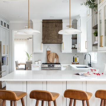
For many, extra time at home during COVID left them wanting more from their homes. Whether you realized the shortcomings of your space or simply wanted to combat boredom, a well-designed and functional home was no longer a want, it became a need. Tina found herself wanting more from her Old Irving Park home and reached out to The Kitchen Studio about adding function to her kitchen to make the most of the available real estate.
At the end of the day, there is nothing better than returning home to a bright and happy space you love. And this kitchen wasn’t that for Tina. Dark and dated, with a palette from the past and features that didn’t make the most of the available square footage, this remodel required vision and a fresh approach to the space. Lead designer, Stephanie Cole’s main design goal was better flow, while adding greater functionality with organized storage, accessible open shelving, and an overall sense of cohesion with the adjoining family room.
The original kitchen featured a large pizza oven, which was rarely used, yet its footprint limited storage space. The nearby pantry had become a catch-all, lacking the organization needed in the home. The initial plan was to keep the pizza oven, but eventually Tina realized she preferred the design possibilities that came from removing this cumbersome feature, with the goal of adding function throughout the upgraded and elevated space. Eliminating the pantry added square footage and length to the kitchen for greater function and more storage. This redesigned space reflects how she lives and uses her home, as well as her love for entertaining.
The kitchen features a classic, clean, and timeless palette. White cabinetry, with brass and bronze finishes, contrasts with rich wood flooring, and lets the large, deep blue island in Woodland’s custom color Harbor – a neutral, yet statement color – draw your eye.
The kitchen was the main priority. In addition to updating and elevating this space, Tina wanted to maximize what her home had to offer. From moving the location of the patio door and eliminating a window to removing an existing closet in the mudroom and the cluttered pantry, the kitchen footprint grew. Once the floorplan was set, it was time to bring cohesion to her home, creating connection between the kitchen and surrounding spaces.
The color palette carries into the mudroom, where we added beautiful new cabinetry, practical bench seating, and accessible hooks, perfect for guests and everyday living. The nearby bar continues the aesthetic, with stunning Carrara marble subway tile, hints of brass and bronze, and a design that further captures the vibe of the kitchen.
Every home has its unique design challenges. But with a fresh perspective and a bit of creativity, there is always a way to give the client exactly what they want [and need]. In this particular kitchen, the existing soffits and high slanted ceilings added a layer of complexity to the lighting layout and upper perimeter cabinets.
While a space needs to look good, it also needs to function well. This meant making the most of the height of the room and accounting for the varied ceiling features, while also giving Tina everything she wanted and more. Pendants and task lighting paired with an abundance of natural light amplify the bright aesthetic. The cabinetry layout and design compliments the soffits with subtle profile details that bring everything together. The tile selections add visual interest, drawing the eye to the focal area above the range. Glass-doored cabinets further customize the space and give the illusion of even more height within the room.
While her family may be grown and out of the house, Tina was focused on adding function without sacrificing a stunning aesthetic and dreamy finishes that make the kitchen the gathering place of any home. It was time to love her kitchen again, and if you’re wondering what she loves most, it’s the niche with glass door cabinetry and open shelving for display paired with the marble mosaic backsplash over the range and complimenting hood. Each of these features is a stunning point of interest within the kitchen – both brag-worthy additions to a perimeter layout that previously felt limited and lacking.
Whether your remodel is the result of special needs in your home or simply the excitement of focusing your energy on creating a fun new aesthetic, we are here for it. We love a good challenge because there is always a way to make a space better – adding function and beauty simultaneously.
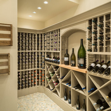
 Alan Mascord Design Associates Inc
View the house plans at:
http://houseplans.co/house-plans/2472
Photos by Bob Greenspan
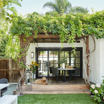

Find the right local pro for your project
 Shari Pellows Interiors
Michael J. Lee
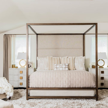
Inspiration for a large transitional master dark wood floor and brown floor bedroom remodel in Boston with white walls
Inspiration for a large transitional master dark wood floor and brown floor bedroom remodel in Boston with white walls
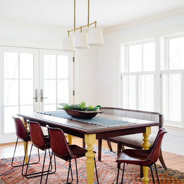
Example of a mid-sized southwest medium tone wood floor and brown floor great room design in Boston with white walls and no fireplace
 TKS Design Group
Download our free ebook, Creating the Ideal Kitchen. DOWNLOAD NOW
For many, extra time at home during COVID left them wanting more from their homes. Whether you realized the shortcomings of your space or simply wanted to combat boredom, a well-designed and functional home was no longer a want, it became a need. Tina found herself wanting more from her Old Irving Park home and reached out to The Kitchen Studio about adding function to her kitchen to make the most of the available real estate.
At the end of the day, there is nothing better than returning home to a bright and happy space you love. And this kitchen wasn’t that for Tina. Dark and dated, with a palette from the past and features that didn’t make the most of the available square footage, this remodel required vision and a fresh approach to the space. Lead designer, Stephanie Cole’s main design goal was better flow, while adding greater functionality with organized storage, accessible open shelving, and an overall sense of cohesion with the adjoining family room.
The original kitchen featured a large pizza oven, which was rarely used, yet its footprint limited storage space. The nearby pantry had become a catch-all, lacking the organization needed in the home. The initial plan was to keep the pizza oven, but eventually Tina realized she preferred the design possibilities that came from removing this cumbersome feature, with the goal of adding function throughout the upgraded and elevated space. Eliminating the pantry added square footage and length to the kitchen for greater function and more storage. This redesigned space reflects how she lives and uses her home, as well as her love for entertaining.
The kitchen features a classic, clean, and timeless palette. White cabinetry, with brass and bronze finishes, contrasts with rich wood flooring, and lets the large, deep blue island in Woodland’s custom color Harbor – a neutral, yet statement color – draw your eye.
The kitchen was the main priority. In addition to updating and elevating this space, Tina wanted to maximize what her home had to offer. From moving the location of the patio door and eliminating a window to removing an existing closet in the mudroom and the cluttered pantry, the kitchen footprint grew. Once the floorplan was set, it was time to bring cohesion to her home, creating connection between the kitchen and surrounding spaces.
The color palette carries into the mudroom, where we added beautiful new cabinetry, practical bench seating, and accessible hooks, perfect for guests and everyday living. The nearby bar continues the aesthetic, with stunning Carrara marble subway tile, hints of brass and bronze, and a design that further captures the vibe of the kitchen.
Every home has its unique design challenges. But with a fresh perspective and a bit of creativity, there is always a way to give the client exactly what they want [and need]. In this particular kitchen, the existing soffits and high slanted ceilings added a layer of complexity to the lighting layout and upper perimeter cabinets.
While a space needs to look good, it also needs to function well. This meant making the most of the height of the room and accounting for the varied ceiling features, while also giving Tina everything she wanted and more. Pendants and task lighting paired with an abundance of natural light amplify the bright aesthetic. The cabinetry layout and design compliments the soffits with subtle profile details that bring everything together. The tile selections add visual interest, drawing the eye to the focal area above the range. Glass-doored cabinets further customize the space and give the illusion of even more height within the room.
While her family may be grown and out of the house, Tina was focused on adding function without sacrificing a stunning aesthetic and dreamy finishes that make the kitchen the gathering place of any home. It was time to love her kitchen again, and if you’re wondering what she loves most, it’s the niche with glass door cabinetry and open shelving for display paired with the marble mosaic backsplash over the range and complimenting hood. Each of these features is a stunning point of interest within the kitchen – both brag-worthy additions to a perimeter layout that previously felt limited and lacking.
Whether your remodel is the result of special needs in your home or simply the excitement of focusing your energy on creating a fun new aesthetic, we are here for it. We love a good challenge because there is always a way to make a space better – adding function and beauty simultaneously.
 Blackband Design
Blackband Design
949.872.2234
www.blackbanddesign.com
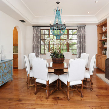
Inspiration for a mediterranean medium tone wood floor dining room remodel in Orange County with white walls, a standard fireplace and a tile fireplace
Inspiration for a mediterranean medium tone wood floor dining room remodel in Orange County with white walls, a standard fireplace and a tile fireplace



 Pro-Land Landscape Construction Inc.
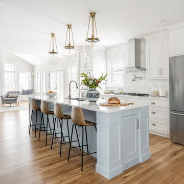
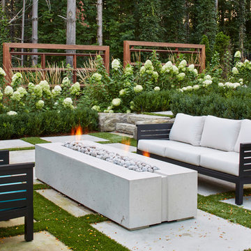
With a lengthy list of ideas about how to transform their backyard, the clients were excited to see what we could do. Existing features on site needed to be updated and in-cooperated within the design. The view from each angle of the property was already outstanding and we didn't want the design to feel out of place. We had to make the grade changes work to our advantage, each separate space had to have a purpose. The client wanted to use the property for charity events, so a large flat turf area was constructed at the back of the property, perfect for setting up tables, chairs and a stage if needed. It also created the perfect look out point into the back of the property, dropping off into a ravine. A lot of focus throughout the project was the plant selection. With a large amount of garden beds, we wanted to maintain a clean and formal look, while still offering seasonal interest. We did this by edging the beds with boxwoods, adding white hydrangeas throughout the beds for constant colour, and subtle pops of purple and yellow. This along with the already breathtaking natural backdrop of the space, is more than enough to make this project stand out.
Photographer: Jason Hartog Photography
 Bizal Built, Inc.
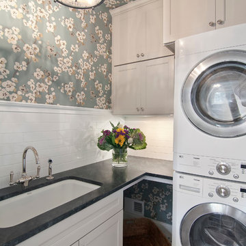
Elegant laundry room photo in Minneapolis with multicolored walls and a stacked washer/dryer
 BUNNYFiSH studio
Photos by Francis and Francis Photography
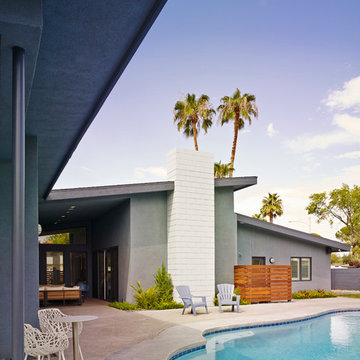
The Anderson Residence is ‘practically’ a new home in one of Las Vegas midcentury modern neighborhoods McNeil. The house is the current home of Ian Anderson the local Herman Miller dealer and Shanna Anderson of Leeland furniture family. When Ian first introduced CSPA studio to the project it was burned down house. Turns out that the house is a 1960 midcentury modern sister of two homes that was destroyed by arson in a dispute between landlord and tenant. Once inside the burned walls it was quite clear what a wonderful house it once was. Great care was taken to try and restore the house to a similar splendor. The reality is the remodel didn’t involve much of the original house, by the time the fire damage was remediated there wasn’t much left. The renovation includes an additional 1000 SF of office, guest bedroom, laundry, mudroom, guest toilet outdoor shower and a garage. The roof line was raised in order to accommodate a forced air mechanical system, but care was taken to keep the lines long and low (appearing) to match the midcentury modern style.
The House is an H-shape. Typically houses of this time period would have small rooms with long narrow hallways. However in this case with the walls burned out one can see from one side of the house to other creating a huge feeling space. It was decided to totally open the East side of the house and make the kitchen which gently spills into the living room and wood burning fireplace the public side. New windows and a huge 16’ sliding door were added all the way around the courtyard so that one can see out and across into the private side. On the west side of the house the long thin hallway is opened up by the windows to the courtyard and the long wall offers an opportunity for a gallery style art display. The long hallway opens to two bedrooms, shared bathroom and master bedroom. The end of the hallway opens to a casual living room and the swimming pool area.
The house has no formal dining room but a 15’ custom crafted table by Ian’s sculptor father that is an extension of the kitchen island.
The H-shape creates two covered areas, one is the front entry courtyard, fenced in by a Brazilian walnut enclosure and crowned by a steel art installation by Ian’s father. The rear covered courtyard is a breezy spot for chilling out on a hot desert day.
The pool was re-finished and a shallow soaking deck added. A new barbeque and covered patio added. Some of the large plant material was salvaged and nursed back to health and a complete new desert landscape was re-installed to bring the exterior to life.

 Penny Black Interiors LLC.
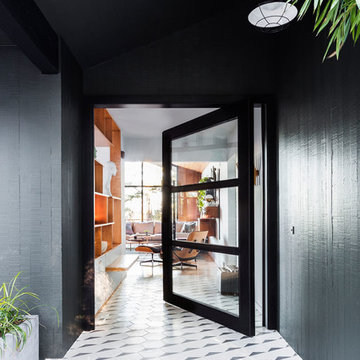
The architecture of this mid-century ranch in Portland’s West Hills oozes modernism’s core values. We wanted to focus on areas of the home that didn’t maximize the architectural beauty. The Client—a family of three, with Lucy the Great Dane, wanted to improve what was existing and update the kitchen and Jack and Jill Bathrooms, add some cool storage solutions and generally revamp the house.
We totally reimagined the entry to provide a “wow” moment for all to enjoy whilst entering the property. A giant pivot door was used to replace the dated solid wood door and side light.
We designed and built new open cabinetry in the kitchen allowing for more light in what was a dark spot. The kitchen got a makeover by reconfiguring the key elements and new concrete flooring, new stove, hood, bar, counter top, and a new lighting plan.
Our work on the Humphrey House was featured in Dwell Magazine.

 The Habitat Collective
Christine Michelle Photography
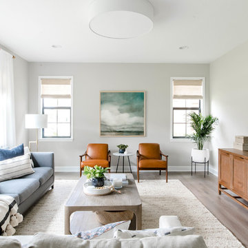
Beach style dark wood floor and brown floor living room photo in Miami with gray walls and a wall-mounted tv
Beach style dark wood floor and brown floor living room photo in Miami with gray walls and a wall-mounted tv
 TVL Creative Ltd.
[Our Clients]
We were so excited to help these new homeowners re-envision their split-level diamond in the rough. There was so much potential in those walls, and we couldn’t wait to delve in and start transforming spaces. Our primary goal was to re-imagine the main level of the home and create an open flow between the space. So, we started by converting the existing single car garage into their living room (complete with a new fireplace) and opening up the kitchen to the rest of the level.
[Kitchen]
The original kitchen had been on the small side and cut-off from the rest of the home, but after we removed the coat closet, this kitchen opened up beautifully. Our plan was to create an open and light filled kitchen with a design that translated well to the other spaces in this home, and a layout that offered plenty of space for multiple cooks. We utilized clean white cabinets around the perimeter of the kitchen and popped the island with a spunky shade of blue. To add a real element of fun, we jazzed it up with the colorful escher tile at the backsplash and brought in accents of brass in the hardware and light fixtures to tie it all together. Through out this home we brought in warm wood accents and the kitchen was no exception, with its custom floating shelves and graceful waterfall butcher block counter at the island.
[Dining Room]
The dining room had once been the home’s living room, but we had other plans in mind. With its dramatic vaulted ceiling and new custom steel railing, this room was just screaming for a dramatic light fixture and a large table to welcome one-and-all.
[Living Room]
We converted the original garage into a lovely little living room with a cozy fireplace. There is plenty of new storage in this space (that ties in with the kitchen finishes), but the real gem is the reading nook with two of the most comfortable armchairs you’ve ever sat in.
[Master Suite]
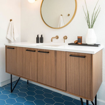
This home didn’t originally have a master suite, so we decided to convert one of the bedrooms and create a charming suite that you’d never want to leave. The master bathroom aesthetic quickly became all about the textures. With a sultry black hex on the floor and a dimensional geometric tile on the walls we set the stage for a calm space. The warm walnut vanity and touches of brass cozy up the space and relate with the feel of the rest of the home. We continued the warm wood touches into the master bedroom, but went for a rich accent wall that elevated the sophistication level and sets this space apart.
[Hall Bathroom]
The floor tile in this bathroom still makes our hearts skip a beat. We designed the rest of the space to be a clean and bright white, and really let the lovely blue of the floor tile pop. The walnut vanity cabinet (complete with hairpin legs) adds a lovely level of warmth to this bathroom, and the black and brass accents add the sophisticated touch we were looking for.
[Office]
We loved the original built-ins in this space, and knew they needed to always be a part of this house, but these 60-year-old beauties definitely needed a little help. We cleaned up the cabinets and brass hardware, switched out the formica counter for a new quartz top, and painted wall a cheery accent color to liven it up a bit. And voila! We have an office that is the envy of the neighborhood.
 Michels Homes
Interior Design: Jami Ludens, Studio M Interiors | Photography: Landmark Photography
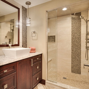
Example of a mid-sized classic 3/4 beige tile beige floor alcove shower design in Minneapolis with a vessel sink, recessed-panel cabinets, dark wood cabinets and beige walls
Example of a mid-sized classic 3/4 beige tile beige floor alcove shower design in Minneapolis with a vessel sink, recessed-panel cabinets, dark wood cabinets and beige walls
 User
UserKaren Melvin
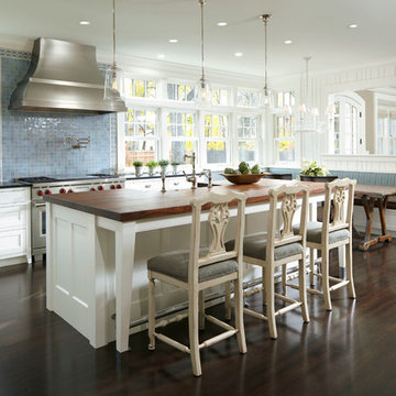
Example of a classic l-shaped dark wood floor eat-in kitchen design in Minneapolis with shaker cabinets, white cabinets, blue backsplash, stainless steel appliances, an island and mosaic tile backsplash
Example of a classic l-shaped dark wood floor eat-in kitchen design in Minneapolis with shaker cabinets, white cabinets, blue backsplash, stainless steel appliances, an island and mosaic tile backsplash
 STEPHANIE BRADSHAW
Jennifer Hughes Photography
Photoshoot Styling by Charlotte Safavi
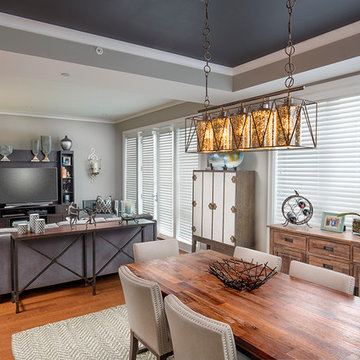
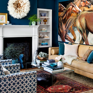
Transitional living room photo in Baltimore with blue walls and a standard fireplace
Transitional living room photo in Baltimore with blue walls and a standard fireplace
 Mosaic Architects SF
Jim Bartsch
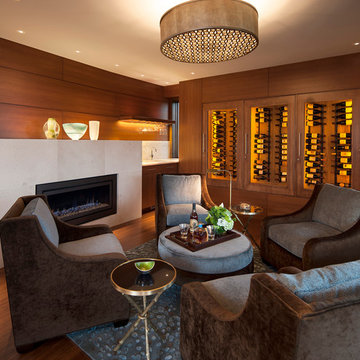
Inspiration for a contemporary medium tone wood floor family room remodel in San Francisco with a ribbon fireplace and a tile fireplace
Inspiration for a contemporary medium tone wood floor family room remodel in San Francisco with a ribbon fireplace and a tile fireplace

10