
Search results for "Difficult experience" in Home Design Ideas
 Kowalske Kitchen & Bath
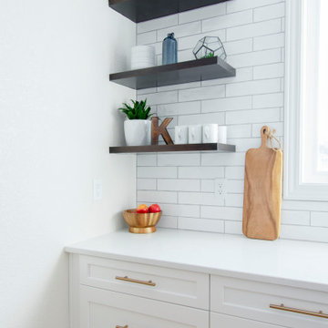
A Sussex family hired us as the design build remodel company to makeover this kitchen. This remodeling project had three main goals: improve storage, update the layout/style and enhance the functionality.
IMPROVE STORAGE
The original home builder put in very narrow cabinets. The small, narrow cabinets made it difficult for the homeowners to store items. They also said it was important to have a kitchen that works for their children. The new design incorporates an appliance cabinet and wide drawers for storing items. The kids have easy access to snack drawers and lower dish storage for plastic cups and plates. Also, we added two built-in cabinets in the dining room for more storage.
UPDATE THE LAYOUT & STYLE
While the area was large, it didn’t maximize the space or fit their contemporary style. They wanted plenty of counter prep space and enough room for friends and family to gather. We added a large wood island with seating – perfect for hosting parties and family dinners. The space is bright with white shaker cabinetry and subway tile backsplash. Warm touches include satin bronze light fixtures and hardware.
ENHANCE THE FUNCTIONALITY
This Sussex kitchen features a Galley Sink Workstation. Having a sink workstation facing the center of the room allows the homeowners to stay part of the conversation while preparing a meal or cleaning up. Sink workstations are one of the hottest kitchen trends.
HOMEOWNER REVIEW
“We recently completed our kitchen remodel with Kowalske and we can’t say enough good things about our experience. Not only was every member of the team amazing, the work that was done in our kitchen was very high quality. We have recommended Kowalske to all of our friends and plan to use them for our master bath remodel in the future!” – Nicole, homeowner (Houzz Review)
 RAJ Kitchen and Bath, LLC
 “Full apartment design”.
IF you have not yet seen this apartment conversion before, we strongly urge you to go to the bottom left of this page and click on the short 2-minutes video. It would put a lot of things into perspective when you come back and continue reading this.
It is true we were literally handed the keys and told a list of things that they wanted to have happen and we were to go into the apartment, look at the space and come up with a design that would satisfy all of that need. UNTIL we showed up! The unit had really seen some better days but we knew we had to look past that and come up with a concept that would work for them.
The immediate challenges were centered around 3 big ideas:
1. Adding a second bedroom to the already small footprint
2. Figuring out a way to make the kitchen bigger, better and brighter
3. Creating a master room walk in closet
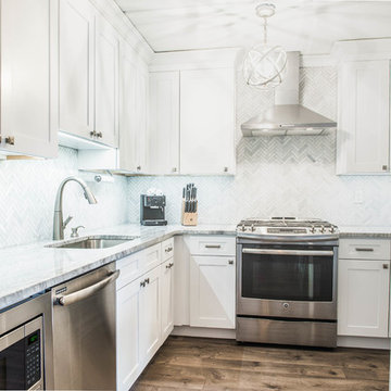
It’s always difficult to add new rooms into existing footprint without expanding out or up and not incurring any opportunity cost. In this case, that was exactly what we had to do. Item one and two above had to be tackled as one. We went ahead and switched out the location of the dining room and eliminating an area where there was a “nook” type eat-in area. By doing so, we were able to cut right into that footprint and change the layout of the kitchen.
That one move allowed us to dig into the kitchen design because it was now the main focal point in the apartment. It was no longer an option to keep it in that tiny hole where it was, so we had to ensure that this design was functional and aesthetically pleasing at the same time. By adding the table into the space where an Island typically would go, we were able to both cut cost and still provide a dining experience. The Table serves as an Island as well when cooking.
We then proceeded to block in the existing doorway to the dining room. By doing this, we were able to create a full room which allowed us to put a door on the other side and called that room Bedroom #2. This was easier to do because all of the mechanicals were already in that space (light, heater and windows). By shifting things around, we also achieved a huge wall to wall closet from inside. PERFECT!
Then we moved into the Single bedroom. We thought it was a big room with a small closet, so by creatively adding an L shaped wall and steal some footprint into the bedroom side, we were able to put a door on that new room and design it for the walk-in closet. Even after this, the bedroom still holds a queen size bed with 2 night stands, a TV on the wall, a sitting chair and plenty of room to walk around. This was done by rethinking the location for the bed and night stands.
The bathroom was gutted to make sure there was no leaks and rebuild from the ground up. We kept all of the plumbing where it was, added a new vanity, medicine cabinet, tiles and lighting and it was done.
From there, the rest of the unit had new flooring all throughout, paint, and lighting. After completion and walk through, this project was handed over back to the clients.
Execution and collaboration between all the trades were: Reggie and his team from Premier Interiors and Rohan from RD Mechanical Services.
p.s. Please see our website to see the video.
 Rivolty
For this project, our client Randy came to us looking for a better way to work from home. Like many homeowners, they found it difficult to stay focused without a dedicated space separated from the main house.
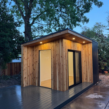
After walking the backyard together and discussing how they planned to use the space day-to-day, we designed a Monterey office that would feel both functional and comfortable - not just a place to work, but somewhere they would actually enjoy spending time.
The structure was built on-site, allowing us to carefully position it within the yard and make small adjustments along the way to achieve the right proportions and layout. This approach helped the office feel naturally integrated rather than added on.
We focused on bringing in as much natural light as possible, using large glass openings to create a bright, open interior. At the same time, the design maintains a sense of privacy, giving the client a quiet environment to focus throughout the day.
Now, just a few steps from the house, the client has a dedicated workspace that fits seamlessly into their daily routine and significantly improves their work-from-home experience.
Find the right local pro for your project
 Schwartz and Architecture
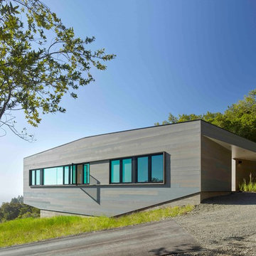
The tightly constrained footprint of the affectionately named “Box on the Rock” is a response to a limited budget and difficult site. Shallow underground hillside waterways run across the site often daylighting in unexpected and unwanted locations. These necessitated relatively expensive pier footings thus motivating an extremely efficient 2,000 sq ft footprint. With no initial resources to develop the wild scrub and rock landscape of the 3-acre property, the home becomes a lone outpost settling the higher ground of the larger natural site --a literal box on a rock.
Given these limitations, the architecture of this outpost needs to provide for all indoor and outdoor functions within its area. With the extremes of the wine country microclimate on the exposed site, this becomes an even more critical requirement for year-round comfort. The central courtyard and the cantilevered deck are strategically carved out of the diagrammatic box to ensure that over the course of the day, temperate options for both sun and shade are always available. In particular, the geometry of the overhang at the front cantilevered deck and the inward angle of its exterior glass walls are carefully calibrated to capture morning sun and winter warming while shielding the internal space from the harshest summer glare. Later in the day the central courtyard comes alive as the sunniest developed outdoor space, yet one that is naturally cooled by capturing the valley cross breezes.
With an economy of means, this simple form morphs to amplify the experience of the dramatic site and create an expansive feeling home that belies its small footprint. Each adjustment to the diagrammatic box negotiates the functional and environmental needs to foster self-contained and site-specific living with a minimal environmental impact.
Photo by Bruce Damonte
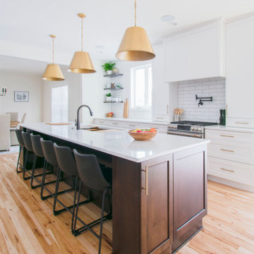 Kowalske Kitchen & Bath
A Sussex family hired us as the design build remodel company to makeover this kitchen. This remodeling project had three main goals: improve storage, update the layout/style and enhance the functionality.
IMPROVE STORAGE
The original home builder put in very narrow cabinets. The small, narrow cabinets made it difficult for the homeowners to store items. They also said it was important to have a kitchen that works for their children. The new design incorporates an appliance cabinet and wide drawers for storing items. The kids have easy access to snack drawers and lower dish storage for plastic cups and plates. Also, we added two built-in cabinets in the dining room for more storage.
UPDATE THE LAYOUT & STYLE
While the area was large, it didn’t maximize the space or fit their contemporary style. They wanted plenty of counter prep space and enough room for friends and family to gather. We added a large wood island with seating – perfect for hosting parties and family dinners. The space is bright with white shaker cabinetry and subway tile backsplash. Warm touches include satin bronze light fixtures and hardware.
ENHANCE THE FUNCTIONALITY
This Sussex kitchen features a Galley Sink Workstation. Having a sink workstation facing the center of the room allows the homeowners to stay part of the conversation while preparing a meal or cleaning up. Sink workstations are one of the hottest kitchen trends.
HOMEOWNER REVIEW
“We recently completed our kitchen remodel with Kowalske and we can’t say enough good things about our experience. Not only was every member of the team amazing, the work that was done in our kitchen was very high quality. We have recommended Kowalske to all of our friends and plan to use them for our master bath remodel in the future!” – Nicole, homeowner (Houzz Review)
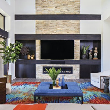
 Metropolitan Custom Homes
PRIMARY COLORS The Noakeses are not afraid of color, which found an outlet in the brilliant red, orange and blue of the Tufenkian Borealis Pacific Fire rug anchoring the living room. On the following spread, the homeowners’ art hangs on a dining room wall and is the soulmate to the living room rug’s deeply saturated colors as well as to the bright oranges in the wool and silk rug under the dining table.
Glamour is a driving force in the house, but it never overwhelms. As a backdrop in the dining room, golden Lori Weitzner wallpaper lines the display shelf where Perry and Suzy Noakes display treasures from their travels.
In the kitchen, a grouping of seeded blown glass cylinder pendants illuminates Bright Group stools and a generously proportioned island that’s big enough to seat eight guests.
The entry’s bright-red lacquered console is a place for the homeowners’ Buddha collection to get attention.
Pieces from Laura Britt’s sustainable furniture line Vervano populate the bedroom, including the Noakeses use for media storage.
Pieces from Laura Britt’s sustainable furniture line Vervano populate the bedroom, including the chair underneath the windows
The gray theme continues in the master bath, where vein-cut travertine slabs on the floor set off the sculptural flair of the bathtub.
“Homes didn’t mean anything to us,” says Perry Noakes, “except as a place to put our keys and get ready for the next journey.” The retired high-tech company executive and his wife, Suzy, are avid globe-trotters. The couple had also lived in Asia for 15 years as part of Perry’s work. Finding a place to live was a well-rehearsed exercise that figured into their system for settling in to a foreign country. But all that changed when Perry and Suzy decided to downsize to a new house in Austin. A friend told them about a spec house under construction, the project of a dream team of Austin-based design professionals that included builder Keith Husbands, architect Bob Wetmore of Cornerstone Architects, and interior designer Laura Britt and her staff. “We went to see it,” says Perry, “and loved it.” The couple quickly bought the framed-out 5,800-square-foot building.
The fact that the two-story dwelling was near a golf course was a bonus for the two golfers, but the low-slung four-bedroom, four-bath house also backs up onto a nature preserve. “The land offered us great opportunity to nestle the house into the topography, giving us both privacy and stunning views,” says Wetmore, who had to negotiate his design for the native stone, stucco and metal house to fit onto the steeply sloping and oddly elongated lot. The Hill Country contemporary house stretches out just below the rim of the slope, comfortably settled into the topography courtesy of terraced landscaping that defines the front approach to the house. “We turned a negative into a positive,” says Wetmore about the difficult site. The rough-and-ready landscape accounts for the building’s quiet dynamics, which Wetmore chronicled with the roofline, a series of horizontal areas that correspond to transitional spaces inside, interrupted by a clerestory that caps the entry and living room.
The process of taking a house from the framing stage to completion was a new experience for the couple. “We had never participated in the building process,” says Suzy. They threw themselves into it as if it were just another one of their adventures. “I think of it as my first project after I retired,” says Perry.
The budding design enthusiast so endeared himself to Britt that she and her staff awarded him with a beret to wear to design meetings, in honor of his artistic verve. “We were able to redesign a lot of the house since we came into the process so early,” says Suzy. “The house started as a spec house,” says Britt, “but it quickly became a custom home with the Noakeses’ involvement.”
Britt started the process by helping the couple select materials and lighting, opting for an earthy glamour that became the touchstone of the house. For pure wow factor, the living room’s stone and steel fireplace—sliced horizontally by three massive wood beams—is a tour de force of drama. In the kitchen, an oversize island (big enough to seat eight) is topped with a slab of dramatically veined marble; the countertops are a quieter quartzite. In the master bath, bold vein-cut travertine pavers on the floor are a counterpoint to the linear-cut mosaic tiles that back the vanity and reach all the way to the skylit ceiling. The pièce de résistance is the shimmering white pebble wall behind the free-standing tub that creates the effect of water frozen in free fall.
Britt used contrast as a backdrop to all the drama, opting for a forged metal chandelier in the shape of a lotus leaf in the entry—a worthy match to the darkened-steel front door. She designed a dining room table (through Vervano, her furniture design company) topped with patinaed steel; overhead, a massive steel-framed drum pendant with mica panels casts a delicate glow over the room. The designer was careful to leave wall space for the homeowners’ art collection, as well as to add space wherever possible. The dining room’s asymmetrical built-in is a place to display Buddhas and other pieces the couple has collected in their travels.
“We wanted this house to be about us and who we are,” says Suzy. That’s understandable since, after 16 previous homes that were really just places to live, the freedom of expression is obviously a thrill. Maybe even too much of a thrill—although this house is the couple’s dream home, they were completely enthralled with the design process. Could house No. 17 be the best and last? Maybe not. But if there is another house in the Noakeses’ future, one thing is certain, says Perry: “We won’t make a move without consulting Laura first.”
https://modernluxury.com/interiors-texas/story/smooth-move
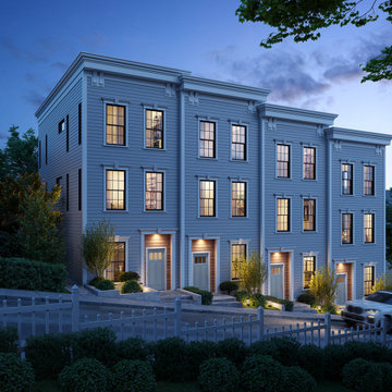
 European Home
Everywhere we look, we’re surrounded by structures and designs that captivate and draw us in, allowing us to truly appreciate the art of modern architecture.
I was very excited to receive a couple of beautiful installation images of our H Series vent-free gas fireplace from Matt Brazeau of Stove King, which operates in Putnam, CT, and Medford, MA. The images show a stunning living room that features large sliding doors and an open layout to the kitchen. What caught my eye was the detailed woodwork and the choice of wall color – I know “dark and moody” is trending but seeing it in a Boston multi-family and done so well, I was captivated and wanted to learn more.
Developer Marc Savatsky, owner of Choose Boston, LLC, a multi-function development and real estate company, was behind this project. Marc’s company works throughout Boston and surrounding suburbs to redevelop and market multi-unit properties. Situated in Dorchester’s Neponset section, the property comprises four townhomes styled in a classic federalist design, paying homage to the rich history of the area. Remarkably, all units were spoken for during construction, which reflects a perfect alignment with what buyers are looking for, which is not common at all.
Collaborating with Architects and Partners
Working with architect Peter Vanko of Vanko Studio and Marc’s spouse and partner, Jessie Franco, the group designed this inviting and sought after living space. Warm and welcoming, with an open and inviting feel, unique building materials, lots of natural light and outdoor living spaces were on the list for what they felt would provide the right character for this property. Elements such as fluted wood were chosen to add visual interest, while the darker palette around the fireplace contributed to the overall aesthetic appeal.
The project faced significant challenges with the sloping terrain because Marc had not expected the need for so many retaining walls. But, once they were designed and put in, the challenge turned to charm and provided the landscaping with additional character.
Overcoming Development Challenges
Addressing the Sloping Land
Besides the sloping terrain, another major challenge was adding gas fireplaces into each unit. Due to building constraints preventing traditional venting, the fireplaces were as tricky as the retaining walls. It was important to Marc and Jessie to include fireplaces in these units. They felt that fireplaces provide a beautiful focal point and with the cold months Boston experiences, they would make the units so much more welcoming.
After consulting with Matt Brazeau, the choice became clear: the European Home H Series Vent-Free Natural Gas Fireplace. Vent free gas fireplaces are safe alternatives to direct vent fireplaces. They solve the challenge of where to run the venting and provide the living space with a real flame, heat efficiency (99%) and with the H Series, a very clean, European design. The H Series installs similarly to a gas stove – connected to gas and built with an outer body to insulate it from combustibles. It is an easy choice when gas is the preferred type of fuel and venting is difficult or the budget does not allow for the additional space, time, and cost of venting. Vent-free gas fireplaces have been allowed in Massachusetts for 20 years (since 2004) due to their safety, efficiency and practicality.
Marc Savatsky: The Developer’s Background
From New Jersey to Boston: A Passion for Building
Marc grew up in New Jersey and received a construction management degree from Purdue. As the chair of the housing committee on Mayor Walsh’s young advisory council, his love for Boston and building came together. Immersed in the dynamic environment of Boston, he discovered his passion for the city and appreciation of the architectural legacy. Suffolk Construction provided Marc with his formative, early years in the construction business. Over time he honed his skill and knowledge of the construction industry.
Having Marc as a developer who values the essence of local history and architecture adds a distinctive touch to his endeavors. It reflects not only a commitment to excellence in construction but also a dedication to harmonizing modern development with the rich tapestry of Boston’s past.
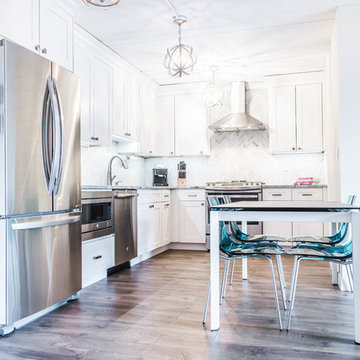 RAJ Kitchen and Bath, LLC
 “Full apartment design”.
IF you have not yet seen this apartment conversion before, we strongly urge you to go to the bottom left of this page and click on the short 2-minutes video. It would put a lot of things into perspective when you come back and continue reading this.
It is true we were literally handed the keys and told a list of things that they wanted to have happen and we were to go into the apartment, look at the space and come up with a design that would satisfy all of that need. UNTIL we showed up! The unit had really seen some better days but we knew we had to look past that and come up with a concept that would work for them.
The immediate challenges were centered around 3 big ideas:
1. Adding a second bedroom to the already small footprint
2. Figuring out a way to make the kitchen bigger, better and brighter
3. Creating a master room walk in closet
It’s always difficult to add new rooms into existing footprint without expanding out or up and not incurring any opportunity cost. In this case, that was exactly what we had to do. Item one and two above had to be tackled as one. We went ahead and switched out the location of the dining room and eliminating an area where there was a “nook” type eat-in area. By doing so, we were able to cut right into that footprint and change the layout of the kitchen.
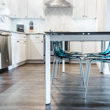
That one move allowed us to dig into the kitchen design because it was now the main focal point in the apartment. It was no longer an option to keep it in that tiny hole where it was, so we had to ensure that this design was functional and aesthetically pleasing at the same time. By adding the table into the space where an Island typically would go, we were able to both cut cost and still provide a dining experience. The Table serves as an Island as well when cooking.
We then proceeded to block in the existing doorway to the dining room. By doing this, we were able to create a full room which allowed us to put a door on the other side and called that room Bedroom #2. This was easier to do because all of the mechanicals were already in that space (light, heater and windows). By shifting things around, we also achieved a huge wall to wall closet from inside. PERFECT!
Then we moved into the Single bedroom. We thought it was a big room with a small closet, so by creatively adding an L shaped wall and steal some footprint into the bedroom side, we were able to put a door on that new room and design it for the walk-in closet. Even after this, the bedroom still holds a queen size bed with 2 night stands, a TV on the wall, a sitting chair and plenty of room to walk around. This was done by rethinking the location for the bed and night stands.
The bathroom was gutted to make sure there was no leaks and rebuild from the ground up. We kept all of the plumbing where it was, added a new vanity, medicine cabinet, tiles and lighting and it was done.
From there, the rest of the unit had new flooring all throughout, paint, and lighting. After completion and walk through, this project was handed over back to the clients.
Execution and collaboration between all the trades were: Reggie and his team from Premier Interiors and Rohan from RD Mechanical Services.
p.s. Please see our website to see the video.
 RAJ Kitchen and Bath, LLC
 “Full apartment design”.
IF you have not yet seen this apartment conversion before, we strongly urge you to go to the bottom left of this page and click on the short 2-minutes video. It would put a lot of things into perspective when you come back and continue reading this.
It is true we were literally handed the keys and told a list of things that they wanted to have happen and we were to go into the apartment, look at the space and come up with a design that would satisfy all of that need. UNTIL we showed up! The unit had really seen some better days but we knew we had to look past that and come up with a concept that would work for them.
The immediate challenges were centered around 3 big ideas:
1. Adding a second bedroom to the already small footprint
2. Figuring out a way to make the kitchen bigger, better and brighter
3. Creating a master room walk in closet
It’s always difficult to add new rooms into existing footprint without expanding out or up and not incurring any opportunity cost. In this case, that was exactly what we had to do. Item one and two above had to be tackled as one. We went ahead and switched out the location of the dining room and eliminating an area where there was a “nook” type eat-in area. By doing so, we were able to cut right into that footprint and change the layout of the kitchen.
That one move allowed us to dig into the kitchen design because it was now the main focal point in the apartment. It was no longer an option to keep it in that tiny hole where it was, so we had to ensure that this design was functional and aesthetically pleasing at the same time. By adding the table into the space where an Island typically would go, we were able to both cut cost and still provide a dining experience. The Table serves as an Island as well when cooking.
We then proceeded to block in the existing doorway to the dining room. By doing this, we were able to create a full room which allowed us to put a door on the other side and called that room Bedroom #2. This was easier to do because all of the mechanicals were already in that space (light, heater and windows). By shifting things around, we also achieved a huge wall to wall closet from inside. PERFECT!
Then we moved into the Single bedroom. We thought it was a big room with a small closet, so by creatively adding an L shaped wall and steal some footprint into the bedroom side, we were able to put a door on that new room and design it for the walk-in closet. Even after this, the bedroom still holds a queen size bed with 2 night stands, a TV on the wall, a sitting chair and plenty of room to walk around. This was done by rethinking the location for the bed and night stands.
The bathroom was gutted to make sure there was no leaks and rebuild from the ground up. We kept all of the plumbing where it was, added a new vanity, medicine cabinet, tiles and lighting and it was done.
From there, the rest of the unit had new flooring all throughout, paint, and lighting. After completion and walk through, this project was handed over back to the clients.
Execution and collaboration between all the trades were: Reggie and his team from Premier Interiors and Rohan from RD Mechanical Services.
p.s. Please see our website to see the video.
 Pete Retondo Architecture
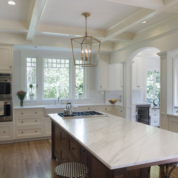
Kitchen with marble & Walnut island, Breakfast Room through the archway
Richard Tauber Photography
Large transitional l-shaped eat-in kitchen photo in San Francisco with shaker cabinets, marble countertops and an island
Large transitional l-shaped eat-in kitchen photo in San Francisco with shaker cabinets, marble countertops and an island
 Dave Fox Design Build Remodelers
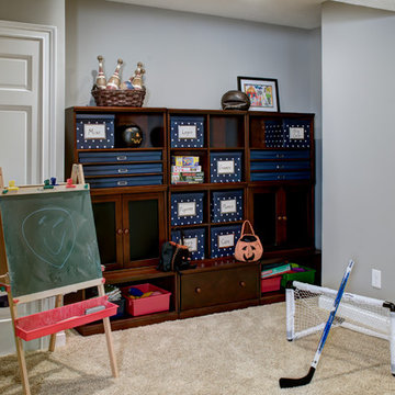
This project involved converting a partially finished basement into an ultimate media room with an English pub. The family is big on entertaining and enjoys watching movies and college football. It was important to combine the media area with the pub to create options for guests within the same space. Although the home has a full sized basement the staircase was centrally located, which made it difficult for special configuration. As a result, we were able to work with the existing plan be designing a media area large enough for a sectional sofa and additional seating with the English pub at the far end of the room.
The home owner had a projection screen on a bare wall with the electrical components stacked on boxes. The new plan involved installing new cabinets to accommodate components and surround the screen to give it a built-in finish. Open shelving also allows the homeowner to feature some of their collectible sports memorabilia. As if the 130 inch projection screen wasn’t large enough, the surround sound system makes you feel like you are part of the action. It is as close to the I MAX viewing experience as you are going to get in a home. Sound-deadening insulation was installed in the ceiling and walls to prevent noise from penetrating the second floor.
The design of the pub was inspired by the home owner’s favorite local pub, Brazenhead. The bar countertop with lift-top entrance was custom built by our carpenters to simulate aged wood. The finish looks rough, but it is smooth enough to wipe down easily. The top encloses the bar and provides seating for guests. A TV at the bar allows guest to follow along with the game on the big screen or tune into another game. The game table provides even another option for entertainment in the media room. Stacked stone with thick mortar joints was installed on the face of the bar and to an opposite wall containing the entrance to a wine room. Hand scrapped hardwood floors were installed in the pub portion of the media room to provide yet another touch to “Brazenhead” their own pub.
The wet bar is under a soffit area that continues into the media area due to existing duct work. We wanted to creatively find a way to separate the two spaces. Adding trim on the ceiling and front of soffit at the bar defined the area and made a great transition from the drywall soffit to the wet bar. A tin ceiling was installed which added to the ambience of the pub wet bar and further aided in defining the soffit as an intentional part of the design. Custom built wainscoting borders the perimeter of the media room. The end result allows the client to comfortably entertain in a space designed just for them.
 Dumpster Rentals
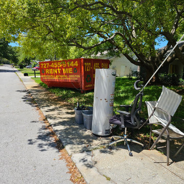
KOZAK Roll Off Dumpster Rentals, LLC 727-455-5144 - New Port Richey, FL, is a leading dumpster rental and junk removal service provider in New Port Richey, Florida. They serve residential and commercial clients, offering various waste disposal solutions. Their services are ideal for repair, renovation, development, and cleanout projects. The company takes pride in keeping its customers on schedule and under budget with reliable and reasonably-priced driveway-friendly bins. They offer low-cost rentals for all projects and jobs in New Port Richey, Florida. Along with top-quality roll-off container rentals, they also offer junk removal services to help clear away waste, allowing customers to focus on their tasks. As a locally owned and operated company, they are committed to providing the #1 dumpster rental service in New Port Richey, FL, for short-term and long-term waste removal needs. Their offerings include 15-yard dump trailers, roll-offs, and 20-yard roll-offs, catering to different project scales and waste volumes. They also provide flexible scheduling to accommodate the needs of their customers and ensure that all waste is disposed of responsibly in partnership with the Pasco and Pinellas County Solid Waste Landfills. Whether you're a homeowner undertaking a DIY remodel, a contractor in need of reliable waste disposal, or a business owner managing a large-scale project, KOZAK Roll Off Dumpster Rentals 727-455-5144 - New Port Richey, FL, is a top choice for quality equipment, outstanding customer support, and affordable pricing. Their services can be quickly booked online or over the phone.
12