
Search results for "Difficult experience" in Home Design Ideas
 Case Design/Remodeling Halifax
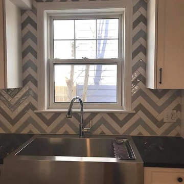
A full kitchen renovation and basement bathroom remodel in Halifax!
Reworking and painting of existing cabinetry, quartz countertops, new farm house sink with faucet, and ceramic tiled backsplash!
Comments from our happy clients:
“We hired Case to renovate a number of things in our new house, including a bathroom and our kitchen. Everyone was great to work with, respectful and accommodating. The process was a lot less difficult than we had anticipated and the finished product looks amazing. We couldn’t be more pleased with the results or the experience! We will definitely contact Case when we decide to renovate other rooms in our house!”
 RAJ Kitchen and Bath, LLC
 “Full apartment design”.
IF you have not yet seen this apartment conversion before, we strongly urge you to go to the bottom left of this page and click on the short 2-minutes video. It would put a lot of things into perspective when you come back and continue reading this.
It is true we were literally handed the keys and told a list of things that they wanted to have happen and we were to go into the apartment, look at the space and come up with a design that would satisfy all of that need. UNTIL we showed up! The unit had really seen some better days but we knew we had to look past that and come up with a concept that would work for them.
The immediate challenges were centered around 3 big ideas:
1. Adding a second bedroom to the already small footprint
2. Figuring out a way to make the kitchen bigger, better and brighter
3. Creating a master room walk in closet
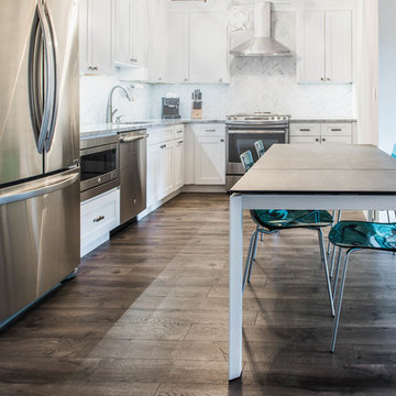
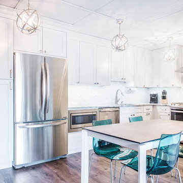
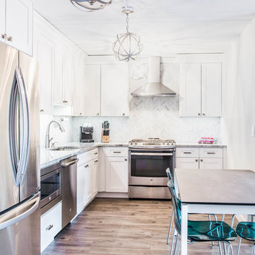
It’s always difficult to add new rooms into existing footprint without expanding out or up and not incurring any opportunity cost. In this case, that was exactly what we had to do. Item one and two above had to be tackled as one. We went ahead and switched out the location of the dining room and eliminating an area where there was a “nook” type eat-in area. By doing so, we were able to cut right into that footprint and change the layout of the kitchen.
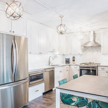
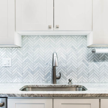
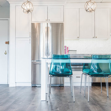
That one move allowed us to dig into the kitchen design because it was now the main focal point in the apartment. It was no longer an option to keep it in that tiny hole where it was, so we had to ensure that this design was functional and aesthetically pleasing at the same time. By adding the table into the space where an Island typically would go, we were able to both cut cost and still provide a dining experience. The Table serves as an Island as well when cooking.
We then proceeded to block in the existing doorway to the dining room. By doing this, we were able to create a full room which allowed us to put a door on the other side and called that room Bedroom #2. This was easier to do because all of the mechanicals were already in that space (light, heater and windows). By shifting things around, we also achieved a huge wall to wall closet from inside. PERFECT!
Then we moved into the Single bedroom. We thought it was a big room with a small closet, so by creatively adding an L shaped wall and steal some footprint into the bedroom side, we were able to put a door on that new room and design it for the walk-in closet. Even after this, the bedroom still holds a queen size bed with 2 night stands, a TV on the wall, a sitting chair and plenty of room to walk around. This was done by rethinking the location for the bed and night stands.
The bathroom was gutted to make sure there was no leaks and rebuild from the ground up. We kept all of the plumbing where it was, added a new vanity, medicine cabinet, tiles and lighting and it was done.
From there, the rest of the unit had new flooring all throughout, paint, and lighting. After completion and walk through, this project was handed over back to the clients.
Execution and collaboration between all the trades were: Reggie and his team from Premier Interiors and Rohan from RD Mechanical Services.
p.s. Please see our website to see the video.
 The Decorating Therapist
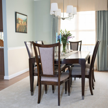
As part of the luxury main-floor renovation, the dining room layout was reimagined to improve circulation and create a more entertaining-friendly floor plan. A large sideboard that previously occupied the shared wall between the kitchen and dining room restricted movement around the dining table, making it difficult for guests to circulate comfortably during gatherings. By relocating the piece to the adjacent living room and repurposing it as an elegant home bar, the design dramatically improved traffic flow while giving the furniture a sophisticated new purpose. This thoughtful space-planning solution enhanced both functionality and hospitality, creating a more open dining experience and a dedicated beverage station for effortless entertaining.
Find the right local pro for your project
 RAJ Kitchen and Bath, LLC
 “Full apartment design”.
IF you have not yet seen this apartment conversion before, we strongly urge you to go to the bottom left of this page and click on the short 2-minutes video. It would put a lot of things into perspective when you come back and continue reading this.
It is true we were literally handed the keys and told a list of things that they wanted to have happen and we were to go into the apartment, look at the space and come up with a design that would satisfy all of that need. UNTIL we showed up! The unit had really seen some better days but we knew we had to look past that and come up with a concept that would work for them.
The immediate challenges were centered around 3 big ideas:
1. Adding a second bedroom to the already small footprint
2. Figuring out a way to make the kitchen bigger, better and brighter
3. Creating a master room walk in closet
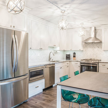
It’s always difficult to add new rooms into existing footprint without expanding out or up and not incurring any opportunity cost. In this case, that was exactly what we had to do. Item one and two above had to be tackled as one. We went ahead and switched out the location of the dining room and eliminating an area where there was a “nook” type eat-in area. By doing so, we were able to cut right into that footprint and change the layout of the kitchen.
That one move allowed us to dig into the kitchen design because it was now the main focal point in the apartment. It was no longer an option to keep it in that tiny hole where it was, so we had to ensure that this design was functional and aesthetically pleasing at the same time. By adding the table into the space where an Island typically would go, we were able to both cut cost and still provide a dining experience. The Table serves as an Island as well when cooking.
We then proceeded to block in the existing doorway to the dining room. By doing this, we were able to create a full room which allowed us to put a door on the other side and called that room Bedroom #2. This was easier to do because all of the mechanicals were already in that space (light, heater and windows). By shifting things around, we also achieved a huge wall to wall closet from inside. PERFECT!
Then we moved into the Single bedroom. We thought it was a big room with a small closet, so by creatively adding an L shaped wall and steal some footprint into the bedroom side, we were able to put a door on that new room and design it for the walk-in closet. Even after this, the bedroom still holds a queen size bed with 2 night stands, a TV on the wall, a sitting chair and plenty of room to walk around. This was done by rethinking the location for the bed and night stands.
The bathroom was gutted to make sure there was no leaks and rebuild from the ground up. We kept all of the plumbing where it was, added a new vanity, medicine cabinet, tiles and lighting and it was done.
From there, the rest of the unit had new flooring all throughout, paint, and lighting. After completion and walk through, this project was handed over back to the clients.
Execution and collaboration between all the trades were: Reggie and his team from Premier Interiors and Rohan from RD Mechanical Services.
p.s. Please see our website to see the video.
 RAJ Kitchen and Bath, LLC
 “Full apartment design”.
IF you have not yet seen this apartment conversion before, we strongly urge you to go to the bottom left of this page and click on the short 2-minutes video. It would put a lot of things into perspective when you come back and continue reading this.
It is true we were literally handed the keys and told a list of things that they wanted to have happen and we were to go into the apartment, look at the space and come up with a design that would satisfy all of that need. UNTIL we showed up! The unit had really seen some better days but we knew we had to look past that and come up with a concept that would work for them.
The immediate challenges were centered around 3 big ideas:
1. Adding a second bedroom to the already small footprint
2. Figuring out a way to make the kitchen bigger, better and brighter
3. Creating a master room walk in closet
It’s always difficult to add new rooms into existing footprint without expanding out or up and not incurring any opportunity cost. In this case, that was exactly what we had to do. Item one and two above had to be tackled as one. We went ahead and switched out the location of the dining room and eliminating an area where there was a “nook” type eat-in area. By doing so, we were able to cut right into that footprint and change the layout of the kitchen.
That one move allowed us to dig into the kitchen design because it was now the main focal point in the apartment. It was no longer an option to keep it in that tiny hole where it was, so we had to ensure that this design was functional and aesthetically pleasing at the same time. By adding the table into the space where an Island typically would go, we were able to both cut cost and still provide a dining experience. The Table serves as an Island as well when cooking.
We then proceeded to block in the existing doorway to the dining room. By doing this, we were able to create a full room which allowed us to put a door on the other side and called that room Bedroom #2. This was easier to do because all of the mechanicals were already in that space (light, heater and windows). By shifting things around, we also achieved a huge wall to wall closet from inside. PERFECT!
Then we moved into the Single bedroom. We thought it was a big room with a small closet, so by creatively adding an L shaped wall and steal some footprint into the bedroom side, we were able to put a door on that new room and design it for the walk-in closet. Even after this, the bedroom still holds a queen size bed with 2 night stands, a TV on the wall, a sitting chair and plenty of room to walk around. This was done by rethinking the location for the bed and night stands.
The bathroom was gutted to make sure there was no leaks and rebuild from the ground up. We kept all of the plumbing where it was, added a new vanity, medicine cabinet, tiles and lighting and it was done.
From there, the rest of the unit had new flooring all throughout, paint, and lighting. After completion and walk through, this project was handed over back to the clients.
Execution and collaboration between all the trades were: Reggie and his team from Premier Interiors and Rohan from RD Mechanical Services.
p.s. Please see our website to see the video.
 RAJ Kitchen and Bath, LLC
 “Full apartment design”.
IF you have not yet seen this apartment conversion before, we strongly urge you to go to the bottom left of this page and click on the short 2-minutes video. It would put a lot of things into perspective when you come back and continue reading this.
It is true we were literally handed the keys and told a list of things that they wanted to have happen and we were to go into the apartment, look at the space and come up with a design that would satisfy all of that need. UNTIL we showed up! The unit had really seen some better days but we knew we had to look past that and come up with a concept that would work for them.
The immediate challenges were centered around 3 big ideas:
1. Adding a second bedroom to the already small footprint
2. Figuring out a way to make the kitchen bigger, better and brighter
3. Creating a master room walk in closet
It’s always difficult to add new rooms into existing footprint without expanding out or up and not incurring any opportunity cost. In this case, that was exactly what we had to do. Item one and two above had to be tackled as one. We went ahead and switched out the location of the dining room and eliminating an area where there was a “nook” type eat-in area. By doing so, we were able to cut right into that footprint and change the layout of the kitchen.
That one move allowed us to dig into the kitchen design because it was now the main focal point in the apartment. It was no longer an option to keep it in that tiny hole where it was, so we had to ensure that this design was functional and aesthetically pleasing at the same time. By adding the table into the space where an Island typically would go, we were able to both cut cost and still provide a dining experience. The Table serves as an Island as well when cooking.
We then proceeded to block in the existing doorway to the dining room. By doing this, we were able to create a full room which allowed us to put a door on the other side and called that room Bedroom #2. This was easier to do because all of the mechanicals were already in that space (light, heater and windows). By shifting things around, we also achieved a huge wall to wall closet from inside. PERFECT!
Then we moved into the Single bedroom. We thought it was a big room with a small closet, so by creatively adding an L shaped wall and steal some footprint into the bedroom side, we were able to put a door on that new room and design it for the walk-in closet. Even after this, the bedroom still holds a queen size bed with 2 night stands, a TV on the wall, a sitting chair and plenty of room to walk around. This was done by rethinking the location for the bed and night stands.
The bathroom was gutted to make sure there was no leaks and rebuild from the ground up. We kept all of the plumbing where it was, added a new vanity, medicine cabinet, tiles and lighting and it was done.
From there, the rest of the unit had new flooring all throughout, paint, and lighting. After completion and walk through, this project was handed over back to the clients.
Execution and collaboration between all the trades were: Reggie and his team from Premier Interiors and Rohan from RD Mechanical Services.
p.s. Please see our website to see the video.
 Kowalske Kitchen & Bath
A Sussex family hired us as the design build remodel company to makeover this kitchen. This remodeling project had three main goals: improve storage, update the layout/style and enhance the functionality.
IMPROVE STORAGE
The original home builder put in very narrow cabinets. The small, narrow cabinets made it difficult for the homeowners to store items. They also said it was important to have a kitchen that works for their children. The new design incorporates an appliance cabinet and wide drawers for storing items. The kids have easy access to snack drawers and lower dish storage for plastic cups and plates. Also, we added two built-in cabinets in the dining room for more storage.
UPDATE THE LAYOUT & STYLE
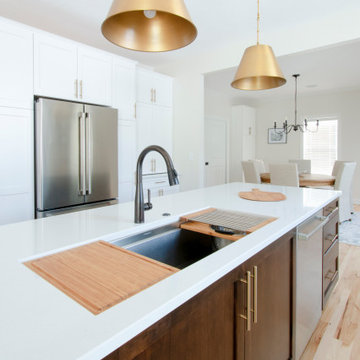
While the area was large, it didn’t maximize the space or fit their contemporary style. They wanted plenty of counter prep space and enough room for friends and family to gather. We added a large wood island with seating – perfect for hosting parties and family dinners. The space is bright with white shaker cabinetry and subway tile backsplash. Warm touches include satin bronze light fixtures and hardware.
ENHANCE THE FUNCTIONALITY
This Sussex kitchen features a Galley Sink Workstation. Having a sink workstation facing the center of the room allows the homeowners to stay part of the conversation while preparing a meal or cleaning up. Sink workstations are one of the hottest kitchen trends.
HOMEOWNER REVIEW
“We recently completed our kitchen remodel with Kowalske and we can’t say enough good things about our experience. Not only was every member of the team amazing, the work that was done in our kitchen was very high quality. We have recommended Kowalske to all of our friends and plan to use them for our master bath remodel in the future!” – Nicole, homeowner (Houzz Review)
 Tangerine Designs Kitchens and Baths
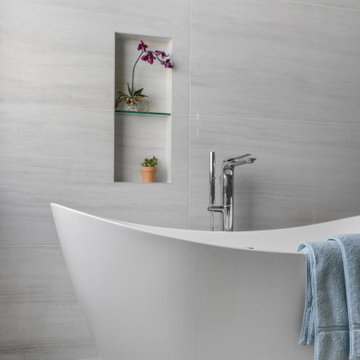
A close view of the freestanding tub and floor-mounted chrome filler, with a recessed glass-shelf niche displaying orchids against soft grey stone-look tile. A tranquil, spa-inspired moment.
 RAJ Kitchen and Bath, LLC
 “Full apartment design”.
IF you have not yet seen this apartment conversion before, we strongly urge you to go to the bottom left of this page and click on the short 2-minutes video. It would put a lot of things into perspective when you come back and continue reading this.
It is true we were literally handed the keys and told a list of things that they wanted to have happen and we were to go into the apartment, look at the space and come up with a design that would satisfy all of that need. UNTIL we showed up! The unit had really seen some better days but we knew we had to look past that and come up with a concept that would work for them.
The immediate challenges were centered around 3 big ideas:
1. Adding a second bedroom to the already small footprint
2. Figuring out a way to make the kitchen bigger, better and brighter
3. Creating a master room walk in closet
It’s always difficult to add new rooms into existing footprint without expanding out or up and not incurring any opportunity cost. In this case, that was exactly what we had to do. Item one and two above had to be tackled as one. We went ahead and switched out the location of the dining room and eliminating an area where there was a “nook” type eat-in area. By doing so, we were able to cut right into that footprint and change the layout of the kitchen.
That one move allowed us to dig into the kitchen design because it was now the main focal point in the apartment. It was no longer an option to keep it in that tiny hole where it was, so we had to ensure that this design was functional and aesthetically pleasing at the same time. By adding the table into the space where an Island typically would go, we were able to both cut cost and still provide a dining experience. The Table serves as an Island as well when cooking.
We then proceeded to block in the existing doorway to the dining room. By doing this, we were able to create a full room which allowed us to put a door on the other side and called that room Bedroom #2. This was easier to do because all of the mechanicals were already in that space (light, heater and windows). By shifting things around, we also achieved a huge wall to wall closet from inside. PERFECT!
Then we moved into the Single bedroom. We thought it was a big room with a small closet, so by creatively adding an L shaped wall and steal some footprint into the bedroom side, we were able to put a door on that new room and design it for the walk-in closet. Even after this, the bedroom still holds a queen size bed with 2 night stands, a TV on the wall, a sitting chair and plenty of room to walk around. This was done by rethinking the location for the bed and night stands.
The bathroom was gutted to make sure there was no leaks and rebuild from the ground up. We kept all of the plumbing where it was, added a new vanity, medicine cabinet, tiles and lighting and it was done.
From there, the rest of the unit had new flooring all throughout, paint, and lighting. After completion and walk through, this project was handed over back to the clients.
Execution and collaboration between all the trades were: Reggie and his team from Premier Interiors and Rohan from RD Mechanical Services.
p.s. Please see our website to see the video.
 RAJ Kitchen and Bath, LLC
 “Full apartment design”.
IF you have not yet seen this apartment conversion before, we strongly urge you to go to the bottom left of this page and click on the short 2-minutes video. It would put a lot of things into perspective when you come back and continue reading this.
It is true we were literally handed the keys and told a list of things that they wanted to have happen and we were to go into the apartment, look at the space and come up with a design that would satisfy all of that need. UNTIL we showed up! The unit had really seen some better days but we knew we had to look past that and come up with a concept that would work for them.
The immediate challenges were centered around 3 big ideas:
1. Adding a second bedroom to the already small footprint
2. Figuring out a way to make the kitchen bigger, better and brighter
3. Creating a master room walk in closet
It’s always difficult to add new rooms into existing footprint without expanding out or up and not incurring any opportunity cost. In this case, that was exactly what we had to do. Item one and two above had to be tackled as one. We went ahead and switched out the location of the dining room and eliminating an area where there was a “nook” type eat-in area. By doing so, we were able to cut right into that footprint and change the layout of the kitchen.
That one move allowed us to dig into the kitchen design because it was now the main focal point in the apartment. It was no longer an option to keep it in that tiny hole where it was, so we had to ensure that this design was functional and aesthetically pleasing at the same time. By adding the table into the space where an Island typically would go, we were able to both cut cost and still provide a dining experience. The Table serves as an Island as well when cooking.
We then proceeded to block in the existing doorway to the dining room. By doing this, we were able to create a full room which allowed us to put a door on the other side and called that room Bedroom #2. This was easier to do because all of the mechanicals were already in that space (light, heater and windows). By shifting things around, we also achieved a huge wall to wall closet from inside. PERFECT!
Then we moved into the Single bedroom. We thought it was a big room with a small closet, so by creatively adding an L shaped wall and steal some footprint into the bedroom side, we were able to put a door on that new room and design it for the walk-in closet. Even after this, the bedroom still holds a queen size bed with 2 night stands, a TV on the wall, a sitting chair and plenty of room to walk around. This was done by rethinking the location for the bed and night stands.
The bathroom was gutted to make sure there was no leaks and rebuild from the ground up. We kept all of the plumbing where it was, added a new vanity, medicine cabinet, tiles and lighting and it was done.
From there, the rest of the unit had new flooring all throughout, paint, and lighting. After completion and walk through, this project was handed over back to the clients.
Execution and collaboration between all the trades were: Reggie and his team from Premier Interiors and Rohan from RD Mechanical Services.
p.s. Please see our website to see the video.
 LPC Paint & Coatings
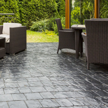
Transform plain concrete or plywood into a durable, designer surface. We offer several styles to choose from simulating flagstone, slate, brick, tile and more. Original concrete does not have to be removed.
This is perfect for patios, decks, driveways, walkways, and flooring.
 RAJ Kitchen and Bath, LLC
 “Full apartment design”.
IF you have not yet seen this apartment conversion before, we strongly urge you to go to the bottom left of this page and click on the short 2-minutes video. It would put a lot of things into perspective when you come back and continue reading this.
It is true we were literally handed the keys and told a list of things that they wanted to have happen and we were to go into the apartment, look at the space and come up with a design that would satisfy all of that need. UNTIL we showed up! The unit had really seen some better days but we knew we had to look past that and come up with a concept that would work for them.
The immediate challenges were centered around 3 big ideas:
1. Adding a second bedroom to the already small footprint
2. Figuring out a way to make the kitchen bigger, better and brighter
3. Creating a master room walk in closet
It’s always difficult to add new rooms into existing footprint without expanding out or up and not incurring any opportunity cost. In this case, that was exactly what we had to do. Item one and two above had to be tackled as one. We went ahead and switched out the location of the dining room and eliminating an area where there was a “nook” type eat-in area. By doing so, we were able to cut right into that footprint and change the layout of the kitchen.
That one move allowed us to dig into the kitchen design because it was now the main focal point in the apartment. It was no longer an option to keep it in that tiny hole where it was, so we had to ensure that this design was functional and aesthetically pleasing at the same time. By adding the table into the space where an Island typically would go, we were able to both cut cost and still provide a dining experience. The Table serves as an Island as well when cooking.
We then proceeded to block in the existing doorway to the dining room. By doing this, we were able to create a full room which allowed us to put a door on the other side and called that room Bedroom #2. This was easier to do because all of the mechanicals were already in that space (light, heater and windows). By shifting things around, we also achieved a huge wall to wall closet from inside. PERFECT!
Then we moved into the Single bedroom. We thought it was a big room with a small closet, so by creatively adding an L shaped wall and steal some footprint into the bedroom side, we were able to put a door on that new room and design it for the walk-in closet. Even after this, the bedroom still holds a queen size bed with 2 night stands, a TV on the wall, a sitting chair and plenty of room to walk around. This was done by rethinking the location for the bed and night stands.
The bathroom was gutted to make sure there was no leaks and rebuild from the ground up. We kept all of the plumbing where it was, added a new vanity, medicine cabinet, tiles and lighting and it was done.
From there, the rest of the unit had new flooring all throughout, paint, and lighting. After completion and walk through, this project was handed over back to the clients.
Execution and collaboration between all the trades were: Reggie and his team from Premier Interiors and Rohan from RD Mechanical Services.
p.s. Please see our website to see the video.
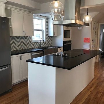 Case Design/Remodeling Halifax
A full kitchen renovation and basement bathroom remodel in Halifax!
Reworking and painting of existing cabinetry, quartz countertops, new farm house sink with faucet, and ceramic tiled backsplash!
Comments from our happy clients:
“We hired Case to renovate a number of things in our new house, including a bathroom and our kitchen. Everyone was great to work with, respectful and accommodating. The process was a lot less difficult than we had anticipated and the finished product looks amazing. We couldn’t be more pleased with the results or the experience! We will definitely contact Case when we decide to renovate other rooms in our house!”
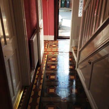
 Tile Doctor Ltd
This Victorian tiled hallway at a house in the Forest of Dean had a very interesting pattern, consisting of an array of different colours, including shades of red, yellow and blue. Unfortunately, as you can see from the first photograph below, the tiles had lost all life, with the colours largely masked by months’ – or maybe even years’ – worth of ingrained dirt and muck. The floor as a whole was also suffering from a number of loose tiles that needed to be reset before it could be cleaned.
The property owner was keen to employ some professional assistance to restore the appearance of the floor and prevent it from getting in an even wrote state, and so contacted Tile Doctor who have a lot of experience working with Victorian tiled floors.
As mentioned, the loose tiles had to be repaired before the cleaning process could be started. I removed the tiles and extracted excess grout and old adhesive from the exposed concrete substrate using a vacuum, before putting the original tiles back into place and fixing them back into position carefully using fresh adhesive and matching grout.
Once happy the replaced tiles had set, I started the process of cleaning the entire area of hallway tiles using a combination of Tile Doctor Remove and Go to strip away the old sealer and Tile Doctor NanoTech HBU (formerly Ultra Clean) remover to get the tiles as clean as possible. The latter product contains nano-sized cleaning particles (hence the name) to reach difficult areas of trapped dirt, making it more effective than your run-of-the-mill tile cleaner. These two products were scrubbed into the tiles using a rotary machine fitted with a black scrubbing pad. The floor was then rinsed with water and the soiled residue was extracted with a wet vacuum.
I then paid particular attention to the grout, applying our alkaline-based multi-purpose cleaner Tile Doctor Pro-Clean to the grout lines, before scrubbing them with a narrow grout brush. This quickly had the grout looking clean again: I’d even go as far as to say that it matched it seamlessly with the fresh grout that had just been laid.
With the tile and grout as clean as it was possible to get it, I gave the whole floor a final rinse to neutralise the excess chemicals. I extracted as much water as possible with a wet vacuum and left the floor to dry overnight.
My first task upon returning to the property the next day was to check for any dampness. If you neglect to remove all excess moisture from the surface of the tiles before sealing it is more than likely going to cloud the sealer, rendering it less effective I’m protecting the stone against ingrained dirt and stains.
Once satisfied that the floor was completely dry, I proceeded to seal the tiles using multiple costs of Tile Doctor Seal and Go. Seal and Go is what we would classify as a topical sealer, meaning it rests on the surface of the tiles to act as a durable layer of protection against all kinds of muck. While providing surface protection, Seal and Go also adds a nice subtle sheen to the tiles, as per the customer’s request.
The customer was quite amazed at how quickly the appearance of the tiles had been restored. It was fantastic to see the colours we both knew were hidden in the tiles come to life once again. Another satisfied customer for sure!
Paul Wales
Monmouthshire Tile Doctor
 RAJ Kitchen and Bath, LLC
 “Full apartment design”.
IF you have not yet seen this apartment conversion before, we strongly urge you to go to the bottom left of this page and click on the short 2-minutes video. It would put a lot of things into perspective when you come back and continue reading this.
It is true we were literally handed the keys and told a list of things that they wanted to have happen and we were to go into the apartment, look at the space and come up with a design that would satisfy all of that need. UNTIL we showed up! The unit had really seen some better days but we knew we had to look past that and come up with a concept that would work for them.
The immediate challenges were centered around 3 big ideas:
1. Adding a second bedroom to the already small footprint
2. Figuring out a way to make the kitchen bigger, better and brighter
3. Creating a master room walk in closet
It’s always difficult to add new rooms into existing footprint without expanding out or up and not incurring any opportunity cost. In this case, that was exactly what we had to do. Item one and two above had to be tackled as one. We went ahead and switched out the location of the dining room and eliminating an area where there was a “nook” type eat-in area. By doing so, we were able to cut right into that footprint and change the layout of the kitchen.
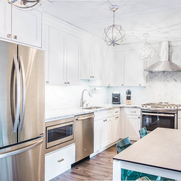
That one move allowed us to dig into the kitchen design because it was now the main focal point in the apartment. It was no longer an option to keep it in that tiny hole where it was, so we had to ensure that this design was functional and aesthetically pleasing at the same time. By adding the table into the space where an Island typically would go, we were able to both cut cost and still provide a dining experience. The Table serves as an Island as well when cooking.
We then proceeded to block in the existing doorway to the dining room. By doing this, we were able to create a full room which allowed us to put a door on the other side and called that room Bedroom #2. This was easier to do because all of the mechanicals were already in that space (light, heater and windows). By shifting things around, we also achieved a huge wall to wall closet from inside. PERFECT!
Then we moved into the Single bedroom. We thought it was a big room with a small closet, so by creatively adding an L shaped wall and steal some footprint into the bedroom side, we were able to put a door on that new room and design it for the walk-in closet. Even after this, the bedroom still holds a queen size bed with 2 night stands, a TV on the wall, a sitting chair and plenty of room to walk around. This was done by rethinking the location for the bed and night stands.
The bathroom was gutted to make sure there was no leaks and rebuild from the ground up. We kept all of the plumbing where it was, added a new vanity, medicine cabinet, tiles and lighting and it was done.
From there, the rest of the unit had new flooring all throughout, paint, and lighting. After completion and walk through, this project was handed over back to the clients.
Execution and collaboration between all the trades were: Reggie and his team from Premier Interiors and Rohan from RD Mechanical Services.
p.s. Please see our website to see the video.
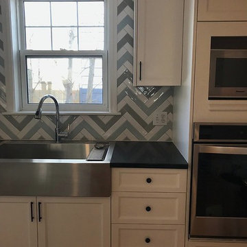 Case Design/Remodeling Halifax
A full kitchen renovation and basement bathroom remodel in Halifax!
Reworking and painting of existing cabinetry, quartz countertops, new farm house sink with faucet, and ceramic tiled backsplash!
Comments from our happy clients:
“We hired Case to renovate a number of things in our new house, including a bathroom and our kitchen. Everyone was great to work with, respectful and accommodating. The process was a lot less difficult than we had anticipated and the finished product looks amazing. We couldn’t be more pleased with the results or the experience! We will definitely contact Case when we decide to renovate other rooms in our house!”
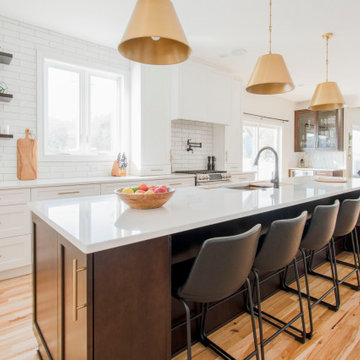 Kowalske Kitchen & Bath
A Sussex family hired us as the design build remodel company to makeover this kitchen. This remodeling project had three main goals: improve storage, update the layout/style and enhance the functionality.
IMPROVE STORAGE
The original home builder put in very narrow cabinets. The small, narrow cabinets made it difficult for the homeowners to store items. They also said it was important to have a kitchen that works for their children. The new design incorporates an appliance cabinet and wide drawers for storing items. The kids have easy access to snack drawers and lower dish storage for plastic cups and plates. Also, we added two built-in cabinets in the dining room for more storage.
UPDATE THE LAYOUT & STYLE
While the area was large, it didn’t maximize the space or fit their contemporary style. They wanted plenty of counter prep space and enough room for friends and family to gather. We added a large wood island with seating – perfect for hosting parties and family dinners. The space is bright with white shaker cabinetry and subway tile backsplash. Warm touches include satin bronze light fixtures and hardware.
ENHANCE THE FUNCTIONALITY
This Sussex kitchen features a Galley Sink Workstation. Having a sink workstation facing the center of the room allows the homeowners to stay part of the conversation while preparing a meal or cleaning up. Sink workstations are one of the hottest kitchen trends.
HOMEOWNER REVIEW
“We recently completed our kitchen remodel with Kowalske and we can’t say enough good things about our experience. Not only was every member of the team amazing, the work that was done in our kitchen was very high quality. We have recommended Kowalske to all of our friends and plan to use them for our master bath remodel in the future!” – Nicole, homeowner (Houzz Review)
 Kowalske Kitchen & Bath
A Sussex family hired us as the design build remodel company to makeover this kitchen. This remodeling project had three main goals: improve storage, update the layout/style and enhance the functionality.
IMPROVE STORAGE
The original home builder put in very narrow cabinets. The small, narrow cabinets made it difficult for the homeowners to store items. They also said it was important to have a kitchen that works for their children. The new design incorporates an appliance cabinet and wide drawers for storing items. The kids have easy access to snack drawers and lower dish storage for plastic cups and plates. Also, we added two built-in cabinets in the dining room for more storage.
UPDATE THE LAYOUT & STYLE
While the area was large, it didn’t maximize the space or fit their contemporary style. They wanted plenty of counter prep space and enough room for friends and family to gather. We added a large wood island with seating – perfect for hosting parties and family dinners. The space is bright with white shaker cabinetry and subway tile backsplash. Warm touches include satin bronze light fixtures and hardware.
ENHANCE THE FUNCTIONALITY
This Sussex kitchen features a Galley Sink Workstation. Having a sink workstation facing the center of the room allows the homeowners to stay part of the conversation while preparing a meal or cleaning up. Sink workstations are one of the hottest kitchen trends.
HOMEOWNER REVIEW
“We recently completed our kitchen remodel with Kowalske and we can’t say enough good things about our experience. Not only was every member of the team amazing, the work that was done in our kitchen was very high quality. We have recommended Kowalske to all of our friends and plan to use them for our master bath remodel in the future!” – Nicole, homeowner (Houzz Review)
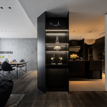
 D2 Architects
"We often rush to divide everything as white and black and store them separately in a separate place. But seemingly opposing things that are inseparable - that is the world - are a mixture of different things." _Matisyahu_
The contrast between black and white is not only a choice but also a way to make it special. When stepping into an all-white or all-black living space, it is easy to feel purity or luxury, but it can also suggest a little skepticism about the monotony or oppressiveness it brings. So using black and white is therefore not difficult but definitely not easy.
In the apartment project at Vinhomes Symphony apartment that we implemented this time, white and black are no longer just two opposing colors, but they are combined and mixed, intertwined creatively to create a unity. As an expression of day and night, brilliance and mystery, white and black have adopted tricks and materials, arrays of blocks and light, blending together with the goal of creating living spaces with comfort, convenience and luxury.
"This is probably a very special and interesting project for me and my colleagues, right from the first approach, the investor is also a sister, a person with a young, dynamic way of thinking with a very special and very own taste. After each actual project, we keep a diary of the conceptualization, design and execution process. Join us to look back on the process of project formation as well as better understand the philosophy, ideas and functions that have been sent in the project" - Kts. Dang Duong - Founder of D2Architects.
The current status of the project is 2 apartments located at location A-20 and A-21 in S6A building of Vinhomes Symphony apartment. With an east-facing façade, the apartment is endowed with the advantage of natural light as well as excellent panoramic views. The highlight of this apartment is the view opening to the Phuc Loi lotus lagoon with a large area, more than 10 hectares and airy landscape by the Duong River.
These are not merely apartments, but they are also places to express creativity and make harmonious use of natural light and surrounding nature. Every view from these apartments not only opens up amazing scenery but also a lifestyle full of relaxation and tranquility amidst the noisy city.
With the special importance of location and unique views, making perfect use of space and light here is not only an advantage but also a great potential to create a sophisticated and classy living space. The sophistication in design and handling of space has been put on top by us, in order to make the most of these extremely special advantages.
In order for a living space to truly become a place called "Home" – a place where we want to return and feel peaceful while there, we have carefully researched the preferences and desires of the owner. Sharing with me about her hobby, Ms. Yen expressed that she loves a modern space with minimalist style and cool tones, creating a sense of tranquility and elegance. This is clearly reflected in the original idea for the apartment.
What's even more interesting is his teenage son's hobby of playing Lego. This is not only a personal preference but also a special source of inspiration for the design process. From these data, we built a preliminary idea for the comprehensive living space of the apartment.
The combination of the requirement of modern, minimalist space and cool tones along with creative elements from his son's personal hobby of playing Lego has created a unique living space, both reflecting the owner's own personality and meeting the needs of living and personal preferences. This is the foundation for creating a real home, where each member of the family feels content and peaceful every time they return.
The project uses the main tone of industrial wood painted in dark gray, white and dark veneer. Versatile combination with other modern materials such as smoke glass and artificial stone,... Create a work of architectural art where everything intersects harmoniously with natural light like a great symphony.
The contrast between the bass of the cool tone and the warm, gentle touch of the light creates an impressive picture of a delicate blend of opposing elements. The soft, beautiful touch of this space is hidden in the strength and modernity of the materials used. This is not only a house, but also a mirror that clearly reflects the personality and philosophy of life of the owner.
The modern, youthful spirit is clearly shown from the moment you cross the threshold to enter the house. Flexibility, creativity and the harmonious intersection of materials and light have created a colorful and sophisticated living space, while celebrating the beauty of modernity and youthful vitality.
LIVING ROOM:
The living room is not merely a living area or common living space of the family, but according to feng shui concept, this is the place where the best energy of the house is concentrated. Therefore, creating a special living room space is extremely important.
Neutral gray-white tones are made in the background, creating the foundation for sophistication and elegance. Color accents are subtly applied, creating a unique touch for the house, increasing the creativity and style of the owner.
Maintaining the spirit of LEGO - unlimited creativity - through every corner, every architectural line has created an interesting space experience right in the living room. It stimulates the imagination of all ages, opening up space for each person to freely create, build and connect with each other through the common language of LEGO.
KITCHEN & DINNING ROOM:
The kitchen is an indispensable piece in every family, this place is likened to the heart of the whole house. All one needs to create great taste is love and creativity in the kitchen. Because the kitchen with family meals is the emotional bond between members. Therefore, designing a beautiful and functional kitchen requires a delicate combination of colors, shapes and meticulousness in choosing the right materials.
Today's kitchen is invested by many people in both form and quality, so a beautiful, luxurious, modern, comfortable kitchen that fully meets the needs of each family is the design criterion D2 Architects aims for.
The Lego House project is not just a project anymore but it is really the result of sending all our core values and creative spirit to create a living space that symbolizes the interconnectedness of design, art and soul.
D2Architects
A : Khuat Duy Tien -Thanh Xuan Bac - Ha Noi – Viet Nam
M: d2architects.vn@gmail.com
W: d2architects.vn
P: 0965551101 - 0965554792
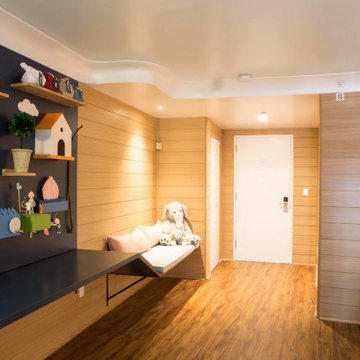
 CSW Studio Interior Design
A continuous line (Desk) creates the illusion of a bigger room and also guides the visitor to go thru the story created in the Interactive 3D panel.
Every day when the families walk into this room and sees first -hand the Design created for them it provides an experience that I believe be essential for the well being of these guests.
The idea that after a long day in the hospital they can come back to the Ronald McDonald House where volunteers and staff interact and generously provide a warm welcome environment that strength their souls in such a difficult time is priceless.
We worked with Brooke Lichtenstein and Yiannos Vrousgos who are also alumni from the New York School of Interior Design. Today they lead the Company Input Creative Studio which differs for its conceptualization and creativity behind each project.
While we were in the Design Process of this project me and my team had meetings to combine all the ideas together into one final IDEA. We decided to create a room that creates a affect of being embraced and secured.
10