
Search results for "Difficult experience" in Home Design Ideas
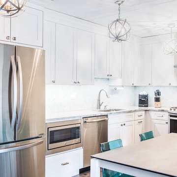
 RAJ Kitchen and Bath, LLC
 “Full apartment design”.
IF you have not yet seen this apartment conversion before, we strongly urge you to go to the bottom left of this page and click on the short 2-minutes video. It would put a lot of things into perspective when you come back and continue reading this.
It is true we were literally handed the keys and told a list of things that they wanted to have happen and we were to go into the apartment, look at the space and come up with a design that would satisfy all of that need. UNTIL we showed up! The unit had really seen some better days but we knew we had to look past that and come up with a concept that would work for them.
The immediate challenges were centered around 3 big ideas:
1. Adding a second bedroom to the already small footprint
2. Figuring out a way to make the kitchen bigger, better and brighter
3. Creating a master room walk in closet
It’s always difficult to add new rooms into existing footprint without expanding out or up and not incurring any opportunity cost. In this case, that was exactly what we had to do. Item one and two above had to be tackled as one. We went ahead and switched out the location of the dining room and eliminating an area where there was a “nook” type eat-in area. By doing so, we were able to cut right into that footprint and change the layout of the kitchen.
That one move allowed us to dig into the kitchen design because it was now the main focal point in the apartment. It was no longer an option to keep it in that tiny hole where it was, so we had to ensure that this design was functional and aesthetically pleasing at the same time. By adding the table into the space where an Island typically would go, we were able to both cut cost and still provide a dining experience. The Table serves as an Island as well when cooking.
We then proceeded to block in the existing doorway to the dining room. By doing this, we were able to create a full room which allowed us to put a door on the other side and called that room Bedroom #2. This was easier to do because all of the mechanicals were already in that space (light, heater and windows). By shifting things around, we also achieved a huge wall to wall closet from inside. PERFECT!
Then we moved into the Single bedroom. We thought it was a big room with a small closet, so by creatively adding an L shaped wall and steal some footprint into the bedroom side, we were able to put a door on that new room and design it for the walk-in closet. Even after this, the bedroom still holds a queen size bed with 2 night stands, a TV on the wall, a sitting chair and plenty of room to walk around. This was done by rethinking the location for the bed and night stands.
The bathroom was gutted to make sure there was no leaks and rebuild from the ground up. We kept all of the plumbing where it was, added a new vanity, medicine cabinet, tiles and lighting and it was done.
From there, the rest of the unit had new flooring all throughout, paint, and lighting. After completion and walk through, this project was handed over back to the clients.
Execution and collaboration between all the trades were: Reggie and his team from Premier Interiors and Rohan from RD Mechanical Services.
p.s. Please see our website to see the video.
 Judith Taylor Designs
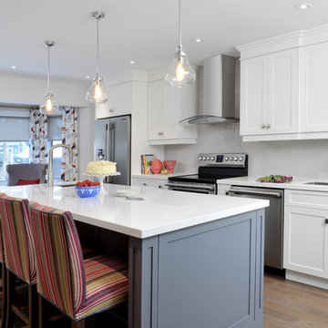
Inspiration for a mid-sized transitional single-wall dark wood floor and brown floor eat-in kitchen remodel in Toronto with a double-bowl sink, shaker cabinets, white cabinets, quartz countertops, gray backsplash, stainless steel appliances, an island and white countertops

Find the right local pro for your project

 Paradise Found Construction
Michelle and Dominic had purchased their home in Wake Forest several years earlier with the idea in mind that it would serve as a family-centric place where they could gather with extended family. Situated in a quiet residential neighborhood with large lots, it was the perfect place for them to raise and home school their 4 children.
As their family grew, the children’s daily activities were split between the 1st and 2nd floors, making it difficult to coordinate activities amongst them all. And their extended family get-togethers had become cramped and increasingly difficult to accommodate everyone comfortably. They were in need of added living space that could serve their family’s needs as well as provide extra entertaining areas to host family gatherings.
With our experience in helping homeowners secure financing for their Home Improvement projects, we worked with Dominic and Michelle to prepare all of the necessary documentation required to apply for an FHA 203K Home Renovation loan. As a result, they were able to finance the full cost of the construction of their new Family Room Addition.
Our solution was to add a 1st floor living space that harmonized with the existing floor plan and décor, was central to the existing Kitchen, and flexible enough to facilitate large groups and accommodate the whole family’s daily activities and access to the outdoors.
As a result of their newly added flexible living area, they are now able to comfortably gather with their extended family as well accommodate the whole family’s needs, giving them the opportunity spend more quality time with their family and friends.
Design Features
Harmony with the home’s existing architecture and décor.
Seamless Transition into the adjoining Kitchen and Living Room, separating the two with a light and bright 15-Lite Double French Door.
Light and bright natural hardwood flooring.
A bright and open floor plan achieved by introducing a double 15-Lite French door in the Kitchen and generous amount of double-hung Low-E windows.
Window Well in the Roof to accommodate required foot-print placement.
Easy access to the outdoors and the large deck and yard.
Extra storage space for tools and outdoor equipment.
Energy Efficient and Green Features
1st floor HVAC Compressor and Air Handler replaced with a more efficient 15 Seer unit.
Floor penetrations and perimeter bottom plates caulked and air sealed.
No-VOC Paints and Finishes.
Durable Exterior Construction
No-Maintenance Composite and PVC Low-E Windows
Cement Fiber Siding
Cement Fiber and PVC Trim
Life-time Architectural Shingles
Metal Roof Flashing with Gutter Kick-Outs
Superior Window Flashing and Water Intrusion sealing measures
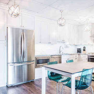 RAJ Kitchen and Bath, LLC
 “Full apartment design”.
IF you have not yet seen this apartment conversion before, we strongly urge you to go to the bottom left of this page and click on the short 2-minutes video. It would put a lot of things into perspective when you come back and continue reading this.
It is true we were literally handed the keys and told a list of things that they wanted to have happen and we were to go into the apartment, look at the space and come up with a design that would satisfy all of that need. UNTIL we showed up! The unit had really seen some better days but we knew we had to look past that and come up with a concept that would work for them.
The immediate challenges were centered around 3 big ideas:
1. Adding a second bedroom to the already small footprint
2. Figuring out a way to make the kitchen bigger, better and brighter
3. Creating a master room walk in closet
It’s always difficult to add new rooms into existing footprint without expanding out or up and not incurring any opportunity cost. In this case, that was exactly what we had to do. Item one and two above had to be tackled as one. We went ahead and switched out the location of the dining room and eliminating an area where there was a “nook” type eat-in area. By doing so, we were able to cut right into that footprint and change the layout of the kitchen.
That one move allowed us to dig into the kitchen design because it was now the main focal point in the apartment. It was no longer an option to keep it in that tiny hole where it was, so we had to ensure that this design was functional and aesthetically pleasing at the same time. By adding the table into the space where an Island typically would go, we were able to both cut cost and still provide a dining experience. The Table serves as an Island as well when cooking.
We then proceeded to block in the existing doorway to the dining room. By doing this, we were able to create a full room which allowed us to put a door on the other side and called that room Bedroom #2. This was easier to do because all of the mechanicals were already in that space (light, heater and windows). By shifting things around, we also achieved a huge wall to wall closet from inside. PERFECT!
Then we moved into the Single bedroom. We thought it was a big room with a small closet, so by creatively adding an L shaped wall and steal some footprint into the bedroom side, we were able to put a door on that new room and design it for the walk-in closet. Even after this, the bedroom still holds a queen size bed with 2 night stands, a TV on the wall, a sitting chair and plenty of room to walk around. This was done by rethinking the location for the bed and night stands.
The bathroom was gutted to make sure there was no leaks and rebuild from the ground up. We kept all of the plumbing where it was, added a new vanity, medicine cabinet, tiles and lighting and it was done.
From there, the rest of the unit had new flooring all throughout, paint, and lighting. After completion and walk through, this project was handed over back to the clients.
Execution and collaboration between all the trades were: Reggie and his team from Premier Interiors and Rohan from RD Mechanical Services.
p.s. Please see our website to see the video.
 Walczak Design And Build
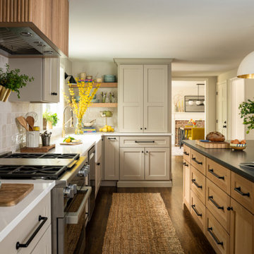
What once felt dark, segmented, and inefficient is now a bright, connected, and highly functional first floor designed for real family living.
Our clients, Terry and Lou, came to us with a home that simply wasn’t keeping up with their growing family. The kitchen was cramped, with tight working lanes and limited light. The laundry room doubled as a powder room—yet functioned poorly as both. Sightlines between spaces were cut off, making it difficult to stay connected to their young children throughout the day. Across the board, the home felt dated and disconnected.
Through thoughtful planning and strategic structural changes, we reimagined the entire first floor to better support how this family truly lives.
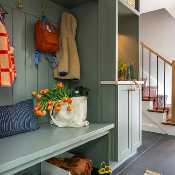
We began by redefining the entry experience—creating a true foyer complete with a dedicated drop zone and custom cubby storage. This space now acts as a natural landing point, bringing order and intention to everyday comings and goings.
Adjacent to the new entry, we relocated and redesigned the laundry room. Now positioned exactly where it needs to be, it functions as a hardworking utility space with countertops for folding, a utility sink for immediate stain treatment, and the ability to be closed off—keeping daily life contained when needed.
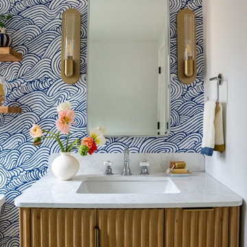
Separating the previous shared function allowed us to carve out a distinct, personality-filled powder room. Wrapped in a bold wave-patterned wallpaper and grounded by a custom reeded oak vanity with warm brass accents, this space delivers a moment of delight and individuality within the home.
The kitchen transformation is where the impact is felt most deeply.
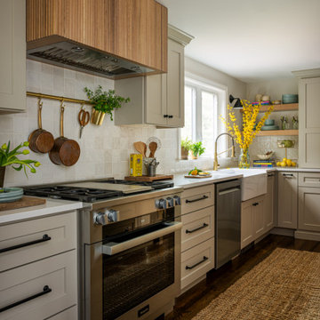
What was once a dark, restrictive layout has been opened into a spacious, highly efficient U-shaped kitchen with generous clearances and an oversized island for gathering. A thoughtful mix of painted cabinetry and rift white oak introduces warmth and balance, while the custom reeded hood becomes a sculptural focal point. Open shelving, integrated pantry storage, and layered lighting ensure the space is as functional as it is beautiful.
Beyond aesthetics, the redesign prioritizes flow—both in movement and in connection. Sightlines between the kitchen, dining, and living areas were intentionally opened, allowing for ease of interaction and visibility throughout the main living spaces.
To unify the home, existing hardwood floors were refinished and extended, creating continuity and a seamless visual experience from one space to the next.
The result is a home that feels lighter, more open, and deeply aligned with how this family lives day to day—designed not just to look beautiful, but to support everything from busy mornings to slow, shared evenings.
 Main Line Kitchen Design
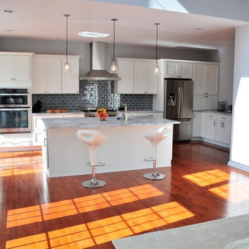
Main Line Kitchen Design is a group of skilled Kitchen Designers each with many years of experience planning kitchens around the Delaware Valley. Using doorstyle and finish kitchen cabinetry samples, photo design books, and laptops to display your kitchen as it is designed, we eliminate the need for and the cost associated with a showroom business model. This makes the design process more convenient for our customers, and we pass the significant savings on to them as well.
Our design process also allows us to spend more time with our customers working on their designs. This is what we enjoy most about our business – it’s what brought us together in the first place. The kitchen cabinet lines we design with and sell are Jim Bishop, Durasupreme, 6 Square, Oracle, Village, Collier, and Bremtowm Fine Custom Cabinetry. This is one of our recently completed kitchens.
Photo by Michael B
 Walczak Design And Build
What once felt dark, segmented, and inefficient is now a bright, connected, and highly functional first floor designed for real family living.
Our clients, Terry and Lou, came to us with a home that simply wasn’t keeping up with their growing family. The kitchen was cramped, with tight working lanes and limited light. The laundry room doubled as a powder room—yet functioned poorly as both. Sightlines between spaces were cut off, making it difficult to stay connected to their young children throughout the day. Across the board, the home felt dated and disconnected.
Through thoughtful planning and strategic structural changes, we reimagined the entire first floor to better support how this family truly lives.
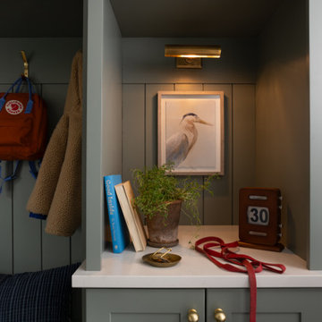
We began by redefining the entry experience—creating a true foyer complete with a dedicated drop zone and custom cubby storage. This space now acts as a natural landing point, bringing order and intention to everyday comings and goings.
Adjacent to the new entry, we relocated and redesigned the laundry room. Now positioned exactly where it needs to be, it functions as a hardworking utility space with countertops for folding, a utility sink for immediate stain treatment, and the ability to be closed off—keeping daily life contained when needed.
Separating the previous shared function allowed us to carve out a distinct, personality-filled powder room. Wrapped in a bold wave-patterned wallpaper and grounded by a custom reeded oak vanity with warm brass accents, this space delivers a moment of delight and individuality within the home.
The kitchen transformation is where the impact is felt most deeply.
What was once a dark, restrictive layout has been opened into a spacious, highly efficient U-shaped kitchen with generous clearances and an oversized island for gathering. A thoughtful mix of painted cabinetry and rift white oak introduces warmth and balance, while the custom reeded hood becomes a sculptural focal point. Open shelving, integrated pantry storage, and layered lighting ensure the space is as functional as it is beautiful.
Beyond aesthetics, the redesign prioritizes flow—both in movement and in connection. Sightlines between the kitchen, dining, and living areas were intentionally opened, allowing for ease of interaction and visibility throughout the main living spaces.
To unify the home, existing hardwood floors were refinished and extended, creating continuity and a seamless visual experience from one space to the next.
The result is a home that feels lighter, more open, and deeply aligned with how this family lives day to day—designed not just to look beautiful, but to support everything from busy mornings to slow, shared evenings.
 Walczak Design And Build
What once felt dark, segmented, and inefficient is now a bright, connected, and highly functional first floor designed for real family living.
Our clients, Terry and Lou, came to us with a home that simply wasn’t keeping up with their growing family. The kitchen was cramped, with tight working lanes and limited light. The laundry room doubled as a powder room—yet functioned poorly as both. Sightlines between spaces were cut off, making it difficult to stay connected to their young children throughout the day. Across the board, the home felt dated and disconnected.
Through thoughtful planning and strategic structural changes, we reimagined the entire first floor to better support how this family truly lives.
We began by redefining the entry experience—creating a true foyer complete with a dedicated drop zone and custom cubby storage. This space now acts as a natural landing point, bringing order and intention to everyday comings and goings.
Adjacent to the new entry, we relocated and redesigned the laundry room. Now positioned exactly where it needs to be, it functions as a hardworking utility space with countertops for folding, a utility sink for immediate stain treatment, and the ability to be closed off—keeping daily life contained when needed.
Separating the previous shared function allowed us to carve out a distinct, personality-filled powder room. Wrapped in a bold wave-patterned wallpaper and grounded by a custom reeded oak vanity with warm brass accents, this space delivers a moment of delight and individuality within the home.
The kitchen transformation is where the impact is felt most deeply.
What was once a dark, restrictive layout has been opened into a spacious, highly efficient U-shaped kitchen with generous clearances and an oversized island for gathering. A thoughtful mix of painted cabinetry and rift white oak introduces warmth and balance, while the custom reeded hood becomes a sculptural focal point. Open shelving, integrated pantry storage, and layered lighting ensure the space is as functional as it is beautiful.
Beyond aesthetics, the redesign prioritizes flow—both in movement and in connection. Sightlines between the kitchen, dining, and living areas were intentionally opened, allowing for ease of interaction and visibility throughout the main living spaces.
To unify the home, existing hardwood floors were refinished and extended, creating continuity and a seamless visual experience from one space to the next.
The result is a home that feels lighter, more open, and deeply aligned with how this family lives day to day—designed not just to look beautiful, but to support everything from busy mornings to slow, shared evenings.
 Walczak Design And Build
What once felt dark, segmented, and inefficient is now a bright, connected, and highly functional first floor designed for real family living.
Our clients, Terry and Lou, came to us with a home that simply wasn’t keeping up with their growing family. The kitchen was cramped, with tight working lanes and limited light. The laundry room doubled as a powder room—yet functioned poorly as both. Sightlines between spaces were cut off, making it difficult to stay connected to their young children throughout the day. Across the board, the home felt dated and disconnected.
Through thoughtful planning and strategic structural changes, we reimagined the entire first floor to better support how this family truly lives.
We began by redefining the entry experience—creating a true foyer complete with a dedicated drop zone and custom cubby storage. This space now acts as a natural landing point, bringing order and intention to everyday comings and goings.
Adjacent to the new entry, we relocated and redesigned the laundry room. Now positioned exactly where it needs to be, it functions as a hardworking utility space with countertops for folding, a utility sink for immediate stain treatment, and the ability to be closed off—keeping daily life contained when needed.
Separating the previous shared function allowed us to carve out a distinct, personality-filled powder room. Wrapped in a bold wave-patterned wallpaper and grounded by a custom reeded oak vanity with warm brass accents, this space delivers a moment of delight and individuality within the home.
The kitchen transformation is where the impact is felt most deeply.
What was once a dark, restrictive layout has been opened into a spacious, highly efficient U-shaped kitchen with generous clearances and an oversized island for gathering. A thoughtful mix of painted cabinetry and rift white oak introduces warmth and balance, while the custom reeded hood becomes a sculptural focal point. Open shelving, integrated pantry storage, and layered lighting ensure the space is as functional as it is beautiful.
Beyond aesthetics, the redesign prioritizes flow—both in movement and in connection. Sightlines between the kitchen, dining, and living areas were intentionally opened, allowing for ease of interaction and visibility throughout the main living spaces.
To unify the home, existing hardwood floors were refinished and extended, creating continuity and a seamless visual experience from one space to the next.
The result is a home that feels lighter, more open, and deeply aligned with how this family lives day to day—designed not just to look beautiful, but to support everything from busy mornings to slow, shared evenings.

 safe ZOnea
Every year, the same thing happens. The first real snowfall arrives, demand for de-icing materials spikes overnight, and the businesses that waited too long find themselves scrambling for supply at the worst possible moment. Facility managers, property owners, contractors, and municipalities all depend on a steady supply of salt and ice melt to keep their properties safe and operational through winter. The ones who plan ahead sail through. The ones who don't pay more, wait longer, and take on real risk.
Sourcing de-icing materials well is not complicated, but it does require thinking ahead and understanding the options. The choices you make about what to buy, how to buy it, and who to buy it from have a direct effect on your costs, your reliability, and your ability to keep people safe when conditions turn dangerous. This article lays out what matters.
Why Your Choice of Supplier Matters More Than You Think
It is easy to treat de-icing material as a commodity, something you grab whenever you need it without much thought about where it comes from. That works fine until the moment it doesn't, usually in the middle of a storm when everyone needs supply at once and the casual sources have run dry. At that point, the relationships you built before the season become the difference between staying stocked and being stuck.
Reliable supply is the whole game in winter operations. A property that runs out of ice melt during a storm faces safety hazards, liability exposure, and disruption, none of which can wait for a back-ordered shipment. This is why establishing relationships with dependable rock salt suppliers before the season starts is one of the smartest moves a facility manager or contractor can make. It locks in supply, often locks in better pricing, and removes a major source of mid-winter stress.
The lesson here is to treat sourcing as a planning decision rather than a last-minute errand. The businesses that come through winter smoothly are almost always the ones that secured their supply chain early, chose suppliers who could actually deliver when it counted, and never had to gamble on finding material during a shortage. Reliability bought in advance is far cheaper than scarcity paid for in a crisis.
Bagged or Bulk: Matching the Material to the Job
One of the first practical decisions is whether to buy de-icing material in bags or in bulk, and the right answer depends entirely on the operation. Each format has clear advantages, and many operations end up using both for different purposes.
Bagged material offers convenience, control, and easy storage. It is simple to handle, easy to distribute to different locations or crews, straightforward to store without special equipment, and convenient for spot application by hand. It suits smaller properties, businesses without bulk storage, and situations where portion control and tidiness matter. Bulk material, on the other hand, tends to make sense for large operations that go through high volumes, where buying in quantity lowers the per-unit cost and the operation has the equipment and space to store and handle it. The tradeoff is between the convenience and flexibility of bags and the volume economics of bulk.
For many operations, the right approach is a mix: bulk for the high-volume core of the work and bags for flexibility, spot treatment, and locations where bulk handling is impractical. The key is to match the format to how the material will actually be stored, moved, and applied, rather than defaulting to one or the other out of habit. Thinking this through in advance avoids both the waste of over-buying bulk you can't handle and the expense of relying entirely on bags for a large operation.
Rock Salt Is Not Your Only Option
Rock salt, or sodium chloride, is the workhorse of winter de-icing for good reason. It is effective, widely available, and cost-efficient, which makes it the default choice for most operations most of the time. But it has limits, and understanding the alternatives helps you choose the right material for the conditions you actually face.
The most important limitation is temperature. Rock salt becomes less effective as temperatures drop, and in genuinely cold conditions it can struggle to do the job at all. This is where alternatives come in. Calcium chloride, for instance, works at much lower temperatures than rock salt and acts quickly, which makes it valuable when conditions are severe or when fast melting matters. Operations that face hard freezes or need dependable performance in extreme cold often keep calcium chloride for sale on hand for exactly those situations, using it alongside rock salt rather than instead of it.
The practical approach is to understand the conditions your property faces and stock accordingly. For many operations, rock salt handles the bulk of the work while a faster, colder-rated material like calcium chloride covers the extreme days when ordinary salt falls short. Matching the material to the temperature and the urgency of the situation is what separates an operation that stays ahead of winter from one that is constantly reacting to it.
Securing Your Supply Before the Season
Knowing what to buy is only half the equation. The other half is making sure you can actually get it when you need it, which means securing your supply before winter arrives rather than after it has already started. Timing is one of the most underrated factors in winter operations.
The logic is simple. Demand for de-icing materials is highly seasonal and spikes sharply during storms, when everyone needs supply simultaneously. Prices and availability both move against the buyer at exactly those moments. By contrast, planning ahead, estimating your needs and arranging supply before the season, puts you in a far stronger position. Working with established rock salt suppliers ahead of time means your material is accounted for before the rush, often at better pricing and with the confidence that it will be there when the first storm hits.
This kind of planning also lets you think clearly rather than react under pressure. You can estimate your seasonal needs based on your property and past winters, decide on the right mix of materials and formats, and arrange storage in advance. Operations that do this consistently spend less, worry less, and never find themselves making frantic calls during a storm. The effort of planning ahead is modest, and the payoff in reliability and cost savings is substantial.
Storing and Handling What You Buy
Securing supply is not much use if the material degrades before you can use it, which makes proper storage and handling an important and often overlooked part of the equation. De-icing materials are sensitive to moisture, and poor storage can turn a good supply into a clumped, hardened mess that is difficult to apply.
The fundamentals are straightforward. Keep material dry and protected from moisture, since salt and ice melt readily absorb water and can harden if exposed. Store it in a way that suits the format, whether that means a proper bulk storage area or a dry space for stacked bags. Keep it accessible, so crews can get to it quickly when a storm hits and time is short. And handle it with the right equipment for the format and volume, which protects both the material and the people working with it. None of this is complicated, but neglecting it can undermine even a well-planned supply.
Good storage practices protect the investment you made in securing supply early. There is little point in arranging your materials ahead of the season only to have them degrade before use. Treating storage and handling as part of the overall plan, rather than an afterthought, ensures that the material you secured is actually usable when the moment comes. It is the final link in a supply chain built to perform under winter conditions.
Estimating How Much You Actually Need
One question trips up operations of every size: how much de-icing material to buy. Order too little and you risk running short during a storm. Order too much and you tie up money and storage space in material you may not use. Getting the estimate reasonably right is a meaningful part of sourcing well.
Several factors shape the answer. The size and type of the areas you treat, sidewalks, lots, entrances, and drive lanes, set the baseline for how much material each application consumes. The local climate matters too, since colder regions and those with frequent snowfall go through far more material than milder ones. Application frequency depends on how often storms hit and how quickly surfaces need to be cleared, which varies with the kind of property and the expectations of the people who use it. And the type of material plays a role, since different products are applied at different rates.
Past experience is often the best guide. Operations that track what they used in previous winters, adjusted for the size of the property and the severity of the season, can estimate their needs with reasonable confidence. For newer operations without that history, it helps to plan conservatively and to work with a supplier who can replenish stock reliably, so that a low estimate does not turn into a mid-storm shortage.
The goal is not perfect precision but a sound, slightly cautious estimate paired with a dependable supply relationship. That combination lets an operation keep enough material on hand to handle the season without over-committing to volume it cannot store or use. Thinking this through before winter, rather than guessing during it, is one more way that planning ahead pays off when the snow starts to fall.
The Bottom Line
Sourcing de-icing materials well comes down to a few straightforward principles: plan ahead, choose reliable suppliers before the season, match your materials and formats to your actual needs and conditions, and store what you buy properly. The operations that follow these principles move through winter with confidence, while those that improvise pay more and take on needless risk.
Winter is predictable in one respect: it arrives every year, and demand for de-icing material spikes the moment it does. The businesses that prepare for that reality, rather than being surprised by it, are the ones that keep their properties safe, their costs controlled, and their operations running no matter what the season throws at them. A little foresight before the first snowfall pays off through every storm that follows.
 The Decorating Therapist
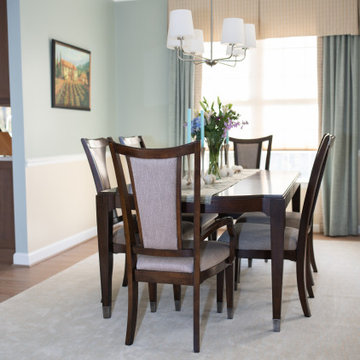
As part of the luxury main-floor renovation, the dining room layout was reimagined to improve circulation and create a more entertaining-friendly floor plan. A large sideboard that previously occupied the shared wall between the kitchen and dining room restricted movement around the dining table, making it difficult for guests to circulate comfortably during gatherings. By relocating the piece to the adjacent living room and repurposing it as an elegant home bar, the design dramatically improved traffic flow while giving the furniture a sophisticated new purpose. This thoughtful space-planning solution enhanced both functionality and hospitality, creating a more open dining experience and a dedicated beverage station for effortless entertaining.
 SabaRehman Abdulrehman
In today’s world of smart interiors and luxury-inspired home décor, LED Mirror backlit designs have become a defining trend. From elegant bathrooms to sophisticated dressing areas and premium commercial spaces, LED Mirrors are now more than just reflective surfaces—they are statement pieces that combine technology, style, and functionality.
Whether you are renovating your home, upgrading a salon, designing a hotel, or creating a modern workspace, investing in a high-quality LED mirror can instantly elevate the atmosphere. The perfect balance of illumination and aesthetics makes these mirrors one of the most sought-after interior additions in contemporary architecture.
This blog explores everything you need to know about LED Mirror backlit solutions, their benefits, applications, features, and why they are becoming essential in modern living spaces.
What Is an LED Mirror Backlit Design?
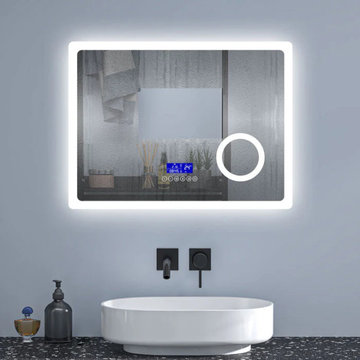
An LED Mirror backlit system refers to a mirror equipped with LED lighting installed behind the mirror surface. Instead of visible front-facing bulbs, the light gently radiates from the rear edges, producing a soft halo effect around the mirror.
This indirect illumination creates a luxurious and ambient glow while providing practical lighting for everyday tasks such as grooming, makeup application, shaving, and skincare routines.
Unlike traditional mirrors, LED Mirrors offer:
- Energy-efficient illumination
- Elegant visual appeal
- Better light distribution
- Enhanced functionality
- Modern smart features
- Bathrooms
- Bedrooms
- Dressing rooms
- Salons
- Hotels
- Restaurants
- Retail stores
- Reduces harsh shadows
- Improves visibility
- Enhances facial clarity
- Creates a comfortable lighting experience
- Reduce energy bills
- Lower electricity usage
- Support eco-friendly living
- Increase long-term savings
- Turn lights on/off
- Adjust brightness
- Change color temperature
- Bright white light for makeup application
- Warm soft light for relaxation
- Neutral lighting for everyday grooming
- Bluetooth speakers
- Digital clocks
- Temperature displays
- Voice control
- Motion sensors
- Better lighting for shaving and makeup
- Enhanced bathroom aesthetics
- Increased property value
- Luxurious visual appeal
- Salons
- Spas
- Hotels
- Restaurants
- Retail stores
- Compact rectangular mirrors work best
- Oversized backlit mirrors create a dramatic statement
- Rectangular
- Oval
- Round
- Square
- Custom geometric designs
- Warm White (cozy ambiance)
- Cool White (bright and crisp)
- Natural White (balanced daylight effect)
- Improve visual appeal
- Increase perceived luxury
- Enhance property value
- Small bathrooms
- Compact apartments
- Narrow dressing areas
 Walczak Design And Build
What once felt dark, segmented, and inefficient is now a bright, connected, and highly functional first floor designed for real family living.
Our clients, Terry and Lou, came to us with a home that simply wasn’t keeping up with their growing family. The kitchen was cramped, with tight working lanes and limited light. The laundry room doubled as a powder room—yet functioned poorly as both. Sightlines between spaces were cut off, making it difficult to stay connected to their young children throughout the day. Across the board, the home felt dated and disconnected.
Through thoughtful planning and strategic structural changes, we reimagined the entire first floor to better support how this family truly lives.
We began by redefining the entry experience—creating a true foyer complete with a dedicated drop zone and custom cubby storage. This space now acts as a natural landing point, bringing order and intention to everyday comings and goings.
Adjacent to the new entry, we relocated and redesigned the laundry room. Now positioned exactly where it needs to be, it functions as a hardworking utility space with countertops for folding, a utility sink for immediate stain treatment, and the ability to be closed off—keeping daily life contained when needed.
Separating the previous shared function allowed us to carve out a distinct, personality-filled powder room. Wrapped in a bold wave-patterned wallpaper and grounded by a custom reeded oak vanity with warm brass accents, this space delivers a moment of delight and individuality within the home.
The kitchen transformation is where the impact is felt most deeply.
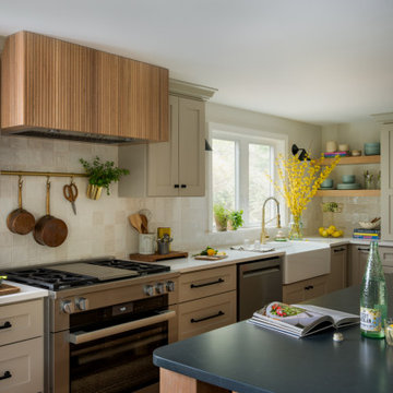
What was once a dark, restrictive layout has been opened into a spacious, highly efficient U-shaped kitchen with generous clearances and an oversized island for gathering. A thoughtful mix of painted cabinetry and rift white oak introduces warmth and balance, while the custom reeded hood becomes a sculptural focal point. Open shelving, integrated pantry storage, and layered lighting ensure the space is as functional as it is beautiful.
Beyond aesthetics, the redesign prioritizes flow—both in movement and in connection. Sightlines between the kitchen, dining, and living areas were intentionally opened, allowing for ease of interaction and visibility throughout the main living spaces.
To unify the home, existing hardwood floors were refinished and extended, creating continuity and a seamless visual experience from one space to the next.
The result is a home that feels lighter, more open, and deeply aligned with how this family lives day to day—designed not just to look beautiful, but to support everything from busy mornings to slow, shared evenings.
 CSW Studio Interior Design
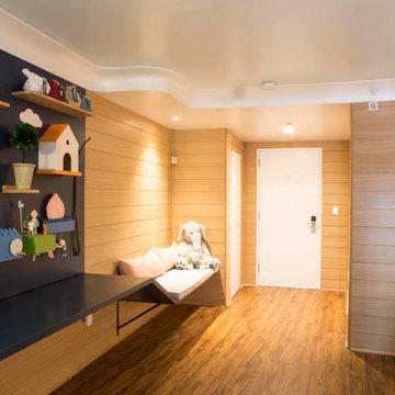
A continuous line (Desk) creates the illusion of a bigger room and also guides the visitor to go thru the story created in the Interactive 3D panel.
Every day when the families walk into this room and sees first -hand the Design created for them it provides an experience that I believe be essential for the well being of these guests.
The idea that after a long day in the hospital they can come back to the Ronald McDonald House where volunteers and staff interact and generously provide a warm welcome environment that strength their souls in such a difficult time is priceless.
We worked with Brooke Lichtenstein and Yiannos Vrousgos who are also alumni from the New York School of Interior Design. Today they lead the Company Input Creative Studio which differs for its conceptualization and creativity behind each project.
While we were in the Design Process of this project me and my team had meetings to combine all the ideas together into one final IDEA. We decided to create a room that creates a affect of being embraced and secured.
 Walczak Design And Build
What once felt dark, segmented, and inefficient is now a bright, connected, and highly functional first floor designed for real family living.
Our clients, Terry and Lou, came to us with a home that simply wasn’t keeping up with their growing family. The kitchen was cramped, with tight working lanes and limited light. The laundry room doubled as a powder room—yet functioned poorly as both. Sightlines between spaces were cut off, making it difficult to stay connected to their young children throughout the day. Across the board, the home felt dated and disconnected.
Through thoughtful planning and strategic structural changes, we reimagined the entire first floor to better support how this family truly lives.
We began by redefining the entry experience—creating a true foyer complete with a dedicated drop zone and custom cubby storage. This space now acts as a natural landing point, bringing order and intention to everyday comings and goings.
Adjacent to the new entry, we relocated and redesigned the laundry room. Now positioned exactly where it needs to be, it functions as a hardworking utility space with countertops for folding, a utility sink for immediate stain treatment, and the ability to be closed off—keeping daily life contained when needed.
Separating the previous shared function allowed us to carve out a distinct, personality-filled powder room. Wrapped in a bold wave-patterned wallpaper and grounded by a custom reeded oak vanity with warm brass accents, this space delivers a moment of delight and individuality within the home.
The kitchen transformation is where the impact is felt most deeply.
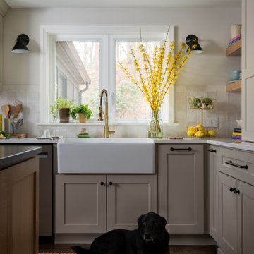
What was once a dark, restrictive layout has been opened into a spacious, highly efficient U-shaped kitchen with generous clearances and an oversized island for gathering. A thoughtful mix of painted cabinetry and rift white oak introduces warmth and balance, while the custom reeded hood becomes a sculptural focal point. Open shelving, integrated pantry storage, and layered lighting ensure the space is as functional as it is beautiful.
Beyond aesthetics, the redesign prioritizes flow—both in movement and in connection. Sightlines between the kitchen, dining, and living areas were intentionally opened, allowing for ease of interaction and visibility throughout the main living spaces.
To unify the home, existing hardwood floors were refinished and extended, creating continuity and a seamless visual experience from one space to the next.
The result is a home that feels lighter, more open, and deeply aligned with how this family lives day to day—designed not just to look beautiful, but to support everything from busy mornings to slow, shared evenings.
 Walczak Design And Build
What once felt dark, segmented, and inefficient is now a bright, connected, and highly functional first floor designed for real family living.
Our clients, Terry and Lou, came to us with a home that simply wasn’t keeping up with their growing family. The kitchen was cramped, with tight working lanes and limited light. The laundry room doubled as a powder room—yet functioned poorly as both. Sightlines between spaces were cut off, making it difficult to stay connected to their young children throughout the day. Across the board, the home felt dated and disconnected.
Through thoughtful planning and strategic structural changes, we reimagined the entire first floor to better support how this family truly lives.
We began by redefining the entry experience—creating a true foyer complete with a dedicated drop zone and custom cubby storage. This space now acts as a natural landing point, bringing order and intention to everyday comings and goings.
Adjacent to the new entry, we relocated and redesigned the laundry room. Now positioned exactly where it needs to be, it functions as a hardworking utility space with countertops for folding, a utility sink for immediate stain treatment, and the ability to be closed off—keeping daily life contained when needed.
Separating the previous shared function allowed us to carve out a distinct, personality-filled powder room. Wrapped in a bold wave-patterned wallpaper and grounded by a custom reeded oak vanity with warm brass accents, this space delivers a moment of delight and individuality within the home.
The kitchen transformation is where the impact is felt most deeply.
What was once a dark, restrictive layout has been opened into a spacious, highly efficient U-shaped kitchen with generous clearances and an oversized island for gathering. A thoughtful mix of painted cabinetry and rift white oak introduces warmth and balance, while the custom reeded hood becomes a sculptural focal point. Open shelving, integrated pantry storage, and layered lighting ensure the space is as functional as it is beautiful.
Beyond aesthetics, the redesign prioritizes flow—both in movement and in connection. Sightlines between the kitchen, dining, and living areas were intentionally opened, allowing for ease of interaction and visibility throughout the main living spaces.
To unify the home, existing hardwood floors were refinished and extended, creating continuity and a seamless visual experience from one space to the next.
The result is a home that feels lighter, more open, and deeply aligned with how this family lives day to day—designed not just to look beautiful, but to support everything from busy mornings to slow, shared evenings.
 Tile Doctor Ltd
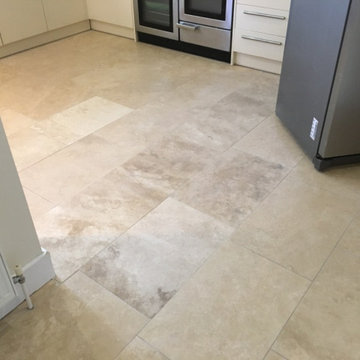
This client from Cobham contacted me in despair, she was quite concerned about her Travertine tiled floor which was cracking. She had the Kitchen and Dining room tiled with Travertine six years ago and recently several cracks had begun to appear in a long line crossing five tiles.
Several holes had also begun to appear and across the threshold to the kitchen from the dining area a serious lip had formed where a tile had risen above its neighbour causing a trip hazard.
After removing a tile from an unobtrusive area, I began to see where the issues lay. The tiler had dabbed the adhesive. This mean that instead of spreading the adhesive equally across the tile and floor they had splurged four lumps in each corner then set the tile down. This is poor working practice that will sooner or later become apparent. It means the areas were no adhesive was applied are eventually compromised resulting in cracking. This could take years or weeks to surface.
After some discussion we decided that I would remove and replace six tiles in total. The client was happy for me to go ahead and agreed a cost for the works to be done.
Returning the following week, firstly I had to remove the grout. This was done with a handheld Fein tool fitted with an oscillating blade. I thought this would be good experience from my son during the holidays, so I took him along and whilst I was working on the grout, he was able to gather the dust in a vacuum cleaner.
Next, I started to remove the cracked tiles with a chisel, starting from the cracks where the tiles would be weakest. This was noisy and messy work which required ear defenders and safety goggles. The process took several hours with the help of my son on general assistance duties. Once the tiles were removed this just left the remaining adhesive attached to the floor to get removed. This was the hardest part of the job, a lot of hammer and chisel work with as much dust gathered as possible to try and contain the mess. I had warned the customer that a considerable amount of mess would be produced and request that she should remove as much items as possible and to tape up her cupboards. Finally, I filled several holes in the sub floor so I would have a flat surface to lay the new tiles on. I left it there for the night to solidify.
Returning the next day, I began laying the replacement tiles down. Colour matching replacement tiles is a difficult task as Travertine is a natural product and colours vary greatly so these were a pretty good match.
Once the adhesive had set, I grouted in the newly laid tiles and once that was dry set about applying a sealer. For this I used two coats of Tile Doctor Ultra Seal which is an impregnating sealer that doesn’t alter the colour of the stone. This would ensure they were nicely protected and hopefully the client will not experience any further issues.
She was very happy with the result and was pleased the floor no long looked unsightly or posed a tripping hazard.
Rupert Mcleod
West Surrey Tile Doctor
8