
Search results for "Disproportionately" in Home Design Ideas
 VEDA Interior Design
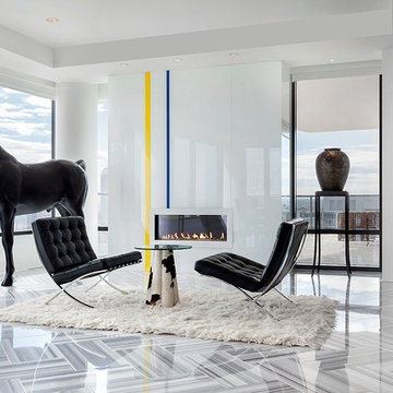
Living room - contemporary open concept living room idea in Denver with white walls and a ribbon fireplace
 JRP Design & Remodel
This home had a kitchen that wasn’t meeting the family’s needs, nor did it fit with the coastal Mediterranean theme throughout the rest of the house. The goals for this remodel were to create more storage space and add natural light. The biggest item on the wish list was a larger kitchen island that could fit a family of four. They also wished for the backyard to transform from an unsightly mess that the clients rarely used to a beautiful oasis with function and style.
One design challenge was incorporating the client’s desire for a white kitchen with the warm tones of the travertine flooring. The rich walnut tone in the island cabinetry helped to tie in the tile flooring. This added contrast, warmth, and cohesiveness to the overall design and complemented the transitional coastal theme in the adjacent spaces. Rooms alight with sunshine, sheathed in soft, watery hues are indicative of coastal decorating. A few essential style elements will conjure the coastal look with its casual beach attitude and renewing seaside energy, even if the shoreline is only in your mind's eye.
By adding two new windows, all-white cabinets, and light quartzite countertops, the kitchen is now open and bright. Brass accents on the hood, cabinet hardware and pendant lighting added warmth to the design. Blue accent rugs and chairs complete the vision, complementing the subtle grey ceramic backsplash and coastal blues in the living and dining rooms. Finally, the added sliding doors lead to the best part of the home: the dreamy outdoor oasis!
Every day is a vacation in this Mediterranean-style backyard paradise. The outdoor living space emphasizes the natural beauty of the surrounding area while offering all of the advantages and comfort of indoor amenities.
The swimming pool received a significant makeover that turned this backyard space into one that the whole family will enjoy. JRP changed out the stones and tiles, bringing a new life to it. The overall look of the backyard went from hazardous to harmonious. After finishing the pool, a custom gazebo was built for the perfect spot to relax day or night.
It’s an entertainer’s dream to have a gorgeous pool and an outdoor kitchen. This kitchen includes stainless-steel appliances, a custom beverage fridge, and a wood-burning fireplace. Whether you want to entertain or relax with a good book, this coastal Mediterranean-style outdoor living remodel has you covered.
Photographer: Andrew - OpenHouse VC
 The Schimberg Group Inc.
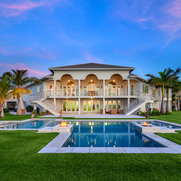
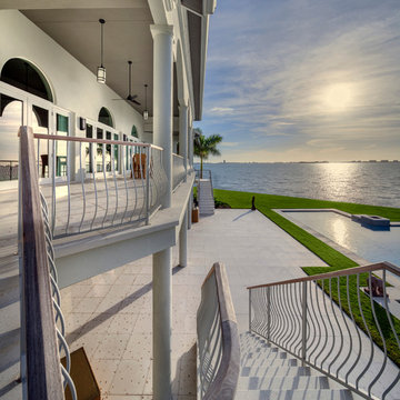
Located in a small gated community north of the city of Sarasota, this private residence benefits from a peninsula-like setting providing breathtaking views of Sarasota Bay to the north and south. The Schimberg Group transformed the original Spanish Mediterranean builder home into a contemporary family abode.
By replacing much of the disproportionate shapes with new windows, changing the roof to a gray slate and painting the building, the exterior took on a stately presence on a traditional cul-de-sac. A rectangular modern pool now features a sun shelf and the connected spa is surrounded by zoysia grass and seems to float in the yard and flow to the Bay beyond.
The interior was gutted and every room was redesigned resulting in a loft-like living space with 10’ high arched windows, reminiscent of the original design but reworked to give the space an urban, beautifully lit interior. The kitchen is a masterpiece for any up-and-coming chef blending crisp, sleek white materials with rich, dark woods and accents of bright red. It is functional, exceptionally detailed, and has the “wow” factor these clients were looking to achieve.
Find the right local pro for your project

 The Schimberg Group Inc.
Located in a small gated community north of the city of Sarasota, this private residence benefits from a peninsula-like setting providing breathtaking views of Sarasota Bay to the north and south. The Schimberg Group transformed the original Spanish Mediterranean builder home into a contemporary family abode.
By replacing much of the disproportionate shapes with new windows, changing the roof to a gray slate and painting the building, the exterior took on a stately presence on a traditional cul-de-sac. A rectangular modern pool now features a sun shelf and the connected spa is surrounded by zoysia grass and seems to float in the yard and flow to the Bay beyond.
The interior was gutted and every room was redesigned resulting in a loft-like living space with 10’ high arched windows, reminiscent of the original design but reworked to give the space an urban, beautifully lit interior. The kitchen is a masterpiece for any up-and-coming chef blending crisp, sleek white materials with rich, dark woods and accents of bright red. It is functional, exceptionally detailed, and has the “wow” factor these clients were looking to achieve.
 Tory Bond Designs
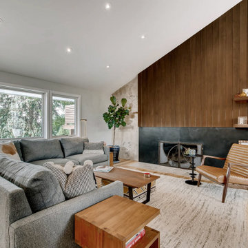
The original fireplace was disproportionately small compared to the large expanse of the brick wall. We built out the fireplace surround with limestone and metal sheath. The tongue-and-groove wood panels that stretch to the ceiling add texture and warmth, and tie in to the wood trim in the kitchen area. The floating walnut shelves with built-in LED light strips create a space to showcase decorative items and family photos.
 Charlotte Comer Interiors, Inc.
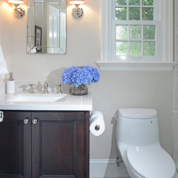
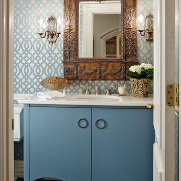
This home was built in the 90s in a period of excess: too many moldings, ceilings disproportionately high and out of proportion, built-in cabinetry. This powder bath had all of those issues. By changing the sink cabinet to a furniture piece, topped with white marble and an under mount sink and adding wall covering above and below the wainscoting; this bath now has a clean, unified look. Strong contrast in detail makes each element stand out. The ebony toned wood floor makes the sharp white molding push the middle value (blue) cabinet forward to draw you into the room. New sconces, an antique mirror and countertop objects d'art make a nice contrast to the transitional lines of cabinetry and wallpaper.
Photo Credits: Bill Bolin Photography
 Jennifer Butler Design
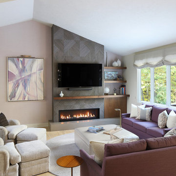
The true volume of this space is understood when you see how it expands into itself, the singular color enhancing the various edges and forms without jarring the eye (as with most color changes from walls to ceilings). The relatively neutral pallet is enlivened with purple sofas and colorful original art.
Photo by David Sparks
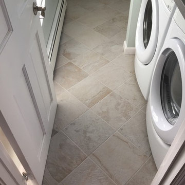
 Lowe's of Auburn, ME
The porcelain Ivetta floor tile has a random, organic look that softens the clean and crisp lines of the room. Setting tiles on the diagonal adds character and energy, and keeps the skinny walkway from looking disproportionately long.
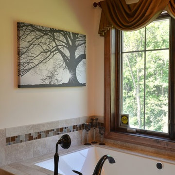
 Belman Homes
Inspiration for a craftsman beige tile and porcelain tile doorless shower remodel in Milwaukee with an undermount tub, a two-piece toilet, shaker cabinets, brown cabinets and granite countertops
 Cynthia B. Wilson Interior Design
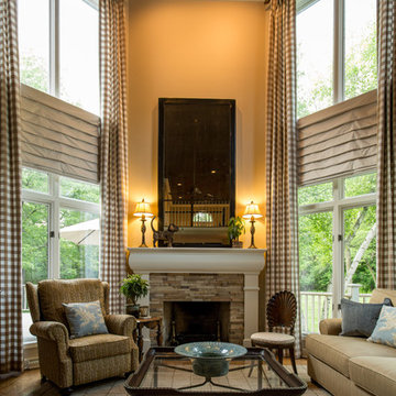
 I began working with the owners of this house in 2013. We started with the living and dining rooms. No new furniture was purchased, but the rooms transformed when we changed the wall and ceiling colors, added lighting and light fixtures, rearranged artwork, rugs and furniture. We softened the windows and added privacy with very simple linen Roman blinds. We used the same linen to slipcover the sofa.
Early in 2015, we tackled the most difficult room. The relatively small family room has disproportionately high ceilings. We worked to minimize the "elevator shaft" feeling of the room by replacing the previously "wimpy" mantel, surround and hearth with a design and combination of materials that stand up to the height of the room. In addition to treating the two sets of windows stacked at ground level and again at 8' as one tall window, we painted the ceiling chocolate brown which is reflected at floor level by the new rug (Dash and Albert - Nigel) and hearth stone. The chocolate brown ceiling extends into the foyer where we hung Circa Lighting's phenomenal "Kate" lantern.
Victoria Mc Hugh Photography
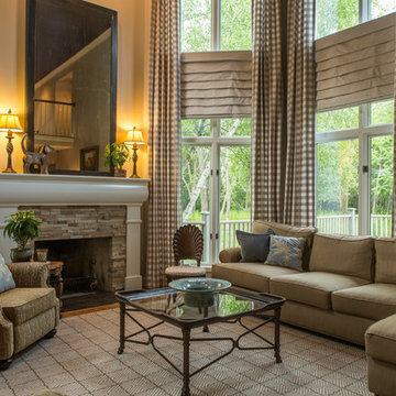 Cynthia B. Wilson Interior Design
Early in 2015, we tackled the most difficult room. The relatively small family room has disproportionately high ceilings. We worked to minimize the "elevator shaft" feeling of the room by replacing the previously "wimpy" mantel, surround and hearth with a design and combination of materials that stand up to the height of the room. In addition to treating the two sets of windows stacked at ground level and again at 8' as one tall window, we painted the ceiling chocolate brown which is reflected at floor level by the new rug (Dash and Albert - Nigel) and hearth stone. The chocolate brown ceiling extends into the foyer where we hung Circa Lighting's phenomenal "Kate" lantern. Victoria Mc Hugh Photography
 Cutting Edge Homes Inc.
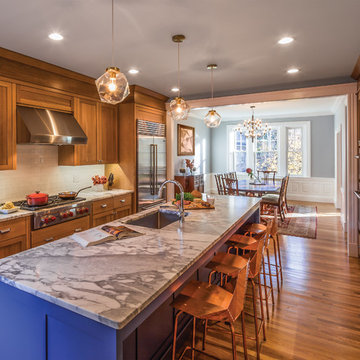
We overhauled a chaotic and cramped kitchen of a top-floor condo in Brookline by re-working the cooking area, entry hall, and surrounding closets to create an open-concept plan that isn’t cut off from the home’s other spaces. By removing a few feet from kitchen closets that were deeper than they were useful and a disproportionately oversized entry hall, we brought the kitchen an additional two feet and significantly improved the over all functionality.
We also incorporated a number of space-saving solutions, like choosing a range top that allowed for storage of pots and pans underneath. Putting the microwave in the pantry keeps the counters clear, and additional refrigerated Sub-Zero drawers make it easy for kids to reach for drinks and snacks.
Photos by Patrick O'Malley
 Cynthia B. Wilson Interior Design
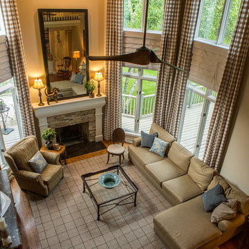
 I began working with the owners of this house in 2013. We started with the living and dining rooms. No new furniture was purchased, but the rooms transformed when we changed the wall and ceiling colors, added lighting and light fixtures, rearranged artwork, rugs and furniture. We softened the windows and added privacy with very simple linen Roman blinds. We used the same linen to slipcover the sofa.
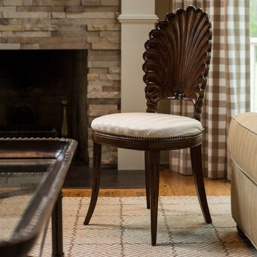
Early in 2015, we tackled the most difficult room. The relatively small family room has disproportionately high ceilings. We worked to minimize the "elevator shaft" feeling of the room by replacing the previously "wimpy" mantel, surround and hearth with a design and combination of materials that stand up to the height of the room. In addition to treating the two sets of windows stacked at ground level and again at 8' as one tall window, we painted the ceiling chocolate brown which is reflected at floor level by the new rug (Dash and Albert - Nigel) and hearth stone. The chocolate brown ceiling extends into the foyer where we hung Circa Lighting's phenomenal "Kate" lantern.
Victoria Mc Hugh Photography
 Cynthia B. Wilson Interior Design
 I began working with the owners of this house in 2013. We started with the living and dining rooms. No new furniture was purchased, but the rooms transformed when we changed the wall and ceiling colors, added lighting and light fixtures, rearranged artwork, rugs and furniture. We softened the windows and added privacy with very simple linen Roman blinds. We used the same linen to slipcover the sofa.
Early in 2015, we tackled the most difficult room. The relatively small family room has disproportionately high ceilings. We worked to minimize the "elevator shaft" feeling of the room by replacing the previously "wimpy" mantel, surround and hearth with a design and combination of materials that stand up to the height of the room. In addition to treating the two sets of windows stacked at ground level and again at 8' as one tall window, we painted the ceiling chocolate brown which is reflected at floor level by the new rug (Dash and Albert - Nigel) and hearth stone. The chocolate brown ceiling extends into the foyer where we hung Circa Lighting's phenomenal "Kate" lantern.
Victoria Mc Hugh Photography
 Cynthia B. Wilson Interior Design
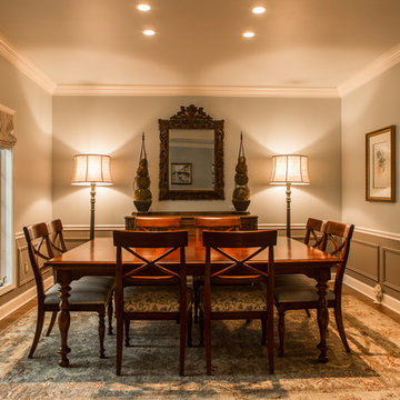
 I began working with the owners of this house in 2013. We started with the living and dining rooms. No new furniture was purchased, but the rooms transformed when we changed the wall and ceiling colors, added lighting and light fixtures, rearranged artwork, rugs and furniture. We softened the windows and added privacy with very simple linen Roman blinds. We used the same linen to slipcover the sofa.
Early in 2015, we tackled the most difficult room. The relatively small family room has disproportionately high ceilings. We worked to minimize the "elevator shaft" feeling of the room by replacing the previously "wimpy" mantel, surround and hearth with a design and combination of materials that stand up to the height of the room. In addition to treating the two sets of windows stacked at ground level and again at 8' as one tall window, we painted the ceiling chocolate brown which is reflected at floor level by the new rug (Dash and Albert - Nigel) and hearth stone. The chocolate brown ceiling extends into the foyer where we hung
Circa Lighting's phenomenal "Kate" lantern.
Victoria Mc Hugh Photography
 Meadowlark Design+Build
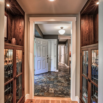
Utilizing space from a disproportionately large living room allowed the designers to create a unique hall bookcase using the clients leaded glass doors that were family heirlooms. This short hallway provides a transition from the entry into the living room. To create this much-needed walk in pantry space, a small square footage was taken from the adjoining living room space. This is part of a first floor renovation completed by Meadowlark Design + Build in Ann Arbor, Michigan.
 Cynthia B. Wilson Interior Design
 I began working with the owners of this house in 2013. We started with the living and dining rooms. No new furniture was purchased, but the rooms transformed when we changed the wall and ceiling colors, added lighting and light fixtures, rearranged artwork, rugs and furniture. We softened the windows and added privacy with very simple linen Roman blinds. We used the same linen to slipcover the sofa.
Early in 2015, we tackled the most difficult room. The relatively small family room has disproportionately high ceilings. We worked to minimize the "elevator shaft" feeling of the room by replacing the previously "wimpy" mantel, surround and hearth with a design and combination of materials that stand up to the height of the room. In addition to treating the two sets of windows stacked at ground level and again at 8' as one tall window, we painted the ceiling chocolate brown which is reflected at floor level by the new rug (Dash and Albert - Nigel) and hearth stone. The chocolate brown ceiling extends into the foyer where we hung
Circa Lighting's phenomenal "Kate" lantern.
Victoria Mc Hugh Photography
 Irene Designs
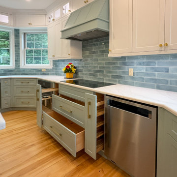
Kitchen — Project Description (Bolton, CT)
(Full Renovation • Reconfiguration • Architectural Corrections)
The original kitchen suffered from spatial imbalance and limited functionality: the right side was visually and physically heavy with cabinetry and appliances, the 135-degree angled walls lacked symmetry due to a missing window on the driveway side, and the small island could only seat two. Circulation was obstructed by a desk positioned in the main traffic flow, and the low French door felt disproportionate in scale compared to the large windows and adjacent two-story Great Room.
Major Structural & Functional Improvements
Repositioned window on the front elevation to the right, creating a long-desired view to the driveway while freeing space for a centered cooktop and statement hood — visually aligning with the Great Room’s redesigned fireplace focal wall.
Installed a new custom sliding door, significantly taller and wider than the original French door. This upgrade enhances natural light, visually opens the kitchen to the deck, and provides unobstructed traffic flow thanks to its sliding operation.
New Kitchen Layout & Enhanced Functionality
Designed an entirely new layout centered around a 10' double-slab island, providing expansive workspace and a natural gathering zone.
Added conversational seating for the whole family, allowing comfortable interaction on all sides of the island.
Introduced purpose-designed storage solutions, including pullouts, rollouts, spice towers, tray organizers, and deep drawers to maximize usability.
Reallocated the desk area to a dedicated window spot overlooking the backyard, removing it from traffic paths and improving both functionality and comfort.
Cabinetry & Architectural Detailing
Custom two-tone cabinetry in soft white and a serene blue-green tone reflects the visual language of the adjacent Great Room, creating whole-home cohesion.
Installed lit upper glass cabinets along the entire perimeter, balancing vertical proportions and creating an elegant display band throughout the kitchen.
A custom range hood was designed and painted to match the base cabinetry, becoming a focal point framed by symmetrical windows.
Surfaces, Lighting & Finishes
The island features a double-thickness quartz slab with a soft ogee radius for a timeless, furniture-like feel.
A full-height, handcrafted aqua subway tile backsplash introduces depth, texture, and a gentle reflective quality.
New layered lighting concept, including recessed lights, pendants, task lighting, and integrated cabinet lighting, ensures a warm and functional workspace at any time of day.
 McCabe By Design LLC
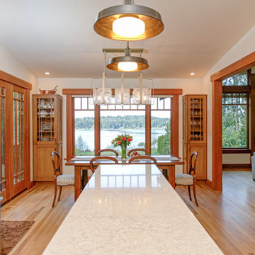
A waterfront home on acreage with stunning views started as a modest Mid-Century Modern and was expanded (by an owner prior to our client) and made into a Craftsman-esque abode. The South-facing Kitchen addition (disproportionate to the overall size of the home, as well as the home’s entertaining value), with its asymmetrical 3-12 pitch gable roof and vaulted ceiling, appears to have been an afterthought (and definitely not inspected) with poor lighting, no ventilation, inadequate storage, and an inefficient layout, rendering it a “one bum kitchen”.
SHOWN IN IMAGE:
Dura Supreme Cabinetry in Quarter-sawn White Oak with Butternut stain with Carson door style |
Cambria 3cm Engineered Quartz in Haydon finish |
Top Knobs Torbay Pulls in Honey Bronze |
Visual Comfort Ruhlmann 14" Factory Pendant in Bronze |
Hubbardton Forge Arc Linear Finish in Soft Gold |Bosch Counter-Depth 3-Door Refrigerator |
Walls are Benjamin Moore Linen White
A view disrupting peninsula was removed opening up the kitchen to the stunning view and dining guests. The island contributes to the much desired counterspace, acts as a buffet and provides ergonomic storage.
2