
Search results for "Distinctive issue" in Home Design Ideas

 Redecorating Vancouver
A modern home with an eclectic mix
My clients in this space were divided. They were split by competing aesthetics. There were Vietnamese art pieces with modern motifs and bold colours mixed with hand-crafted rustic tables and antique Canadiana. I quickly identified a lack of cohesion and an uncomfortable conversation area as the primary issues that were causing my clients stress.
A change was in order. We partitioned their large connected dining room, living and entryway areas using the existing furniture and floor covering. We were able to create several distinct and cohesive areas that each brought out the best of their contents. Each grouping now seemed natural and harmonious. Smooth international contemporary style and rustic heritage pieces now coexisted in the same space without causing my clients decorating headaches. To organize future projects and to summarize personalized decorating tips, Redecorating Vancouver provided them with a written Design Plan at the conclusion of the consultation.
Family is important to me. I recognize that items in my clients' homes have unseen significance. In this instance, I was able to gather items to create a grand-parents nook to honour the couple's family. We took advantage of an heirloom antique radio that belonged to the client's grandfather and a meaningful handmade table. It is both pleasing to the eye and a daily reminder to the couple of who really matters in a home: the family that lives in it.

 Jordan Design Build Group
Distinctive quartzite counters are a showstopper, with unique veining and striking color variation, from blue to gray to ochre. The pearlescent blue-gray backsplash unites the entire space.
The overall goal was to create an expansive entertaining kitchen that could accommodate our clients’ large gatherings of family and friends, and provide them with several zones for prepping, serving, seating, and socializing. Also high on the clients’ wish list: a more generous island, professional appliances, and better storage. We expanded the island in two directions to allow for comfortable seating at the counter with plenty of room for a table in the breakfast nook. An expandable bar height table in the adjacent dining area offers even more flexibility for eating and socializing.
We designed a custom hutch which has a multitude of storage options and functionality – open display shelves, roll-outs, drawers, extra counter/serving space, as well as a beverage fridge and appliance garage/coffee center. On the opposite side of the kitchen, we replaced a small pantry closet with a furniture style built-in that took advantage of underutilized space. Anticipating issues with supply chain, we opted to use a local cabinet maker on this project which allowed us to fully customize the cabinets for optimal functionality.
Other stand-out features include a Thermador appliance package, workstation farmhouse sink, ‘touch’ faucet, hot+cold water dispenser, and hidden toe-kick storage. Our clients now have a beautiful, cohesive space that reflects their personal style and fulfills their dream of a having an expansive kitchen where they can cook and entertain for years to come.

 Jordan Woodworking, LLC
The vintage look of these cabinet doors is achieved by using reclaimed material with evidence of previous use. We used a burnt umber glaze over white paint to highlight the naturally distressed material. Vintage hardware and half overlay cabinet doors are featured in this kitchen.
Find the right local pro for your project
 Jordan Design Build Group
Distinctive quartzite counters are a showstopper, with unique veining and striking color variation, from blue to gray to ochre. The pearlescent blue-gray backsplash unites the entire space.
The overall goal was to create an expansive entertaining kitchen that could accommodate our clients’ large gatherings of family and friends, and provide them with several zones for prepping, serving, seating, and socializing. Also high on the clients’ wish list: a more generous island, professional appliances, and better storage. We expanded the island in two directions to allow for comfortable seating at the counter with plenty of room for a table in the breakfast nook. An expandable bar height table in the adjacent dining area offers even more flexibility for eating and socializing.
We designed a custom hutch which has a multitude of storage options and functionality – open display shelves, roll-outs, drawers, extra counter/serving space, as well as a beverage fridge and appliance garage/coffee center. On the opposite side of the kitchen, we replaced a small pantry closet with a furniture style built-in that took advantage of underutilized space. Anticipating issues with supply chain, we opted to use a local cabinet maker on this project which allowed us to fully customize the cabinets for optimal functionality.
Other stand-out features include a Thermador appliance package, workstation farmhouse sink, ‘touch’ faucet, hot+cold water dispenser, and hidden toe-kick storage. Our clients now have a beautiful, cohesive space that reflects their personal style and fulfills their dream of a having an expansive kitchen where they can cook and entertain for years to come.
 Tile Doctor Ltd
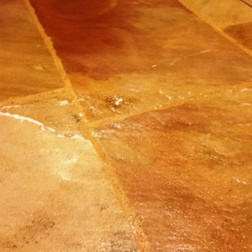
Sandstone is a particularly popular choice for kitchen and hallway floors amongst home owners in the UK. It not only possesses beautiful natural shades and features, but it is also typically hard wearing, making it an ideal stone for tiled flooring in high traffic areas of a house and can often be found laid as large riven flagstones in pubs and other commercial premises.
Naturally, just like any other type of tiled floor, Sandstone needs to be maintained using appropriate products and methods. A lack of adequate surface sealer in particular leaves Sandstone susceptible to ingrained dirt, and can leave distinct, unsightly patches such as those in the photograph below.
In this instance, I visited a client in the old Essex town of Thaxted, who believed that her four square meter Sandstone tiled floor might be suffering from damp issues after lifting up the mats covering the area.
However, when I arrived at the property and ran damp tests, I found the issue to be superficial. The Sandstone floor however did require attention in the form of a deep clean and a fresh seal to tackle the white patches and prevent further discolouration.
To begin the cleaning process I spread Tile Doctor Remove & Go evenly across the floor. It was left to dwell for approximately 15 minutes, during which time it worked to break down the old sealer remaining on the tiles. I then agitated the area twice over with both a black scrubbing pad fitted to a rotation machine lift away any dirt.
The resultant slurry was removed using a wet vacuum and the floor was then rinsed with water and then mixed a strong solution of one part Tile Doctor Pro Clean to three parts water which was used to give the floor a final clean and scrub the grout clean before using the wet vacuum again and giving the floor a final rinse with water.
After completing the cleaning process I left the floor to dry over the weekend. Upon my return to the house I proceeded to seal the tiles with three coats of Tile Doctor Colour Grow which is an impregnating sealer that soaks into the pores of the stone and provide durable surface protection going forward. Colour Grow is also specially designed to let the floor breathe and enhance the natural colours in the stone and, in this case, really helped to intensify the natural sand-coloured shades in the tiles.
The difference made to these Sandstone tiles was really noticeable, with the white patches completely removed and the surface more generally back to looking like new, needless to say, my client was very happy with the results.
Nick Murphy
South Essex Tile Doctor

 River Valley Landscapes
The property is one of the original farm houses located on the main street of a small town. It has been in the family for many years and our client just inherited the property. They were trying to have balance of preserving the old while realizing modern day living has its benefits too. The house had a large addition added using mostly old style materials, but designed with function and modern day luxuries. Our goal was to carry that theme to the outside.
Our first problem we had to address was how to transition between the first floor elevation changes. The lower room was the husband’s office. He stated in the future he may have clients over and it would be nice to have an area to sit outside. The wife’s main concern was to renew the four corner garden. She also felt it was very important to be able to see it from the kitchen area. Finally there was an old wishing well stuck right outside the kitchen. They both felt it would be neat to be able to incorporate this in some how. They wanted a patio area with a built in grill to accommodate there family and friends. They also wanted to keep a large play area for the kids.
We were able to pull this off successfully. We addressed the first issue by having a small lower level flagstone area. This area is large enough for 1 to 2 people to sit comfortably. It also provides a transition from his office to the larger patio area. We installed a simple small gravel sitting area opposite of the main patio. This provides our client a secluded place to relax or do business. Mrs.... told me she is amazed how much her and her husband enjoys this area. It is so peaceful looking at the small creek over a glass of wine.
We built a natural limestone retaining wall to create the patio terrace. The stone was chosen to extend the houses architectural elements into the landscape. Irregular broken flagstone was used to give it a more casual feel. We installed three Serviceberries into the patio terrace to replace some trees that were taken down during the remodeling. She was very concern that they would block the view of the four corner garden. We new they were crucial to nestle in the terrace, so we placed them for a couple days for her to decide. Fortunately she agreed they not only kept the view open, but helped frame the garden.
The four corner garden was designed to be viewed from afar and experienced up close. We wanted the space to have some formal structure while keeping with the casual farm house feel. Another natural limestone retaining wall was created. This leveled the garden terrace and helped associate it with the rest of the property. The four corner garden is nestled into the existing woods edge. This provides three distinct experiences to entering the garden; a more formal from the driveway, an open feel from the lower lawn, and a more natural / casual experience from the wooded area. The Plymouth brown gravel was used for the center of the garden. This helped highlight the stone post that was found during construction. The gravel also brings the sense of sound into the garden space. Lamb’s ear was chosen as a fun way to get kids interest in horticulture.
The balance of using the new to create the old feel is what makes this project a success. The property has already hosted a local historical society event and won an award for its preservation efforts. When Mrs.... can’t find her husband, she knows he is either reading the newspaper by the grill or resting in the hammock along the wood’s path.

 The Brooklyn Studio
This residence was a complete gut renovation of a 4-story row house in Park Slope, and included a new rear extension and penthouse addition. The owners wished to create a warm, family home using a modern language that would act as a clean canvas to feature rich textiles and items from their world travels. As with most Brooklyn row houses, the existing house suffered from a lack of natural light and connection to exterior spaces, an issue that Principal Brendan Coburn is acutely aware of from his experience re-imagining historic structures in the New York area. The resulting architecture is designed around moments featuring natural light and views to the exterior, of both the private garden and the sky, throughout the house, and a stripped-down language of detailing and finishes allows for the concept of the modern-natural to shine.
Upon entering the home, the kitchen and dining space draw you in with views beyond through the large glazed opening at the rear of the house. An extension was built to allow for a large sunken living room that provides a family gathering space connected to the kitchen and dining room, but remains distinctly separate, with a strong visual connection to the rear garden. The open sculptural stair tower was designed to function like that of a traditional row house stair, but with a smaller footprint. By extending it up past the original roof level into the new penthouse, the stair becomes an atmospheric shaft for the spaces surrounding the core. All types of weather – sunshine, rain, lightning, can be sensed throughout the home through this unifying vertical environment. The stair space also strives to foster family communication, making open living spaces visible between floors. At the upper-most level, a free-form bench sits suspended over the stair, just by the new roof deck, which provides at-ease entertaining. Oak was used throughout the home as a unifying material element. As one travels upwards within the house, the oak finishes are bleached to further degrees as a nod to how light enters the home.
The owners worked with CWB to add their own personality to the project. The meter of a white oak and blackened steel stair screen was designed by the family to read “I love you” in Morse Code, and tile was selected throughout to reference places that hold special significance to the family. To support the owners’ comfort, the architectural design engages passive house technologies to reduce energy use, while increasing air quality within the home – a strategy which aims to respect the environment while providing a refuge from the harsh elements of urban living.
This project was published by Wendy Goodman as her Space of the Week, part of New York Magazine’s Design Hunting on The Cut.
Photography by Kevin Kunstadt

 Midtown Cabinetry & Designs
Our mission is to guide clients seamlessly through the design/Install process; presenting the very best options, maximizing the use of latest technologies and delivering on the quality and integrity of our work. Our ultimate goal is to bring the clients dream space to life.

 JNMRustic Designs
Shiplap Wall featuring our Weathered White Brown color option in the 5" size also available in 8" wide plank.
New wood with a special clean weathered finish mimicking an aged wood look.
 River Valley Landscapes
The property is one of the original farm houses located on the main street of a small town. It has been in the family for many years and our client just inherited the property. They were trying to have balance of preserving the old while realizing modern day living has its benefits too. The house had a large addition added using mostly old style materials, but designed with function and modern day luxuries. Our goal was to carry that theme to the outside.
Our first problem we had to address was how to transition between the first floor elevation changes. The lower room was the husband’s office. He stated in the future he may have clients over and it would be nice to have an area to sit outside. The wife’s main concern was to renew the four corner garden. She also felt it was very important to be able to see it from the kitchen area. Finally there was an old wishing well stuck right outside the kitchen. They both felt it would be neat to be able to incorporate this in some how. They wanted a patio area with a built in grill to accommodate there family and friends. They also wanted to keep a large play area for the kids.
We were able to pull this off successfully. We addressed the first issue by having a small lower level flagstone area. This area is large enough for 1 to 2 people to sit comfortably. It also provides a transition from his office to the larger patio area. We installed a simple small gravel sitting area opposite of the main patio. This provides our client a secluded place to relax or do business. Mrs.... told me she is amazed how much her and her husband enjoys this area. It is so peaceful looking at the small creek over a glass of wine.
We built a natural limestone retaining wall to create the patio terrace. The stone was chosen to extend the houses architectural elements into the landscape. Irregular broken flagstone was used to give it a more casual feel. We installed three Serviceberries into the patio terrace to replace some trees that were taken down during the remodeling. She was very concern that they would block the view of the four corner garden. We new they were crucial to nestle in the terrace, so we placed them for a couple days for her to decide. Fortunately she agreed they not only kept the view open, but helped frame the garden.
The four corner garden was designed to be viewed from afar and experienced up close. We wanted the space to have some formal structure while keeping with the casual farm house feel. Another natural limestone retaining wall was created. This leveled the garden terrace and helped associate it with the rest of the property. The four corner garden is nestled into the existing woods edge. This provides three distinct experiences to entering the garden; a more formal from the driveway, an open feel from the lower lawn, and a more natural / casual experience from the wooded area. The Plymouth brown gravel was used for the center of the garden. This helped highlight the stone post that was found during construction. The gravel also brings the sense of sound into the garden space. Lamb’s ear was chosen as a fun way to get kids interest in horticulture.
The balance of using the new to create the old feel is what makes this project a success. The property has already hosted a local historical society event and won an award for its preservation efforts. When Mrs.... can’t find her husband, she knows he is either reading the newspaper by the grill or resting in the hammock along the wood’s path.

 Decksouth
This parting board is a great way to separate two areas of the deck as well as eliminate seams in a deck project.
Huge elegant backyard deck photo in Atlanta with a pergola
Huge elegant backyard deck photo in Atlanta with a pergola
 River Valley Landscapes
The property is one of the original farm houses located on the main street of a small town. It has been in the family for many years and our client just inherited the property. They were trying to have balance of preserving the old while realizing modern day living has its benefits too. The house had a large addition added using mostly old style materials, but designed with function and modern day luxuries. Our goal was to carry that theme to the outside.
Our first problem we had to address was how to transition between the first floor elevation changes. The lower room was the husband’s office. He stated in the future he may have clients over and it would be nice to have an area to sit outside. The wife’s main concern was to renew the four corner garden. She also felt it was very important to be able to see it from the kitchen area. Finally there was an old wishing well stuck right outside the kitchen. They both felt it would be neat to be able to incorporate this in some how. They wanted a patio area with a built in grill to accommodate there family and friends. They also wanted to keep a large play area for the kids.
We were able to pull this off successfully. We addressed the first issue by having a small lower level flagstone area. This area is large enough for 1 to 2 people to sit comfortably. It also provides a transition from his office to the larger patio area. We installed a simple small gravel sitting area opposite of the main patio. This provides our client a secluded place to relax or do business. Mrs.... told me she is amazed how much her and her husband enjoys this area. It is so peaceful looking at the small creek over a glass of wine.
We built a natural limestone retaining wall to create the patio terrace. The stone was chosen to extend the houses architectural elements into the landscape. Irregular broken flagstone was used to give it a more casual feel. We installed three Serviceberries into the patio terrace to replace some trees that were taken down during the remodeling. She was very concern that they would block the view of the four corner garden. We new they were crucial to nestle in the terrace, so we placed them for a couple days for her to decide. Fortunately she agreed they not only kept the view open, but helped frame the garden.
The four corner garden was designed to be viewed from afar and experienced up close. We wanted the space to have some formal structure while keeping with the casual farm house feel. Another natural limestone retaining wall was created. This leveled the garden terrace and helped associate it with the rest of the property. The four corner garden is nestled into the existing woods edge. This provides three distinct experiences to entering the garden; a more formal from the driveway, an open feel from the lower lawn, and a more natural / casual experience from the wooded area. The Plymouth brown gravel was used for the center of the garden. This helped highlight the stone post that was found during construction. The gravel also brings the sense of sound into the garden space. Lamb’s ear was chosen as a fun way to get kids interest in horticulture.
The balance of using the new to create the old feel is what makes this project a success. The property has already hosted a local historical society event and won an award for its preservation efforts. When Mrs.... can’t find her husband, she knows he is either reading the newspaper by the grill or resting in the hammock along the wood’s path.
 Morris Black Designs
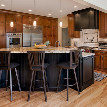
Sometimes the design solutions we come up for a homeowner extend beyond their kitchen — as was the case at the Burfeind residence. Julia Burfeind was unhappy that her home’s nearly 20-year-old kitchen was not well suited to entertain guests, which is something she’s been doing more of recently. She was also not satisfied with how the adjacent sunroom and mud/laundry rooms were laid out and being used (or in the case of the sunroom, not being used) by the family. Julia was recommended to Morris Black Designs whom she was told would be excellent at resolving all three issues.
“Our house was built in ‘98 I believe, so the kitchen was in need of a facelift but more importantly its setup was not particularly helpful for socializing,” explains Julia. “Among other things, there was a small island in the kitchen which was not suitable for accommodating guests.
“In addition, our kitchen was attached to a “sunroom” which was essentially a stepdown separate room that was attached to the kitchen but really wasn’t part of the kitchen — and so it felt like a lot of wasted space for us,” she continues. “We had our kids’ art supplies and the dog bed out there. The space was kinda useless. We didn’t like that setup particularly.”
“And then thirdly, we had a room attached to the kitchen that served as both a mudroom and a laundry room but didn’t do a good job of being either. I’ve got two active young kids that play a lot of sports. There wasn’t enough room in there for all their stuff. And not enough room to do the laundry. The problems we had with all three spaces convinced us to renovate.”
Julia met with one of our designers in her home to discuss and show first-hand the issues that were plaguing the kitchen area of the home. Initial designs were created and approved quickly. The need to address three distinct areas required a bit more planning and time to go from initial ideas to installation than typical kitchen-only projects, but when it was all finally said and done, Julia had three rooms that now meet her needs much better than they did before.
“By itself the kitchen would be fantastic,” she happily expresses. “We have a really large island now where we have four comfortable stools where people can sit and relax while others cook which is exactly what we wanted. You know the kitchen is always the central part of your home and when you entertain, which we do fairly often, people always end up in the kitchen so this big new island works great for us.”
“And now the area that was called a sunroom is incorporated with the kitchen — it was brought physically up to the same level as the kitchen which opened the two rooms up to each other as much as they can be so it’s really all one room now. We now have a dining room table out in that area and a wet bar where we have our bar stuff and our coffee makers and all of that. So those areas now work together great.”
“We completed a small addition to bump the laundry room out behind the kitchen. We then had Morris Black Designs build four big storage lockers in our mudroom for the kids’ gym bags and sports stuff. They’re not like gym lockers; they’re more like nice cabinets with wooden doors which we keep closed to hide the mess inside each — so it looks very nice in that room despite having all of my kids’ gym bags secretly piled up in there. And we have the great big, beautiful, sunny laundry room with a door and a window and a skylight and a big granite countertop where I can fold clothes.”
As much as she loves the distinct improvements made to each individual space, Burfeind will quickly tell you, however, that this project is truly an example of when the whole is greater than the sum of its parts
“The whole house is just much more usable now,” she surmises. “The work done by Morris Black Designs has really increased our daily satisfaction of being in the house which is fun and makes it all worthwhile.”
 Jordan Design Build Group
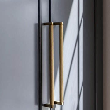
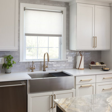
After more than a decade in their new Alexandria home, our clients decided their kitchen was ready for a major refresh, both in form and function. The original stained wood cabinets and granite countertops had served them well, but the traditional design no longer fit with their evolving style which had become less formal and more transitional. The homeowners liked the idea of two-toned kitchen cabinets, so we opted for a combination of pure white and charcoal gray for dramatic contrast. Brushed gold fixtures and statement brass pulls add warmth and sophistication. The distinctive marble counters are a showstopper, with unique veining and striking color variation, from blue to gray to ochre. The shimmering blue-gray backsplash unites the entire space.
The overall goal was to create an expansive entertaining kitchen that could accommodate our clients’ large gatherings of family and friends, and provide them with several zones for prepping, serving, seating, and socializing. Also high on the clients’ wish list: a more generous island, professional appliances, and better storage. We expanded the island in two directions to allow for comfortable seating at the counter with plenty of room for a table in the breakfast nook. An expandable bar height table in the adjacent dining area offers even more flexibility for eating and socializing.
We designed a custom hutch which has a multitude of storage options and functionality – open display shelves, roll-outs, drawers, extra counter/serving space, as well as a beverage fridge and appliance garage/coffee center. On the opposite side of the kitchen, we replaced a small pantry closet with a furniture style built-in that took advantage of underutilized space. Anticipating issues with supply chain, we opted to use a local cabinet maker on this project which allowed us to fully customize the cabinets for optimal functionality.
Other stand-out features include a Thermador appliance package, workstation farmhouse sink, ‘touch’ faucet, hot+cold water dispenser, and hidden toe-kick storage. Our clients now have a beautiful, cohesive space that reflects their personal style and fulfills their dream of a having an expansive kitchen where they can cook and entertain for years to come.


 Bilotta Kitchen & Home
The homeowners wanted a sleek, contemporary kitchen that didn't feel cold, and still worked with the style of their classic, red brick colonial home. The design team, consisting of Bilotta senior designer, RitaLuisa Garcés and Billy Ceglia of Billy Ceglia Designs, opted for the warmth of traditional walnut cabinetry done in an exaggerated shaker style with ultra-thin stiles and rails and light textured laminate cabinets with distinct horizontal graining. The cabinetry they selected is Bilotta’s contemporary Artcraft line – European style cabinets manufactured in Canada. This combination of colors and textures helped solve another design issue: a long narrow space that opened directly into the family room. Cabinet colors and finishes helped to create the illusion of width in the space by situating the light cabinetry in an “L” across the rear wall and window wall of the space and “bookending” it with the full height walnut units that read more as paneling than cabinetry when viewed from the adjoining family room. The large simple island outfitted with Donghia counter stools, allows for an uninterrupted work space, storage of tabletop items, and also houses a “snack zone” for the client’s children with cabinetry and roll-outs for snacks, a microwave, and a beverage center all within easy reach, but outside of the main work area.
The custom stainless steel exhaust hood and handcrafted tile backsplash also add subtle visual interest to the space, reinforcing the idea that the back walls of the kitchen recede into the background creating the illusion of more space.
The centerpiece of the breakfast room is the multi light, hand blown chandelier from Niche Modern hanging above a blue lacquered breakfast table with stainless steel detailing and vintage Saarinen dining chairs. Together the components create a comfortable spot to dine, or just hang out.
Designers: RitaLuisa Garcés in collaboration with Billy Ceglia of Billy Ceglia Designs; Photo Credit: Peter Krupenye
 River Valley Landscapes
The property is one of the original farm houses located on the main street of a small town. It has been in the family for many years and our client just inherited the property. They were trying to have balance of preserving the old while realizing modern day living has its benefits too. The house had a large addition added using mostly old style materials, but designed with function and modern day luxuries. Our goal was to carry that theme to the outside.
Our first problem we had to address was how to transition between the first floor elevation changes. The lower room was the husband’s office. He stated in the future he may have clients over and it would be nice to have an area to sit outside. The wife’s main concern was to renew the four corner garden. She also felt it was very important to be able to see it from the kitchen area. Finally there was an old wishing well stuck right outside the kitchen. They both felt it would be neat to be able to incorporate this in some how. They wanted a patio area with a built in grill to accommodate there family and friends. They also wanted to keep a large play area for the kids.
We were able to pull this off successfully. We addressed the first issue by having a small lower level flagstone area. This area is large enough for 1 to 2 people to sit comfortably. It also provides a transition from his office to the larger patio area. We installed a simple small gravel sitting area opposite of the main patio. This provides our client a secluded place to relax or do business. Mrs.... told me she is amazed how much her and her husband enjoys this area. It is so peaceful looking at the small creek over a glass of wine.
We built a natural limestone retaining wall to create the patio terrace. The stone was chosen to extend the houses architectural elements into the landscape. Irregular broken flagstone was used to give it a more casual feel. We installed three Serviceberries into the patio terrace to replace some trees that were taken down during the remodeling. She was very concern that they would block the view of the four corner garden. We new they were crucial to nestle in the terrace, so we placed them for a couple days for her to decide. Fortunately she agreed they not only kept the view open, but helped frame the garden.
The four corner garden was designed to be viewed from afar and experienced up close. We wanted the space to have some formal structure while keeping with the casual farm house feel. Another natural limestone retaining wall was created. This leveled the garden terrace and helped associate it with the rest of the property. The four corner garden is nestled into the existing woods edge. This provides three distinct experiences to entering the garden; a more formal from the driveway, an open feel from the lower lawn, and a more natural / casual experience from the wooded area. The Plymouth brown gravel was used for the center of the garden. This helped highlight the stone post that was found during construction. The gravel also brings the sense of sound into the garden space. Lamb’s ear was chosen as a fun way to get kids interest in horticulture.
The balance of using the new to create the old feel is what makes this project a success. The property has already hosted a local historical society event and won an award for its preservation efforts. When Mrs.... can’t find her husband, she knows he is either reading the newspaper by the grill or resting in the hammock along the wood’s path.
 Jordan Design Build Group
After more than a decade in their new Alexandria home, our clients decided their kitchen was ready for a major refresh, both in form and function. The original stained wood cabinets and granite countertops had served them well, but the traditional design no longer fit with their evolving style which had become less formal and more transitional. The homeowners liked the idea of two-toned kitchen cabinets, so we opted for a combination of pure white and charcoal gray for dramatic contrast. Brushed gold fixtures and statement brass pulls add warmth and sophistication. The distinctive marble counters are a showstopper, with unique veining and striking color variation, from blue to gray to ochre. The shimmering blue-gray backsplash unites the entire space.
The overall goal was to create an expansive entertaining kitchen that could accommodate our clients’ large gatherings of family and friends, and provide them with several zones for prepping, serving, seating, and socializing. Also high on the clients’ wish list: a more generous island, professional appliances, and better storage. We expanded the island in two directions to allow for comfortable seating at the counter with plenty of room for a table in the breakfast nook. An expandable bar height table in the adjacent dining area offers even more flexibility for eating and socializing.
We designed a custom hutch which has a multitude of storage options and functionality – open display shelves, roll-outs, drawers, extra counter/serving space, as well as a beverage fridge and appliance garage/coffee center. On the opposite side of the kitchen, we replaced a small pantry closet with a furniture style built-in that took advantage of underutilized space. Anticipating issues with supply chain, we opted to use a local cabinet maker on this project which allowed us to fully customize the cabinets for optimal functionality.
Other stand-out features include a Thermador appliance package, workstation farmhouse sink, ‘touch’ faucet, hot+cold water dispenser, and hidden toe-kick storage. Our clients now have a beautiful, cohesive space that reflects their personal style and fulfills their dream of a having an expansive kitchen where they can cook and entertain for years to come.
 Bilotta Kitchen & Home
The homeowners wanted a sleek, contemporary kitchen that didn't feel cold, and still worked with the style of their classic, red brick colonial home. The design team, consisting of Bilotta senior designer, RitaLuisa Garcés and Billy Ceglia of Billy Ceglia Designs, opted for the warmth of traditional walnut cabinetry done in an exaggerated shaker style with ultra-thin stiles and rails and light textured laminate cabinets with distinct horizontal graining. The cabinetry they selected is Bilotta’s contemporary Artcraft line – European style cabinets manufactured in Canada. This combination of colors and textures helped solve another design issue: a long narrow space that opened directly into the family room. Cabinet colors and finishes helped to create the illusion of width in the space by situating the light cabinetry in an “L” across the rear wall and window wall of the space and “bookending” it with the full height walnut units that read more as paneling than cabinetry when viewed from the adjoining family room. The large simple island outfitted with Donghia counter stools, allows for an uninterrupted work space, storage of tabletop items, and also houses a “snack zone” for the client’s children with cabinetry and roll-outs for snacks, a microwave, and a beverage center all within easy reach, but outside of the main work area.
The custom stainless steel exhaust hood and handcrafted tile backsplash also add subtle visual interest to the space, reinforcing the idea that the back walls of the kitchen recede into the background creating the illusion of more space.
The centerpiece of the breakfast room is the multi light, hand blown chandelier from Niche Modern hanging above a blue lacquered breakfast table with stainless steel detailing and vintage Saarinen dining chairs. Together the components create a comfortable spot to dine, or just hang out.
Designers: RitaLuisa Garcés in collaboration with Billy Ceglia of Billy Ceglia Designs; Photo Credit: Peter Krupenye
 Bilotta Kitchen & Home
The homeowners wanted a sleek, contemporary kitchen that didn't feel cold, and still worked with the style of their classic, red brick colonial home. The design team, consisting of Bilotta senior designer, RitaLuisa Garcés and Billy Ceglia of Billy Ceglia Designs, opted for the warmth of traditional walnut cabinetry done in an exaggerated shaker style with ultra-thin stiles and rails and light textured laminate cabinets with distinct horizontal graining. The cabinetry they selected is Bilotta’s contemporary Artcraft line – European style cabinets manufactured in Canada. This combination of colors and textures helped solve another design issue: a long narrow space that opened directly into the family room. Cabinet colors and finishes helped to create the illusion of width in the space by situating the light cabinetry in an “L” across the rear wall and window wall of the space and “bookending” it with the full height walnut units that read more as paneling than cabinetry when viewed from the adjoining family room. The large simple island outfitted with Donghia counter stools, allows for an uninterrupted work space, storage of tabletop items, and also houses a “snack zone” for the client’s children with cabinetry and roll-outs for snacks, a microwave, and a beverage center all within easy reach, but outside of the main work area.
The custom stainless steel exhaust hood and handcrafted tile backsplash also add subtle visual interest to the space, reinforcing the idea that the back walls of the kitchen recede into the background creating the illusion of more space.
The centerpiece of the breakfast room is the multi light, hand blown chandelier from Niche Modern hanging above a blue lacquered breakfast table with stainless steel detailing and vintage Saarinen dining chairs. Together the components create a comfortable spot to dine, or just hang out.
Designers: RitaLuisa Garcés in collaboration with Billy Ceglia of Billy Ceglia Designs; Photo Credit: Peter Krupenye
7