
Search results for "Distinctive issue" in Home Design Ideas
 C. Boesch Design
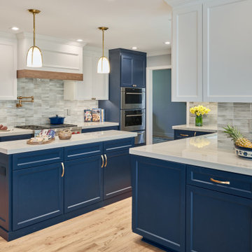
This kitchen was designed for a couple who have lived in their home for more than 30 years and have no plans to move. They LOVE the color blue.
In terms of design, the challenges were about striking the right balance between the family’s desire to have ‘everything’ blue and the existing 1980’s yellowed oak, prevalent throughout the home.
When we started out on the design journey, the existing style was very traditional with a lot of oak trim, walls, floors and doors, but as the project moved along it was evident that the family wanted to update the style, leaning towards a more Transitional style.
The existing kitchen was very dated with oak cabinets and floors and fell short in several areas: it was too small, without ample storage, had a tiny, angled island and was inefficient in terms of layout. In addition, the refrigerator was full depth and sat within a major walkway.
The kitchen and nook area are open to the adjacent family room, also filled with oak; floors, formal ceiling molding, cabinetry, fireplace wall and mantle. This was another challenge; to blend the existing oak with the new, creating a distinctive, harmonious, and very inter-connected space.
To address these issues, we framed in the existing wet bar in the family room, and opened that space into the kitchen. This was perfect for a counter-depth, built-in fridge and pantry and increased their storage capacity.
We removed the tiny angled island and replaced with a longer narrow island which now serves as a prep space and landing area for the cooking space.
We removed the existing dated hexagonal window in the nook, changed out the exterior door and created a new bar, complete with a more formal area within the nook to accommodate the glassware and dishware that was originally stored in the family room wet bar area.
The new kitchen design incorporates painted shaker cabinets, Pro-Style Sub Zero, Wolf and Cove appliances, multiple workspaces, and, of course the use of ‘Blue’.
To provide maximum ergonomic function, roll out trays were strategically planned at heights specific for convenient cooking apparatus and cutlery dividers included in drawers.

 Bilotta Kitchen & Home
The homeowners wanted a sleek, contemporary kitchen that didn't feel cold, and still worked with the style of their classic, red brick colonial home. The design team, consisting of Bilotta senior designer, RitaLuisa Garcés and Billy Ceglia of Billy Ceglia Designs, opted for the warmth of traditional walnut cabinetry done in an exaggerated shaker style with ultra-thin stiles and rails and light textured laminate cabinets with distinct horizontal graining. The cabinetry they selected is Bilotta’s contemporary Artcraft line – European style cabinets manufactured in Canada. This combination of colors and textures helped solve another design issue: a long narrow space that opened directly into the family room. Cabinet colors and finishes helped to create the illusion of width in the space by situating the light cabinetry in an “L” across the rear wall and window wall of the space and “bookending” it with the full height walnut units that read more as paneling than cabinetry when viewed from the adjoining family room. The large simple island outfitted with Donghia counter stools, allows for an uninterrupted work space, storage of tabletop items, and also houses a “snack zone” for the client’s children with cabinetry and roll-outs for snacks, a microwave, and a beverage center all within easy reach, but outside of the main work area.
The custom stainless steel exhaust hood and handcrafted tile backsplash also add subtle visual interest to the space, reinforcing the idea that the back walls of the kitchen recede into the background creating the illusion of more space.
The centerpiece of the breakfast room is the multi light, hand blown chandelier from Niche Modern hanging above a blue lacquered breakfast table with stainless steel detailing and vintage Saarinen dining chairs. Together the components create a comfortable spot to dine, or just hang out.
Designers: RitaLuisa Garcés in collaboration with Billy Ceglia of Billy Ceglia Designs; Photo Credit: Peter Krupenye
 Bilotta Kitchen & Home
The homeowners wanted a sleek, contemporary kitchen that didn't feel cold, and still worked with the style of their classic, red brick colonial home. The design team, consisting of Bilotta senior designer, RitaLuisa Garcés and Billy Ceglia of Billy Ceglia Designs, opted for the warmth of traditional walnut cabinetry done in an exaggerated shaker style with ultra-thin stiles and rails and light textured laminate cabinets with distinct horizontal graining. The cabinetry they selected is Bilotta’s contemporary Artcraft line – European style cabinets manufactured in Canada. This combination of colors and textures helped solve another design issue: a long narrow space that opened directly into the family room. Cabinet colors and finishes helped to create the illusion of width in the space by situating the light cabinetry in an “L” across the rear wall and window wall of the space and “bookending” it with the full height walnut units that read more as paneling than cabinetry when viewed from the adjoining family room. The large simple island outfitted with Donghia counter stools, allows for an uninterrupted work space, storage of tabletop items, and also houses a “snack zone” for the client’s children with cabinetry and roll-outs for snacks, a microwave, and a beverage center all within easy reach, but outside of the main work area.
The custom stainless steel exhaust hood and handcrafted tile backsplash also add subtle visual interest to the space, reinforcing the idea that the back walls of the kitchen recede into the background creating the illusion of more space.
The centerpiece of the breakfast room is the multi light, hand blown chandelier from Niche Modern hanging above a blue lacquered breakfast table with stainless steel detailing and vintage Saarinen dining chairs. Together the components create a comfortable spot to dine, or just hang out.
Designers: RitaLuisa Garcés in collaboration with Billy Ceglia of Billy Ceglia Designs; Photo Credit: Peter Krupenye
Find the right local pro for your project
 C. Boesch Design
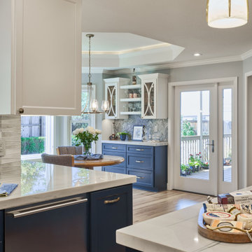
This kitchen was designed for a couple who have lived in their home for more than 30 years and have no plans to move. They LOVE the color blue.
In terms of design, the challenges were about striking the right balance between the family’s desire to have ‘everything’ blue and the existing 1980’s yellowed oak, prevalent throughout the home.
When we started out on the design journey, the existing style was very traditional with a lot of oak trim, walls, floors and doors, but as the project moved along it was evident that the family wanted to update the style, leaning towards a more Transitional style.
The existing kitchen was very dated with oak cabinets and floors and fell short in several areas: it was too small, without ample storage, had a tiny, angled island and was inefficient in terms of layout. In addition, the refrigerator was full depth and sat within a major walkway.
The kitchen and nook area are open to the adjacent family room, also filled with oak; floors, formal ceiling molding, cabinetry, fireplace wall and mantle. This was another challenge; to blend the existing oak with the new, creating a distinctive, harmonious, and very inter-connected space.
To address these issues, we framed in the existing wet bar in the family room, and opened that space into the kitchen. This was perfect for a counter-depth, built-in fridge and pantry and increased their storage capacity.
We removed the tiny angled island and replaced with a longer narrow island which now serves as a prep space and landing area for the cooking space.
We removed the existing dated hexagonal window in the nook, changed out the exterior door and created a new bar, complete with a more formal area within the nook to accommodate the glassware and dishware that was originally stored in the family room wet bar area.
The new kitchen design incorporates painted shaker cabinets, Pro-Style Sub Zero, Wolf and Cove appliances, multiple workspaces, and, of course the use of ‘Blue’.
To provide maximum ergonomic function, roll out trays were strategically planned at heights specific for convenient cooking apparatus and cutlery dividers included in drawers.

 River Valley Landscapes
The property is one of the original farm houses located on the main street of a small town. It has been in the family for many years and our client just inherited the property. They were trying to have balance of preserving the old while realizing modern day living has its benefits too. The house had a large addition added using mostly old style materials, but designed with function and modern day luxuries. Our goal was to carry that theme to the outside.
Our first problem we had to address was how to transition between the first floor elevation changes. The lower room was the husband’s office. He stated in the future he may have clients over and it would be nice to have an area to sit outside. The wife’s main concern was to renew the four corner garden. She also felt it was very important to be able to see it from the kitchen area. Finally there was an old wishing well stuck right outside the kitchen. They both felt it would be neat to be able to incorporate this in some how. They wanted a patio area with a built in grill to accommodate there family and friends. They also wanted to keep a large play area for the kids.
We were able to pull this off successfully. We addressed the first issue by having a small lower level flagstone area. This area is large enough for 1 to 2 people to sit comfortably. It also provides a transition from his office to the larger patio area. We installed a simple small gravel sitting area opposite of the main patio. This provides our client a secluded place to relax or do business. Mrs.... told me she is amazed how much her and her husband enjoys this area. It is so peaceful looking at the small creek over a glass of wine.
We built a natural limestone retaining wall to create the patio terrace. The stone was chosen to extend the houses architectural elements into the landscape. Irregular broken flagstone was used to give it a more casual feel. We installed three Serviceberries into the patio terrace to replace some trees that were taken down during the remodeling. She was very concern that they would block the view of the four corner garden. We new they were crucial to nestle in the terrace, so we placed them for a couple days for her to decide. Fortunately she agreed they not only kept the view open, but helped frame the garden.
The four corner garden was designed to be viewed from afar and experienced up close. We wanted the space to have some formal structure while keeping with the casual farm house feel. Another natural limestone retaining wall was created. This leveled the garden terrace and helped associate it with the rest of the property. The four corner garden is nestled into the existing woods edge. This provides three distinct experiences to entering the garden; a more formal from the driveway, an open feel from the lower lawn, and a more natural / casual experience from the wooded area. The Plymouth brown gravel was used for the center of the garden. This helped highlight the stone post that was found during construction. The gravel also brings the sense of sound into the garden space. Lamb’s ear was chosen as a fun way to get kids interest in horticulture.
The balance of using the new to create the old feel is what makes this project a success. The property has already hosted a local historical society event and won an award for its preservation efforts. When Mrs.... can’t find her husband, she knows he is either reading the newspaper by the grill or resting in the hammock along the wood’s path.
 River Valley Landscapes
The property is one of the original farm houses located on the main street of a small town. It has been in the family for many years and our client just inherited the property. They were trying to have balance of preserving the old while realizing modern day living has its benefits too. The house had a large addition added using mostly old style materials, but designed with function and modern day luxuries. Our goal was to carry that theme to the outside.
Our first problem we had to address was how to transition between the first floor elevation changes. The lower room was the husband’s office. He stated in the future he may have clients over and it would be nice to have an area to sit outside. The wife’s main concern was to renew the four corner garden. She also felt it was very important to be able to see it from the kitchen area. Finally there was an old wishing well stuck right outside the kitchen. They both felt it would be neat to be able to incorporate this in some how. They wanted a patio area with a built in grill to accommodate there family and friends. They also wanted to keep a large play area for the kids.
We were able to pull this off successfully. We addressed the first issue by having a small lower level flagstone area. This area is large enough for 1 to 2 people to sit comfortably. It also provides a transition from his office to the larger patio area. We installed a simple small gravel sitting area opposite of the main patio. This provides our client a secluded place to relax or do business. Mrs.... told me she is amazed how much her and her husband enjoys this area. It is so peaceful looking at the small creek over a glass of wine.
We built a natural limestone retaining wall to create the patio terrace. The stone was chosen to extend the houses architectural elements into the landscape. Irregular broken flagstone was used to give it a more casual feel. We installed three Serviceberries into the patio terrace to replace some trees that were taken down during the remodeling. She was very concern that they would block the view of the four corner garden. We new they were crucial to nestle in the terrace, so we placed them for a couple days for her to decide. Fortunately she agreed they not only kept the view open, but helped frame the garden.
The four corner garden was designed to be viewed from afar and experienced up close. We wanted the space to have some formal structure while keeping with the casual farm house feel. Another natural limestone retaining wall was created. This leveled the garden terrace and helped associate it with the rest of the property. The four corner garden is nestled into the existing woods edge. This provides three distinct experiences to entering the garden; a more formal from the driveway, an open feel from the lower lawn, and a more natural / casual experience from the wooded area. The Plymouth brown gravel was used for the center of the garden. This helped highlight the stone post that was found during construction. The gravel also brings the sense of sound into the garden space. Lamb’s ear was chosen as a fun way to get kids interest in horticulture.
The balance of using the new to create the old feel is what makes this project a success. The property has already hosted a local historical society event and won an award for its preservation efforts. When Mrs.... can’t find her husband, she knows he is either reading the newspaper by the grill or resting in the hammock along the wood’s path.

 Columbia Roofing Inc.
Mr. Mescher – Home Owner Shares Story
“I wanted to take this opportunity to tell you that I am extremely pleased with the work that Columbia Roofing did in replacing the roof on our Kent Island home. The house has a complicated roof structure with multiple gables and a quarter round conical roof which spans between two vertical walls in the back. We choose a 50 year Owens Corning shingle and to assure a good job, we only obtained quotes from roofing companies that received outstanding reviews.
We were pleased when the Columbia production crew roofed the house without issue and brought the full visual effect of slate using the 4 tab asphalt shingle with its distinctive keyway.
When it came to the conical roof, we were faced with the possibility of having to install a metal roof in lieu of maintaining the slate like appearance that was so prominent on the other roof sections of the house. Our preference was to maintain the appearance of slate on the conical section similar to that seen on the old slate roof cathedrals. While this is easy to say, I can now appreciate how difficult it is to do.
To honor our wishes, Ben Alsop came to the house and worked through the complicated layout necessary to use the same 4 tab shingles on the conical section. To do the job properly, every single 4 tab shingle had to be cut into individual tabs.
Each tab was then taken up on the roof where the keyway was aligned to vertical through a system of straight lines drawn from the point of the conical roof to the starter shingle at the roof’s edge. Each tab had to be cut again (often multiple times) after the tab alignment was complete. To assure the accuracy necessary to maintain the visual effect, Ben took it upon himself to personally perform the roofing of the conical section.
Ben is a manager for Columbia Roofing who no longer performs the physical roofing work after coming up through the ranks of the roofing trade. His personal dedication to getting this job done for us in a way that is simply stellar could not go without acknowledgement. Ben is not only a craftsman, he is an artisan whose skill set can clearly be seen in the pictures that I have attached.
I want to thank Columbia Roofing for a job well done and particularly I want to thank Ben for taking the time and putting in the effort to truly make this a stellar installation.”

 Moss Yaw Design studio
Engineered cedar siding creates beautiful gray-blue tones at the exterior of the home, while adding a textural element to activate the simple exterior design.
 Aljalabiya
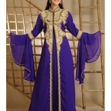
Buy Online Hijab Dress For Women
Abayas Islamic Clothing
There is no uniform way to deal with phrasing for Islamic dress. HIJAB is an Arabic word, initially alluding to a drapery or parcel, which later came to allude to Islamic dress as a rule, however, is presently usually metonymically diminished to the headscarf.
In the late years, Islamic dress has risen as tolerating locales of the dispute in the relationship between Muslim people group and the State. In particular, the wearing of Islamic headscarves by ladies in broad daylight places has brought up issues about secularism, ladies' rights, and national character. It has dependably been seen by the Western women's activist as onerous and as an image of a Muslim lady's subservience to men.
Accordingly, it frequently comes as a shock to Western women's activists that the shroud has turned out to be progressively basic in the Muslim world and is regularly worn gladly by school young ladies as an image of an Islamic character, liberating them typically from neo-pioneer Western social colonialism and mastery. For well more than two decades, Muslim ladies have been situated in the Australian prominent media contrary to the estimations of liberal majority rules system and the women's activist motivation. Muslim ladies, as though the demonstration of "disclosing" will some way or another offer the "balance" and "flexibilities" that Western ladies appreciate.
There are diverse styles of hijab. Contrasts essentially are because of the distinctions of area and culture. Muslim ladies in the subcontinent, India, and Pakistan, wear Burqa which is a two piece shroud comprising a head covering and an outfit.
Present-day patterns have changed the approach of numerous men and ladies towards Hijab. Men spruce up unassumingly and a dominant part of them cease from covering their heads with the exception of supplication times. Numerous ladies have taken up more popular methods for watching hijab.
Uniting the finest in Arabian dress, Aljalabiya is glad to serve a differing exhibit of clients with its wide assortment of Islamic garments for ladies.
For More Islamic clothing :à
What Al-Jalabiya,
King Khalid Street
P.O.BOX 32530 Jeddah,
21438 Saudi Arabia
Call us now: +966-12-6323222

 The Brooklyn Studio
This residence was a complete gut renovation of a 4-story row house in Park Slope, and included a new rear extension and penthouse addition. The owners wished to create a warm, family home using a modern language that would act as a clean canvas to feature rich textiles and items from their world travels. As with most Brooklyn row houses, the existing house suffered from a lack of natural light and connection to exterior spaces, an issue that Principal Brendan Coburn is acutely aware of from his experience re-imagining historic structures in the New York area. The resulting architecture is designed around moments featuring natural light and views to the exterior, of both the private garden and the sky, throughout the house, and a stripped-down language of detailing and finishes allows for the concept of the modern-natural to shine.
Upon entering the home, the kitchen and dining space draw you in with views beyond through the large glazed opening at the rear of the house. An extension was built to allow for a large sunken living room that provides a family gathering space connected to the kitchen and dining room, but remains distinctly separate, with a strong visual connection to the rear garden. The open sculptural stair tower was designed to function like that of a traditional row house stair, but with a smaller footprint. By extending it up past the original roof level into the new penthouse, the stair becomes an atmospheric shaft for the spaces surrounding the core. All types of weather – sunshine, rain, lightning, can be sensed throughout the home through this unifying vertical environment. The stair space also strives to foster family communication, making open living spaces visible between floors. At the upper-most level, a free-form bench sits suspended over the stair, just by the new roof deck, which provides at-ease entertaining. Oak was used throughout the home as a unifying material element. As one travels upwards within the house, the oak finishes are bleached to further degrees as a nod to how light enters the home.
The owners worked with CWB to add their own personality to the project. The meter of a white oak and blackened steel stair screen was designed by the family to read “I love you” in Morse Code, and tile was selected throughout to reference places that hold special significance to the family. To support the owners’ comfort, the architectural design engages passive house technologies to reduce energy use, while increasing air quality within the home – a strategy which aims to respect the environment while providing a refuge from the harsh elements of urban living.
This project was published by Wendy Goodman as her Space of the Week, part of New York Magazine’s Design Hunting on The Cut.
Photography by Kevin Kunstadt
 Columbia Roofing Inc.
Mr. Mescher – Home Owner Shares Story
“I wanted to take this opportunity to tell you that I am extremely pleased with the work that Columbia Roofing did in replacing the roof on our Kent Island home. The house has a complicated roof structure with multiple gables and a quarter round conical roof which spans between two vertical walls in the back. We choose a 50 year Owens Corning shingle and to assure a good job, we only obtained quotes from roofing companies that received outstanding reviews.
We were pleased when the Columbia production crew roofed the house without issue and brought the full visual effect of slate using the 4 tab asphalt shingle with its distinctive keyway.
When it came to the conical roof, we were faced with the possibility of having to install a metal roof in lieu of maintaining the slate like appearance that was so prominent on the other roof sections of the house. Our preference was to maintain the appearance of slate on the conical section similar to that seen on the old slate roof cathedrals. While this is easy to say, I can now appreciate how difficult it is to do.
To honor our wishes, Ben Alsop came to the house and worked through the complicated layout necessary to use the same 4 tab shingles on the conical section. To do the job properly, every single 4 tab shingle had to be cut into individual tabs.
Each tab was then taken up on the roof where the keyway was aligned to vertical through a system of straight lines drawn from the point of the conical roof to the starter shingle at the roof’s edge. Each tab had to be cut again (often multiple times) after the tab alignment was complete. To assure the accuracy necessary to maintain the visual effect, Ben took it upon himself to personally perform the roofing of the conical section.
Ben is a manager for Columbia Roofing who no longer performs the physical roofing work after coming up through the ranks of the roofing trade. His personal dedication to getting this job done for us in a way that is simply stellar could not go without acknowledgement. Ben is not only a craftsman, he is an artisan whose skill set can clearly be seen in the pictures that I have attached.
I want to thank Columbia Roofing for a job well done and particularly I want to thank Ben for taking the time and putting in the effort to truly make this a stellar installation.”
 Columbia Roofing Inc.
Mr. Mescher – Home Owner Shares Story
“I wanted to take this opportunity to tell you that I am extremely pleased with the work that Columbia Roofing did in replacing the roof on our Kent Island home. The house has a complicated roof structure with multiple gables and a quarter round conical roof which spans between two vertical walls in the back. We choose a 50 year Owens Corning shingle and to assure a good job, we only obtained quotes from roofing companies that received outstanding reviews.
We were pleased when the Columbia production crew roofed the house without issue and brought the full visual effect of slate using the 4 tab asphalt shingle with its distinctive keyway.
When it came to the conical roof, we were faced with the possibility of having to install a metal roof in lieu of maintaining the slate like appearance that was so prominent on the other roof sections of the house. Our preference was to maintain the appearance of slate on the conical section similar to that seen on the old slate roof cathedrals. While this is easy to say, I can now appreciate how difficult it is to do.
To honor our wishes, Ben Alsop came to the house and worked through the complicated layout necessary to use the same 4 tab shingles on the conical section. To do the job properly, every single 4 tab shingle had to be cut into individual tabs.
Each tab was then taken up on the roof where the keyway was aligned to vertical through a system of straight lines drawn from the point of the conical roof to the starter shingle at the roof’s edge. Each tab had to be cut again (often multiple times) after the tab alignment was complete. To assure the accuracy necessary to maintain the visual effect, Ben took it upon himself to personally perform the roofing of the conical section.
Ben is a manager for Columbia Roofing who no longer performs the physical roofing work after coming up through the ranks of the roofing trade. His personal dedication to getting this job done for us in a way that is simply stellar could not go without acknowledgement. Ben is not only a craftsman, he is an artisan whose skill set can clearly be seen in the pictures that I have attached.
I want to thank Columbia Roofing for a job well done and particularly I want to thank Ben for taking the time and putting in the effort to truly make this a stellar installation.”

 Decra-Scape, Inc.
This modern fire and ice interpretation was designed to showcase the native environment and its integration with the distinctive neo-classic architecture of this new home. This property is located in a southeast suburb of Michigan, Canton. A natural ravine sits at the back of the home creating magnificent views of the Washtenaw watershed. The fall colors are amazing with Hickory golds and vibrant Maple reds ablaze.
The client had been to numerous design centers and displays to research what they wanted to create in their backyard. They were interested in an outdoor fireplace and cook center with a bar. Our initial consultation provided them with some other options that would not be obtrusive to their magnificent vistas. The cook center and bar evolved into a smaller counter space and fire feature coffee table.
The design process started with a clean canvas. It progressed into a formal design that provided modern conveniences and an outdoor living space. The client was presented with a concept drawing on the second visit as a starting off point and they agreed to proceed with a design fee to bring that concept into fruition. The formal landscape elements close to the residence contrast the natural surroundings. The result: tremendous interest created by the tension of the formal hardscape against dramatic vistas of the ravine which appears endless. We created four defined areas within the patio space: dining, cooking, coffee table conversation area and a fire wall relaxation terrace. The relaxation terrace was elevated so that it could be viewed and enjoyed from both inside and out. The cook center was installed around the owners existing grill with the potential for a future, more permanent unit. Area rug patterns were designed within the paver field to soften and define spaces.
During installation, clay loam soils were discovered. This slowed down he base preparation, drain tile installation, and running of utilities. These non native soils are common in new construction sites. The business development associate oversaw the entire process along with the team leader. Caution was also taken to preserve a Shagbark Hickory close to the newly installed walkway.
The largest challenge of this project was the fabrication of the burners to provide a dramatic flame. These burners were custom made and installed to provide the homeowners with the climactic effects they were looking for. An intensive drainage system was installed to accommodate a water issue in the rear yard but to also be cognizant of the native surroundings and ravine.
Overall, an environment was created that was reminiscent of the homeowner’s favorite après ski, sitting next to an open fire after a long descent to the base of the Rockies. The end result not only thrilled the owner but the Canton community as well. Since the installation, the Village of Canton has asked us to present these fire features at their home show.
 River Valley Landscapes
The property is one of the original farm houses located on the main street of a small town. It has been in the family for many years and our client just inherited the property. They were trying to have balance of preserving the old while realizing modern day living has its benefits too. The house had a large addition added using mostly old style materials, but designed with function and modern day luxuries. Our goal was to carry that theme to the outside.
Our first problem we had to address was how to transition between the first floor elevation changes. The lower room was the husband’s office. He stated in the future he may have clients over and it would be nice to have an area to sit outside. The wife’s main concern was to renew the four corner garden. She also felt it was very important to be able to see it from the kitchen area. Finally there was an old wishing well stuck right outside the kitchen. They both felt it would be neat to be able to incorporate this in some how. They wanted a patio area with a built in grill to accommodate there family and friends. They also wanted to keep a large play area for the kids.
We were able to pull this off successfully. We addressed the first issue by having a small lower level flagstone area. This area is large enough for 1 to 2 people to sit comfortably. It also provides a transition from his office to the larger patio area. We installed a simple small gravel sitting area opposite of the main patio. This provides our client a secluded place to relax or do business. Mrs.... told me she is amazed how much her and her husband enjoys this area. It is so peaceful looking at the small creek over a glass of wine.
We built a natural limestone retaining wall to create the patio terrace. The stone was chosen to extend the houses architectural elements into the landscape. Irregular broken flagstone was used to give it a more casual feel. We installed three Serviceberries into the patio terrace to replace some trees that were taken down during the remodeling. She was very concern that they would block the view of the four corner garden. We new they were crucial to nestle in the terrace, so we placed them for a couple days for her to decide. Fortunately she agreed they not only kept the view open, but helped frame the garden.
The four corner garden was designed to be viewed from afar and experienced up close. We wanted the space to have some formal structure while keeping with the casual farm house feel. Another natural limestone retaining wall was created. This leveled the garden terrace and helped associate it with the rest of the property. The four corner garden is nestled into the existing woods edge. This provides three distinct experiences to entering the garden; a more formal from the driveway, an open feel from the lower lawn, and a more natural / casual experience from the wooded area. The Plymouth brown gravel was used for the center of the garden. This helped highlight the stone post that was found during construction. The gravel also brings the sense of sound into the garden space. Lamb’s ear was chosen as a fun way to get kids interest in horticulture.
The balance of using the new to create the old feel is what makes this project a success. The property has already hosted a local historical society event and won an award for its preservation efforts. When Mrs.... can’t find her husband, she knows he is either reading the newspaper by the grill or resting in the hammock along the wood’s path.
 River Valley Landscapes
The property is one of the original farm houses located on the main street of a small town. It has been in the family for many years and our client just inherited the property. They were trying to have balance of preserving the old while realizing modern day living has its benefits too. The house had a large addition added using mostly old style materials, but designed with function and modern day luxuries. Our goal was to carry that theme to the outside.
Our first problem we had to address was how to transition between the first floor elevation changes. The lower room was the husband’s office. He stated in the future he may have clients over and it would be nice to have an area to sit outside. The wife’s main concern was to renew the four corner garden. She also felt it was very important to be able to see it from the kitchen area. Finally there was an old wishing well stuck right outside the kitchen. They both felt it would be neat to be able to incorporate this in some how. They wanted a patio area with a built in grill to accommodate there family and friends. They also wanted to keep a large play area for the kids.
We were able to pull this off successfully. We addressed the first issue by having a small lower level flagstone area. This area is large enough for 1 to 2 people to sit comfortably. It also provides a transition from his office to the larger patio area. We installed a simple small gravel sitting area opposite of the main patio. This provides our client a secluded place to relax or do business. Mrs.... told me she is amazed how much her and her husband enjoys this area. It is so peaceful looking at the small creek over a glass of wine.
We built a natural limestone retaining wall to create the patio terrace. The stone was chosen to extend the houses architectural elements into the landscape. Irregular broken flagstone was used to give it a more casual feel. We installed three Serviceberries into the patio terrace to replace some trees that were taken down during the remodeling. She was very concern that they would block the view of the four corner garden. We new they were crucial to nestle in the terrace, so we placed them for a couple days for her to decide. Fortunately she agreed they not only kept the view open, but helped frame the garden.
The four corner garden was designed to be viewed from afar and experienced up close. We wanted the space to have some formal structure while keeping with the casual farm house feel. Another natural limestone retaining wall was created. This leveled the garden terrace and helped associate it with the rest of the property. The four corner garden is nestled into the existing woods edge. This provides three distinct experiences to entering the garden; a more formal from the driveway, an open feel from the lower lawn, and a more natural / casual experience from the wooded area. The Plymouth brown gravel was used for the center of the garden. This helped highlight the stone post that was found during construction. The gravel also brings the sense of sound into the garden space. Lamb’s ear was chosen as a fun way to get kids interest in horticulture.
The balance of using the new to create the old feel is what makes this project a success. The property has already hosted a local historical society event and won an award for its preservation efforts. When Mrs.... can’t find her husband, she knows he is either reading the newspaper by the grill or resting in the hammock along the wood’s path.
 The Brooklyn Studio
This residence was a complete gut renovation of a 4-story row house in Park Slope, and included a new rear extension and penthouse addition. The owners wished to create a warm, family home using a modern language that would act as a clean canvas to feature rich textiles and items from their world travels. As with most Brooklyn row houses, the existing house suffered from a lack of natural light and connection to exterior spaces, an issue that Principal Brendan Coburn is acutely aware of from his experience re-imagining historic structures in the New York area. The resulting architecture is designed around moments featuring natural light and views to the exterior, of both the private garden and the sky, throughout the house, and a stripped-down language of detailing and finishes allows for the concept of the modern-natural to shine.
Upon entering the home, the kitchen and dining space draw you in with views beyond through the large glazed opening at the rear of the house. An extension was built to allow for a large sunken living room that provides a family gathering space connected to the kitchen and dining room, but remains distinctly separate, with a strong visual connection to the rear garden. The open sculptural stair tower was designed to function like that of a traditional row house stair, but with a smaller footprint. By extending it up past the original roof level into the new penthouse, the stair becomes an atmospheric shaft for the spaces surrounding the core. All types of weather – sunshine, rain, lightning, can be sensed throughout the home through this unifying vertical environment. The stair space also strives to foster family communication, making open living spaces visible between floors. At the upper-most level, a free-form bench sits suspended over the stair, just by the new roof deck, which provides at-ease entertaining. Oak was used throughout the home as a unifying material element. As one travels upwards within the house, the oak finishes are bleached to further degrees as a nod to how light enters the home.
The owners worked with CWB to add their own personality to the project. The meter of a white oak and blackened steel stair screen was designed by the family to read “I love you” in Morse Code, and tile was selected throughout to reference places that hold special significance to the family. To support the owners’ comfort, the architectural design engages passive house technologies to reduce energy use, while increasing air quality within the home – a strategy which aims to respect the environment while providing a refuge from the harsh elements of urban living.
This project was published by Wendy Goodman as her Space of the Week, part of New York Magazine’s Design Hunting on The Cut.
Photography by Kevin Kunstadt
 River Valley Landscapes
The property is one of the original farm houses located on the main street of a small town. It has been in the family for many years and our client just inherited the property. They were trying to have balance of preserving the old while realizing modern day living has its benefits too. The house had a large addition added using mostly old style materials, but designed with function and modern day luxuries. Our goal was to carry that theme to the outside.
Our first problem we had to address was how to transition between the first floor elevation changes. The lower room was the husband’s office. He stated in the future he may have clients over and it would be nice to have an area to sit outside. The wife’s main concern was to renew the four corner garden. She also felt it was very important to be able to see it from the kitchen area. Finally there was an old wishing well stuck right outside the kitchen. They both felt it would be neat to be able to incorporate this in some how. They wanted a patio area with a built in grill to accommodate there family and friends. They also wanted to keep a large play area for the kids.
We were able to pull this off successfully. We addressed the first issue by having a small lower level flagstone area. This area is large enough for 1 to 2 people to sit comfortably. It also provides a transition from his office to the larger patio area. We installed a simple small gravel sitting area opposite of the main patio. This provides our client a secluded place to relax or do business. Mrs.... told me she is amazed how much her and her husband enjoys this area. It is so peaceful looking at the small creek over a glass of wine.
We built a natural limestone retaining wall to create the patio terrace. The stone was chosen to extend the houses architectural elements into the landscape. Irregular broken flagstone was used to give it a more casual feel. We installed three Serviceberries into the patio terrace to replace some trees that were taken down during the remodeling. She was very concern that they would block the view of the four corner garden. We new they were crucial to nestle in the terrace, so we placed them for a couple days for her to decide. Fortunately she agreed they not only kept the view open, but helped frame the garden.
The four corner garden was designed to be viewed from afar and experienced up close. We wanted the space to have some formal structure while keeping with the casual farm house feel. Another natural limestone retaining wall was created. This leveled the garden terrace and helped associate it with the rest of the property. The four corner garden is nestled into the existing woods edge. This provides three distinct experiences to entering the garden; a more formal from the driveway, an open feel from the lower lawn, and a more natural / casual experience from the wooded area. The Plymouth brown gravel was used for the center of the garden. This helped highlight the stone post that was found during construction. The gravel also brings the sense of sound into the garden space. Lamb’s ear was chosen as a fun way to get kids interest in horticulture.
The balance of using the new to create the old feel is what makes this project a success. The property has already hosted a local historical society event and won an award for its preservation efforts. When Mrs.... can’t find her husband, she knows he is either reading the newspaper by the grill or resting in the hammock along the wood’s path.
 River Valley Landscapes
The property is one of the original farm houses located on the main street of a small town. It has been in the family for many years and our client just inherited the property. They were trying to have balance of preserving the old while realizing modern day living has its benefits too. The house had a large addition added using mostly old style materials, but designed with function and modern day luxuries. Our goal was to carry that theme to the outside.
Our first problem we had to address was how to transition between the first floor elevation changes. The lower room was the husband’s office. He stated in the future he may have clients over and it would be nice to have an area to sit outside. The wife’s main concern was to renew the four corner garden. She also felt it was very important to be able to see it from the kitchen area. Finally there was an old wishing well stuck right outside the kitchen. They both felt it would be neat to be able to incorporate this in some how. They wanted a patio area with a built in grill to accommodate there family and friends. They also wanted to keep a large play area for the kids.
We were able to pull this off successfully. We addressed the first issue by having a small lower level flagstone area. This area is large enough for 1 to 2 people to sit comfortably. It also provides a transition from his office to the larger patio area. We installed a simple small gravel sitting area opposite of the main patio. This provides our client a secluded place to relax or do business. Mrs.... told me she is amazed how much her and her husband enjoys this area. It is so peaceful looking at the small creek over a glass of wine.
We built a natural limestone retaining wall to create the patio terrace. The stone was chosen to extend the houses architectural elements into the landscape. Irregular broken flagstone was used to give it a more casual feel. We installed three Serviceberries into the patio terrace to replace some trees that were taken down during the remodeling. She was very concern that they would block the view of the four corner garden. We new they were crucial to nestle in the terrace, so we placed them for a couple days for her to decide. Fortunately she agreed they not only kept the view open, but helped frame the garden.
The four corner garden was designed to be viewed from afar and experienced up close. We wanted the space to have some formal structure while keeping with the casual farm house feel. Another natural limestone retaining wall was created. This leveled the garden terrace and helped associate it with the rest of the property. The four corner garden is nestled into the existing woods edge. This provides three distinct experiences to entering the garden; a more formal from the driveway, an open feel from the lower lawn, and a more natural / casual experience from the wooded area. The Plymouth brown gravel was used for the center of the garden. This helped highlight the stone post that was found during construction. The gravel also brings the sense of sound into the garden space. Lamb’s ear was chosen as a fun way to get kids interest in horticulture.
The balance of using the new to create the old feel is what makes this project a success. The property has already hosted a local historical society event and won an award for its preservation efforts. When Mrs.... can’t find her husband, she knows he is either reading the newspaper by the grill or resting in the hammock along the wood’s path.
 The Brooklyn Studio
This residence was a complete gut renovation of a 4-story row house in Park Slope, and included a new rear extension and penthouse addition. The owners wished to create a warm, family home using a modern language that would act as a clean canvas to feature rich textiles and items from their world travels. As with most Brooklyn row houses, the existing house suffered from a lack of natural light and connection to exterior spaces, an issue that Principal Brendan Coburn is acutely aware of from his experience re-imagining historic structures in the New York area. The resulting architecture is designed around moments featuring natural light and views to the exterior, of both the private garden and the sky, throughout the house, and a stripped-down language of detailing and finishes allows for the concept of the modern-natural to shine.
Upon entering the home, the kitchen and dining space draw you in with views beyond through the large glazed opening at the rear of the house. An extension was built to allow for a large sunken living room that provides a family gathering space connected to the kitchen and dining room, but remains distinctly separate, with a strong visual connection to the rear garden. The open sculptural stair tower was designed to function like that of a traditional row house stair, but with a smaller footprint. By extending it up past the original roof level into the new penthouse, the stair becomes an atmospheric shaft for the spaces surrounding the core. All types of weather – sunshine, rain, lightning, can be sensed throughout the home through this unifying vertical environment. The stair space also strives to foster family communication, making open living spaces visible between floors. At the upper-most level, a free-form bench sits suspended over the stair, just by the new roof deck, which provides at-ease entertaining. Oak was used throughout the home as a unifying material element. As one travels upwards within the house, the oak finishes are bleached to further degrees as a nod to how light enters the home.
The owners worked with CWB to add their own personality to the project. The meter of a white oak and blackened steel stair screen was designed by the family to read “I love you” in Morse Code, and tile was selected throughout to reference places that hold special significance to the family. To support the owners’ comfort, the architectural design engages passive house technologies to reduce energy use, while increasing air quality within the home – a strategy which aims to respect the environment while providing a refuge from the harsh elements of urban living.
This project was published by Wendy Goodman as her Space of the Week, part of New York Magazine’s Design Hunting on The Cut.
Photography by Kevin Kunstadt
 The Brooklyn Studio
This residence was a complete gut renovation of a 4-story row house in Park Slope, and included a new rear extension and penthouse addition. The owners wished to create a warm, family home using a modern language that would act as a clean canvas to feature rich textiles and items from their world travels. As with most Brooklyn row houses, the existing house suffered from a lack of natural light and connection to exterior spaces, an issue that Principal Brendan Coburn is acutely aware of from his experience re-imagining historic structures in the New York area. The resulting architecture is designed around moments featuring natural light and views to the exterior, of both the private garden and the sky, throughout the house, and a stripped-down language of detailing and finishes allows for the concept of the modern-natural to shine.
Upon entering the home, the kitchen and dining space draw you in with views beyond through the large glazed opening at the rear of the house. An extension was built to allow for a large sunken living room that provides a family gathering space connected to the kitchen and dining room, but remains distinctly separate, with a strong visual connection to the rear garden. The open sculptural stair tower was designed to function like that of a traditional row house stair, but with a smaller footprint. By extending it up past the original roof level into the new penthouse, the stair becomes an atmospheric shaft for the spaces surrounding the core. All types of weather – sunshine, rain, lightning, can be sensed throughout the home through this unifying vertical environment. The stair space also strives to foster family communication, making open living spaces visible between floors. At the upper-most level, a free-form bench sits suspended over the stair, just by the new roof deck, which provides at-ease entertaining. Oak was used throughout the home as a unifying material element. As one travels upwards within the house, the oak finishes are bleached to further degrees as a nod to how light enters the home.
The owners worked with CWB to add their own personality to the project. The meter of a white oak and blackened steel stair screen was designed by the family to read “I love you” in Morse Code, and tile was selected throughout to reference places that hold special significance to the family. To support the owners’ comfort, the architectural design engages passive house technologies to reduce energy use, while increasing air quality within the home – a strategy which aims to respect the environment while providing a refuge from the harsh elements of urban living.
This project was published by Wendy Goodman as her Space of the Week, part of New York Magazine’s Design Hunting on The Cut.
Photography by Kevin Kunstadt
8