
Search results for "Distract" in Home Design Ideas

 Cityview Pools
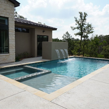
Pool fountain - large contemporary backyard stamped concrete and rectangular lap pool fountain idea in Austin
 Sullivan Building & Design Group
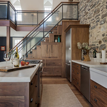
Open concept kitchen - country single-wall medium tone wood floor open concept kitchen idea in Philadelphia with a farmhouse sink, medium tone wood cabinets, stainless steel appliances, an island and white countertops
Find the right local pro for your project
 Cascade Outdoor Design
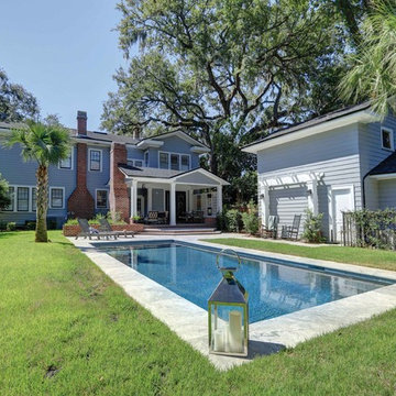
For this project the house itself and the garage are the only original features on the property. In the front yard we created massive curb appeal by adding a new brick driveway, framed by lighted brick columns, with an offset parking space. A brick retaining wall and walkway lead visitors to the front door, while a low brick wall and crisp white pergola enhance a previous underutilized patio. Landscaping, sod, and lighting frame the house without distracting from its character.
In the back yard the driveway leads to an updated garage which received a new brick floor and air conditioning. The back of the house changed drastically with the seamless addition of a covered patio framed on one side by a trellis with inset stained glass opposite a brick fireplace. The live-edge cypress mantel provides the perfect place for decor. The travertine patio steps down to a rectangular pool, which features a swim jet and linear glass waterline tile. Again, the space includes all new landscaping, sod, and lighting to extend enjoyment of the space after dusk.
Photo by Craig O'Neal
 Joe McGuire Design
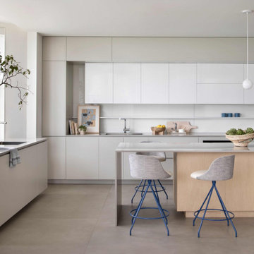
Experience urban sophistication meets artistic flair in this unique Chicago residence. Combining urban loft vibes with Beaux Arts elegance, it offers 7000 sq ft of modern luxury. Serene interiors, vibrant patterns, and panoramic views of Lake Michigan define this dreamy lakeside haven.
The minimalist modern kitchen is designed to reflect the ever-changing lakeside moods of sea and sky. The artfully aligned cabinets, dine-in island, and window-facing sink are outfitted with organic touches that bring warmth without distracting from the views.

 Realtor & Freelance Designer
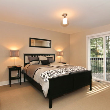
Inspiration for a mid-sized transitional master carpeted bedroom remodel in Portland with beige walls and no fireplace
 K. Rue Designs, LLC
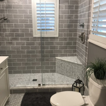
Sweet little country cottage, this home was built in the 1930's in Dallas, Texas. The master bathroom shown in the before photo was extremely small, unappealing, and did not utilize the best space. With the K. Rue new design, a larger shower was created and a major update to the cabinetry was involved. Notice the shower controls are placed on the end opposite of the showerhead to allow enough space for the water to heat up without soaking the user. Trying to eliminate constant distractions and interruptions, white and gray were the key colors in the bathroom to make a fluid statement. The small Carrara marble mosaic used on the floor was carried into the shower floor for a consistent rhythm. For an emphasized country cottage look, these 4x10 gray subway ceramic tiles add a slight rough and handmade look to the walls with an intentionally thick grout line. The cabinetry was purchased as one unit to appear as a furniture piece with built-in lavatories and faucets. Gray walls add a great accent to the almost all-white bathroom for depth and drama.
Our client living in Dallas TX was referred to the K. Rue team through another client. We LOVE referrals and would be glad to help your friends or family with their design needs.
 Whitespace
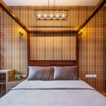
The daughter’s bedroom sports a sophisticated yet playful look with plaid-pattern wallpaper behind a four-poster bed that is paired with antique gold lights and an overhead industrial-style light. A long wooden study table on one side overlooks the sights and sounds of the Aarey forest, a welcome distraction from long bouts of studying.
 Thyme & Place Design LLC
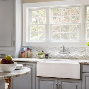
This small kitchen packs a powerful punch. By replacing an oversized sliding glass door with a 24" cantilever which created additional floor space. We tucked a large Reid Shaw farm sink with a wall mounted faucet into this recess. A 7' peninsula was added for storage, work counter and informal dining. A large oversized window floods the kitchen with light. The color of the Eucalyptus painted and glazed cabinets is reflected in both the Najerine stone counter tops and the glass mosaic backsplash tile from Oceanside Glass Tile, "Devotion" series. All dishware is stored in drawers and the large to the counter cabinet houses glassware, mugs and serving platters. Tray storage is located above the refrigerator. Bottles and large spices are located to the left of the range in a pull out cabinet. Pots and pans are located in large drawers to the left of the dishwasher. Pantry storage was created in a large closet to the left of the peninsula for oversized items as well as the microwave. Additional pantry storage for food is located to the right of the refrigerator in an alcove. Cooking ventilation is provided by a pull out hood so as not to distract from the lines of the kitchen.
 Doyle McCullar
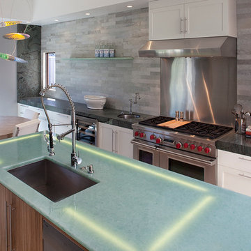
Example of a large trendy galley marble floor eat-in kitchen design in San Francisco with an undermount sink, shaker cabinets, white cabinets, glass countertops, green backsplash, stone tile backsplash, stainless steel appliances and an island
 Camden Grace LLC
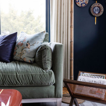
Corner of a cozy living room/office - the perfect place to curl up in with a book or newspaper, without distractions - no TV in here!
Example of a living room design
Example of a living room design
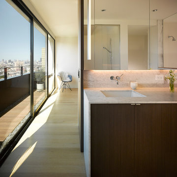
 Blair Burke General Contractors, Inc.
Featured in the 2013 AIA San Francisco Home Tour, this Bernal Heights residence was transformed from a drab stucco box to an architectural gem prominently positioned to take in bridge to bridge views. Scope of work consisted of a complete gut of the existing house and adding a third story to capture kitchen, dining and living room functions. An exterior Skatelite rainscreen system provides street side privacy while modest materials and simple glass box bring in the views without distraction.
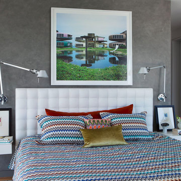
 Axis Mundi | New York
It wasn’t necessary to overthink things when Axis Mundi designed interiors for an apartment at Brooklyn’s glass-sheathed 1 Grand Army Plaza, the luxury building by Richard Meier already endowed with all the “starchitect” bells and whistles, as well as drop-dead stunning views of Brooklyn, the harbor and Prospect Park. What did require considerable aptitude was to strike the right balance between respect for these assets, particularly the panoramas, and livability. The all-white scheme doesn’t just complement Meier’s own aesthetic devotion to this purest of pure hues; it serves as a cool backdrop for the views, affording comfortable vantage points from which to enjoy them, yet not drawing attention away from the splendors of one of the world’s most distinctive boroughs. Sleek, low-lying Italian seating avoids distracting interruptions on the horizon line. But minimal color accents and pattern also sidestep what could have been a potentially antiseptic environment, making it tactile, human and luxurious.
2,200 sf
Design Team: John Beckmann, Richard Rosenbloom and Nick Messerlian
Vintage photography coursety of the Ubu Gallery, New York
Photography: Adriana Buffi and Fran Parente
© Axis Mundi Design LLC
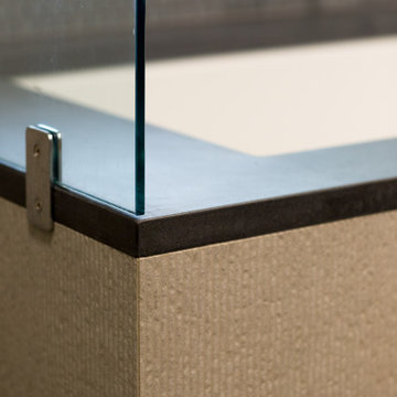
 Newschool Builders LLC
Embracing the natural elements of this circa 1960’s Condo development in Stowe Vermont was a priority for our clients. We worked closely with a great design team and our clients to create this simple, but beautiful minimalist retreat. Our clients, both authors, wanted a place to withdraw from the endless distractions and fast pace rhythms of the city. Custom made cabinets, bookshelves and built ins helped off set the sandblasted CMU block walls and ground concrete floors. A beautiful handcrafted stairwell was a center piece connecting the three floors. A handcrafted integrated concrete sink in the master is was another testament to the mixed mediums used to create this space. We embraced exposed conduit and commercial grade light fixtures throughout which helped add to the overall minimalist feel of the space. There is a beautiful rawness to this project which everyone came to admire.
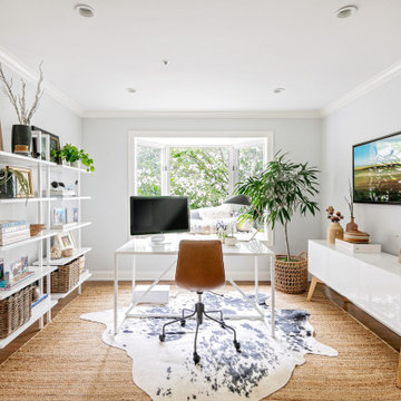
 jennifer rhode design
in this home, we turned what had been an extra sitting area into a tranquil, highly functional work space that is consistent in palette and tone with the rest of the house. we chose neutrals that range from bright, lacquered whites (bookshelves, desk and credenza), off whites and quiet grays (window cushions), natural fibers (baskets and sisal rug), warm, saddle leather (desk chair) to hits of black (hide rug and accessories) that punctuate the room.
the baskets on the lower shelves of the bookcase and the credenza house the less pretty items like the printer and various office supplies. the desk is positioned to capitalize on the lovely garden view and to help the occupant from being distracted by what may be going on in the rest of the house with her school age “colleagues.”
 Phantom Screens
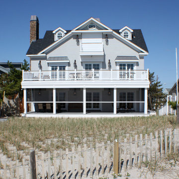
During the warmer months, these Mantaloking, New Jersey homeowners spend many evenings on their porch enjoying the salt air and spectacular views. Shortly after moving in, they realized that to fully enjoy their porch they needed to add insect screens. Since it was a vacation home, the screens had to be easy to maintain, reliable and simple to use.
After looking at several screen solutions, they decided on Phantom’s motorized screens. The screens do not distract from the homes architecture or block their view of the ocean. When it’s time to leaveat the end of a weekend or before the arrival of winter, the screens are safely and effortlessly stored in their housings.
 Robin's Nest Interiors
It was a pleasure to help this single dad transform a previous French Country motif into a Handsome Space with Masculine Vibe. The homeowner loves the blues you find in the Caribbean so we used those as accent colors throughout the rooms.
Entry
We painted the walls Sherwin Williams’ Latte (SW6108) to add warmth. We accessorized the homeowner’s beautiful burl wood cabinet with vibrant artwork and whimsical Chinese horses. I always recommend task lighting in a Foyer, if possible, and the rectangular lamp shade is the perfect shape to fit on the small end of the cabinet.
Powder Room
I adore the Candace Olson wallpaper we used in the Powder Room. The blocks look like sections of wood. It works great with the existing granite. Other examples of wallpaper here and here.
Great Room
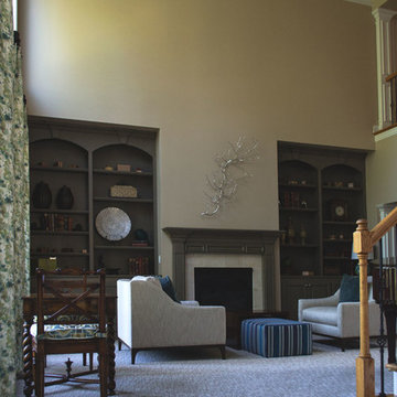
We touched every surface in this Great Room from painting the walls Nomadic Desert (SW6107) to painting the ceiling Double Latte (SW9108) to make the room feel cozier to replacing the carpet with this transitional style with striated pattern to painting the white built-ins.
Furniture placement was a real challenge because the grand piano needed to stay without blocking the traffic flow through the space. The homeowner also wanted us to incorporate his chess table and chairs. We centered a small seating area in front of the fireplace utilizing two oversized club chairs and an upholstered ottoman with a wood tray that slides. The wood bases on the chairs helps their size not overpower the room. The velvet ottoman fabric with navy, azure, and teal blues is a showstopper.
We used the homeowner’s wonderful collection of unique puzzle boxes to accessorize the built-ins. We just added some pops of blues, greens and silver. The homeowner loves sculptural objects so the nickel twig wall decor was the perfect focal point above the mantle. We opted not to add anything to the mantle so it would not distract from the art piece.
We added decorative drapery panels installed on short rods between each set of doors. The homeowner was open to this abstract floral pattern in greens and blues!
We reupholstered the cushions for the chess table chairs in a fun geometric fabric that coordinates with the panel fabric. The homeowner does not use this set of doors to access the deck so we were able to position the table directly in front of them.
Kelly Sisler of Kelly Faux Creations worked her magic on the built-ins. We used Sherwin Williams’ Mega Greige (SW7031) as the base and then applied a heavy bronze glaze. It completely transformed the Great Room. Other examples of painting built-ins here and here.
We hoped you enjoyed this Handsome Space with Masculine Vibe. It was quite a transformation!
 Daniels Landscape Inc.
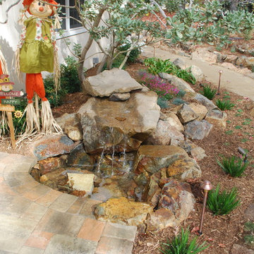
Photo of a mid-sized transitional drought-tolerant and full sun side yard stone water fountain landscape in San Diego.
 The Myers Touch
In collaboration with the client’s architect, AR Design the layout of the kitchen was already in place. However, upon meeting the client it was clear she wanted a ‘wow’ island, symmetry in design and plenty of functional storage.
As well as a contemporary, family-friendly space it was also important the space that still respected the heritage of the house. The original walls of the property had many angled walls and featured some tight spaces, so careful consideration of SieMatic's cabinetry choices was given to ensure maximum functionality in those spaces. After much consideration, The Myers Touch specified SieMatic’s SC10 Cabinetry in a Provence Oak Laminate finish which was placed in a framed-style at the rear wall.
The same cabinetry was specified for under the island to create contrast with the new and original material features in the space. In order for the family to keep the kitchen uncluttered, careful planning of internal storage systems was considered in the form of using SieMatic’s internal Drawer boxes and their MultiMatic internal storage system which were used to store smaller items such as spices and sauces, as well whilst providing space for slide-out drawers and storage baskets.
To ensure an elegant yet ‘wow’ factor central island, The Myers Touch combined contrasting textures by using 30mm Silestone Eternal Calacatta natural stone, polished worktops with ‘waterfall island’ edges and a Corian solid surface back panel. The distinctive geometric patterned Corian panel in Cameo White looks particularly spectacular at night when the owner's turn on the architectural-toned lighting under the island.
Appliances chosen for the island included a sophisticated Elica Illusion extractor hood so it could be totally integrated in the new architectural space without visual distraction, a Siemens iQ500 Induction Hob with touch-slide control and a Caple Under-counter Wine cabinet.
To maximise every inch of the new space, and to ensure the owners had a place for everything, The Myers Touch also used additional cabinetry and storage options in the island such as extra deep drawers to store saucepans, cutlery, and everyday crockery.
The eye-catching Antique-bronze mirrored splashback not only helps to provide the illusion of extra space, but reinforces family ‘togetherness’ as it reflects and links the rear of the kitchen ‘snug’ area where family members can sit and relax or work when not in the main kitchen extension area.
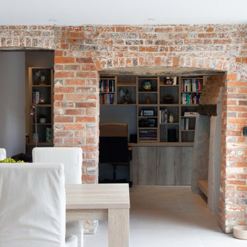
The original toned brickwork and 18th Century steel windows in the original part of the extension also helps to tell the story about the older part of the house which now juxtaposes to the new, contemporary kitchen living extension. A handy door was also included in the extension which leads to the garage on the main road for family convenience and over-flow storage.
Photography by Paul Craig (Reproduction of image by request only - joy@bakerpr.co.uk)
44