
Search results for "Distracted" in Home Design Ideas
 MossCreek
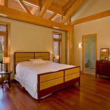
This stunning custom designed home by MossCreek features contemporary mountain styling with sleek Asian influences. Glass walls all around the home bring in light, while also giving the home a beautiful evening glow. Designed by MossCreek for a client who wanted a minimalist look that wouldn't distract from the perfect setting, this home is natural design at its very best. Photo by Joseph Hilliard
 Studio Snaidero DC Metro
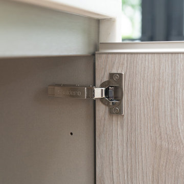
The entry-level kitchenette echoes the primary kitchen featuring our WAY cabinet style, while introducing the textured Oslo Oak matrix finish. The subtle grain creates an interesting texture without adding weight or distraction from the large French doors that open into a private garden. The open-concept design, which includes an efficient dry bar, provides plenty of room for entertaining.
 Nip Tuck Remodeling
No more orange wood...
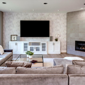
There was so much cherry and fir throughout the main floor, the color was distracting and dated, as was the older fireplace surround and flanking shelves.
The clients wished to modernize the aesthetic, update and improve the appliances (with a fully plumbed espresso machine), and lighten the visual load in the family room.
To dramatically change the scale of an architectural element, the space still needed to feel livable. A larger fireplace profile, larger appliances, and a larger island were all key considerations for the final look and balance of the project.
Find the right local pro for your project
 Full Bloom Cottage
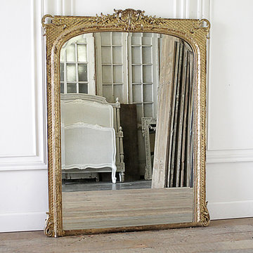
Early 20th century Louis Philippe style giltwood mirror with clamshell carvings. Beautiful aged gilt finish with bevel mirror, large clam shell carving at the top and intricate carved details. This mirror is wood, and gesso. Minor scratches to the frame where you will see white peeking through. It does have age, and has a couple minor carvings missing. This does not distract from the mirror and is very hard to spot out when looking at it. Overall is in great condition, the frame is solid and sturdy, the mirror is secure inside the frame. It looks as if it were once above a mantel (fireplace), there are 2 tiny holes at the very top where is was once placed. Measures: 47" W x 2.5" D x 61" H.
 SmartFurniture
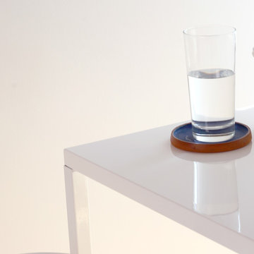
Structuring your office for utility and inspiration is difficult balance. What design elements inspire you? What distracts you? Emma shows us the perfect harmony between work and play in the office.
 Bilotta Kitchen & Home
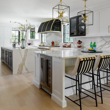
Do you cringe at the thought of spotlighting black in your kitchen? This sophisticated stunner may well give you a change of heart! Though the walls and most of the cabinetry are painted “Super White”, the real eyecatchers are the custom brass-trimmed black hood; the black mullion glass doors flanking the hood; and the black front and rear island bases, which echo the black-framed windows. With the addition of elegant Calacatta Gold marble countertops with waterfall island ends and slab backsplashes, I challenge you to say the inclusion of black makes the kitchen feel small or dark.
Despite contemporary touches, the cabinetry is traditional flush inset construction; doors and large drawers are wide-framed classic Shaker styling with a stepped inner profile. The fridge and dishwasher are paneled to match to avoid distraction. Decorative hardware is honey bronze; the faucet and instant hot are sleek matte black. Pulling triple duty is the peninsula, which houses a microwave drawer; a beverage fridge; and space for cushioned stools with awning-stripe black webbed backs.
The most dramatic view is through the opening in the striking black and gold Art Deco wallpapered dining room, which is centered directly on the black island and black-and-brass hood.
This project was done in collaboration with Atelier Milot Shala, LLC and Breton Contracting. Photography by Stefan Radtke.
 Paramount Kitchen & Bath
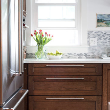
Plenty of light in this kitchen remodel by Angie! Paired with the rich, transitional cabinets the MSI Cashmere Carrarra countertops, light natural stone backsplash and white walls make this kitchen remodel feel incredibly open and airy. Large stainless pulls blend well with the appliances and don't distract from the overall beauty of the space.
The Dura Supreme stained Cherry Hazelnut finish on a wide modified shaker door and drawer front creates a transitional feel when paired with the other muted selections that really let the cabinetry shine!
Schedule a free consultation with one of our designers today:
https://paramount-kitchens.com/
 Hestia Blinds
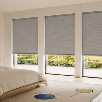
Elevate your mid-century modern bedroom with our premium gray honeycomb blinds, beautifully custom-fitted for these three floor-to-ceiling windows. The cool gray tone of the shades anchors the room's eclectic, artistic vibe, perfectly balancing the warmth of the wooden platform bed and the playful, colorful decor. Featuring a fully fabric-wrapped track system, the headrail and bottom rail blend seamlessly with the fabric for a bespoke, high-end look. This design replaces distracting raw metal hardware with a sleek, continuous finish that complements your minimalist art and designer furniture.
 Phillip Smith General Contractor, LLC
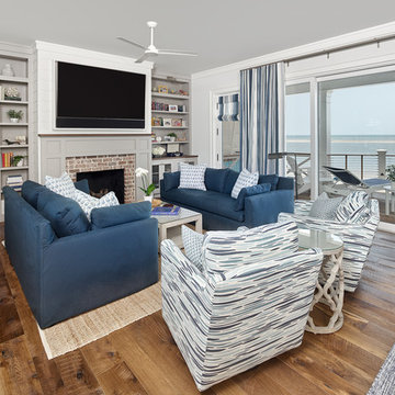
Elevated, family-friendly beach house on Sullivan's Island with double circular porches, cedar shake siding, and views from every room.
Large beach style open concept medium tone wood floor and brown floor family room photo in Charleston with white walls, a standard fireplace, a brick fireplace and a wall-mounted tv
Large beach style open concept medium tone wood floor and brown floor family room photo in Charleston with white walls, a standard fireplace, a brick fireplace and a wall-mounted tv
 Distinctive Interior Designs
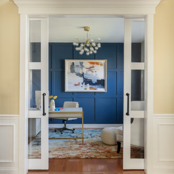
Create a statement-making ‘power’ home office with a perfect Zoom Meeting backdrop…DONE!
Poppin’ art on a blue board & batten wall ensures no office blues here! This client has a high level legal position for a multi-billion dollar company and works from her home office. We needed to ensure everyone who spoke with her listened to her every word and didn’t get distracted by small pictures and notes behind her. Navy blue on a custom detailed wall creates a stately backdrop to statement art that says POWER and makes people listen up!
Darcy has been asked again and again who transformed her space — be it the bookclub Moms in the neighborhood or corporate connections. According to her, the next project is kitchen & family room!
 Cascade Outdoor Design
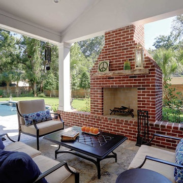
For this project the house itself and the garage are the only original features on the property. In the front yard we created massive curb appeal by adding a new brick driveway, framed by lighted brick columns, with an offset parking space. A brick retaining wall and walkway lead visitors to the front door, while a low brick wall and crisp white pergola enhance a previous underutilized patio. Landscaping, sod, and lighting frame the house without distracting from its character.
In the back yard the driveway leads to an updated garage which received a new brick floor and air conditioning. The back of the house changed drastically with the seamless addition of a covered patio framed on one side by a trellis with inset stained glass opposite a brick fireplace. The live-edge cypress mantel provides the perfect place for decor. The travertine patio steps down to a rectangular pool, which features a swim jet and linear glass waterline tile. Again, the space includes all new landscaping, sod, and lighting to extend enjoyment of the space after dusk.
Photo by Craig O'Neal
 K. Rue Designs, LLC
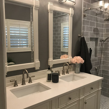
Sweet little country cottage, this home was built in the 1930's in Dallas, Texas. The master bathroom shown in the before photo was extremely small, unappealing, and did not utilize the best space. With the K. Rue new design, a larger shower was created and a major update to the cabinetry was involved. Trying to eliminate constant distractions and interruptions, white and gray were the key colors in the bathroom to make a fluid statement. The small Carrara marble mosaic used on the floor was carried into the shower floor for a consistent rhythm. For an emphasized country cottage look, these 4x10 gray subway ceramic tiles add a slight rough and handmade look to the walls with an intentionally thick grout line. The cabinetry was purchased as one unit to appear as a furniture piece with built-in lavatories and faucets. Gray walls add a great accent to the almost all-white bathroom for depth and drama.
Our client living in Dallas TX was referred to the K. Rue team through another client. We LOVE referrals and would be glad to help your friends or family with their design needs.

 Ann Brooke Landscape Design
Light and shade are crucial elements of landscape design, especially in winter when the distractions of texture and detail are no longer evident.
Photo of a traditional landscaping in DC Metro for winter.
Photo of a traditional landscaping in DC Metro for winter.
 Trendy Blinds & Closets
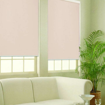
Roller shades are a great option for windows of various sized including very large windows, where you want a clean, non-distracting look that blends into the background.
For any inquiries or book appointment, call us at 905-604-1222. For more info of our products visit us at www.trendyblinds.ca
 Kon-strux Developments
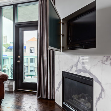
The windows on two sides of this master bedroom bring tons of light into this space. But we've all experienced the distraction of having light reflecting off the screen of a tv or computer screen. This peek-a-boo wall mirror opens out to reveal the media centre within, doubling as a screen shadow when necessary.
(Calgary Photos)
 Janvrin & Co.
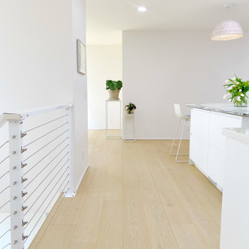
A transformation of a modest raised ranch into a modern oasis. I was the interior designer and general contractor from mechanicals to finishing. It’s also my personal home.
The interior design style is that of modern minimalist meets organic modern. I wanted a space that reduced distractions and let the eyes, head, and soul rest. Where everything inside the home has a specific use and purpose. The objects in our home are fewer but each hold a great personal value. You might expect to see this airy aesthetic, with its gallery white walls, in California or New York. Not nestled in a modest 50 year old neighborhood in Omaha, Nebraska. Creating a minimal aesthetic is one of the trickiest design styles to pull off. It is more than just less stuff and lots of white. It means sticking to these design principals:
-weaving in an abundance of textures
-incorporating natural finishes
-keenly curating art
-giving extra attention to scale
-limiting purely decorative items
-maximizing natural light
This style is not to be confused with the frugality of reductive design. I have incorporated many elevated basics that create an aesthetic of quiet luxury:
-architectural bead for trim-less doors
-first-of-its kind interior door hardware made of terrazzo
-historical marble found in landmark interiors like the NY Public Library
-premium flush air vents that disappear out of site
-luxury appliances from GE Café and Signature
-elegant and resilient terrazzo field tiles
Ours was not a simple interior remodel and addition:
-gutted and remodeled the existing 2,000 SF
-added on approximately another 1,000 SF
-moved and installed all new major mechanicals i.e. heating, plumbing and electrical.
-knocked through foundation walls to extend the space back
-dug down and built up
 Sherri Blum | Jack and Jill Interiors, Inc.
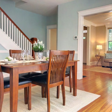
I was recently hired to stage an older (yet very charming) duplex in Carlisle, PA. The home is vacant and had been a rental for the past few years. It has adorable wood moulding throughout, as well as hardwood flooring on the main level. Considering what the homeowner has invested in appliances and other repairs, as well as realtor fees, the budget for staging was right around $1000. This allowed us to bring in furniture, accessories, area rugs and wall art to really bring the home to life. Take a look at the before and after and see what a difference $1000 can make on a home! Before staging, the house felt drab and boring. The view of the neighbor’s peeling house paint outside the windows was a huge distraction from the potential of this home to be a warm and cheery place for a potential buyer.
Ideally, I would have placed curtain rods and soft, white sheers over the windows to allow the light to stream in, yet help detract from the need for a paint job on the exterior of the neighbor’s home. However the seller’s budget didn’t allow for window treatments so my job was to use the furniture and accessories keep the eye and focus on the beauty of this home and help buyers to feel like this house could be their home.
Seeking a real estate home stager in the Harrisburg, Camp Hill, Mechanicsburg or Carlisle area of central PA? Contact Sherri today. No home staging job is too big or too small.
 Studio TOOP
design: Studio TOOP, 2008
location: Vianen, NL
status: built in 2008, Tuinvreugd
photo: Jolanthe Lalkens, 2009
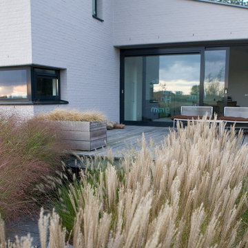
This front garden needed to make a link with the newly built contemporary home and its gorgeous view. The key was for the design not to compete with either. Strokes of three types of grass and textural interest and privacy while not distracting you from the main focus of the garden: the view!
 The Myers Touch
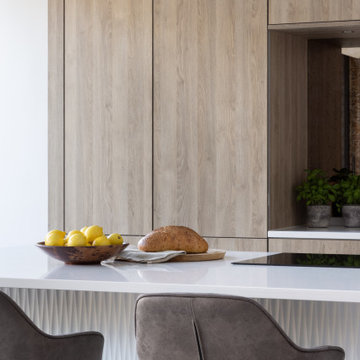
In collaboration with the client’s architect, AR Design the layout of the kitchen was already in place. However, upon meeting the client it was clear she wanted a ‘wow’ island, symmetry in design and plenty of functional storage.
As well as a contemporary, family-friendly space it was also important the space that still respected the heritage of the house. The original walls of the property had many angled walls and featured some tight spaces, so careful consideration of SieMatic's cabinetry choices was given to ensure maximum functionality in those spaces. After much consideration, The Myers Touch specified SieMatic’s SC10 Cabinetry in a Provence Oak Laminate finish which was placed in a framed-style at the rear wall.
The same cabinetry was specified for under the island to create contrast with the new and original material features in the space. In order for the family to keep the kitchen uncluttered, careful planning of internal storage systems was considered in the form of using SieMatic’s internal Drawer boxes and their MultiMatic internal storage system which were used to store smaller items such as spices and sauces, as well whilst providing space for slide-out drawers and storage baskets.
To ensure an elegant yet ‘wow’ factor central island, The Myers Touch combined contrasting textures by using 30mm Silestone Eternal Calacatta natural stone, polished worktops with ‘waterfall island’ edges and a Corian solid surface back panel. The distinctive geometric patterned Corian panel in Cameo White looks particularly spectacular at night when the owner's turn on the architectural-toned lighting under the island.
Appliances chosen for the island included a sophisticated Elica Illusion extractor hood so it could be totally integrated in the new architectural space without visual distraction, a Siemens iQ500 Induction Hob with touch-slide control and a Caple Under-counter Wine cabinet.
To maximise every inch of the new space, and to ensure the owners had a place for everything, The Myers Touch also used additional cabinetry and storage options in the island such as extra deep drawers to store saucepans, cutlery, and everyday crockery.
The eye-catching Antique-bronze mirrored splashback not only helps to provide the illusion of extra space, but reinforces family ‘togetherness’ as it reflects and links the rear of the kitchen ‘snug’ area where family members can sit and relax or work when not in the main kitchen extension area.
The original toned brickwork and 18th Century steel windows in the original part of the extension also helps to tell the story about the older part of the house which now juxtaposes to the new, contemporary kitchen living extension. A handy door was also included in the extension which leads to the garage on the main road for family convenience and over-flow storage.
Photography by Paul Craig (Reproduction of image by request only - joy@bakerpr.co.uk)
 Lehrer Fireplace & Patio
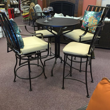
This OW Lee set is perfect for homes with a view. This table will sit you so your eye is not distracted by a deck railing or any other obstruction.
Small backyard patio photo in Denver with no cover
Small backyard patio photo in Denver with no cover
51