
Search results for "Distracted" in Home Design Ideas
 Donald A. Gardner Architects
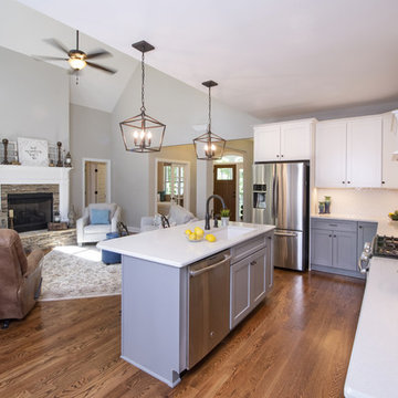
This modern farmhouse enjoys the best of both worlds with a classic front porch and stylish curb-appeal. A second sprawling porch to the rear continues outdoor enjoyment. The open floor plan maintains an easy flow for families to relax and enjoy meals together. The master suite is free of distractions and tucked away for privacy while the utility room with laundry sink is nearby for convenience. Two additional rooms are available for children, guests, or a study.
 KD Landscape
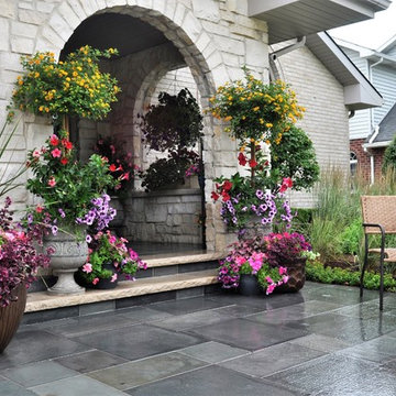
This bluestone entry was featured in spring of 2016 in Outdoor Living Magazine. An avalanche of seasonal color in containers complements the bluestone and limestone at the entry.
 House Styling & Staging
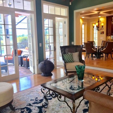
Owner Occupied Homes for Sale have the opposite problem of Vacant Homes. There is usually too much clutter. The owners Minimized the Knick Knacks for a much cleaner presentation to buyers. Too much clutter is distracting to buyers and a selling turn off.
Find the right local pro for your project
 Full Bloom Cottage
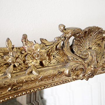
Early 20th century Louis Philippe style giltwood mirror with clamshell carvings. Beautiful aged gilt finish with bevel mirror, large clam shell carving at the top and intricate carved details. This mirror is wood, and gesso. Minor scratches to the frame where you will see white peeking through. It does have age, and has a couple minor carvings missing. This does not distract from the mirror and is very hard to spot out when looking at it. Overall is in great condition, the frame is solid and sturdy, the mirror is secure inside the frame. It looks as if it were once above a mantel (fireplace), there are 2 tiny holes at the very top where is was once placed. Measures: 47" W x 2.5" D x 61" H.
 Tracy Berman Interiors
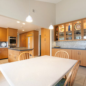
This contemporary kitchen was in need of a lighter and brighter counter top and backsplash. The black granite on both was absorbing all the light and distracting from the beauty of the newly refaced bamboo cabinets. A pallet of light grey and charcoal grey Silestone quartz counter tops were installed with a suede finish. The glass mosaic backsplash adds interest, texture and color. Now the kitchen and adjoining hutch and hall cabinets reflect the style of the rest of the home.
 The Myers Touch
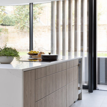
In collaboration with the client’s architect, AR Design the layout of the kitchen was already in place. However, upon meeting the client it was clear she wanted a ‘wow’ island, symmetry in design and plenty of functional storage.
As well as a contemporary, family-friendly space it was also important the space that still respected the heritage of the house. The original walls of the property had many angled walls and featured some tight spaces, so careful consideration of SieMatic's cabinetry choices was given to ensure maximum functionality in those spaces. After much consideration, The Myers Touch specified SieMatic’s SC10 Cabinetry in a Provence Oak Laminate finish which was placed in a framed-style at the rear wall.
The same cabinetry was specified for under the island to create contrast with the new and original material features in the space. In order for the family to keep the kitchen uncluttered, careful planning of internal storage systems was considered in the form of using SieMatic’s internal Drawer boxes and their MultiMatic internal storage system which were used to store smaller items such as spices and sauces, as well whilst providing space for slide-out drawers and storage baskets.
To ensure an elegant yet ‘wow’ factor central island, The Myers Touch combined contrasting textures by using 30mm Silestone Eternal Calacatta natural stone, polished worktops with ‘waterfall island’ edges and a Corian solid surface back panel. The distinctive geometric patterned Corian panel in Cameo White looks particularly spectacular at night when the owner's turn on the architectural-toned lighting under the island.
Appliances chosen for the island included a sophisticated Elica Illusion extractor hood so it could be totally integrated in the new architectural space without visual distraction, a Siemens iQ500 Induction Hob with touch-slide control and a Caple Under-counter Wine cabinet.
To maximise every inch of the new space, and to ensure the owners had a place for everything, The Myers Touch also used additional cabinetry and storage options in the island such as extra deep drawers to store saucepans, cutlery, and everyday crockery.
The eye-catching Antique-bronze mirrored splashback not only helps to provide the illusion of extra space, but reinforces family ‘togetherness’ as it reflects and links the rear of the kitchen ‘snug’ area where family members can sit and relax or work when not in the main kitchen extension area.
The original toned brickwork and 18th Century steel windows in the original part of the extension also helps to tell the story about the older part of the house which now juxtaposes to the new, contemporary kitchen living extension. A handy door was also included in the extension which leads to the garage on the main road for family convenience and over-flow storage.
Photography by Paul Craig (Reproduction of image by request only - joy@bakerpr.co.uk)
 User
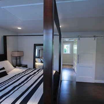
UserThe heating panel in this room provides comfortable radiant heat from the ceiling without distracting from the rest of the space.
Example of a mid-sized minimalist master dark wood floor bedroom design in Seattle with gray walls
Example of a mid-sized minimalist master dark wood floor bedroom design in Seattle with gray walls
 Kahrs
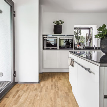
KahrsShown: Kährs Lumen Dawn wood flooring
Kährs have launched two new ultra-matt wood flooring collections, Lux and Lumen. Recently winning Gold for 'Best Flooring' at the 2017 House Beautiful Awards, Kährs' Lux collection includes nine one-strip plank format designs in an array of natural colours, which are mirrored in Lumen's three-strip designs.
The new surface treatment applied to the designs is non reflective; enhancing the colour and beauty of real wood, whilst giving a silky, yet strong shield against wear and tear.
Emanuel Lidberg, Head of Design at Kährs Group, says,
“Lux and Lumen have been developed for design-led interiors, with abundant natural light, for example with floor-to-ceiling glazing. Traditional lacquer finishes reflect light which distracts from the floor’s appearance. Our new, ultra-matt finish minimizes reflections so that the wood’s natural grain and tone can be appreciated to the full."
The contemporary Lux Collection features nine floors spanning from the milky white "Ash Air" to the earthy, deep-smoked "Oak Terra". Kährs' Lumen Collection offers mirrored three strip and two-strip designs to complement Lux, or offer an alternative interior look. All designs feature a brushed effect, accentuating the natural grain of the wood. All floors feature Kährs' multi-layered construction, with a surface layer of oak or ash.
This engineered format is eco-friendly, whilst also making the floors more stable, and ideal for use with underfloor heating systems. Matching accessories, including mouldings, skirting and handmade stairnosing are also available for the new designs.
 Axis Mundi | New York
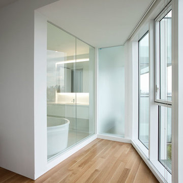
It wasn’t necessary to overthink things when Axis Mundi designed interiors for an apartment at Brooklyn’s glass-sheathed 1 Grand Army Plaza, the luxury building by Richard Meier already endowed with all the “starchitect” bells and whistles, as well as drop-dead stunning views of Brooklyn, the harbor and Prospect Park. What did require considerable aptitude was to strike the right balance between respect for these assets, particularly the panoramas, and livability. The all-white scheme doesn’t just complement Meier’s own aesthetic devotion to this purest of pure hues; it serves as a cool backdrop for the views, affording comfortable vantage points from which to enjoy them, yet not drawing attention away from the splendors of one of the world’s most distinctive boroughs. Sleek, low-lying Italian seating avoids distracting interruptions on the horizon line. But minimal color accents and pattern also sidestep what could have been a potentially antiseptic environment, making it tactile, human and luxurious.
2,200 sf
Design Team: John Beckmann, Richard Rosenbloom and Nick Messerlian
Vintage photography coursety of the Ubu Gallery, New York
Photography: Adriana Buffi and Fran Parente
© Axis Mundi Design LLC
 Simply Home Decorating
The kitchen may be the heart of a home, but the dining room is where the family gathers to enjoy special occasions, create and pass on traditions, and savour each other’s company free from distractions. The family behind this particular dining room enjoys doing just that.
When they are not traveling the world, Matthew and Anna (names changed) love to cook meals at home with their teenage daughter, entertain family and friends, and live amongst their cherished travel souvenirs and heirlooms. Their dining room, however, was far from the perfect backdrop for these experiences.
Before: Dining Room:
When Matthew and Anna contacted us, they imagined a space that would comfortably seat 8 to 10 people and incorporate their beautiful inherited dining table and sideboard in a fresh, modern way. Above all, they wanted a dining room that they would feel proud to share.
They worked with us to design, lightly renovate, and furnish their dining room and adjacent living space. Now, the room is nothing short of inviting and elevated.
Classic Yet Contemporary Dining Room:
Viewed from the living area, the dining room is a hidden gem waiting to be discovered. Matthew and Anna wanted dark blue for the walls, and we couldn’t have been happier to find the perfect shade for them. By leaning darker, this rich blue creates the perception of depth, making the room feel enticing, comfortable and secluded.
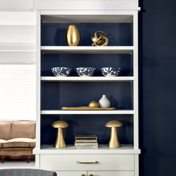
The previous built-ins were underwhelming and lacked function, so we designed wider, taller, double sided cabinets that integrated the existing bulk-head, and then accessorized the shelves with the family’s travel finds, books, and decor. Topping these units with brass art lights not only blends contemporary and traditional styles, it also draws attention to the dining table’s modern show-stopping chandelier. You can’t miss it.
Inside the dining room, the effect is equally impressive: enveloping yet spacious, warm yet cool, classic yet contemporary. We incorporated their heirloom pieces seamlessly into the design thanks to the 1:2 ratio. For every traditional piece, we introduced two more modern or contemporary pieces — clean lines, subtle curves, and lustrous brass hardware. The result is a collected yet updated look.
In any room with dark walls, lighting is of the utmost importance. We placed a mirror adjacent to the window to reflect natural light throughout the room, and we kept the trim and ceiling white for brightness. To provide maximum versatility, we provided multiple light sources that can be adjusted to create different levels of light to suit any mood or occasion. These include: pot lights and a chandelier on dimmers, a sculptural trilight lamp on the sideboard, and art lights on the bookcases and above important art pieces.
The built-ins have another surprise waiting inside this special dining room:
Double-sided built-ins: dining room shelving and living room shelving.
Rather than keep them white like we did in the living room, we painted the back wall of the book cases the same dark blue as the walls in the rest of the room. This reduces the contrast with the surrounding walls and emphasizes the white outline of the cabinets. We also love the dark blue walls’ role as a beautiful backdrop for this family’s treasures. The brass accessories and hand-painted vases and bowls feel like part of the experience.
Of course, what is beauty without function? It may not look like it, but the base storage is only accessible from the dining room side. The units include deep cabinets for storing serving ware, as well as another delightful surprise: silverware drawers lined in luxurious navy velvet!
Lastly, we designed this beautiful nook for their heirloom sideboard. From afar, the wall looks as if it has texture and perhaps a touch of shine. Up close, you will notice that it is actually navy blue wallpaper with tiny golden dots. This unique touch accentuates the brass in the room touches throughout the space.. The room feels curated, contemporary, and full of character.
Words of Praise:
Anna and Matthew were thrilled with their new dining room and with the design process itself, which is always the highest compliment. They said:
“Working with Lori and her team at Simply Home Decorating was a great experience. The design they came up with was both beautiful and practical for our family. Renovations can be stressful but working with Simply Home made the process much more pleasant.
“Simply Home's project management and their longstanding relationships with reliable trades meant we could relax, knowing that everything was taken care of. If an issue arose, the entire Simply Home team was quick to address it. They were excellent at communicating with us—we never felt like we didn't know what was going on. We would highly recommend working with Simply Home Decorating.”
Thank you, Matthew and Anna! We are honoured to have been part of your journey and wish your family many happy memories in these new spaces.
Now, is it your turn? Are you ready to uncover the hidden potential in your home? If so, contact us here to start the conversation or download my guide Uncovering the Hidden Potential in Your Home below to learn more about what we can do for you.
 McKinney York Architects
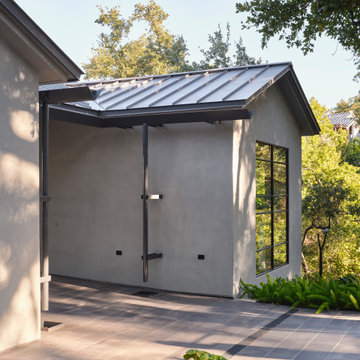
This extensive remodel overlooking Lake Austin is a paean to the powerful art it enfolds. Rigorous editing of every distracting, inconsequential element of the original house was critical. So too was the insertion of new complementary components that provide artful ways to move through both interior and exterior rooms. The collection of modern art is arresting. Ranging from a Turrell hologram to a pair of Agnes Martins, the art is framed by the architecture and lighting so that it is experienced in a choreographed, curated way that encourages wandering and an intimate connection to each piece. The mood is set in the entry courtyard. A floating walkway curves down and around a brilliant spiraling blue Clement sculpture. It pauses once, at a moment of surprise, when the first view through the house is filled with the blue water of the lake beyond. Inside, the saturated color of many of the pieces of art are balanced by an absence of other visual clutter in the color palette, furniture, and architecture. A new interior plaster, steel, and bronze stair carves through a space occupied by two small Clement sculptures in niches, a McKay Otto sculpture on a landing and a glass cylinder elevator. This is a very specific place, designed for specific art and for a collector who has a close relationship with each piece.
 User
UserPortraits of Home
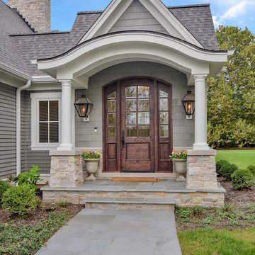
Entryway - large craftsman entryway idea in Chicago with a dark wood front door
Entryway - large craftsman entryway idea in Chicago with a dark wood front door
 Josh Blanc
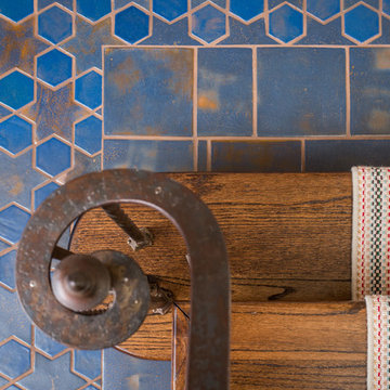
These rich blue tiles enhance the dark wood and rustic railing to finish off this old-world look. The two colors are close enough to work well together and yet not distract from the inherent warmth of the room.
Photographer: Kory Kevin, Interior Designer: Martha Dayton Design, Architect: Rehkamp Larson Architects, Tiler: Reuter Quality Tile
 Stipfold
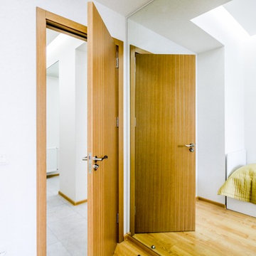
The low budget, family house project posed a challenge of conveniently arranging multiple rooms in small area. Pre-reconstruction edges of the walls were toned down, in order to conform to the new, minimalistic aesthetics and letting two colors prevail in the interior was also the part of the concept.
The white walls and the large mirrors make the space appear sizable. The wooden components of the interior bring an unifying ambience into play. The technical lighting illuminates the rooms without distracting the eye.
CREDITS
Project Leader: Beka Pkhakadze
Copywriter: Mika Motskobili
Photos: Beka Pkhakadze
Location: Tbilisi / Georgia
Type: Residential Interior
Site: 110 sq.m.
Year: 2014
Status: Complete
 Michael Nash Design, Build & Homes
Kitchen Over 150K
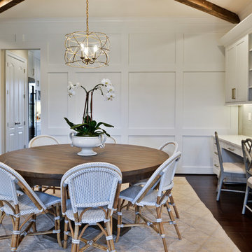
If you ever found yourself shopping for a new home, finding a model home, falling in love with this model home and immediately signing on the dotted line. Yet after a few months of moving into your new home you realize that the kitchen and the layout of main level will not work out for your lifestyle. The model home you fell in love with was furnished with beautiful furniture distracting you from concentrating on what is really important to you. This is what happened to this couple in Ashburn, VA, after purchasing their dream home.
The kitchen lacked natural light, while its location was not ideal and was disrupting their daily routine. After a careful review of the kitchen design, a plan was formed to upgrade the kitchen.
Their kitchen was moved to a location between the two-story family room and front dining room. To the left of the family room there was a breakfast eating area that was not serving any purpose.
Our design incorporated the breakfast area placed along a couple feet from an adjacent pantry space to create this new dream kitchen.
By knocking down a few bearing walls, we have placed the main sink area under large backside windows. Now the kitchen can look into their beautiful backyard. A major load bearing wall between the old breakfast room and adjacent two-story family was taken down and a big steel beam took the place of that, creating a large seamless connection between the new kitchen and the rest of the home.
A large island was implemented with a prep sink, microwave, and with lots of seating space around it. Large scale professional appliances along with stunning mosaic backsplash tiles complement this amazing kitchen design.
Double barn style door in front of the pantry area sets off this storage space tucked away from rest of the kitchen. All the old tile was removed and a matching wide plank distressed wood floor was installed to create a seamless connection to rest of the home. A matching butler pantry cabinet area just outside of dining room and a wine station/drink serving area between family room and main foyer were added to better utilize the multi-function needs of the family.
The custom inset cabinetry with double layers and exotic stone counter top, distressed ceiling beams, and other amenities are just a few standouts of this project.
 Distinctive Interior Designs
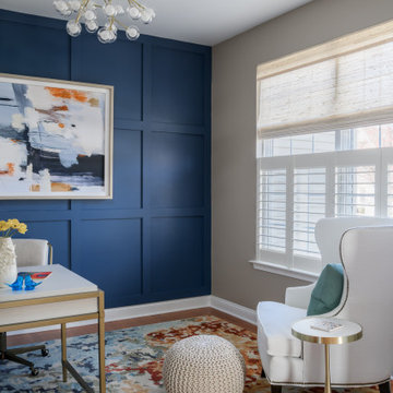
Create a statement-making ‘power’ home office with a perfect Zoom Meeting backdrop…DONE!
Poppin’ art on a blue board & batten wall ensures no office blues here! This client has a high level legal position for a multi-billion dollar company and works from her home office. We needed to ensure everyone who spoke with her listened to her every word and didn’t get distracted by small pictures and notes behind her. Navy blue on a custom detailed wall creates a stately backdrop to statement art that says POWER and makes people listen up!
Darcy has been asked again and again who transformed her space — be it the bookclub Moms in the neighborhood or corporate connections. According to her, the next project is kitchen & family room!
 Janvrin & Co.
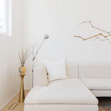
A transformation of a modest raised ranch into a modern oasis. I was the interior designer and general contractor from mechanicals to finishing. It’s also my personal home.
The interior design style is that of modern minimalist meets organic modern. I wanted a space that reduced distractions and let the eyes, head, and soul rest. Where everything inside the home has a specific use and purpose. The objects in our home are fewer but each hold a great personal value. You might expect to see this airy aesthetic, with its gallery white walls, in California or New York. Not nestled in a modest 50 year old neighborhood in Omaha, Nebraska. Creating a minimal aesthetic is one of the trickiest design styles to pull off. It is more than just less stuff and lots of white. It means sticking to these design principals:
-weaving in an abundance of textures
-incorporating natural finishes
-keenly curating art
-giving extra attention to scale
-limiting purely decorative items
-maximizing natural light
This style is not to be confused with the frugality of reductive design. I have incorporated many elevated basics that create an aesthetic of quiet luxury:
-architectural bead for trim-less doors
-first-of-its kind interior door hardware made of terrazzo
-historical marble found in landmark interiors like the NY Public Library
-premium flush air vents that disappear out of site
-luxury appliances from GE Café and Signature
-elegant and resilient terrazzo field tiles
Ours was not a simple interior remodel and addition:
-gutted and remodeled the existing 2,000 SF
-added on approximately another 1,000 SF
-moved and installed all new major mechanicals i.e. heating, plumbing and electrical.
-knocked through foundation walls to extend the space back
-dug down and built up
 360 Construction & Design
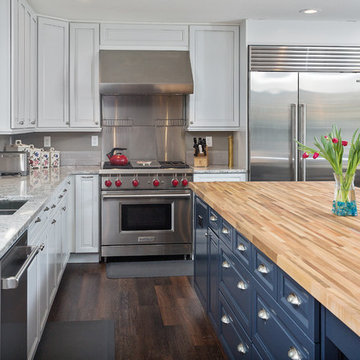
Example of a large transitional l-shaped vinyl floor and brown floor eat-in kitchen design in Other with an undermount sink, raised-panel cabinets, white cabinets, quartz countertops, white backsplash, ceramic backsplash, stainless steel appliances, an island and white countertops
 Robin's Nest Interiors
It was a pleasure to help this single dad transform a previous French Country motif into a Handsome Space with Masculine Vibe. The homeowner loves the blues you find in the Caribbean so we used those as accent colors throughout the rooms.
Entry
We painted the walls Sherwin Williams’ Latte (SW6108) to add warmth. We accessorized the homeowner’s beautiful burl wood cabinet with vibrant artwork and whimsical Chinese horses. I always recommend task lighting in a Foyer, if possible, and the rectangular lamp shade is the perfect shape to fit on the small end of the cabinet.
Powder Room
I adore the Candace Olson wallpaper we used in the Powder Room. The blocks look like sections of wood. It works great with the existing granite. Other examples of wallpaper here and here.
Great Room
We touched every surface in this Great Room from painting the walls Nomadic Desert (SW6107) to painting the ceiling Double Latte (SW9108) to make the room feel cozier to replacing the carpet with this transitional style with striated pattern to painting the white built-ins.
Furniture placement was a real challenge because the grand piano needed to stay without blocking the traffic flow through the space. The homeowner also wanted us to incorporate his chess table and chairs. We centered a small seating area in front of the fireplace utilizing two oversized club chairs and an upholstered ottoman with a wood tray that slides. The wood bases on the chairs helps their size not overpower the room. The velvet ottoman fabric with navy, azure, and teal blues is a showstopper.
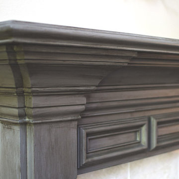
We used the homeowner’s wonderful collection of unique puzzle boxes to accessorize the built-ins. We just added some pops of blues, greens and silver. The homeowner loves sculptural objects so the nickel twig wall decor was the perfect focal point above the mantle. We opted not to add anything to the mantle so it would not distract from the art piece.
We added decorative drapery panels installed on short rods between each set of doors. The homeowner was open to this abstract floral pattern in greens and blues!
We reupholstered the cushions for the chess table chairs in a fun geometric fabric that coordinates with the panel fabric. The homeowner does not use this set of doors to access the deck so we were able to position the table directly in front of them.
Kelly Sisler of Kelly Faux Creations worked her magic on the built-ins. We used Sherwin Williams’ Mega Greige (SW7031) as the base and then applied a heavy bronze glaze. It completely transformed the Great Room. Other examples of painting built-ins here and here.
We hoped you enjoyed this Handsome Space with Masculine Vibe. It was quite a transformation!
 Claremont Rug Company
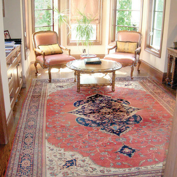
This early, spacious town carpet with its riveting medallion and softly glowing field provides a center point for all the activities of a chief executive’s personal home office. One of the gems of this whole home collection of carpets, it sits comfortably within the eclectic furnishings, offering the refreshing distraction of watching its colors respond to the changing sunlight throughout the day. The understated interior design includes paired fauteuil armchairs with carved botanical motifs that recall the spacious, stylized vinery pattern that fills the 19th century Ferahan’s grand borders and surrounds its one-of-a-kind medallion.
http://www.claremontrug.com/client-home-interiors-design/antique-ferahan-sarouk-rug-in-elegant-home-office/
77