
Search results for "Distracted" in Home Design Ideas
 Renovisions
One of the hottest trends in bath design is open, clean-line spaces. This serene look is accomplished by reducing distractions caused by too many ornate details. This client approached Renovisions to remodel her outdated master bath and create a clean and uncluttered space with a contemporary flair. The bathtub and tile floor remains in the new design adding a small challenge to coordinate the right color selection for shower and tub surround tile. The existing bath’s fiberglass shower was cramped, under utilized and under styled, so Renovisions first enlarged the depth of the shower with a complete water proof system, hand-held shower and soap dish, corner shelf and safety grab bar.
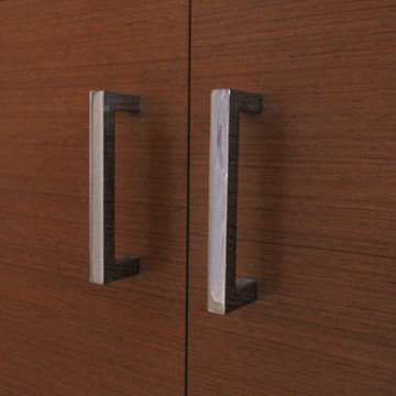
A teak veneer vanity was designed to compliment the client’s master bedroom teak furniture. A beautiful combination of sleek grey quartz countertop, rectangular under-mount sink, modern plumbing fixtures, stylish hardware and a simple yet elegant tilt mirror completed the contemporary look.
This renewed master bath combines functionality and aesthetics in perfect harmony.
 CLN Group
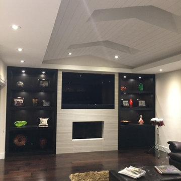
Example of a mid-sized trendy enclosed dark wood floor home theater design in Miami with white walls and a wall-mounted tv
 interior design MARCOMEDES
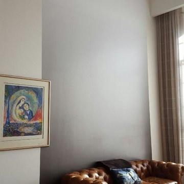
To bring interest to a big white box with tall ceilings, many different textures were brought in, including a tufted leather chesterfield sofa, velvet armchairs, free-edge cowhide over a herringbone cowhide rug, industrial metal coffee tables, and fur stools. Dramatic ombre walls warmed up the space while still emphasizing the high ceiling and without distracting from the original artwork.
Find the right local pro for your project
 MossCreek
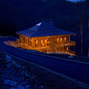
This stunning custom designed home by MossCreek features contemporary mountain styling with sleek Asian influences. Glass walls all around the home bring in light, while also giving the home a beautiful evening glow. Designed by MossCreek for a client who wanted a minimalist look that wouldn't distract from the perfect setting, this home is natural design at its very best. Photo by Joseph Hilliard
 LEDVANS
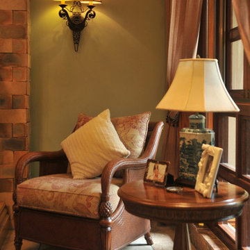
Chestnut furniture is the best to bring out the old-world look in the furnishing design. For those with higher budget and prefer traditional furnishing design better, try to invest in some high quality wooden furniture pieces. Warm tone lighting from 2200K to 3000K is recommended, as light that have higher color temperature will ‘distract’ the nostalgic-ness and turn retro into something that needs to be thrown.
 Open Door Furniture
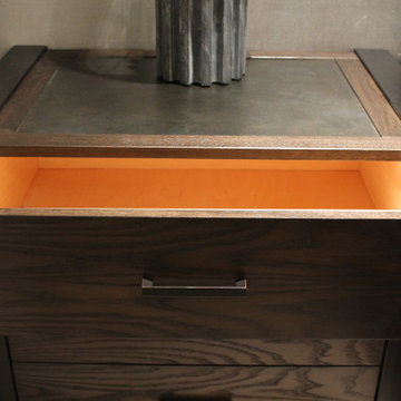
We worked with the talented Katie Porter of KP Design studio to help bring her design of this bedroom set to life.
The hallmark of this mini collection is the intersection of wood and metal to create something that is unique, beautiful and functional with heirloom durability. The first thing that the eye is drawn to are the steel legs that wrap all the way around the case. These function as as support of the case and the leg base. The tops are laminated steel with a patina applied to give a nice subtle visual interest without being overpowering or distracting. The added benefit to the steel is that the client will not have to worry about their guests using coasters for drinks!
Finally, to ensure that we controlled for any seasonal wood movement that would cause issues inside of the steel wrapping, we created our own shop sawn veneers to wrap all of the cases and drawer fronts. This keeps the pieces stable and contains wood movement while giving allowing us to create grain patterns that are pleasing to the eye and flow through the piece.
This Ash wood of this collection was finished with a rich dark brown which is a lovely contrast to the lighter colors in the finished space.
We hope that you enjoy looking at them as much as we enjoyed building them!
 Ukázkový domov Home Staging & Home Tuning
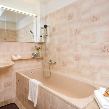
I tried to get most even though the bathroom is very devastated. This part of my job was rather about distracting the negatives.
Small eclectic master beige tile and ceramic tile ceramic tile bathroom photo in Other with a wall-mount sink, raised-panel cabinets, distressed cabinets, tile countertops and beige walls
Small eclectic master beige tile and ceramic tile ceramic tile bathroom photo in Other with a wall-mount sink, raised-panel cabinets, distressed cabinets, tile countertops and beige walls
 Inprint Designs
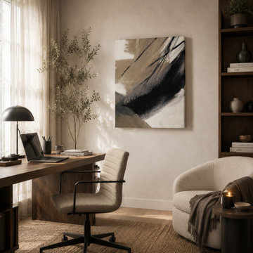
Create a calm and inspiring workspace with the Brush Rhythm abstract canvas wall art. Featuring expressive black and warm beige brushstrokes, this organic modern canvas adds depth, texture, and refined elegance to home offices and creative studios. Its neutral color palette complements Japandi, Scandinavian, minimalist, and contemporary interiors while promoting a balanced, distraction-free environment. Perfect for professionals seeking sophisticated abstract canvas wall art that enhances productivity and brings timeless designer style to modern office décor.
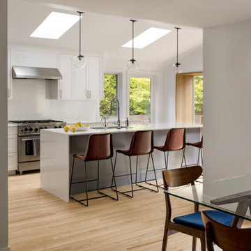
 MAKE Design Studio
A former tiny kitchen, pantry and eating area gets a makeover into one large room that allows plenty of space to gather and lots of connection to their expansive deck and backyard.
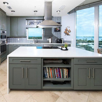
 Coast Design Kitchen & Bath
The Klein condo is a penthouse unit overlooking the beautiful back bay of Orange Beach, AL. The original kitchen was put in by the developer and lacked a wow factor as well as the organization and functionality that the Klein's desired to fit their cooking and entertaining needs. The right side of the kitchen is a wall of floor to ceiling windows that bring in the beautiful scenery of the bay. It was important to the client to create a kitchen that would enhance and compliment the water view rather than distract from it. We chose the Bristol door, a wide stile shaker, because of it's clean and simple lines. Wellborn's Willow paint served as the perfect compliment to the cool blue tones from the bay view that poured into the kitchen. We made sure to use every inch of space for functional storage; from a lazy susan in the tight left corner, to a tall pull-out cabinet left of the fridge, to custom fitting a cabinet front all the way to the angled wall on the right side of the kitchen. Mrs. Klein wanted a large smooth surface for baking, so we created a double-sided island that gave her a 50" deep smooth countertop with waterfall ends. The Klein's also wanted to incorporate a large wet bar near the kitchen to use for entertaining and display. We used the same finishes and moldings, but added some glass doors and glass shelves to reflect the water views. The bar includes two spice rack pull-outs that are used for liquor bottle storage. This renovation transformed the Klein's drab, builder level kitchen into a custom, highly functional kitchen & bar that harmonizes with the beautiful bay views that encompass it.
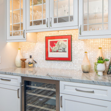
 Signature Designs Kitchen | Bath | Interiors
Transitional kitchens, which blend contemporary and traditional styles, are bright, relaxed, and often loaded with storage. Transitional-style kitchen that is open and airy with casual elegance that draws you in. The key to this blended style is a simple color palette and a cohesive design that eliminates visual distractions like patterns and clutter.
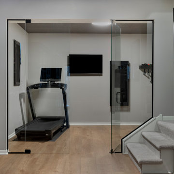
 FBC Remodel
Sleek & Modern Basement Home Gym
This glass-enclosed home gym seamlessly integrates fitness into a stylish basement design. The frameless glass doors create a sense of openness while providing a dedicated workout space. The minimalist aesthetic is complemented by neutral tones, recessed lighting, and sleek wall-mounted technology, ensuring a distraction-free workout experience.
The luxury vinyl plank flooring adds warmth and durability, making it perfect for both high-impact training and everyday exercise. A wall-mounted TV offers entertainment or guided workouts, while a compact wall-mounted weight rack maximizes space efficiency.
Positioned within an entertainment-driven basement, this home gym is ideal for those who want to maintain their fitness routine while staying connected to the home’s social atmosphere. Modern, functional, and stylish—this basement gym proves that fitness and design can coexist beautifully.
 Janvrin & Co.
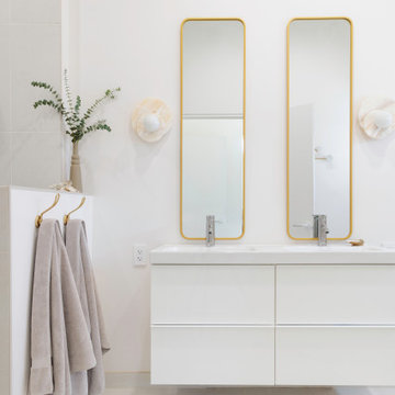
A transformation of a modest raised ranch into a modern oasis. I was the interior designer and general contractor from mechanicals to finishing. It’s also my personal home.
The interior design style is that of modern minimalist meets organic modern. I wanted a space that reduced distractions and let the eyes, head, and soul rest. Where everything inside the home has a specific use and purpose. The objects in our home are fewer but each hold a great personal value. You might expect to see this airy aesthetic, with its gallery white walls, in California or New York. Not nestled in a modest 50 year old neighborhood in Omaha, Nebraska. Creating a minimal aesthetic is one of the trickiest design styles to pull off. It is more than just less stuff and lots of white. It means sticking to these design principals:
-weaving in an abundance of textures
-incorporating natural finishes
-keenly curating art
-giving extra attention to scale
-limiting purely decorative items
-maximizing natural light
This style is not to be confused with the frugality of reductive design. I have incorporated many elevated basics that create an aesthetic of quiet luxury:
-architectural bead for trim-less doors
-first-of-its kind interior door hardware made of terrazzo
-historical marble found in landmark interiors like the NY Public Library
-premium flush air vents that disappear out of site
-luxury appliances from GE Café and Signature
-elegant and resilient terrazzo field tiles
Ours was not a simple interior remodel and addition:
-gutted and remodeled the existing 2,000 SF
-added on approximately another 1,000 SF
-moved and installed all new major mechanicals i.e. heating, plumbing and electrical.
-knocked through foundation walls to extend the space back
-dug down and built up
 Bellisa Design
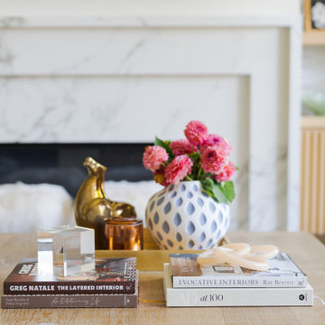
This living room renovation began by moving the fireplace from the corner to the middle of the wall, creating a bold new focal point and allowing the marble fireplace to anchor the space with elegance and visual weight. White oak floating shelves and reeded cabinets add warmth and depth to the cooler tones of the stone. The Samsung Frame TV serves a dual purpose as art when not in use, avoiding the distraction of a blank black screen and seamlessly integrating technology into the room’s design. Wallpaper in the back of built-in shelves introduces layered patterns without overwhelming the space, and the geometric rug along with patterned sofa The overall design balances cozy materials with striking details, ensuring the living room is both inviting and visually rich. A thoughtful mix of pattern, texture, and smart technology results in a space where comfort and sophistication coexist seamlessly.
 Blair Burke General Contractors, Inc.
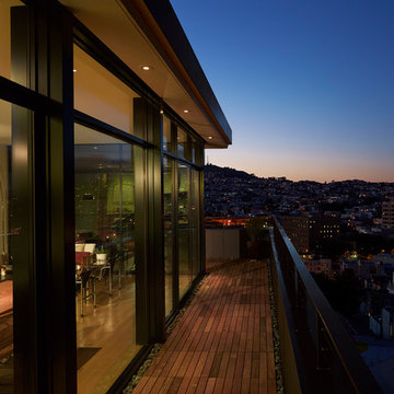
Featured in the 2013 AIA San Francisco Home Tour, this Bernal Heights residence was transformed from a drab stucco box to an architectural gem prominently positioned to take in bridge to bridge views. Scope of work consisted of a complete gut of the existing house and adding a third story to capture kitchen, dining and living room functions. An exterior Skatelite rainscreen system provides street side privacy while modest materials and simple glass box bring in the views without distraction.
 The Myers Touch
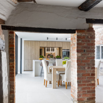
In collaboration with the client’s architect, AR Design the layout of the kitchen was already in place. However, upon meeting the client it was clear she wanted a ‘wow’ island, symmetry in design and plenty of functional storage.
As well as a contemporary, family-friendly space it was also important the space that still respected the heritage of the house. The original walls of the property had many angled walls and featured some tight spaces, so careful consideration of SieMatic's cabinetry choices was given to ensure maximum functionality in those spaces. After much consideration, The Myers Touch specified SieMatic’s SC10 Cabinetry in a Provence Oak Laminate finish which was placed in a framed-style at the rear wall.
The same cabinetry was specified for under the island to create contrast with the new and original material features in the space. In order for the family to keep the kitchen uncluttered, careful planning of internal storage systems was considered in the form of using SieMatic’s internal Drawer boxes and their MultiMatic internal storage system which were used to store smaller items such as spices and sauces, as well whilst providing space for slide-out drawers and storage baskets.
To ensure an elegant yet ‘wow’ factor central island, The Myers Touch combined contrasting textures by using 30mm Silestone Eternal Calacatta natural stone, polished worktops with ‘waterfall island’ edges and a Corian solid surface back panel. The distinctive geometric patterned Corian panel in Cameo White looks particularly spectacular at night when the owner's turn on the architectural-toned lighting under the island.
Appliances chosen for the island included a sophisticated Elica Illusion extractor hood so it could be totally integrated in the new architectural space without visual distraction, a Siemens iQ500 Induction Hob with touch-slide control and a Caple Under-counter Wine cabinet.
To maximise every inch of the new space, and to ensure the owners had a place for everything, The Myers Touch also used additional cabinetry and storage options in the island such as extra deep drawers to store saucepans, cutlery, and everyday crockery.
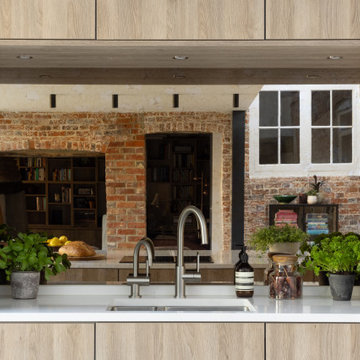
The eye-catching Antique-bronze mirrored splashback not only helps to provide the illusion of extra space, but reinforces family ‘togetherness’ as it reflects and links the rear of the kitchen ‘snug’ area where family members can sit and relax or work when not in the main kitchen extension area.
The original toned brickwork and 18th Century steel windows in the original part of the extension also helps to tell the story about the older part of the house which now juxtaposes to the new, contemporary kitchen living extension. A handy door was also included in the extension which leads to the garage on the main road for family convenience and over-flow storage.
Photography by Paul Craig (Reproduction of image by request only - joy@bakerpr.co.uk)
 The Myers Touch
In collaboration with the client’s architect, AR Design the layout of the kitchen was already in place. However, upon meeting the client it was clear she wanted a ‘wow’ island, symmetry in design and plenty of functional storage.
As well as a contemporary, family-friendly space it was also important the space that still respected the heritage of the house. The original walls of the property had many angled walls and featured some tight spaces, so careful consideration of SieMatic's cabinetry choices was given to ensure maximum functionality in those spaces. After much consideration, The Myers Touch specified SieMatic’s SC10 Cabinetry in a Provence Oak Laminate finish which was placed in a framed-style at the rear wall.
The same cabinetry was specified for under the island to create contrast with the new and original material features in the space. In order for the family to keep the kitchen uncluttered, careful planning of internal storage systems was considered in the form of using SieMatic’s internal Drawer boxes and their MultiMatic internal storage system which were used to store smaller items such as spices and sauces, as well whilst providing space for slide-out drawers and storage baskets.
To ensure an elegant yet ‘wow’ factor central island, The Myers Touch combined contrasting textures by using 30mm Silestone Eternal Calacatta natural stone, polished worktops with ‘waterfall island’ edges and a Corian solid surface back panel. The distinctive geometric patterned Corian panel in Cameo White looks particularly spectacular at night when the owner's turn on the architectural-toned lighting under the island.
Appliances chosen for the island included a sophisticated Elica Illusion extractor hood so it could be totally integrated in the new architectural space without visual distraction, a Siemens iQ500 Induction Hob with touch-slide control and a Caple Under-counter Wine cabinet.
To maximise every inch of the new space, and to ensure the owners had a place for everything, The Myers Touch also used additional cabinetry and storage options in the island such as extra deep drawers to store saucepans, cutlery, and everyday crockery.
The eye-catching Antique-bronze mirrored splashback not only helps to provide the illusion of extra space, but reinforces family ‘togetherness’ as it reflects and links the rear of the kitchen ‘snug’ area where family members can sit and relax or work when not in the main kitchen extension area.
The original toned brickwork and 18th Century steel windows in the original part of the extension also helps to tell the story about the older part of the house which now juxtaposes to the new, contemporary kitchen living extension. A handy door was also included in the extension which leads to the garage on the main road for family convenience and over-flow storage.
Photography by Paul Craig (Reproduction of image by request only - joy@bakerpr.co.uk)
 MCDW + Architecture
Kitchen Cube 1
Upper East- Residence
Work: Full Gut renovation- 2 apartments- in the same ‘S’ line
Size: 650 Sq Ft of space in both apartments, 5S and 4S
Using the Frankfurt Kitchen of 1926 for inspiration, Ms.Cianfaglione began asking herself how the typology of the NYC kitchenette for her building, in the ‘S’ line, needed to be upgraded to fit today’s physical and aesthetic needs. The Frankfurt Kitchen was the forerunner of modern fitted kitchens and had an unified concept to enable efficient work, consolidating a woman’s efforts and allowing her more time to spend else ware. But unlike the Frankfurt kitchen, Ms. Cianfaglione wanted to take this a step further and open it up rather than concealing it, and its user, inside a room. This would showcase the designer’s evolved notion of “cooking”,that would now become an orchestrated dance to be put on display.
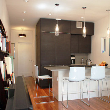
Ms. Cianfaglione had a typical NYC kitchenette, a small room with an air grille for ventilation, and in this case, there was a small window that was currently blocked by a refrigerator. There was also the problem of the foyer space, which was just a waste in an apartment this small, and the structural wall that could not be removed. Ms. Cianfaglione responded to these conditions by designing the kitchen to become a wrap around condition, in an ‘L’ shape, that would use the foyer more effectively and at the same time, face the living area, and all the while concealing the structural wall that separates them.
The interesting thing about the ‘L’ shape was that it allows for a beautifully orchestrated flow that makes cooking look like a beautiful dance that moves back and forth along the’ L.’
The appliances are designed within the cabinetry to give a tailored look that does not allow for distraction, and you instead focus on the user. This renovation made the otherwise small, unused foyer and ineffective kitchen, now a focal point that dictates movement throughout. The kitchen has unified and designed an otherwise standard one bedroom apartment and seeks to become a new standard in this building’s typology.
 Axis Mundi Design
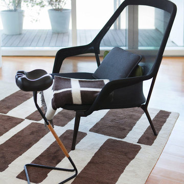
It wasn’t necessary to overthink things when Axis Mundi designed interiors for an apartment at Brooklyn’s glass-sheathed 1 Grand Army Plaza, the luxury building by Richard Meier already endowed with all the “starchitect” bells and whistles, as well as drop-dead stunning views of Brooklyn, the harbor and Prospect Park. What did require considerable aptitude was to strike the right balance between respect for these assets, particularly the panoramas, and livability. The all-white scheme doesn’t just complement Meier’s own aesthetic devotion to this purest of pure hues; it serves as a cool backdrop for the views, affording comfortable vantage points from which to enjoy them, yet not drawing attention away from the splendors of one of the world’s most distinctive boroughs. Sleek, low-lying Italian seating avoids distracting interruptions on the horizon line. But minimal color accents and pattern also sidestep what could have been a potentially antiseptic environment, making it tactile, human and luxurious.
2,200 sf
Design Team: John Beckmann, Richard Rosenbloom and Nick Messerlian
Photography: Adriana Buffi and Fran Parente
© Axis Mundi Design LLC
 Tracy Berman Interiors
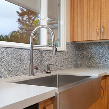
This contemporary kitchen was in need of a lighter and brighter counter top and backsplash. The black granite on both was absorbing all the light and distracting from the beauty of the newly refaced bamboo cabinets. A pallet of light grey and charcoal grey Silestone quartz counter tops were installed with a suede finish. The glass mosaic backsplash adds interest, texture and color. Now the kitchen and adjoining hutch and hall cabinets reflect the style of the rest of the home.
82