
Search results for "Distracted" in Home Design Ideas
 Cabinets 4U, Inc.
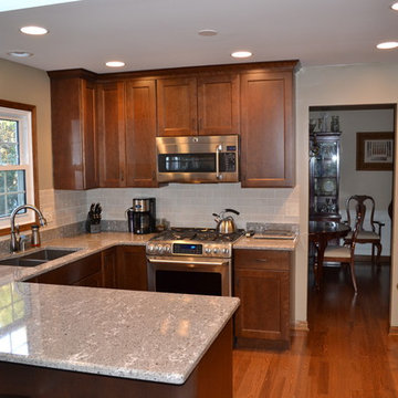
This Naperville kitchen had some BIG changes. From the ceiling to the floor, everything was transformed. Soffits were removed, and also a small closet, which opened up the kitchen space. New lighting, moldings and interior doors elevated the look. And finally, new hardwood floors installed throughout complete the updated framework.
For this new space we chose lovely Cherry cabinets from Kemper. The transitional Wolcott door style bridges the more modern family area with the formal living spaces. The classic chestnut tones blend perfectly with the existing furniture. Finishing the look is a traditional tall crown, adding detail at the ceiling. Though the room is not huge, thoughtful storage options make the most of the space. On the wall that previously held the small closet, a buffet piece was designed. This carries our wood tones through the space, provides more storage, and offers the perfect opportunity for a display piece. The antique glass doors are a subtle touch of texture.
The next layer is the beautiful Cambria countertops. The soft, neutral tones allow the cabinetry to be the star, while the random variations in pattern add interest, and pull together our color palette. In keeping with the brown tones, an Espresso quartz sink was used, as well as Vintage Bronze hardware, and classic brown leather stools. The slightly irregular handmade tiles used for the backsplash add texture without being distracting. Overall, the blending of rich wood tones and neutral surfaces creates a warm yet light and open space – a perfect place for the family to gather!

 Pro-Tile & Marble
Bodway Photography... Pro-Tile & Marble, Inc.
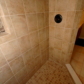
When this homeowner and her husband commissioned Pro-Tile & Marble to remodel their outdated shower they chose tile that are simply laid side by side in a straight line, to give an overall even grid pattern. They also wanted this beautiful inlay patterned insert to give a look of sophistication to their shower. It’s a good choice of pattern for rooms where you don’t want the tiles to distract from other design features. And we all know a long hot shower in a beautifully tiled stall at the end of the day can change everything.
Pro-Tile & Marble, Inc. 904-731-6471
Find the right local pro for your project
 Distinctive Interior Designs
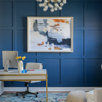
Create a statement-making ‘power’ home office with a perfect Zoom Meeting backdrop…DONE!
Poppin’ art on a blue board & batten wall ensures no office blues here! This client has a high level legal position for a multi-billion dollar company and works from her home office. We needed to ensure everyone who spoke with her listened to her every word and didn’t get distracted by small pictures and notes behind her. Navy blue on a custom detailed wall creates a stately backdrop to statement art that says POWER and makes people listen up!
Darcy has been asked again and again who transformed her space — be it the bookclub Moms in the neighborhood or corporate connections. According to her, the next project is kitchen & family room!
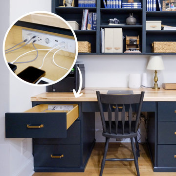
 Docking Drawer
Install Docking Drawer in-drawer outlets into office desks & built-ins to lessen workday distractions and create a more intentional and functional home workspace.
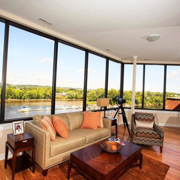
 B Designs Interior's
This water front space has a stunning view so i didn't need much and i wanted to keep the colors in harmony to not distract from the gorgeous focal point, yet i wanted ot to be sophisticated and elegant yet inviting.
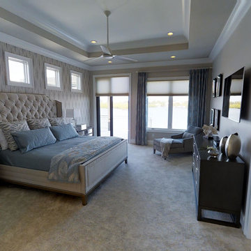
 EDC INTERIORS INC
Photo by John Rippons. The master suite is both soothing and sumptuous. One wall is accented with abstract-print wallpaper that only draws your attention to the tufted upholstered bed and mirrored nightstands. The carpet is absolute divine while the minimal accessories don't distract from the view of the room or outside it.

 Prestige Handyman
From an exposed mess to a seamless wall! Our experts patched this opening, restoring a clean, polished look for a distraction-free room.
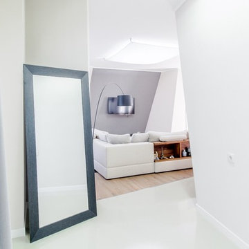
 Stipfold
The low budget, family house project posed a challenge of conveniently arranging multiple rooms in small area. Pre-reconstruction edges of the walls were toned down, in order to conform to the new, minimalistic aesthetics and letting two colors prevail in the interior was also the part of the concept.
The white walls and the large mirrors make the space appear sizable. The wooden components of the interior bring an unifying ambience into play. The technical lighting illuminates the rooms without distracting the eye.
CREDITS
Project Leader: Beka Pkhakadze
Copywriter: Mika Motskobili
Photos: Beka Pkhakadze
Location: Tbilisi / Georgia
Type: Residential Interior
Site: 110 sq.m.
Year: 2014
Status: Complete
 Cascade Outdoor Design
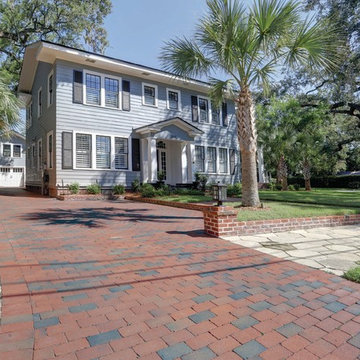
For this project the house itself and the garage are the only original features on the property. In the front yard we created massive curb appeal by adding a new brick driveway, framed by lighted brick columns, with an offset parking space. A brick retaining wall and walkway lead visitors to the front door, while a low brick wall and crisp white pergola enhance a previous underutilized patio. Landscaping, sod, and lighting frame the house without distracting from its character.
In the back yard the driveway leads to an updated garage which received a new brick floor and air conditioning. The back of the house changed drastically with the seamless addition of a covered patio framed on one side by a trellis with inset stained glass opposite a brick fireplace. The live-edge cypress mantel provides the perfect place for decor. The travertine patio steps down to a rectangular pool, which features a swim jet and linear glass waterline tile. Again, the space includes all new landscaping, sod, and lighting to extend enjoyment of the space after dusk.
Photo by Craig O'Neal
 Design Results: Creative Coastal Living
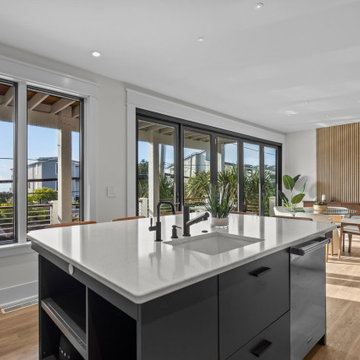
Large sliding patio doors open onto a front deck made of ipe running the breadth of the house. Matte black metal fixtures, pulls, and oil rubbed bronze door and window frames minimize visual distractions. The kitchen island is positioned to accommodate the use of counterstools and provide easy access from all sides. Light brown earth tones repeat in the flooring, leather upholstery, wall panels and walnut cabinetry, to create a cohesive tonal range in shades of sandy blonde to chestnut brown.
 Bespoke Decor
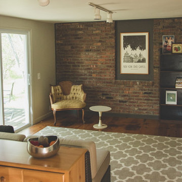
Warm, rich paint highlights the trim around this exposed brick. The remnants of a window recess are now a feature instead of a distraction. The sunroom has the industrial charm of exposed brick in a loft like space. Staged for sale.
JD Urban Photography
 Hans Krug Fine European Cabinetry
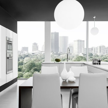
Contrasting finishes of Light Wenge Veneer and White Lacquer create a bold look with sleek, contemporary lines. Timeless beauty without any distractions.
 Janvrin & Co.
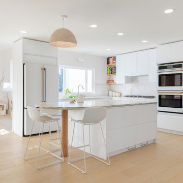
A transformation of a modest raised ranch into a modern oasis. I was the interior designer and general contractor from mechanicals to finishing. It’s also my personal home.
The interior design style is that of modern minimalist meets organic modern. I wanted a space that reduced distractions and let the eyes, head, and soul rest. Where everything inside the home has a specific use and purpose. The objects in our home are fewer but each hold a great personal value. You might expect to see this airy aesthetic, with its gallery white walls, in California or New York. Not nestled in a modest 50 year old neighborhood in Omaha, Nebraska. Creating a minimal aesthetic is one of the trickiest design styles to pull off. It is more than just less stuff and lots of white. It means sticking to these design principals:
-weaving in an abundance of textures
-incorporating natural finishes
-keenly curating art
-giving extra attention to scale
-limiting purely decorative items
-maximizing natural light
This style is not to be confused with the frugality of reductive design. I have incorporated many elevated basics that create an aesthetic of quiet luxury:
-architectural bead for trim-less doors
-first-of-its kind interior door hardware made of terrazzo
-historical marble found in landmark interiors like the NY Public Library
-premium flush air vents that disappear out of site
-luxury appliances from GE Café and Signature
-elegant and resilient terrazzo field tiles
Ours was not a simple interior remodel and addition:
-gutted and remodeled the existing 2,000 SF
-added on approximately another 1,000 SF
-moved and installed all new major mechanicals i.e. heating, plumbing and electrical.
-knocked through foundation walls to extend the space back
-dug down and built up
 Nantucket Looms
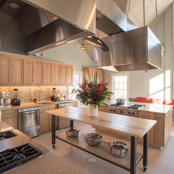
Action Kitchen:
One of the challenges of the project was to not only have a highly functional space, which meant having the components of a commercial kitchen, all while making it look attractive. Keeping the second floor Action Kitchen space bright and full of light was a main consideration, which is why the palette of light green was chosen for the walls. Housefitters played large role in selecting the cabinetry, tiles and appliances. Ensuring that the noise levels were not distracting to the other parts of the building, an intricate acoustical ceiling panel was designed. Not noticeable to the untrained eye, these panels are covered with a metallic acoustical fabric, which balances the workspace sound.
Nantucket Looms supplied the table by Design Workshop - a custom-designed center island with an oak top and steel legs. The legs are on on casters, which allowed flexibility for the space.
The AKDO tile from Housefitters was chosen for the stainless steel element and the warm neutral sand tones that remind us of the beautiful beaches of Nantucket, with a hint of stainless to reflect the contemporary feel.
 Janvrin & Co.
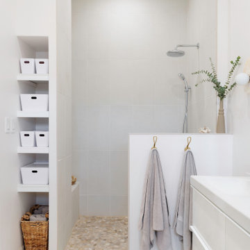
A transformation of a modest raised ranch into a modern oasis. I was the interior designer and general contractor from mechanicals to finishing. It’s also my personal home.
The interior design style is that of modern minimalist meets organic modern. I wanted a space that reduced distractions and let the eyes, head, and soul rest. Where everything inside the home has a specific use and purpose. The objects in our home are fewer but each hold a great personal value. You might expect to see this airy aesthetic, with its gallery white walls, in California or New York. Not nestled in a modest 50 year old neighborhood in Omaha, Nebraska. Creating a minimal aesthetic is one of the trickiest design styles to pull off. It is more than just less stuff and lots of white. It means sticking to these design principals:
-weaving in an abundance of textures
-incorporating natural finishes
-keenly curating art
-giving extra attention to scale
-limiting purely decorative items
-maximizing natural light
This style is not to be confused with the frugality of reductive design. I have incorporated many elevated basics that create an aesthetic of quiet luxury:
-architectural bead for trim-less doors
-first-of-its kind interior door hardware made of terrazzo
-historical marble found in landmark interiors like the NY Public Library
-premium flush air vents that disappear out of site
-luxury appliances from GE Café and Signature
-elegant and resilient terrazzo field tiles
Ours was not a simple interior remodel and addition:
-gutted and remodeled the existing 2,000 SF
-added on approximately another 1,000 SF
-moved and installed all new major mechanicals i.e. heating, plumbing and electrical.
-knocked through foundation walls to extend the space back
-dug down and built up
 Quarry Mill
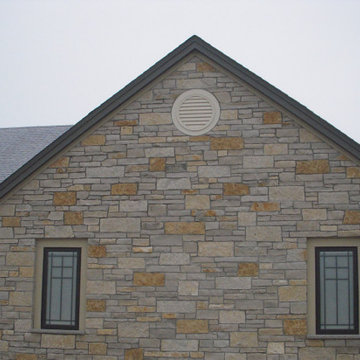
The Quarry Mill's Evanston real thin stone veneer adds classic character to the exterior of this beautiful home. Evanston is a classic blend of natural thin cut Wisconsin limestone that has been a favorite product for decades. The stone is a classic option due to its timeless and recognizable limestone colors in shades of gold and grey. The tones are neutral and liked by designers as they are not busy or distracting on large scale applications. Evanston’s ashlar style stones consist of familiar grey split face pieces mixed with gold jumpers. The larger gold pieces are called jumpers because on the finished wall they jump up a course or two compared to the stones around them. This type of installation is a common and comfortable masonry style.

 Bilotta Kitchen & Home
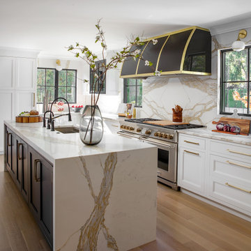
Do you cringe at the thought of spotlighting black in your kitchen? This sophisticated stunner may well give you a change of heart! Though the walls and most of the cabinetry are painted “Super White”, the real eyecatchers are the custom brass-trimmed black hood; the black mullion glass doors flanking the hood; and the black front and rear island bases, which echo the black-framed windows. With the addition of elegant Calacatta Gold marble countertops with waterfall island ends and slab backsplashes, I challenge you to say the inclusion of black makes the kitchen feel small or dark.
Despite contemporary touches, the cabinetry is traditional flush inset construction; doors and large drawers are wide-framed classic Shaker styling with a stepped inner profile. The fridge and dishwasher are paneled to match to avoid distraction. Decorative hardware is honey bronze; the faucet and instant hot are sleek matte black. Pulling triple duty is the peninsula, which houses a microwave drawer; a beverage fridge; and space for cushioned stools with awning-stripe black webbed backs.
The most dramatic view is through the opening in the striking black and gold Art Deco wallpapered dining room, which is centered directly on the black island and black-and-brass hood.
This project was done in collaboration with Atelier Milot Shala, LLC and Breton Contracting. Photography by Stefan Radtke.
 Michael Nash Design, Build & Homes
Kitchen Over 150K
If you ever found yourself shopping for a new home, finding a model home, falling in love with this model home and immediately signing on the dotted line. Yet after a few months of moving into your new home you realize that the kitchen and the layout of main level will not work out for your lifestyle. The model home you fell in love with was furnished with beautiful furniture distracting you from concentrating on what is really important to you. This is what happened to this couple in Ashburn, VA, after purchasing their dream home.
The kitchen lacked natural light, while its location was not ideal and was disrupting their daily routine. After a careful review of the kitchen design, a plan was formed to upgrade the kitchen.
Their kitchen was moved to a location between the two-story family room and front dining room. To the left of the family room there was a breakfast eating area that was not serving any purpose.
Our design incorporated the breakfast area placed along a couple feet from an adjacent pantry space to create this new dream kitchen.
By knocking down a few bearing walls, we have placed the main sink area under large backside windows. Now the kitchen can look into their beautiful backyard. A major load bearing wall between the old breakfast room and adjacent two-story family was taken down and a big steel beam took the place of that, creating a large seamless connection between the new kitchen and the rest of the home.
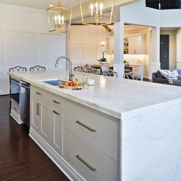
A large island was implemented with a prep sink, microwave, and with lots of seating space around it. Large scale professional appliances along with stunning mosaic backsplash tiles complement this amazing kitchen design.
Double barn style door in front of the pantry area sets off this storage space tucked away from rest of the kitchen. All the old tile was removed and a matching wide plank distressed wood floor was installed to create a seamless connection to rest of the home. A matching butler pantry cabinet area just outside of dining room and a wine station/drink serving area between family room and main foyer were added to better utilize the multi-function needs of the family.
The custom inset cabinetry with double layers and exotic stone counter top, distressed ceiling beams, and other amenities are just a few standouts of this project.
91