
Search results for "Easy to navigate locate" in Home Design Ideas
 Aeris Home
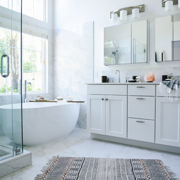
My client decided to sell his house. Fantastic location, best schools in the area, minutes away from the ocean... All that was missing were signs of life and updated finishes. We instantly agreed on whites & greys; a free standing tub, double vanity, and long-lasting / easy-maintenance tile. We now have a clean white space that can be molded into anyone's perfect bath. White canvas gives opportunity to add color and drama. I call this "Baltic White" because sky reflections and tint in the shower glass cast just enough blue to remind me of snowy winters in Scandinavia. To demonstrate character, I staged with black accessories, a tribal rug and added warmth via walnut tub shelf. Candles and salt rock ground the airy feel and leave us with a balanced space that is as welcoming as it is elegant.
Photos - Hale Production Studios
 TKS Design Group
Free ebook, Creating the Ideal Kitchen. DOWNLOAD NOW
The Klimala’s and their three kids are no strangers to moving, this being their fifth house in the same town over the 20-year period they have lived there. “It must be the 7-year itch, because every seven years, we seem to find ourselves antsy for a new project or a new environment. I think part of it is being a designer, I see my own taste evolve and I want my environment to reflect that. Having easy access to wonderful tradesmen and a knowledge of the process makes it that much easier”.
This time, Klimala’s fell in love with a somewhat unlikely candidate. The 1950’s ranch turned cape cod was a bit of a mutt, but it’s location 5 minutes from their design studio and backing up to the high school where their kids can roll out of bed and walk to school, coupled with the charm of its location on a private road and lush landscaping made it an appealing choice for them.
“The bones of the house were really charming. It was typical 1,500 square foot ranch that at some point someone added a second floor to. Its sloped roofline and dormered bedrooms gave it some charm.” With the help of architect Maureen McHugh, Klimala’s gutted and reworked the layout to make the house work for them. An open concept kitchen and dining room allows for more frequent casual family dinners and dinner parties that linger. A dingy 3-season room off the back of the original house was insulated, given a vaulted ceiling with skylights and now opens up to the kitchen. This room now houses an 8’ raw edge white oak dining table and functions as an informal dining room. “One of the challenges with these mid-century homes is the 8’ ceilings. I had to have at least one room that had a higher ceiling so that’s how we did it” states Klimala.
The kitchen features a 10’ island which houses a 5’0” Galley Sink. The Galley features two faucets, and double tiered rail system to which accessories such as cutting boards and stainless steel bowls can be added for ease of cooking. Across from the large sink is an induction cooktop. “My two teen daughters and I enjoy cooking, and the Galley and induction cooktop make it so easy.” A wall of tall cabinets features a full size refrigerator, freezer, double oven and built in coffeemaker. The area on the opposite end of the kitchen features a pantry with mirrored glass doors and a beverage center below.
The rest of the first floor features an entry way, a living room with views to the front yard’s lush landscaping, a family room where the family hangs out to watch TV, a back entry from the garage with a laundry room and mudroom area, one of the home’s four bedrooms and a full bath. There is a double sided fireplace between the family room and living room. The home features pops of color from the living room’s peach grass cloth to purple painted wall in the family room. “I’m definitely a traditionalist at heart but because of the home’s Midcentury roots, I wanted to incorporate some of those elements into the furniture, lighting and accessories which also ended up being really fun. We are not formal people so I wanted a house that my kids would enjoy, have their friends over and feel comfortable.”
The second floor houses the master bedroom suite, two of the kids’ bedrooms and a back room nicknamed “the library” because it has turned into a quiet get away area where the girls can study or take a break from the rest of the family. The area was originally unfinished attic, and because the home was short on closet space, this Jack and Jill area off the girls’ bedrooms houses two large walk-in closets and a small sitting area with a makeup vanity. “The girls really wanted to keep the exposed brick of the fireplace that runs up the through the space, so that’s what we did, and I think they feel like they are in their own little loft space in the city when they are up there” says Klimala.
Designed by: Susan Klimala, CKD, CBD
Photography by: Carlos Vergara
For more information on kitchen and bath design ideas go to: www.kitchenstudio-ge.com
 TKS Design Group
Download our free ebook, Creating the Ideal Kitchen. DOWNLOAD NOW
Lakefront property in the northwest suburbs of Chicago is hard to come by, so when we were hired by this young family with exactly that, we were immediately inspired by not just the unusually large footprint of this 1950’s colonial revival but also the lovely views of the manmade lake it was sited on. The large 5-bedroom home was solidly stuck in the 1980’s, but we saw tons of potential. We started out by updating the existing staircase with a fresh coat of paint and adding new herringbone slate to the entry hall.
The powder room off the entryway also got a refresh - new flooring, new cabinets and fixtures. We ran the new slate right through into this space for some consistency. A fun wallpaper and shiplap trim add a welcoming feel and set the tone for the home.
Next, we tackled the kitchen. Located away from the rest of the first floor, the kitchen felt a little isolated, so we immediately began planning for how to better connect it to the rest of the first floor. We landed on removing the wall between the kitchen and dining room and designed a modified galley style space with separate cooking and clean up zones. The cooking zone consists of the refrigerator, prep sink and cooktop, along with a nice long run of prep space at the island. The cleanup side of the kitchen consists of the main sink and dishwasher. Both areas are situated so that the user can view the lake during prep work and cleanup!
One of the home’s main puzzles was how to incorporate the mudroom and area in front of the patio doors at the back of the house. We already had a breakfast table area, so the space by the patio doors was a bit of a no man’s land. We decided to separate the kitchen proper from what became the new mudroom with a large set of barn doors. That way you can quickly hide any mudroom messes but have easy access to the light coming in through the patio doors as well as the outdoor grilling station. We also love the impact the barn doors add to the overall space.
The homeowners’ first words to us were “it’s time to ditch the brown,” so we did! We chose a lovely blue pallet that reflects the home’s location on the lake which is also vibrant yet easy on the eye. Countertops are white quartz, and the natural oak floor works well with the other honey accents. The breakfast table was given a refresh with new chairs, chandelier and window treatments that frame the gorgeous views of the lake out the back.
We coordinated the slate mudroom flooring with that used in the home’s main entrance for a consistent feel. The storage area consists of open and closed storage to allow for some clutter control as needed.
Next on our “to do” list was revamping the dated brown bar area in the neighboring dining room. We eliminated the clutter by adding some closed cabinets and did some easy updates to help the space feel more current. One snag we ran into here was the discovery of a beam above the existing open shelving that had to be modified with a smaller structural beam to allow for our new design to work. This was an unexpected surprise, but in the end we think it was well worth it!
We kept the colors here a bit more muted to blend with the homeowner’s existing furnishings. Open shelving and polished nickel hardware add some simple detail to the new entertainment zone which also looks out onto the lake!
Next we tackled the upstairs starting with the homeowner’s son’s bath. The bath originally had both a tub shower and a separate shower, so we decided to swap out the shower for a new laundry area. This freed up some space downstairs in what used to be the mudroom/laundry room and is much more convenient for daily laundry needs.
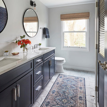
We continued the blue palette here with navy cabinetry and the navy tile in the shower. Porcelain floor tile and chrome fixtures keep maintenance to a minimum while matte black mirrors and lighting add some depth the design. A low maintenance runner adds some warmth underfoot and ties the whole space together.
We added a pocket door to the bathroom to minimize interference with the door swings. The left door of the laundry closet is on a 180 degree hinge to allow for easy full access to the machines. Next we tackled the master bath which is an en suite arrangement. The original was typical of the 1980’s with the vanity outside of the bathroom, situated near the master closet. And the brown theme continued here with multiple shades of brown.
Our first move was to segment off the bath and the closet from the master bedroom. We created a short hall from the bedroom to the bathroom with his and hers walk-in closets on the left and right as well as a separate toilet closet outside of the main bathroom for privacy and flexibility.
The original bathroom had a giant soaking tub with steps (dangerous!) as well as a small shower that did not work well for our homeowner who is 6’3”. With other bathtubs in the home, they decided to eliminate the tub and create an oversized shower which takes up the space where the old tub was located. The double vanity is on the opposite wall and a bench is located under the window for morning conversations and a place to set a couple of towels.
The pallet in here is light and airy with a mix of blond wood, creamy porcelain and marble tile, and brass accents. A simple roman shade adds some texture and it’s top-down mechanism allows for light and privacy.
This large whole house remodel gave our homeowners not only the ability to maximize the potential of their home but also created a lovely new frame from which to view their fabulous lake views.
Designed by: Susan Klimala, CKD, CBD
Photography by: Michael Kaskel
For more information on kitchen and bath design ideas go to: www.kitchenstudio-ge.com
Find the right local pro for your project
 TKS Design Group
Download our free ebook, Creating the Ideal Kitchen. DOWNLOAD NOW
Lakefront property in the northwest suburbs of Chicago is hard to come by, so when we were hired by this young family with exactly that, we were immediately inspired by not just the unusually large footprint of this 1950’s colonial revival but also the lovely views of the manmade lake it was sited on. The large 5-bedroom home was solidly stuck in the 1980’s, but we saw tons of potential. We started out by updating the existing staircase with a fresh coat of paint and adding new herringbone slate to the entry hall.
The powder room off the entryway also got a refresh - new flooring, new cabinets and fixtures. We ran the new slate right through into this space for some consistency. A fun wallpaper and shiplap trim add a welcoming feel and set the tone for the home.
Next, we tackled the kitchen. Located away from the rest of the first floor, the kitchen felt a little isolated, so we immediately began planning for how to better connect it to the rest of the first floor. We landed on removing the wall between the kitchen and dining room and designed a modified galley style space with separate cooking and clean up zones. The cooking zone consists of the refrigerator, prep sink and cooktop, along with a nice long run of prep space at the island. The cleanup side of the kitchen consists of the main sink and dishwasher. Both areas are situated so that the user can view the lake during prep work and cleanup!
One of the home’s main puzzles was how to incorporate the mudroom and area in front of the patio doors at the back of the house. We already had a breakfast table area, so the space by the patio doors was a bit of a no man’s land. We decided to separate the kitchen proper from what became the new mudroom with a large set of barn doors. That way you can quickly hide any mudroom messes but have easy access to the light coming in through the patio doors as well as the outdoor grilling station. We also love the impact the barn doors add to the overall space.
The homeowners’ first words to us were “it’s time to ditch the brown,” so we did! We chose a lovely blue pallet that reflects the home’s location on the lake which is also vibrant yet easy on the eye. Countertops are white quartz, and the natural oak floor works well with the other honey accents. The breakfast table was given a refresh with new chairs, chandelier and window treatments that frame the gorgeous views of the lake out the back.
We coordinated the slate mudroom flooring with that used in the home’s main entrance for a consistent feel. The storage area consists of open and closed storage to allow for some clutter control as needed.
Next on our “to do” list was revamping the dated brown bar area in the neighboring dining room. We eliminated the clutter by adding some closed cabinets and did some easy updates to help the space feel more current. One snag we ran into here was the discovery of a beam above the existing open shelving that had to be modified with a smaller structural beam to allow for our new design to work. This was an unexpected surprise, but in the end we think it was well worth it!
We kept the colors here a bit more muted to blend with the homeowner’s existing furnishings. Open shelving and polished nickel hardware add some simple detail to the new entertainment zone which also looks out onto the lake!
Next we tackled the upstairs starting with the homeowner’s son’s bath. The bath originally had both a tub shower and a separate shower, so we decided to swap out the shower for a new laundry area. This freed up some space downstairs in what used to be the mudroom/laundry room and is much more convenient for daily laundry needs.
We continued the blue palette here with navy cabinetry and the navy tile in the shower. Porcelain floor tile and chrome fixtures keep maintenance to a minimum while matte black mirrors and lighting add some depth the design. A low maintenance runner adds some warmth underfoot and ties the whole space together.
We added a pocket door to the bathroom to minimize interference with the door swings. The left door of the laundry closet is on a 180 degree hinge to allow for easy full access to the machines. Next we tackled the master bath which is an en suite arrangement. The original was typical of the 1980’s with the vanity outside of the bathroom, situated near the master closet. And the brown theme continued here with multiple shades of brown.
Our first move was to segment off the bath and the closet from the master bedroom. We created a short hall from the bedroom to the bathroom with his and hers walk-in closets on the left and right as well as a separate toilet closet outside of the main bathroom for privacy and flexibility.
The original bathroom had a giant soaking tub with steps (dangerous!) as well as a small shower that did not work well for our homeowner who is 6’3”. With other bathtubs in the home, they decided to eliminate the tub and create an oversized shower which takes up the space where the old tub was located. The double vanity is on the opposite wall and a bench is located under the window for morning conversations and a place to set a couple of towels.
The pallet in here is light and airy with a mix of blond wood, creamy porcelain and marble tile, and brass accents. A simple roman shade adds some texture and it’s top-down mechanism allows for light and privacy.
This large whole house remodel gave our homeowners not only the ability to maximize the potential of their home but also created a lovely new frame from which to view their fabulous lake views.
Designed by: Susan Klimala, CKD, CBD
Photography by: Michael Kaskel
For more information on kitchen and bath design ideas go to: www.kitchenstudio-ge.com
 BUILD
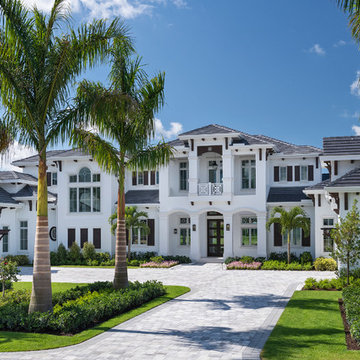
BUILDA custom-made expansive two-story home providing views of the spacious kitchen, breakfast nook, dining, great room and outdoor amenities upon entry.
Featuring 11,000 square feet of open area lavish living this residence does not
disappoint with the attention to detail throughout. Elegant features embellish this home with the intricate woodworking and exposed wood beams, ceiling details, gorgeous stonework, European Oak flooring throughout, and unique lighting.
This residence offers seven bedrooms including a mother-in-law suite, nine bathrooms, a bonus room, his and her offices, wet bar adjacent to dining area, wine room, laundry room featuring a dog wash area and a game room located above one of the two garages. The open-air kitchen is the perfect space for entertaining family and friends with the two islands, custom panel Sub-Zero appliances and easy access to the dining areas.
Outdoor amenities include a pool with sun shelf and spa, fire bowls spilling water into the pool, firepit, large covered lanai with summer kitchen and fireplace surrounded by roll down screens to protect guests from inclement weather, and two additional covered lanais. This is luxury at its finest!
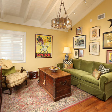
 Creative Spaces Interior Design, Inc.
We were hired to select all new fabric, space planning, lighting, and paint colors in this three-story home. Our client decided to do a remodel and to install an elevator to be able to reach all three levels in their forever home located in Redondo Beach, CA.
We selected close to 200 yards of fabric to tell a story and installed all new window coverings, and reupholstered all the existing furniture. We mixed colors and textures to create our traditional Asian theme.
We installed all new LED lighting on the first and second floor with either tracks or sconces. We installed two chandeliers, one in the first room you see as you enter the home and the statement fixture in the dining room reminds me of a cherry blossom.
We did a lot of spaces planning and created a hidden office in the family room housed behind bypass barn doors. We created a seating area in the bedroom and a conversation area in the downstairs.
I loved working with our client. She knew what she wanted and was very easy to work with. We both expanded each other's horizons.
Tom Queally Photography
 Harrell Design + Build
What our clients needed:
• Create a garden folly that doubles as a well-built shed for crafts and storage.
• Size the structure large enough for comfortable storage without dominating the garden.
• Discreetly locate the shed in the far corner of the rear yard while maintaining existing trees.
• Ensure that the structure is protected from the weather and carefully detailed to deter access of wildlife and rodents.
FUNCTION
• Construct the shed slab close to grade to permit easy access for bicycle storage, while building shed walls above grade to ensure against termites and dryrot.
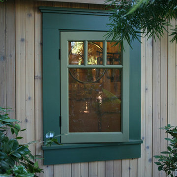
• Install a French door and operable casement windows to admit plenty of daylight and provide views to the garden.
• Include rugged built-in work bench, shelves, bike racks and tool storage for a rustic well-organized and efficient space.
• Incorporate GFIC electrical service for safe access to power at this distant corner of the yard.
• Position energy-efficient interior lighting to ensure space can be used year-round.
• Switch control of exterior light from house and from shed for ease of command.
AESTHETICS
• Design and detail the shed to coordinate with the Arts and Crafts style house.
• Include an arbor for future flowering vines, further softening the shed’s garden presence.
• Simple and rustic interior surfaces ensure that the space is easy to clean.
• Create an aged and softly weathered appearance, and protect the exterior siding by finishing the cedar with a custom-colored semi-transparent stain.
INNOVATIVE MATERIALS AND CONSTRUCTION
• Factory-built components were pre-assembled to allow for a speedy assembly and for a shorter on-site construction schedule.
• Each component was easily transported through the yard without disturbing garden features.
• Decorative exterior trim frames the door and windows, while a simpler trim is used inside the unadorned shed.
OBSTACLE OVERCOME
• The structure is located in the corner of the yard to avoid disturbance of a curly willow tree.
• The low-profile structure is positioned close to property lines while staying beneath the allowable daylight plane for structures.
• To comply with daylight plane close to fence, the roof form combines hip and gable forms, with door located at gable end.
• The height of the modest interior is maximized, without exceeding the allowable building height.
CRAFTSMANSHIP
• The concrete slab was precisely formed and finished for ease of shed assembly before the factory-built components were delivered to site.
• Precision planning meant the pre-framed door fit exactly between raised concrete curb.
Sponsored
Columbus, OH
Free consultation for landscape design!

Peabody Landscape Group
Franklin County's Reliable Landscape Design & Contracting
 River Valley Landscapes
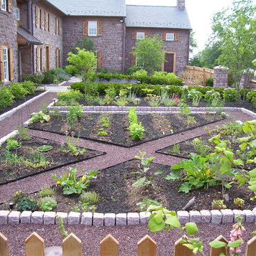
 This project presented unique opportunities that are not often found in residential landscaping. The homeowners were not only restoring their 1840's era farmhouse, a piece of their family’s history, but also enlarging and updating the home for modern living. The landscape designers continued this idea by creating a space that is a modern day interpretation of an 1840s era farm rather then a strict recreation. The resulting design combines elements of farm living from that time, as well as acknowledging the property’s history as a horse farm, with staples of 21st century landscapes such as space for outdoor living, lighting, and newer plant varieties.
Guests approach from the main driveway which winds through the property and ends at the main barn. There is secondary gated driveway just for the homeowners. Connected to this main driveway is a narrower gravel lane which leads directly to the residence. The lane passes near fruit trees planted in broken rows to give the illusion that they are the remains of an orchard that once existed on the site. The lane widens at the entrance to the gardens where there is a hitching post built into the fence that surrounds the gardens and a watering trough. The widened section is intended as a place to park a golf cart or, in a nod to the home’s past, tie up horses before entering. The gravel lane passes between two stone pillars and then ends at a square gravel court edged in cobblestones. The gravel court transitions into a wide flagstone walk bordered with yew hedges and lavender leading to the front door.
Directly to the right, upon entering the gravel court, is located a gravel and cobblestone edged walk leading to a secondary entrance into the residence. The walk is gated where it connects with the gravel court to close it off so as not to confuse visitors and guests to the main residence and to emphasize the primary entrance. An area for a bench is provided along this walk to encourage stopping to view and enjoy the gardens.
On either side of the front door, gravel and cobblestone walks branch off into the garden spaces. The one on the right leads to a flagstone with cobblestone border patio space. Since the home has no designated backyard like most modern suburban homes the outdoor living space had to be placed in what would traditionally be thought of as the front of the house. The patio is separated from the entrance walk by the yew hedge and further enclosed by three Amelanchiers and a variety of plantings including modern cultivars of old fashioned plants such as Itea and Hydrangea. A third entrance, the original front door to the 1840’s era section, connects to the patio from the home’s kitchen, making the space ideal for outdoor dining.
The gravel and cobblestone walk branching off to the left of the front door leads to the vegetable and perennial gardens. The idea for the vegetable garden was to recreate the tradition of a kitchen garden which would have been planted close to the residence for easy access. The vegetable garden is surrounded by mixed perennial beds along the inside of the wood picket fence which surrounds the entire garden space. Another area designated for a bench is provided here to encourage stopping and viewing. The home’s original smokehouse, completely restored and used as a garden shed, provides a strong architectural focal point to the vegetable garden. Behind the smokehouse is planted lilacs and other plants to give mass and balance to the corner and help screen the garden from the neighboring subdivision. At the rear corner of the garden a wood arbor was constructed to provide a structure on which to grow grapes or other vines should the homeowners choose to.
The landscape and gardens for this restored farmhouse and property are a thoughtfully designed and planned recreation of a historic landscape reinterpreted for modern living. The idea was to give a sense of timelessness when walking through the gardens as if they had been there for years but had possibly been updated and rejuvenated as lifestyles changed. The attention to materials and craftsmanship blend seamlessly with the residence and insure the gardens and landscape remain an integral part of the property. The farm has been in the homeowner’s family for many years and they are thrilled at the results and happy to see respect given to the home’s history and to its meticulous restoration.
 AZL interiors
With tall ceilings, an impressive stone fireplace, and original wooden beams, this home in Glen Ellyn, a suburb of Chicago, had plenty of character and a style that felt coastal. Six months into the purchase of their home, this family of six contacted Alessia Loffredo and Sarah Coscarelli of ReDesign Home to complete their home’s renovation by tackling the kitchen.
“Surprisingly, the kitchen was the one room in the home that lacked interest due to a challenging layout between kitchen, butler pantry, and pantry,” the designer shared, “the cabinetry was not proportionate to the space’s large footprint and height. None of the house’s architectural features were introduced into kitchen aside from the wooden beams crossing the room throughout the main floor including the family room.” She moved the pantry door closer to the prepping and cooking area while converting the former butler pantry a bar. Alessia designed an oversized hood around the stove to counterbalance the impressive stone fireplace located at the opposite side of the living space.
She then wanted to include functionality, using Trim Tech‘s cabinets, featuring a pair with retractable doors, for easy access, flanking both sides of the range. The client had asked for an island that would be larger than the original in their space – Alessia made the smart decision that if it was to increase in size it shouldn’t increase in visual weight and designed it with legs, raised above the floor. Made out of steel, by Wayward Machine Co., along with a marble-replicating porcelain countertop, it was designed with durability in mind to withstand anything that her client’s four children would throw at it. Finally, she added finishing touches to the space in the form of brass hardware from Katonah Chicago, with similar toned wall lighting and faucet.
 TKS Design Group
Download our free ebook, Creating the Ideal Kitchen. DOWNLOAD NOW
Lakefront property in the northwest suburbs of Chicago is hard to come by, so when we were hired by this young family with exactly that, we were immediately inspired by not just the unusually large footprint of this 1950’s colonial revival but also the lovely views of the manmade lake it was sited on. The large 5-bedroom home was solidly stuck in the 1980’s, but we saw tons of potential. We started out by updating the existing staircase with a fresh coat of paint and adding new herringbone slate to the entry hall.
The powder room off the entryway also got a refresh - new flooring, new cabinets and fixtures. We ran the new slate right through into this space for some consistency. A fun wallpaper and shiplap trim add a welcoming feel and set the tone for the home.
Next, we tackled the kitchen. Located away from the rest of the first floor, the kitchen felt a little isolated, so we immediately began planning for how to better connect it to the rest of the first floor. We landed on removing the wall between the kitchen and dining room and designed a modified galley style space with separate cooking and clean up zones. The cooking zone consists of the refrigerator, prep sink and cooktop, along with a nice long run of prep space at the island. The cleanup side of the kitchen consists of the main sink and dishwasher. Both areas are situated so that the user can view the lake during prep work and cleanup!
One of the home’s main puzzles was how to incorporate the mudroom and area in front of the patio doors at the back of the house. We already had a breakfast table area, so the space by the patio doors was a bit of a no man’s land. We decided to separate the kitchen proper from what became the new mudroom with a large set of barn doors. That way you can quickly hide any mudroom messes but have easy access to the light coming in through the patio doors as well as the outdoor grilling station. We also love the impact the barn doors add to the overall space.
The homeowners’ first words to us were “it’s time to ditch the brown,” so we did! We chose a lovely blue pallet that reflects the home’s location on the lake which is also vibrant yet easy on the eye. Countertops are white quartz, and the natural oak floor works well with the other honey accents. The breakfast table was given a refresh with new chairs, chandelier and window treatments that frame the gorgeous views of the lake out the back.
We coordinated the slate mudroom flooring with that used in the home’s main entrance for a consistent feel. The storage area consists of open and closed storage to allow for some clutter control as needed.
Next on our “to do” list was revamping the dated brown bar area in the neighboring dining room. We eliminated the clutter by adding some closed cabinets and did some easy updates to help the space feel more current. One snag we ran into here was the discovery of a beam above the existing open shelving that had to be modified with a smaller structural beam to allow for our new design to work. This was an unexpected surprise, but in the end we think it was well worth it!
We kept the colors here a bit more muted to blend with the homeowner’s existing furnishings. Open shelving and polished nickel hardware add some simple detail to the new entertainment zone which also looks out onto the lake!
Next we tackled the upstairs starting with the homeowner’s son’s bath. The bath originally had both a tub shower and a separate shower, so we decided to swap out the shower for a new laundry area. This freed up some space downstairs in what used to be the mudroom/laundry room and is much more convenient for daily laundry needs.
We continued the blue palette here with navy cabinetry and the navy tile in the shower. Porcelain floor tile and chrome fixtures keep maintenance to a minimum while matte black mirrors and lighting add some depth the design. A low maintenance runner adds some warmth underfoot and ties the whole space together.
We added a pocket door to the bathroom to minimize interference with the door swings. The left door of the laundry closet is on a 180 degree hinge to allow for easy full access to the machines. Next we tackled the master bath which is an en suite arrangement. The original was typical of the 1980’s with the vanity outside of the bathroom, situated near the master closet. And the brown theme continued here with multiple shades of brown.
Our first move was to segment off the bath and the closet from the master bedroom. We created a short hall from the bedroom to the bathroom with his and hers walk-in closets on the left and right as well as a separate toilet closet outside of the main bathroom for privacy and flexibility.
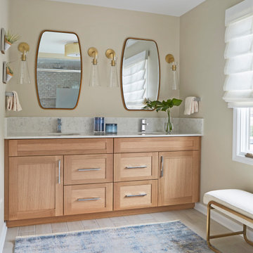
The original bathroom had a giant soaking tub with steps (dangerous!) as well as a small shower that did not work well for our homeowner who is 6’3”. With other bathtubs in the home, they decided to eliminate the tub and create an oversized shower which takes up the space where the old tub was located. The double vanity is on the opposite wall and a bench is located under the window for morning conversations and a place to set a couple of towels.
The pallet in here is light and airy with a mix of blond wood, creamy porcelain and marble tile, and brass accents. A simple roman shade adds some texture and it’s top-down mechanism allows for light and privacy.
This large whole house remodel gave our homeowners not only the ability to maximize the potential of their home but also created a lovely new frame from which to view their fabulous lake views.
Designed by: Susan Klimala, CKD, CBD
Photography by: Michael Kaskel
For more information on kitchen and bath design ideas go to: www.kitchenstudio-ge.com
 ZeroEnergy Design
ZeroEnergy Design (ZED) created this modern home for a progressive family in the desirable community of Lexington.
Thoughtful Land Connection. The residence is carefully sited on the infill lot so as to create privacy from the road and neighbors, while cultivating a side yard that captures the southern sun. The terraced grade rises to meet the house, allowing for it to maintain a structured connection with the ground while also sitting above the high water table. The elevated outdoor living space maintains a strong connection with the indoor living space, while the stepped edge ties it back to the true ground plane. Siting and outdoor connections were completed by ZED in collaboration with landscape designer Soren Deniord Design Studio.
Exterior Finishes and Solar. The exterior finish materials include a palette of shiplapped wood siding, through-colored fiber cement panels and stucco. A rooftop parapet hides the solar panels above, while a gutter and site drainage system directs rainwater into an irrigation cistern and dry wells that recharge the groundwater.
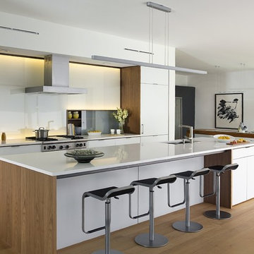
Cooking, Dining, Living. Inside, the kitchen, fabricated by Henrybuilt, is located between the indoor and outdoor dining areas. The expansive south-facing sliding door opens to seamlessly connect the spaces, using a retractable awning to provide shade during the summer while still admitting the warming winter sun. The indoor living space continues from the dining areas across to the sunken living area, with a view that returns again to the outside through the corner wall of glass.
Accessible Guest Suite. The design of the first level guest suite provides for both aging in place and guests who regularly visit for extended stays. The patio off the north side of the house affords guests their own private outdoor space, and privacy from the neighbor. Similarly, the second level master suite opens to an outdoor private roof deck.
Light and Access. The wide open interior stair with a glass panel rail leads from the top level down to the well insulated basement. The design of the basement, used as an away/play space, addresses the need for both natural light and easy access. In addition to the open stairwell, light is admitted to the north side of the area with a high performance, Passive House (PHI) certified skylight, covering a six by sixteen foot area. On the south side, a unique roof hatch set flush with the deck opens to reveal a glass door at the base of the stairwell which provides additional light and access from the deck above down to the play space.
Energy. Energy consumption is reduced by the high performance building envelope, high efficiency mechanical systems, and then offset with renewable energy. All windows and doors are made of high performance triple paned glass with thermally broken aluminum frames. The exterior wall assembly employs dense pack cellulose in the stud cavity, a continuous air barrier, and four inches exterior rigid foam insulation. The 10kW rooftop solar electric system provides clean energy production. The final air leakage testing yielded 0.6 ACH 50 - an extremely air tight house, a testament to the well-designed details, progress testing and quality construction. When compared to a new house built to code requirements, this home consumes only 19% of the energy.
Architecture & Energy Consulting: ZeroEnergy Design
Landscape Design: Soren Deniord Design
Paintings: Bernd Haussmann Studio
Photos: Eric Roth Photography
 SV Design
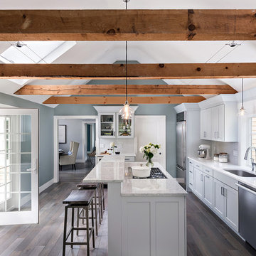
The layout of this colonial-style house lacked the open, coastal feel the homeowners wanted for their summer retreat. Siemasko + Verbridge worked with the homeowners to understand their goals and priorities: gourmet kitchen; open first floor with casual, connected lounging and entertaining spaces; an out-of-the-way area for laundry and a powder room; a home office; and overall, give the home a lighter and more “airy” feel. SV’s design team reprogrammed the first floor to successfully achieve these goals.
SV relocated the kitchen to what had been an underutilized family room and moved the dining room to the location of the existing kitchen. This shift allowed for better alignment with the existing living spaces and improved flow through the rooms. The existing powder room and laundry closet, which opened directly into the dining room, were moved and are now tucked in a lower traffic area that connects the garage entrance to the kitchen. A new entry closet and home office were incorporated into the front of the house to define a well-proportioned entry space with a view of the new kitchen.
By making use of the existing cathedral ceilings, adding windows in key locations, removing very few walls, and introducing a lighter color palette with contemporary materials, this summer cottage now exudes the light and airiness this home was meant to have.
© Dan Cutrona Photography
 S.J. Janis Company, Inc.
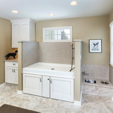
After the renovation, the dogs have their own personal bowls and a customized washing area for when they come in from outside. The standing height dog washing station includes a Sterling shower base and Delta wall mount hand shower for easy washing without back pain. Even better, the lower cabinet opens up exposing retractable stairs for the retrievers’ easy access to bathing. An Elkay under mount sink for fresh water and easy draining was complimented by a Kohler Purist Lavatory faucet. These dogs quite possibly are the only ones with their own under mount sink!
Plato Prelude cabinets provide plenty of cabinet space for dog food and other items. One golden retriever and four flat coated retrievers = a lot of food storage needs! To the left of the washing station is a food prep area and a medication storage location to keep everything organized.
Porcelain fired earth ceramics 18" field tile was installed for a durable floor. An LG Hi-Macs Volcanics Solid Surface material was used on the counter tops featuring built-in food bowls.
The dogs love the new amenities but the homeowners have a spectacular kitchen, improved dining/coffee experience, an efficient flow from the kitchen to the backyard, and functional designs to make their life easier.
Sponsored
Columbus, OH
Free consultation for landscape design!
Peabody Landscape Group
Franklin County's Reliable Landscape Design & Contracting
 Harrell Design + Build
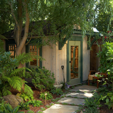
What our clients needed:
• Create a garden folly that doubles as a well-built shed for crafts and storage.
• Size the structure large enough for comfortable storage without dominating the garden.
• Discreetly locate the shed in the far corner of the rear yard while maintaining existing trees.
• Ensure that the structure is protected from the weather and carefully detailed to deter access of wildlife and rodents.
FUNCTION
• Construct the shed slab close to grade to permit easy access for bicycle storage, while building shed walls above grade to ensure against termites and dryrot.
• Install a French door and operable casement windows to admit plenty of daylight and provide views to the garden.
• Include rugged built-in work bench, shelves, bike racks and tool storage for a rustic well-organized and efficient space.
• Incorporate GFIC electrical service for safe access to power at this distant corner of the yard.
• Position energy-efficient interior lighting to ensure space can be used year-round.
• Switch control of exterior light from house and from shed for ease of command.
AESTHETICS
• Design and detail the shed to coordinate with the Arts and Crafts style house.
• Include an arbor for future flowering vines, further softening the shed’s garden presence.
• Simple and rustic interior surfaces ensure that the space is easy to clean.
• Create an aged and softly weathered appearance, and protect the exterior siding by finishing the cedar with a custom-colored semi-transparent stain.
INNOVATIVE MATERIALS AND CONSTRUCTION
• Factory-built components were pre-assembled to allow for a speedy assembly and for a shorter on-site construction schedule.
• Each component was easily transported through the yard without disturbing garden features.
• Decorative exterior trim frames the door and windows, while a simpler trim is used inside the unadorned shed.
OBSTACLE OVERCOME
• The structure is located in the corner of the yard to avoid disturbance of a curly willow tree.
• The low-profile structure is positioned close to property lines while staying beneath the allowable daylight plane for structures.
• To comply with daylight plane close to fence, the roof form combines hip and gable forms, with door located at gable end.
• The height of the modest interior is maximized, without exceeding the allowable building height.
CRAFTSMANSHIP
• The concrete slab was precisely formed and finished for ease of shed assembly before the factory-built components were delivered to site.
• Precision planning meant the pre-framed door fit exactly between raised concrete curb.
 Maraya Interior Design
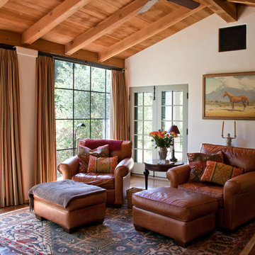
This old 1920's home is thought to be an original George Washington Smith home, has now been updated and extended by Architect Bob Easton of Santa Barbara.
Arched walls over stairs, plaster fireplaces, and very simple, comfortable design make for a very livable home for this family with multiple pets. Leather sofas for an easy feel, over antique hand knotted rugs and old world furniture show off this old Spanish home in the Ojai Valley. The Designers used periwinkle colored windows and doors to play off the black iron windows, and real Malibu tile with white marble tile surrounds around a blue granite kitchen island. The living room ceiling is completely original, and is the inspiration for the new exposed beam master suite ceilings. All the lighting is custom wrought iron fixtures, made especially for this home. A powder room features deep blue tiles and Malibu tile wainscot, the paintings are all of simple early California scenes which all make for an earthy, simple old time style, Project Location: Ojai, California. Project designed by Maraya Interior Design. From their beautiful resort town of Ojai, they serve clients in Montecito, Hope Ranch, Malibu, Westlake and Calabasas, across the tri-county areas of Santa Barbara, Ventura and Los Angeles, south to Hidden Hills- north through Solvang and more.
 Pineapple House Interior Design
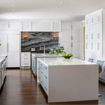
-In this kitchen renovation, new double islands & ceiling-high cabinetry quadruples the previous counter & storage space
-9’ island with seating includes three workstations
-Seating island offers under counter electronics charging ports & three shelves of storage per workstation in cabinets directly in front of stools
-Behind stools, lower cabinetry provides one drawer & two pull-out shelves per workstation
-7’ prep island services 48” paneled refrigerator & 48” gas range & includes 2nd sink, 2nd dishwasher & 2nd trash/recycling station
-Wine/beverage chiller located opposite island sink
-Both sink spigots are touch-less & are fed by whole-house water filtration system
-Independent non-leaching water faucet delivers purified, double-pass reverse osmosis drinking water
-Exhaust fan for gas range is hidden inside bridge of upper cabinets
-New built-in window seat in bay window increases seating for informal dining while reducing floor space needed for table and chairs
-New configuration allows unobstructed windows & French doors to flood space with natural light & enhances views into the back yard
-Gray-blue coloration of cabinet bases helps anchor the middle of the room and provides welcome contrast in scheme
 TKS Design Group
Free ebook, Creating the Ideal Kitchen. DOWNLOAD NOW
The Klimala’s and their three kids are no strangers to moving, this being their fifth house in the same town over the 20-year period they have lived there. “It must be the 7-year itch, because every seven years, we seem to find ourselves antsy for a new project or a new environment. I think part of it is being a designer, I see my own taste evolve and I want my environment to reflect that. Having easy access to wonderful tradesmen and a knowledge of the process makes it that much easier”.
This time, Klimala’s fell in love with a somewhat unlikely candidate. The 1950’s ranch turned cape cod was a bit of a mutt, but it’s location 5 minutes from their design studio and backing up to the high school where their kids can roll out of bed and walk to school, coupled with the charm of its location on a private road and lush landscaping made it an appealing choice for them.
“The bones of the house were really charming. It was typical 1,500 square foot ranch that at some point someone added a second floor to. Its sloped roofline and dormered bedrooms gave it some charm.” With the help of architect Maureen McHugh, Klimala’s gutted and reworked the layout to make the house work for them. An open concept kitchen and dining room allows for more frequent casual family dinners and dinner parties that linger. A dingy 3-season room off the back of the original house was insulated, given a vaulted ceiling with skylights and now opens up to the kitchen. This room now houses an 8’ raw edge white oak dining table and functions as an informal dining room. “One of the challenges with these mid-century homes is the 8’ ceilings. I had to have at least one room that had a higher ceiling so that’s how we did it” states Klimala.
The kitchen features a 10’ island which houses a 5’0” Galley Sink. The Galley features two faucets, and double tiered rail system to which accessories such as cutting boards and stainless steel bowls can be added for ease of cooking. Across from the large sink is an induction cooktop. “My two teen daughters and I enjoy cooking, and the Galley and induction cooktop make it so easy.” A wall of tall cabinets features a full size refrigerator, freezer, double oven and built in coffeemaker. The area on the opposite end of the kitchen features a pantry with mirrored glass doors and a beverage center below.
The rest of the first floor features an entry way, a living room with views to the front yard’s lush landscaping, a family room where the family hangs out to watch TV, a back entry from the garage with a laundry room and mudroom area, one of the home’s four bedrooms and a full bath. There is a double sided fireplace between the family room and living room. The home features pops of color from the living room’s peach grass cloth to purple painted wall in the family room. “I’m definitely a traditionalist at heart but because of the home’s Midcentury roots, I wanted to incorporate some of those elements into the furniture, lighting and accessories which also ended up being really fun. We are not formal people so I wanted a house that my kids would enjoy, have their friends over and feel comfortable.”
The second floor houses the master bedroom suite, two of the kids’ bedrooms and a back room nicknamed “the library” because it has turned into a quiet get away area where the girls can study or take a break from the rest of the family. The area was originally unfinished attic, and because the home was short on closet space, this Jack and Jill area off the girls’ bedrooms houses two large walk-in closets and a small sitting area with a makeup vanity. “The girls really wanted to keep the exposed brick of the fireplace that runs up the through the space, so that’s what we did, and I think they feel like they are in their own little loft space in the city when they are up there” says Klimala.
Designed by: Susan Klimala, CKD, CBD
Photography by: Carlos Vergara
For more information on kitchen and bath design ideas go to: www.kitchenstudio-ge.com

 Bercher Homes
Come and experience upscale townhome living at The Carlyle, a new development by Bercher Homes. Perfectly located near Kennestone Hospital, Downtown Marietta, and with easy highway access to all of Atlanta, The Carlyle offers the ideal blend of convenience and sophistication. Features You’ll Love include...Upgraded finishes that elevate every space, Premium appliances designed for modern living, and a prime location that keeps you connected. We provide a 1-year builder warranty and an 8-year structural warranty. The Community Association takes care of your yard maintenance allowing you extra time to explore Marietta.
 threshold interiors
Location: Brooklyn, NY, United States
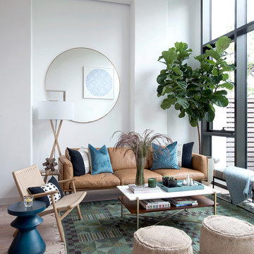
This brand-new townhouse at Pierhouse, Brooklyn was a gorgeous space, but was crying out for some personalization to reflect our clients vivid, sophisticated and lively design aesthetic. Bold Patterns and Colors were our friends in this fun and eclectic project. Our amazing clients collaborated with us to select the fabrics for the den's custom Roche Bobois Mah Jong sofa and we also customized a vintage swedish rug from Doris Leslie Blau. for the Living Room Our biggest challenge was to capture the space under the Staircase so that it would become usable for this family. We created cubby storage, a desk area, coat closet and oversized storage. We even managed to fit in a 12' ladder - not an easy feat!
Photographed by: James Salomon
 ZeroEnergy Design
This renovated brick rowhome in Boston’s South End offers a modern aesthetic within a historic structure, creative use of space, exceptional thermal comfort, a reduced carbon footprint, and a passive stream of income.
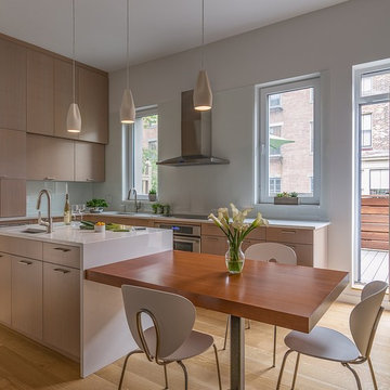
DESIGN PRIORITIES. The goals for the project were clear - design the primary unit to accommodate the family’s modern lifestyle, rework the layout to create a desirable rental unit, improve thermal comfort and introduce a modern aesthetic. We designed the street-level entry as a shared entrance for both the primary and rental unit. The family uses it as their everyday entrance - we planned for bike storage and an open mudroom with bench and shoe storage to facilitate the change from shoes to slippers or bare feet as they enter their home. On the main level, we expanded the kitchen into the dining room to create an eat-in space with generous counter space and storage, as well as a comfortable connection to the living space. The second floor serves as master suite for the couple - a bedroom with a walk-in-closet and ensuite bathroom, and an adjacent study, with refinished original pumpkin pine floors. The upper floor, aside from a guest bedroom, is the child's domain with interconnected spaces for sleeping, work and play. In the play space, which can be separated from the work space with new translucent sliding doors, we incorporated recreational features inspired by adventurous and competitive television shows, at their son’s request.
MODERN MEETS TRADITIONAL. We left the historic front facade of the building largely unchanged - the security bars were removed from the windows and the single pane windows were replaced with higher performing historic replicas. We designed the interior and rear facade with a vision of warm modernism, weaving in the notable period features. Each element was either restored or reinterpreted to blend with the modern aesthetic. The detailed ceiling in the living space, for example, has a new matte monochromatic finish, and the wood stairs are covered in a dark grey floor paint, whereas the mahogany doors were simply refinished. New wide plank wood flooring with a neutral finish, floor-to-ceiling casework, and bold splashes of color in wall paint and tile, and oversized high-performance windows (on the rear facade) round out the modern aesthetic.
RENTAL INCOME. The existing rowhome was zoned for a 2-family dwelling but included an undesirable, single-floor studio apartment at the garden level with low ceiling heights and questionable emergency egress. In order to increase the quality and quantity of space in the rental unit, we reimagined it as a two-floor, 1 or 2 bedroom, 2 bathroom apartment with a modern aesthetic, increased ceiling height on the lowest level and provided an in-unit washer/dryer. The apartment was listed with Jackie O'Connor Real Estate and rented immediately, providing the owners with a source of passive income.
ENCLOSURE WITH BENEFITS. The homeowners sought a minimal carbon footprint, enabled by their urban location and lifestyle decisions, paired with the benefits of a high-performance home. The extent of the renovation allowed us to implement a deep energy retrofit (DER) to address air tightness, insulation, and high-performance windows. The historic front facade is insulated from the interior, while the rear facade is insulated on the exterior. Together with these building enclosure improvements, we designed an HVAC system comprised of continuous fresh air ventilation, and an efficient, all-electric heating and cooling system to decouple the house from natural gas. This strategy provides optimal thermal comfort and indoor air quality, improved acoustic isolation from street noise and neighbors, as well as a further reduced carbon footprint. We also took measures to prepare the roof for future solar panels, for when the South End neighborhood’s aging electrical infrastructure is upgraded to allow them.
URBAN LIVING. The desirable neighborhood location allows the both the homeowners and tenant to walk, bike, and use public transportation to access the city, while each charging their respective plug-in electric cars behind the building to travel greater distances.
OVERALL. The understated rowhouse is now ready for another century of urban living, offering the owners comfort and convenience as they live life as an expression of their values.
Photography: Eric Roth Photo
1