
Search results for "Edition helps" in Home Design Ideas
 Housetrends Magazine
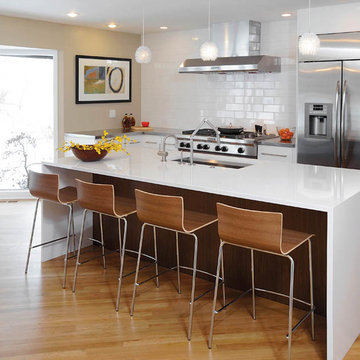
Since moving into her Dublin home two and a half years ago, Nancy Sanford has been peeling off the decades—quite literally. Built in the 1980s, the home was “very well-maintained, but very little had been done to it” in terms of updating the finishes or style, Sanford says. Plush white carpet ran from wall-to-wall-to-wall, almond-colored laminate coated the kitchen cabinets and wallpaper ran rampant—even covering some ceilings.
Despite her efforts, Sanford knew it was going to take more than cosmetic editing to shake the ‘80s and make the home her own. Although she lives in the traditional-leaning Muirfield community, Sanford adores a minimalist, contemporary style—and admits to devouring design magazines “ad nauseam.”
To implement her thoroughly modern vision, Sanford turned to Brigid Norton, an interior designer and family friend, and Kristi Youles, a kitchen designer with The JAE Company. Working together, the trio created a carefully considered contemporary design that’s easy on the eyes, and the body.
In addition to improving the flow of the kitchen—by removing a V-shaped peninsula that angled out into the room—and adding appliances like a stainless steel refrigerator, Sanford’s short list of must-haves included clean, uncluttered lines and no wall cabinets over the countertops. “I’ve found as I’ve aged, I’ve gotten shorter and just don’t use the upper cabinets,” Sanford explains.
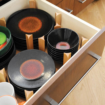
Easy-access, smooth-slide drawers with clean slab fronts were the answer—resulting in strong visual lines, an open, airy feel and enhanced ergonomics. Starting with a “needs assessment,” Youles and Norton designed the space quite literally around Nancy. By looking at factors such as her height and which items she uses most frequently, they were able to determine the optimum placement for everything from canned goods in the pantry to cutlery, pans and plates in the customized drawers, all of which helped to achieve the ultimate kitchen organization.
But there’s more to the kitchen cabinets smooth façade than clean-lined storage. Walnut drawer fronts—found on the oven and the base of the island—are book-matched, allowing the grain to continue from drawer to drawer. And even in spaces where drawers weren’t feasible, beneath the sink and in a desk area, the designers continued the look with cabinet doors crafted to resemble drawers.
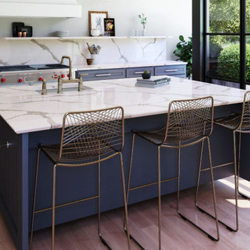
The visual continuity of these lines might not be as impactful if it weren’t for the careful selection of contrasting finishes. The designers filled the space with pure, glossy white—using a specific type of quartz, White Cliff by Cambria, to accent the bold rectangular design of the island. Then, to break up the expanse of accompanying white painted drawers, walnut was selected to bring the contrasting warmth and grain of wood without red undertones. It is commonly found in modern furniture design, as well as current productions of mid-century designs like the iconic Eames Lounge Chair from Herman Miller, Youles says.
 Tracy Berman Interiors
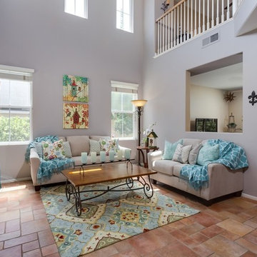
Adding pops of color to enlarge a living room. Using the same color blue throughout the rooms helps enlarge the space and tie the rooms together.
SandKasl Imaging
 L.A. Custom Grill Islands
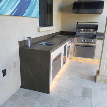
Outdoor BBQ island with unique counter top outlets.
Patio kitchen - large modern backyard patio kitchen idea in Orange County
Patio kitchen - large modern backyard patio kitchen idea in Orange County
Find the right local pro for your project
 Nanette Wong
Photo: Nanette Wong © 2014 Houzz
Example of an eclectic home design design in San Francisco
Example of an eclectic home design design in San Francisco
 Housetrends Magazine
Since moving into her Dublin home two and a half years ago, Nancy Sanford has been peeling off the decades—quite literally. Built in the 1980s, the home was “very well-maintained, but very little had been done to it” in terms of updating the finishes or style, Sanford says. Plush white carpet ran from wall-to-wall-to-wall, almond-colored laminate coated the kitchen cabinets and wallpaper ran rampant—even covering some ceilings.
Despite her efforts, Sanford knew it was going to take more than cosmetic editing to shake the ‘80s and make the home her own. Although she lives in the traditional-leaning Muirfield community, Sanford adores a minimalist, contemporary style—and admits to devouring design magazines “ad nauseam.”
To implement her thoroughly modern vision, Sanford turned to Brigid Norton, an interior designer and family friend, and Kristi Youles, a kitchen designer with The JAE Company. Working together, the trio created a carefully considered contemporary design that’s easy on the eyes, and the body.
In addition to improving the flow of the kitchen—by removing a V-shaped peninsula that angled out into the room—and adding appliances like a stainless steel refrigerator, Sanford’s short list of must-haves included clean, uncluttered lines and no wall cabinets over the countertops. “I’ve found as I’ve aged, I’ve gotten shorter and just don’t use the upper cabinets,” Sanford explains.
Easy-access, smooth-slide drawers with clean slab fronts were the answer—resulting in strong visual lines, an open, airy feel and enhanced ergonomics. Starting with a “needs assessment,” Youles and Norton designed the space quite literally around Nancy. By looking at factors such as her height and which items she uses most frequently, they were able to determine the optimum placement for everything from canned goods in the pantry to cutlery, pans and plates in the customized drawers, all of which helped to achieve the ultimate kitchen organization.
But there’s more to the kitchen cabinets smooth façade than clean-lined storage. Walnut drawer fronts—found on the oven and the base of the island—are book-matched, allowing the grain to continue from drawer to drawer. And even in spaces where drawers weren’t feasible, beneath the sink and in a desk area, the designers continued the look with cabinet doors crafted to resemble drawers.
The visual continuity of these lines might not be as impactful if it weren’t for the careful selection of contrasting finishes. The designers filled the space with pure, glossy white—using a specific type of quartz, White Cliff by Cambria, to accent the bold rectangular design of the island. Then, to break up the expanse of accompanying white painted drawers, walnut was selected to bring the contrasting warmth and grain of wood without red undertones. It is commonly found in modern furniture design, as well as current productions of mid-century designs like the iconic Eames Lounge Chair from Herman Miller, Youles says.
 PJ Sullivan Exteriors
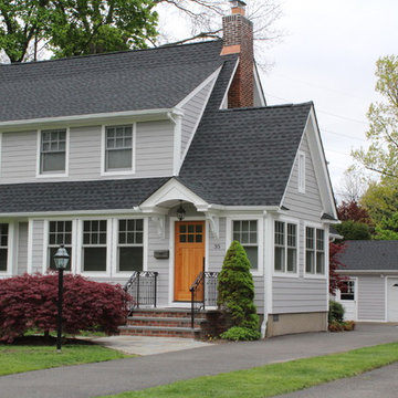
This beautiful traditional home had an incredible face-lift including: James Hardie siding, a new front door, updated garage, and more! Considering a home exterior renovation? Give us a call!
 LaRue Architects
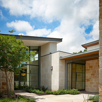
This charming hill country contemporary is perched perfectly beneath huge pecan trees overlooking Lake Austin. With its soft and inviting materials palette, this home raises the bar in Caslano.
Published:
Austin-San Antonio Urban Home, April/May 2016
Western Art & Architecture, June/July 2015 (Cover)
Luxe interiors + design, Austin + Hill Country, Dallas + Fort Worth, & Houston Editions, Winter 2015
Leading Design Professionals - The Luxury of Home: Annual 2015
Photo Credit: Dror Baldinger

Sponsored
Delaware, OH

Buckeye Basements, Inc.
Central Ohio's Basement Finishing ExpertsBest Of Houzz '13-'21

 Housetrends Magazine
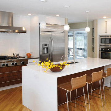
Since moving into her Dublin home two and a half years ago, Nancy Sanford has been peeling off the decades—quite literally. Built in the 1980s, the home was “very well-maintained, but very little had been done to it” in terms of updating the finishes or style, Sanford says. Plush white carpet ran from wall-to-wall-to-wall, almond-colored laminate coated the kitchen cabinets and wallpaper ran rampant—even covering some ceilings.
Despite her efforts, Sanford knew it was going to take more than cosmetic editing to shake the ‘80s and make the home her own. Although she lives in the traditional-leaning Muirfield community, Sanford adores a minimalist, contemporary style—and admits to devouring design magazines “ad nauseam.”
To implement her thoroughly modern vision, Sanford turned to Brigid Norton, an interior designer and family friend, and Kristi Youles, a kitchen designer with The JAE Company. Working together, the trio created a carefully considered contemporary design that’s easy on the eyes, and the body.
In addition to improving the flow of the kitchen—by removing a V-shaped peninsula that angled out into the room—and adding appliances like a stainless steel refrigerator, Sanford’s short list of must-haves included clean, uncluttered lines and no wall cabinets over the countertops. “I’ve found as I’ve aged, I’ve gotten shorter and just don’t use the upper cabinets,” Sanford explains.
Easy-access, smooth-slide drawers with clean slab fronts were the answer—resulting in strong visual lines, an open, airy feel and enhanced ergonomics. Starting with a “needs assessment,” Youles and Norton designed the space quite literally around Nancy. By looking at factors such as her height and which items she uses most frequently, they were able to determine the optimum placement for everything from canned goods in the pantry to cutlery, pans and plates in the customized drawers, all of which helped to achieve the ultimate kitchen organization.
But there’s more to the kitchen cabinets smooth façade than clean-lined storage. Walnut drawer fronts—found on the oven and the base of the island—are book-matched, allowing the grain to continue from drawer to drawer. And even in spaces where drawers weren’t feasible, beneath the sink and in a desk area, the designers continued the look with cabinet doors crafted to resemble drawers.
The visual continuity of these lines might not be as impactful if it weren’t for the careful selection of contrasting finishes. The designers filled the space with pure, glossy white—using a specific type of quartz, White Cliff by Cambria, to accent the bold rectangular design of the island. Then, to break up the expanse of accompanying white painted drawers, walnut was selected to bring the contrasting warmth and grain of wood without red undertones. It is commonly found in modern furniture design, as well as current productions of mid-century designs like the iconic Eames Lounge Chair from Herman Miller, Youles says.

 Aerial Videos and Photographers in Miami
If you're thinking of selling or renting your Miami house, hiring a home photographer can make a big difference between making money and just breaking even. Think about when you look at photos of homes online: If the lighting is terrible, the quality is poor and the listing provides very few photos, don't you subconsciously associate these bad qualities with the homeowner or renter?
A home photographer helps with those challenges.
- We specialize in Real Estate, architectural and commercial photography.
- Our pictures are meticulously made by a professional photographer.
- All the pictures are then professionally processed and edited to assure an stunning finish.
- For real estate agents we have created a professional looking Virtual Tour format.
- 24-48 hours turnaround time in most of the orders.
- Also features a property map display, school locator and property flayer printing option.
- Send Virtual Tour and flayer via email to all your prospect buyers.
- Download all the pictures to your computer.
- Upgrade your virtual tour with 360 panoramas, voice narration, and night photography.
- 48 hours turn around time for Commercial and Hotel-magazine style photography.
 Tracy Berman Interiors
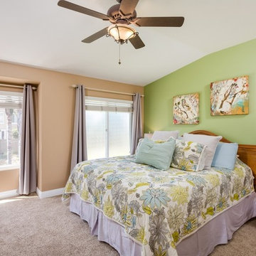
Adding pops of color to enlarge a bedroom. Using the same color blue throughout the rooms helps enlarge the space and tie the rooms together.
SandKasl Imaging
 SHELLEY RODNER DESIGN / DDI
DESIGN CHALLENGES ADDRESSED:
To anyone who may be reading this project overview, I do hope you'll have the opportunity to
have a look at the 'before' photo of this space. It's quite a transformation!
Our homeowners purchased their condo at the beach several years ago. As shown in the 'before'
photo, at the time, their family room was a dark and dated space with unsightly paneled walls,
heavy faux ceiling beams and odds and ends for furniture. Everything felt cramped and cluttered
throughout the condo, especially their family room. The client's vision was for an airy and
relaxed coastal vibe for their 'place at the beach'.
DESIGN SOLUTIONS PROVIDED:
The entire condo was taken down to stud. The faux beams were edited out and the ceiling raised.
The heavy out-dated paneling was removed and replaced with fresh clean walls that were painted
in a calming creamy sand tone throughout the entire condo.
The existing dark and gloomy furniture was replaced with stylish updated pieces. Great thought
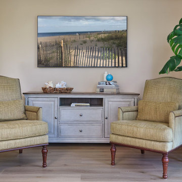
was given to the size, scale and textiles used. The sofa and loveseat, done in a softly textured
herring boned pattern, was the perfect choice. It's cremey toned easy care fabric created a 'pet
friendly' environment for the clients. The homeowners have two dogs and a cat who love a visit
to the beach as much as their 'humans'.
Worn out window treatments were replaced with fresh custom draperies in a playful botanical
print featuring tones of kiwi, leaf green and cerulean blue. A special 'solar friendly' lining was
used to tame the harmful rays of direct sun.
A variety of special curated accents were added to the room. The richly textured rug, round
coffee table with an organic feel, comfy pillows and a few special art pieces all helped to
complete this space.
The overall effect of the renovation was quite dramatic and the clients were thrilled with the
results. This family room went from being dark and dated to light and airy and is now a space
that is inviting and relaxing which perfectly suits the homeowner's coastal lifestyle.
RETAIL PROJECT PRICE: $ 9,000.00
Retail price is defined as the total sale you submitted on your sales repor
 First Lamp
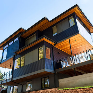
Modern home in the Capitol Hill Neighborhood of Seattle Washington. Designed by First Lamp Architects.
First Lamp Architects Builders
John Granen Photography

Sponsored
Sunbury, OH

J.Holderby - Renovations
Franklin County's Leading General Contractors - 2X Best of Houzz!
 Carolina V. Gentry, RID
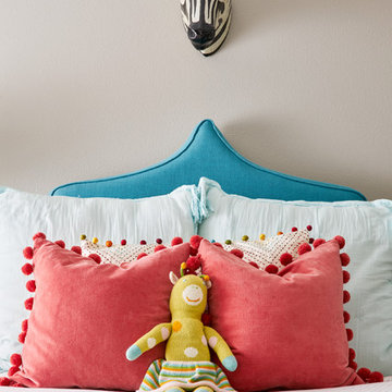
Highly edited and livable, this Dallas mid-century residence is both bright and airy. The layered neutrals are brightened with carefully placed pops of color, creating a simultaneously welcoming and relaxing space. The home is a perfect spot for both entertaining large groups and enjoying family time -- exactly what the clients were looking for.
 SHELLEY RODNER DESIGN / DDI
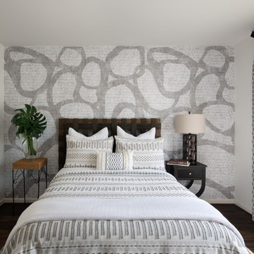
Careful edits and updates were needed in our client's guest bedroom. Their current metal sleigh bed was far too bulky and heavy visually in addition to taking up too much precious space in this tiny bedroom. The room felt cluttered with far too much furniture, cold and downright unwelcoming.
For balance, the bed was relocated to the opposite wall. A bold Nikki Chu wallcovering with a playful abstract design was then added to create a focal point and interest. To free up space and to add balance to this room, a 'headboard only' design (minus the footboard) was selected. The headboard's teak and jute elements paired well with this new backdrop to add great texture and interest to the room. Less furniture, visually exciting feature wall and crisp draperies in a free form pattern helped to complete the look.
 Turbo Beds
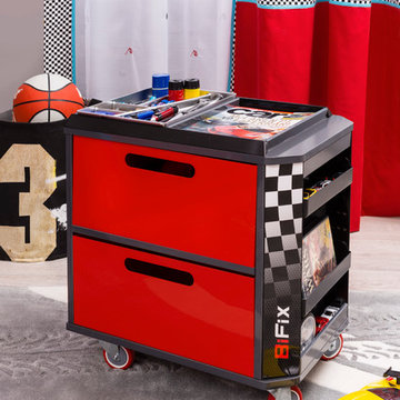
This toy storage chest is part of the “Champion GTI Racer” edition of Turbo Beds.
Portable storage chest will help win the race to be organized!!!
• Revved up red wheels ensure smooth mobility
• Five (5) section lift-out tray organizes writing tools, art supplies & accessories
• Magazine compartment displays personal favorites
• Deep drawers open easily with hand-grip pulls
• Section side panel displays matchbox cars, books & toys
• Decal of black & white checkered flag spotlights front edge
• 5 – year warranty
 Making Spaces Work
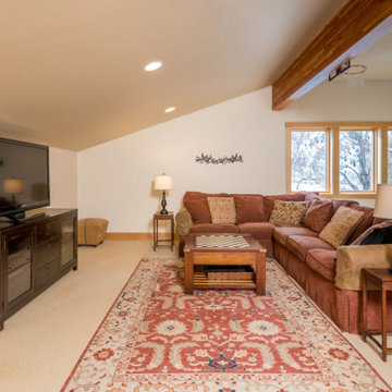
Staging this 4-bedroom house, for sale came with some challenges. Walls and ceilings painted the same color were making the house feel dark and were not showcasing the architectural features of the house. I found a new appreciation for Navajo White and Alabaster White on this project. The initial plan was to paint a few key rooms, but as the project unfolded, it was clear the new paint was making the rest of the 18-year-old house show its age. The new wall and ceiling colors helped show off the natural wood trim and frame the beautiful exterior views. Queue the elk and cross-country skiers on the snow-covered bike path.
The next challenge was furniture. A mixed variety of furniture styles were a distraction to the eye. This drew focus away from highlighting the house’s large spaces. We edited out all of the distracting and mismatched pieces then decided to stage with empty bedrooms rather than spend money on bedding and accessories.
Next, space planning. During the initial build of the home a 900-foot bonus room was created over the 3-car garage. It was a huge multipurpose space that was underutilized for day to day living. The family room furniture was moved out of a cozy first floor guest bedroom and into the bonus space. The new family room now had purpose and allowed the first-floor guest room to be staged as a 4th bedroom.
Finally, lighting and art. Dining, kitchen and living area lighting was updated from traditional craftsman fixtures to more current fixtures with a mix of bronze and clear glass. Eddison, filament style bulbs made the fixtures interesting and added warmth. Several track lights were replaced with can lights including the one highlighting new art over the fireplace. Simple things like changing outlets, switches and covers cleaned up the walls. Carpet stretching and cleaning brought a fresh clean look to the carpeted areas while cleaning and buffing the wood and concrete floors brought back their original shine.
Sponsored
Sunbury, OH
J.Holderby - Renovations
Franklin County's Leading General Contractors - 2X Best of Houzz!
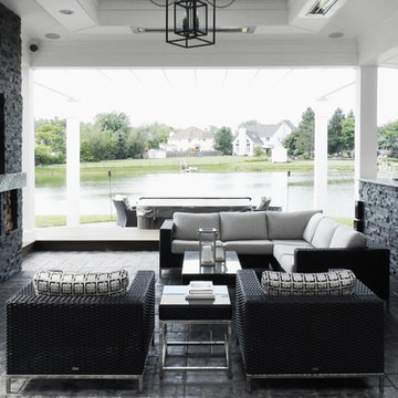
 smartDESIGN Architecture, PLLC
Photo Credit: Tyler Wolcott
Trendy backyard concrete patio photo in New York with a gazebo and a fire pit
Trendy backyard concrete patio photo in New York with a gazebo and a fire pit
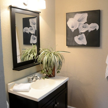
 Staging Beautifully
This was a project where we worked together with the client and helped them remove/edit their belongings and then came alongside and added artwork, bedding and all accessories. This approach saves the client money because we are not having to rent furniture. They were able to leave all the basic furniture pieces and then we added the rest for a fresh and finished look.
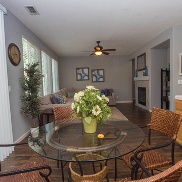 Staging Beautifully
This terrific family just needed a little help editing their home. Once that was done we brought in new artwork and a bunch of coordinated accessories and there you have it, a home ready for the market!
12