
Search results for "Effective straight" in Home Design Ideas
 Century Stair Company
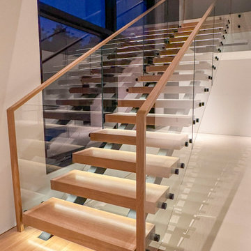
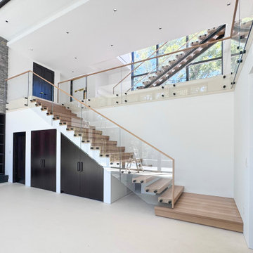
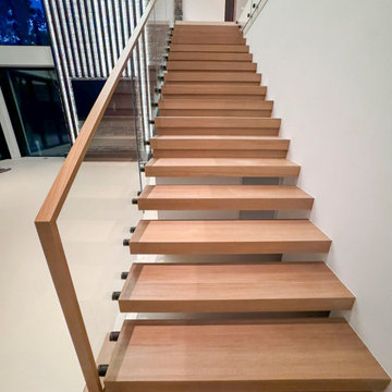
This contemporary home features two striking staircases with integrated LED lighting, glass railing, and thick wood treads. The color-changing LEDs shift from red to blue to yellow, transforming the staircases into dynamic focal points throughout the day. Wood treads and handrails are paired with frameless glass balustrades secured by black pins. Open risers amplify the LED lighting effect while maximizing transparency.
The first-level staircase uses cantilevered and field-supported construction, while the second rises on dual metal stringers. Glass railing continues on the second-floor balcony, creating a cohesive system where light and glass elevate the design beyond the purely functional.
1976-2026 © Century Stair Company
 Anderson Tuftex
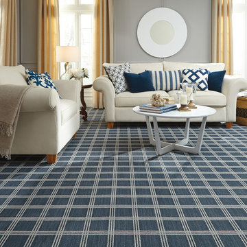
Madera is a beautiful new addition to our popular Naturals Collection. This block pattern blends clean, straight lines with the influence of natural, handcrafted materials. Inspired by sustainable, green design, Madera has subtle yarn striations that exhibit organic variations in color and add a rustic, distressed aesthetic to any room. Constructed of STAINMASTER® Luxerell® nylon fiber and part of the Active Family™ brand, this patterned loop is offered in eighteen dramatic colors that have been custom blended to create a beautiful visual effect. Perfect for wall-to-wall installations, staircases, and area rugs, Madera is sure to make a statement on the floor.
 Century Stair Company
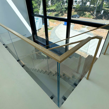
This contemporary home features two striking staircases with integrated LED lighting, glass railing, and thick wood treads. The color-changing LEDs shift from red to blue to yellow, transforming the staircases into dynamic focal points throughout the day. Wood treads and handrails are paired with frameless glass balustrades secured by black pins. Open risers amplify the LED lighting effect while maximizing transparency.
The first-level staircase uses cantilevered and field-supported construction, while the second rises on dual metal stringers. Glass railing continues on the second-floor balcony, creating a cohesive system where light and glass elevate the design beyond the purely functional.
1976-2026 © Century Stair Company
Find the right local pro for your project
 UBrothers Construction
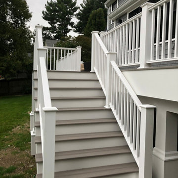
 Authenticity of cedar shingles with the strength of James Hardie. Better than the real thing, it resists rotting, curling, warping and splitting. Used to highlight and accent gable or top half of you house, but really has no limits. Fit every house, not only Cape Cods or cottage styles home. And this project is a nice illustration of this. New James Hardie Straight Edge Shingles and PVC trim work, combined with black new construction Pella windows delivere "WOW" effect. New huge deck with PVC Azek decking is a great addition to this.
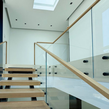 Century Stair Company
This contemporary home features two striking staircases with integrated LED lighting, glass railing, and thick wood treads. The color-changing LEDs shift from red to blue to yellow, transforming the staircases into dynamic focal points throughout the day. Wood treads and handrails are paired with frameless glass balustrades secured by black pins. Open risers amplify the LED lighting effect while maximizing transparency.
The first-level staircase uses cantilevered and field-supported construction, while the second rises on dual metal stringers. Glass railing continues on the second-floor balcony, creating a cohesive system where light and glass elevate the design beyond the purely functional.
1976-2026 © Century Stair Company
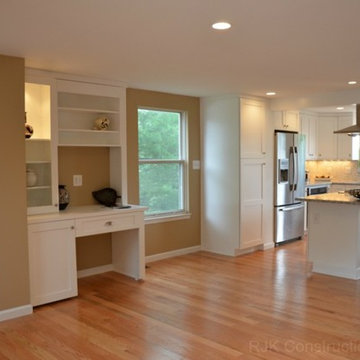
 Skill Construction & Design, LLC
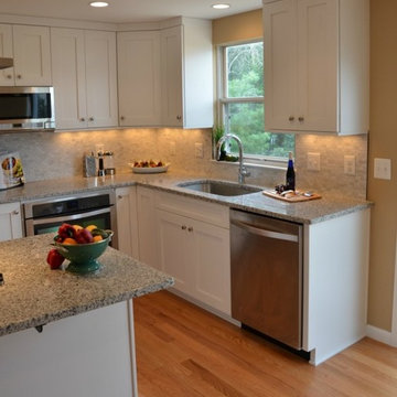
There are so many design elements to this kitchen, I almost don’t know where to start. Bright and airy with crisp clean white cabinets, the kitchen is open and welcoming. Still crisp but gently contrasting, the stainless steel appliance add depth amid the white. To keep this kitchen warm, natural oak covers the floors and a toasted wheat color washes the walls. And then there is the architectural elements. You know. That post and beam in the middle of the room. It’s the center of attention.
When you walk into a room your eyes roam around, establishing the size and shape of the room as your feet take you forward. From the front door of this home straight ahead you encountered this wall. The dining area to the right gives you a glimpse of things to come. Where there is a dining room you will usually find a kitchen.
The architecture of years gone by consistently hides the kitchen, the heart of the home, behind walls. I sympathize with my Mom, and all the other Moms, who have had to spend so much time tucked into a tight kitchen, away from the family. This wall had to go, but it was structural. We needed its support but not its bulk.
So we got rid of the bulk and only the bulk. Instead of a wall we have a post and beam, offering all of the structure we need. We could have installed a huge steel beam and reconfigure the joists to upset the beam, but why? The small beam and post add an incredible architectural element. It’s turning lemons into lemon, we simply made the most of what we had. It may be functional but it’s so fantastic. It looks like we created the effect just for the drama.
The original kitchen may have had a working triangle and some counter space, but it was fairly small, with each area only a step or two away. The dark cabinets made the space feel even smaller and the butcher block patterned laminate counter tops were very dated. The appliances were feeling their age as well, from a coil burner electric stove to a top freezer refrigerator. To keep this kitchen within its space, a half wall separated it from the dining area.
With the wall gone we borrowed some space from the living room and extended what was a U shaped kitchen into an L. At the living room window we start our new kitchen. We kept a small part of the wall to support the other end of our decorative beam. Sandwiched between a large pantry and our new French door refrigerator, the wall disappears. With our new open floor plan a sizable island was in order.
We split our cooking areas and installed a continuous grill gas cooktop into the island. A sleek island hood takes care of exhaust and adds an extra element to our architectural feature. Under the cooktop we added over-sized drawers for pots and pan storage. The frameless cabinets from New River Cabinetry are maple, painted white, with the Herndon door style. With the cooktop safely nestled into our island, we still had to add an oven.
We used the space where the old range sat for a large single oven of stainless steel and glass. If it worked for one, why not two? We created a home for a microwave in the wall cabinets. It’s perfect for heating leftovers so close to the refrigerator.
An important consideration for hot spots in your kitchen is landing zones. Each of our cooking areas have generous landing zones, one on each side of the cooktop and an entire counter area above or below the ovens, depending on which one you’re using.
We wanted to give the sink area more room so the half wall had to come out. We moved the trash and recycle cans into a cabinet, removed the heavy soffits and kept the sink under the window.
With that little bit of extra space we were able to add a larger cabinet above the dishwasher and slide it all down. This used to be where the carpeting met the vinyl floor, but all of it is gone. Long oak planks eliminate that final divide between the kitchen and the dining area, while adding visual length to the area. White wall cabinets on each side of the window reflect the sunlight for a brighter view.
With all of the darker cabinetry the backsplash walls had been painted white. Even still, there was a darkness in the corners and it wasn’t very exciting. We wanted to add visual interest and reflect the new under-cabinet lighting, eliminating the shadows in this corner.
With 1″x 2″ Arabescato Honed marble mosaics and those under-cabinet lights, we achieved the perfect balance. The marble has subtle swirls in gray and beige on a clean white background, but with the honed finish the light is softly reflected instead of glaring. For granite, we chose the soft gray tones of Luna Pearl. The speckles of gray and beige are a gentle contrast to the white cabinets and emulate the color of the stainless steel.
Between the carpet, red half wall, dark railing and dated light fixture, the dining area felt tired. Since the kitchen lacked sufficient storage, a large utility cabinet crowded the table space without adding any decorate elements.
Although it didn’t get any bigger, our dining area feels fresher and more open too. With the oak flooring joining the area to the rest of our space and the toasted wheat on the walls, the white table and chairs compliment the cabinetry while contrasting the warmer colors. We replaced the chandelier with recessed lighting and changed that railing too.
With our new open floor plan, we ended up with a fairly open area in between our foyer closet and the living room window. Not one to miss an opportunity, we filled the space with a multi-functional work space.
With the sunlight streaming in this bright corner works for anything this family needs.
There’s plenty of space for a chair under this large desk drawer. A closed cabinet below, glass doors above and lots of open shelving let you store and or showcase your belongings. We added a lite area at the top to keep away the darker corners.
The transformation is complete. This kitchen and all of its features are truly the center of attention in this home.
http://www.designsbyskill.com/
http://www.rjkconstructioninc.com/
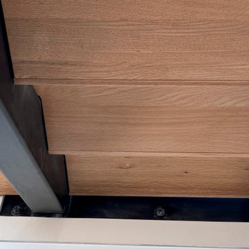 Century Stair Company
This contemporary home features two striking staircases with integrated LED lighting, glass railing, and thick wood treads. The color-changing LEDs shift from red to blue to yellow, transforming the staircases into dynamic focal points throughout the day. Wood treads and handrails are paired with frameless glass balustrades secured by black pins. Open risers amplify the LED lighting effect while maximizing transparency.
The first-level staircase uses cantilevered and field-supported construction, while the second rises on dual metal stringers. Glass railing continues on the second-floor balcony, creating a cohesive system where light and glass elevate the design beyond the purely functional.
1976-2026 © Century Stair Company

Sponsored
Sunbury, OH

J.Holderby - Renovations
Franklin County's Leading General Contractors - 2X Best of Houzz!
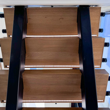 Century Stair Company
This contemporary home features two striking staircases with integrated LED lighting, glass railing, and thick wood treads. The color-changing LEDs shift from red to blue to yellow, transforming the staircases into dynamic focal points throughout the day. Wood treads and handrails are paired with frameless glass balustrades secured by black pins. Open risers amplify the LED lighting effect while maximizing transparency.
The first-level staircase uses cantilevered and field-supported construction, while the second rises on dual metal stringers. Glass railing continues on the second-floor balcony, creating a cohesive system where light and glass elevate the design beyond the purely functional.
1976-2026 © Century Stair Company
 Century Stair Company
This contemporary home features two striking staircases with integrated LED lighting, glass railing, and thick wood treads. The color-changing LEDs shift from red to blue to yellow, transforming the staircases into dynamic focal points throughout the day. Wood treads and handrails are paired with frameless glass balustrades secured by black pins. Open risers amplify the LED lighting effect while maximizing transparency.
The first-level staircase uses cantilevered and field-supported construction, while the second rises on dual metal stringers. Glass railing continues on the second-floor balcony, creating a cohesive system where light and glass elevate the design beyond the purely functional.
1976-2026 © Century Stair Company
 Century Stair Company
This contemporary home features two striking staircases with integrated LED lighting, glass railing, and thick wood treads. The color-changing LEDs shift from red to blue to yellow, transforming the staircases into dynamic focal points throughout the day. Wood treads and handrails are paired with frameless glass balustrades secured by black pins. Open risers amplify the LED lighting effect while maximizing transparency.
The first-level staircase uses cantilevered and field-supported construction, while the second rises on dual metal stringers. Glass railing continues on the second-floor balcony, creating a cohesive system where light and glass elevate the design beyond the purely functional.
1976-2026 © Century Stair Company
 Century Stair Company
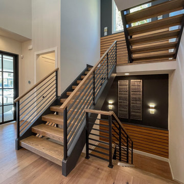
Twin solid black-painted stringers support thick oak treads in this contemporary Maryland home, creating a bold floating effect enhanced by the open risers. A horizontal blade railing system maintains the clean, modern aesthetic, topped with a wood handrail that matches the oak treads and landings. Metal posts anchor the structure at key points. Every element was carefully chosen to complement the home's unique lighting, wall colors, and trim. Together, the metal and wood create a beautifully bold architectural statement while seamlessly integrating into the home.
1976-2026 © Century Stair Company
 Skill Construction & Design, LLC
There are so many design elements to this kitchen, I almost don’t know where to start. Bright and airy with crisp clean white cabinets, the kitchen is open and welcoming. Still crisp but gently contrasting, the stainless steel appliance add depth amid the white. To keep this kitchen warm, natural oak covers the floors and a toasted wheat color washes the walls. And then there is the architectural elements. You know. That post and beam in the middle of the room. It’s the center of attention.
When you walk into a room your eyes roam around, establishing the size and shape of the room as your feet take you forward. From the front door of this home straight ahead you encountered this wall. The dining area to the right gives you a glimpse of things to come. Where there is a dining room you will usually find a kitchen.
The architecture of years gone by consistently hides the kitchen, the heart of the home, behind walls. I sympathize with my Mom, and all the other Moms, who have had to spend so much time tucked into a tight kitchen, away from the family. This wall had to go, but it was structural. We needed its support but not its bulk.
So we got rid of the bulk and only the bulk. Instead of a wall we have a post and beam, offering all of the structure we need. We could have installed a huge steel beam and reconfigure the joists to upset the beam, but why? The small beam and post add an incredible architectural element. It’s turning lemons into lemon, we simply made the most of what we had. It may be functional but it’s so fantastic. It looks like we created the effect just for the drama.
The original kitchen may have had a working triangle and some counter space, but it was fairly small, with each area only a step or two away. The dark cabinets made the space feel even smaller and the butcher block patterned laminate counter tops were very dated. The appliances were feeling their age as well, from a coil burner electric stove to a top freezer refrigerator. To keep this kitchen within its space, a half wall separated it from the dining area.
With the wall gone we borrowed some space from the living room and extended what was a U shaped kitchen into an L. At the living room window we start our new kitchen. We kept a small part of the wall to support the other end of our decorative beam. Sandwiched between a large pantry and our new French door refrigerator, the wall disappears. With our new open floor plan a sizable island was in order.
We split our cooking areas and installed a continuous grill gas cooktop into the island. A sleek island hood takes care of exhaust and adds an extra element to our architectural feature. Under the cooktop we added over-sized drawers for pots and pan storage. The frameless cabinets from New River Cabinetry are maple, painted white, with the Herndon door style. With the cooktop safely nestled into our island, we still had to add an oven.
We used the space where the old range sat for a large single oven of stainless steel and glass. If it worked for one, why not two? We created a home for a microwave in the wall cabinets. It’s perfect for heating leftovers so close to the refrigerator.
An important consideration for hot spots in your kitchen is landing zones. Each of our cooking areas have generous landing zones, one on each side of the cooktop and an entire counter area above or below the ovens, depending on which one you’re using.
We wanted to give the sink area more room so the half wall had to come out. We moved the trash and recycle cans into a cabinet, removed the heavy soffits and kept the sink under the window.
With that little bit of extra space we were able to add a larger cabinet above the dishwasher and slide it all down. This used to be where the carpeting met the vinyl floor, but all of it is gone. Long oak planks eliminate that final divide between the kitchen and the dining area, while adding visual length to the area. White wall cabinets on each side of the window reflect the sunlight for a brighter view.
With all of the darker cabinetry the backsplash walls had been painted white. Even still, there was a darkness in the corners and it wasn’t very exciting. We wanted to add visual interest and reflect the new under-cabinet lighting, eliminating the shadows in this corner.
With 1″x 2″ Arabescato Honed marble mosaics and those under-cabinet lights, we achieved the perfect balance. The marble has subtle swirls in gray and beige on a clean white background, but with the honed finish the light is softly reflected instead of glaring. For granite, we chose the soft gray tones of Luna Pearl. The speckles of gray and beige are a gentle contrast to the white cabinets and emulate the color of the stainless steel.
Between the carpet, red half wall, dark railing and dated light fixture, the dining area felt tired. Since the kitchen lacked sufficient storage, a large utility cabinet crowded the table space without adding any decorate elements.
Although it didn’t get any bigger, our dining area feels fresher and more open too. With the oak flooring joining the area to the rest of our space and the toasted wheat on the walls, the white table and chairs compliment the cabinetry while contrasting the warmer colors. We replaced the chandelier with recessed lighting and changed that railing too.
With our new open floor plan, we ended up with a fairly open area in between our foyer closet and the living room window. Not one to miss an opportunity, we filled the space with a multi-functional work space.
With the sunlight streaming in this bright corner works for anything this family needs.
There’s plenty of space for a chair under this large desk drawer. A closed cabinet below, glass doors above and lots of open shelving let you store and or showcase your belongings. We added a lite area at the top to keep away the darker corners.
The transformation is complete. This kitchen and all of its features are truly the center of attention in this home.
http://www.designsbyskill.com/
http://www.rjkconstructioninc.com/
 Studio Good Architects
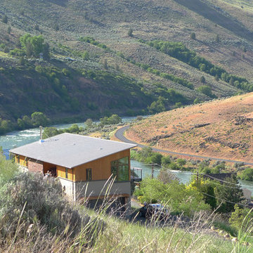
This residential retreat on the Deschutes River near Maupin, Oregon is uniquely designed around a large central deck overlooking the river. Used for relaxation and entertainment, the deck is partially covered to function as an outdoor room. A large barn door can close off the deck for additional privacy, protection from the westerly winds and security. The deck space also separates the master suite from the great room for an enhanced sense of privacy and intimacy.
By keeping square footage at a minimum and construction straight forward, the simple, cost-effective design met the client's tight budget constraints without compromising features. The shed roof design increases the sense of height of the interior space on the upper level, opening up dramatic easterly views toward the river and hills beyond. The great room combines the kitchen, dining and living room into an open, flexible floor plan. Two guest rooms, a guest bathroom, utility room, mud room and garage efficiently occupy the lower level of the structure.
Located in the high-desert east of the Cascade Mountains, an area prone to range fires, this home is extremely fire-resistant. Features include a fireproof metal roof, concrete pavers instead of wood on the deck and fiber cement siding along the lower level.


 Century Stair Company
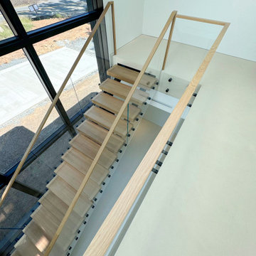
This contemporary home features two striking staircases with integrated LED lighting, glass railing, and thick wood treads. The color-changing LEDs shift from red to blue to yellow, transforming the staircases into dynamic focal points throughout the day. Wood treads and handrails are paired with frameless glass balustrades secured by black pins. Open risers amplify the LED lighting effect while maximizing transparency.
The first-level staircase uses cantilevered and field-supported construction, while the second rises on dual metal stringers. Glass railing continues on the second-floor balcony, creating a cohesive system where light and glass elevate the design beyond the purely functional.
1976-2026 © Century Stair Company
 UBrothers Construction
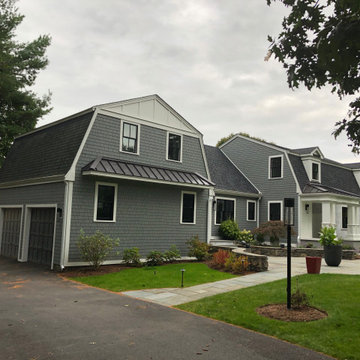
 Authenticity of cedar shingles with the strength of James Hardie. Better than the real thing, it resists rotting, curling, warping and splitting. Used to highlight and accent gable or top half of you house, but really has no limits. Fit every house, not only Cape Cods or cottage styles home. And this project is a nice illustration of this. New James Hardie Straight Edge Shingles and PVC trim work, combined with black new construction Pella windows delivere "WOW" effect. New huge deck with PVC Azek decking is a great addition to this.
 Century Stair Company
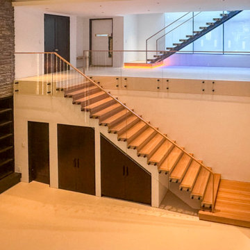
This contemporary home features two striking staircases with integrated LED lighting, glass railing, and thick wood treads. The color-changing LEDs shift from red to blue to yellow, transforming the staircases into dynamic focal points throughout the day. Wood treads and handrails are paired with frameless glass balustrades secured by black pins. Open risers amplify the LED lighting effect while maximizing transparency.
The first-level staircase uses cantilevered and field-supported construction, while the second rises on dual metal stringers. Glass railing continues on the second-floor balcony, creating a cohesive system where light and glass elevate the design beyond the purely functional.
1976-2026 © Century Stair Company
 UBrothers Construction
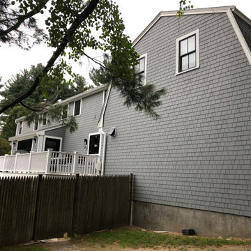
 Authenticity of cedar shingles with the strength of James Hardie. Better than the real thing, it resists rotting, curling, warping and splitting. Used to highlight and accent gable or top half of you house, but really has no limits. Fit every house, not only Cape Cods or cottage styles home. And this project is a nice illustration of this. New James Hardie Straight Edge Shingles and PVC trim work, combined with black new construction Pella windows delivere "WOW" effect. New huge deck with PVC Azek decking is a great addition to this.
Sponsored
Sunbury, OH
J.Holderby - Renovations
Franklin County's Leading General Contractors - 2X Best of Houzz!
 Simply Perfect
Advice on interior design is available everywhere—from TV shows and websites to books, magazines and apps.
We love seeing people become engaged in design and educated on the wide range of possibilities. But we hope you’ll proceed with caution.
It’s not that style errors are a matter of life and death. It’s just that it’s easy to choose designs that aren’t necessarily reflective of your own personality and character. And since you’re typically stuck with your interior design decisions for years, styles that don’t quite fit can tend to grate on you.
Interiors that give one person comfort may unleash chaos in someone else. This goes beyond favorite colors or hot trends, right to the heart of interior design, where you find questions of composition, balance, repetition, space and more.
The goal is to find that unique combination of design elements that gives you comfort, support and balance.
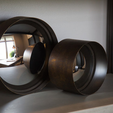
In one home, that perfect balance was struck through the use of symmetry. A pair of comfortable swivel chairs sit beneath matching indigo patterned paintings. Matching bookcases below the paintings contain similar, but not identical, arrangements of books, vases and bowls. Woods and bronzes help warm up the simple white bookcase shelving.
Two matching poufs in front of the fireplace provide additional seating. The sofa is accented with a pair of pillows with a blue pattern that echoes the artwork.
The effect of the symmetry is to achieve order and simplicity, which I promote at every opportunity. After all, your home interiors should be the setting or the backdrop of your life—not center stage.
Antique bronze and blue are complementary colors. Together, they offer a rich palette of richness and depth, which brings out the beauty of wood and stone.
In the home office, a unique, whitewash-stained wooden desk rests on metal, Sawhorse-inspired legs for a warm, rustic look. The black leather chair features a contemporary silhouette with an antique brass frame. An adjustable desk lamp has bronze accents.
The bookcase combines a sleek, black metal frame with concrete shelves, for another unusual pairing. It’s kept uncluttered for an orderly, peaceful look. Items on the shelves include a bronze-accented lamp and a pair
of high gloss-finished wooden bookends.
The elegant artwork behind the desk is a simple midnight-blue and bronze with mottled white. Deep blues are again picked up in the rug, which adds a stately vibe with a modern pattern and satisfying texture.
Within the framework of symmetry, the living room repeats the blue-and-bronze color scheme.
A large midcentury brass clock above the fireplace keeps the natural stone visible, rather than hidden behind a painting or television, while its straight lines and color create a beautiful contrast.
The sofa is a soft, neutral blue. The pattern on the round brass side table features echoes the darker blue-patterned rug, as well as the rug in the office, tying the rooms together.
Indigo blue books adjacent to bronze vases on the shelves repeat the color scheme. The soapstone-topped coffee table echoes the shape of the fireplace. A pair of tall, matching floor lamps with long wooden bases, brass pulls and simple linen shades combine both the colors and symmetry found throughout the home.
 Century Stair Company
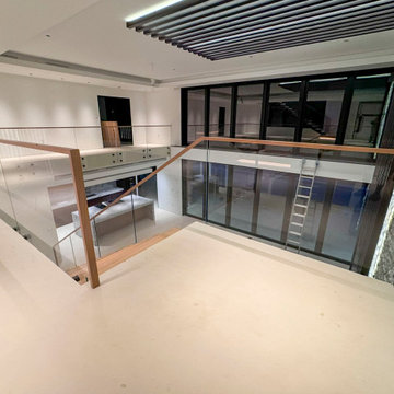
This contemporary home features two striking staircases with integrated LED lighting, glass railing, and thick wood treads. The color-changing LEDs shift from red to blue to yellow, transforming the staircases into dynamic focal points throughout the day. Wood treads and handrails are paired with frameless glass balustrades secured by black pins. Open risers amplify the LED lighting effect while maximizing transparency.
The first-level staircase uses cantilevered and field-supported construction, while the second rises on dual metal stringers. Glass railing continues on the second-floor balcony, creating a cohesive system where light and glass elevate the design beyond the purely functional.
1976-2026 © Century Stair Company
 Rotator Rod
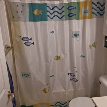
This Rotator Rod customer wanted to expand the shower space in their guest bathroom without knocking down walls or losing any of their already small bathroom space. The bathroom felt uncomfortably small with its old, straight shower rod but is not used very frequently. The customer was looking for a quick and cost effective way to save space for holiday guests.
The Rotator Rod is the original curved shower rod that rotates. It's curved design instantly gives you a luxuriously large shower like in all the major hotels. After showering, simply flip the Rotator Rod shower rod into the tub -- and out of your way -- while you use the rest of the bathroom! The Rotator Rod is the only bathroom invention that expands shower space by 33% without forfeiting any bathroom space.
In this photograph, the Rotator Rod flipped out, like a traditional curved shower rod.
This photo helps illustrate how much shower space -- and bathroom space -- you gain with the original curved shower rod that rotates! White the Rotator Rod is in the "in" position, the shower curtain hangs into and against the shower instead of on top of the toilet. The narrow towel bar is another great space-saving idea and the tropical shower curtain also helps brighten up the small space!
29