Search results for "Elective add ons" in Home Design Ideas
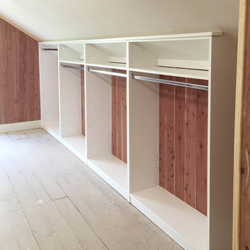
California closets couldn't make our custom dressing room as tall as we wanted it. So I bought 93" Pax units from Ikea, as well as Billy Bookshelves (with three height add-ons) and installed the entire thing myself. The great thing about the Pax is that it is endlessly customizable.

Overview
Whole house refurbishment, double storey wrap around extension and large loft conversion.
The Brief
Create a WOW factor space, add glamour and fun and give the house a street side and garden side, both different.
Our Solution
This project was exciting from the start, the client wanted to entertain in a WOW factor space, have a panoramic view of the garden (which was to be landscaped), add bedrooms and a great master suite.
We had some key elements to introduce such as an aquarium separating two rooms; double height spaces and a gloss kitchen, all of which manifest themselves in the completed scheme.
Architecture is a process taking a schedule of areas, some key desires and needs, mixing the functionality and creating space.
New spaces transform a house making it more valuable, giving it kerb appeal and making it feel like a different building. All of which happened at Ailsa Road.

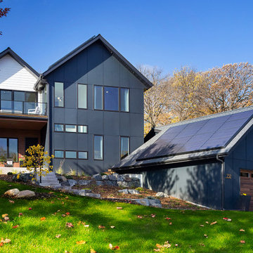
The Roger Lee designed house from 1962 was purchased by the current homeowners in almost original condition, as the previous owners elected to defer most maintenance projects over the years. The clients were able to see beyond the dated materials and finishes, single-paned glass and uninsulated walls and they approached Klopf Architecture to help them expand and update the entire home, one the family could settle into and enjoy for years to come. It was important that the new designs were aligned with Lee's original intent not only because of the client's appreciation for mid-century modern architecture, but also because the house was deemed historical. The Stanford Real Estate Office requires a stringent design review which safeguards the integrity of the community, which Klopf Architecture was happy to oblige going into their updated designs.
As with many original mid-century modern homes, the house was scaled to the 1960s lifestyle where rooms were smaller and openings to views were limited and tightly framed. The original conditions defined the direction the family of four would take in updating the house and making it comfortable for their modern lifestyle. Klopf designed a full gut remodel and major addition to bring the house into the 21st century and provide the living area needed for the client's family. The newly expanded house added just about 1,100 sf to create an airy, comfortable and family friendly house, taking full advantage of the beautiful southwestern views that extend out to the hills beyond. The enclosed garage created an additional 240 sf of covered space for long-term storage.
A cracked swimming pool created an eyesore taking up a majority of the backyard landscape, so it was one of the first elements to go during the transformation. Working with Outer Space Landscape Architects, the family asked for a mix of relaxing outdoor patio spaces that eventually blend into the native landscaping, extending their views outward toward the natural greenery of the trees beyond their property. Filling in the old pool was a smart way to expand the living spaces outward. The orientation of the house was designed to enjoy the views, but the original architecture provided the first homeowners with mere glimpses of the landscape outside.
Klopf was able to broaden those views, continuing and extending on the original architecture to take full advantage of the unobstructed natural views across the rear facade of the house. Small horizontal openings in the primary bedroom and office were replaced with much taller windows that now follow the angled roof line upward, extending across almost all of the facade. We worked with Western Windows, whose designs included an oblique-shaped, operable casement that allowed our design to rise with the slope. A new corner office added to the primary suite, offers a bright and functional work-from-home solution that looks out at the distant views and added natural light from the expanded window configuration that now wraps around the corner.
The existing lower level was designed by Lee as a utilitarian space, serving as a wet pool room with a drain in the center of the floor, bathroom, laundry and storage areas. Without the need for a pool room, Klopf was able to convert the area into a much more comfortable and functional living space with a new family room and guest suite. The new spaces enjoy easy access to a new outdoor patio through floor to ceiling, full-width glass sliders.
Continuing along the rear facade, a previously exposed deck extending from the living room and hallway provided access to the backyard through a single set of stairs leading toward the side of the house which made sense when the pool was in place. The new deck was re-envisioned as an extension of the main living room and now serves as a second outdoor living room. A new slatted pergola above provides the homeowners welcome relief from the hot afternoon sun. A second set of stairs now creates a better connection to the redesigned lower level. Klopf was able to reconfigure the spaces, extending the living room outward toward the views, where the family now claims it as the heart of the home, spending a large majority of their time outdoors.
Back inside, the original wood-burning Malm fireplace was beautifully restored and a gas burner installed to comply with California's strict air standards. It now rests in front of a wall of Heath accent tiles where a dated red brick wall used to stand. A new taller window brings more light and views into the refreshed interior living room. The original glass doors opposite the fireplace were replaced by larger sliders that when fully opened, create a seamless transition to the new outdoor living area so the two spaces feel like one connected space. The original utilitarian kitchen was needlessly tucked into the far back corner and closed-off, out of sight from the living room, so the clients asked Klopf to open it up and expand the kitchen forward so it felt more connected. Today the much larger kitchen is connected to the living area where a short wall with a cutout offers a visual glimpse into the kitchen and a handy pass-through counter for serving guests. A new breakfast nook was also added to create another spot where the family can gather for casual meals. Just outside, a new built-in outdoor grill and prep area extends the kitchen outside and connects to a new outdoor dining spot nestled amongst the trees, taking advantage of the views out back.
Klopf was able to expand the other two bedrooms, add a new laundry room and half-bath and convert the carport to an enclosed garage to add more storage areas which was lost when the pool house was converted to the family and guest room.
To maintain a historical connection to the original designs, the exterior siding was repeated on all exterior walls, a full-height stained glass window at the front entryway restored, and an interior slatted screen element repeated outside at the exterior entry courtyard and over the new outdoor living room to create a shade trellis. The new house stands proudly and shines against it's new landscaping features, while respecting and expanding on the original intent of Roger Lee's designs epitomizing the comforts of indoor-outdoor living in Northern California.
Completion year: 2020
Klopf Architecture project team: John Klopf, Klara Kevane, Noel Andrade
Contractor: ORB Construction, Brendan O'Reilly
Structural engineer: Sezen and Moon
Landscape architect: Outer space
Furnishings and decoration: Urbanism Designs
Photographer: Mariko Reed
Find the right local pro for your project
Completely redesigned, this guest bathroom now reflects an updated and clean look and feel. All new add ons include, tile, vanity, countertop, medicine cabinets, hardware, baseboards. The bathtub was replaced with a frameless shower with new shower head and shower niche for hair products.

Custom built-in cabinets and bookshelves with textured grasscloth wallpaper makes the perfect backdrop for this cozy family room. Sheer striped roman shades still lets plenty of light it while still allowing for privacy. Vintage swivel club chairs upholstered in an updated blue plaid fabric. The yummy rich brown tufted leather ottoman allows for plenty of room to rest your feet on.

The Roger Lee designed house from 1962 was purchased by the current homeowners in almost original condition, as the previous owners elected to defer most maintenance projects over the years. The clients were able to see beyond the dated materials and finishes, single-paned glass and uninsulated walls and they approached Klopf Architecture to help them expand and update the entire home, one the family could settle into and enjoy for years to come. It was important that the new designs were aligned with Lee's original intent not only because of the client's appreciation for mid-century modern architecture, but also because the house was deemed historical. The Stanford Real Estate Office requires a stringent design review which safeguards the integrity of the community, which Klopf Architecture was happy to oblige going into their updated designs.
As with many original mid-century modern homes, the house was scaled to the 1960s lifestyle where rooms were smaller and openings to views were limited and tightly framed. The original conditions defined the direction the family of four would take in updating the house and making it comfortable for their modern lifestyle. Klopf designed a full gut remodel and major addition to bring the house into the 21st century and provide the living area needed for the client's family. The newly expanded house added just about 1,100 sf to create an airy, comfortable and family friendly house, taking full advantage of the beautiful southwestern views that extend out to the hills beyond. The enclosed garage created an additional 240 sf of covered space for long-term storage.
A cracked swimming pool created an eyesore taking up a majority of the backyard landscape, so it was one of the first elements to go during the transformation. Working with Outer Space Landscape Architects, the family asked for a mix of relaxing outdoor patio spaces that eventually blend into the native landscaping, extending their views outward toward the natural greenery of the trees beyond their property. Filling in the old pool was a smart way to expand the living spaces outward. The orientation of the house was designed to enjoy the views, but the original architecture provided the first homeowners with mere glimpses of the landscape outside.
Klopf was able to broaden those views, continuing and extending on the original architecture to take full advantage of the unobstructed natural views across the rear facade of the house. Small horizontal openings in the primary bedroom and office were replaced with much taller windows that now follow the angled roof line upward, extending across almost all of the facade. We worked with Western Windows, whose designs included an oblique-shaped, operable casement that allowed our design to rise with the slope. A new corner office added to the primary suite, offers a bright and functional work-from-home solution that looks out at the distant views and added natural light from the expanded window configuration that now wraps around the corner.
The existing lower level was designed by Lee as a utilitarian space, serving as a wet pool room with a drain in the center of the floor, bathroom, laundry and storage areas. Without the need for a pool room, Klopf was able to convert the area into a much more comfortable and functional living space with a new family room and guest suite. The new spaces enjoy easy access to a new outdoor patio through floor to ceiling, full-width glass sliders.
Continuing along the rear facade, a previously exposed deck extending from the living room and hallway provided access to the backyard through a single set of stairs leading toward the side of the house which made sense when the pool was in place. The new deck was re-envisioned as an extension of the main living room and now serves as a second outdoor living room. A new slatted pergola above provides the homeowners welcome relief from the hot afternoon sun. A second set of stairs now creates a better connection to the redesigned lower level. Klopf was able to reconfigure the spaces, extending the living room outward toward the views, where the family now claims it as the heart of the home, spending a large majority of their time outdoors.
Back inside, the original wood-burning Malm fireplace was beautifully restored and a gas burner installed to comply with California's strict air standards. It now rests in front of a wall of Heath accent tiles where a dated red brick wall used to stand. A new taller window brings more light and views into the refreshed interior living room. The original glass doors opposite the fireplace were replaced by larger sliders that when fully opened, create a seamless transition to the new outdoor living area so the two spaces feel like one connected space. The original utilitarian kitchen was needlessly tucked into the far back corner and closed-off, out of sight from the living room, so the clients asked Klopf to open it up and expand the kitchen forward so it felt more connected. Today the much larger kitchen is connected to the living area where a short wall with a cutout offers a visual glimpse into the kitchen and a handy pass-through counter for serving guests. A new breakfast nook was also added to create another spot where the family can gather for casual meals. Just outside, a new built-in outdoor grill and prep area extends the kitchen outside and connects to a new outdoor dining spot nestled amongst the trees, taking advantage of the views out back.
Klopf was able to expand the other two bedrooms, add a new laundry room and half-bath and convert the carport to an enclosed garage to add more storage areas which was lost when the pool house was converted to the family and guest room.
To maintain a historical connection to the original designs, the exterior siding was repeated on all exterior walls, a full-height stained glass window at the front entryway restored, and an interior slatted screen element repeated outside at the exterior entry courtyard and over the new outdoor living room to create a shade trellis. The new house stands proudly and shines against it's new landscaping features, while respecting and expanding on the original intent of Roger Lee's designs epitomizing the comforts of indoor-outdoor living in Northern California.
Completion year: 2020
Klopf Architecture project team: John Klopf, Klara Kevane, Noel Andrade
Contractor: ORB Construction, Brendan O'Reilly
Structural engineer: Sezen and Moon
Landscape architect: Outer space
Furnishings and decoration: Urbanism Designs
Photographer: Mariko Reed

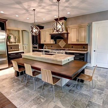
A simple, and consistent, dark countertop never seems to disappoint. These Impala Black granite countertops are the perfect add-on to this industrial inspired kitchen, providing both a bold and classy set-up.

Sponsored
Columbus, OH
Free consultation for landscape design!
Peabody Landscape Group
Columbus' Reliable Landscape Design & Contracting

The Chambord Residence was a typical worker’s duplex house in the heart of the patrimonial neighbourhood of the Plateau Mont-Royal. The initial intent of this residential renovation project was to annex a master bedroom that would have a view over the iconic Mount Royal, and at the same time, a rooftop terrace. The new addition’s architecture had to contrast with the existing building which stayed untouched. It consisted of a simple volume laid gently over the duplex. We recessed the facade of the new construction to keep the initial alignment of the street.
The client’s love for natural materials and bright colors made it easy for us to choose copper as the siding finish for the extension. The idea of seeing his house change color and evolve through time and natural oxidation made it clear for him that it was the most interesting material. We chose a diamond shaped tile to cover the new add-on construction, as it refers to the vernacular false-mansard found in the city, and adds a texture that will make the copper age unevenly.
Our goal was to create a contemporary jewel that celebrates the patrimonial gem it sits on.
© Lorelei L'Affeter

The Chambord Residence was a typical worker’s duplex house in the heart of the patrimonial neighbourhood of the Plateau Mont-Royal. The initial intent of this residential renovation project was to annex a master bedroom that would have a view over the iconic Mount Royal, and at the same time, a rooftop terrace. The new addition’s architecture had to contrast with the existing building which stayed untouched. It consisted of a simple volume laid gently over the duplex. We recessed the facade of the new construction to keep the initial alignment of the street.
The client’s love for natural materials and bright colors made it easy for us to choose copper as the siding finish for the extension. The idea of seeing his house change color and evolve through time and natural oxidation made it clear for him that it was the most interesting material. We chose a diamond shaped tile to cover the new add-on construction, as it refers to the vernacular false-mansard found in the city, and adds a texture that will make the copper age unevenly.
Our goal was to create a contemporary jewel that celebrates the patrimonial gem it sits on.
© Lorelei L'Affeter

The Chambord Residence was a typical worker’s duplex house in the heart of the patrimonial neighbourhood of the Plateau Mont-Royal. The initial intent of this residential renovation project was to annex a master bedroom that would have a view over the iconic Mount Royal, and at the same time, a rooftop terrace. The new addition’s architecture had to contrast with the existing building which stayed untouched. It consisted of a simple volume laid gently over the duplex. We recessed the facade of the new construction to keep the initial alignment of the street.
The client’s love for natural materials and bright colors made it easy for us to choose copper as the siding finish for the extension. The idea of seeing his house change color and evolve through time and natural oxidation made it clear for him that it was the most interesting material. We chose a diamond shaped tile to cover the new add-on construction, as it refers to the vernacular false-mansard found in the city, and adds a texture that will make the copper age unevenly.
Our goal was to create a contemporary jewel that celebrates the patrimonial gem it sits on.
© Lorelei L'Affeter

The Chambord Residence was a typical worker’s duplex house in the heart of the patrimonial neighbourhood of the Plateau Mont-Royal. The initial intent of this residential renovation project was to annex a master bedroom that would have a view over the iconic Mount Royal, and at the same time, a rooftop terrace. The new addition’s architecture had to contrast with the existing building which stayed untouched. It consisted of a simple volume laid gently over the duplex. We recessed the facade of the new construction to keep the initial alignment of the street.
The client’s love for natural materials and bright colors made it easy for us to choose copper as the siding finish for the extension. The idea of seeing his house change color and evolve through time and natural oxidation made it clear for him that it was the most interesting material. We chose a diamond shaped tile to cover the new add-on construction, as it refers to the vernacular false-mansard found in the city, and adds a texture that will make the copper age unevenly.
Our goal was to create a contemporary jewel that celebrates the patrimonial gem it sits on.
© Lorelei L'Affeter

The Chambord Residence was a typical worker’s duplex house in the heart of the patrimonial neighbourhood of the Plateau Mont-Royal. The initial intent of this residential renovation project was to annex a master bedroom that would have a view over the iconic Mount Royal, and at the same time, a rooftop terrace. The new addition’s architecture had to contrast with the existing building which stayed untouched. It consisted of a simple volume laid gently over the duplex. We recessed the facade of the new construction to keep the initial alignment of the street.
The client’s love for natural materials and bright colors made it easy for us to choose copper as the siding finish for the extension. The idea of seeing his house change color and evolve through time and natural oxidation made it clear for him that it was the most interesting material. We chose a diamond shaped tile to cover the new add-on construction, as it refers to the vernacular false-mansard found in the city, and adds a texture that will make the copper age unevenly.
Our goal was to create a contemporary jewel that celebrates the patrimonial gem it sits on.
© Lorelei L'Affeter

The Chambord Residence was a typical worker’s duplex house in the heart of the patrimonial neighbourhood of the Plateau Mont-Royal. The initial intent of this residential renovation project was to annex a master bedroom that would have a view over the iconic Mount Royal, and at the same time, a rooftop terrace. The new addition’s architecture had to contrast with the existing building which stayed untouched. It consisted of a simple volume laid gently over the duplex. We recessed the facade of the new construction to keep the initial alignment of the street.
The client’s love for natural materials and bright colors made it easy for us to choose copper as the siding finish for the extension. The idea of seeing his house change color and evolve through time and natural oxidation made it clear for him that it was the most interesting material. We chose a diamond shaped tile to cover the new add-on construction, as it refers to the vernacular false-mansard found in the city, and adds a texture that will make the copper age unevenly.
Our goal was to create a contemporary jewel that celebrates the patrimonial gem it sits on.
© Lorelei L'Affeter

Sponsored
Columbus, OH
Hope Restoration & General Contracting
Columbus Design-Build, Kitchen & Bath Remodeling, Historic Renovations

The Chambord Residence was a typical worker’s duplex house in the heart of the patrimonial neighbourhood of the Plateau Mont-Royal. The initial intent of this residential renovation project was to annex a master bedroom that would have a view over the iconic Mount Royal, and at the same time, a rooftop terrace. The new addition’s architecture had to contrast with the existing building which stayed untouched. It consisted of a simple volume laid gently over the duplex. We recessed the facade of the new construction to keep the initial alignment of the street.
The client’s love for natural materials and bright colors made it easy for us to choose copper as the siding finish for the extension. The idea of seeing his house change color and evolve through time and natural oxidation made it clear for him that it was the most interesting material. We chose a diamond shaped tile to cover the new add-on construction, as it refers to the vernacular false-mansard found in the city, and adds a texture that will make the copper age unevenly.
Our goal was to create a contemporary jewel that celebrates the patrimonial gem it sits on.
© Lorelei L'Affeter

The Chambord Residence was a typical worker’s duplex house in the heart of the patrimonial neighbourhood of the Plateau Mont-Royal. The initial intent of this residential renovation project was to annex a master bedroom that would have a view over the iconic Mount Royal, and at the same time, a rooftop terrace. The new addition’s architecture had to contrast with the existing building which stayed untouched. It consisted of a simple volume laid gently over the duplex. We recessed the facade of the new construction to keep the initial alignment of the street.
The client’s love for natural materials and bright colors made it easy for us to choose copper as the siding finish for the extension. The idea of seeing his house change color and evolve through time and natural oxidation made it clear for him that it was the most interesting material. We chose a diamond shaped tile to cover the new add-on construction, as it refers to the vernacular false-mansard found in the city, and adds a texture that will make the copper age unevenly.
Our goal was to create a contemporary jewel that celebrates the patrimonial gem it sits on.
© Lorelei L'Affeter

One small window, faux woodgrain cabinets and lots of doors made this closed-off Arlington kitchen feel dark and drab, the total opposite of the vibrant young family of four that lives here. To brighten and open up the small kitchen, we removed the wall separating the dining room, expanded the window above the sink and installed a French door to let even more light in from an adjoining sun room. Light now pours into the kitchen, making it feel welcoming, airy and bright. To accommodate the expanded kitchen, we removed a hulking set of built-ins from the dining room which provided two extra feet to work with. The larger footprint allowed us to relocate major appliances and provide a generous amount of storage and prep space including a food safe butcher block to the right of the range. Natural wood elements such as the chopping block, reclaimed shelves and beautiful new floors add character and warmth to the all-white kitchen.
One of the must-haves in this renovation was a farmhouse sink which is a great way to maximize function when a smaller sink base is used. We opted to take the tile backsplash all the way to the ceiling along the window wall, creating a more polished look with the added bonus of making the ceiling feel taller. The subway tiles’ subtle texture adds depth to the simple white-on-white motif and the change to a herringbone pattern behind the range adds visual interest without feeling too busy. A crisp white backdrop is perfect for adding pops of color with dishware, accessories and the family’s vintage stand mixer. The newly renovated kitchen-dining area is much better suited for this family’s active lifestyle and the updated design now complements the rest of their stylish home.
Photos by Stacy Zarin Goldberg

Despite a tight budget and very little time, we were able to transform this teenager’s bedroom into a mature grown-up space that is serene and restful. This one-day makeover was achieved simply by rearranging the furniture, adding new pillows, and by borrowing a few accessories from other rooms in the house.
We started by moving the bed in front of the windows, which made the bedroom look more spacious and created a strong focal point. We kept all of the existing bedding and simply replaced the colorful purple duvet with a large white throw we bought at IKEA. Adding cushions with earthy colors, combined with a Buddha and greenery, helped create a peaceful resting space. In the “before” picture, the night table was hiding beside the bed, now it draws attention and provides the perfect surface on which to display accessories and a table lamp. As for the walls, we switched the purple and white flower artwork for a more abstract piece that ties in nicely with the colors from the throw pillows.
We borrowed a nesting table from the living room and draped it with a sheepskin to add softness and warmth to the room and also brought in tall faux spring blooming branches to add height to the space. The bright green decorative stool injects a pop of color to the room and ties in nicely with the bohemian-inspired pillow. We moved the brown leather bench to the foot of the bed to break up the white-on-white bedding and to create the perfect catch-all to throw clothes on at the end of a long day.
Tip: Adding a touch of black in the room as we did with the lampshade, vase, and bed frame breaks up the neutral color palette and gives the space a touch of elegance.
With only a few hours and a small budget we created an inviting, peaceful and zen-like space, perfect to catch up on beauty sleep.
©UTRdecorating.com

Sponsored
Sunbury, OH
J.Holderby - Renovations
Franklin County's Leading General Contractors - 2X Best of Houzz!

This recent remodel was a full gut down to the stubs and sub floors. The biggest challenge in the space was creating a single room from 2 separate areas. The original galley kitchen and a 1980’s add-on breakfast room. The breakfast room was cold and had old mechanicals emphasizing the need for a continuous space. The existing kitchen area was small, cramped and did not fit the lifestyle of the homeowners.
The homeowners wanted a hidden pantry for large and seasonal items as well as for food storage. I planned for a portion of the garage to be transformed to a full size, walk-in, hidden pantry that catered to the needs of the family.
Three of the most important design features include the hidden pantry, “other room” storage such as the mudroom seat and window bench, as well as the eat-in counter. Other notable design elements include glass cabinets, under-cabinet lighting, a message center and built-in under the counter appliances.
The coffee system is plumbed allowing for immediate hot coffee and specialty drinks at the touch of a button.
Dimensions: 27’X12’
Cabinetry: KEMPER
Flooring: MAPLE HARDWOOD with Radiant floor heat.
Countertops/Vanity Tops: Quartzite/MARBLE (Donna Sandra)
Sinks: BLANCO
Faucets: DELTA with Touch2o-technology.
Dishwasher: MIELE
Cooktop/Range: WOLF
Lighting: FEISS
Refrigerator: SUB-ZERO
Oven: WOLF
Plumbing Supplies: DELTA POT FILLER
Hardware: ATLAS

Homeowners with kids and active life wanting progressive style to facilitate outdoor living. We fused the traditional neighborhood and home style with a contemporary feel offering an upscale, clean, defined look and the result was awesome!
Landscape Architect and Landscape Designer Values:
Any given Landscape Architect or Landscape Designer may have a different approach, but Landscape Designer and Landscape Contractor, Brett Berry of Berry Outdoor Living creates living areas that feel connected to the home. As a Landscape Designer and Landscape Contractor working with a Landscape Architect, we try to create the space so it feels relaxed. It should feel like it's been in place with the home for years and not an "add-on".
As a Landscape Contractor that merges old and new construction into the landscape design, the goal is to build a space people want to spend time, whether at the bar of the outdoor kitchen, fire pit, patio, or covered porch. When a space becomes a large part of the homeowners' daily life, a Landscape Architect or Landscape Designer, or Landscape Contractor, knows a project has been completed with excellence. I work closely with a Landscape Architect through the design process to ensure the space has the correct "feel".
A Landscape Architect and Landscape Designer must design the space to flow from the inside of the home out. The patio and outdoor living space feels like an extension of the home, or another "room" of the home and feels wrapped with fresh, low-maintenance landscaping.
In Kansas City patio, and landscaping design, there is a clear trend toward a cleaner, more defined look influenced by a more modern era viewpoint that values a non-cluttered look and feel. So, as a Landscape Contractor, in our circle of clients, we've seen a definite shift toward cleaner, artisan-crafted backyards and fewer "boxy", shrub-heavy yards. A Landscape Architect with a keen sense designs this effect.
landscape modern landscape Kansas city berry landscape photos, Houzz landscape design ideas pictures remodel décor, Houzz landscape design photos, Houzz outdoor photos, outdoor landscape design photos, Houzz outdoor photos, Houzz landscape design ideas pictures remodel décor outdoor photos, landscape design outdoor photos, Houzz pictures landscape, landscape back yard, landscape residential, landscape contractor, landscape design, landscape designer, landscaper, landscaping, landscape architect, landscape contractor, landscape photos, modern landscape photos, Staker landscape photos, Kansas City landscape photos, landscape photos back yard, landscape photos residential, landscape design ideas pictures, landscape pictures, landscape design ideas residential, landscape design ideas Staker residence, Houzz landscape photos, Houzz landscape pictures, Houzz landscape, Houzz landscape design ideas pictures, Houzz landscape design ideas pictures Staker residence

Just Add Paint was called into action to finish this gorgeous houzz after the original painting company sent in some unqualified painters and ended up leaving the job before completion. And it was a good thing - we were mortified to find patches that had been painted over before sanding, joints on the tray ceiling and throughout with excess caulk that had been sealed in with paint, fuzzy walls from low grade paint rollers, splatter all over brand new hardwood floors, and the list goes on, We used every trick in the book that we had accumulated from years of experience to get this one cleaned up. It ended up feeling more like a restoration than a repaint, and we easily the most challenging and satisfying project this year. Very proud of work the crew did on this one and happy to put our name on it. Photos by Grant "Shutterbug" Tankersley
11