Search results for "Elective add ons" in Home Design Ideas
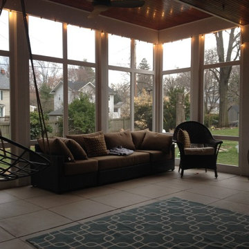
The comfortable elegance of this French-Country inspired home belies the challenges faced during its conception. The beautiful, wooded site was steeply sloped requiring study of the location, grading, approach, yard and views from and to the rolling Pennsylvania countryside. The client desired an old world look and feel, requiring a sensitive approach to the extensive program. Large, modern spaces could not add bulk to the interior or exterior. Furthermore, it was critical to balance voluminous spaces designed for entertainment with more intimate settings for daily living while maintaining harmonic flow throughout.
The result home is wide, approached by a winding drive terminating at a prominent facade embracing the motor court. Stone walls feather grade to the front façade, beginning the masonry theme dressing the structure. A second theme of true Pennsylvania timber-framing is also introduced on the exterior and is subsequently revealed in the formal Great and Dining rooms. Timber-framing adds drama, scales down volume, and adds the warmth of natural hand-wrought materials. The Great Room is literal and figurative center of this master down home, separating casual living areas from the elaborate master suite. The lower level accommodates casual entertaining and an office suite with compelling views. The rear yard, cut from the hillside, is a composition of natural and architectural elements with timber framed porches and terraces accessed from nearly every interior space flowing to a hillside of boulders and waterfalls.
The result is a naturally set, livable, truly harmonious, new home radiating old world elegance. This home is powered by a geothermal heating and cooling system and state of the art electronic controls and monitoring systems.

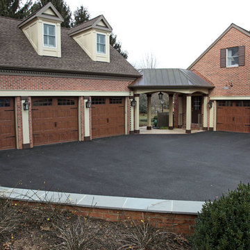
This off-grid mountain barn home located in the heart of the Rockies sits at 7,500 feet and has expansive, beautiful views of the foothills below. The model is a Barn Pros 36 ft. x 36 ft. Denali barn apartment with a partially enclosed shed roof on one side for outdoor seating and entertainment area. The deck off the back of the building is smaller than the standard 12 ft. x 12 ft. deck included in the Denali package. Roll-up garage doors like the one shown at the front of the home are an add-on option for nearly any Barn Pros kit.
Inside, the finish is decidedly rustic modern where sheetrock walls contrast handsomely with the exposed posts and beams throughout the space. The owners incorporated garage parking, laundry, kitchenette with wood-burning stove oven, bathroom, workout area and a pool table all on the first floor. The upper level houses the main living space where contemporary décor and finished are combined with natural wood flooring and those same exposed posts and beams. Lots of natural light fills the space from the 18 ft. vaulted ceilings, dormer windows and French doors off the living room. The owners added a partial loft for additional sleeping and a functional storage area.

We introduce to you one of our newer services we are providing here at Kitchen Design Concepts: spaces that just need a little reviving! As of recent, we are taking on projects that are in need of minimal updating, as in, spaces that don’t need a full-on remodel. Yes, you heard right! If your space has good bones, you like the layout of your kitchen, and you just need a few cosmetic changes, then today’s feature is for you! Recently, we updated a space where we did just this! The kitchen was in need of a little love, some fresh paint, and new finishes. And if we’re being honest here, the result looks almost as if the kitchen had a full-on remodel! To learn more about this space and how we did our magic, continue reading below:
The Before and After
First, see what an impact new finishes can make! The “before” image shows a kitchen with outdated finishes such as the tile countertops, backsplash, and cabinetry finish. The “after” image, is a kitchen that looks almost as if its brand new, the image speaks for itself!
Cabinetry
With the wooden cabinetry in this kitchen already having great bones, all we needed to do was our refinishing process that involved removing door and drawer fronts, sanding, priming, and painting. The main color of the cabinetry is white (Sherwin Williams Pure White 7005) and as an accent, we applied a deep navy blue that really pops in this space (Sherwin Willaims Naval 6244). As a special design element, we incorporated a natural wooden band across the hood which is subtle but adds an element of surprise.
Countertops
The original countertops in this space were a 12×12 tile with cracks and discolored grout from all the wear and tear. To replace the countertops, we installed a clean and crisp quartz that is not only durable but easy to maintain (no grout here!). The 3cm countertops are a Cambria quartz in a grey-tone color (Carrick).
Backsplash
Keeping things simple, yet classic, we installed a 3×6 subway tile from Interceramic. The crisp white pairs well with all the other finishes of the space and really brighten the space up! To spice things up, we paired the white tile with a contrasting grout color (Cape Grey) that matches the countertop. This is a simple method to add interest to your white backsplash!
Fixtures and Fittings
For the fixtures and fittings of the kitchen, we wanted pieces that made a statement. That’s why we selected this industrial style faucet from Brizo! The faucet is a Brizo LITZE™ PULL-DOWN FAUCET WITH ARC SPOUT AND INDUSTRIAL HANDLE (63044LF-BLGL). The matte black paired with the luxe gold elements really make a statement! To match the gold elements of the faucet, we installed cabinetry hardware from Topknobs in the same gold finish. The hardware is a Channing pull TK743HB. Lastly, the large single bowl sink (who doesn’t want a large sink?!) is a great functional touch to the kitchen. The sink is a Blanco Precision 16″ R10 super single with 16″ Drainer in stainless steel (516216).
Find the right local pro for your project
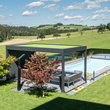
We designed and delivered a perfectly hidden kitchen laundry and, can you believe, it adds tremendous style to this new open space Moorestown, New Jersey kitchen?! Besides figuring out what to do with the washer and dryer, the client asked for a large table island, fun green accenting, and wood details.
To truly understand the challenge we had with this project, please look at the befores first — a small space condo kitchen that had a stacked washer & dryer fully exposed. Solutions: knock out a wall to open things up to the dining room, and somehow enclose the washer and dryer. Besides now having a tremendously functional open space kitchen with an electic mix of modern and transitional that is ‘perfectly Theresa’, the laundry space now adds style. It’s amazing how the caning on the doors became a statement element!
How fun! We truly managed to hide a washer & dryer in plain sight and add beauty!

Custom Wood-on-Steel doors using C Grade Douglas fir and stained using the Sikkens Cetol 1/23+ stain system. Odd numbers of door panels sometimes enhances visual interest. What do you think?

Featured here are steps with cable rail leading down to the lower terrace. Concrete steppers in the grass create a walking path to the deck area under the balcony. The space was designed around the old pine in the foreground that was kept to add character. Also in view is a turf play area for kids.
Here, a balcony with cable rail is pictured, along with a private garden with ocean view off the master bedroom.
A modern concrete hardscape with Mexican beach pebble bands is featured, along with a low-water-use palette.
Front & Backyard Landscape Design - La Jolla, CA
Here, a succulent garden is the highlight, with some decorative pebbles and boulders used in combination as accents with a low-water-use plant palette.
A horizontal screen fence made of beautiful cumaru wood is in the foreground, with a modern paver driveway in view.
Here, a succulent garden with vibrant flowers can be viewed in the foreground. This aloe plant with coral flowers is a great example of a low-water-use focal plant.
The modern paver driveway highlights this modern design featuring low-water-use olive trees in mass groupings. The cumaru wood fence can be viewed in the background. Also in view are boulders, which were found on the property and repurposed in the landscape.
The modern paver driveway is in view, with native grasses used to give movement as they sway in the wind. The design incorporates this beautiful old pine (on the right)that was on the property.
This view of the driveway shows how boulders found on the property were incorporated into the design, with the cumaru wood screen fence and low-water-use olive trees also in view.
This view shows the modern design of the house and the paver driveway. Also in view is theMexican beach pebble bed with modern grasses. A modern bridge entry over a succulent gardencan be seen in the background.
This photo shows the modern bridge entry over a succulent garden. The modern architecture is showcased here, and in the foreground, flowering succulents contrast nicely with the wood.
A view of the modern architecture of the home and the paver driveway, with native grasses incorporated to create movement in the landscape.
Colorful grasses create movement here in this side view of the home.
A succulent garden with a low-water-use plant palette and colorful flowering plants is featured. Boulders found on the property have been repurposed in the landscape.
In this view, different colors and textures are used to create visual interest. The low-water-use olive trees and succulent garden are pictured.
Here, a concrete fire pit is pictured with built-in bench seating made of cumaru wood. Throw pillows have been added to give splashes of color. Behind the seating area are tall modern grasses, used to soften the screen area in the back.
A modern concrete hardscape with Mexican beach pebble bands is featured, along with the concrete fire pit and built-in bench seating made of cumaru wood.
An indoor/outdoor room is pictured with the concrete firepit in the foreground.
A convenient outdoor dining room is shown here, featuring a modern concrete hardscape with Mexican beach pebble bands. A colorful umbrella, cushions and flower pots create visual interest. The cumaru horizontal wood screen has been added to create privacy.
The expansive balcony off this modern home allows residents to enjoy the beautiful ocean views. The deck is constructed of cumaru wood, with cable rail wrapped around it. A native, low-water-use plant palette is featured in the foreground.
Featured here are steps with cable rail leading down to the lower terrace. Concrete steppers in the grass create a walking path to the deck area under the balcony. The space was designed around the old pine in the foreground that was kept to add character. Also in view is a turf play area for kids.
Here, a balcony with cable rail is pictured, along with a private garden with ocean view off the master bedroom.
A modern concrete hardscape with Mexican beach pebble bands is featured, along with a low-water-use palette.

This off-grid mountain barn home located in the heart of the Rockies sits at 7,500 feet and has expansive, beautiful views of the foothills below. The model is a Barn Pros 36 ft. x 36 ft. Denali barn apartment with a partially enclosed shed roof on one side for outdoor seating and entertainment area. The deck off the back of the building is smaller than the standard 12 ft. x 12 ft. deck included in the Denali package. Roll-up garage doors like the one shown at the front of the home are an add-on option for nearly any Barn Pros kit.
Inside, the finish is decidedly rustic modern where sheetrock walls contrast handsomely with the exposed posts and beams throughout the space. The owners incorporated garage parking, laundry, kitchenette with wood-burning stove oven, bathroom, workout area and a pool table all on the first floor. The upper level houses the main living space where contemporary décor and finished are combined with natural wood flooring and those same exposed posts and beams. Lots of natural light fills the space from the 18 ft. vaulted ceilings, dormer windows and French doors off the living room. The owners added a partial loft for additional sleeping and a functional storage area.

Sponsored
Columbus, OH
Hope Restoration & General Contracting
Columbus Design-Build, Kitchen & Bath Remodeling, Historic Renovations

 
Download our free ebook, Creating the Ideal Kitchen. DOWNLOAD NOW
 
Lakefront property in the northwest suburbs of Chicago is hard to come by, so when we were hired by this young family with exactly that, we were immediately inspired by not just the unusually large footprint of this 1950’s colonial revival but also the lovely views of the manmade lake it was sited on. The large 5-bedroom home was solidly stuck in the 1980’s, but we saw tons of potential. We started out by updating the existing staircase with a fresh coat of paint and adding new herringbone slate to the entry hall.
The powder room off the entryway also got a refresh - new flooring, new cabinets and fixtures. We ran the new slate right through into this space for some consistency. A fun wallpaper and shiplap trim add a welcoming feel and set the tone for the home.
Next, we tackled the kitchen. Located away from the rest of the first floor, the kitchen felt a little isolated, so we immediately began planning for how to better connect it to the rest of the first floor. We landed on removing the wall between the kitchen and dining room and designed a modified galley style space with separate cooking and clean up zones. The cooking zone consists of the refrigerator, prep sink and cooktop, along with a nice long run of prep space at the island. The cleanup side of the kitchen consists of the main sink and dishwasher. Both areas are situated so that the user can view the lake during prep work and cleanup!
One of the home’s main puzzles was how to incorporate the mudroom and area in front of the patio doors at the back of the house. We already had a breakfast table area, so the space by the patio doors was a bit of a no man’s land. We decided to separate the kitchen proper from what became the new mudroom with a large set of barn doors. That way you can quickly hide any mudroom messes but have easy access to the light coming in through the patio doors as well as the outdoor grilling station. We also love the impact the barn doors add to the overall space.
The homeowners’ first words to us were “it’s time to ditch the brown,” so we did! We chose a lovely blue pallet that reflects the home’s location on the lake which is also vibrant yet easy on the eye. Countertops are white quartz, and the natural oak floor works well with the other honey accents. The breakfast table was given a refresh with new chairs, chandelier and window treatments that frame the gorgeous views of the lake out the back.
We coordinated the slate mudroom flooring with that used in the home’s main entrance for a consistent feel. The storage area consists of open and closed storage to allow for some clutter control as needed.
Next on our “to do” list was revamping the dated brown bar area in the neighboring dining room. We eliminated the clutter by adding some closed cabinets and did some easy updates to help the space feel more current. One snag we ran into here was the discovery of a beam above the existing open shelving that had to be modified with a smaller structural beam to allow for our new design to work. This was an unexpected surprise, but in the end we think it was well worth it!
We kept the colors here a bit more muted to blend with the homeowner’s existing furnishings. Open shelving and polished nickel hardware add some simple detail to the new entertainment zone which also looks out onto the lake!
Next we tackled the upstairs starting with the homeowner’s son’s bath. The bath originally had both a tub shower and a separate shower, so we decided to swap out the shower for a new laundry area. This freed up some space downstairs in what used to be the mudroom/laundry room and is much more convenient for daily laundry needs.
We continued the blue palette here with navy cabinetry and the navy tile in the shower. Porcelain floor tile and chrome fixtures keep maintenance to a minimum while matte black mirrors and lighting add some depth the design. A low maintenance runner adds some warmth underfoot and ties the whole space together.
We added a pocket door to the bathroom to minimize interference with the door swings. The left door of the laundry closet is on a 180 degree hinge to allow for easy full access to the machines. Next we tackled the master bath which is an en suite arrangement. The original was typical of the 1980’s with the vanity outside of the bathroom, situated near the master closet. And the brown theme continued here with multiple shades of brown.
Our first move was to segment off the bath and the closet from the master bedroom. We created a short hall from the bedroom to the bathroom with his and hers walk-in closets on the left and right as well as a separate toilet closet outside of the main bathroom for privacy and flexibility.
The original bathroom had a giant soaking tub with steps (dangerous!) as well as a small shower that did not work well for our homeowner who is 6’3”. With other bathtubs in the home, they decided to eliminate the tub and create an oversized shower which takes up the space where the old tub was located. The double vanity is on the opposite wall and a bench is located under the window for morning conversations and a place to set a couple of towels.
The pallet in here is light and airy with a mix of blond wood, creamy porcelain and marble tile, and brass accents. A simple roman shade adds some texture and it’s top-down mechanism allows for light and privacy.
This large whole house remodel gave our homeowners not only the ability to maximize the potential of their home but also created a lovely new frame from which to view their fabulous lake views.
Designed by: Susan Klimala, CKD, CBD
Photography by: Michael Kaskel
For more information on kitchen and bath design ideas go to: www.kitchenstudio-ge.com

The Roger Lee designed house from 1962 was purchased by the current homeowners in almost original condition, as the previous owners elected to defer most maintenance projects over the years. The clients were able to see beyond the dated materials and finishes, single-paned glass and uninsulated walls and they approached Klopf Architecture to help them expand and update the entire home, one the family could settle into and enjoy for years to come. It was important that the new designs were aligned with Lee's original intent not only because of the client's appreciation for mid-century modern architecture, but also because the house was deemed historical. The Stanford Real Estate Office requires a stringent design review which safeguards the integrity of the community, which Klopf Architecture was happy to oblige going into their updated designs.
As with many original mid-century modern homes, the house was scaled to the 1960s lifestyle where rooms were smaller and openings to views were limited and tightly framed. The original conditions defined the direction the family of four would take in updating the house and making it comfortable for their modern lifestyle. Klopf designed a full gut remodel and major addition to bring the house into the 21st century and provide the living area needed for the client's family. The newly expanded house added just about 1,100 sf to create an airy, comfortable and family friendly house, taking full advantage of the beautiful southwestern views that extend out to the hills beyond. The enclosed garage created an additional 240 sf of covered space for long-term storage.
A cracked swimming pool created an eyesore taking up a majority of the backyard landscape, so it was one of the first elements to go during the transformation. Working with Outer Space Landscape Architects, the family asked for a mix of relaxing outdoor patio spaces that eventually blend into the native landscaping, extending their views outward toward the natural greenery of the trees beyond their property. Filling in the old pool was a smart way to expand the living spaces outward. The orientation of the house was designed to enjoy the views, but the original architecture provided the first homeowners with mere glimpses of the landscape outside.
Klopf was able to broaden those views, continuing and extending on the original architecture to take full advantage of the unobstructed natural views across the rear facade of the house. Small horizontal openings in the primary bedroom and office were replaced with much taller windows that now follow the angled roof line upward, extending across almost all of the facade. We worked with Western Windows, whose designs included an oblique-shaped, operable casement that allowed our design to rise with the slope. A new corner office added to the primary suite, offers a bright and functional work-from-home solution that looks out at the distant views and added natural light from the expanded window configuration that now wraps around the corner.
The existing lower level was designed by Lee as a utilitarian space, serving as a wet pool room with a drain in the center of the floor, bathroom, laundry and storage areas. Without the need for a pool room, Klopf was able to convert the area into a much more comfortable and functional living space with a new family room and guest suite. The new spaces enjoy easy access to a new outdoor patio through floor to ceiling, full-width glass sliders.
Continuing along the rear facade, a previously exposed deck extending from the living room and hallway provided access to the backyard through a single set of stairs leading toward the side of the house which made sense when the pool was in place. The new deck was re-envisioned as an extension of the main living room and now serves as a second outdoor living room. A new slatted pergola above provides the homeowners welcome relief from the hot afternoon sun. A second set of stairs now creates a better connection to the redesigned lower level. Klopf was able to reconfigure the spaces, extending the living room outward toward the views, where the family now claims it as the heart of the home, spending a large majority of their time outdoors.
Back inside, the original wood-burning Malm fireplace was beautifully restored and a gas burner installed to comply with California's strict air standards. It now rests in front of a wall of Heath accent tiles where a dated red brick wall used to stand. A new taller window brings more light and views into the refreshed interior living room. The original glass doors opposite the fireplace were replaced by larger sliders that when fully opened, create a seamless transition to the new outdoor living area so the two spaces feel like one connected space. The original utilitarian kitchen was needlessly tucked into the far back corner and closed-off, out of sight from the living room, so the clients asked Klopf to open it up and expand the kitchen forward so it felt more connected. Today the much larger kitchen is connected to the living area where a short wall with a cutout offers a visual glimpse into the kitchen and a handy pass-through counter for serving guests. A new breakfast nook was also added to create another spot where the family can gather for casual meals. Just outside, a new built-in outdoor grill and prep area extends the kitchen outside and connects to a new outdoor dining spot nestled amongst the trees, taking advantage of the views out back.
Klopf was able to expand the other two bedrooms, add a new laundry room and half-bath and convert the carport to an enclosed garage to add more storage areas which was lost when the pool house was converted to the family and guest room.
To maintain a historical connection to the original designs, the exterior siding was repeated on all exterior walls, a full-height stained glass window at the front entryway restored, and an interior slatted screen element repeated outside at the exterior entry courtyard and over the new outdoor living room to create a shade trellis. The new house stands proudly and shines against it's new landscaping features, while respecting and expanding on the original intent of Roger Lee's designs epitomizing the comforts of indoor-outdoor living in Northern California.
Completion year: 2020
Klopf Architecture project team: John Klopf, Klara Kevane, Noel Andrade
Contractor: ORB Construction, Brendan O'Reilly
Structural engineer: Sezen and Moon
Landscape architect: Outer space
Furnishings and decoration: Urbanism Designs
Photographer: Mariko Reed

Morgante Wilson Architects used Anne Sacks tile behind the vanity to add glamour to this Powder Room. The THG faucet is in polished nickel to add even more sparkle to this Powder Room.

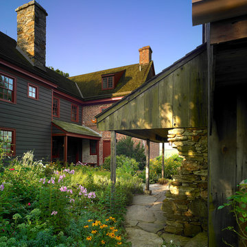
Every inch of the exterior, from the chimney down to the sagging front porch, was meticulously restored to it's original beauty. Years of poorly done add-on's were removed, while features such as the hanging lights along the driveway were added for safety and convenience.

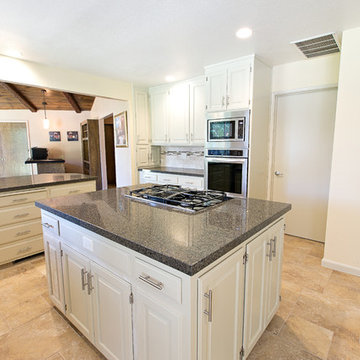
Perimeter cabinets restained to an updated darker stain finish. Island refinished to a black distressed finish. Add ons include new raised side panels to replace beadboard. New decorative legs, corbels and crown molding. All new knobs and pulls added to all the cabinet doors and drawers.

Our clients wanted to add an ensuite bathroom to their charming 1950’s Cape Cod, but they were reluctant to sacrifice the only closet in their owner’s suite. The hall bathroom they’d been sharing with their kids was also in need of an update so we took this into consideration during the design phase to come up with a creative new layout that would tick all their boxes.
By relocating the hall bathroom, we were able to create an ensuite bathroom with a generous shower, double vanity, and plenty of space left over for a separate walk-in closet. We paired the classic look of marble with matte black fixtures to add a sophisticated, modern edge. The natural wood tones of the vanity and teak bench bring warmth to the space. A frosted glass pocket door to the walk-through closet provides privacy, but still allows light through. We gave our clients additional storage by building drawers into the Cape Cod’s eave space.

 
Download our free ebook, Creating the Ideal Kitchen. DOWNLOAD NOW
 
Lakefront property in the northwest suburbs of Chicago is hard to come by, so when we were hired by this young family with exactly that, we were immediately inspired by not just the unusually large footprint of this 1950’s colonial revival but also the lovely views of the manmade lake it was sited on. The large 5-bedroom home was solidly stuck in the 1980’s, but we saw tons of potential. We started out by updating the existing staircase with a fresh coat of paint and adding new herringbone slate to the entry hall.
The powder room off the entryway also got a refresh - new flooring, new cabinets and fixtures. We ran the new slate right through into this space for some consistency. A fun wallpaper and shiplap trim add a welcoming feel and set the tone for the home.
Next, we tackled the kitchen. Located away from the rest of the first floor, the kitchen felt a little isolated, so we immediately began planning for how to better connect it to the rest of the first floor. We landed on removing the wall between the kitchen and dining room and designed a modified galley style space with separate cooking and clean up zones. The cooking zone consists of the refrigerator, prep sink and cooktop, along with a nice long run of prep space at the island. The cleanup side of the kitchen consists of the main sink and dishwasher. Both areas are situated so that the user can view the lake during prep work and cleanup!
One of the home’s main puzzles was how to incorporate the mudroom and area in front of the patio doors at the back of the house. We already had a breakfast table area, so the space by the patio doors was a bit of a no man’s land. We decided to separate the kitchen proper from what became the new mudroom with a large set of barn doors. That way you can quickly hide any mudroom messes but have easy access to the light coming in through the patio doors as well as the outdoor grilling station. We also love the impact the barn doors add to the overall space.
The homeowners’ first words to us were “it’s time to ditch the brown,” so we did! We chose a lovely blue pallet that reflects the home’s location on the lake which is also vibrant yet easy on the eye. Countertops are white quartz, and the natural oak floor works well with the other honey accents. The breakfast table was given a refresh with new chairs, chandelier and window treatments that frame the gorgeous views of the lake out the back.
We coordinated the slate mudroom flooring with that used in the home’s main entrance for a consistent feel. The storage area consists of open and closed storage to allow for some clutter control as needed.
Next on our “to do” list was revamping the dated brown bar area in the neighboring dining room. We eliminated the clutter by adding some closed cabinets and did some easy updates to help the space feel more current. One snag we ran into here was the discovery of a beam above the existing open shelving that had to be modified with a smaller structural beam to allow for our new design to work. This was an unexpected surprise, but in the end we think it was well worth it!
We kept the colors here a bit more muted to blend with the homeowner’s existing furnishings. Open shelving and polished nickel hardware add some simple detail to the new entertainment zone which also looks out onto the lake!
Next we tackled the upstairs starting with the homeowner’s son’s bath. The bath originally had both a tub shower and a separate shower, so we decided to swap out the shower for a new laundry area. This freed up some space downstairs in what used to be the mudroom/laundry room and is much more convenient for daily laundry needs.
We continued the blue palette here with navy cabinetry and the navy tile in the shower. Porcelain floor tile and chrome fixtures keep maintenance to a minimum while matte black mirrors and lighting add some depth the design. A low maintenance runner adds some warmth underfoot and ties the whole space together.
We added a pocket door to the bathroom to minimize interference with the door swings. The left door of the laundry closet is on a 180 degree hinge to allow for easy full access to the machines. Next we tackled the master bath which is an en suite arrangement. The original was typical of the 1980’s with the vanity outside of the bathroom, situated near the master closet. And the brown theme continued here with multiple shades of brown.
Our first move was to segment off the bath and the closet from the master bedroom. We created a short hall from the bedroom to the bathroom with his and hers walk-in closets on the left and right as well as a separate toilet closet outside of the main bathroom for privacy and flexibility.
The original bathroom had a giant soaking tub with steps (dangerous!) as well as a small shower that did not work well for our homeowner who is 6’3”. With other bathtubs in the home, they decided to eliminate the tub and create an oversized shower which takes up the space where the old tub was located. The double vanity is on the opposite wall and a bench is located under the window for morning conversations and a place to set a couple of towels.
The pallet in here is light and airy with a mix of blond wood, creamy porcelain and marble tile, and brass accents. A simple roman shade adds some texture and it’s top-down mechanism allows for light and privacy.
This large whole house remodel gave our homeowners not only the ability to maximize the potential of their home but also created a lovely new frame from which to view their fabulous lake views.
Designed by: Susan Klimala, CKD, CBD
Photography by: Michael Kaskel
For more information on kitchen and bath design ideas go to: www.kitchenstudio-ge.com

Do you move to the suburbs, make do, or add on? For a couple who wanted more kitchen and room to spread out and entertain, the decision was made to stay and grow. An addition was made behind their home that created an entirely new kitchen and family room, complete with vaulted ceilings and custom light fixtures. The addition itself is also not highly visible from the road, cutting down on the “hunchback” look of so many older city homes with massive additions. Windows give the space abundant natural light, with doors that inconspicuously blend indoor and outdoor living – an all in the home and neighborhood the couple loves best.

This kitchen has many interesting elements that set it apart.
The sense of openness is created by the raised ceiling and multiple ceiling levels, lighting and light colored cabinets.
A custom hood over the stone back splash creates a wonderful focal point. The traditionally styled architectural mill work compliments the island's use of reclaimed wood, transitional tapered legs, and white Carrara marble.
White Subway Tile and floating shelves in a distressed warm wood tone balance the barn door across the room and add another transitional touch to the room.
This kitchen was featured in a Houzz Kitchen of the Week article!
Photography by Alicia's Art, LLC
RUDLOFF Custom Builders, is a residential construction company that connects with clients early in the design phase to ensure every detail of your project is captured just as you imagined. RUDLOFF Custom Builders will create the project of your dreams that is executed by on-site project managers and skilled craftsman, while creating lifetime client relationships that are build on trust and integrity.
We are a full service, certified remodeling company that covers all of the Philadelphia suburban area including West Chester, Gladwynne, Malvern, Wayne, Haverford and more.
As a 6 time Best of Houzz winner, we look forward to working with you on your next project.

Sponsored
Delaware, OH
Buckeye Basements, Inc.
Central Ohio's Basement Finishing ExpertsBest Of Houzz '13-'21

Mid-sized transitional l-shaped slate floor eat-in kitchen photo in Boston with a farmhouse sink, raised-panel cabinets, white cabinets, granite countertops, metallic backsplash, metal backsplash, stainless steel appliances and an island
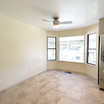
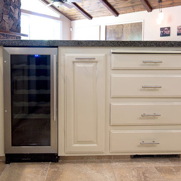
Perimeter cabinets refinished to an off white finish. Island refinished to a walnut woodgrain finish.Add ons include new raised side panels, crown & light rail molding, corbels & glass door. New countertops include Absolute Black Honed granite on perimeter and Super White Quartzite on Island. The backsplash is Carrara subway tile.

Our clients wanted to incorporate an East Coast vibe into their home. The kitchen had a great layout, but a wilted palette of earth tones looked outdated and uninspired. With a busy lifestyle and two kids in school, the couple needed a highly functional space that didn't skimp on style. Their research of design-build firms led them to the JRP website, and they called for a consultation the same day. After years of living with dark cabinets and a mix of heavy colors, the couple craved lightness. They wanted an airy kitchen with smooth, light-reflecting surfaces and a full-slab backsplash. A plan was drawn up for a complete rebuild that would change everything in the kitchen except the layout and the original tile-and-wood floors.
Now bright and uncluttered, this transitional kitchen is truly a space where the family can gather for years to come. Every part of the room draws you in, creating an atmosphere that embraces lingering conversations. The holistic design balances East Coast cool with California chic. Layers of contrasting textures achieve a high level of polish that looks and feels exceptional. The full-slab backsplash in Calacatta quartz stands out as a work of art, its glossy surface softly reflecting natural light. Matching quartz countertops add lustrous movement, where painted and natural wood textures quietly anchor the room. New, two-tone cabinetry is fresh and on-trend. A stunning linear chandelier in bronze evokes classical warmth. Where a built-in desk once collected clutter, stacked shaker cabinets now incorporate storage and visual interest. Integrated appliances, beautifully concealed behind DeWils cabinetry, hint at minimalist sophistication.
Cabinets (Manufacturer, Door Style, Material, Color/Stain or Finish)
- KITCHEN PERIMETER & PANTRY: DeWils, Sheffield, Maple, Limestone
- KITCHEN ISLAND: DeWils, Sheffield, Walnut, Nutmeg
Countertops (Material Type - Manufacturer, Collection, Color)
- Quartz – Vadara, Paris Collection, Calacatta Blanco
Light Fixture (Type - Manufacturer, Collection, Color)
- Chandelier - Visual Comfort & Co, Darlana Large Linear Lantern
Plumbing Fixture (Type - Manufacturer, Color)
- Faucet – Grohe, Antique Bronze
Sink (Type – Manufacturer, Material)
- Undermount - Kohler, Cast Iron
Hardware (Type – Manufacturer, Color)
- Cabinet Pulls - Top Knobs, Oil Rubbed Bronze
- Cabinet Knobs - Top Knobs, Oil Rubbed Bronze
Color of wall:
- Dunn Edwards Bone China
Photographer: J.R. Maddox
10