
Search results for "Element separate" in Home Design Ideas
 Vision Interiors
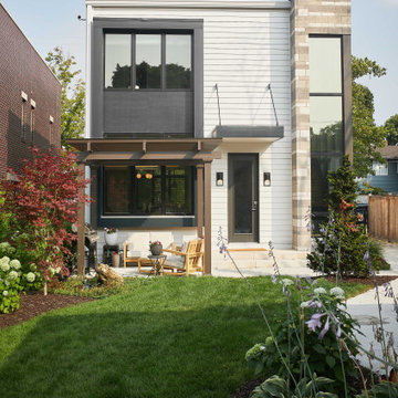
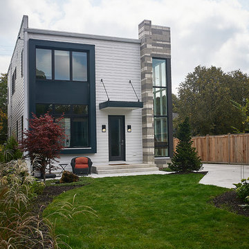
As a conceptual urban infill project, the Wexley is designed for a narrow lot in the center of a city block. The 26’x48’ floor plan is divided into thirds from front to back and from left to right. In plan, the left third is reserved for circulation spaces and is reflected in elevation by a monolithic block wall in three shades of gray. Punching through this block wall, in three distinct parts, are the main levels windows for the stair tower, bathroom, and patio. The right two-thirds of the main level are reserved for the living room, kitchen, and dining room. At 16’ long, front to back, these three rooms align perfectly with the three-part block wall façade. It’s this interplay between plan and elevation that creates cohesion between each façade, no matter where it’s viewed. Given that this project would have neighbors on either side, great care was taken in crafting desirable vistas for the living, dining, and master bedroom. Upstairs, with a view to the street, the master bedroom has a pair of closets and a skillfully planned bathroom complete with soaker tub and separate tiled shower. Main level cabinetry and built-ins serve as dividing elements between rooms and framing elements for views outside.
Architect: Visbeen Architects
Builder: J. Peterson Homes
Photographer: Ashley Avila Photography
 Visbeen Architects
Interior Designer: Vision Interiors by Visbeen
Builder: Joel Peterson Homes
Photographer: Ashley Avila Photography
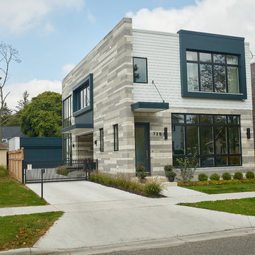
As a conceptual urban infill project, the Wexley, is designed for a narrow lot in the center of a city block. The 26’x48’ floor plan is divided into thirds from front to back and from left to right. In plan, the left third is reserved for circulation spaces and is reflected in elevation by a monolithic block wall in three shades of gray. Punching through this block wall, in three distinct parts, are the main levels windows for the stair tower, bathroom, and patio. The right two thirds of the main level are reserved for the living room, kitchen, and dining room. At 16’ long, front to back, these three rooms align perfectly with the three-part block wall façade. It’s this interplay between plan and elevation that creates cohesion between each façade, no matter where it’s viewed. Given that this project would have neighbors on either side, great care was taken in crafting desirable vistas for the living, dinning, and master bedroom. Upstairs, with a view to the street, the master bedroom has a pair of closets and a skillfully planned bathroom complete with soaker tub and separate tiled shower. Main level cabinetry and built-ins serve as dividing elements between rooms and framing elements for views outside.

Find the right local pro for your project
 Deep River Partners
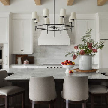
The central T-shape island is a workhorse for preparation, yet provides a cozy spot where a line of leather-backed barstools encourage conversation. The darkly stained finish provides contrast and anchors the space to separate it from other kitchen elements. The black metal light fixture, veining of the natural quartzite countertops, and accessories provide elegant contrast to the neutral theme through pattern, contrast and pops of color.
 Kadlec Architecture + Design
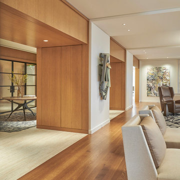
Our clients—philanthropists that split time between Chicago and Naples—embraced a rare opportunity to buy an adjacent unit and experience full-floor city living. With a vision for both intimate and large gatherings and minimal maintenance, we developed simple architectural details that organize the primary living spaces and integrate mechanical, lighting and structural elements. Their growing art collection is set against classic oak paneling, travertine and oak flooring and white lacquer finishes. Seeded glass and metal doors filter natural light into the center of the apartment and reflect city and lake views. The result is an understated yet inviting home.
 Visbeen Architects
Interior Designer: Vision Interiors by Visbeen
Builder: Joel Peterson Homes
Photographer: Ashley Avila Photography
As a conceptual urban infill project, the Wexley, is designed for a narrow lot in the center of a city block. The 26’x48’ floor plan is divided into thirds from front to back and from left to right. In plan, the left third is reserved for circulation spaces and is reflected in elevation by a monolithic block wall in three shades of gray. Punching through this block wall, in three distinct parts, are the main levels windows for the stair tower, bathroom, and patio. The right two thirds of the main level are reserved for the living room, kitchen, and dining room. At 16’ long, front to back, these three rooms align perfectly with the three-part block wall façade. It’s this interplay between plan and elevation that creates cohesion between each façade, no matter where it’s viewed. Given that this project would have neighbors on either side, great care was taken in crafting desirable vistas for the living, dinning, and master bedroom. Upstairs, with a view to the street, the master bedroom has a pair of closets and a skillfully planned bathroom complete with soaker tub and separate tiled shower. Main level cabinetry and built-ins serve as dividing elements between rooms and framing elements for views outside.
 Visbeen Architects
Builder: AVB Inc.
Interior Design: Vision Interiors by Visbeen
Photographer: Ashley Avila Photography
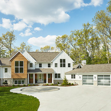
The Holloway blends the recent revival of mid-century aesthetics with the timelessness of a country farmhouse. Each façade features playfully arranged windows tucked under steeply pitched gables. Natural wood lapped siding emphasizes this homes more modern elements, while classic white board & batten covers the core of this house. A rustic stone water table wraps around the base and contours down into the rear view-out terrace.
Inside, a wide hallway connects the foyer to the den and living spaces through smooth case-less openings. Featuring a grey stone fireplace, tall windows, and vaulted wood ceiling, the living room bridges between the kitchen and den. The kitchen picks up some mid-century through the use of flat-faced upper and lower cabinets with chrome pulls. Richly toned wood chairs and table cap off the dining room, which is surrounded by windows on three sides. The grand staircase, to the left, is viewable from the outside through a set of giant casement windows on the upper landing. A spacious master suite is situated off of this upper landing. Featuring separate closets, a tiled bath with tub and shower, this suite has a perfect view out to the rear yard through the bedrooms rear windows. All the way upstairs, and to the right of the staircase, is four separate bedrooms. Downstairs, under the master suite, is a gymnasium. This gymnasium is connected to the outdoors through an overhead door and is perfect for athletic activities or storing a boat during cold months. The lower level also features a living room with view out windows and a private guest suite.

Sponsored
Sunbury, OH

J.Holderby - Renovations
Franklin County's Leading General Contractors - 2X Best of Houzz!
 Opal Enterprises, Inc.
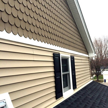
Scalloped siding in gables and new windows, shutters, and roof. This home got a curb appeal upgrade!
Mid-sized elegant beige two-story vinyl exterior home photo in Chicago
Mid-sized elegant beige two-story vinyl exterior home photo in Chicago
 Dream Luxe Remodeling INC
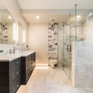
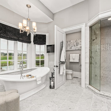
Example of a large transitional master marble tile and gray tile marble floor, gray floor and double-sink walk-in shower design in Chicago with a wall-mount toilet, beige walls, granite countertops, a floating vanity, shaker cabinets, gray cabinets, an undermount sink, a hinged shower door and gray countertops
 My House Design|Build|Team
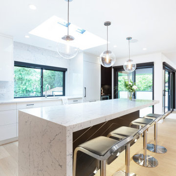
The family who owned this 1965 home chose a dramatic upgrade for their Coquitlam full home renovation. They wanted more room for gatherings, an open concept kitchen, and upgrades to bathrooms and the rec room. Their neighbour knew of our work, and we were glad to bring our skills to another project in the area.
Choosing Dramatic Lines
In the original house, the entryway was cramped, with a closet being the first thing everyone saw.
We opened the entryway and moved the closet, all while maintaining separation between the entry and the living space.
To draw the attention from the entry into the living room, we used a dramatic, flush, black herringbone ceiling detail across the ceiling. This detail goes all the way to the entertainment area on the main floor.
The eye arrives at a stunning waterfall edge walnut mantle, modern fireplace.
Open Concept Kitchen with Lots of Seating
The dividing wall between the kitchen and living areas was removed to create a larger, integrated entertaining space. The kitchen also has easy access to a new outdoor social space.
A new large skylight directly over the kitchen floods the space with natural light.
The kitchen now has gloss white cabinetry, with matte black accents and the same herringbone detail as the living room, and is tied together with a low maintenance Caesarstone’s white Attica quartz for the island countertop.
This over-sized island has barstool seating for five while leaving plenty of room for homework, snacking, socializing, and food prep in the same space.
To maximize space and minimize clutter, we integrated the kitchen appliances into the kitchen island, including a food warming drawer, a hidden fridge, and the dishwasher. This takes the eyes to focus off appliances, and onto the design elements which feed throughout the home.
We also installed a beverage center just beside the kitchen so family and guests can fix themselves a drink, without disrupting the flow of the kitchen.
Updated Downstairs Space, Updated Guest Room, Updated Bathrooms
It was a treat to update this entire house. Upstairs, we renovated the master bedroom with new blackout drapery, new decor, and a warm light grey paint colour. The tight bathroom was transformed with modern fixtures and gorgeous grey tile the homeowners loved.
The two teen girls’ rooms were updated with new lighting and furniture that tied in with the whole home decor, but which also reflected their personal taste.
In the basement, we updated the rec room with a bright modern look and updated fireplace. We added a needed door to the garage. We upgraded the bathrooms and created a legal second suite which the young adult daughter will use, for now.
Laundry Its Own Room, Finally
In a family with four women, you can imagine how much laundry gets done in this house. As part of the renovation, we built a proper laundry room with plenty of storage space, countertops, and a large sink.
 Vision Interiors
As a conceptual urban infill project, the Wexley is designed for a narrow lot in the center of a city block. The 26’x48’ floor plan is divided into thirds from front to back and from left to right. In plan, the left third is reserved for circulation spaces and is reflected in elevation by a monolithic block wall in three shades of gray. Punching through this block wall, in three distinct parts, are the main levels windows for the stair tower, bathroom, and patio. The right two-thirds of the main level are reserved for the living room, kitchen, and dining room. At 16’ long, front to back, these three rooms align perfectly with the three-part block wall façade. It’s this interplay between plan and elevation that creates cohesion between each façade, no matter where it’s viewed. Given that this project would have neighbors on either side, great care was taken in crafting desirable vistas for the living, dining, and master bedroom. Upstairs, with a view to the street, the master bedroom has a pair of closets and a skillfully planned bathroom complete with soaker tub and separate tiled shower. Main level cabinetry and built-ins serve as dividing elements between rooms and framing elements for views outside.
Architect: Visbeen Architects
Builder: J. Peterson Homes
Photographer: Ashley Avila Photography
 Selle Valley Construction, Inc.
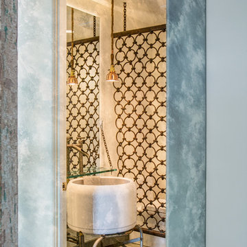
The powder room of the Custom River House certainly makes a statement. The sink is actually an antique washing machine that the homeowner purchased and wanted converted for this bathroom. A floor-to-ceiling mirror sits atop the 7" bluestone base board and is backlit with LED lighting on both sides and the top. A small glass ledge hangs just above the sink, where the Sonoma Forge faucet sits. The steel screen that separates the sink and toilet was custom fabricated by Seattle based artist Kirk Albert.
Photography by Marie-Dominique Verdier.
 Studio Hillier
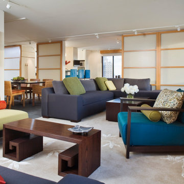
Many of the interior partitions were removed to create an expansive loft-like space. The openness would become the unifying element in the design and permit light to enter the space from the south and east. No longer defined by partitions, the kitchen, dining and living spaces enjoy a connectedness without sacrificing their individual spatial integrity. Separation and privacy between spaces is achieved through the use of sliding doors and screens. The inspiration was fueled by examples of Japanese architecture known as sukiya zukuri, where lower ceilings, simple wood paneling and shoji screens were commonly used. This image shows the sliding panels partly closed to conceal the sunroom.
Sponsored
Sunbury, OH
J.Holderby - Renovations
Franklin County's Leading General Contractors - 2X Best of Houzz!

 Simply Home Decorating
This beautiful North Vancouver home belongs to a nature-loving and health-conscious couple, Emma and Vince (names changed), their two young children, and their dog, Jasper. When they contacted us about renovating and furnishing their kitchen and family room, we walked in and saw a world of potential waiting to be uncovered.
Before: Larkhall Crescent Home:
Like many original North Vancouver homes, the interior was definitely dated. We encountered late ‘80s finishes in powder pink and teal green, old carpet, and a kitchen that wasn’t maximized to suit this family’s modern-day lifestyle. However, the size of the rooms offered us a ton of space with which to get creative.
Knowing our clients’ love of cooking, need for work spaces (Emma and Vince both work remotely), and growing family, we developed a design concept that would increase usable space, optimize storage, and create intimacy in this large area. As for the style, we were inspired by their European roots, inventing a new and modern take on “Belgian Farmhouse” style. Now, the home is truly one-of-a-kind.
After: Warm & Cozy Family Room:
Fresh, bright, and comfortable, this living area has been transformed! We started with the fireplace as a focal point, selecting aged brick tiles for added texture and a crisp wood mantle. The taupe-coloured sectional infuses the room with visual warmth and serves the added purpose of separating the family room from the kitchen.
Emma and Vince were also keen on using non-toxic materials in their home, and we were happy to oblige. To meet their needs, we sourced natural wood elements and sought out Canadian-made products - that adhere to high health standards - whenever possible.
Look closer at the elements of this space, and you will find this stunning, honeycomb-patterned rug in earthy gold, beige, and charcoal tones. It’s plush to the touch and full of visual texture that brings this room’s colour palette together. We sourced these two-tone chairs with caning, petrified wood side table, black sconces, and botanical prints in greyscale from local artist, Heather Johnston.
We topped off the space with this dark wood and rattan console that offers storage facing the kitchen and presents an opportunity to display cherished items. The result is a cozy lounging space brimming with comfort and functionality. It’s perfect for enjoying quality family time, or Emma can simply slide the coffee table away to make room for her morning yoga practice.
Now, let’s turn around and give some attention to the kitchen. Do you remember what the original kitchen looked like? If not, scroll back up, because the transformation is shocking…
Moody & Welcoming Kitchen for Healthy Living:
This kitchen looks very different from how it started, right? Though we didn’t touch any walls, the kitchen has almost doubled in usable space! We created a long, extended island with storage, an outlet for small appliances, and seating for comfortable prep, after-school snacking, or mingling among friends.
On the other side of the island, the family has even more storage and an integrated dishwasher within easy reach of the sink, perfect for quick clean-up. From this angle, you can also see the expansive custom Shaker cabinetry in white and the integrated double ovens. These facilitate their cooking experience and gave us the opportunity to add an additional surprise…
A coffee garage station and more hidden storage! Keeping these items located along the perimeter allows them to be accessed by the family or their guests without someone getting under the cook’s feet. These are the little details that make everyday life easier and more enjoyable.
Moving deeper into the kitchen, the seamless induction cooktop topped with a freestanding concealed hood fan commands attention in a soft yet prominent way. The natural wood accent mirrors the fireplace mantle, and the choice of off-black wood-grain cabinets not only continues our black-and-white colour palette but adds a sense of depth and contrast. The corner sink is located to the right and perfectly positioned with a view of their thriving backyard.
To invite more of this family’s character into the space, we mixed metals for interest — matte black, dark pewter, and warm brass — and created open shelves in white oak for their plants and decor. You can also glimpse the tumbled edge of the backsplash tile, which echoes the rustic brick of the fireplace. It adds that farmhouse charm while still feeling timeless and sophisticated.
Last but not least, we designed this dining banquette in the bay window (with integrated bench storage, of course), where the family can share a meal together, the kids can do homework, or Emma and Vince can work and enjoy a change of scenery from their offices. Like the other spaces in the home, it was designed to be beautiful, multi-functional, and long-lasting.
Praise from Our Clients:
It is clear that we love this home, but what did our clients have to say?
“Lori is a visionary and masters execution to the finest detail all at the same time. When she first met us to know more about who we are and how we live, she could right away envision how we could use the space in our kitchen and living room…The results exceeded our expectations.
Lori and her team were also a delight to work with — coordination with all the trades, fast problem-solving, regular updates, professional and friendly attitude of her entire team — made it the dream team. Thank you SHD for making our space so beautiful!”
In turn, we are so grateful for this family’s trust, their open communication, and for being wonderful people with whom to work. (So, thank you!)
 Vision Interiors
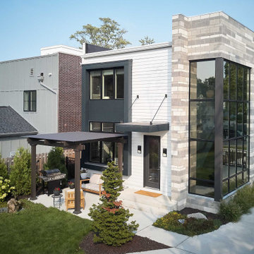
As a conceptual urban infill project, the Wexley is designed for a narrow lot in the center of a city block. The 26’x48’ floor plan is divided into thirds from front to back and from left to right. In plan, the left third is reserved for circulation spaces and is reflected in elevation by a monolithic block wall in three shades of gray. Punching through this block wall, in three distinct parts, are the main levels windows for the stair tower, bathroom, and patio. The right two-thirds of the main level are reserved for the living room, kitchen, and dining room. At 16’ long, front to back, these three rooms align perfectly with the three-part block wall façade. It’s this interplay between plan and elevation that creates cohesion between each façade, no matter where it’s viewed. Given that this project would have neighbors on either side, great care was taken in crafting desirable vistas for the living, dining, and master bedroom. Upstairs, with a view to the street, the master bedroom has a pair of closets and a skillfully planned bathroom complete with soaker tub and separate tiled shower. Main level cabinetry and built-ins serve as dividing elements between rooms and framing elements for views outside.
Architect: Visbeen Architects
Builder: J. Peterson Homes
Photographer: Ashley Avila Photography
 The Boutique Real Estate Group
You've seen the world, tasted its finest flavors, beheld its proudest splendors. Wanderlust romanced and beauty stayed you. EXPERIENCE THE INTERACTIVE FILM.
An Iconic, World-Class Destination
Neighbor to the Ritz Carlton and newly built Montage, you're at home with a standard of living consistent with the world's finest resorts.
Whether in its days as a private retreat for A-list celebrities or as a home to its discerning designer, Hale Ali'i has always been a generous host. Within the Kapalua resort, your complimentary shuttle drives you and your guests to local restaurants, shops, beaches, and hiking trails. Five-star restaurants, shopping, and world-famous spas call this resort community home. One of America's best surf spots is minutes north while "America's best beach" (Conde Nast Traveler) is a short walk south. The quiet, white sand beach of Oneloa Bay is a single step from your backyard just past the plumeria tree.
Inspired Hawaiian Living
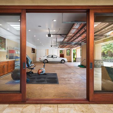
Tastefully decorated and furnished by world-renowned designer Mary Philpotts, this Hawaiian plantation revival residence accommodates a wide range of tastes – from traditional formal to contemporary casual. Home to a wide range of the world's most coveted woods, luxury finishes, and modern conveniences, the structure is built to exacting standards. From African Sapele Mahogany cabinetry to a myriad of floor-to-ceiling pocket sliding walls, no expense was spared in crafting the finest estate on Maui's coast.
Designed according to the timeless principles of feng shui, Hale Ali'i invites nature in, protects on all sides, and honors the elements. Appraised by feng shui expert Kanoe Merino and blessed by Hawaiian native and cultural advisor to the Ritz Carlton, Clifford Nae'ole, this iconic Maui estate brings life, energy, and peace to those who call it home.
For Life Abundant
In concert with whitewater ocean views, warm fragrant breezes, and the rolling of the Pacific, Hale Ali'i harmonizes luxurious features with a genuine spirit.
It's a comfortable place, yet never taken for granted. Each feature, flower, and fauna inspires a spirit of hospitality. Investments in modern conveniences, stately finishes, and ethereal design inspire the life within. An abundant life amongst the world's most magnificent landscape.
Designed according to the timeless principles of feng shui, Hale Ali'i invites nature in, protects on all sides, and honors the elements. E Komo Mai, traveler. It's been worth the wait.
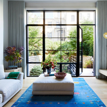
 The Brooklyn Studio
This residence was a complete gut renovation of a 4-story row house in Park Slope, and included a new rear extension and penthouse addition. The owners wished to create a warm, family home using a modern language that would act as a clean canvas to feature rich textiles and items from their world travels. As with most Brooklyn row houses, the existing house suffered from a lack of natural light and connection to exterior spaces, an issue that Principal Brendan Coburn is acutely aware of from his experience re-imagining historic structures in the New York area. The resulting architecture is designed around moments featuring natural light and views to the exterior, of both the private garden and the sky, throughout the house, and a stripped-down language of detailing and finishes allows for the concept of the modern-natural to shine.
Upon entering the home, the kitchen and dining space draw you in with views beyond through the large glazed opening at the rear of the house. An extension was built to allow for a large sunken living room that provides a family gathering space connected to the kitchen and dining room, but remains distinctly separate, with a strong visual connection to the rear garden. The open sculptural stair tower was designed to function like that of a traditional row house stair, but with a smaller footprint. By extending it up past the original roof level into the new penthouse, the stair becomes an atmospheric shaft for the spaces surrounding the core. All types of weather – sunshine, rain, lightning, can be sensed throughout the home through this unifying vertical environment. The stair space also strives to foster family communication, making open living spaces visible between floors. At the upper-most level, a free-form bench sits suspended over the stair, just by the new roof deck, which provides at-ease entertaining. Oak was used throughout the home as a unifying material element. As one travels upwards within the house, the oak finishes are bleached to further degrees as a nod to how light enters the home.
The owners worked with CWB to add their own personality to the project. The meter of a white oak and blackened steel stair screen was designed by the family to read “I love you” in Morse Code, and tile was selected throughout to reference places that hold special significance to the family. To support the owners’ comfort, the architectural design engages passive house technologies to reduce energy use, while increasing air quality within the home – a strategy which aims to respect the environment while providing a refuge from the harsh elements of urban living.
This project was published by Wendy Goodman as her Space of the Week, part of New York Magazine’s Design Hunting on The Cut.
Photography by Kevin Kunstadt
Sponsored
Sunbury, OH
J.Holderby - Renovations
Franklin County's Leading General Contractors - 2X Best of Houzz!
 Storie Collective
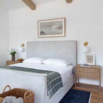
In this new build project, our objective was to create light and airy spaces and rooms that evoke warmth and coziness, including a main level floor plan that elicits open concept and separate spaces through architectural details. We love that our client felt inspired by minimal, clean and modern design elements that incorporate interest through movement in natural materials yet also adored traditional elements and beachside inspiration. By juxtaposing strong raw wood elements against soft linen curves and contrasting soft neutral colors against moody tones, we strove to create balance within the design. The space provides the perfect amount of richness and depth to ensure coastal vibes are respected not overwhelming. Bringing the outdoors in, through greenery and living plants, we created a soothing and natural ease about this family home.
 Storie Collective
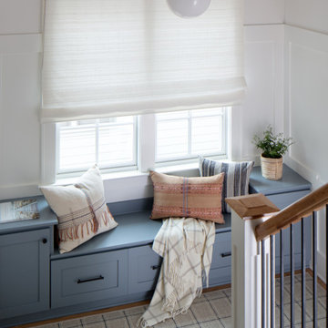
In this new build project, our objective was to create light and airy spaces and rooms that evoke warmth and coziness, including a main level floor plan that elicits open concept and separate spaces through architectural details. We love that our client felt inspired by minimal, clean and modern design elements that incorporate interest through movement in natural materials yet also adored traditional elements and beachside inspiration. By juxtaposing strong raw wood elements against soft linen curves and contrasting soft neutral colors against moody tones, we strove to create balance within the design. The space provides the perfect amount of richness and depth to ensure coastal vibes are respected not overwhelming. Bringing the outdoors in, through greenery and living plants, we created a soothing and natural ease about this family home.
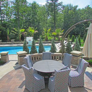
 Interlocking Concrete Pavement Institute
HNA Hardscape Project Award Winner
A Slice of Paradise
Strongsville, Ohio
Rock Bottom Lawn & Landscaping
With a resort-like feel, this project incorporates many entertainment features. The homeowner requested an area for hosting large parties without feeling crowded. The separate design elements allow for more intimate gatherings within the overall project. These elements include a partially covered outdoor kitchen/bar, large dining area, covered pavilion and fireplace patio, in-ground swimming pool with accompanying pool deck, and a raised gas fire pit patio bordered by a curved seat wall. The theme of contrast runs throughout the project while unifying each of the features. Light and dark, smooth and textured, linear and sinuous play off each other adding interest and bringing attention to the materials used. The large pavers were chosen to fit the grand scale and style of the project, additionally creating a smooth surface along the pool deck, all while having a minimal joint between pavers. Textured dark grey and brown pavers provide accents and borders throughout the site. Seven feet of elevation change from the threshold of the house to the back side of the pool wall had to be taken into account. Retaining walls and the placement of patios limit the amount of stairs between areas, as requested by the homeowner, while still creating vertical interest in key places such as the fire pit patio. Non-concrete elements such as the palm trees, wooden pergolas and columns combine with the hardscaping to create a truly unique and relaxing slice of paradise.
45