
Search results for "Element separate" in Home Design Ideas
 Granit Architects + Interiors
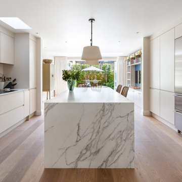
An expressive family home in Clapham.
The Brief
The brief was to create a new ground floor. It needed to be a flexible home capable of accommodating guests of all ages whilst maintaining purpose and separation between spaces.
The Solution
We proposed re-routing the hallway to become a central corridor through the ground floor plan. This would connect the rear and front halves of the property across a series of staggered level changes. We also wanted to create an enlarged rear space for entertainment that linked to the garden space.
The removal of an existing courtyard allowed for the insertion of a boot room and relocated WC central to the plan.
Separating the distinctly classical detailing of the front reception and dining room, which emphasises our clients’ favoured style and family backgrounds, from the sleek contemporary rear kitchen and entertainment space was successfully enhanced by the varied format of the timber flooring from Trunk.
Maintaining visual connectivity was achieved by way of two sizeable glazed pocket doors that enable the two halves of the plan to be differentiated from each other. At the same time, the use of internal glazing supports views through the property to the remodelled rear garden.
The bespoke designed kitchen from Eclectic Interiors introduces the user to the modernised rear extension, which features sharp detailing and a splash of colour from the feature media unit designed by our interiors team.
The symmetrical rear elevation carries through to the garden making for an interconnected, seamless transition through the property.
The Result
The combination of classical and contemporary elements marry together well to support flexible family living and entertaining. Our clients are delighted with the outcome and feel that it meets their brief and design aspirations.
 Cottage Home, Inc.
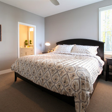
Bigger is not always better, but something of highest quality is. This amazing, size-appropriate Lake Michigan cottage is just that. Nestled in an existing historic stretch of Lake Michigan cottages, this new construction was built to fit in the neighborhood, but outperform any other home in the area concerning energy consumption, LEED certification and functionality. It features 3 bedrooms, 3 bathrooms, an open concept kitchen/living room, a separate mudroom entrance and a separate laundry. This small (but smart) cottage is perfect for any family simply seeking a retreat without the stress of a big lake home. The interior details include quartz and granite countertops, stainless appliances, quarter-sawn white oak floors, Pella windows, and beautiful finishing fixtures. The dining area was custom designed, custom built, and features both new and reclaimed elements. The exterior displays Smart-Side siding and trim details and has a large EZE-Breeze screen porch for additional dining and lounging. This home owns all the best products and features of a beach house, with no wasted space. Cottage Home is the premiere builder on the shore of Lake Michigan, between the Indiana border and Holland.
 Michael Nash Design, Build & Homes
This single-family home purchased by a young family in Sterling, Virginia needed a kitchen and living space remodel.
This family did not want separate kitchen and family spaces separated by a bearing wall.
Our expert team got to work redesigning the spaces. By removing the wall and placing a large-scale island in place of the previous island, both kitchen and living spaces were opened up. The refrigerator and other tall elements were relocated to a north wall and covered with closet doors.
By eliminating a window on one side, we enlarged the west wall of the kitchen to allow for new features such as a large-scale gas stove, custom-made metal hood surrounded by floating shelves, a full backsplash of granite covers up this entire wall.
The previous north wall had a large-sized refrigerator and freezer, built-in coffee maker, microwave along with plenty of pantry and storage space.
The new island sitting at the center of the kitchen, includes a farmhouse sink, dishwasher, and other amenities with plenty of seating.
A new wood floor was installed across the entire space with a new stain color complimenting the island cabinet finish.
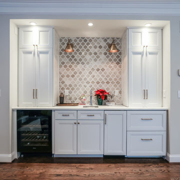
The family room closet was converted to feature a wet bar area including a beverage center with display glass cabinets, a wine cooler, ice maker and decorated with waterjet backsplash & sconce lights.
The high-end professional appliances and unique contrast between the stone top and cabinet finish make this kitchen remodel an award-winning project.
Find the right local pro for your project
 Drury Design
THE SETUP
Sam’s client had lived in her downtown townhome home for less than a year when she decided to remodel the spacious second level. This open area consisted of three sections: a TV and fireplace zone, a sparsely furnished dining area, and a dominant central kitchen. The kitchen featured a long back wall with three segmented sections and a massive island housing the cooktop. She found the kitchen’s functionality lacking and its presence overwhelming – it dominated the entire floor, regardless of where you stood.
Design objectives:
- Reconfigure key kitchen elements (sink, cooktop, oven) while minimizing the kitchen’s visual impact
- Optimize the kitchen’s back wall, eliminating existing dead space
- Create a purposeful, well-defined dining area
- Establish a distinct, comfortable living area
- Reuse existing appliances and flooring
- Maintain an overall modern design aesthetic
THE REMODEL
Design challenges to be solved:
- Redesign the island to reduce its overwhelming presence
- Create a comfortable, dedicated living room within the available space
- Establish a distinct, inviting dining area within spatial constraints
- Enhance kitchen functionality and style without dominating the entire floor
THE RENEWED SPACE
Design solutions:
- Sam created raised end caps for the island. This separated the kitchen from adjacent living and dining areas while focusing the kitchen’s functionality. The new sink location offers ample workspace, allowing the cook to interact with guests seated at the island. The redesigned island also provides additional storage.
- For the living area, Sam opted for a functional-yet-minimalist approach. Large-format tile creates a natural stone look for the fireplace and TV wall. The recessed TV and extended fireplace shelf maintain a sleek profile. - Artistic wallpaper adds depth and texture, while the intentional lack of extensive shelving keeps the space open and distinct.
- Sam transformed the dining area’s blank wall into a feature, adding a unique dry bar with counter space, open shelves, cabinet storage and a beverage fridge. - - - Wallpaper behind and above the bar contributes to the area’s personality. A mirror adds depth while pendant lights add style and visual interest.
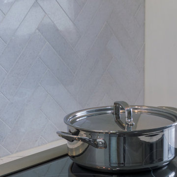
Relocating the cooktop to the back wall facilitates hidden ventilation, reducing visual clutter. Sam balanced transitional and modern elements for a contemporary yet comfortable feel. The digital control panel on the convection cooktop maintains a sleek look, while the wall oven is now at an easy-to-use height. ----- Mirrored base cabinet fronts and a paneled fridge prevent cabinetry monotony.
The redesign has delighted Sam’s client, achieving her main goal of creating a more inviting and visually appealing space. Each section now has its own visual personality and functionality while harmonizing within a monochromatic palette. The entire floor offers wow-factor pop upon first glance, with each area maintaining its distinct character while contributing to a cohesive, modern aesthetic.
 Ancient Surfaces
Project: Le Petit Hopital in Provence
Limestone Elements by Ancient Surfaces
Project Renovation completed in 2012
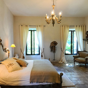
Situated in a quiet, bucolic setting surrounded by lush apple and cherry orchards, Petit Hopital is a refurbished eighteenth century Bastide farmhouse.
With manicured gardens and pathways that seem as if they emerged from a fairy tale. Petit Hopital is a quintessential Provencal retreat that merges natural elements of stone, wind, fire and water.
Talking about water, Ancient Surfaces made sure to provide this lovely estate with unique and one of a kind fountains that are simply out of this world.
The villa is in proximity to the magical canal-town of Isle Sur La Sorgue and within comfortable driving distance of Avignon, Carpentras and Orange with all the French culture and history offered along the way.
The grounds at Petit Hopital include a pristine swimming pool with a Romanesque wall fountain full with its thick stone coping surround pieces.
The interior courtyard features another special fountain for an even more romantic effect.
Cozy outdoor furniture allows for splendid moments of alfresco dining and lounging.
The furnishings at Petit Hopital are modern, comfortable and stately, yet rather quaint when juxtaposed against the exposed stone walls.
The plush living room has also been fitted with a fireplace.
Antique Limestone Flooring adorned the entire home giving it a surreal out of time feel to it.
The villa includes a fully equipped kitchen with center island featuring gas hobs and a separate bar counter connecting via open plan to the formal dining area to help keep the flow of the conversation going.
 TOC design & construction inc.
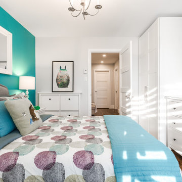
Girl and Boy Bedrooms:
Personalization: Allow each teenager to express their individual style and interests in their bedroom decor. Incorporate their favorite colors, artwork, and decor elements that reflect their personalities.
Ample Storage: Include sufficient storage options like closets, shelves, and drawers to accommodate their belongings and keep the rooms organized.
Flexibility: Design the space in a way that allows for flexibility and future adaptations as their needs and preferences may change over time.
 Otogawa-Anschel Design-Build
There is always an easy way out. A simple, uninteresting solution that neither challenges nor engages the mind or the soul. The 50s rambler is a simple structure that lacks character and charm. Its greatest contribution to architecture was the single floor living concept. We came to this project because the homeowners believed their home had the potential to be something more and had invested their time and creativity into developing ideas for what it could become. We embraced the opportunity to collaborate with the homeowner to create a home that was unique, thoughtful, customized for their use, and cared for.
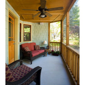
The curved exterior shell of this addition wraps around to accommodate a screen porch under a lifted peak. Inside, the new kitchen follows the curve with custom cabinets and honed granite creating a dynamite space for a chef. Shade tree, bamboo and honed slate flooring weave the living room, dining room, bathroom and kitchen together. Walls jog and jump with color and dimension.
One of the major challenges was to ensure that the space could accommodate large family gatherings of 12 – 16 people yet still feel intimate and comfortable for two people when guests were not present. As you move through the home you will notice that none of the spaces feel cavernous or restrictive. Careful attention was paid to mapping out the space to create areas that were cozy and appropriate while taking traffic patterns into consideration. The dining room entrances are staggered which creates the illusion of two separate spaces. The warm red halogen lights further encourage a sense of scale. One can easily extend the dining room table to accommodate a large crowd without causing guests to feel uncomfortable or confined.
The use of color is an often noted feature in our projects. Our philosophy is that the selection of color for the walls is as important as the selection of all the other materials. Color influences everything we do and gives us direction for how to feel, where to go, where to stop, and how to interact. It is the binding component between all the elements in a design. It bends, bounces, twists, manipulates light and the eye, and is required to fully develop and design a space.
This project was an exciting and rewarding challenge, and we are grateful to the homeowners for asking us to be a part of it and to opening up their home to the public. We hope that you will enjoy your time visiting this remarkably transformed home.
highlights
Re-use of existing housing stock
Icynene insulation
Super-insulated ceilings
Remnant granite countertops
Energy Star windows
Shade tree floors
Bamboo floors
Hardishingle siding
Halogen lights
Dimmers and separated task lighting
Energy efficient Panasonic fans
Locally manufactured cabinets
FSC certified millwork
Energy Star appliances
Dual flush toilet
Sponsored
Sunbury, OH

J.Holderby - Renovations
Franklin County's Leading General Contractors - 2X Best of Houzz!
 Top Tread Stairways
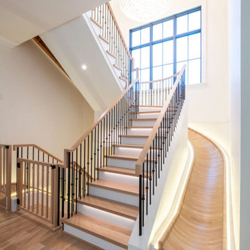
Custom Curved Wooden Slides by Top Tread Stairways ~
Transform Your Home Into Something Extraordinary
Custom Curved Wooden Slides
When was the Last Time Someone Walked Into Your Home and Their Jaw Literally Dropped?
When was the last time someone walked into your home and their jaw literally dropped?
Picture this: Your guests arrive for dinner. They step into your foyer, and suddenly—silence. Wide eyes. A moment of pure disbelief. Then, inevitably, the question: “Is that really what I think it is?”
Welcome to the world of custom curved wooden slides, where Top Tread Stairways turns childhood dreams into sophisticated architectural statements.
The Secret is Out
For years, Clyde Martin and his team at Top Tread Stairways in Sierra Vista, Arizona, have been quietly building something extraordinary. While most stair companies focus on traditional projects, TopTread Stairways has been perfecting the art of custom hardwood slides—creating installations so remarkable that we joke about renaming the business “Chutes and Ladders.”
The truth? These aren’t just slides. They’re conversation pieces. Works of functional art. The kind of architectural element that sets your home apart from every other one on the planet.
And we build so many of them that we’ve shipped custom slides all over North America and beyond.
Four Ways to Make Your Home Unforgettable
Every slide project we undertake is unique, but they generally fall into four categories:
1. Curved Stair-Slide Combinations – The ultimate space-efficient solution, where stairs and slide spiral together in a stunning combination of form and function.
2. Curved Slides Separate from Stairways – For those who want the drama of a standalone curved slide that makes its own architectural statement.
3. Straight Stair-Slide Combinations – Perfect for modern, linear spaces where clean lines meet playful innovation.
4. Straight Slides Separate from Stairways – Sometimes simplicity creates the most powerful impact.
But here’s where it gets interesting: Some slides feature flat seat areas with vertical sides. Others embrace a barrel shape for enhanced comfort. We’ve built slides wide enough for several people to descend shoulder-to-shoulder, laughing all the way down. And we’ve crafted intimate slides designed for solo adventures, regardless of age or size.
Our clients? They absolutely love them.
Stories That Will Make You Rethink What’s Possible
Take the 11,000-square-foot home in Beverly Hills, overlooking the famous Sunset Strip. In one child’s bedroom, we installed a 12-foot curved slide crafted from white oak. Understated location, extraordinary feature.
Or consider the 35-foot-high round tower room in an 8,500-square-foot custom home bordering the Sacramento River in Northern California. This project has become our most famous installation—a stunning 33-foot curved stair-slide combination built entirely from solid black walnut, featuring 445 layers of cross-laminated hardwood and a spiral newel post that took eight months to construct in our shop.
The homeowners had searched for eight years to find someone “crazy enough” to build their dream. When we completed it, one of Clyde’s trusted business partners—someone who’d seen him tackle countless unique projects—admitted he thought Clyde had lost his mind taking this one on. He genuinely didn’t believe we could pull it off.
We did. And the homeowners? Still thrilled years later.
Where Imagination Meets Reality
But these slides aren’t just for private estates. We’ve installed a 24-foot hickory slide in an elementary school library just east of Dallas, where kids absolutely love it. And here’s something that will make you smile: We built the longest wood slide ever for a children’s hospital in Springfield, Illinois.
Have you ever heard a child beg to go to the doctor?
We’re pretty sure it happens in Springfield. That walnut slide stretches 45 feet long and 3 feet wide—spacious enough for three children to sit side-by-side or for an adult and child to slide together comfortably. We built it in one piece, filling an entire semi-trailer for transport. It lives in the hospital lobby, and no appointment is needed to experience it yourself.
In Raleigh, North Carolina, we installed a 36-foot white oak slide in a custom home. The client loved it so much they ordered a second one—literally 15 minutes after we finished the installation. When Clyde returned to the office, there was already a check in the mailbox for slide number two. This 14,000-square-foot home now features 72 linear feet of curved white oak slide: one connecting the second floor to the main level, another linking the main floor to the finished basement.
What a ride, indeed.
Then there’s the curved stair-slide combination in Visalia, California—32 feet of knotty alder complemented by a hanging netted loft and climbing wall. Creative? Absolutely. Fun? Beyond measure.
The People Behind the Dreams
What inspires us most isn’t the technical challenge of building these slides—though engineering a 33-foot curved slide from 445 layers of cross-laminated hardwood certainly keeps us engaged. It’s working with clients who refuse to think inside the box.
These are creative individuals willing to explore ideas that set their homes and businesses apart. They dream of installations that make people stop and stare. They understand that architecture can—and should—inspire joy.
Listening to them describe their visions, explaining their dreams of a slide design unlike anything else on earth? That’s a privilege. And bringing those dreams to life? That’s what we live for.
My team and I have as much fun designing and building these slides as our clients have riding them. We’d love nothing better than to hear from you!
Custom Curved Wooden Slides
What Sets Top Tread Stairways Apart
Since 2006, Clyde Martin has built Top Tread Stairways on a simple premise: there’s a better way to build stairs. With roots in eastern Pennsylvania and years of experience installing hundreds of pre-built stairways, Clyde brought that expertise west and founded a company dedicated to exceptional craftsmanship.
We stock thousands of stair parts in more than ten wood species—hickory, jatoba, maple, cherry, mahogany, alder, red oak, white oak, poplar, Douglas fir, and walnut. Quality levels are high. Lead times are short. We understand the urgency of your project schedule and deliver accordingly.
But here’s what really matters: When it comes to custom wooden slides, Top Tread Stairways is one of—if not the—premier builders of indoor wooden slides in the United States. This isn’t a side project for us. It’s a specialty we’ve refined through years of experience, countless installations, and an unwavering commitment to turning impossible dreams into breathtaking reality.
Your Home, Reimagined
Whether you’re envisioning a straight wooden stand-alone slide for your office or a jaw-dropping curved wooden slide/stairway combination that will become your home’s signature feature, we’d love to hear from you.
We’re not here to build ordinary. We’re here to build extraordinary.
Ready to set your home apart?
~ Custom Curved Wooden Slides ~ ART YOU RIDE!
 Kitchen Solvers of Grayslake
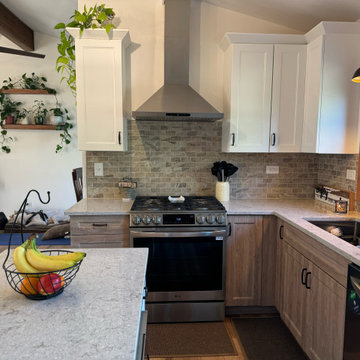
Our latest project involved a complete kitchen overhaul for a family looking to create an open, functional space that seamlessly blends modern and rustic elements. By modifying the wall separating the kitchen and living room, we opened up the area and then custom-designed the cabinet depth behind the new high-top seating area, allowing us to install a small but highly functional island with a built-in microwave. They went with our Amesbury III door style from our Kitchen Solvers Legacy Collection in Stratus SuperMatte for the upper cabinets and Rustic Light Oak for the lowers. Next, we installed a new gray Lagoon Quartz countertop paired with a subway pattern Eurasia-Chiara Glazed Porcelain backsplash. The transitional design brings together white and wood tones, creating a warm yet contemporary look. The homeowners are thrilled with their new kitchen, especially the island and high-top counter that have become the heart of their home. Now, they spend more time together as a family in this beautifully transformed space.
 Maison Birmingham
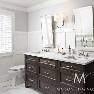
Challenged with creating an updated, more functional bath within this well-preserved 1937 Grosse Pointe home, our team began by reworking the layout in order to accommodate a separate soaking tub and shower (previously one bathtub with shower head), as well as a dual vanity (previously just one pedestal sink). The space was tight, but we were able to incorporate these new elements with a very efficient floor plan, and maintain a light airy feel by carefully selecting materials that would still bring a historic warmth to the space without creating darkness or heaviness.
Encasing the new shower in glass was the first step in allowing daylight to reach all the way back to the bathroom’s entrance. Beautiful polished nickel plumbing fixtures, lights, hardware, and pivot mirrors bring in a warm element that continuously bounces light and shine around the space. Wanting to stay true to classic materials, but also balance the homeowners’ desire for functionality and practicality, porcelain tile and quartz were used for the main floor tile and countertop, while a white marble hexagon mosaic is inlaid into the floor, shower floor, and shower ceiling. Five foot high wainscoting panels adorn the new bathroom walls to bring in light and warmth, as well as a nod to the previous pink tile that came up to the same height.
Photography by Martin Vecchio
 Cummings Architecture + Interiors
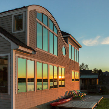
Situated along Eagle River, looking across to the mouth of the Ipswich Harbor, this was clearly a little cape house that was married to the sea. The owners were inquiring about adding a simple shed dormer to provide additional exposure to the stunning water view, but they were also interested in what Mathew would design if this beach cottage were his.
Inspired by the waves that came ashore mere feet from the little house, Mathew took up a fat marker and sketched a sweeping, S-shape dormer on the waterside of the building. He then described how the dormer would be designed in the shape of an ocean wave. “This way,” he explained, “you will not only be able to see the ocean from your new master bedroom, you’ll also be able to experience that view from a space that actually reflects the spirit of the waves.”
Mathew and his team designed the master suite and study using a subtle combination of contemporary and traditional, beach-house elements. The result was a completely unique and one-of-a-kind space inside and out. Transparencies are built into the design via features like gently curved glass that reflects the water and the arched interior window separating the bedroom and bath. On the exterior, the curved dormer on the street side echoes these rounded shapes and lines to create continuity throughout. The sense of movement is accentuated by the continuous, V-groove boarded ceiling that runs from one ocean-shaped dormer through to the opposite side of the house.
The bedroom features a cozy sitting area with built in storage and a porthole window to look out onto the rowboats in the harbor. A bathroom and closet were combined into a single room in a modern design that doesn't sacrifice any style or space and provides highly efficient functionality. A striking barn door made of glass with industrial hardware divides the two zones of the master suite. The custom, built-in maple cabinetry of the closets provides a textural counterpoint to the unique glass shower that incorporates sea stones and an ocean wave motif accent tile.
With this spectacular design vision, the owners are now able to enjoy their stunning view from a bright and spacious interior that brings the natural elements of the beach into the home.
Photo by Eric Roth
 Leslie Cohen Design
Originally from Hawaii, my clients wanted to incorporate the warmth and color of the islands into their California ranch home. Their requests:
• Comfortable, serene, uncluttered design
• Natural elements
• Kitchen more open to dining
• Arrangement to accommodate new flat-screen TV viewing
Hosting constant visitors, my clients live in their kitchen and enjoy cooking.
For Hawaiian colors, I used green quartz, glass tile and counters, iroko flooring, hemlock cabinets, and an unusual slate limestone.
To create a lighter, more welcoming space I removed the wall between the dining room and kitchen and increased the entry wall length to create a better kitchen/dining/entry relationship. I added a wall between the family room and kitchen to house tall kitchen elements on one side and TV equipment on the other, as well as create a natural transition for the ceiling height changes.
Features:
• Ventilated drawers
• Composting sink
• Energy-efficient lighting
• Silent hood and dishwasher
When it came to their master bath, my clients requested:
• Spa-feeling
• Shower for two
• Functional makeup area
• Two sinks
• Linen storage
• Walk-in closet
• Separate toilet compartment
• Door to backyard for pool access.
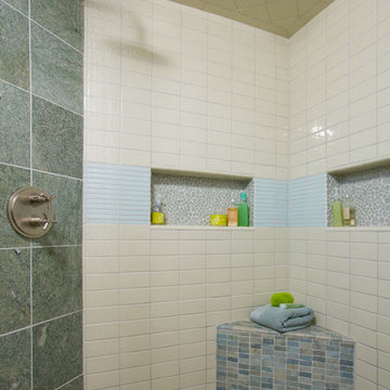
I rearranged the space for convenience and function and created an open shower with double rain and hand-showers, a shallow makeup counter (easy to get close to the mirror), plentiful storage, and seating.
Shades of blue and green create a sense of “spa”. Blended textures of honed limestone countertops, slate, glass tile, large-format and mosaic porcelain tile, glass pebbles, granite tile, and ceramic tiles are earthy yet refined. Horizontal patterns create serenity.
Storage:
• Tall louvered linen cabinet
• Flush medicine cabinets
• His-and-her pullouts at each end of the vanity
• Multiple shower niches
• Function-packed walk-in closet
• Toilet roll cabinet in toilet vestibule
• Bedroom armoire
Function:
• Seating in shower
• Seating in main bath
• Convenient towel bars
• Silent, powerful vent fans
• Good lighting
• Textured glass windows add light and privacy.
Ed Gohlich photographer
 Bilotta Kitchen & Home
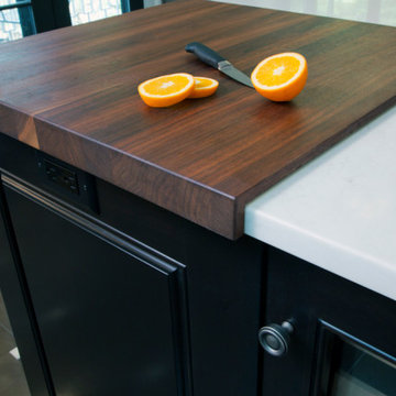
This two-toned kitchen was designed by Paula Greer, CKD of Bilotta Kitchens with Robin Zahn of Robin Prince Zahn Architecture. The u-shaped space has perimeter cabinets in Bilotta’s own line, the Bilotta Collection in a custom gray paint. The island is Wood-Mode Cabinetry in cherry with a stain. Countertops are Caesarstone’s London Grey with a built-in walnut cutting board on one corner of the island from Brooks Custom. The custom Madison Hood by Rangecraft is in a Dark Antique Steel finish and extends up accentuating the high ceiling above the cooking triangle. Two of the most interesting elements of this space are the banquette area and the coffered ceilings. By far, the most frequent installation of banquettes is tucking them into a corner of the room, regardless of how much seating is available at the island. In this kitchen, the island provides enough space for four to five stools. But because the space is separated from the rest of the house, the client wanted to ensure there was sufficient seating for their frequent entertaining. Also, the house is situated in a secluded wooded area; the new kitchen includes an abundance of unobstructed windows to fully experience the beautiful outdoor surroundings. The corner banquette (under more windows!) makes it feel like you’re dining in the trees. The bonus feature is that there’s extra storage below for table linens or seldom-used serving pieces. This really functions like a couch, complete with throw pillows and a TV, where the empty-nesters love spending time even when it isn’t mealtime. As for the ceiling, coffers don’t necessarily have to be large and intricately detailed with layers of moldings in order to be effective. This kitchen features two different ceiling heights: a small section of an addition contains a vaulted ceiling, while the larger island and eating area are tucked under a 2nd floor balcony and bedrooms. The client wanted to distinguish the lower area from the vaulted section, but in a subtle manner. The architect chose to implement shallow coffers with minimal trim for a softer result. The geometric pattern also reflects the floor tile and other lines within the room. The most interesting aspect, though, is that the vaulted area is actually concealed from view when you’re standing in the breakfast area; but as you approach the sink and window, the ceiling explodes above you for a visual surprise. And lastly, of course during this time of “work from home” the desk tucked in a nook opposite the banquette creates the perfect space for Zoom meetings, email checking and just the day-to-day activities we used to go into the office to do. The kitchen is an all-around perfect space for cooking, entertaining, relaxing or working!
Bilotta Designer: Paula Greer
Photographer: Philip Jensen-Carter
Architect: Robin Prince Zahn Architecture
Sponsored
Sunbury, OH
J.Holderby - Renovations
Franklin County's Leading General Contractors - 2X Best of Houzz!
 Jarrett Design
Many recent renovations had already taken place at this phenomenal old Tudor home. The kitchen redo was saved for last. Our mission, imposed by our client, was to create a jaw-dropping, ultra-functional space for family and friends to gather in for years to come. Naturally, the new kitchen would have to reflect the style of the home seamlessly.
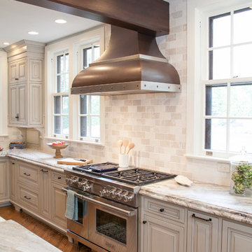
One challenge was to incorporate very large professional style appliances into the space while keeping the feel of a stately, yet warm home. Custom wood panels were designed for the refrigerator units to give a furniture feel. A copper hood was designed to bring in an old world element. Wood panels were applied to all other appliances – two dishwashers, a wine refrigerator, and a beverage refrigerator.
An iron I-beam that separated the original kitchen from the butler’s pantry and back entry was covered in wood with chamfers to match the other ceiling beams in the home by a local woodworker.
Due to the age of the home, the outside walls are concrete block. This necessitated chiseling troughs into the concrete for electrical wiring. Ceilings were studded randomly, so finding openings for recessed lighting was hit or miss. A large cluster of wiring and plumbing to the second floor had to be hidden behind cabinetry to the left of and above the refrigerators. HVAC wasn’t straight forward either. Toe kick heaters from the old kitchen had to be replaced with other sources. A propane tank had to be added to fuel the large dual fuel, double oven range. The homeowner wanted to add a walk-in pantry for extra storage, so space was taken from an existing exterior space. This created the need for extra insulation, supplemental heat and added lighting. Needless to say, mechanicals were a big challenge.
Natural stone was added in backsplash areas to the ceiling to mimic the rectangular stone on the exterior of the home. Wood panels fill the backsplash areas under wall cabinets. Large chandeliers light the space. Open shelves at the wet bar/prep area offer convenient storage for grab and go service items. A built-in pantry with antique mirrored mullion doors hides a microwave, several other small appliances as well as dishes and food items. This pantry was tucked into an alcove for an added architectural element. Herringbone wood floors are classic and timeless. Wrought iron hardware and shelf brackets fit right in. Large Barclay twist legs ground the island giving a nod to the Tudor style.
Mission accomplished.
Matt Villano Photography
 TVL Creative Ltd.
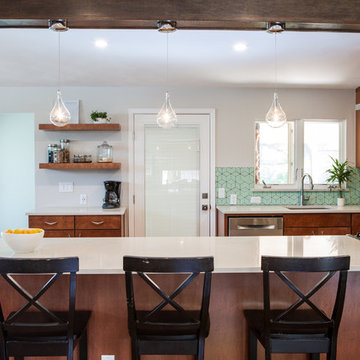
There’s nothing as wonderful as walking into a mid-century gem with clients who love the character of their new home. Our goal for this project was to incorporate the mid-century bones of this home into a new design that would better meet the contemporary needs of our clients. We started by taking down the walls that had separated this kitchen from the rest of the home and creating a welcoming space that blended seamlessly with the new open concept. The new kitchen design was a win for our clients with increased storage, more work surfaces, and a peninsula with plenty of seating. We utilized wood finishes through out this space with light wood flooring, medium-tones on the cabinetry, and darker wood accents throughout giving us a beautiful balance and a calm backdrop. This home had beautiful horizontal lines that we wanted to accentuate, so we selected a dark wood finish for the central beam and tied it in with the dark finish on the wood fireplace mantel and the stair handrail to emphasize the horizontal features. But we never miss an opportunity for a fun mid-century pop, and this home provided plenty of inspiration! The boomerang hardware on the cabinets and escher backsplash tiles give us great geometric elements to break up the clean lines of the rest of the space. One of our favorite features of this home was the original plaster ceilings with the custom hand troweled texture. We knew from the beginning that this was an element we wanted to maintain and accentuate, so when we opened up the kitchen and added recessed lighting we reached out to a local plaster artisan to carry the texture throughout the space, and we couldn’t be happier with the results. This design brings together the mid-century aesthetics of clean lines and fun patterns with the modern-day functionality our clients were looking for in their new kitchen.
 Housing & Building Association of Colorado Springs
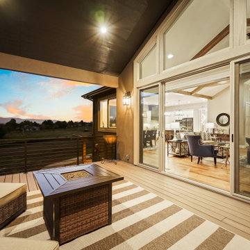
The Home
A family heirloom full of warm memories passed down for generations to come greets you after opening the beautiful knotty alder front
door. The rear staircase and separate back entrance allows for multi-generations to share this home.
The Eagles Nest is a place for all to land. The five bedroom, four bath mountain modern plan offers several areas for relaxing and
entertaining. Upon entering, you are welcomed by the warmth of the beams, hickory floors and inviting fireplace. The overall environment gently whispers, “come in, sit down and relax”. The back staircase off the kitchen leads you to a private oasis. The lower level is designed to serve two purposes. It can be a separate living quarter because of its private entrance, or an extension of the house for entertaining.
The open floor plan maximizes square footage for all to enjoy and partake, or for one to find their own quiet space.
The Builder
We build your dreams is the heartfelt motto of Murphy’s Custom Homes, and that’s because we take great pride in crafting homes that reflect the individuality of the people who live in them. With more than 35 years of experience and passion, Murphy’s Custom Homes personally crafts clients’ dream homes by combining their ideas with our expert design team, experience, the environmental elements of the land, quality construction techniques and state-of-the-art products.
We are committed to our clients’ satisfaction during every step of the homebuilding process — from the development of ideas and acquiring land — until the final celebration of walking through the front door and seeing those dreams fulfilled. View a full gallery of our work at murphyscustomhomes.com or call 719-488-8818.
The Interior Design
Inspired by nature’s palette and a touch of modern, the Eagles Nest is a calm haven of earth tones and casual elegance. The interior is an inviting blend of subtle neutrals and pops of color, combined with metals, textures, and fine finishes, creating a transitional rustic design. Entertain guests in the large downstairs rec room with a glass of wine at the built-in bar, or take on an opponent with a game of foosball.
The homeowners joined forces with Caprice King at Upstage Furniture Consignments to paint the pallet of the home. Caprice King staged the home with additional furnishings and accessories, lending the home a designer’s touch while utilizing her spatial expertise and attention to detail.
 Drury Design
THE SETUP
Sam’s client had lived in her downtown townhome home for less than a year when she decided to remodel the spacious second level. This open area consisted of three sections: a TV and fireplace zone, a sparsely furnished dining area, and a dominant central kitchen. The kitchen featured a long back wall with three segmented sections and a massive island housing the cooktop. She found the kitchen’s functionality lacking and its presence overwhelming – it dominated the entire floor, regardless of where you stood.
Design objectives:
- Reconfigure key kitchen elements (sink, cooktop, oven) while minimizing the kitchen’s visual impact
- Optimize the kitchen’s back wall, eliminating existing dead space
- Create a purposeful, well-defined dining area
- Establish a distinct, comfortable living area
- Reuse existing appliances and flooring
- Maintain an overall modern design aesthetic
THE REMODEL
Design challenges to be solved:
- Redesign the island to reduce its overwhelming presence
- Create a comfortable, dedicated living room within the available space
- Establish a distinct, inviting dining area within spatial constraints
- Enhance kitchen functionality and style without dominating the entire floor
THE RENEWED SPACE
Design solutions:
- Sam created raised end caps for the island. This separated the kitchen from adjacent living and dining areas while focusing the kitchen’s functionality. The new sink location offers ample workspace, allowing the cook to interact with guests seated at the island. The redesigned island also provides additional storage.
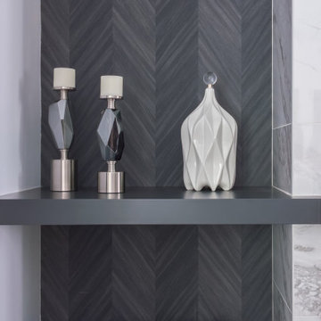
- For the living area, Sam opted for a functional-yet-minimalist approach. Large-format tile creates a natural stone look for the fireplace and TV wall. The recessed TV and extended fireplace shelf maintain a sleek profile. - Artistic wallpaper adds depth and texture, while the intentional lack of extensive shelving keeps the space open and distinct.
- Sam transformed the dining area’s blank wall into a feature, adding a unique dry bar with counter space, open shelves, cabinet storage and a beverage fridge. - - - Wallpaper behind and above the bar contributes to the area’s personality. A mirror adds depth while pendant lights add style and visual interest.
Relocating the cooktop to the back wall facilitates hidden ventilation, reducing visual clutter. Sam balanced transitional and modern elements for a contemporary yet comfortable feel. The digital control panel on the convection cooktop maintains a sleek look, while the wall oven is now at an easy-to-use height. ----- Mirrored base cabinet fronts and a paneled fridge prevent cabinetry monotony.
The redesign has delighted Sam’s client, achieving her main goal of creating a more inviting and visually appealing space. Each section now has its own visual personality and functionality while harmonizing within a monochromatic palette. The entire floor offers wow-factor pop upon first glance, with each area maintaining its distinct character while contributing to a cohesive, modern aesthetic.

Sponsored
Sunbury, OH
J.Holderby - Renovations
Franklin County's Leading General Contractors - 2X Best of Houzz!
 Grandin Road
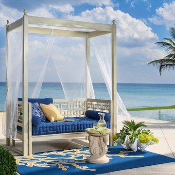
Lounge away the afternoon reading, napping or surfing in style. A new modern twist to the traditional Chinese form, our Amelia Daybed has an Asian-inspired geometric design. This mixed-wood canopy would look lovely beside a pool, on a patio, or in a sunroom. Wherever you put it, you will enjoy hours spent stylishly relaxing in our exclusive Amelia daybed. Amelia Canopy (sold separately) includes a custom sheer for an added element of a secret world hideaway. Amelia Custom Cushions (sold separately) include one seat cushion, two back cushions, and two bolster pillows.

 Christian Duvernois Landscape/Studio
The rooftop is subdivided by a home office space and separate residential area. The terrace conversion introduces elements that create a multifunctional green roof and arboretum. A steppable green walkway, laced with thyme, is positioned between a diverse range of perennials and provides access to both spaces. Selection of the vegetation was inspired by the client’s French Alp origins. On the north terrace there is a designed sculptural fountain. This soothing focal element contributes to a sublime occurrence in the garden, set against the astounding Manhattan skyline.
Photo credit: Eve K. Tremblay
 Granit Architects + Interiors
An expressive family home in Clapham.
The Brief
The brief was to create a new ground floor. It needed to be a flexible home capable of accommodating guests of all ages whilst maintaining purpose and separation between spaces.
The Solution
We proposed re-routing the hallway to become a central corridor through the ground floor plan. This would connect the rear and front halves of the property across a series of staggered level changes. We also wanted to create an enlarged rear space for entertainment that linked to the garden space.
The removal of an existing courtyard allowed for the insertion of a boot room and relocated WC central to the plan.
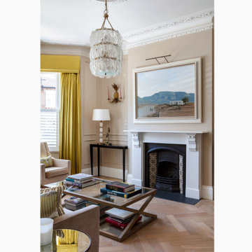
Separating the distinctly classical detailing of the front reception and dining room, which emphasises our clients’ favoured style and family backgrounds, from the sleek contemporary rear kitchen and entertainment space was successfully enhanced by the varied format of the timber flooring from Trunk.
Maintaining visual connectivity was achieved by way of two sizeable glazed pocket doors that enable the two halves of the plan to be differentiated from each other. At the same time, the use of internal glazing supports views through the property to the remodelled rear garden.
The bespoke designed kitchen from Eclectic Interiors introduces the user to the modernised rear extension, which features sharp detailing and a splash of colour from the feature media unit designed by our interiors team.
The symmetrical rear elevation carries through to the garden making for an interconnected, seamless transition through the property.
The Result
The combination of classical and contemporary elements marry together well to support flexible family living and entertaining. Our clients are delighted with the outcome and feel that it meets their brief and design aspirations.
79