
Search results for "Elevate issues" in Home Design Ideas
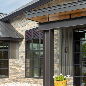
 Edgewater Design Group
As written in Northern Home & Cottage by Elizabeth Edwards
Sara and Paul Matthews call their head-turning home, located in a sweet neighborhood just up the hill from downtown Petoskey, “a very human story.” Indeed it is. Sara and her husband, Paul, have a special-needs son as well as an energetic middle-school daughter. This home has an answer for everyone. Located down the street from the school, it is ideally situated for their daughter and a self-contained apartment off the great room accommodates all their son’s needs while giving his caretakers privacy—and the family theirs. The Matthews began the building process by taking their thoughts and
needs to Stephanie Baldwin and her team at Edgewater Design Group. Beyond the above considerations, they wanted their new home to be low maintenance and to stand out architecturally, “But not so much that anyone would complain that it didn’t work in our neighborhood,” says Sara. “We
were thrilled that Edgewater listened to us and were able to give us a unique-looking house that is meeting all our needs.” Lombardy LLC built this handsome home with Paul working alongside the construction crew throughout the project. The low maintenance exterior is a cutting-edge blend of stacked stone, black corrugated steel, black framed windows and Douglas fir soffits—elements that add up to an organic contemporary look. The use of black steel, including interior beams and the staircase system, lend an industrial vibe that is courtesy of the Matthews’ friend Dan Mello of Trimet Industries in Traverse City. The couple first met Dan, a metal fabricator, a number of years ago, right around the time they found out that their then two-year-old son would never be able to walk. After the couple explained to Dan that they couldn’t find a solution for a child who wasn’t big enough for a wheelchair, he designed a comfortable, rolling chair that was just perfect. They still use it. The couple’s gratitude for the chair resulted in a trusting relationship with Dan, so it was natural for them to welcome his talents into their home-building process. A maple floor finished to bring out all of its color-tones envelops the room in warmth. Alder doors and trim and a Doug fir ceiling reflect that warmth. Clearstory windows and floor-to-ceiling window banks fill the space with light—and with views of the spacious grounds that will
become a canvas for Paul, a retired landscaper. The couple’s vibrant art pieces play off against modernist furniture and lighting that is due to an inspired collaboration between Sara and interior designer Kelly Paulsen. “She was absolutely instrumental to the project,” Sara says. “I went through
two designers before I finally found Kelly.” The open clean-lined kitchen, butler’s pantry outfitted with a beverage center and Miele coffee machine (that allows guests to wait on themselves when Sara is cooking), and an outdoor room that centers around a wood-burning fireplace, all make for easy,
fabulous entertaining. A den just off the great room houses the big-screen television and Sara’s loom—
making for relaxing evenings of weaving, game watching and togetherness. Tourgoers will leave understanding that this house is everything great design should be. Form following function—and solving very human issues with soul-soothing style.
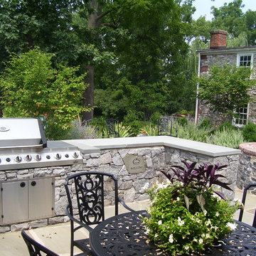
 River Valley Landscapes
The property is one of the original farm houses located on the main street of a small town. It has been in the family for many years and our client just inherited the property. They were trying to have balance of preserving the old while realizing modern day living has its benefits too. The house had a large addition added using mostly old style materials, but designed with function and modern day luxuries. Our goal was to carry that theme to the outside.
Our first problem we had to address was how to transition between the first floor elevation changes. The lower room was the husband’s office. He stated in the future he may have clients over and it would be nice to have an area to sit outside. The wife’s main concern was to renew the four corner garden. She also felt it was very important to be able to see it from the kitchen area. Finally there was an old wishing well stuck right outside the kitchen. They both felt it would be neat to be able to incorporate this in some how. They wanted a patio area with a built in grill to accommodate there family and friends. They also wanted to keep a large play area for the kids.
We were able to pull this off successfully. We addressed the first issue by having a small lower level flagstone area. This area is large enough for 1 to 2 people to sit comfortably. It also provides a transition from his office to the larger patio area. We installed a simple small gravel sitting area opposite of the main patio. This provides our client a secluded place to relax or do business. Mrs.... told me she is amazed how much her and her husband enjoys this area. It is so peaceful looking at the small creek over a glass of wine.
We built a natural limestone retaining wall to create the patio terrace. The stone was chosen to extend the houses architectural elements into the landscape. Irregular broken flagstone was used to give it a more casual feel. We installed three Serviceberries into the patio terrace to replace some trees that were taken down during the remodeling. She was very concern that they would block the view of the four corner garden. We new they were crucial to nestle in the terrace, so we placed them for a couple days for her to decide. Fortunately she agreed they not only kept the view open, but helped frame the garden.
The four corner garden was designed to be viewed from afar and experienced up close. We wanted the space to have some formal structure while keeping with the casual farm house feel. Another natural limestone retaining wall was created. This leveled the garden terrace and helped associate it with the rest of the property. The four corner garden is nestled into the existing woods edge. This provides three distinct experiences to entering the garden; a more formal from the driveway, an open feel from the lower lawn, and a more natural / casual experience from the wooded area. The Plymouth brown gravel was used for the center of the garden. This helped highlight the stone post that was found during construction. The gravel also brings the sense of sound into the garden space. Lamb’s ear was chosen as a fun way to get kids interest in horticulture.
The balance of using the new to create the old feel is what makes this project a success. The property has already hosted a local historical society event and won an award for its preservation efforts. When Mrs.... can’t find her husband, she knows he is either reading the newspaper by the grill or resting in the hammock along the wood’s path.
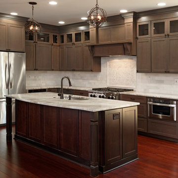
 Zelaya Properties LLC
We used: Custom cherry cabinetry in Arts & Crafts Shaker style by Kabinart in Boulder and Espresso stains. Liberty Hardware Venetian bronze 1-1/2" cabinet knobs. KitchenAid Architect II Series 22 CF counter-depth French door refrigerator. KitchenAid Architect Series II 27" convection single wall oven. KitchenAid 36" 6-burner dual fuel freestanding commercial-style range. KitchenAid Architect II Series 24" dishwasher. Sharp Insight Pro Series 24" built-in microwave drawer (Model #KB6524PS). Crystorama Solaris 12" wide pendant lights in English bronze. Granite countertops in Brown Fantasy. 3"x6" polished marble backsplash.
Paint colors:
Walls: Glidden Silver Cloud 30YY 63/024
Ceilings/Trims/Doors: Glidden Swan White GLC23
Robert B. Narod Photography
Find the right local pro for your project
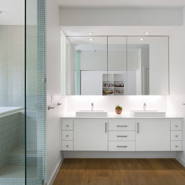
 Milgard Windows & Doors
The Kiguchi family moved into their Austin, Texas home in 1994. Built in the 1980’s as part of a neighborhood development, they happily raised their family here but longed for something more contemporary. Once they became empty nesters, they decided it was time for a major remodel. After spending many years visiting Austin AIA Home Tours that highlight contemporary residential architecture, they had a lot of ideas and in 2013 were ready to interview architects and get their renovation underway.
The project turned into a major remodel due to an unstable foundation. Architects Ben Arbib and Ed Hughey, of Arbib Hughey Design were hired to solve the structural issue and look for inspiration in the bones of the house, which sat on top of a hillside and was surrounded by great views.
Unfortunately, with the old floor plan, the beautiful views were hidden by small windows that were poorly placed. In order to bring more natural light into the house the window sizes and configurations had to be addressed, all while keeping in mind the homeowners desire for a modern look and feel.
To achieve a more contemporary and sophisticated front of house, a new entry was designed that included removing a two-story bay window and porch. The entrance of the home also became more integrated with the landscape creating a template for new foliage to be planted. Older exterior materials were updated to incorporate a more muted palette of colors with a metal roof, dark grey siding in the back and white stucco in the front. Deep eaves were added over many of the new large windows for clean lines and sun protection.
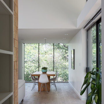
“Inside it was about opening up the floor plan, expanding the views throughout the house, and updating the material palette to get a modern look that was also warm and inviting,” said Ben from Arbib Hughey Design. “Prior to the remodel, the house had the typical separation of rooms. We removed the walls between them and changed all of the windows to Milgard Thermally Improved Aluminum to connect the inside with the outside. No matter where you are you get nice views and natural light.”
The architects wanted to create some drama, which they accomplished with the window placement and opening up the interior floor plan to an open concept approach. Cabinetry was used to help delineate intimate spaces. To add warmth to an all-white living room, white-washed oak wood floors were installed and pine planks were used around the fireplace. The large windows served as artwork bringing the color of nature into the space.
An octagon shaped, elevated dining room, (named “the turret”), had a big impact on the design of the house. They architects rounded the corners and added larger window openings overlooking a new sunken garden. The great room was also softened by rounding out the corners and that circular theme continued throughout the house, being picked up in skylight wells and kitchen cabinetry. A staircase leading to a catwalk was added and the result was a two-story window wall that flooded the home with natural light.
When asked why Milgard® Thermally Improved Aluminum windows were selected, the architectural team listed many reasons:
1) Aesthetics: “We liked the slim profiles and narrow sightlines. The window frames never get in the way of the view and that was important to us. They also have a very contemporary look that went well with our design.”
2) Options: “We liked that we could get large sliding doors that matched the windows, giving us a very cohesive look and feel throughout the project.”
3) Cost Effective: “Milgard windows are affordable. You get a good product at a good price.”
4) Custom Sizes: “Milgard windows are customizable, which allowed us to get the right window for each location.”
Ready to take on your own traditional to modern home remodeling project? Arbib Hughey Design advises, “Work with a good architect. That means picking a team that is creative, communicative, listens well and is responsive. We think it’s important for an architect to listen to their clients and give them something they want, not something the architect thinks they should have. At the same time you want an architect who is willing and able to think outside the box and offer up design options that you may not have considered. Design is about a lot of back and forth, trying out ideas, getting feedback and trying again.”
The home was completely transformed into a unique, contemporary house perfectly integrated with its site. Internally the home has a natural flow for the occupants and externally it is integrated with the surroundings taking advantage of great natural light. As a side note, it was highly praised as part of the Austin AIA homes tour.
 Architectural Collaborative
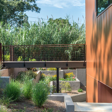
Situated on a sloping site with a shared driveway and prescribed parking on the lower level, the home was designed to maximize daylight into the walk-out basement. In placing the parking in the center and wrapping the basement spaces around it, all rooms are afforded exterior views. By locating much of the home’s program below street level, the 3244 s.f. house is able to maintain a scale in keeping with the surrounding residences. The grade along the front of the site was pulled back from the home with stepped retaining walls revealing a sunken garden and above-ground basement walls. An entry bridge allows access to the front door above the sunken garden.
UV-responsive, color-changing metal siding and cedar rainscreen clad the flat roof volumes of the home while fiber cement boards encase the shed roof volume. The shed was created to provide passive solar daylighting and conditioning in the vaulted living and dining rooms as well as an ideal surface for future solar panels.
The home possesses a myriad of outdoor living spaces including a front balcony and sunken courtyard, side balcony terrace, and rear screened porch and deck above a covered patio. The south side balcony is wrapped with a metal and cedar clad bamboo planter which acts as a privacy screen and shading device.
Accessibility was a strong consideration in the design as the homeowners were forward-thinking about aging in place. ADA-sized doorways and thresholds are provided as well as a shelled elevator shaft from the basement level.
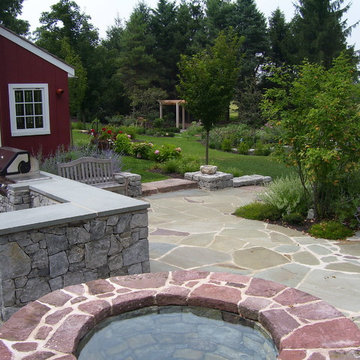 River Valley Landscapes
The property is one of the original farm houses located on the main street of a small town. It has been in the family for many years and our client just inherited the property. They were trying to have balance of preserving the old while realizing modern day living has its benefits too. The house had a large addition added using mostly old style materials, but designed with function and modern day luxuries. Our goal was to carry that theme to the outside.
Our first problem we had to address was how to transition between the first floor elevation changes. The lower room was the husband’s office. He stated in the future he may have clients over and it would be nice to have an area to sit outside. The wife’s main concern was to renew the four corner garden. She also felt it was very important to be able to see it from the kitchen area. Finally there was an old wishing well stuck right outside the kitchen. They both felt it would be neat to be able to incorporate this in some how. They wanted a patio area with a built in grill to accommodate there family and friends. They also wanted to keep a large play area for the kids.
We were able to pull this off successfully. We addressed the first issue by having a small lower level flagstone area. This area is large enough for 1 to 2 people to sit comfortably. It also provides a transition from his office to the larger patio area. We installed a simple small gravel sitting area opposite of the main patio. This provides our client a secluded place to relax or do business. Mrs.... told me she is amazed how much her and her husband enjoys this area. It is so peaceful looking at the small creek over a glass of wine.
We built a natural limestone retaining wall to create the patio terrace. The stone was chosen to extend the houses architectural elements into the landscape. Irregular broken flagstone was used to give it a more casual feel. We installed three Serviceberries into the patio terrace to replace some trees that were taken down during the remodeling. She was very concern that they would block the view of the four corner garden. We new they were crucial to nestle in the terrace, so we placed them for a couple days for her to decide. Fortunately she agreed they not only kept the view open, but helped frame the garden.
The four corner garden was designed to be viewed from afar and experienced up close. We wanted the space to have some formal structure while keeping with the casual farm house feel. Another natural limestone retaining wall was created. This leveled the garden terrace and helped associate it with the rest of the property. The four corner garden is nestled into the existing woods edge. This provides three distinct experiences to entering the garden; a more formal from the driveway, an open feel from the lower lawn, and a more natural / casual experience from the wooded area. The Plymouth brown gravel was used for the center of the garden. This helped highlight the stone post that was found during construction. The gravel also brings the sense of sound into the garden space. Lamb’s ear was chosen as a fun way to get kids interest in horticulture.
The balance of using the new to create the old feel is what makes this project a success. The property has already hosted a local historical society event and won an award for its preservation efforts. When Mrs.... can’t find her husband, she knows he is either reading the newspaper by the grill or resting in the hammock along the wood’s path.
 TKS Design Group
Download our free ebook, Creating the Ideal Kitchen. DOWNLOAD NOW
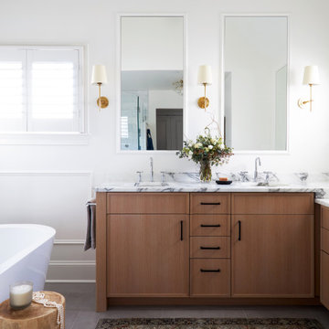
A tired primary bathroom, with varying ceiling heights and a beige-on-beige color scheme, was screaming for love. Squaring the room and adding natural materials erased the memory of the lack luster space and converted it to a bright and welcoming spa oasis. The home was a new build in 2005 and it looked like all the builder’s material choices remained. The client was clear on their design direction but were challenged by the differing ceiling heights and were looking to hire a design-build firm that could resolve that issue.
This local Glen Ellyn couple found us on Instagram (@kitchenstudioge, follow us ?). They loved our designs and felt like we fit their style. They requested a full primary bath renovation to include a large shower, soaking tub, double vanity with storage options, and heated floors. The wife also really wanted a separate make-up vanity. The biggest challenge presented to us was to architecturally marry the various ceiling heights and deliver a streamlined design.
The existing layout worked well for the couple, so we kept everything in place, except we enlarged the shower and replaced the built-in tub with a lovely free-standing model. We also added a sitting make-up vanity. We were able to eliminate the awkward ceiling lines by extending all the walls to the highest level. Then, to accommodate the sprinklers and HVAC, lowered the ceiling height over the entrance and shower area which then opens to the 2-story vanity and tub area. Very dramatic!
This high-end home deserved high-end fixtures. The homeowners also quickly realized they loved the look of natural marble and wanted to use as much of it as possible in their new bath. They chose a marble slab from the stone yard for the countertops and back splash, and we found complimentary marble tile for the shower. The homeowners also liked the idea of mixing metals in their new posh bathroom and loved the look of black, gold, and chrome.
Although our clients were very clear on their style, they were having a difficult time pulling it all together and envisioning the final product. As interior designers it is our job to translate and elevate our clients’ ideas into a deliverable design. We presented the homeowners with mood boards and 3D renderings of our modern, clean, white marble design. Since the color scheme was relatively neutral, at the homeowner’s request, we decided to add of interest with the patterns and shapes in the room.
We were first inspired by the shower floor tile with its circular/linear motif. We designed the cabinetry, floor and wall tiles, mirrors, cabinet pulls, and wainscoting to have a square or rectangular shape, and then to create interest we added perfectly placed circles to contrast with the rectangular shapes. The globe shaped chandelier against the square wall trim is a delightful yet subtle juxtaposition.
The clients were overjoyed with our interpretation of their vision and impressed with the level of detail we brought to the project. It’s one thing to know how you want a space to look, but it takes a special set of skills to create the design and see it thorough to implementation. Could hiring The Kitchen Studio be the first step to making your home dreams come to life?
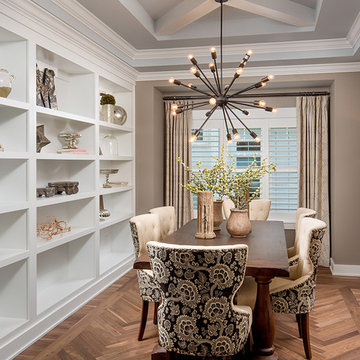

 Milgard Windows & Doors
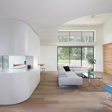
The Kiguchi family moved into their Austin, Texas home in 1994. Built in the 1980’s as part of a neighborhood development, they happily raised their family here but longed for something more contemporary. Once they became empty nesters, they decided it was time for a major remodel. After spending many years visiting Austin AIA Home Tours that highlight contemporary residential architecture, they had a lot of ideas and in 2013 were ready to interview architects and get their renovation underway.
The project turned into a major remodel due to an unstable foundation. Architects Ben Arbib and Ed Hughey, of Arbib Hughey Design were hired to solve the structural issue and look for inspiration in the bones of the house, which sat on top of a hillside and was surrounded by great views.
Unfortunately, with the old floor plan, the beautiful views were hidden by small windows that were poorly placed. In order to bring more natural light into the house the window sizes and configurations had to be addressed, all while keeping in mind the homeowners desire for a modern look and feel.
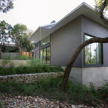
To achieve a more contemporary and sophisticated front of house, a new entry was designed that included removing a two-story bay window and porch. The entrance of the home also became more integrated with the landscape creating a template for new foliage to be planted. Older exterior materials were updated to incorporate a more muted palette of colors with a metal roof, dark grey siding in the back and white stucco in the front. Deep eaves were added over many of the new large windows for clean lines and sun protection.
“Inside it was about opening up the floor plan, expanding the views throughout the house, and updating the material palette to get a modern look that was also warm and inviting,” said Ben from Arbib Hughey Design. “Prior to the remodel, the house had the typical separation of rooms. We removed the walls between them and changed all of the windows to Milgard Thermally Improved Aluminum to connect the inside with the outside. No matter where you are you get nice views and natural light.”
The architects wanted to create some drama, which they accomplished with the window placement and opening up the interior floor plan to an open concept approach. Cabinetry was used to help delineate intimate spaces. To add warmth to an all-white living room, white-washed oak wood floors were installed and pine planks were used around the fireplace. The large windows served as artwork bringing the color of nature into the space.
An octagon shaped, elevated dining room, (named “the turret”), had a big impact on the design of the house. They architects rounded the corners and added larger window openings overlooking a new sunken garden. The great room was also softened by rounding out the corners and that circular theme continued throughout the house, being picked up in skylight wells and kitchen cabinetry. A staircase leading to a catwalk was added and the result was a two-story window wall that flooded the home with natural light.
When asked why Milgard® Thermally Improved Aluminum windows were selected, the architectural team listed many reasons:
1) Aesthetics: “We liked the slim profiles and narrow sightlines. The window frames never get in the way of the view and that was important to us. They also have a very contemporary look that went well with our design.”
2) Options: “We liked that we could get large sliding doors that matched the windows, giving us a very cohesive look and feel throughout the project.”
3) Cost Effective: “Milgard windows are affordable. You get a good product at a good price.”
4) Custom Sizes: “Milgard windows are customizable, which allowed us to get the right window for each location.”
Ready to take on your own traditional to modern home remodeling project? Arbib Hughey Design advises, “Work with a good architect. That means picking a team that is creative, communicative, listens well and is responsive. We think it’s important for an architect to listen to their clients and give them something they want, not something the architect thinks they should have. At the same time you want an architect who is willing and able to think outside the box and offer up design options that you may not have considered. Design is about a lot of back and forth, trying out ideas, getting feedback and trying again.”
The home was completely transformed into a unique, contemporary house perfectly integrated with its site. Internally the home has a natural flow for the occupants and externally it is integrated with the surroundings taking advantage of great natural light. As a side note, it was highly praised as part of the Austin AIA homes tour.
 Milgard Windows & Doors
The Kiguchi family moved into their Austin, Texas home in 1994. Built in the 1980’s as part of a neighborhood development, they happily raised their family here but longed for something more contemporary. Once they became empty nesters, they decided it was time for a major remodel. After spending many years visiting Austin AIA Home Tours that highlight contemporary residential architecture, they had a lot of ideas and in 2013 were ready to interview architects and get their renovation underway.
The project turned into a major remodel due to an unstable foundation. Architects Ben Arbib and Ed Hughey, of Arbib Hughey Design were hired to solve the structural issue and look for inspiration in the bones of the house, which sat on top of a hillside and was surrounded by great views.
Unfortunately, with the old floor plan, the beautiful views were hidden by small windows that were poorly placed. In order to bring more natural light into the house the window sizes and configurations had to be addressed, all while keeping in mind the homeowners desire for a modern look and feel.
To achieve a more contemporary and sophisticated front of house, a new entry was designed that included removing a two-story bay window and porch. The entrance of the home also became more integrated with the landscape creating a template for new foliage to be planted. Older exterior materials were updated to incorporate a more muted palette of colors with a metal roof, dark grey siding in the back and white stucco in the front. Deep eaves were added over many of the new large windows for clean lines and sun protection.
“Inside it was about opening up the floor plan, expanding the views throughout the house, and updating the material palette to get a modern look that was also warm and inviting,” said Ben from Arbib Hughey Design. “Prior to the remodel, the house had the typical separation of rooms. We removed the walls between them and changed all of the windows to Milgard Thermally Improved Aluminum to connect the inside with the outside. No matter where you are you get nice views and natural light.”
The architects wanted to create some drama, which they accomplished with the window placement and opening up the interior floor plan to an open concept approach. Cabinetry was used to help delineate intimate spaces. To add warmth to an all-white living room, white-washed oak wood floors were installed and pine planks were used around the fireplace. The large windows served as artwork bringing the color of nature into the space.
An octagon shaped, elevated dining room, (named “the turret”), had a big impact on the design of the house. They architects rounded the corners and added larger window openings overlooking a new sunken garden. The great room was also softened by rounding out the corners and that circular theme continued throughout the house, being picked up in skylight wells and kitchen cabinetry. A staircase leading to a catwalk was added and the result was a two-story window wall that flooded the home with natural light.
When asked why Milgard® Thermally Improved Aluminum windows were selected, the architectural team listed many reasons:
1) Aesthetics: “We liked the slim profiles and narrow sightlines. The window frames never get in the way of the view and that was important to us. They also have a very contemporary look that went well with our design.”
2) Options: “We liked that we could get large sliding doors that matched the windows, giving us a very cohesive look and feel throughout the project.”
3) Cost Effective: “Milgard windows are affordable. You get a good product at a good price.”
4) Custom Sizes: “Milgard windows are customizable, which allowed us to get the right window for each location.”
Ready to take on your own traditional to modern home remodeling project? Arbib Hughey Design advises, “Work with a good architect. That means picking a team that is creative, communicative, listens well and is responsive. We think it’s important for an architect to listen to their clients and give them something they want, not something the architect thinks they should have. At the same time you want an architect who is willing and able to think outside the box and offer up design options that you may not have considered. Design is about a lot of back and forth, trying out ideas, getting feedback and trying again.”
The home was completely transformed into a unique, contemporary house perfectly integrated with its site. Internally the home has a natural flow for the occupants and externally it is integrated with the surroundings taking advantage of great natural light. As a side note, it was highly praised as part of the Austin AIA homes tour.

 CourseworkService
The natural right of each youngster to a quality instruction was initially recognized in 1948 in the Universal Declaration of Human Rights (UDHR). Embraced by the UN General Assembly on 10 December 1948, the Universal Declaration of Human Rights (UDHR) states that: everybody has the privilege to training and that it ought to be free in any event at the essential level. Not just does everybody have the privilege to a free and mandatory essential instruction, that training ought to concentrate on full human advancement, fortify admiration for human rights, and advance comprehension, resistance and companionship (UDHR Article 26).
The 1960, UNESCO Convention Against Discrimination in Education fortifies the privilege to a free and obligatory quality essential trainings laid out in the 1948 UDHR, and further orders that segregation in instruction is an infringement of human rights. It sets out that segregation in instruction incorporates any qualification, rejection, restriction or inclination that depends on race, shading, sex, dialect, religion, political or other feeling, national or social birthplace, monetary condition or conception.
The Convention on the Rights of the Child of 1989 further characterized youngsters' entitlement to training. The Millennium Development Goals and other worldwide traditions have subsequent to fortified instruction as a widespread right to be ensured to ALL youngsters.
Rights-based methodology
Getting to and accepting a quality training is an all inclusive human right. Instruct A Child's work is established in the privilege of ALL CHILDREN around the globe to get to a quality training that regards and elevates their entitlement to pride and full improvement.
There are three imperative parts of instruction as a human right:
Investment in quality instruction in itself;
The act of human rights in training; and
Training as a privilege that encourages the satisfaction of different rights.
Our work depends on various global instruments that recognize instruction as a human right. A few of these global instruments show the fancied nature, or nature of this training. When we take a gander at these instruments together and translate them we go a long ways past single articles to a web of responsibilities that identifies with the profundity and expansiveness of how to start to comprehend instructive quality.
Elucidation of the different instruments as to quality training must be inserted inside of the general current nearby and world settings and desires of instruction. That is, training must be set and comprehended as far as the bigger setting. A quality training must reflect learning in connection to the learner as an individual, a family and group part, and a portion of a world society.
A quality instruction comprehends the past, is significant to the present, and has a perspective to what's to come. Quality training identifies with learning building and the handy utilization of all types of information by special people who capacity both freely and in connection to others. A quality instruction mirrors the dynamic way of society and dialects, the estimation of the person in connection to the bigger setting, and the significance of living in a way that advances equity in the present and encourages an economical future.
About the Author: She is a superb essayist. Her major is «Phycology». She examines the issues of kids' advanceme at courseworkservice.com
 Milgard Windows & Doors
The Kiguchi family moved into their Austin, Texas home in 1994. Built in the 1980’s as part of a neighborhood development, they happily raised their family here but longed for something more contemporary. Once they became empty nesters, they decided it was time for a major remodel. After spending many years visiting Austin AIA Home Tours that highlight contemporary residential architecture, they had a lot of ideas and in 2013 were ready to interview architects and get their renovation underway.
The project turned into a major remodel due to an unstable foundation. Architects Ben Arbib and Ed Hughey, of Arbib Hughey Design were hired to solve the structural issue and look for inspiration in the bones of the house, which sat on top of a hillside and was surrounded by great views.
Unfortunately, with the old floor plan, the beautiful views were hidden by small windows that were poorly placed. In order to bring more natural light into the house the window sizes and configurations had to be addressed, all while keeping in mind the homeowners desire for a modern look and feel.
To achieve a more contemporary and sophisticated front of house, a new entry was designed that included removing a two-story bay window and porch. The entrance of the home also became more integrated with the landscape creating a template for new foliage to be planted. Older exterior materials were updated to incorporate a more muted palette of colors with a metal roof, dark grey siding in the back and white stucco in the front. Deep eaves were added over many of the new large windows for clean lines and sun protection.
“Inside it was about opening up the floor plan, expanding the views throughout the house, and updating the material palette to get a modern look that was also warm and inviting,” said Ben from Arbib Hughey Design. “Prior to the remodel, the house had the typical separation of rooms. We removed the walls between them and changed all of the windows to Milgard Thermally Improved Aluminum to connect the inside with the outside. No matter where you are you get nice views and natural light.”
The architects wanted to create some drama, which they accomplished with the window placement and opening up the interior floor plan to an open concept approach. Cabinetry was used to help delineate intimate spaces. To add warmth to an all-white living room, white-washed oak wood floors were installed and pine planks were used around the fireplace. The large windows served as artwork bringing the color of nature into the space.
An octagon shaped, elevated dining room, (named “the turret”), had a big impact on the design of the house. They architects rounded the corners and added larger window openings overlooking a new sunken garden. The great room was also softened by rounding out the corners and that circular theme continued throughout the house, being picked up in skylight wells and kitchen cabinetry. A staircase leading to a catwalk was added and the result was a two-story window wall that flooded the home with natural light.
When asked why Milgard® Thermally Improved Aluminum windows were selected, the architectural team listed many reasons:
1) Aesthetics: “We liked the slim profiles and narrow sightlines. The window frames never get in the way of the view and that was important to us. They also have a very contemporary look that went well with our design.”
2) Options: “We liked that we could get large sliding doors that matched the windows, giving us a very cohesive look and feel throughout the project.”
3) Cost Effective: “Milgard windows are affordable. You get a good product at a good price.”
4) Custom Sizes: “Milgard windows are customizable, which allowed us to get the right window for each location.”
Ready to take on your own traditional to modern home remodeling project? Arbib Hughey Design advises, “Work with a good architect. That means picking a team that is creative, communicative, listens well and is responsive. We think it’s important for an architect to listen to their clients and give them something they want, not something the architect thinks they should have. At the same time you want an architect who is willing and able to think outside the box and offer up design options that you may not have considered. Design is about a lot of back and forth, trying out ideas, getting feedback and trying again.”
The home was completely transformed into a unique, contemporary house perfectly integrated with its site. Internally the home has a natural flow for the occupants and externally it is integrated with the surroundings taking advantage of great natural light. As a side note, it was highly praised as part of the Austin AIA homes tour.
 Homestead Doors, Inc.
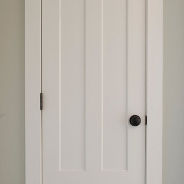
Door #10
FP3190
Flat 3 Panel Interior Door with Farmhouse Sticking
Solid Poplar stiles and rails
MDF panels
Painted White
1 x 4 door casing
1 x 6 baseboard
Bravura 336B door knob
Call us for a quote on your door project
419-684-9582
Visit https://www.door.cc

 Elizabeth Aldrich
Bigger is better, right? Not anymore!
Tiny homes are the latest trend for both home buyers and home builders. From small cabins to budget houses to granny flats, it’s clear that the saying “less is more” is finally starting to ring true.
You might think that smaller spaces means less room for creativity, but you’d be wrong. In fact, these tiny homes and granny flats tend to be far more diverse and creatively designed than full-sized homes and McMansions that often all look the same. People are building rustic cabins, mid-century modern flats, urban industrial lofts, and even treehouses.
There’s a lot of inspiration to be had with the inside of a tiny home as well. Having such a limited amount of space in which to both store your belongings and live comfortable forces you to get creative. And people have developed some great solutions. From lofted beds to rooftop patios to Murphy style kitchen tables that fold up into the wall, people everywhere are finding ways to still have it all in their small homes.
Here are some of our favorite ways to make a tiny home more usable and livable.
Build a lofted bed.
This might be the most popular method for creating more space in everything from small houses to shared kids’ bedrooms to dorm rooms. Elevating the bed gives you plenty of space underneath for a desk, bookshelves, or a living area. You can easily buy a lofted bed, but they are usually twin beds, and they’re not as fun as some of the custom built ones out there. People are starting to build hanging beds into their homes, for example. Shorten the rope, add a ladder, and you have yourself a lofted bed.
Get a futon.
Another popular option, couches that convert into beds solve a lot of space issues by being multi-functional. Even if you do get yourself a lofted bed, you might want to consider a sofa-bed for your living area as well so that you can host guests. This solves the biggest problem with tiny living – not being able to have friends and family stay over!
Build a Murphy table.
Murphy-style furniture, or furniture that folds down from the wall and then folds back up when you’re done, has gone out of style a bit. But we don’t think it’s deserved its reputation as outdated, and with the surge in tiny homes, it’s only a matter of time before these come back in style. You can build a Murphy table to serve as your dining area with folding chairs that hang from wall pegs, or you can build a Murphy desk if you need some space to do work.
This is only the start. There are plenty of inventive ideas out there for creating small, multi-purpose living spaces that are cozy instead of cramped. Get those creative juices flowing, and go small!
Sponsored
Delaware, OH

Buckeye Basements, Inc.
Central Ohio's Basement Finishing ExpertsBest Of Houzz '13-'21
 KitchenLab Interiors
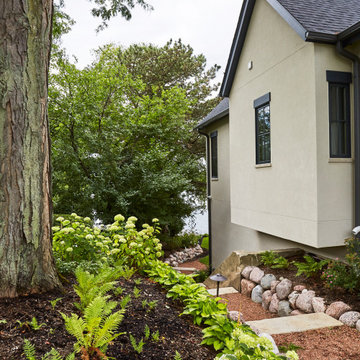
KitchenLab Interiors’ first, entirely new construction project in collaboration with GTH architects who designed the residence. KLI was responsible for all interior finishes, fixtures, furnishings, and design including the stairs, casework, interior doors, moldings and millwork. KLI also worked with the client on selecting the roof, exterior stucco and paint colors, stone, windows, and doors. The homeowners had purchased the existing home on a lakefront lot of the Valley Lo community in Glenview, thinking that it would be a gut renovation, but when they discovered a host of issues including mold, they decided to tear it down and start from scratch. The minute you look out the living room windows, you feel as though you're on a lakeside vacation in Wisconsin or Michigan. We wanted to help the homeowners achieve this feeling throughout the house - merging the causal vibe of a vacation home with the elegance desired for a primary residence. This project is unique and personal in many ways - Rebekah and the homeowner, Lorie, had grown up together in a small suburb of Columbus, Ohio. Lorie had been Rebekah's babysitter and was like an older sister growing up. They were both heavily influenced by the style of the late 70's and early 80's boho/hippy meets disco and 80's glam, and both credit their moms for an early interest in anything related to art, design, and style. One of the biggest challenges of doing a new construction project is that it takes so much longer to plan and execute and by the time tile and lighting is installed, you might be bored by the selections of feel like you've seen them everywhere already. “I really tried to pull myself, our team and the client away from the echo-chamber of Pinterest and Instagram. We fell in love with counter stools 3 years ago that I couldn't bring myself to pull the trigger on, thank god, because then they started showing up literally everywhere", Rebekah recalls. Lots of one of a kind vintage rugs and furnishings make the home feel less brand-spanking new. The best projects come from a team slightly outside their comfort zone. One of the funniest things Lorie says to Rebekah, "I gave you everything you wanted", which is pretty hilarious coming from a client to a designer.
 Taragano Design and Build
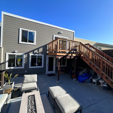
Taragano Design & Build completed this two story rear addition in
San Francisco, California.
On a narrow urban lot there is no direction to build but up and
back, and the constraint that governs everything is the rear yard
setback. The addition was held to the line, which fixed the
footprint before any interior planning began. Every square foot
inside came from stacking rather than spreading.
That created the real problem, which is access. Adding upstairs
living space on a lot this size means the upper floor has no way
out to the yard, and in a city where outdoor space is scarce, an
upper floor that cannot reach the ground wastes the yard it sits
above. The exterior stair answers that. It runs down the property
line where it takes nothing from the usable patio, and it gives the
upper floor its own direct route out.
The deck was kept deliberately small. A larger platform would have
shaded the patio below and turned the ground level into a covered
service area rather than a place anyone would sit. Holding it to a
landing keeps daylight on the concrete for most of the day, which
is what makes the lower level the primary outdoor room.
The two levels then read as one exterior. Continuous siding and
matching trim across old and new means the addition does not
announce itself as an addition, which on a rear elevation this
visible from neighboring properties matters more than it would on a
detached lot.
Licensed general contractor, CSLB #1143420. Diamond Certified.
 River Valley Landscapes
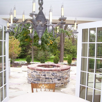
The property is one of the original farm houses located on the main street of a small town. It has been in the family for many years and our client just inherited the property. They were trying to have balance of preserving the old while realizing modern day living has its benefits too. The house had a large addition added using mostly old style materials, but designed with function and modern day luxuries. Our goal was to carry that theme to the outside.
Our first problem we had to address was how to transition between the first floor elevation changes. The lower room was the husband’s office. He stated in the future he may have clients over and it would be nice to have an area to sit outside. The wife’s main concern was to renew the four corner garden. She also felt it was very important to be able to see it from the kitchen area. Finally there was an old wishing well stuck right outside the kitchen. They both felt it would be neat to be able to incorporate this in some how. They wanted a patio area with a built in grill to accommodate there family and friends. They also wanted to keep a large play area for the kids.
We were able to pull this off successfully. We addressed the first issue by having a small lower level flagstone area. This area is large enough for 1 to 2 people to sit comfortably. It also provides a transition from his office to the larger patio area. We installed a simple small gravel sitting area opposite of the main patio. This provides our client a secluded place to relax or do business. Mrs.... told me she is amazed how much her and her husband enjoys this area. It is so peaceful looking at the small creek over a glass of wine.
We built a natural limestone retaining wall to create the patio terrace. The stone was chosen to extend the houses architectural elements into the landscape. Irregular broken flagstone was used to give it a more casual feel. We installed three Serviceberries into the patio terrace to replace some trees that were taken down during the remodeling. She was very concern that they would block the view of the four corner garden. We new they were crucial to nestle in the terrace, so we placed them for a couple days for her to decide. Fortunately she agreed they not only kept the view open, but helped frame the garden.
The four corner garden was designed to be viewed from afar and experienced up close. We wanted the space to have some formal structure while keeping with the casual farm house feel. Another natural limestone retaining wall was created. This leveled the garden terrace and helped associate it with the rest of the property. The four corner garden is nestled into the existing woods edge. This provides three distinct experiences to entering the garden; a more formal from the driveway, an open feel from the lower lawn, and a more natural / casual experience from the wooded area. The Plymouth brown gravel was used for the center of the garden. This helped highlight the stone post that was found during construction. The gravel also brings the sense of sound into the garden space. Lamb’s ear was chosen as a fun way to get kids interest in horticulture.
The balance of using the new to create the old feel is what makes this project a success. The property has already hosted a local historical society event and won an award for its preservation efforts. When Mrs.... can’t find her husband, she knows he is either reading the newspaper by the grill or resting in the hammock along the wood’s path.
 TKS Design Group
Download our free ebook, Creating the Ideal Kitchen. DOWNLOAD NOW
A tired primary bathroom, with varying ceiling heights and a beige-on-beige color scheme, was screaming for love. Squaring the room and adding natural materials erased the memory of the lack luster space and converted it to a bright and welcoming spa oasis. The home was a new build in 2005 and it looked like all the builder’s material choices remained. The client was clear on their design direction but were challenged by the differing ceiling heights and were looking to hire a design-build firm that could resolve that issue.
This local Glen Ellyn couple found us on Instagram (@kitchenstudioge, follow us ?). They loved our designs and felt like we fit their style. They requested a full primary bath renovation to include a large shower, soaking tub, double vanity with storage options, and heated floors. The wife also really wanted a separate make-up vanity. The biggest challenge presented to us was to architecturally marry the various ceiling heights and deliver a streamlined design.
The existing layout worked well for the couple, so we kept everything in place, except we enlarged the shower and replaced the built-in tub with a lovely free-standing model. We also added a sitting make-up vanity. We were able to eliminate the awkward ceiling lines by extending all the walls to the highest level. Then, to accommodate the sprinklers and HVAC, lowered the ceiling height over the entrance and shower area which then opens to the 2-story vanity and tub area. Very dramatic!
This high-end home deserved high-end fixtures. The homeowners also quickly realized they loved the look of natural marble and wanted to use as much of it as possible in their new bath. They chose a marble slab from the stone yard for the countertops and back splash, and we found complimentary marble tile for the shower. The homeowners also liked the idea of mixing metals in their new posh bathroom and loved the look of black, gold, and chrome.
Although our clients were very clear on their style, they were having a difficult time pulling it all together and envisioning the final product. As interior designers it is our job to translate and elevate our clients’ ideas into a deliverable design. We presented the homeowners with mood boards and 3D renderings of our modern, clean, white marble design. Since the color scheme was relatively neutral, at the homeowner’s request, we decided to add of interest with the patterns and shapes in the room.
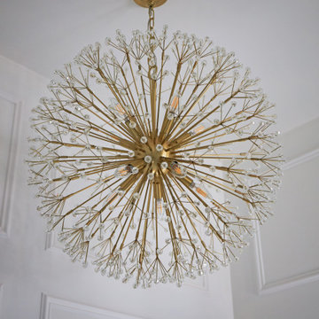
We were first inspired by the shower floor tile with its circular/linear motif. We designed the cabinetry, floor and wall tiles, mirrors, cabinet pulls, and wainscoting to have a square or rectangular shape, and then to create interest we added perfectly placed circles to contrast with the rectangular shapes. The globe shaped chandelier against the square wall trim is a delightful yet subtle juxtaposition.
The clients were overjoyed with our interpretation of their vision and impressed with the level of detail we brought to the project. It’s one thing to know how you want a space to look, but it takes a special set of skills to create the design and see it thorough to implementation. Could hiring The Kitchen Studio be the first step to making your home dreams come to life?


 River Valley Landscapes
The property is one of the original farm houses located on the main street of a small town. It has been in the family for many years and our client just inherited the property. They were trying to have balance of preserving the old while realizing modern day living has its benefits too. The house had a large addition added using mostly old style materials, but designed with function and modern day luxuries. Our goal was to carry that theme to the outside.
Our first problem we had to address was how to transition between the first floor elevation changes. The lower room was the husband’s office. He stated in the future he may have clients over and it would be nice to have an area to sit outside. The wife’s main concern was to renew the four corner garden. She also felt it was very important to be able to see it from the kitchen area. Finally there was an old wishing well stuck right outside the kitchen. They both felt it would be neat to be able to incorporate this in some how. They wanted a patio area with a built in grill to accommodate there family and friends. They also wanted to keep a large play area for the kids.
We were able to pull this off successfully. We addressed the first issue by having a small lower level flagstone area. This area is large enough for 1 to 2 people to sit comfortably. It also provides a transition from his office to the larger patio area. We installed a simple small gravel sitting area opposite of the main patio. This provides our client a secluded place to relax or do business. Mrs.... told me she is amazed how much her and her husband enjoys this area. It is so peaceful looking at the small creek over a glass of wine.
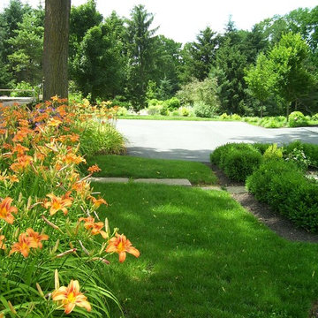
We built a natural limestone retaining wall to create the patio terrace. The stone was chosen to extend the houses architectural elements into the landscape. Irregular broken flagstone was used to give it a more casual feel. We installed three Serviceberries into the patio terrace to replace some trees that were taken down during the remodeling. She was very concern that they would block the view of the four corner garden. We new they were crucial to nestle in the terrace, so we placed them for a couple days for her to decide. Fortunately she agreed they not only kept the view open, but helped frame the garden.
The four corner garden was designed to be viewed from afar and experienced up close. We wanted the space to have some formal structure while keeping with the casual farm house feel. Another natural limestone retaining wall was created. This leveled the garden terrace and helped associate it with the rest of the property. The four corner garden is nestled into the existing woods edge. This provides three distinct experiences to entering the garden; a more formal from the driveway, an open feel from the lower lawn, and a more natural / casual experience from the wooded area. The Plymouth brown gravel was used for the center of the garden. This helped highlight the stone post that was found during construction. The gravel also brings the sense of sound into the garden space. Lamb’s ear was chosen as a fun way to get kids interest in horticulture.
The balance of using the new to create the old feel is what makes this project a success. The property has already hosted a local historical society event and won an award for its preservation efforts. When Mrs.... can’t find her husband, she knows he is either reading the newspaper by the grill or resting in the hammock along the wood’s path.
 TKS Design Group
Download our free ebook, Creating the Ideal Kitchen. DOWNLOAD NOW
A tired primary bathroom, with varying ceiling heights and a beige-on-beige color scheme, was screaming for love. Squaring the room and adding natural materials erased the memory of the lack luster space and converted it to a bright and welcoming spa oasis. The home was a new build in 2005 and it looked like all the builder’s material choices remained. The client was clear on their design direction but were challenged by the differing ceiling heights and were looking to hire a design-build firm that could resolve that issue.
This local Glen Ellyn couple found us on Instagram (@kitchenstudioge, follow us ?). They loved our designs and felt like we fit their style. They requested a full primary bath renovation to include a large shower, soaking tub, double vanity with storage options, and heated floors. The wife also really wanted a separate make-up vanity. The biggest challenge presented to us was to architecturally marry the various ceiling heights and deliver a streamlined design.
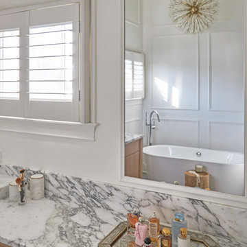
The existing layout worked well for the couple, so we kept everything in place, except we enlarged the shower and replaced the built-in tub with a lovely free-standing model. We also added a sitting make-up vanity. We were able to eliminate the awkward ceiling lines by extending all the walls to the highest level. Then, to accommodate the sprinklers and HVAC, lowered the ceiling height over the entrance and shower area which then opens to the 2-story vanity and tub area. Very dramatic!
This high-end home deserved high-end fixtures. The homeowners also quickly realized they loved the look of natural marble and wanted to use as much of it as possible in their new bath. They chose a marble slab from the stone yard for the countertops and back splash, and we found complimentary marble tile for the shower. The homeowners also liked the idea of mixing metals in their new posh bathroom and loved the look of black, gold, and chrome.
Although our clients were very clear on their style, they were having a difficult time pulling it all together and envisioning the final product. As interior designers it is our job to translate and elevate our clients’ ideas into a deliverable design. We presented the homeowners with mood boards and 3D renderings of our modern, clean, white marble design. Since the color scheme was relatively neutral, at the homeowner’s request, we decided to add of interest with the patterns and shapes in the room.
We were first inspired by the shower floor tile with its circular/linear motif. We designed the cabinetry, floor and wall tiles, mirrors, cabinet pulls, and wainscoting to have a square or rectangular shape, and then to create interest we added perfectly placed circles to contrast with the rectangular shapes. The globe shaped chandelier against the square wall trim is a delightful yet subtle juxtaposition.
The clients were overjoyed with our interpretation of their vision and impressed with the level of detail we brought to the project. It’s one thing to know how you want a space to look, but it takes a special set of skills to create the design and see it thorough to implementation. Could hiring The Kitchen Studio be the first step to making your home dreams come to life?
 Milgard Windows & Doors
The Kiguchi family moved into their Austin, Texas home in 1994. Built in the 1980’s as part of a neighborhood development, they happily raised their family here but longed for something more contemporary. Once they became empty nesters, they decided it was time for a major remodel. After spending many years visiting Austin AIA Home Tours that highlight contemporary residential architecture, they had a lot of ideas and in 2013 were ready to interview architects and get their renovation underway.
The project turned into a major remodel due to an unstable foundation. Architects Ben Arbib and Ed Hughey, of Arbib Hughey Design were hired to solve the structural issue and look for inspiration in the bones of the house, which sat on top of a hillside and was surrounded by great views.
Unfortunately, with the old floor plan, the beautiful views were hidden by small windows that were poorly placed. In order to bring more natural light into the house the window sizes and configurations had to be addressed, all while keeping in mind the homeowners desire for a modern look and feel.
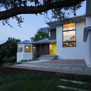
To achieve a more contemporary and sophisticated front of house, a new entry was designed that included removing a two-story bay window and porch. The entrance of the home also became more integrated with the landscape creating a template for new foliage to be planted. Older exterior materials were updated to incorporate a more muted palette of colors with a metal roof, dark grey siding in the back and white stucco in the front. Deep eaves were added over many of the new large windows for clean lines and sun protection.
“Inside it was about opening up the floor plan, expanding the views throughout the house, and updating the material palette to get a modern look that was also warm and inviting,” said Ben from Arbib Hughey Design. “Prior to the remodel, the house had the typical separation of rooms. We removed the walls between them and changed all of the windows to Milgard Thermally Improved Aluminum to connect the inside with the outside. No matter where you are you get nice views and natural light.”
The architects wanted to create some drama, which they accomplished with the window placement and opening up the interior floor plan to an open concept approach. Cabinetry was used to help delineate intimate spaces. To add warmth to an all-white living room, white-washed oak wood floors were installed and pine planks were used around the fireplace. The large windows served as artwork bringing the color of nature into the space.
An octagon shaped, elevated dining room, (named “the turret”), had a big impact on the design of the house. They architects rounded the corners and added larger window openings overlooking a new sunken garden. The great room was also softened by rounding out the corners and that circular theme continued throughout the house, being picked up in skylight wells and kitchen cabinetry. A staircase leading to a catwalk was added and the result was a two-story window wall that flooded the home with natural light.
When asked why Milgard® Thermally Improved Aluminum windows were selected, the architectural team listed many reasons:
1) Aesthetics: “We liked the slim profiles and narrow sightlines. The window frames never get in the way of the view and that was important to us. They also have a very contemporary look that went well with our design.”
2) Options: “We liked that we could get large sliding doors that matched the windows, giving us a very cohesive look and feel throughout the project.”
3) Cost Effective: “Milgard windows are affordable. You get a good product at a good price.”
4) Custom Sizes: “Milgard windows are customizable, which allowed us to get the right window for each location.”
Ready to take on your own traditional to modern home remodeling project? Arbib Hughey Design advises, “Work with a good architect. That means picking a team that is creative, communicative, listens well and is responsive. We think it’s important for an architect to listen to their clients and give them something they want, not something the architect thinks they should have. At the same time you want an architect who is willing and able to think outside the box and offer up design options that you may not have considered. Design is about a lot of back and forth, trying out ideas, getting feedback and trying again.”
The home was completely transformed into a unique, contemporary house perfectly integrated with its site. Internally the home has a natural flow for the occupants and externally it is integrated with the surroundings taking advantage of great natural light. As a side note, it was highly praised as part of the Austin AIA homes tour.
27