
Search results for "Encroach" in Home Design Ideas
 STUDIO TASHIMA
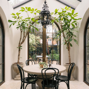
Keyes Road is a two-storey, semi-detached red brick house dating to around 1890-1910. The focus of our work was on the ground floor where we were asked to improve the layout and use of the main living areas of the house, for an active family of four. Important to the design was to maximise the quality and amount of light as well as connection to the garden and flow to the rest of the house.
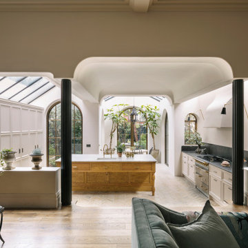
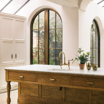
Our proposal introduces three single storey extensions, comprising a central, large space that extends the main outrigger of the house. To each side are smaller volumes, affording a full width kitchen. While defining a series of discrete volumes, it was important for us to ensure that the kitchen, living, family and dining rooms that are interconnecting and continuous. The result is a big space punctuated by a series of differently sized arches, defining spaces to ensure their intimacy.
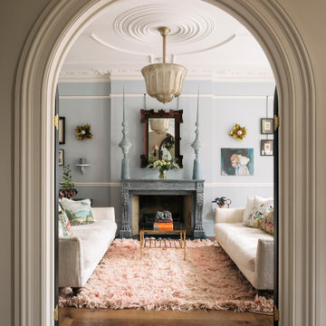
It was important for our client to have a sense of warmth and comfort - perhaps not dissimilar to the qualities of a hotel lobby. The colour scheme of the rooms are warm white painted plaster, natural wood flooring with black, bronze and brass accents. Indirect and carefully placed light fittings pulls together the atmosphere of the rooms - particularly in the evenings.
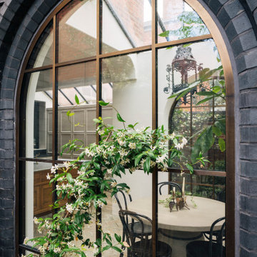
Externally, we felt it important to differentiate the extensions from the main house by using a dark, charcoal grey brick. This sets up a contrasting yet complimentary relationship to the rich red coloured brick house. The facets of the brick play with light and depth as do the graduated brick arches.
During the design process, we grappled with floor levels, the direction of sunlight, and care to not encroach on the neighbouring properties. As the house is in a conservation area, we worked closely with our trusted planning advisor. Throughout, we pursued a sensitive design strategy, using pitched roofs, matching materials and careful detailing. Internally, many of the original details are intact. This has enabled us to create an eclectic ensemble of elements, colours and materials varying in age and period.
 STUDIO TASHIMA
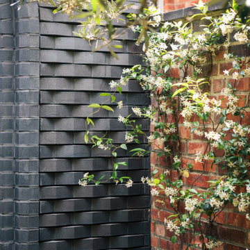
Keyes Road is a two-storey, semi-detached red brick house dating to around 1890-1910. The focus of our work was on the ground floor where we were asked to improve the layout and use of the main living areas of the house, for an active family of four. Important to the design was to maximise the quality and amount of light as well as connection to the garden and flow to the rest of the house.
Our proposal introduces three single storey extensions, comprising a central, large space that extends the main outrigger of the house. To each side are smaller volumes, affording a full width kitchen. While defining a series of discrete volumes, it was important for us to ensure that the kitchen, living, family and dining rooms that are interconnecting and continuous. The result is a big space punctuated by a series of differently sized arches, defining spaces to ensure their intimacy.
It was important for our client to have a sense of warmth and comfort - perhaps not dissimilar to the qualities of a hotel lobby. The colour scheme of the rooms are warm white painted plaster, natural wood flooring with black, bronze and brass accents. Indirect and carefully placed light fittings pulls together the atmosphere of the rooms - particularly in the evenings.
Externally, we felt it important to differentiate the extensions from the main house by using a dark, charcoal grey brick. This sets up a contrasting yet complimentary relationship to the rich red coloured brick house. The facets of the brick play with light and depth as do the graduated brick arches.
During the design process, we grappled with floor levels, the direction of sunlight, and care to not encroach on the neighbouring properties. As the house is in a conservation area, we worked closely with our trusted planning advisor. Throughout, we pursued a sensitive design strategy, using pitched roofs, matching materials and careful detailing. Internally, many of the original details are intact. This has enabled us to create an eclectic ensemble of elements, colours and materials varying in age and period.
 Designs by KS
We partnered up with Furtado Contracting to update the kitchen in this stunning 100 year old house in Vancouver. The vision was to freshen up the dated cabinetry and countertops to a style that would lend well to the age of the home, while providing more storage and new appliances.
Layout: The gas range was previously hidden from the dining room by a pony wall. It was decided early on to remove the pony wall, opening the space visually while providing added counter space behind the range. The removal of the pony wall also allowed us to add additional storage on the dining room side of the kitchen.
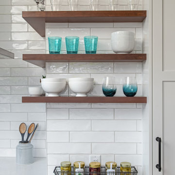
The fridge was the next item to be relocated. Previously encroaching into the walkway, the fridge was previously placed where our new microwave lives. The fridge now sits in the perfect spot, next to a narrow open-self cabinet which was another wish list from the client, to display bottles and decorative items.
Storage in this kitchen increased by mounting the upper cabinets to the ceiling and improving the lower cabinets by adding more drawers and interior accessories like pullouts, spice storage and a super-susan in the base-corner cabinet.
Materials:
The materials used were extra important to this renovation to ensure we complimented the age of the home. To achieve the right look, shaker doors were used on all cabinets. The painted white cabinets were constructed of a Maple species and painted in Benjamin Moores ‘Silver Satin’. On the base cabinets, a Cherry species was used in a warm stain. To brighten up the room, Caesarstone countertops in ‘Frosty Carrina’ were paired with a white tile in a subway pattern from Olympia Tile.
The details on the crown moulding, door-style panels, cabinetry hardware, kitchen faucet and pendant light fixture are what made this space feel warm and welcoming for the 21st century.
Find the right local pro for your project
 STUDIO TASHIMA
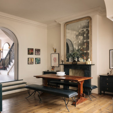
Keyes Road is a two-storey, semi-detached red brick house dating to around 1890-1910. The focus of our work was on the ground floor where we were asked to improve the layout and use of the main living areas of the house, for an active family of four. Important to the design was to maximise the quality and amount of light as well as connection to the garden and flow to the rest of the house.
Our proposal introduces three single storey extensions, comprising a central, large space that extends the main outrigger of the house. To each side are smaller volumes, affording a full width kitchen. While defining a series of discrete volumes, it was important for us to ensure that the kitchen, living, family and dining rooms that are interconnecting and continuous. The result is a big space punctuated by a series of differently sized arches, defining spaces to ensure their intimacy.
It was important for our client to have a sense of warmth and comfort - perhaps not dissimilar to the qualities of a hotel lobby. The colour scheme of the rooms are warm white painted plaster, natural wood flooring with black, bronze and brass accents. Indirect and carefully placed light fittings pulls together the atmosphere of the rooms - particularly in the evenings.
Externally, we felt it important to differentiate the extensions from the main house by using a dark, charcoal grey brick. This sets up a contrasting yet complimentary relationship to the rich red coloured brick house. The facets of the brick play with light and depth as do the graduated brick arches.
During the design process, we grappled with floor levels, the direction of sunlight, and care to not encroach on the neighbouring properties. As the house is in a conservation area, we worked closely with our trusted planning advisor. Throughout, we pursued a sensitive design strategy, using pitched roofs, matching materials and careful detailing. Internally, many of the original details are intact. This has enabled us to create an eclectic ensemble of elements, colours and materials varying in age and period.
 STUDIO TASHIMA
Keyes Road is a two-storey, semi-detached red brick house dating to around 1890-1910. The focus of our work was on the ground floor where we were asked to improve the layout and use of the main living areas of the house, for an active family of four. Important to the design was to maximise the quality and amount of light as well as connection to the garden and flow to the rest of the house.
Our proposal introduces three single storey extensions, comprising a central, large space that extends the main outrigger of the house. To each side are smaller volumes, affording a full width kitchen. While defining a series of discrete volumes, it was important for us to ensure that the kitchen, living, family and dining rooms that are interconnecting and continuous. The result is a big space punctuated by a series of differently sized arches, defining spaces to ensure their intimacy.
It was important for our client to have a sense of warmth and comfort - perhaps not dissimilar to the qualities of a hotel lobby. The colour scheme of the rooms are warm white painted plaster, natural wood flooring with black, bronze and brass accents. Indirect and carefully placed light fittings pulls together the atmosphere of the rooms - particularly in the evenings.
Externally, we felt it important to differentiate the extensions from the main house by using a dark, charcoal grey brick. This sets up a contrasting yet complimentary relationship to the rich red coloured brick house. The facets of the brick play with light and depth as do the graduated brick arches.
During the design process, we grappled with floor levels, the direction of sunlight, and care to not encroach on the neighbouring properties. As the house is in a conservation area, we worked closely with our trusted planning advisor. Throughout, we pursued a sensitive design strategy, using pitched roofs, matching materials and careful detailing. Internally, many of the original details are intact. This has enabled us to create an eclectic ensemble of elements, colours and materials varying in age and period.
 STUDIO TASHIMA
Keyes Road is a two-storey, semi-detached red brick house dating to around 1890-1910. The focus of our work was on the ground floor where we were asked to improve the layout and use of the main living areas of the house, for an active family of four. Important to the design was to maximise the quality and amount of light as well as connection to the garden and flow to the rest of the house.
Our proposal introduces three single storey extensions, comprising a central, large space that extends the main outrigger of the house. To each side are smaller volumes, affording a full width kitchen. While defining a series of discrete volumes, it was important for us to ensure that the kitchen, living, family and dining rooms that are interconnecting and continuous. The result is a big space punctuated by a series of differently sized arches, defining spaces to ensure their intimacy.
It was important for our client to have a sense of warmth and comfort - perhaps not dissimilar to the qualities of a hotel lobby. The colour scheme of the rooms are warm white painted plaster, natural wood flooring with black, bronze and brass accents. Indirect and carefully placed light fittings pulls together the atmosphere of the rooms - particularly in the evenings.
Externally, we felt it important to differentiate the extensions from the main house by using a dark, charcoal grey brick. This sets up a contrasting yet complimentary relationship to the rich red coloured brick house. The facets of the brick play with light and depth as do the graduated brick arches.
During the design process, we grappled with floor levels, the direction of sunlight, and care to not encroach on the neighbouring properties. As the house is in a conservation area, we worked closely with our trusted planning advisor. Throughout, we pursued a sensitive design strategy, using pitched roofs, matching materials and careful detailing. Internally, many of the original details are intact. This has enabled us to create an eclectic ensemble of elements, colours and materials varying in age and period.
 STUDIO TASHIMA
Keyes Road is a two-storey, semi-detached red brick house dating to around 1890-1910. The focus of our work was on the ground floor where we were asked to improve the layout and use of the main living areas of the house, for an active family of four. Important to the design was to maximise the quality and amount of light as well as connection to the garden and flow to the rest of the house.
Our proposal introduces three single storey extensions, comprising a central, large space that extends the main outrigger of the house. To each side are smaller volumes, affording a full width kitchen. While defining a series of discrete volumes, it was important for us to ensure that the kitchen, living, family and dining rooms that are interconnecting and continuous. The result is a big space punctuated by a series of differently sized arches, defining spaces to ensure their intimacy.
It was important for our client to have a sense of warmth and comfort - perhaps not dissimilar to the qualities of a hotel lobby. The colour scheme of the rooms are warm white painted plaster, natural wood flooring with black, bronze and brass accents. Indirect and carefully placed light fittings pulls together the atmosphere of the rooms - particularly in the evenings.
Externally, we felt it important to differentiate the extensions from the main house by using a dark, charcoal grey brick. This sets up a contrasting yet complimentary relationship to the rich red coloured brick house. The facets of the brick play with light and depth as do the graduated brick arches.
During the design process, we grappled with floor levels, the direction of sunlight, and care to not encroach on the neighbouring properties. As the house is in a conservation area, we worked closely with our trusted planning advisor. Throughout, we pursued a sensitive design strategy, using pitched roofs, matching materials and careful detailing. Internally, many of the original details are intact. This has enabled us to create an eclectic ensemble of elements, colours and materials varying in age and period.
 STUDIO TASHIMA
Keyes Road is a two-storey, semi-detached red brick house dating to around 1890-1910. The focus of our work was on the ground floor where we were asked to improve the layout and use of the main living areas of the house, for an active family of four. Important to the design was to maximise the quality and amount of light as well as connection to the garden and flow to the rest of the house.
Our proposal introduces three single storey extensions, comprising a central, large space that extends the main outrigger of the house. To each side are smaller volumes, affording a full width kitchen. While defining a series of discrete volumes, it was important for us to ensure that the kitchen, living, family and dining rooms that are interconnecting and continuous. The result is a big space punctuated by a series of differently sized arches, defining spaces to ensure their intimacy.
It was important for our client to have a sense of warmth and comfort - perhaps not dissimilar to the qualities of a hotel lobby. The colour scheme of the rooms are warm white painted plaster, natural wood flooring with black, bronze and brass accents. Indirect and carefully placed light fittings pulls together the atmosphere of the rooms - particularly in the evenings.
Externally, we felt it important to differentiate the extensions from the main house by using a dark, charcoal grey brick. This sets up a contrasting yet complimentary relationship to the rich red coloured brick house. The facets of the brick play with light and depth as do the graduated brick arches.
During the design process, we grappled with floor levels, the direction of sunlight, and care to not encroach on the neighbouring properties. As the house is in a conservation area, we worked closely with our trusted planning advisor. Throughout, we pursued a sensitive design strategy, using pitched roofs, matching materials and careful detailing. Internally, many of the original details are intact. This has enabled us to create an eclectic ensemble of elements, colours and materials varying in age and period.
 STUDIO TASHIMA
Keyes Road is a two-storey, semi-detached red brick house dating to around 1890-1910. The focus of our work was on the ground floor where we were asked to improve the layout and use of the main living areas of the house, for an active family of four. Important to the design was to maximise the quality and amount of light as well as connection to the garden and flow to the rest of the house.
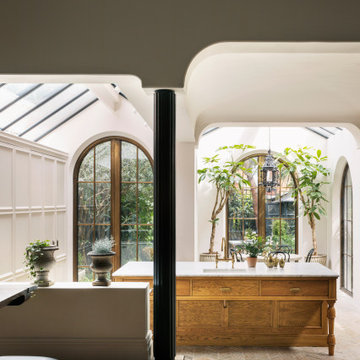
Our proposal introduces three single storey extensions, comprising a central, large space that extends the main outrigger of the house. To each side are smaller volumes, affording a full width kitchen. While defining a series of discrete volumes, it was important for us to ensure that the kitchen, living, family and dining rooms that are interconnecting and continuous. The result is a big space punctuated by a series of differently sized arches, defining spaces to ensure their intimacy.
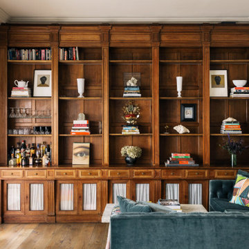
It was important for our client to have a sense of warmth and comfort - perhaps not dissimilar to the qualities of a hotel lobby. The colour scheme of the rooms are warm white painted plaster, natural wood flooring with black, bronze and brass accents. Indirect and carefully placed light fittings pulls together the atmosphere of the rooms - particularly in the evenings.
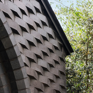
Externally, we felt it important to differentiate the extensions from the main house by using a dark, charcoal grey brick. This sets up a contrasting yet complimentary relationship to the rich red coloured brick house. The facets of the brick play with light and depth as do the graduated brick arches.
During the design process, we grappled with floor levels, the direction of sunlight, and care to not encroach on the neighbouring properties. As the house is in a conservation area, we worked closely with our trusted planning advisor. Throughout, we pursued a sensitive design strategy, using pitched roofs, matching materials and careful detailing. Internally, many of the original details are intact. This has enabled us to create an eclectic ensemble of elements, colours and materials varying in age and period.
 STUDIO TASHIMA
Keyes Road is a two-storey, semi-detached red brick house dating to around 1890-1910. The focus of our work was on the ground floor where we were asked to improve the layout and use of the main living areas of the house, for an active family of four. Important to the design was to maximise the quality and amount of light as well as connection to the garden and flow to the rest of the house.
Our proposal introduces three single storey extensions, comprising a central, large space that extends the main outrigger of the house. To each side are smaller volumes, affording a full width kitchen. While defining a series of discrete volumes, it was important for us to ensure that the kitchen, living, family and dining rooms that are interconnecting and continuous. The result is a big space punctuated by a series of differently sized arches, defining spaces to ensure their intimacy.
It was important for our client to have a sense of warmth and comfort - perhaps not dissimilar to the qualities of a hotel lobby. The colour scheme of the rooms are warm white painted plaster, natural wood flooring with black, bronze and brass accents. Indirect and carefully placed light fittings pulls together the atmosphere of the rooms - particularly in the evenings.
Externally, we felt it important to differentiate the extensions from the main house by using a dark, charcoal grey brick. This sets up a contrasting yet complimentary relationship to the rich red coloured brick house. The facets of the brick play with light and depth as do the graduated brick arches.
During the design process, we grappled with floor levels, the direction of sunlight, and care to not encroach on the neighbouring properties. As the house is in a conservation area, we worked closely with our trusted planning advisor. Throughout, we pursued a sensitive design strategy, using pitched roofs, matching materials and careful detailing. Internally, many of the original details are intact. This has enabled us to create an eclectic ensemble of elements, colours and materials varying in age and period.
 STUDIO TASHIMA
Keyes Road is a two-storey, semi-detached red brick house dating to around 1890-1910. The focus of our work was on the ground floor where we were asked to improve the layout and use of the main living areas of the house, for an active family of four. Important to the design was to maximise the quality and amount of light as well as connection to the garden and flow to the rest of the house.
Our proposal introduces three single storey extensions, comprising a central, large space that extends the main outrigger of the house. To each side are smaller volumes, affording a full width kitchen. While defining a series of discrete volumes, it was important for us to ensure that the kitchen, living, family and dining rooms that are interconnecting and continuous. The result is a big space punctuated by a series of differently sized arches, defining spaces to ensure their intimacy.
It was important for our client to have a sense of warmth and comfort - perhaps not dissimilar to the qualities of a hotel lobby. The colour scheme of the rooms are warm white painted plaster, natural wood flooring with black, bronze and brass accents. Indirect and carefully placed light fittings pulls together the atmosphere of the rooms - particularly in the evenings.
Externally, we felt it important to differentiate the extensions from the main house by using a dark, charcoal grey brick. This sets up a contrasting yet complimentary relationship to the rich red coloured brick house. The facets of the brick play with light and depth as do the graduated brick arches.
During the design process, we grappled with floor levels, the direction of sunlight, and care to not encroach on the neighbouring properties. As the house is in a conservation area, we worked closely with our trusted planning advisor. Throughout, we pursued a sensitive design strategy, using pitched roofs, matching materials and careful detailing. Internally, many of the original details are intact. This has enabled us to create an eclectic ensemble of elements, colours and materials varying in age and period.
 Designs by KS
We partnered up with Furtado Contracting to update the kitchen in this stunning 100 year old house in Vancouver. The vision was to freshen up the dated cabinetry and countertops to a style that would lend well to the age of the home, while providing more storage and new appliances.
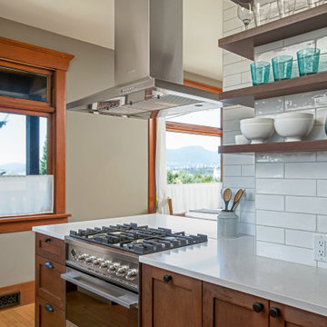
Layout: The gas range was previously hidden from the dining room by a pony wall. It was decided early on to remove the pony wall, opening the space visually while providing added counter space behind the range. The removal of the pony wall also allowed us to add additional storage on the dining room side of the kitchen.
The fridge was the next item to be relocated. Previously encroaching into the walkway, the fridge was previously placed where our new microwave lives. The fridge now sits in the perfect spot, next to a narrow open-self cabinet which was another wish list from the client, to display bottles and decorative items.
Storage in this kitchen increased by mounting the upper cabinets to the ceiling and improving the lower cabinets by adding more drawers and interior accessories like pullouts, spice storage and a super-susan in the base-corner cabinet.
Materials:
The materials used were extra important to this renovation to ensure we complimented the age of the home. To achieve the right look, shaker doors were used on all cabinets. The painted white cabinets were constructed of a Maple species and painted in Benjamin Moores ‘Silver Satin’. On the base cabinets, a Cherry species was used in a warm stain. To brighten up the room, Caesarstone countertops in ‘Frosty Carrina’ were paired with a white tile in a subway pattern from Olympia Tile.
The details on the crown moulding, door-style panels, cabinetry hardware, kitchen faucet and pendant light fixture are what made this space feel warm and welcoming for the 21st century.
 STUDIO TASHIMA
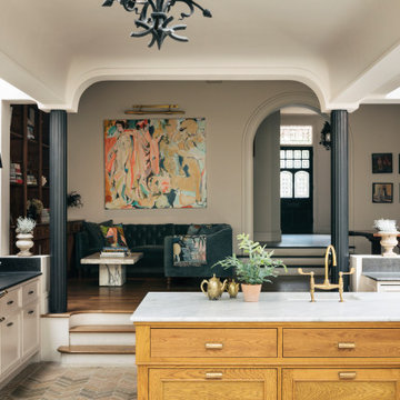
Keyes Road is a two-storey, semi-detached red brick house dating to around 1890-1910. The focus of our work was on the ground floor where we were asked to improve the layout and use of the main living areas of the house, for an active family of four. Important to the design was to maximise the quality and amount of light as well as connection to the garden and flow to the rest of the house.
Our proposal introduces three single storey extensions, comprising a central, large space that extends the main outrigger of the house. To each side are smaller volumes, affording a full width kitchen. While defining a series of discrete volumes, it was important for us to ensure that the kitchen, living, family and dining rooms that are interconnecting and continuous. The result is a big space punctuated by a series of differently sized arches, defining spaces to ensure their intimacy.
It was important for our client to have a sense of warmth and comfort - perhaps not dissimilar to the qualities of a hotel lobby. The colour scheme of the rooms are warm white painted plaster, natural wood flooring with black, bronze and brass accents. Indirect and carefully placed light fittings pulls together the atmosphere of the rooms - particularly in the evenings.
Externally, we felt it important to differentiate the extensions from the main house by using a dark, charcoal grey brick. This sets up a contrasting yet complimentary relationship to the rich red coloured brick house. The facets of the brick play with light and depth as do the graduated brick arches.
During the design process, we grappled with floor levels, the direction of sunlight, and care to not encroach on the neighbouring properties. As the house is in a conservation area, we worked closely with our trusted planning advisor. Throughout, we pursued a sensitive design strategy, using pitched roofs, matching materials and careful detailing. Internally, many of the original details are intact. This has enabled us to create an eclectic ensemble of elements, colours and materials varying in age and period.
 STUDIO TASHIMA
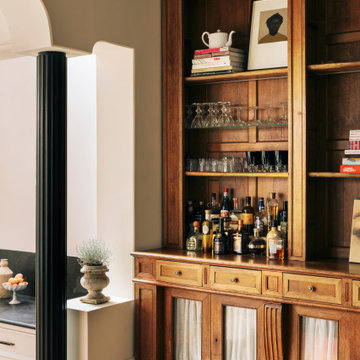
Keyes Road is a two-storey, semi-detached red brick house dating to around 1890-1910. The focus of our work was on the ground floor where we were asked to improve the layout and use of the main living areas of the house, for an active family of four. Important to the design was to maximise the quality and amount of light as well as connection to the garden and flow to the rest of the house.
Our proposal introduces three single storey extensions, comprising a central, large space that extends the main outrigger of the house. To each side are smaller volumes, affording a full width kitchen. While defining a series of discrete volumes, it was important for us to ensure that the kitchen, living, family and dining rooms that are interconnecting and continuous. The result is a big space punctuated by a series of differently sized arches, defining spaces to ensure their intimacy.
It was important for our client to have a sense of warmth and comfort - perhaps not dissimilar to the qualities of a hotel lobby. The colour scheme of the rooms are warm white painted plaster, natural wood flooring with black, bronze and brass accents. Indirect and carefully placed light fittings pulls together the atmosphere of the rooms - particularly in the evenings.
Externally, we felt it important to differentiate the extensions from the main house by using a dark, charcoal grey brick. This sets up a contrasting yet complimentary relationship to the rich red coloured brick house. The facets of the brick play with light and depth as do the graduated brick arches.
During the design process, we grappled with floor levels, the direction of sunlight, and care to not encroach on the neighbouring properties. As the house is in a conservation area, we worked closely with our trusted planning advisor. Throughout, we pursued a sensitive design strategy, using pitched roofs, matching materials and careful detailing. Internally, many of the original details are intact. This has enabled us to create an eclectic ensemble of elements, colours and materials varying in age and period.
 Designs by KS
We partnered up with Furtado Contracting to update the kitchen in this stunning 100 year old house in Vancouver. The vision was to freshen up the dated cabinetry and countertops to a style that would lend well to the age of the home, while providing more storage and new appliances.
Layout: The gas range was previously hidden from the dining room by a pony wall. It was decided early on to remove the pony wall, opening the space visually while providing added counter space behind the range. The removal of the pony wall also allowed us to add additional storage on the dining room side of the kitchen.
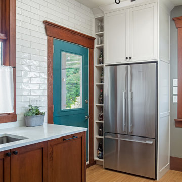
The fridge was the next item to be relocated. Previously encroaching into the walkway, the fridge was previously placed where our new microwave lives. The fridge now sits in the perfect spot, next to a narrow open-self cabinet which was another wish list from the client, to display bottles and decorative items.
Storage in this kitchen increased by mounting the upper cabinets to the ceiling and improving the lower cabinets by adding more drawers and interior accessories like pullouts, spice storage and a super-susan in the base-corner cabinet.
Materials:
The materials used were extra important to this renovation to ensure we complimented the age of the home. To achieve the right look, shaker doors were used on all cabinets. The painted white cabinets were constructed of a Maple species and painted in Benjamin Moores ‘Silver Satin’. On the base cabinets, a Cherry species was used in a warm stain. To brighten up the room, Caesarstone countertops in ‘Frosty Carrina’ were paired with a white tile in a subway pattern from Olympia Tile.
The details on the crown moulding, door-style panels, cabinetry hardware, kitchen faucet and pendant light fixture are what made this space feel warm and welcoming for the 21st century.
 STUDIO TASHIMA
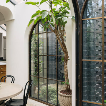
Keyes Road is a two-storey, semi-detached red brick house dating to around 1890-1910. The focus of our work was on the ground floor where we were asked to improve the layout and use of the main living areas of the house, for an active family of four. Important to the design was to maximise the quality and amount of light as well as connection to the garden and flow to the rest of the house.
Our proposal introduces three single storey extensions, comprising a central, large space that extends the main outrigger of the house. To each side are smaller volumes, affording a full width kitchen. While defining a series of discrete volumes, it was important for us to ensure that the kitchen, living, family and dining rooms that are interconnecting and continuous. The result is a big space punctuated by a series of differently sized arches, defining spaces to ensure their intimacy.
It was important for our client to have a sense of warmth and comfort - perhaps not dissimilar to the qualities of a hotel lobby. The colour scheme of the rooms are warm white painted plaster, natural wood flooring with black, bronze and brass accents. Indirect and carefully placed light fittings pulls together the atmosphere of the rooms - particularly in the evenings.
Externally, we felt it important to differentiate the extensions from the main house by using a dark, charcoal grey brick. This sets up a contrasting yet complimentary relationship to the rich red coloured brick house. The facets of the brick play with light and depth as do the graduated brick arches.
During the design process, we grappled with floor levels, the direction of sunlight, and care to not encroach on the neighbouring properties. As the house is in a conservation area, we worked closely with our trusted planning advisor. Throughout, we pursued a sensitive design strategy, using pitched roofs, matching materials and careful detailing. Internally, many of the original details are intact. This has enabled us to create an eclectic ensemble of elements, colours and materials varying in age and period.
 Designs by KS
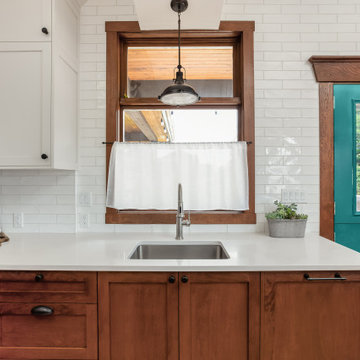
We partnered up with Furtado Contracting to update the kitchen in this stunning 100 year old house in Vancouver. The vision was to freshen up the dated cabinetry and countertops to a style that would lend well to the age of the home, while providing more storage and new appliances.
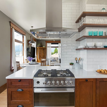
Layout: The gas range was previously hidden from the dining room by a pony wall. It was decided early on to remove the pony wall, opening the space visually while providing added counter space behind the range. The removal of the pony wall also allowed us to add additional storage on the dining room side of the kitchen.
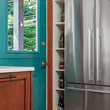
The fridge was the next item to be relocated. Previously encroaching into the walkway, the fridge was previously placed where our new microwave lives. The fridge now sits in the perfect spot, next to a narrow open-self cabinet which was another wish list from the client, to display bottles and decorative items.
Storage in this kitchen increased by mounting the upper cabinets to the ceiling and improving the lower cabinets by adding more drawers and interior accessories like pullouts, spice storage and a super-susan in the base-corner cabinet.
Materials:
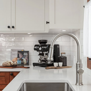
The materials used were extra important to this renovation to ensure we complimented the age of the home. To achieve the right look, shaker doors were used on all cabinets. The painted white cabinets were constructed of a Maple species and painted in Benjamin Moores ‘Silver Satin’. On the base cabinets, a Cherry species was used in a warm stain. To brighten up the room, Caesarstone countertops in ‘Frosty Carrina’ were paired with a white tile in a subway pattern from Olympia Tile.
The details on the crown moulding, door-style panels, cabinetry hardware, kitchen faucet and pendant light fixture are what made this space feel warm and welcoming for the 21st century.
 Designs by KS
We partnered up with Furtado Contracting to update the kitchen in this stunning 100 year old house in Vancouver. The vision was to freshen up the dated cabinetry and countertops to a style that would lend well to the age of the home, while providing more storage and new appliances.
Layout: The gas range was previously hidden from the dining room by a pony wall. It was decided early on to remove the pony wall, opening the space visually while providing added counter space behind the range. The removal of the pony wall also allowed us to add additional storage on the dining room side of the kitchen.
The fridge was the next item to be relocated. Previously encroaching into the walkway, the fridge was previously placed where our new microwave lives. The fridge now sits in the perfect spot, next to a narrow open-self cabinet which was another wish list from the client, to display bottles and decorative items.
Storage in this kitchen increased by mounting the upper cabinets to the ceiling and improving the lower cabinets by adding more drawers and interior accessories like pullouts, spice storage and a super-susan in the base-corner cabinet.
Materials:
The materials used were extra important to this renovation to ensure we complimented the age of the home. To achieve the right look, shaker doors were used on all cabinets. The painted white cabinets were constructed of a Maple species and painted in Benjamin Moores ‘Silver Satin’. On the base cabinets, a Cherry species was used in a warm stain. To brighten up the room, Caesarstone countertops in ‘Frosty Carrina’ were paired with a white tile in a subway pattern from Olympia Tile.
The details on the crown moulding, door-style panels, cabinetry hardware, kitchen faucet and pendant light fixture are what made this space feel warm and welcoming for the 21st century.
 Designs by KS
We partnered up with Furtado Contracting to update the kitchen in this stunning 100 year old house in Vancouver. The vision was to freshen up the dated cabinetry and countertops to a style that would lend well to the age of the home, while providing more storage and new appliances.
Layout: The gas range was previously hidden from the dining room by a pony wall. It was decided early on to remove the pony wall, opening the space visually while providing added counter space behind the range. The removal of the pony wall also allowed us to add additional storage on the dining room side of the kitchen.
The fridge was the next item to be relocated. Previously encroaching into the walkway, the fridge was previously placed where our new microwave lives. The fridge now sits in the perfect spot, next to a narrow open-self cabinet which was another wish list from the client, to display bottles and decorative items.
Storage in this kitchen increased by mounting the upper cabinets to the ceiling and improving the lower cabinets by adding more drawers and interior accessories like pullouts, spice storage and a super-susan in the base-corner cabinet.
Materials:
The materials used were extra important to this renovation to ensure we complimented the age of the home. To achieve the right look, shaker doors were used on all cabinets. The painted white cabinets were constructed of a Maple species and painted in Benjamin Moores ‘Silver Satin’. On the base cabinets, a Cherry species was used in a warm stain. To brighten up the room, Caesarstone countertops in ‘Frosty Carrina’ were paired with a white tile in a subway pattern from Olympia Tile.
The details on the crown moulding, door-style panels, cabinetry hardware, kitchen faucet and pendant light fixture are what made this space feel warm and welcoming for the 21st century.
 Designs by KS
We partnered up with Furtado Contracting to update the kitchen in this stunning 100 year old house in Vancouver. The vision was to freshen up the dated cabinetry and countertops to a style that would lend well to the age of the home, while providing more storage and new appliances.
Layout: The gas range was previously hidden from the dining room by a pony wall. It was decided early on to remove the pony wall, opening the space visually while providing added counter space behind the range. The removal of the pony wall also allowed us to add additional storage on the dining room side of the kitchen.
The fridge was the next item to be relocated. Previously encroaching into the walkway, the fridge was previously placed where our new microwave lives. The fridge now sits in the perfect spot, next to a narrow open-self cabinet which was another wish list from the client, to display bottles and decorative items.
Storage in this kitchen increased by mounting the upper cabinets to the ceiling and improving the lower cabinets by adding more drawers and interior accessories like pullouts, spice storage and a super-susan in the base-corner cabinet.
Materials:
The materials used were extra important to this renovation to ensure we complimented the age of the home. To achieve the right look, shaker doors were used on all cabinets. The painted white cabinets were constructed of a Maple species and painted in Benjamin Moores ‘Silver Satin’. On the base cabinets, a Cherry species was used in a warm stain. To brighten up the room, Caesarstone countertops in ‘Frosty Carrina’ were paired with a white tile in a subway pattern from Olympia Tile.
The details on the crown moulding, door-style panels, cabinetry hardware, kitchen faucet and pendant light fixture are what made this space feel warm and welcoming for the 21st century.
18