
Search results for "Encroach" in Home Design Ideas
 Mantell-Hecathorn Builders
The land parcel that our client purchased for his home is unique in numerous ways. Located in the desert country of Southwest Colorado in the historically and archaeologically significant McElmo Canyon, it encompasses 20 acres of seasonally irrigated ranch land along the banks of McElmo Creek. The richly colored sandstone canyon walls that rise on the other side of the creek are included in the Canyons of the Ancients National Monument.
Mantell-Hecathorn Builders oriented the house on the property with great care. The goals included:
Maximizing solar exposure for photovoltaic panels and passive solar benefits
Retaining the irrigated acreage for continued agricultural hay production
Avoiding encroachment into the natural riparian zone located along McElmo Creek, which has year around water flow (rare in the desert ecosystem)
Locating and designing the home to stay above a potential floodplain level (more as a precaution due to lack of historical evidence flooding)
Focusing on the beautiful views to the north of the sandstone canyon walls and Sleeping Ute Mountain to the south, while maintaining the privacy and seclusion of the setting
This home won the Department of Energy's Housing Innovation Award in 2016 for its efficiency, comfort, and design making this Net Zero home truly in a league of its own.
 Bonnie McCarthy
Photo: Bonnie McCarthy © 2016 Houzz
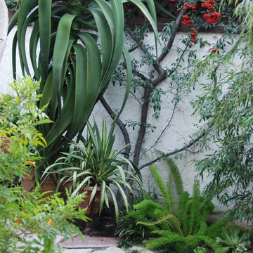
This is an example of an eclectic landscaping in Los Angeles.
This is an example of an eclectic landscaping in Los Angeles.
 Construction Landscape, LLC.
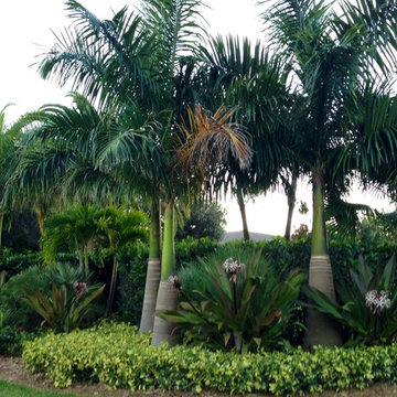
Royal Palms and Queen Emmas
Landscape designed and installed by Construction Landscape, Jennifer Bevins 772-492-8382
Design ideas for a mid-sized traditional partial sun front yard formal garden in Orlando.
Design ideas for a mid-sized traditional partial sun front yard formal garden in Orlando.
Find the right local pro for your project
 Miller-Roodell Architects Ltd
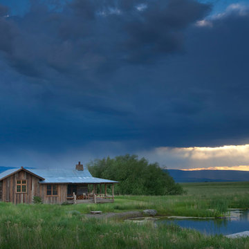
Set in Montana's tranquil Shields River Valley, the Shilo Ranch Compound is a collection of structures that were specifically built on a relatively smaller scale, to maximize efficiency. The main house has two bedrooms, a living area, dining and kitchen, bath and adjacent greenhouse, while two guest homes within the compound can sleep a total of 12 friends and family. There's also a common gathering hall, for dinners, games, and time together. The overall feel here is of sophisticated simplicity, with plaster walls, concrete and wood floors, and weathered boards for exteriors. The placement of each building was considered closely when envisioning how people would move through the property, based on anticipated needs and interests. Sustainability and consumption was also taken into consideration, as evidenced by the photovoltaic panels on roof of the garage, and the capability to shut down any of the compound's buildings when not in use.
 Mantell-Hecathorn Builders
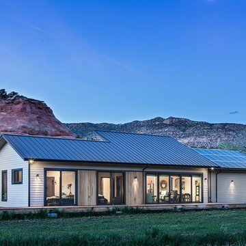
The land parcel that our client purchased for his home is unique in numerous ways. Located in the desert country of Southwest Colorado in the historically and archaeologically significant McElmo Canyon, it encompasses 20 acres of seasonally irrigated ranch land along the banks of McElmo Creek. The richly colored sandstone canyon walls that rise on the other side of the creek are included in the Canyons of the Ancients National Monument.
Mantell-Hecathorn Builders oriented the house on the property with great care. The goals included:
Maximizing solar exposure for photovoltaic panels and passive solar benefits
Retaining the irrigated acreage for continued agricultural hay production
Avoiding encroachment into the natural riparian zone located along McElmo Creek, which has year around water flow (rare in the desert ecosystem)
Locating and designing the home to stay above a potential floodplain level (more as a precaution due to lack of historical evidence flooding)
Focusing on the beautiful views to the north of the sandstone canyon walls and Sleeping Ute Mountain to the south, while maintaining the privacy and seclusion of the setting
This home won the Department of Energy's Housing Innovation Award in 2016 for its efficiency, comfort, and design making this Net Zero home truly in a league of its own.
 Dream Coast Builders
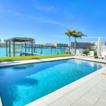
Framed by clean paver tiles and bordered in uniform grout lines, the in-ground pool uses a subtle gradient in tiling to visually deepen the center basin. The waterline features a linear mosaic trim that adds a precision finish between the interior surface and coping edge. Perimeter drainage is embedded beneath the patio surface to prevent runoff accumulation without interrupting the slab’s clean layout.
A consistent light-stone deck finish surrounds the pool, extending to a lounge zone arranged with modern Adirondack-style seating in UV-resistant composite material. Adjacent turf is edged with structural concrete and transitions into a reinforced boat dock equipped with a covered lift system, enabling watercraft access without encroaching on poolside activities. Framing the boundary, slim-profile fencing and mature palm plantings add privacy without blocking the expansive water view. The entire layout emphasizes symmetry, unobstructed sightlines, and a balance of functional exterior zones in a luxury coastal setting.
 Patrick A. Finn, Ltd
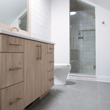
This luxury primary bathroom showcases a masterclass in space optimization, proving that a challenging attic footprint can be transformed into a functional oasis. Every inch of the sloped roofline has been strategically utilized. Nestled perfectly into the low knee-wall alcove, a custom open wooden shelving unit and a woven laundry hamper maximize vertical storage without encroaching on the room's footprint.
A sleek light-wood vanity anchors the room, paired with a large wood-framed mirror that amplifies the room's brightness. A seamless walk-in shower with a frameless glass door tightly hugs the ceiling slope, featuring a built-in recessed wall niche to keep essentials organized and off the floor. Anchored by large-format gray slate floor tiles and a striking feature wall of vertically stacked handmade white Zellige tiles, the design delivers ultimate high-end functionality while preserving a clean, clutter-free Scandinavian aesthetic.
 Pro Dunk Hoops
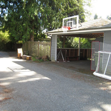
Deanna installed Roof King Platinum Basketball System on her carport by the laneway. The dimensions of the playing area are 50' and 25'. She and her family are so glad that they installed the hoop. The depth is approx. 6 meters of complete flat ground, with an additional few meters of extra playing space if they really encroach on their neighbors' garage entrance. The width is unlimited in both directions, as it is a through lane. It is located in North Vancouver. This is a Roof King Platinum Basketball System that was purchased in May of 2013. It was installed on a 50 ft wide by a 25 ft deep playing area in N. Vancouver, XX. Browse all of Deanna B's photos navigate to: http://www.produnkhoops.com/photos/albums/deanna-50x25-roof-king-platinum-basketball-system-371/

 TKS Design Group
Free ebook, Creating the Ideal Kitchen. DOWNLOAD NOW
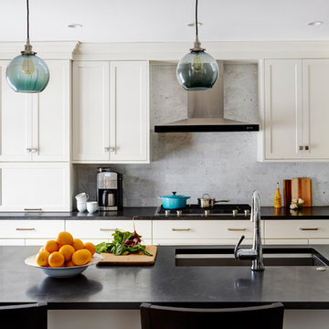
This was a fun and special project for me to work on – it’s my parent’s new (to them) townhome. Downsizing from their previous home, and I collaborated with my architect father on redesigning their kitchen and master bathroom.
Opening up the layout on the 1st floor was on the top of their list. They hoped to make it possible for whoever was cooking in the kitchen was still able to interact with people in family room and the dining room easily. An existing wall between the family room and the kitchen, made the kitchen feel cut off from the rest of the house.
By removing the wall, we were able to turn the kitchen layout from the standard "U" shape kitchen to a galley which allowed for more storage and countertop space. White Dove frameless cabinetry from Woodharbor was used to give the space a light and fresh feel, while maximizing space within for easy storage. A built in-hutch in the dining room was added for additional storage without encroaching in the room itself.
The master bathroom was completely remodeled as well from head-to-toe. The existing layout was not conducive to my parent’s daily lifestyle. It had one vanity, an awkward corner tub with a just as awkward corner shower which seemed more like a dungeon than a shower. We gutted the existing bathroom, relocated a wall to create a large walk-in closet, omitted the tub, and created a nice spa like shower. The new layout also allowed them to have a double vanity with a small make-up area in between.
Some features we added into the bathroom were heated floors, which are especially nice during the cold Chicago winters, custom marble tile as an accent in the shower, and a custom shower enclosure which really kept the room open.
Designed by: Keri Pryde
Photography by: Mike Kaskal
For more information on kitchen and bath design ideas go to: www.kitchenstudio-ge.com
 Bennett Contracting, Inc.
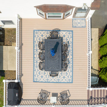
Our next project gave us an amazing opportunity to work with a delightful couple who wanted to breathe new life into their outdated and deteriorated 2-tier wooden deck. Upon assessing the space as well as the wants and needs of our clients, Project Manager, EJ Bonacker, knew it was evident that there was immense potential for improvement. He proposed to shift the deck to a single level and incorporate a Trex RainEscape system. This ingenious addition ensured the area below the deck would remain dry and usable no matter the weather conditions and would also maximize space for entertaining friends and family. Low maintenance TimberTech decking and Titan railings were used which will allow our clients to spend more time enjoying the deck rather than maintaining it. While the older deck did have some lighting, we proposed a comprehensive lighting upgrade which included lights around the perimeter as well as well-lit stairs leading to the ground level which enhanced not only the aesthetics but also the safety during evening gatherings. One of our favorite pieces of this project was designing a special nook for the grill as to not encroach on the primary entertainment area. Our clients were ecstatic we were able to complete their project just in time for the Fourth of July celebrations so they could share laughter, delicious food and create beautiful memories with their neighbors, kids and grandkids. We look forward to helping these clients with more projects for years to come!
 Bennett Contracting, Inc.
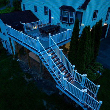
Our next project gave us an amazing opportunity to work with a delightful couple who wanted to breathe new life into their outdated and deteriorated 2-tier wooden deck. Upon assessing the space as well as the wants and needs of our clients, Project Manager, EJ Bonacker, knew it was evident that there was immense potential for improvement. He proposed to shift the deck to a single level and incorporate a Trex RainEscape system. This ingenious addition ensured the area below the deck would remain dry and usable no matter the weather conditions and would also maximize space for entertaining friends and family. Low maintenance TimberTech decking and Titan railings were used which will allow our clients to spend more time enjoying the deck rather than maintaining it. While the older deck did have some lighting, we proposed a comprehensive lighting upgrade which included lights around the perimeter as well as well-lit stairs leading to the ground level which enhanced not only the aesthetics but also the safety during evening gatherings. One of our favorite pieces of this project was designing a special nook for the grill as to not encroach on the primary entertainment area. Our clients were ecstatic we were able to complete their project just in time for the Fourth of July celebrations so they could share laughter, delicious food and create beautiful memories with their neighbors, kids and grandkids. We look forward to helping these clients with more projects for years to come!
 Bennett Contracting, Inc.
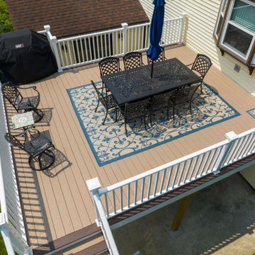
Our next project gave us an amazing opportunity to work with a delightful couple who wanted to breathe new life into their outdated and deteriorated 2-tier wooden deck. Upon assessing the space as well as the wants and needs of our clients, Project Manager, EJ Bonacker, knew it was evident that there was immense potential for improvement. He proposed to shift the deck to a single level and incorporate a Trex RainEscape system. This ingenious addition ensured the area below the deck would remain dry and usable no matter the weather conditions and would also maximize space for entertaining friends and family. Low maintenance TimberTech decking and Titan railings were used which will allow our clients to spend more time enjoying the deck rather than maintaining it. While the older deck did have some lighting, we proposed a comprehensive lighting upgrade which included lights around the perimeter as well as well-lit stairs leading to the ground level which enhanced not only the aesthetics but also the safety during evening gatherings. One of our favorite pieces of this project was designing a special nook for the grill as to not encroach on the primary entertainment area. Our clients were ecstatic we were able to complete their project just in time for the Fourth of July celebrations so they could share laughter, delicious food and create beautiful memories with their neighbors, kids and grandkids. We look forward to helping these clients with more projects for years to come!
 Santa Barbara Home Design
Design Consultant Jeff Doubét is the author of Creating Spanish Style Homes: Before & After – Techniques – Designs – Insights. The 240 page “Design Consultation in a Book” is now available. Please visit SantaBarbaraHomeDesigner.com for more info.
Jeff Doubét specializes in Santa Barbara style home and landscape designs. To learn more info about the variety of custom design services I offer, please visit SantaBarbaraHomeDesigner.com
Jeff Doubét is the Founder of Santa Barbara Home Design - a design studio based in Santa Barbara, California USA.
 Bennett Contracting, Inc.
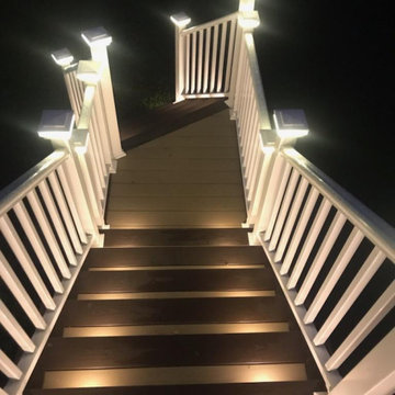
Our next project gave us an amazing opportunity to work with a delightful couple who wanted to breathe new life into their outdated and deteriorated 2-tier wooden deck. Upon assessing the space as well as the wants and needs of our clients, Project Manager, EJ Bonacker, knew it was evident that there was immense potential for improvement. He proposed to shift the deck to a single level and incorporate a Trex RainEscape system. This ingenious addition ensured the area below the deck would remain dry and usable no matter the weather conditions and would also maximize space for entertaining friends and family. Low maintenance TimberTech decking and Titan railings were used which will allow our clients to spend more time enjoying the deck rather than maintaining it. While the older deck did have some lighting, we proposed a comprehensive lighting upgrade which included lights around the perimeter as well as well-lit stairs leading to the ground level which enhanced not only the aesthetics but also the safety during evening gatherings. One of our favorite pieces of this project was designing a special nook for the grill as to not encroach on the primary entertainment area. Our clients were ecstatic we were able to complete their project just in time for the Fourth of July celebrations so they could share laughter, delicious food and create beautiful memories with their neighbors, kids and grandkids. We look forward to helping these clients with more projects for years to come!
 TKS Design Group
Free ebook, Creating the Ideal Kitchen. DOWNLOAD NOW
This was a fun and special project for me to work on – it’s my parent’s new (to them) townhome. Downsizing from their previous home, and I collaborated with my architect father on redesigning their kitchen and master bathroom.
Opening up the layout on the 1st floor was on the top of their list. They hoped to make it possible for whoever was cooking in the kitchen was still able to interact with people in family room and the dining room easily. An existing wall between the family room and the kitchen, made the kitchen feel cut off from the rest of the house.
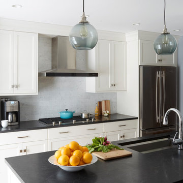
By removing the wall, we were able to turn the kitchen layout from the standard "U" shape kitchen to a galley which allowed for more storage and countertop space. White Dove frameless cabinetry from Woodharbor was used to give the space a light and fresh feel, while maximizing space within for easy storage. A built in-hutch in the dining room was added for additional storage without encroaching in the room itself.
The master bathroom was completely remodeled as well from head-to-toe. The existing layout was not conducive to my parent’s daily lifestyle. It had one vanity, an awkward corner tub with a just as awkward corner shower which seemed more like a dungeon than a shower. We gutted the existing bathroom, relocated a wall to create a large walk-in closet, omitted the tub, and created a nice spa like shower. The new layout also allowed them to have a double vanity with a small make-up area in between.
Some features we added into the bathroom were heated floors, which are especially nice during the cold Chicago winters, custom marble tile as an accent in the shower, and a custom shower enclosure which really kept the room open.
Designed by: Keri Pryde
Photography by: Mike Kaskal
For more information on kitchen and bath design ideas go to: www.kitchenstudio-ge.com
 FormLA Landscaping
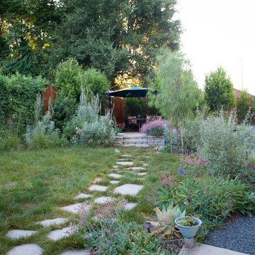
A gravel path and concrete patios adjacent to the structures provide defensible space where fire fighters could easily remove embers. They are also delightful places for exploring and viewing the garden.
 TKS Design Group
Free ebook, Creating the Ideal Kitchen. DOWNLOAD NOW
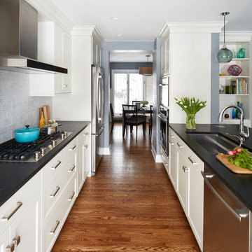
This was a fun and special project for me to work on – it’s my parent’s new (to them) townhome. Downsizing from their previous home, and I collaborated with my architect father on redesigning their kitchen and master bathroom.
Opening up the layout on the 1st floor was on the top of their list. They hoped to make it possible for whoever was cooking in the kitchen was still able to interact with people in family room and the dining room easily. An existing wall between the family room and the kitchen, made the kitchen feel cut off from the rest of the house.
By removing the wall, we were able to turn the kitchen layout from the standard "U" shape kitchen to a galley which allowed for more storage and countertop space. White Dove frameless cabinetry from Woodharbor was used to give the space a light and fresh feel, while maximizing space within for easy storage. A built in-hutch in the dining room was added for additional storage without encroaching in the room itself.
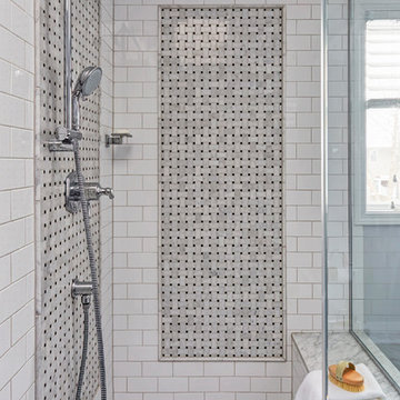
The master bathroom was completely remodeled as well from head-to-toe. The existing layout was not conducive to my parent’s daily lifestyle. It had one vanity, an awkward corner tub with a just as awkward corner shower which seemed more like a dungeon than a shower. We gutted the existing bathroom, relocated a wall to create a large walk-in closet, omitted the tub, and created a nice spa like shower. The new layout also allowed them to have a double vanity with a small make-up area in between.
Some features we added into the bathroom were heated floors, which are especially nice during the cold Chicago winters, custom marble tile as an accent in the shower, and a custom shower enclosure which really kept the room open.
Designed by: Keri Pryde
Photography by: Mike Kaskal
For more information on kitchen and bath design ideas go to: www.kitchenstudio-ge.com
 Randy Angell Designs
The client purchased this property with grand plans of renovating the entire place; from top to bottom, and from inside to outside. And while the inside canvas was very generous and even somewhat forgiving, the outside space would be anything but.
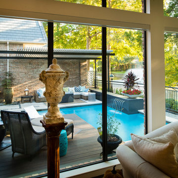
We wanted to squeeze in as much seating space as possible in their limited courtyard area, without encroaching on the already compact-sized pool. The first and most obvious solution was to get rid of the trees and shrubs that separated this house from its zero-lot-line neighbor. With the addition of Lueder limestone pavers, this new area alone would free up nearly 120 additional square feet, which happened to be the perfect amount of space for a mobile gas fire pit and sectional sofa. And this would make for the perfect place to enjoy the afternoon sunset with the implementation of a custom-built metal pergola standing above it all.
The next problem to overcome was the disconnected feel of the existing patio; there were too many levels of steps and stairs, which meant that it would have been difficult to have any sort of traditional furniture arrangement in their outdoor space. Randy knew that it only made sense to bring in a wood deck that could be mated to the highest level of the patio, thus creating and gaining the greatest amount of continuous, flat space that the client needed. But even so, that flat space would be limited to a very tight "L-shape" around the pool. And knowing this, the client decided that the larger space would be more valuable to them than the spa, so they opted to have a portion of the deck built over it in order to allow for a more generous amount of patio space.
And with the edge of the patio/deck dropping off almost 2 feet to the waterline, it now created the perfect opportunity to have a visually compelling raised wall that could be adorned with different hues of plank-shaped tiles. From inside the pool, the varying shades of brown were a great accent to the wood deck that sat just above.
However, the true visual crowning jewel of this project would end up being the raised back wall along the fence, fully encased in a large format, 24x24 slate grey tile, complete with a custom stainless steel, square-tube scupper bank, installed at just the right height to create the perfect amount of water noise.
But Randy wasn't done just yet. With two entirely new entertaining areas opened up at opposite ends of the pool, the only thing left to do now was to connect them. Knowing that he nor the client wanted to eliminate any more water space, he decided to bring a new traffic pattern right into the pool by way of two "floating", Lueder limestone stepper pads. It would be a visually perfect union of both pool and walking spaces.
The existing steps and walkways were then cut away and replaced with matching Lueder limestone caps and steppers. All remaining hardscape gaps were later filled with Mexican beach pebble, which helped to promote a very "zen-like" feel in this outdoor space.
The interior of the pool was coated with Wet Edge Primerastone "Blue Pacific Coast" plaster, and then lit up with the incredibly versatile Pentair GloBrite LED pool lights.
In the end, the client ended up gaining the additional entertaining and seating space that they needed, and the updated, modern feel that they loved.
 TKS Design Group
Free ebook, Creating the Ideal Kitchen. DOWNLOAD NOW
This was a fun and special project for me to work on – it’s my parent’s new (to them) townhome. Downsizing from their previous home, and I collaborated with my architect father on redesigning their kitchen and master bathroom.
Opening up the layout on the 1st floor was on the top of their list. They hoped to make it possible for whoever was cooking in the kitchen was still able to interact with people in family room and the dining room easily. An existing wall between the family room and the kitchen, made the kitchen feel cut off from the rest of the house.
By removing the wall, we were able to turn the kitchen layout from the standard "U" shape kitchen to a galley which allowed for more storage and countertop space. White Dove frameless cabinetry from Woodharbor was used to give the space a light and fresh feel, while maximizing space within for easy storage. A built in-hutch in the dining room was added for additional storage without encroaching in the room itself.
The master bathroom was completely remodeled as well from head-to-toe. The existing layout was not conducive to my parent’s daily lifestyle. It had one vanity, an awkward corner tub with a just as awkward corner shower which seemed more like a dungeon than a shower. We gutted the existing bathroom, relocated a wall to create a large walk-in closet, omitted the tub, and created a nice spa like shower. The new layout also allowed them to have a double vanity with a small make-up area in between.
Some features we added into the bathroom were heated floors, which are especially nice during the cold Chicago winters, custom marble tile as an accent in the shower, and a custom shower enclosure which really kept the room open.
Designed by: Keri Pryde
Photography by: Mike Kaskal
For more information on kitchen and bath design ideas go to: www.kitchenstudio-ge.com
16