
Search results for "Evening meal" in Home Design Ideas

 Jarrett Design
This small kitchen received a big makeover when the room was gutted. The old cabinets were replaced with shaker style full overlay cabinets from Medallion Cabinetry in a white painted finish. Taking the cabinets to the ceiling with crown molding draws the eye up to make the room feel brighter. The BlueStar range and soapstone countertops are a chef's dream, and hidden accessories like roll-out trays, super-susans, and cutlery dividers make meal prep simple. Matt Villano Photography

 TKS Design Group
Free ebook, Creating the Ideal Kitchen. DOWNLOAD NOW
One of my favorite things to work on is older homes with a bit of history because I find it an interesting challenge to marry the historical architectural features of a home with modern design elements that work well for my client’s current lifestyle.
This home was particularly fun because it was the second kitchen we had done for this family and was quite a departure from the style of the first kitchen.
The before shot of the kitchen shows a view from the family room. See the dropped ceiling? We were curious, was this just part of the design or was the dropped ceiling there to hide mechanicals? Well we soon found out that it was mostly decorative (yay!), and with the exception of a little bit of work to some plumbing from an upstairs bathroom and rerouting of the ventilation system within the original floor joists, we were in the clear, phew! The shot of the completed kitchen from roughly the same vantage point shows how much taller the ceilings are. It makes a huge difference in the feel of the space. Dark and gloomy turned fresh and light!
Another serious consideration was what do we do with the skinny transom window above the refrigerator. After much back and forth, we decided to eliminate it and do some open shelving instead. This ended up being one of the nicest areas in the room. I am calling it the “fun zone” because it houses all the barware, wine cubbies and a bar fridge — the perfect little buffet spot for entertaining. It is flanked on either side by pull out pantries that I’m sure will get a ton of use. Since the neighboring room has literally three walls of almost full height windows, the kitchen gets plenty of light.
The gold shelving brackets, large pendant fixtures over the island and the tile mural behind the range all pay subtle homage to the home’s prairie style architecture and bring a bit of sparkle to the room.
Even though the room is quite large, the work triangle is very tight with the large Subzero fridge, sink and range all nearby for easy maneuvering during meal prep. There is seating for four at the island, and work aisles are generous.
Designed by: Susan Klimala, CKD, CBD
Photography by: LOMA Studios
For more information on kitchen and bath design ideas go to: www.kitchenstudio-ge.com

 Michael Nash Design, Build & Homes
2011 CAPITAL COTY AWARD HONORABLE MENTION AWARD WINNER
Built circa 1980, a young couple with three children originally purchased this home for their growing family. After four years of karate, soccer, piano and other activities, however, the home was becoming too small to meet their needs.
Problems started upon entering the front foyer. A 25-foot long dark hallway separated the family room and the kitchen, ending in a tiny powder room stuck in the middle of the layout. The kitchen was especially isolated, a cramped L-shaped design with a box bay breakfast bump out that was literally falling apart.
The new design started with the core of the problem—the maze and separation created by the long hallways.
First, the 25’ load bearing wall separating the foyer from family room was totally taken out and replaced with a long supporting beam. A French door replaced a small door and window leading to a screen porch . This action allowed lots of light to get into family and foyer. Then, the powder room was removed and the partition wall between the kitchen and family room was taken down. This created a large open concept design and greatly increased the size of the kitchen.
The box bay was demolished and replaced with new walls and a large window. The plumbing for main sink and dishwasher got relocated into this box bay allowing a total transformation of the space. Now there are cabinets and counters on all sides.
The doorway to the dining room was reconfigured to allow a butler area on its left. While the right side was occupied with new 36” gas range top with a decorative wood hood above it. The refrigerator, microwave/oven and pantries—the space’s tall elements—occupy one wall..
A large Island with a prep sink and beverage center for the kids occupies the center of the layout. Capable of seating up to four, family and friends can now keep the cook company. A large built-in desk area lets the kids do their homework so the parents can supervise while they prepare meals.
Light cabinetry with a touch of caramel glazing and exotic granite countertops by our designers contributed to this kitchen’s elegant design. The contrasting distressed island’s darker finish matches the dinette set and other furnishings.
New hardwood floors were installed throughout the first floor for a seamless look, while recess, pendant and task lighting make the space even brighter. Importantly, there’s plenty of space for parents and kids to hang out together. The kitchen is truly the heart of their home.
Find the right local pro for your project

 Custom Design & Construction
We were excited when the homeowners of this project approached us to help them with their whole house remodel as this is a historic preservation project. The historical society has approved this remodel. As part of that distinction we had to honor the original look of the home; keeping the façade updated but intact. For example the doors and windows are new but they were made as replicas to the originals. The homeowners were relocating from the Inland Empire to be closer to their daughter and grandchildren. One of their requests was additional living space. In order to achieve this we added a second story to the home while ensuring that it was in character with the original structure. The interior of the home is all new. It features all new plumbing, electrical and HVAC. Although the home is a Spanish Revival the homeowners style on the interior of the home is very traditional. The project features a home gym as it is important to the homeowners to stay healthy and fit. The kitchen / great room was designed so that the homewoners could spend time with their daughter and her children. The home features two master bedroom suites. One is upstairs and the other one is down stairs. The homeowners prefer to use the downstairs version as they are not forced to use the stairs. They have left the upstairs master suite as a guest suite.
Enjoy some of the before and after images of this project:
http://www.houzz.com/discussions/3549200/old-garage-office-turned-gym-in-los-angeles
http://www.houzz.com/discussions/3558821/la-face-lift-for-the-patio
http://www.houzz.com/discussions/3569717/la-kitchen-remodel
http://www.houzz.com/discussions/3579013/los-angeles-entry-hall
http://www.houzz.com/discussions/3592549/exterior-shots-of-a-whole-house-remodel-in-la
http://www.houzz.com/discussions/3607481/living-dining-rooms-become-a-library-and-formal-dining-room-in-la
http://www.houzz.com/discussions/3628842/bathroom-makeover-in-los-angeles-ca
http://www.houzz.com/discussions/3640770/sweet-dreams-la-bedroom-remodels
Exterior: Approved by the historical society as a Spanish Revival, the second story of this home was an addition. All of the windows and doors were replicated to match the original styling of the house. The roof is a combination of Gable and Hip and is made of red clay tile. The arched door and windows are typical of Spanish Revival. The home also features a Juliette Balcony and window.
Library / Living Room: The library offers Pocket Doors and custom bookcases.
Powder Room: This powder room has a black toilet and Herringbone travertine.
Kitchen: This kitchen was designed for someone who likes to cook! It features a Pot Filler, a peninsula and an island, a prep sink in the island, and cookbook storage on the end of the peninsula. The homeowners opted for a mix of stainless and paneled appliances. Although they have a formal dining room they wanted a casual breakfast area to enjoy informal meals with their grandchildren. The kitchen also utilizes a mix of recessed lighting and pendant lights. A wine refrigerator and outlets conveniently located on the island and around the backsplash are the modern updates that were important to the homeowners.
Master bath: The master bath enjoys both a soaking tub and a large shower with body sprayers and hand held. For privacy, the bidet was placed in a water closet next to the shower. There is plenty of counter space in this bathroom which even includes a makeup table.
Staircase: The staircase features a decorative niche
Upstairs master suite: The upstairs master suite features the Juliette balcony
Outside: Wanting to take advantage of southern California living the homeowners requested an outdoor kitchen complete with retractable awning. The fountain and lounging furniture keep it light.
Home gym: This gym comes completed with rubberized floor covering and dedicated bathroom. It also features its own HVAC system and wall mounted TV.

 The Jack + Mare | Portland Design & Build
Split Level 1970 home of a young and active family of four. The main public spaces in this home were remodeled to create a fresh, clean look.
The Jack + Mare demo'd the kitchen and dining room down to studs and removed the wall between the kitchen/dining and living room to create an open concept space with a clean and fresh new kitchen and dining with ample storage. Now the family can all be together and enjoy one another's company even if mom or dad is busy in the kitchen prepping the next meal.
The custom white cabinets and the blue accent island (and walls) really give a nice clean and fun feel to the space. The island has a gorgeous local solid slab of wood on top. A local artisan salvaged and milled up the big leaf maple for this project. In fact, the tree was from the University of Portland's campus located right where the client once rode the bus to school when she was a child. So it's an extra special custom piece! (fun fact: there is a bullet lodged in the wood that is visible...we estimate it was shot into the tree 30-35 years ago!)
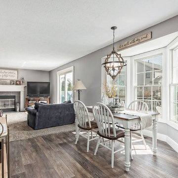
The 'public' spaces were given a brand new waterproof luxury vinyl wide plank tile. With 2 young daughters, a large golden retriever and elderly cat, the durable floor was a must.
project scope at quick glance:
- demo'd and rebuild kitchen and dining room.
- removed wall separating kitchen/dining and living room
- removed carpet and installed new flooring in public spaces
- removed stair carpet and gave fresh black and white paint
- painted all public spaces
- new hallway doorknob harware
- all new LED lighting (kitchen, dining, living room and hallway)
Jason Quigley Photography

 Dura Supreme Cabinetry
With an ideal location in the Pacific Heights neighborhood of San Francisco, this dated Victorian residence had "beautiful bones" but had been sitting on the market for a year before being purchased with plans to revitalize the interior. Interior designer, Noel Han, explained, "Historical Victorian homes in this area often have beautiful architectural elements that I aim to preserve, but the floor plan and layout tend to be stuffy, not live-able and not light filled. Modern families want bright, light-filled, spacious rooms that take advantage of outdoor views and living spaces, and function well for storage, meals and entertaining."
Preserving the architectural integrity and special features of the home was one of Han's goals but at the same time, she re-designed the space, moving walls and adding windows to create an open floorplan that flowed easily between the kitchen and outdoor living spaces. Where the range once stood in the original design, now an entire wall of windows provides panoramic views of the outdoors and fills the kitchen with light. Below the windows, Han designed a long bank of base cabinets with drawers to provide plenty of storage and work surface. Light now pours into the space even on foggy days. The range was moved to the opposite wall so that beautiful window views could be added to the kitchen.
Han selected a palette of finishes with an eye toward creating a "soft color aesthetic". "White painted finishes are very popular right now but would have felt stark and cold in this space," she explained. "The French grey paint from Dura Supreme was a perfect complement for this vintage Victorian home, to create a classic color scheme".
"This beautiful home already had hardware elements with a vintage brass finish, so I carefully selected antiqued, brushed brass hardware, plumbing and metal finishes to blend with the original elements," said Han. She continued, "The La Cornue French Range adds modern function with a French antique look."
"I appreciate working with Dura Supreme cabinetry because of the quality of the cabinetry, fast delivery and the custom options. I'm able to create beautiful architectural details like the pull-out columns on both sides of the range and the curved mullion doors on the furniture hutch, and they offer a stunning palette of finishes and styles," explained Han. For the bath cabinetry, Han created a similar palette of finishes and styles to create a complementary look throughout the entire home.
Product Details:
Perimeter: Dura Supreme Cabinetry shown in the St. Augustine door style and Mullion Pattern #15 door style with a “Zinc” painted finish.
Kitchen Island: Dura Supreme Cabinetry shown in the St. Augustine door style with a Clove stain and Black Accent finish on Cherry wood.
For more information about Noel Han, Interior Designer, click to her website here www.atelnoel.com.
For more information about Gilmans Kitchens and Baths, click to their website here www.gkandb.com.
Photography by: Ned Bonzi www.nedbonzi.com.
Request a FREE Dura Supreme Brochure Packet:
http://www.durasupreme.com/request-brochure
 Fiorito Interior Design
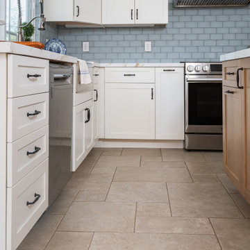
My clients approached this kitchen remodel hoping not only for improved functionality but for a space that invited comfort, warmth, and daily enjoyment. Their existing kitchen was limited in both layout and atmosphere where a small island barely larger than a podium offered little utility. An oversized double-width doorway at the rear of the room leading into the adjacent living space disrupted the flow, making furniture placement nearly impossible. They longed for a kitchen where cooking felt easy and intuitive, but also one where they could sit at the table with a book and a cup of tea, or host friends without feeling cramped or awkwardly positioned.
One of the most impactful decisions we made early on was to close off that extra-wide opening to the living room. Doing so allowed us to reclaim the wall, which not only improved circulation but also gave us the freedom to rethink the spacing of the kitchen and eat-in area. With that change, we could introduce a much larger island—truly functional this time—complete with generous workspace and storage. It became a true centerpiece for meal prep, casual dining, and gathering.
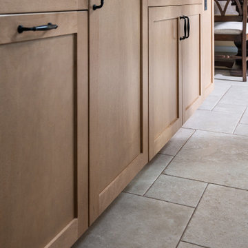
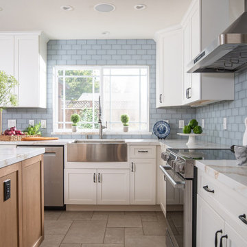
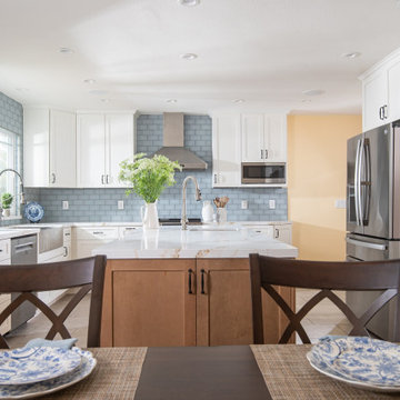
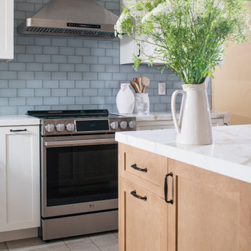
From there I turned my attention to layering in comfort, personality, and style. I curated a color palette of soft white, pale blue, light wood tones, and touches of sunshine yellow. This fresh and uplifting combination feels timeless and relaxed. We chose cabinetry with traditional Shaker-style doors, accented by black forged iron hardware for a subtle hint of contrast and authenticity. For the countertops we chose a Gold Calacatta-look quartz, bringing elegance and warmth with its soft veining and classic appeal.
To elevate the kitchen walls I selected a soft matte glass tile in a moody, sky-blue that blankets the backsplash, providing a gentle wash of color that’s calming and cohesive. On the floors I chose a limestone-look porcelain tile in a classic Versailles pattern as an homage to old English manor houses—bringing character and texture underfoot while remaining durable and low-maintenance for modern life.
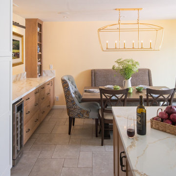
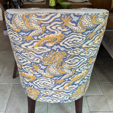
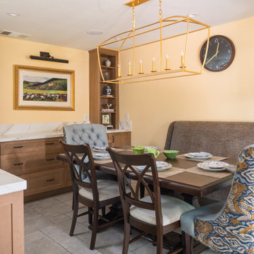
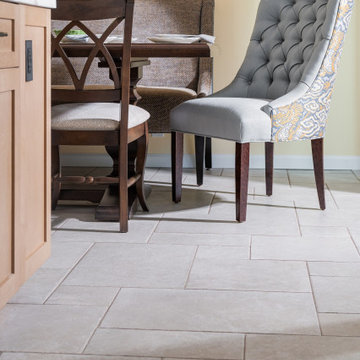
Lastly I transformed the adjacent eat-in area into a cozy, multifunctional space. We added custom built-in bookshelves and a sideboard for serving and display—perfect for entertaining or simply making daily routines feel more special. A black iron picture light softly illuminates the buffet, lending a warm, ambient glow in the evenings. I carefully planned the seating arrangement to include a space-saving banquette along the wall, paired with a trestle-style dining table and side chairs. At either end I placed tufted host chairs upholstered in an exquisite, tonal Chinoiserie dragon pattern that are comfortable enough to sit on for hours. Whether sharing a leisurely meal, reading in the sunlight, or gazing out at the greenery just beyond the windows, this spot now invites my clients to truly enjoy their home in a new, deeper way.
Photo: Bernardo Grijalva
Sponsored
Sunbury, OH

J.Holderby - Renovations
Franklin County's Leading General Contractors - 2X Best of Houzz!
 Fiorito Interior Design
My clients approached this kitchen remodel hoping not only for improved functionality but for a space that invited comfort, warmth, and daily enjoyment. Their existing kitchen was limited in both layout and atmosphere where a small island barely larger than a podium offered little utility. An oversized double-width doorway at the rear of the room leading into the adjacent living space disrupted the flow, making furniture placement nearly impossible. They longed for a kitchen where cooking felt easy and intuitive, but also one where they could sit at the table with a book and a cup of tea, or host friends without feeling cramped or awkwardly positioned.
One of the most impactful decisions we made early on was to close off that extra-wide opening to the living room. Doing so allowed us to reclaim the wall, which not only improved circulation but also gave us the freedom to rethink the spacing of the kitchen and eat-in area. With that change, we could introduce a much larger island—truly functional this time—complete with generous workspace and storage. It became a true centerpiece for meal prep, casual dining, and gathering.
From there I turned my attention to layering in comfort, personality, and style. I curated a color palette of soft white, pale blue, light wood tones, and touches of sunshine yellow. This fresh and uplifting combination feels timeless and relaxed. We chose cabinetry with traditional Shaker-style doors, accented by black forged iron hardware for a subtle hint of contrast and authenticity. For the countertops we chose a Gold Calacatta-look quartz, bringing elegance and warmth with its soft veining and classic appeal.
To elevate the kitchen walls I selected a soft matte glass tile in a moody, sky-blue that blankets the backsplash, providing a gentle wash of color that’s calming and cohesive. On the floors I chose a limestone-look porcelain tile in a classic Versailles pattern as an homage to old English manor houses—bringing character and texture underfoot while remaining durable and low-maintenance for modern life.
Lastly I transformed the adjacent eat-in area into a cozy, multifunctional space. We added custom built-in bookshelves and a sideboard for serving and display—perfect for entertaining or simply making daily routines feel more special. A black iron picture light softly illuminates the buffet, lending a warm, ambient glow in the evenings. I carefully planned the seating arrangement to include a space-saving banquette along the wall, paired with a trestle-style dining table and side chairs. At either end I placed tufted host chairs upholstered in an exquisite, tonal Chinoiserie dragon pattern that are comfortable enough to sit on for hours. Whether sharing a leisurely meal, reading in the sunlight, or gazing out at the greenery just beyond the windows, this spot now invites my clients to truly enjoy their home in a new, deeper way.
Photo: Bernardo Grijalva
 Fiorito Interior Design
My clients approached this kitchen remodel hoping not only for improved functionality but for a space that invited comfort, warmth, and daily enjoyment. Their existing kitchen was limited in both layout and atmosphere where a small island barely larger than a podium offered little utility. An oversized double-width doorway at the rear of the room leading into the adjacent living space disrupted the flow, making furniture placement nearly impossible. They longed for a kitchen where cooking felt easy and intuitive, but also one where they could sit at the table with a book and a cup of tea, or host friends without feeling cramped or awkwardly positioned.
One of the most impactful decisions we made early on was to close off that extra-wide opening to the living room. Doing so allowed us to reclaim the wall, which not only improved circulation but also gave us the freedom to rethink the spacing of the kitchen and eat-in area. With that change, we could introduce a much larger island—truly functional this time—complete with generous workspace and storage. It became a true centerpiece for meal prep, casual dining, and gathering.
From there I turned my attention to layering in comfort, personality, and style. I curated a color palette of soft white, pale blue, light wood tones, and touches of sunshine yellow. This fresh and uplifting combination feels timeless and relaxed. We chose cabinetry with traditional Shaker-style doors, accented by black forged iron hardware for a subtle hint of contrast and authenticity. For the countertops we chose a Gold Calacatta-look quartz, bringing elegance and warmth with its soft veining and classic appeal.
To elevate the kitchen walls I selected a soft matte glass tile in a moody, sky-blue that blankets the backsplash, providing a gentle wash of color that’s calming and cohesive. On the floors I chose a limestone-look porcelain tile in a classic Versailles pattern as an homage to old English manor houses—bringing character and texture underfoot while remaining durable and low-maintenance for modern life.
Lastly I transformed the adjacent eat-in area into a cozy, multifunctional space. We added custom built-in bookshelves and a sideboard for serving and display—perfect for entertaining or simply making daily routines feel more special. A black iron picture light softly illuminates the buffet, lending a warm, ambient glow in the evenings. I carefully planned the seating arrangement to include a space-saving banquette along the wall, paired with a trestle-style dining table and side chairs. At either end I placed tufted host chairs upholstered in an exquisite, tonal Chinoiserie dragon pattern that are comfortable enough to sit on for hours. Whether sharing a leisurely meal, reading in the sunlight, or gazing out at the greenery just beyond the windows, this spot now invites my clients to truly enjoy their home in a new, deeper way.
Photo: Bernardo Grijalva
 Fiorito Interior Design
My clients approached this kitchen remodel hoping not only for improved functionality but for a space that invited comfort, warmth, and daily enjoyment. Their existing kitchen was limited in both layout and atmosphere where a small island barely larger than a podium offered little utility. An oversized double-width doorway at the rear of the room leading into the adjacent living space disrupted the flow, making furniture placement nearly impossible. They longed for a kitchen where cooking felt easy and intuitive, but also one where they could sit at the table with a book and a cup of tea, or host friends without feeling cramped or awkwardly positioned.
One of the most impactful decisions we made early on was to close off that extra-wide opening to the living room. Doing so allowed us to reclaim the wall, which not only improved circulation but also gave us the freedom to rethink the spacing of the kitchen and eat-in area. With that change, we could introduce a much larger island—truly functional this time—complete with generous workspace and storage. It became a true centerpiece for meal prep, casual dining, and gathering.
From there I turned my attention to layering in comfort, personality, and style. I curated a color palette of soft white, pale blue, light wood tones, and touches of sunshine yellow. This fresh and uplifting combination feels timeless and relaxed. We chose cabinetry with traditional Shaker-style doors, accented by black forged iron hardware for a subtle hint of contrast and authenticity. For the countertops we chose a Gold Calacatta-look quartz, bringing elegance and warmth with its soft veining and classic appeal.
To elevate the kitchen walls I selected a soft matte glass tile in a moody, sky-blue that blankets the backsplash, providing a gentle wash of color that’s calming and cohesive. On the floors I chose a limestone-look porcelain tile in a classic Versailles pattern as an homage to old English manor houses—bringing character and texture underfoot while remaining durable and low-maintenance for modern life.
Lastly I transformed the adjacent eat-in area into a cozy, multifunctional space. We added custom built-in bookshelves and a sideboard for serving and display—perfect for entertaining or simply making daily routines feel more special. A black iron picture light softly illuminates the buffet, lending a warm, ambient glow in the evenings. I carefully planned the seating arrangement to include a space-saving banquette along the wall, paired with a trestle-style dining table and side chairs. At either end I placed tufted host chairs upholstered in an exquisite, tonal Chinoiserie dragon pattern that are comfortable enough to sit on for hours. Whether sharing a leisurely meal, reading in the sunlight, or gazing out at the greenery just beyond the windows, this spot now invites my clients to truly enjoy their home in a new, deeper way.
Photo: Bernardo Grijalva
 Fiorito Interior Design
My clients approached this kitchen remodel hoping not only for improved functionality but for a space that invited comfort, warmth, and daily enjoyment. Their existing kitchen was limited in both layout and atmosphere where a small island barely larger than a podium offered little utility. An oversized double-width doorway at the rear of the room leading into the adjacent living space disrupted the flow, making furniture placement nearly impossible. They longed for a kitchen where cooking felt easy and intuitive, but also one where they could sit at the table with a book and a cup of tea, or host friends without feeling cramped or awkwardly positioned.
One of the most impactful decisions we made early on was to close off that extra-wide opening to the living room. Doing so allowed us to reclaim the wall, which not only improved circulation but also gave us the freedom to rethink the spacing of the kitchen and eat-in area. With that change, we could introduce a much larger island—truly functional this time—complete with generous workspace and storage. It became a true centerpiece for meal prep, casual dining, and gathering.
From there I turned my attention to layering in comfort, personality, and style. I curated a color palette of soft white, pale blue, light wood tones, and touches of sunshine yellow. This fresh and uplifting combination feels timeless and relaxed. We chose cabinetry with traditional Shaker-style doors, accented by black forged iron hardware for a subtle hint of contrast and authenticity. For the countertops we chose a Gold Calacatta-look quartz, bringing elegance and warmth with its soft veining and classic appeal.
To elevate the kitchen walls I selected a soft matte glass tile in a moody, sky-blue that blankets the backsplash, providing a gentle wash of color that’s calming and cohesive. On the floors I chose a limestone-look porcelain tile in a classic Versailles pattern as an homage to old English manor houses—bringing character and texture underfoot while remaining durable and low-maintenance for modern life.
Lastly I transformed the adjacent eat-in area into a cozy, multifunctional space. We added custom built-in bookshelves and a sideboard for serving and display—perfect for entertaining or simply making daily routines feel more special. A black iron picture light softly illuminates the buffet, lending a warm, ambient glow in the evenings. I carefully planned the seating arrangement to include a space-saving banquette along the wall, paired with a trestle-style dining table and side chairs. At either end I placed tufted host chairs upholstered in an exquisite, tonal Chinoiserie dragon pattern that are comfortable enough to sit on for hours. Whether sharing a leisurely meal, reading in the sunlight, or gazing out at the greenery just beyond the windows, this spot now invites my clients to truly enjoy their home in a new, deeper way.
Photo: Bernardo Grijalva
 Fiorito Interior Design
My clients approached this kitchen remodel hoping not only for improved functionality but for a space that invited comfort, warmth, and daily enjoyment. Their existing kitchen was limited in both layout and atmosphere where a small island barely larger than a podium offered little utility. An oversized double-width doorway at the rear of the room leading into the adjacent living space disrupted the flow, making furniture placement nearly impossible. They longed for a kitchen where cooking felt easy and intuitive, but also one where they could sit at the table with a book and a cup of tea, or host friends without feeling cramped or awkwardly positioned.
One of the most impactful decisions we made early on was to close off that extra-wide opening to the living room. Doing so allowed us to reclaim the wall, which not only improved circulation but also gave us the freedom to rethink the spacing of the kitchen and eat-in area. With that change, we could introduce a much larger island—truly functional this time—complete with generous workspace and storage. It became a true centerpiece for meal prep, casual dining, and gathering.
From there I turned my attention to layering in comfort, personality, and style. I curated a color palette of soft white, pale blue, light wood tones, and touches of sunshine yellow. This fresh and uplifting combination feels timeless and relaxed. We chose cabinetry with traditional Shaker-style doors, accented by black forged iron hardware for a subtle hint of contrast and authenticity. For the countertops we chose a Gold Calacatta-look quartz, bringing elegance and warmth with its soft veining and classic appeal.
To elevate the kitchen walls I selected a soft matte glass tile in a moody, sky-blue that blankets the backsplash, providing a gentle wash of color that’s calming and cohesive. On the floors I chose a limestone-look porcelain tile in a classic Versailles pattern as an homage to old English manor houses—bringing character and texture underfoot while remaining durable and low-maintenance for modern life.
Lastly I transformed the adjacent eat-in area into a cozy, multifunctional space. We added custom built-in bookshelves and a sideboard for serving and display—perfect for entertaining or simply making daily routines feel more special. A black iron picture light softly illuminates the buffet, lending a warm, ambient glow in the evenings. I carefully planned the seating arrangement to include a space-saving banquette along the wall, paired with a trestle-style dining table and side chairs. At either end I placed tufted host chairs upholstered in an exquisite, tonal Chinoiserie dragon pattern that are comfortable enough to sit on for hours. Whether sharing a leisurely meal, reading in the sunlight, or gazing out at the greenery just beyond the windows, this spot now invites my clients to truly enjoy their home in a new, deeper way.
Photo: Bernardo Grijalva
 Fiorito Interior Design
My clients approached this kitchen remodel hoping not only for improved functionality but for a space that invited comfort, warmth, and daily enjoyment. Their existing kitchen was limited in both layout and atmosphere where a small island barely larger than a podium offered little utility. An oversized double-width doorway at the rear of the room leading into the adjacent living space disrupted the flow, making furniture placement nearly impossible. They longed for a kitchen where cooking felt easy and intuitive, but also one where they could sit at the table with a book and a cup of tea, or host friends without feeling cramped or awkwardly positioned.
One of the most impactful decisions we made early on was to close off that extra-wide opening to the living room. Doing so allowed us to reclaim the wall, which not only improved circulation but also gave us the freedom to rethink the spacing of the kitchen and eat-in area. With that change, we could introduce a much larger island—truly functional this time—complete with generous workspace and storage. It became a true centerpiece for meal prep, casual dining, and gathering.
From there I turned my attention to layering in comfort, personality, and style. I curated a color palette of soft white, pale blue, light wood tones, and touches of sunshine yellow. This fresh and uplifting combination feels timeless and relaxed. We chose cabinetry with traditional Shaker-style doors, accented by black forged iron hardware for a subtle hint of contrast and authenticity. For the countertops we chose a Gold Calacatta-look quartz, bringing elegance and warmth with its soft veining and classic appeal.
To elevate the kitchen walls I selected a soft matte glass tile in a moody, sky-blue that blankets the backsplash, providing a gentle wash of color that’s calming and cohesive. On the floors I chose a limestone-look porcelain tile in a classic Versailles pattern as an homage to old English manor houses—bringing character and texture underfoot while remaining durable and low-maintenance for modern life.
Lastly I transformed the adjacent eat-in area into a cozy, multifunctional space. We added custom built-in bookshelves and a sideboard for serving and display—perfect for entertaining or simply making daily routines feel more special. A black iron picture light softly illuminates the buffet, lending a warm, ambient glow in the evenings. I carefully planned the seating arrangement to include a space-saving banquette along the wall, paired with a trestle-style dining table and side chairs. At either end I placed tufted host chairs upholstered in an exquisite, tonal Chinoiserie dragon pattern that are comfortable enough to sit on for hours. Whether sharing a leisurely meal, reading in the sunlight, or gazing out at the greenery just beyond the windows, this spot now invites my clients to truly enjoy their home in a new, deeper way.
Photo: Bernardo Grijalva
Sponsored
Columbus, OH

Wannemacher Interiors
Customized Award-Winning Interior Design Solutions in Franklin Cnty OH
 Fiorito Interior Design
My clients approached this kitchen remodel hoping not only for improved functionality but for a space that invited comfort, warmth, and daily enjoyment. Their existing kitchen was limited in both layout and atmosphere where a small island barely larger than a podium offered little utility. An oversized double-width doorway at the rear of the room leading into the adjacent living space disrupted the flow, making furniture placement nearly impossible. They longed for a kitchen where cooking felt easy and intuitive, but also one where they could sit at the table with a book and a cup of tea, or host friends without feeling cramped or awkwardly positioned.
One of the most impactful decisions we made early on was to close off that extra-wide opening to the living room. Doing so allowed us to reclaim the wall, which not only improved circulation but also gave us the freedom to rethink the spacing of the kitchen and eat-in area. With that change, we could introduce a much larger island—truly functional this time—complete with generous workspace and storage. It became a true centerpiece for meal prep, casual dining, and gathering.
From there I turned my attention to layering in comfort, personality, and style. I curated a color palette of soft white, pale blue, light wood tones, and touches of sunshine yellow. This fresh and uplifting combination feels timeless and relaxed. We chose cabinetry with traditional Shaker-style doors, accented by black forged iron hardware for a subtle hint of contrast and authenticity. For the countertops we chose a Gold Calacatta-look quartz, bringing elegance and warmth with its soft veining and classic appeal.
To elevate the kitchen walls I selected a soft matte glass tile in a moody, sky-blue that blankets the backsplash, providing a gentle wash of color that’s calming and cohesive. On the floors I chose a limestone-look porcelain tile in a classic Versailles pattern as an homage to old English manor houses—bringing character and texture underfoot while remaining durable and low-maintenance for modern life.
Lastly I transformed the adjacent eat-in area into a cozy, multifunctional space. We added custom built-in bookshelves and a sideboard for serving and display—perfect for entertaining or simply making daily routines feel more special. A black iron picture light softly illuminates the buffet, lending a warm, ambient glow in the evenings. I carefully planned the seating arrangement to include a space-saving banquette along the wall, paired with a trestle-style dining table and side chairs. At either end I placed tufted host chairs upholstered in an exquisite, tonal Chinoiserie dragon pattern that are comfortable enough to sit on for hours. Whether sharing a leisurely meal, reading in the sunlight, or gazing out at the greenery just beyond the windows, this spot now invites my clients to truly enjoy their home in a new, deeper way.
Photo: Bernardo Grijalva

 Sub-Zero, Wolf, and Cove Showroom Columbia
Jay Greene Photography
Inspiration for a contemporary light wood floor kitchen remodel in Baltimore with a single-bowl sink, light wood cabinets, solid surface countertops, metallic backsplash, mirror backsplash, stainless steel appliances, a peninsula and multicolored countertops
Inspiration for a contemporary light wood floor kitchen remodel in Baltimore with a single-bowl sink, light wood cabinets, solid surface countertops, metallic backsplash, mirror backsplash, stainless steel appliances, a peninsula and multicolored countertops
 Fiorito Interior Design
My clients approached this kitchen remodel hoping not only for improved functionality but for a space that invited comfort, warmth, and daily enjoyment. Their existing kitchen was limited in both layout and atmosphere where a small island barely larger than a podium offered little utility. An oversized double-width doorway at the rear of the room leading into the adjacent living space disrupted the flow, making furniture placement nearly impossible. They longed for a kitchen where cooking felt easy and intuitive, but also one where they could sit at the table with a book and a cup of tea, or host friends without feeling cramped or awkwardly positioned.
One of the most impactful decisions we made early on was to close off that extra-wide opening to the living room. Doing so allowed us to reclaim the wall, which not only improved circulation but also gave us the freedom to rethink the spacing of the kitchen and eat-in area. With that change, we could introduce a much larger island—truly functional this time—complete with generous workspace and storage. It became a true centerpiece for meal prep, casual dining, and gathering.
From there I turned my attention to layering in comfort, personality, and style. I curated a color palette of soft white, pale blue, light wood tones, and touches of sunshine yellow. This fresh and uplifting combination feels timeless and relaxed. We chose cabinetry with traditional Shaker-style doors, accented by black forged iron hardware for a subtle hint of contrast and authenticity. For the countertops we chose a Gold Calacatta-look quartz, bringing elegance and warmth with its soft veining and classic appeal.
To elevate the kitchen walls I selected a soft matte glass tile in a moody, sky-blue that blankets the backsplash, providing a gentle wash of color that’s calming and cohesive. On the floors I chose a limestone-look porcelain tile in a classic Versailles pattern as an homage to old English manor houses—bringing character and texture underfoot while remaining durable and low-maintenance for modern life.
Lastly I transformed the adjacent eat-in area into a cozy, multifunctional space. We added custom built-in bookshelves and a sideboard for serving and display—perfect for entertaining or simply making daily routines feel more special. A black iron picture light softly illuminates the buffet, lending a warm, ambient glow in the evenings. I carefully planned the seating arrangement to include a space-saving banquette along the wall, paired with a trestle-style dining table and side chairs. At either end I placed tufted host chairs upholstered in an exquisite, tonal Chinoiserie dragon pattern that are comfortable enough to sit on for hours. Whether sharing a leisurely meal, reading in the sunlight, or gazing out at the greenery just beyond the windows, this spot now invites my clients to truly enjoy their home in a new, deeper way.
Photo: Bernardo Grijalva

 C.E. Pontz Sons
When homeowners Garry and Sherry bought their 1799 farmhouse in Lancaster, they prepared themselves for many years of renovation: 28 years, to be exact. They gradually tackled inside projects like the master bath, basement, a recent kitchen remodel and even an office-turned-Irish pub. During one painfully hot summer, they installed a pool that became their go-to for summer entertainment and parties. Now, Garry and Sherry’s four children have grown and the couple has found free time in not devoting their days to hockey, volleyball and softball games. So several years ago, they decided to take on the outdoor space.
The couple contacted Bobby Kenyon and Adrian Kapp of C.E. Pontz (www.cepontzsons.com) to create a design that would blend with the rustic look of their farmhouse. They hoped to increase the amount of entertaining space by enlarging the patio area and adding a pavilion and outdoor kitchen. Another must-have was a covered area that could ensure the party would not end even if the weather would not cooperate. After brainstorming with Bobby and Adrian, they decided to include a gas fireplace, an outdoor television in the pavilion, and a Kegerator in the kitchen.
For the outdoor overhaul, C.E. Pontz began by adding two separate patios of flagstone and natural stone that combine to a total area of 1,100 square feet. They laid large stone slabs to create a walkway connecting the kitchen and living area. For sunny days, C.E. Pontz installed an outdoor kitchen complete with granite countertops, sink, gas burner, grill and storage area. A pergola above the grill offers shade to whomever is tending the tongs that night. Sherry said that having an outdoor kitchen has made entertaining a time for sharing and enjoying food rather than preparing and serving it. When their indoor kitchen was being remodeled last summer, the family prepared nearly all of their meals outdoors, from eggs at breakfast to pasta at dinner. And they still love the summer staple of anything with grill marks. Because the perfect addition to charred meats and veggies is usually a cold draft, C.E. Pontz completed the kitchen with a Kegerator, placed conveniently in arm’s reach of the guest seating.
Across the walkway and above the adjoining stone patio, C.E. Pontz built a 16- by 20-foot pavilion, or, essentially, a living room under the trees. A fan hanging from the vaulted ceiling keeps guests cool while they lounge in plush wicker chairs, watching television. Sherry and Garry furnished the space with dark wicker seating from Wicker Imports in Lancaster (www.wickerimportsonline.com). They added pillows and cushions in earth-toned patterns for extra comfort and color. To keep the space alive after the sun sets, they decorated with lots of candles as well as copper lighting that Garry, having an electrical background, installed himself. Plus, C.E. Pontz constructed a gas-fed stone fireplace just outside the pavilion that illuminates the living area and provides a cozy warmth in colder months.
Garry, who has a green thumb according to his wife, sets out 18 to 20 large planters around the pool and patio in the summer. These complement the roses, nandina and various grasses that C.E. Pontz used to landscape around the patios. In spring, the couple works to beautify the beds so that in summer, they simply need to water the plants and enjoy the flora.
“It is truly an outdoor oasis that we utilize during the warm months and are sorry to see closed during the winter months,” Sherry says. After nearly thirty years of transformation, their 217-year-old home is the entertaining hot spot for friends, family and grandkids.
Fun Facts:
A Kegerator? Simpler than it sounds, a Kegerator is a dispensing device connected to a keg (typically of beer) that is kept in a refrigerated container. It maintains the quality of the beer for longer periods of time, even for several months.
Approximately 60 tons of stone base material were used for this project.
Two patios were added that combined a total area of 1,100 square feet of natural flagstone.
This landscape features about 18,000 pounds of flagstone.
This article appears in the April 2016 issue of Susquehanna Style
Did you like what you read here? Subscribe to Susquehanna Style »
http://www.susquehannastyle.com/April-2016/Historic-Hot-Spot/
Sponsored
Sunbury, OH
J.Holderby - Renovations
Franklin County's Leading General Contractors - 2X Best of Houzz!

 Pennsylvania Landscape & Nursery Association
PA Landscape Group INC http://www.palandscapegroup.com
Project Entry: Yellow Breeches Residence
2014 PLNA Awards for Landscape Excellence Winner
Category: Hardscaping-Residential $60,000-$120,000
Award Level: Bronze
Photo Description:
At this Yellow Breeches Residence our hardscape project went hand in hand with an addition to the back of the house, not uncommon. However, the new addition was designed in such a way that it created one opportunity to integrate an outdoor kitchen and living area into the design. With the pool already in place and the location of the house against a mountain side, after the addition was built it would cut off all access to add out living space in the future. So with careful thought and planning we set out to make sure that nothing was forgotten, from a kitchen area for congregating and preparing meals, to creating adequate patio space for entertaining, to assuring that the area was drained properly. The materials for the project were staged 6 months in advance of them being installed while the addition was being constructed and drainage work and base preparation for paving happened before the construction for the addition started.
The homeowners’ goal was to add an outdoor living space that had an updated feel, while still feeling as if it fit behind this mountainside home. The blending of the refined look of the Unilock Umbriano paver with the border of natural river stone was our way of meeting their request. Gravel-lock was applied to the gravel border so that it could act as spill over patio space when entertaining large groups.
Boulders where used to retain grade where needed and keep with the natural feel. Accent boulders were added to the slope to blend existing with the new. Natural slab step where used as the transition between the upper patio space and pool surround.
LED low voltage lighting was used to accent the plant material and structures as well as make the space usable for the evening hours. The lighting was installed up the mountainside to stretch out the landscape at night and give the landscape depth.
In the end the project exceeded the homeowners’ expectations and it is the most used room in the house we are told.
Photo Credit: Dimitri Ganas
 C.E. Pontz Sons
When homeowners Garry and Sherry bought their 1799 farmhouse in Lancaster, they prepared themselves for many years of renovation: 28 years, to be exact. They gradually tackled inside projects like the master bath, basement, a recent kitchen remodel and even an office-turned-Irish pub. During one painfully hot summer, they installed a pool that became their go-to for summer entertainment and parties. Now, Garry and Sherry’s four children have grown and the couple has found free time in not devoting their days to hockey, volleyball and softball games. So several years ago, they decided to take on the outdoor space.
The couple contacted Bobby Kenyon and Adrian Kapp of C.E. Pontz (www.cepontzsons.com) to create a design that would blend with the rustic look of their farmhouse. They hoped to increase the amount of entertaining space by enlarging the patio area and adding a pavilion and outdoor kitchen. Another must-have was a covered area that could ensure the party would not end even if the weather would not cooperate. After brainstorming with Bobby and Adrian, they decided to include a gas fireplace, an outdoor television in the pavilion, and a Kegerator in the kitchen.
For the outdoor overhaul, C.E. Pontz began by adding two separate patios of flagstone and natural stone that combine to a total area of 1,100 square feet. They laid large stone slabs to create a walkway connecting the kitchen and living area. For sunny days, C.E. Pontz installed an outdoor kitchen complete with granite countertops, sink, gas burner, grill and storage area. A pergola above the grill offers shade to whomever is tending the tongs that night. Sherry said that having an outdoor kitchen has made entertaining a time for sharing and enjoying food rather than preparing and serving it. When their indoor kitchen was being remodeled last summer, the family prepared nearly all of their meals outdoors, from eggs at breakfast to pasta at dinner. And they still love the summer staple of anything with grill marks. Because the perfect addition to charred meats and veggies is usually a cold draft, C.E. Pontz completed the kitchen with a Kegerator, placed conveniently in arm’s reach of the guest seating.
Across the walkway and above the adjoining stone patio, C.E. Pontz built a 16- by 20-foot pavilion, or, essentially, a living room under the trees. A fan hanging from the vaulted ceiling keeps guests cool while they lounge in plush wicker chairs, watching television. Sherry and Garry furnished the space with dark wicker seating from Wicker Imports in Lancaster (www.wickerimportsonline.com). They added pillows and cushions in earth-toned patterns for extra comfort and color. To keep the space alive after the sun sets, they decorated with lots of candles as well as copper lighting that Garry, having an electrical background, installed himself. Plus, C.E. Pontz constructed a gas-fed stone fireplace just outside the pavilion that illuminates the living area and provides a cozy warmth in colder months.
Garry, who has a green thumb according to his wife, sets out 18 to 20 large planters around the pool and patio in the summer. These complement the roses, nandina and various grasses that C.E. Pontz used to landscape around the patios. In spring, the couple works to beautify the beds so that in summer, they simply need to water the plants and enjoy the flora.
“It is truly an outdoor oasis that we utilize during the warm months and are sorry to see closed during the winter months,” Sherry says. After nearly thirty years of transformation, their 217-year-old home is the entertaining hot spot for friends, family and grandkids.
Fun Facts:
A Kegerator? Simpler than it sounds, a Kegerator is a dispensing device connected to a keg (typically of beer) that is kept in a refrigerated container. It maintains the quality of the beer for longer periods of time, even for several months.
Approximately 60 tons of stone base material were used for this project.
Two patios were added that combined a total area of 1,100 square feet of natural flagstone.
This landscape features about 18,000 pounds of flagstone.
This article appears in the April 2016 issue of Susquehanna Style
Did you like what you read here? Subscribe to Susquehanna Style »
http://www.susquehannastyle.com/April-2016/Historic-Hot-Spot/
 Pennsylvania Landscape & Nursery Association
PA Landscape Group INC http://www.palandscapegroup.com
Project Entry: Yellow Breeches Residence
2014 PLNA Awards for Landscape Excellence Winner
Category: Hardscaping-Residential $60,000-$120,000
Award Level: Bronze
Photo Description:
At this Yellow Breeches Residence our hardscape project went hand in hand with an addition to the back of the house, not uncommon. However, the new addition was designed in such a way that it created one opportunity to integrate an outdoor kitchen and living area into the design. With the pool already in place and the location of the house against a mountain side, after the addition was built it would cut off all access to add out living space in the future. So with careful thought and planning we set out to make sure that nothing was forgotten, from a kitchen area for congregating and preparing meals, to creating adequate patio space for entertaining, to assuring that the area was drained properly. The materials for the project were staged 6 months in advance of them being installed while the addition was being constructed and drainage work and base preparation for paving happened before the construction for the addition started.
The homeowners’ goal was to add an outdoor living space that had an updated feel, while still feeling as if it fit behind this mountainside home. The blending of the refined look of the Unilock Umbriano paver with the border of natural river stone was our way of meeting their request. Gravel-lock was applied to the gravel border so that it could act as spill over patio space when entertaining large groups.
Boulders where used to retain grade where needed and keep with the natural feel. Accent boulders were added to the slope to blend existing with the new. Natural slab step where used as the transition between the upper patio space and pool surround.
LED low voltage lighting was used to accent the plant material and structures as well as make the space usable for the evening hours. The lighting was installed up the mountainside to stretch out the landscape at night and give the landscape depth.
In the end the project exceeded the homeowners’ expectations and it is the most used room in the house we are told.
Photo Credit: Dimitri Ganas
58