
Search results for "Everyday purchases" in Home Design Ideas
 Byggmeister Inc
Photo by Jim Raycroft
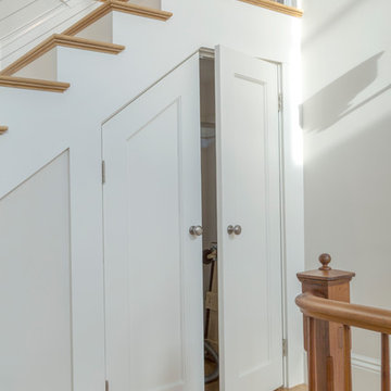
Our client for this project, an amateur pianist, wanted to create a music room for a nice new piano he was planning to purchase. The project scope would also include a new kitchen, bathroom, bedroom and living space, but the new piano was the priority.
LIFTING THE CEILING
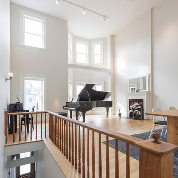
The client was moving into a row house, and hoped to accommodate occasional gatherings of musician friends for informal recitals. Because acoustics were important we asked sound engineers from Acentech to visit the site. They noted that the ideal space would have higher ceilings and would be more like a cube than the “half a cube” we were dealing with. “How can we raise the ceiling and make the space a cube?” our client asked.
Designer Josy Raycroft started to explore the possibility of combining the second and third floor units by removing the front half of second floor ceiling, thereby opening up a 2-story music space in the shape of a nearly perfect cube. Thus, the project turned from a straightforward floor plan modification into a complete reimagining of the whole row house, with the client’s new Steinway D as the focal point. Josy and the client started with the piano and created the space around it.
ADDRESSING EVERYDAY NEEDS
For the client’s more mundane needs, Josy switched the location of the bathroom and kitchen—moving the bathroom towards the middle of the second floor where it would be convenient to the rest of the spaces, and placing the kitchen towards the back. The remainder of the third floor was transformed into bedroom and office space open to the music room below.
Products and finishes coordinator Karin Mahdavi worked with the client to select understated finishes for the living spaces so that they would support the piano room without competing with it. As a result the living spaces flow seamlessly into the piano space, creating a coherent whole out of the different parts, kind of like a Schubert piano sonata.
 User
UserEvery home improvement project can feel like going into battle, but the sweet taste of victory is enough to make it worthwhile. If you ever feel intimidated by homes and gardens in magazines, don’t fret – you can turn your home into a beautiful beacon with easy curb appeal updates! Kevin and Annette Klingel are some of our favorite weekend warriors, and their latest project proves that anything is possible when it comes to dressing up your front garden. The Klingels recently gave their home and front garden a major renovation and entered their photos in the Window Box Contest. When we saw the gorgeous before and after pictures, we knew we had to get the inside scoop on their process and uncover their best curb appeal ideas.
Curb Appeal – Before and After
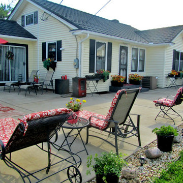
Before the renovation, the Klingels had a charming South Bend, Indiana rambler that was tidy and traditional, if a little unassuming. Deciding it was time for a much-needed update, the Klingels replaced their old green roof with a black barrel roof to match the style of their home. They also made a needed replacement and changed out the sidewalk and front stoop to a new version in classic black.
After those dramatic changes, the Klingels just couldn’t stop! Loving the contrast between the new black roof and stoop and their cream house, they painted their shutters black. And here’s where we come in – Annette wanted to incorporate her love of flowers into the new home design and found the perfect planters and window boxes to match the shutters. They purchased ten black window boxes in a classic and chic design to put around their outside windows. The Klingels also used tall black planters around the entrance to the house. The window boxes and planters each received the same plant treatment – red, yellow, and orange impatiens with flowing ferns for a bright punch of color. Paired with hanging baskets and a few other accents, the Klingels house is now a masterpiece.
From Drab to Fab
The Klingels love their warm and inviting new front entrance, and the neighbors do too. Instead of getting overlooked, their house now stands out and is the star of their busy street, where it is seen by lots of people everyday. They have received tons of compliments about their new look – a crisp and clean front garden that stays true to the style of the home and neighborhood.
The Klingels’ curb appeal update wasn’t without its challenges, but the end product is amazing, and as Annette says, definitely worth the time. The Klingels recommend starting with the necessary replacements and finding beautiful matching pieces to add curb appeal. With a little patience, elbow grease, and the help of a great garden supply store like Hooks & Lattice, you too can have the home of your dreams.
Photos: Kevin & Annette Klingel
 Progressive Design Build
Challenge
This 2001 riverfront home was purchased by the owners in 2015 and immediately renovated. Progressive Design Build was hired at that time to remodel the interior, with tentative plans to remodel their outdoor living space as a second phase design/build remodel. True to their word, after completing the interior remodel, this young family turned to Progressive Design Build in 2017 to address known zoning regulations and restrictions in their backyard and build an outdoor living space that was fit for entertaining and everyday use.
The homeowners wanted a pool and spa, outdoor living room, kitchen, fireplace and covered patio. They also wanted to stay true to their home’s Old Florida style architecture while also adding a Jamaican influence to the ceiling detail, which held sentimental value to the homeowners who honeymooned in Jamaica.
Solution
To tackle the known zoning regulations and restrictions in the backyard, the homeowners researched and applied for a variance. With the variance in hand, Progressive Design Build sat down with the homeowners to review several design options. These options included:
Option 1) Modifications to the original pool design, changing it to be longer and narrower and comply with an existing drainage easement
Option 2) Two different layouts of the outdoor living area
Option 3) Two different height elevations and options for the fire pit area
Option 4) A proposed breezeway connecting the new area with the existing home
After reviewing the options, the homeowners chose the design that placed the pool on the backside of the house and the outdoor living area on the west side of the home (Option 1).
It was important to build a patio structure that could sustain a hurricane (a Southwest Florida necessity), and provide substantial sun protection. The new covered area was supported by structural columns and designed as an open-air porch (with no screens) to allow for an unimpeded view of the Caloosahatchee River. The open porch design also made the area feel larger, and the roof extension was built with substantial strength to survive severe weather conditions.
The pool and spa were connected to the adjoining patio area, designed to flow seamlessly into the next. The pool deck was designed intentionally in a 3-color blend of concrete brick with freeform edge detail to mimic the natural river setting. Bringing the outdoors inside, the pool and fire pit were slightly elevated to create a small separation of space.
Result
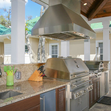
All of the desirable amenities of a screened porch were built into an open porch, including electrical outlets, a ceiling fan/light kit, TV, audio speakers, and a fireplace. The outdoor living area was finished off with additional storage for cushions, ample lighting, an outdoor dining area, a smoker, a grill, a double-side burner, an under cabinet refrigerator, a major ventilation system, and water supply plumbing that delivers hot and cold water to the sinks.
Because the porch is under a roof, we had the option to use classy woods that would give the structure a natural look and feel. We chose a dark cypress ceiling with a gloss finish, replicating the same detail that the homeowners experienced in Jamaica. This created a deep visceral and emotional reaction from the homeowners to their new backyard.
The family now spends more time outdoors enjoying the sights, sounds and smells of nature. Their professional lives allow them to take a trip to paradise right in their backyard—stealing moments that reflect on the past, but are also enjoyed in the present.
Find the right local pro for your project
 Byggmeister Inc
Photo by Jim Raycroft
Our client for this project, an amateur pianist, wanted to create a music room for a nice new piano he was planning to purchase. The project scope would also include a new kitchen, bathroom, bedroom and living space, but the new piano was the priority.
LIFTING THE CEILING
The client was moving into a row house, and hoped to accommodate occasional gatherings of musician friends for informal recitals. Because acoustics were important we asked sound engineers from Acentech to visit the site. They noted that the ideal space would have higher ceilings and would be more like a cube than the “half a cube” we were dealing with. “How can we raise the ceiling and make the space a cube?” our client asked.
Designer Josy Raycroft started to explore the possibility of combining the second and third floor units by removing the front half of second floor ceiling, thereby opening up a 2-story music space in the shape of a nearly perfect cube. Thus, the project turned from a straightforward floor plan modification into a complete reimagining of the whole row house, with the client’s new Steinway D as the focal point. Josy and the client started with the piano and created the space around it.
ADDRESSING EVERYDAY NEEDS
For the client’s more mundane needs, Josy switched the location of the bathroom and kitchen—moving the bathroom towards the middle of the second floor where it would be convenient to the rest of the spaces, and placing the kitchen towards the back. The remainder of the third floor was transformed into bedroom and office space open to the music room below.
Products and finishes coordinator Karin Mahdavi worked with the client to select understated finishes for the living spaces so that they would support the piano room without competing with it. As a result the living spaces flow seamlessly into the piano space, creating a coherent whole out of the different parts, kind of like a Schubert piano sonata.
 Byggmeister Inc
Photo by Jim Raycroft
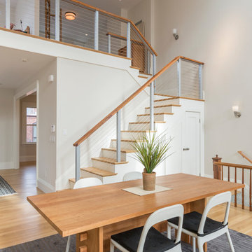
Our client for this project, an amateur pianist, wanted to create a music room for a nice new piano he was planning to purchase. The project scope would also include a new kitchen, bathroom, bedroom and living space, but the new piano was the priority.
LIFTING THE CEILING
The client was moving into a row house, and hoped to accommodate occasional gatherings of musician friends for informal recitals. Because acoustics were important we asked sound engineers from Acentech to visit the site. They noted that the ideal space would have higher ceilings and would be more like a cube than the “half a cube” we were dealing with. “How can we raise the ceiling and make the space a cube?” our client asked.
Designer Josy Raycroft started to explore the possibility of combining the second and third floor units by removing the front half of second floor ceiling, thereby opening up a 2-story music space in the shape of a nearly perfect cube. Thus, the project turned from a straightforward floor plan modification into a complete reimagining of the whole row house, with the client’s new Steinway D as the focal point. Josy and the client started with the piano and created the space around it.
ADDRESSING EVERYDAY NEEDS
For the client’s more mundane needs, Josy switched the location of the bathroom and kitchen—moving the bathroom towards the middle of the second floor where it would be convenient to the rest of the spaces, and placing the kitchen towards the back. The remainder of the third floor was transformed into bedroom and office space open to the music room below.
Products and finishes coordinator Karin Mahdavi worked with the client to select understated finishes for the living spaces so that they would support the piano room without competing with it. As a result the living spaces flow seamlessly into the piano space, creating a coherent whole out of the different parts, kind of like a Schubert piano sonata.
 Byggmeister Inc
Photo by Jim Raycroft
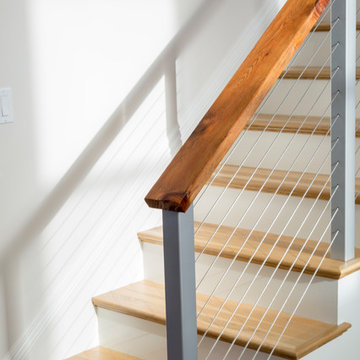
Our client for this project, an amateur pianist, wanted to create a music room for a nice new piano he was planning to purchase. The project scope would also include a new kitchen, bathroom, bedroom and living space, but the new piano was the priority.
LIFTING THE CEILING
The client was moving into a row house, and hoped to accommodate occasional gatherings of musician friends for informal recitals. Because acoustics were important we asked sound engineers from Acentech to visit the site. They noted that the ideal space would have higher ceilings and would be more like a cube than the “half a cube” we were dealing with. “How can we raise the ceiling and make the space a cube?” our client asked.
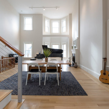
Designer Josy Raycroft started to explore the possibility of combining the second and third floor units by removing the front half of second floor ceiling, thereby opening up a 2-story music space in the shape of a nearly perfect cube. Thus, the project turned from a straightforward floor plan modification into a complete reimagining of the whole row house, with the client’s new Steinway D as the focal point. Josy and the client started with the piano and created the space around it.
ADDRESSING EVERYDAY NEEDS
For the client’s more mundane needs, Josy switched the location of the bathroom and kitchen—moving the bathroom towards the middle of the second floor where it would be convenient to the rest of the spaces, and placing the kitchen towards the back. The remainder of the third floor was transformed into bedroom and office space open to the music room below.
Products and finishes coordinator Karin Mahdavi worked with the client to select understated finishes for the living spaces so that they would support the piano room without competing with it. As a result the living spaces flow seamlessly into the piano space, creating a coherent whole out of the different parts, kind of like a Schubert piano sonata.
 Byggmeister Inc
Photo by Jim Raycroft
Our client for this project, an amateur pianist, wanted to create a music room for a nice new piano he was planning to purchase. The project scope would also include a new kitchen, bathroom, bedroom and living space, but the new piano was the priority.
LIFTING THE CEILING
The client was moving into a row house, and hoped to accommodate occasional gatherings of musician friends for informal recitals. Because acoustics were important we asked sound engineers from Acentech to visit the site. They noted that the ideal space would have higher ceilings and would be more like a cube than the “half a cube” we were dealing with. “How can we raise the ceiling and make the space a cube?” our client asked.
Designer Josy Raycroft started to explore the possibility of combining the second and third floor units by removing the front half of second floor ceiling, thereby opening up a 2-story music space in the shape of a nearly perfect cube. Thus, the project turned from a straightforward floor plan modification into a complete reimagining of the whole row house, with the client’s new Steinway D as the focal point. Josy and the client started with the piano and created the space around it.
ADDRESSING EVERYDAY NEEDS
For the client’s more mundane needs, Josy switched the location of the bathroom and kitchen—moving the bathroom towards the middle of the second floor where it would be convenient to the rest of the spaces, and placing the kitchen towards the back. The remainder of the third floor was transformed into bedroom and office space open to the music room below.
Products and finishes coordinator Karin Mahdavi worked with the client to select understated finishes for the living spaces so that they would support the piano room without competing with it. As a result the living spaces flow seamlessly into the piano space, creating a coherent whole out of the different parts, kind of like a Schubert piano sonata.


 Byggmeister Inc
Photo by Jim Raycroft
Our client for this project, an amateur pianist, wanted to create a music room for a nice new piano he was planning to purchase. The project scope would also include a new kitchen, bathroom, bedroom and living space, but the new piano was the priority.
LIFTING THE CEILING
The client was moving into a row house, and hoped to accommodate occasional gatherings of musician friends for informal recitals. Because acoustics were important we asked sound engineers from Acentech to visit the site. They noted that the ideal space would have higher ceilings and would be more like a cube than the “half a cube” we were dealing with. “How can we raise the ceiling and make the space a cube?” our client asked.
Designer Josy Raycroft started to explore the possibility of combining the second and third floor units by removing the front half of second floor ceiling, thereby opening up a 2-story music space in the shape of a nearly perfect cube. Thus, the project turned from a straightforward floor plan modification into a complete reimagining of the whole row house, with the client’s new Steinway D as the focal point. Josy and the client started with the piano and created the space around it.
ADDRESSING EVERYDAY NEEDS
For the client’s more mundane needs, Josy switched the location of the bathroom and kitchen—moving the bathroom towards the middle of the second floor where it would be convenient to the rest of the spaces, and placing the kitchen towards the back. The remainder of the third floor was transformed into bedroom and office space open to the music room below.
Products and finishes coordinator Karin Mahdavi worked with the client to select understated finishes for the living spaces so that they would support the piano room without competing with it. As a result the living spaces flow seamlessly into the piano space, creating a coherent whole out of the different parts, kind of like a Schubert piano sonata.
 Byggmeister Inc
Photo by Jim Raycroft
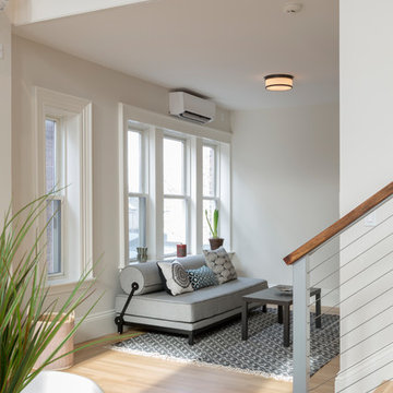
Our client for this project, an amateur pianist, wanted to create a music room for a nice new piano he was planning to purchase. The project scope would also include a new kitchen, bathroom, bedroom and living space, but the new piano was the priority.
LIFTING THE CEILING
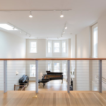
The client was moving into a row house, and hoped to accommodate occasional gatherings of musician friends for informal recitals. Because acoustics were important we asked sound engineers from Acentech to visit the site. They noted that the ideal space would have higher ceilings and would be more like a cube than the “half a cube” we were dealing with. “How can we raise the ceiling and make the space a cube?” our client asked.
Designer Josy Raycroft started to explore the possibility of combining the second and third floor units by removing the front half of second floor ceiling, thereby opening up a 2-story music space in the shape of a nearly perfect cube. Thus, the project turned from a straightforward floor plan modification into a complete reimagining of the whole row house, with the client’s new Steinway D as the focal point. Josy and the client started with the piano and created the space around it.
ADDRESSING EVERYDAY NEEDS
For the client’s more mundane needs, Josy switched the location of the bathroom and kitchen—moving the bathroom towards the middle of the second floor where it would be convenient to the rest of the spaces, and placing the kitchen towards the back. The remainder of the third floor was transformed into bedroom and office space open to the music room below.
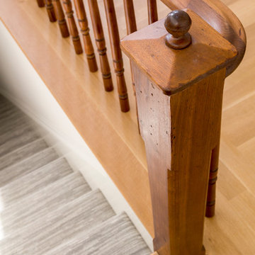
Products and finishes coordinator Karin Mahdavi worked with the client to select understated finishes for the living spaces so that they would support the piano room without competing with it. As a result the living spaces flow seamlessly into the piano space, creating a coherent whole out of the different parts, kind of like a Schubert piano sonata.
 Byggmeister Inc
Photo by Jim Raycroft
Our client for this project, an amateur pianist, wanted to create a music room for a nice new piano he was planning to purchase. The project scope would also include a new kitchen, bathroom, bedroom and living space, but the new piano was the priority.
LIFTING THE CEILING
The client was moving into a row house, and hoped to accommodate occasional gatherings of musician friends for informal recitals. Because acoustics were important we asked sound engineers from Acentech to visit the site. They noted that the ideal space would have higher ceilings and would be more like a cube than the “half a cube” we were dealing with. “How can we raise the ceiling and make the space a cube?” our client asked.
Designer Josy Raycroft started to explore the possibility of combining the second and third floor units by removing the front half of second floor ceiling, thereby opening up a 2-story music space in the shape of a nearly perfect cube. Thus, the project turned from a straightforward floor plan modification into a complete reimagining of the whole row house, with the client’s new Steinway D as the focal point. Josy and the client started with the piano and created the space around it.
ADDRESSING EVERYDAY NEEDS
For the client’s more mundane needs, Josy switched the location of the bathroom and kitchen—moving the bathroom towards the middle of the second floor where it would be convenient to the rest of the spaces, and placing the kitchen towards the back. The remainder of the third floor was transformed into bedroom and office space open to the music room below.
Products and finishes coordinator Karin Mahdavi worked with the client to select understated finishes for the living spaces so that they would support the piano room without competing with it. As a result the living spaces flow seamlessly into the piano space, creating a coherent whole out of the different parts, kind of like a Schubert piano sonata.
 Byggmeister Inc
Photo by Jim Raycroft
Our client for this project, an amateur pianist, wanted to create a music room for a nice new piano he was planning to purchase. The project scope would also include a new kitchen, bathroom, bedroom and living space, but the new piano was the priority.
LIFTING THE CEILING
The client was moving into a row house, and hoped to accommodate occasional gatherings of musician friends for informal recitals. Because acoustics were important we asked sound engineers from Acentech to visit the site. They noted that the ideal space would have higher ceilings and would be more like a cube than the “half a cube” we were dealing with. “How can we raise the ceiling and make the space a cube?” our client asked.
Designer Josy Raycroft started to explore the possibility of combining the second and third floor units by removing the front half of second floor ceiling, thereby opening up a 2-story music space in the shape of a nearly perfect cube. Thus, the project turned from a straightforward floor plan modification into a complete reimagining of the whole row house, with the client’s new Steinway D as the focal point. Josy and the client started with the piano and created the space around it.
ADDRESSING EVERYDAY NEEDS
For the client’s more mundane needs, Josy switched the location of the bathroom and kitchen—moving the bathroom towards the middle of the second floor where it would be convenient to the rest of the spaces, and placing the kitchen towards the back. The remainder of the third floor was transformed into bedroom and office space open to the music room below.
Products and finishes coordinator Karin Mahdavi worked with the client to select understated finishes for the living spaces so that they would support the piano room without competing with it. As a result the living spaces flow seamlessly into the piano space, creating a coherent whole out of the different parts, kind of like a Schubert piano sonata.
 Byggmeister Inc
Photo by Jim Raycroft
Our client for this project, an amateur pianist, wanted to create a music room for a nice new piano he was planning to purchase. The project scope would also include a new kitchen, bathroom, bedroom and living space, but the new piano was the priority.
LIFTING THE CEILING
The client was moving into a row house, and hoped to accommodate occasional gatherings of musician friends for informal recitals. Because acoustics were important we asked sound engineers from Acentech to visit the site. They noted that the ideal space would have higher ceilings and would be more like a cube than the “half a cube” we were dealing with. “How can we raise the ceiling and make the space a cube?” our client asked.
Designer Josy Raycroft started to explore the possibility of combining the second and third floor units by removing the front half of second floor ceiling, thereby opening up a 2-story music space in the shape of a nearly perfect cube. Thus, the project turned from a straightforward floor plan modification into a complete reimagining of the whole row house, with the client’s new Steinway D as the focal point. Josy and the client started with the piano and created the space around it.
ADDRESSING EVERYDAY NEEDS
For the client’s more mundane needs, Josy switched the location of the bathroom and kitchen—moving the bathroom towards the middle of the second floor where it would be convenient to the rest of the spaces, and placing the kitchen towards the back. The remainder of the third floor was transformed into bedroom and office space open to the music room below.
Products and finishes coordinator Karin Mahdavi worked with the client to select understated finishes for the living spaces so that they would support the piano room without competing with it. As a result the living spaces flow seamlessly into the piano space, creating a coherent whole out of the different parts, kind of like a Schubert piano sonata.
 Precision Cabinets
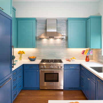
Kitchen: Material – Painted Maple; Finish – Custom Color; Door Style – #7 Shaker 1/4"; Cabinet Construction – Full Overlay
Transitional u-shaped medium tone wood floor and brown floor kitchen photo in San Francisco with shaker cabinets, blue cabinets, an undermount sink, gray backsplash, matchstick tile backsplash, stainless steel appliances, a peninsula and white countertops
Transitional u-shaped medium tone wood floor and brown floor kitchen photo in San Francisco with shaker cabinets, blue cabinets, an undermount sink, gray backsplash, matchstick tile backsplash, stainless steel appliances, a peninsula and white countertops

Sponsored
Sunbury, OH

J.Holderby - Renovations
Franklin County's Leading General Contractors - 2X Best of Houzz!
 J.THOM Residential Design & Cabinetry
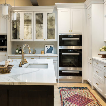
The client purchased a historic carriage house which needed to be completely gutted and rebuilt. Our goal was to direct the client how to best position the kitchen into an open floor plan without overwhelming the adjacent spaces.
We created a glass and steel separation wall that helped delineate the space between the kitchen and other public areas such as the dining and living areas. The screen wall provided a visual transition and acoustical privacy from the living area as well.
The design & selections resulted in an open carriage house reinforced with industrial steel accents mixed with the modern elegance of painted cabinetry anchored by a walnut furniture island.
Cabinetry: J. THOM Signature
Installation: Lilly Development
Photography: Jonathan Kolbe
 User
UserEvery home improvement project can feel like going into battle, but the sweet taste of victory is enough to make it worthwhile. If you ever feel intimidated by homes and gardens in magazines, don’t fret – you can turn your home into a beautiful beacon with easy curb appeal updates! Kevin and Annette Klingel are some of our favorite weekend warriors, and their latest project proves that anything is possible when it comes to dressing up your front garden. The Klingels recently gave their home and front garden a major renovation and entered their photos in the Window Box Contest. When we saw the gorgeous before and after pictures, we knew we had to get the inside scoop on their process and uncover their best curb appeal ideas.
Curb Appeal – Before and After
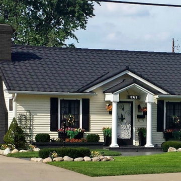
Before the renovation, the Klingels had a charming South Bend, Indiana rambler that was tidy and traditional, if a little unassuming. Deciding it was time for a much-needed update, the Klingels replaced their old green roof with a black barrel roof to match the style of their home. They also made a needed replacement and changed out the sidewalk and front stoop to a new version in classic black.
After those dramatic changes, the Klingels just couldn’t stop! Loving the contrast between the new black roof and stoop and their cream house, they painted their shutters black. And here’s where we come in – Annette wanted to incorporate her love of flowers into the new home design and found the perfect planters and window boxes to match the shutters. They purchased ten black window boxes in a classic and chic design to put around their outside windows. The Klingels also used tall black planters around the entrance to the house. The window boxes and planters each received the same plant treatment – red, yellow, and orange impatiens with flowing ferns for a bright punch of color. Paired with hanging baskets and a few other accents, the Klingels house is now a masterpiece.
From Drab to Fab
The Klingels love their warm and inviting new front entrance, and the neighbors do too. Instead of getting overlooked, their house now stands out and is the star of their busy street, where it is seen by lots of people everyday. They have received tons of compliments about their new look – a crisp and clean front garden that stays true to the style of the home and neighborhood.
The Klingels’ curb appeal update wasn’t without its challenges, but the end product is amazing, and as Annette says, definitely worth the time. The Klingels recommend starting with the necessary replacements and finding beautiful matching pieces to add curb appeal. With a little patience, elbow grease, and the help of a great garden supply store like Hooks & Lattice, you too can have the home of your dreams.
Photos: Kevin & Annette Klingel
 Progressive Design Build
Challenge
This 2001 riverfront home was purchased by the owners in 2015 and immediately renovated. Progressive Design Build was hired at that time to remodel the interior, with tentative plans to remodel their outdoor living space as a second phase design/build remodel. True to their word, after completing the interior remodel, this young family turned to Progressive Design Build in 2017 to address known zoning regulations and restrictions in their backyard and build an outdoor living space that was fit for entertaining and everyday use.
The homeowners wanted a pool and spa, outdoor living room, kitchen, fireplace and covered patio. They also wanted to stay true to their home’s Old Florida style architecture while also adding a Jamaican influence to the ceiling detail, which held sentimental value to the homeowners who honeymooned in Jamaica.
Solution
To tackle the known zoning regulations and restrictions in the backyard, the homeowners researched and applied for a variance. With the variance in hand, Progressive Design Build sat down with the homeowners to review several design options. These options included:
Option 1) Modifications to the original pool design, changing it to be longer and narrower and comply with an existing drainage easement
Option 2) Two different layouts of the outdoor living area
Option 3) Two different height elevations and options for the fire pit area
Option 4) A proposed breezeway connecting the new area with the existing home
After reviewing the options, the homeowners chose the design that placed the pool on the backside of the house and the outdoor living area on the west side of the home (Option 1).
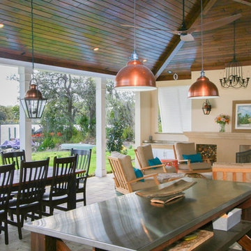
It was important to build a patio structure that could sustain a hurricane (a Southwest Florida necessity), and provide substantial sun protection. The new covered area was supported by structural columns and designed as an open-air porch (with no screens) to allow for an unimpeded view of the Caloosahatchee River. The open porch design also made the area feel larger, and the roof extension was built with substantial strength to survive severe weather conditions.
The pool and spa were connected to the adjoining patio area, designed to flow seamlessly into the next. The pool deck was designed intentionally in a 3-color blend of concrete brick with freeform edge detail to mimic the natural river setting. Bringing the outdoors inside, the pool and fire pit were slightly elevated to create a small separation of space.
Result
All of the desirable amenities of a screened porch were built into an open porch, including electrical outlets, a ceiling fan/light kit, TV, audio speakers, and a fireplace. The outdoor living area was finished off with additional storage for cushions, ample lighting, an outdoor dining area, a smoker, a grill, a double-side burner, an under cabinet refrigerator, a major ventilation system, and water supply plumbing that delivers hot and cold water to the sinks.
Because the porch is under a roof, we had the option to use classy woods that would give the structure a natural look and feel. We chose a dark cypress ceiling with a gloss finish, replicating the same detail that the homeowners experienced in Jamaica. This created a deep visceral and emotional reaction from the homeowners to their new backyard.
The family now spends more time outdoors enjoying the sights, sounds and smells of nature. Their professional lives allow them to take a trip to paradise right in their backyard—stealing moments that reflect on the past, but are also enjoyed in the present.
 TimeLine Renovations Inc.
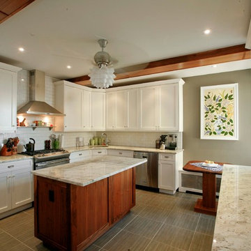
The kitchen, the most important room in the home. For everyday with the family to entertaining friends. Even though they just purchased this new apartment and have never actually cooked 1 meal, they knew that the existing kitchen was all wrong. Everything needed to get renovated prior to them moving in. Besides the lime green walls, the kitchen layout just didn't work for such a large room and had all appliances on 1 elevation.
We played around with a couple of different layouts but nothing was really making sense. Until we came up with the idea to close off the existing doorway from the hallway into kitchen and relocate it. That gave us the ability to bring in some completely new ideas and configure the entire layout. Everything we did from here featured the Manhattan skyline view through the window: from prepping at the island to having lunch in the banquette seat.
We kept to the traditional design to keep the integrity of the "pre-war" building. Originally we wanted to keep all the cabinetry white but then decided to bring in some walnut elements. In which we built the island, the banquette table, floating shelves and even dressed up the existing structural columns. The cabinetry is all custom made using 3/4 plywood boxes and maple doors. All feature have soft close doors and drawers, roll out shelves.
We improved the lighting by adding low voltage recessed lights, under cabinet lights, ceiling fan and also lights inside the glass door cabinets. Each are on separate zones with dimmers.
The banquette seat serves as two functions, one side to conceal the under window radiator and the side for storage. The wire mesh front for the radiator was also used on the storage side for a uniform look.
The small hallway wall leading into kitchen from the dining room is painted with a grey chalk board paint, for "on the go" quick memo...

Sponsored
Delaware, OH

Buckeye Basements, Inc.
Central Ohio's Basement Finishing ExpertsBest Of Houzz '13-'21
 The Home Budget Houseware Inc
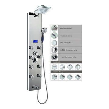
This new luxurious shower panel has just newly arrived to North America and it is one of the best shower panels you can find in the market. It qualifies under the ISO-9001 standard, which can only be acquired by products that went through strict quality control and product inspection. The body of the shower panel is made of high quality aluminum alloy and it comes with several functions, including an overhead shower, a hand-held showerhead, 8 body massage nozzles, and a tub spout. Two controllers are added to control the functions and water temperature. By buying this unique and lavishing shower panel, you would be able to enjoy a higher level of showering experience after everyday's hard work! * Item Size: 52"H x 10"W x 3.5"D (132 x 26 x 9cm) * Package Size: 55"H x 13"W x 8"D (138 x 33 x 19cm) * Gross Weight 32lbs * Includes a rainfall shower head, a handheld showerhead, a tub spout, 8 adjustable body nozzles, and temperature display * Shower panel frame is made of aluminum alloy * 5mm mirror like tempered glass surface * Lightweight and durable * Unique massage panel is designed for flat wall installation * Comes with chrome-plated brass hose * Standard 1/2" plumbing connection * Hot/Cold water hose of shower panel will be connected to water pipe fitting directly * Reinforced pipes on back * Temperature display is powered by AA battery * The minimum pressure required is 28 psi and maximum pressure required 72 psi * Offer 1 year part warranty * All functions work independently to ensure proper water pressure * Easy installation, come with all standard installation accessories * In stock and ship out in 1-2 business days If there are any questions regarding this item or if you have any issues after purchase, please feel free to contact us and we are more than happy to assist you!
 Byggmeister Inc
Photo by Jim Raycroft
Our client for this project, an amateur pianist, wanted to create a music room for a nice new piano he was planning to purchase. The project scope would also include a new kitchen, bathroom, bedroom and living space, but the new piano was the priority.
LIFTING THE CEILING
The client was moving into a row house, and hoped to accommodate occasional gatherings of musician friends for informal recitals. Because acoustics were important we asked sound engineers from Acentech to visit the site. They noted that the ideal space would have higher ceilings and would be more like a cube than the “half a cube” we were dealing with. “How can we raise the ceiling and make the space a cube?” our client asked.
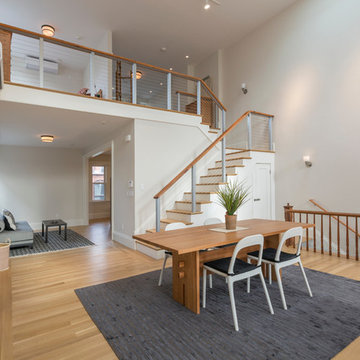
Designer Josy Raycroft started to explore the possibility of combining the second and third floor units by removing the front half of second floor ceiling, thereby opening up a 2-story music space in the shape of a nearly perfect cube. Thus, the project turned from a straightforward floor plan modification into a complete reimagining of the whole row house, with the client’s new Steinway D as the focal point. Josy and the client started with the piano and created the space around it.
ADDRESSING EVERYDAY NEEDS
For the client’s more mundane needs, Josy switched the location of the bathroom and kitchen—moving the bathroom towards the middle of the second floor where it would be convenient to the rest of the spaces, and placing the kitchen towards the back. The remainder of the third floor was transformed into bedroom and office space open to the music room below.
Products and finishes coordinator Karin Mahdavi worked with the client to select understated finishes for the living spaces so that they would support the piano room without competing with it. As a result the living spaces flow seamlessly into the piano space, creating a coherent whole out of the different parts, kind of like a Schubert piano sonata.
 Byggmeister Inc
Photo by Jim Raycroft
Our client for this project, an amateur pianist, wanted to create a music room for a nice new piano he was planning to purchase. The project scope would also include a new kitchen, bathroom, bedroom and living space, but the new piano was the priority.
LIFTING THE CEILING
The client was moving into a row house, and hoped to accommodate occasional gatherings of musician friends for informal recitals. Because acoustics were important we asked sound engineers from Acentech to visit the site. They noted that the ideal space would have higher ceilings and would be more like a cube than the “half a cube” we were dealing with. “How can we raise the ceiling and make the space a cube?” our client asked.
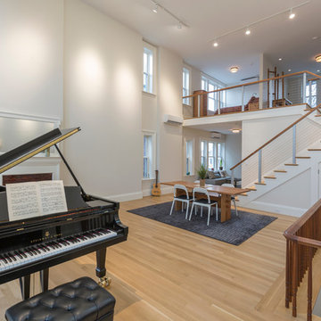
Designer Josy Raycroft started to explore the possibility of combining the second and third floor units by removing the front half of second floor ceiling, thereby opening up a 2-story music space in the shape of a nearly perfect cube. Thus, the project turned from a straightforward floor plan modification into a complete reimagining of the whole row house, with the client’s new Steinway D as the focal point. Josy and the client started with the piano and created the space around it.
ADDRESSING EVERYDAY NEEDS
For the client’s more mundane needs, Josy switched the location of the bathroom and kitchen—moving the bathroom towards the middle of the second floor where it would be convenient to the rest of the spaces, and placing the kitchen towards the back. The remainder of the third floor was transformed into bedroom and office space open to the music room below.
Products and finishes coordinator Karin Mahdavi worked with the client to select understated finishes for the living spaces so that they would support the piano room without competing with it. As a result the living spaces flow seamlessly into the piano space, creating a coherent whole out of the different parts, kind of like a Schubert piano sonata.
13