
Search results for "Everyday purchases" in Home Design Ideas
 Bilotta Kitchen & Home
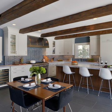
This transitional kitchen featuring Bilotta Custom Cabinetry is a favorite project of Paulette Gambacorta’s, senior designer at Bilotta Kitchens. The client lives in Manhattan and purchased this classic Victorian house as their weekend escape from the hustle and bustle of the city. The renovation planned to provide plenty of storage space and appliances while still having backyard views of the Hudson, perfect for entertaining and holidays. However, kitchen plans changed when the homeowners decided to have a child and their intended weekend getaway home became the city dwellers’ permanent residence. Having the home be their main residence, meant the kitchen had to function for everyday living as well as for entertaining and large family and friend gatherings. The perimeter cabinetry is a white dove paint and the island and pantry are quarter-sawn white oak with a stain. The pantry has tapered legs for a free-standing furniture look. The countertop is Calcutta Super White Quartzite with a Blue Ceramic Waterworks backsplash. The 48” Thermador range has a custom-made wall hood in Antiqued Brass and Antiqued steel by Amore Design LLC. The refrigerator, freezer, and wine unit are Subzero with the wine fridge outside the cooking area for easy access. Sinks are from Kohler and stainless steel faucets are by Artesso Collection by Brizo. Designer: Paulette Gambacorta Photo Credit: Peter Krupenye
 k+co LIVING - Interiors by Karen B Wolf
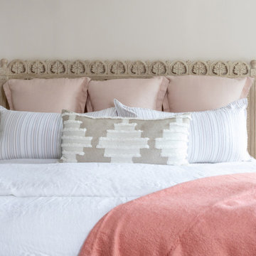
This project transformed a Montclair historic home into a bohemian, family-friendly farmhouse. The decor and styling embraced the formal bones of the house but was updated with warm tones and a boho luxe style that is well-suited for everyday living.
Find the right local pro for your project
 Bilotta Kitchen & Home
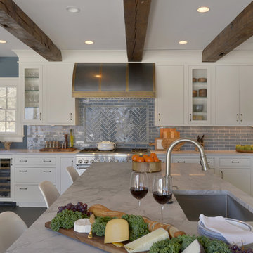
This transitional kitchen featuring Bilotta Custom Cabinetry is a favorite project of Paulette Gambacorta’s, senior designer at Bilotta Kitchens. The client lives in Manhattan and purchased this classic Victorian house as their weekend escape from the hustle and bustle of the city. The renovation planned to provide plenty of storage space and appliances while still having backyard views of the Hudson, perfect for entertaining and holidays. However, kitchen plans changed when the homeowners decided to have a child and their intended weekend getaway home became the city dwellers’ permanent residence. Having the home be their main residence, meant the kitchen had to function for everyday living as well as for entertaining and large family and friend gatherings. The perimeter cabinetry is a white dove paint and the island and pantry are quarter-sawn white oak with a stain. The pantry has tapered legs for a free-standing furniture look. The countertop is Calcutta Super White Quartzite with a Blue Ceramic Waterworks backsplash. The 48” Thermador range has a custom-made wall hood in Antiqued Brass and Antiqued steel by Amore Design LLC. The refrigerator, freezer, and wine unit are Subzero with the wine fridge outside the cooking area for easy access. Sinks are from Kohler and stainless steel faucets are by Artesso Collection by Brizo. Designer: Paulette Gambacorta Photo Credit: Peter Krupenye
 embrio design studio
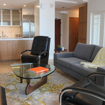
Have you ever dreamt about your pie in the sky home? Well I have! That is, our wonderful client’s dream home. It includes a place with 72-degree weather everyday, a wondrous view of a harbor, a walkable city & with clean, modern accommodations. And voilà… a penthouse flat in downtown San Diego by the bay. We stripped away the cheap 80’s rental finishes, opened things up to bring in the sunshine, added new flooring, kitchen, bathrooms, a fireplace refresh and modern furniture for a little slice of heaven and comfort. Don't tell anyone, but there’s even a Lazy Boy chair in there!

 Cameo Kitchens, Inc.
Kelly Keul Duer
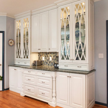
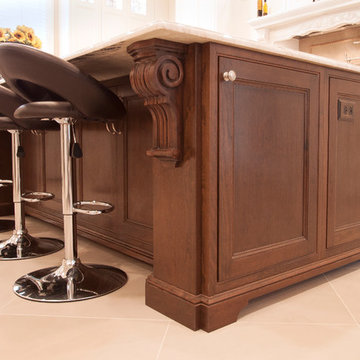
Kitchen - traditional u-shaped kitchen idea in DC Metro with beaded inset cabinets, white cabinets, quartz countertops, beige backsplash, stainless steel appliances and an island
Kitchen - traditional u-shaped kitchen idea in DC Metro with beaded inset cabinets, white cabinets, quartz countertops, beige backsplash, stainless steel appliances and an island

Sponsored
Delaware, OH

Buckeye Basements, Inc.
Central Ohio's Basement Finishing ExpertsBest Of Houzz '13-'21
 Cameo Kitchens, Inc.
Kelly Keul Duer and Merima Hopkins
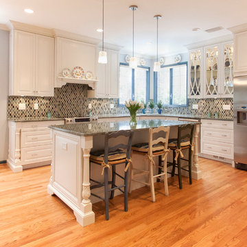
Inspiration for a contemporary kitchen remodel in DC Metro
Inspiration for a contemporary kitchen remodel in DC Metro
 Bilotta Kitchen & Home
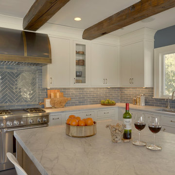
This transitional kitchen featuring Bilotta Custom Cabinetry is a favorite project of Paulette Gambacorta’s, senior designer at Bilotta Kitchens. The client lives in Manhattan and purchased this classic Victorian house as their weekend escape from the hustle and bustle of the city. The renovation planned to provide plenty of storage space and appliances while still having backyard views of the Hudson, perfect for entertaining and holidays. However, kitchen plans changed when the homeowners decided to have a child and their intended weekend getaway home became the city dwellers’ permanent residence. Having the home be their main residence, meant the kitchen had to function for everyday living as well as for entertaining and large family and friend gatherings. The perimeter cabinetry is a white dove paint and the island and pantry are quarter-sawn white oak with a stain. The pantry has tapered legs for a free-standing furniture look. The countertop is Calcutta Super White Quartzite with a Blue Ceramic Waterworks backsplash. The 48” Thermador range has a custom-made wall hood in Antiqued Brass and Antiqued steel by Amore Design LLC. The refrigerator, freezer, and wine unit are Subzero with the wine fridge outside the cooking area for easy access. Sinks are from Kohler and stainless steel faucets are by Artesso Collection by Brizo. Designer: Paulette Gambacorta Photo Credit: Peter Krupenye
 Valentini Kids Furniture Brooklyn NY
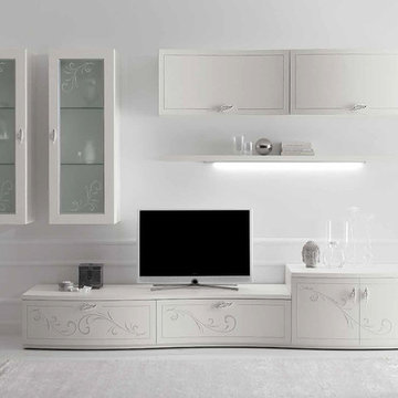
Classic Wall Unit Prestige Liberty 102 by Spar
Made in Italy
Spar Arreda gets into contemporary homes with collections for everyday living. Prestige Liberty by Spar is an italian modular wall unit line featuring modern styles, lines and shapes that harmoniously develop a concept of freshness and innovation, that tune in to the essential and pure luxury and that reflect the most advanced and innovative needs. This italian entertainment center will complement your living room, not only as an aesthetic, but also as a functional addition, featuring an abundance of storage space, both hidden and exposed. White Ash finishing, concave and convex fronts, cabinets refined with a floral decoration in relief and printed with bright silver glitter - all these details will definitely make your living room elegant, unique and charming.
MATERIAL/CONSTRUCTION:
Curved front: 19 mm thick, made of plywood covered with laminate and edged with white lacquered Ash. Finished with a floral design in relief with frosted silver glitter brilliant
Shaped tops: 30 mm thickness made of particle board panels E1 class melamine laminate pore white ash, abs edge 1 mm thick rounded wood effect
Internal Structure: 18 mm thick, made of particle board panels E1 class ennobled and lined with melamine coating
Drawers: banks 12 mm thick panels made of wood particles in E1 class with PVC coating finish gray fabric - Provisions drawer sp. 6 mm wood fiber medium density '(MDF) coated with melamine coating with the same finish of the banks. Slides in galvanized steel with invisible self-closing closure automatic suspension with height adjustment
Front glass: 19 mm thick, frame made of medium-density fiberboard '(MDF) covered with white laminate pore ash, 4mm thick tempered frosted glass with decoration beaded floral printed with bright silver glitter
The starting price is for the Prestige Wall Unit Composition Liberty 102 as shown in the main picture. The Light Kit is not included in the price and can be purchased separately.
Dimensions:
Wall Unit Composition: W124" x D22" x H78"
 Byggmeister Inc
Photo by Jim Raycroft
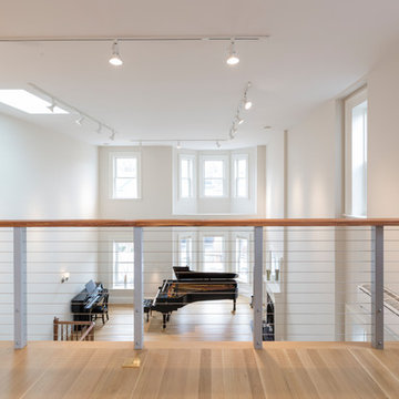
Our client for this project, an amateur pianist, wanted to create a music room for a nice new piano he was planning to purchase. The project scope would also include a new kitchen, bathroom, bedroom and living space, but the new piano was the priority.
LIFTING THE CEILING
The client was moving into a row house, and hoped to accommodate occasional gatherings of musician friends for informal recitals. Because acoustics were important we asked sound engineers from Acentech to visit the site. They noted that the ideal space would have higher ceilings and would be more like a cube than the “half a cube” we were dealing with. “How can we raise the ceiling and make the space a cube?” our client asked.
Designer Josy Raycroft started to explore the possibility of combining the second and third floor units by removing the front half of second floor ceiling, thereby opening up a 2-story music space in the shape of a nearly perfect cube. Thus, the project turned from a straightforward floor plan modification into a complete reimagining of the whole row house, with the client’s new Steinway D as the focal point. Josy and the client started with the piano and created the space around it.
ADDRESSING EVERYDAY NEEDS
For the client’s more mundane needs, Josy switched the location of the bathroom and kitchen—moving the bathroom towards the middle of the second floor where it would be convenient to the rest of the spaces, and placing the kitchen towards the back. The remainder of the third floor was transformed into bedroom and office space open to the music room below.
Products and finishes coordinator Karin Mahdavi worked with the client to select understated finishes for the living spaces so that they would support the piano room without competing with it. As a result the living spaces flow seamlessly into the piano space, creating a coherent whole out of the different parts, kind of like a Schubert piano sonata.
 Byggmeister Inc
Photo by Jim Raycroft
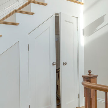
Our client for this project, an amateur pianist, wanted to create a music room for a nice new piano he was planning to purchase. The project scope would also include a new kitchen, bathroom, bedroom and living space, but the new piano was the priority.
LIFTING THE CEILING
The client was moving into a row house, and hoped to accommodate occasional gatherings of musician friends for informal recitals. Because acoustics were important we asked sound engineers from Acentech to visit the site. They noted that the ideal space would have higher ceilings and would be more like a cube than the “half a cube” we were dealing with. “How can we raise the ceiling and make the space a cube?” our client asked.
Designer Josy Raycroft started to explore the possibility of combining the second and third floor units by removing the front half of second floor ceiling, thereby opening up a 2-story music space in the shape of a nearly perfect cube. Thus, the project turned from a straightforward floor plan modification into a complete reimagining of the whole row house, with the client’s new Steinway D as the focal point. Josy and the client started with the piano and created the space around it.
ADDRESSING EVERYDAY NEEDS
For the client’s more mundane needs, Josy switched the location of the bathroom and kitchen—moving the bathroom towards the middle of the second floor where it would be convenient to the rest of the spaces, and placing the kitchen towards the back. The remainder of the third floor was transformed into bedroom and office space open to the music room below.
Products and finishes coordinator Karin Mahdavi worked with the client to select understated finishes for the living spaces so that they would support the piano room without competing with it. As a result the living spaces flow seamlessly into the piano space, creating a coherent whole out of the different parts, kind of like a Schubert piano sonata.
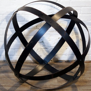
 Antique Farmhouse
Metal garden spheres add interest and dimension to your lawn or garden. Metal lawn ornaments are perfect for event decor or everyday enjoyment.
Made of metal.
Some assembly required.
Dimensions: 24" x 24" x 24" H.

Sponsored
Sunbury, OH

J.Holderby - Renovations
Franklin County's Leading General Contractors - 2X Best of Houzz!
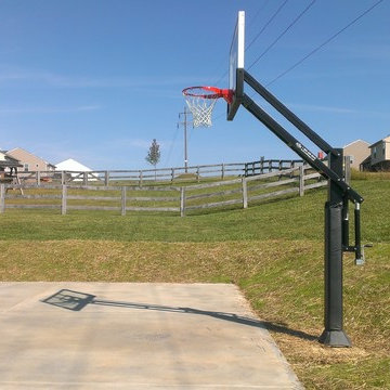
 Pro Dunk Hoops
William's photos of his Pro Dunk Gold Basketball System were taken in Burlington, Kentucky. He installed the system on his backyard court. The dimensions of his playing area are 35' x 25'. He loves the system and uses it almost everyday. This is a Pro Dunk Gold Basketball System that was purchased in June of 2013. It was installed on a 35 ft wide by a 25 ft deep playing area in Burlington, KY. Browse all of William G's photos navigate to: http://www.produnkhoops.com/photos/albums/william-35x25-pro-dunk-gold-basketball-system-475/
 Pro Dunk Hoops
William's photos of his Pro Dunk Gold Basketball System were taken in Burlington, Kentucky. He installed the system on his backyard court. The dimensions of his playing area are 35' x 25'. He loves the system and uses it almost everyday. This is a Pro Dunk Gold Basketball System that was purchased in June of 2013. It was installed on a 35 ft wide by a 25 ft deep playing area in Burlington, KY. Browse all of William G's photos navigate to: http://www.produnkhoops.com/photos/albums/william-35x25-pro-dunk-gold-basketball-system-475/
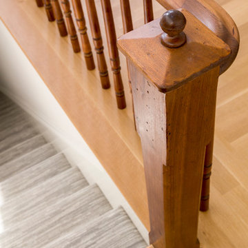 Byggmeister Inc
Photo by Jim Raycroft
Our client for this project, an amateur pianist, wanted to create a music room for a nice new piano he was planning to purchase. The project scope would also include a new kitchen, bathroom, bedroom and living space, but the new piano was the priority.
LIFTING THE CEILING
The client was moving into a row house, and hoped to accommodate occasional gatherings of musician friends for informal recitals. Because acoustics were important we asked sound engineers from Acentech to visit the site. They noted that the ideal space would have higher ceilings and would be more like a cube than the “half a cube” we were dealing with. “How can we raise the ceiling and make the space a cube?” our client asked.
Designer Josy Raycroft started to explore the possibility of combining the second and third floor units by removing the front half of second floor ceiling, thereby opening up a 2-story music space in the shape of a nearly perfect cube. Thus, the project turned from a straightforward floor plan modification into a complete reimagining of the whole row house, with the client’s new Steinway D as the focal point. Josy and the client started with the piano and created the space around it.
ADDRESSING EVERYDAY NEEDS
For the client’s more mundane needs, Josy switched the location of the bathroom and kitchen—moving the bathroom towards the middle of the second floor where it would be convenient to the rest of the spaces, and placing the kitchen towards the back. The remainder of the third floor was transformed into bedroom and office space open to the music room below.
Products and finishes coordinator Karin Mahdavi worked with the client to select understated finishes for the living spaces so that they would support the piano room without competing with it. As a result the living spaces flow seamlessly into the piano space, creating a coherent whole out of the different parts, kind of like a Schubert piano sonata.
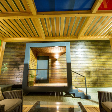
 Ernest M. Ferizi
German Embassy in Pristina - Kosovo, contracted the architecture office “Ferizi + Ferizi Architects” to plan and implement an Annex Office building for their purposes. As detached part of this building is designed the waiting area, as alone standing structure.
This Office Building is constructed by assembling of Eight used office containers that were delivered on trucks and set up after only a few hours on the basis of the LEGO principle, according to the planning on strip foundations.
By removing the flexible exterior wall panels, a large room of 115 m² was created, with the counter wall as a room partition between two office spaces, each with seven workstations as well as three counters for agents on one side and a room for visitors on the other side.
With this system, room solutions can be easily implemented in all dimensions.
The container, seen as a geometric shape, is a simple, octagonal, solid box.
The standardized perfection of its dimensions is striking: 2.44 meters wide, 2.59 meters high and 6.06 meters or 12.19 meters long.
Since its introduction in 1956 by the American transport entrepreneur Malcom McLean, the container has become a standardized transport module worldwide, whether on ships, trucks or construction sites.
The shipping containers have additionally revolutionized the transport industry, pushed the globalization noticeably, and thus directly or indirectly influenced all our lives.
But after only a few years, when the first overseas containers wore out, many engineers recognized the positive properties of used shipping containers for building houses, especially since they are robust, flexible, multifunctional and second-hand relatively inexpensive to purchase. The time has long passed by to treat containers exclusively as transport objects.
As a "measure of all things", containers can hardly be ignored in construction.
Their use is no longer limited to temporary use since school containers, information containers, office containers or entire residential buildings are now part of our everyday life in the construction industry.
However, current examples of the container architecture prove that even the most demanding solutions for container building are feasible. For their specific aesthetic and spatial qualities, containers also serve as design parameters for the development of new forms of architecture and urbanity.
The office building as an extension of the visa section, characterized by modern materials and contemporary aesthetics has been designed and built mainly as a low-energy building.
Extensive insulation to achieve a comfortable and sustainable constant temperature in the interior, high window quality and low energy consumption make the building energy-efficient.
The sophisticated lighting technology, networks, heating systems and air-conditioning systems are also components of this equipment.
It creates an overall harmonic picture and guarantees the highest standard in sustainable construction, taking into consideration the fact that environmentally friendly recycling and reutilization have become an increasingly important issue in our society.
West and East side of the wooden facade is compact and has few openings, while the southern facade is completely open with lot of glass. Its spatial openness ensures a transparent, friendly work environment, which allows a lot of light into the space.
This openness allows an uninterrupted, pleasant and close-to-nature view from interior spaces into the beautiful garden. During the installation of sophisticated light sources in the garden, emphasis was not only put on functionality and security, but also on the beauty of the garden shown through the illumination in the evening.
Large, horizontal white “brisole” serve as external sun protection systems, mounted on the canopies of the entrance areas of the modular construction and the enclosure, adeptly cast shade on these areas and at the same time shape the entire architectural language.
While on one hand, the two quadratic ledges suspended in the air, are docked with steel stairs and match the wooden façade, lead the staff to their office space, the artful modern interior, on the other hand, perfectly unites the functionality, innovative technology, culture and positive effects on the employees' efficiency and wellbeing.
A lot of white, interjected by warm wooden and colored accents, determines the ambience.
In the case of the lighting solution, the mainly linear ceiling lighting is used as the overlapping design element both for the offices of the visa section as well as for the counters and the waiting area for the visitors.
They underline the puristic design in order to create a pleasant light for a desired general illumination and ensure optimal light conditions without causing disturbing reflections on the computer screens.
In addition, precisely positioned pendant luminaires are installed at the workstations, which ensure pleasant room brightness.
In the entrance area, the harmonic and uniform lighting effect from the ground highlights the integration of photography and architecture.
Photographs of landscapes, people, places, expressing unforgettable, impressive moments and memories have been lovingly engraved on 8 x 8cm square oak blocks.
The idea of an effective, impressive environment that stimulates and inspires the work was the premiss on which the whole design concept was based. Consequently, the modular construction was no longer viewed through its history of utilization and scars, but rather as a structure of work ambiance, art and elegance.
FERIZI + FERIZI Architects
Photo: Arben Llapashtica


 M Design
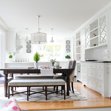
This is a hard working dining room that gets used everyday and is now a part of an open space plan. We removed the wall between the kitchen and the living room to open up the space and to bring more natural light into the space. The family hosts many gatherings including children, so the best option was to create a dining space with benches, so we could fit as many kids around the table as possible. We refinished the dining table in a dark stain to match the legs of the benches and upholstered dining chairs. A custom built-in buffet was designed to house extra plates, party platters, and glasses. It also includes a hidden charging station for iphones, iPods, and iMacs. The beautiful china was purchased in Italy during the home owner's travels.
 birdRock Project Studio Inc.
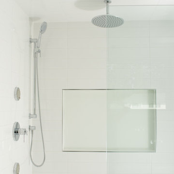
One of our main design goals with this new construction project was to create a comfortable family home with timeless lines that would allow for optimal flow & function for everyday living.
Built as a spec home in the highly desirable Lakeview Heights neighbourhood of West Kelowna, the design needed to be broadly appealing to potential purchasers. We opted for a light and natural colour palette utilizing contemporary lines to create a welcoming and approachable feel throughout the home.
With ample square footage - 3 Bedrooms, 4 Bathrooms on the upper floor, with a fully finished Basement, & Rental Suite, as well as above Garage Bonus Room - we were tasked with making revisions to the Architectural plans as needed to improve flow and function between the spaces.
The Main Floor was specially re-designed to allow for a creation of a chef inspired, gourmet Kitchen with executive appliances, large Island, gas Range, and a very convenient Butler’s Pantry which sits beside the bright, open concept Living Room & Dining Room with floor-to-ceiling Fireplace.
The re-designed outdoor entertaining space includes a spacious deck off the Kitchen, featuring an outdoor BBQ area with bar top counter to seat guests and relaxing conversation area.
The home sold to a young family, and we’re told they love their new home.
 birdRock Project Studio Inc.
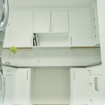
One of our main design goals with this new construction project was to create a comfortable family home with timeless lines that would allow for optimal flow & function for everyday living.
Built as a spec home in the highly desirable Lakeview Heights neighbourhood of West Kelowna, the design needed to be broadly appealing to potential purchasers. We opted for a light and natural colour palette utilizing contemporary lines to create a welcoming and approachable feel throughout the home.
With ample square footage - 3 Bedrooms, 4 Bathrooms on the upper floor, with a fully finished Basement, & Rental Suite, as well as above Garage Bonus Room - we were tasked with making revisions to the Architectural plans as needed to improve flow and function between the spaces.
The Main Floor was specially re-designed to allow for a creation of a chef inspired, gourmet Kitchen with executive appliances, large Island, gas Range, and a very convenient Butler’s Pantry which sits beside the bright, open concept Living Room & Dining Room with floor-to-ceiling Fireplace.
The re-designed outdoor entertaining space includes a spacious deck off the Kitchen, featuring an outdoor BBQ area with bar top counter to seat guests and relaxing conversation area.
The home sold to a young family, and we’re told they love their new home.
15