
Search results for "Excessive" in Home Design Ideas

 Sun Control of Minnesota
Sun Control of Minnesota is a family owned and operated business that offers Professional Window Tinting Services. We first started out in one office with two part time installers, and we have now grown our business with over 15 employees badge-1980and four different locations in the metro area. We continue to expand our relationships with customers, as well as our service and quality of work.
We offer a complete line of Window Tinting services for Automotive, Commercial, Residential, & Marine applications. Our products include Decorative Frost Films, for glass enhancement; Safety/ Security Films, for Anti-Theft and Blast Protection; and 3M Paint Protection Film, for Automotive Rock Chip Prevention.
We focus on helping our customers reduce damaging UV rays, excessive solar heat gain, and glare from their interior spaces. UV rays, solar heat, and visible light are the main contributors to fading concerns in homes. Window Film reduces these elements to provide a beautiful view without having to close out the natural sunlight with a shade or blind. We provide the quality that competitors can’t even touch.
Our Mission is to Provide the Highest Quality Service, Products, and Installation in the Solar Energy Control Tint & Glass Film industry.
 Alina Gardens Inc.
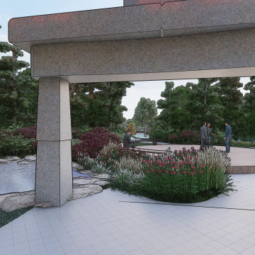
The view from the north exit into the private community gathering space. The pond is ephemeral and created by roof capture water. Once the pond is full, it overflows into the adjacent rain garden. There are three more rain gardens along the slope to gather overflow until any excess is sent to the city sewer.
 Jordan Design Build Group
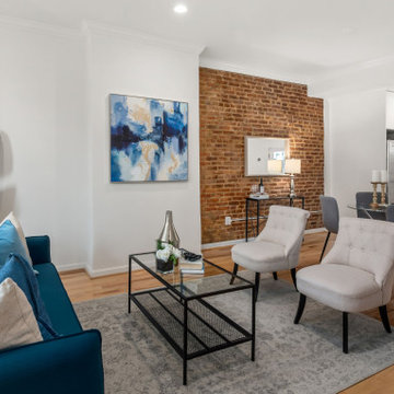
Built in 1910, this charming DC row house is located in the historic Bloomingdale neighborhood. At some point, the home had been converted into two separate apartments and, in doing so, the previous owners had removed the connecting stairs and made some other problematic design decisions. When our clients purchased the home in 2017, it required a full gut renovation in order to bring it up to code and return it to a single family residence. One of the initial challenges was to address the excessive bulkheads, soffits and ceiling height changes that made the rooms feel off kilter. Reconfiguring the HVAC system and ductwork allowed us to minimize bulkheads and raise the ceilings which, in turn made the spaces feel larger and more open. In the kitchen, the extra height meant we could install taller upper cabinets which provided much needed storage. By expanding the kitchen we were able to reconfigure the layout and create additional prep space and a more functional location for the range.
Find the right local pro for your project
 USI Design & Remodeling
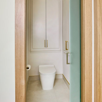
This master bathroom renovation in Frisco was completed for a repeat USI Design & Remodeling client as part of a larger first-floor transformation of the home. The original bathroom reflected a very typical North Texas layout of its era — dark stained cabinetry, granite countertops, compartmentalized vanities, a built-in tub adjoining a framed shower, and separated spaces that no longer aligned with how the homeowners wanted to live. As their aesthetic evolved toward a more transitional and contemporary direction, the goal became less about replacing finishes and more about redefining the experience of the room itself. The project needed to feel calmer, more architectural, and far more intentional in how the space functioned visually and emotionally.
One of the most important changes was removing the original shower curb and pony wall in favor of a fully open curbless shower with ultra-clear ½-inch heavy glass. Achieving that look required recessing the slab, re-floating the shower floor toward a linear drain, and engineering the space so the room would read as visually uninterrupted from end to end. Throughout the project, many of the design decisions were rooted in restraint rather than excess. The oversized 24x48 Porcelanosa flooring carries very little shade variation, creating a quieter visual field, while the cabinetry was executed in rift-sawn white oak specifically because it produces a far more controlled and consistent finish outcome than more common cuts of wood. In luxury projects, consistency itself becomes part of the refinement.
The floating vanity was designed more like custom furniture than traditional cabinetry, utilizing waterfall mitered edges and fully reworked plumbing locations so both homeowners could share in having generous functional countertop space. The original makeup station was repurposed into integrated storage with powered drawers and concealed organization for everyday items such as blow dryers and flat irons. Along the vanity wall, wall-mounted plumbing fixtures were paired with ribbed natural marble surfaces — a detail that required intentional planning long before construction began. Rather than allowing the ribbed material to terminate awkwardly behind the fixtures, the backsplash and stone transitions were specifically designed to resolve those conditions cleanly. Those are the types of details that distinguish highly coordinated design-build work from projects that simply assemble materials together.
While the room contains a significant amount of luxury detailing — from the freestanding tub and geoprism marble focal wall to the custom rift-sawn white oak closet doors and elongated mirrors that leverage the 11-foot ceiling heights — the project was always guided by quiet luxury rather than visual competition. Even the water closet enclosure was handled with restraint through the use of a satin-etched glass door rather than another heavy solid opening. The intent throughout was to create a bathroom that feels restorative and serene rather than overdesigned. In our view, the best luxury spaces are the ones that feel composed long after the initial impression wears off.
 Modern Citi Group: Renovations & Remodeling
What Is Modern Style?
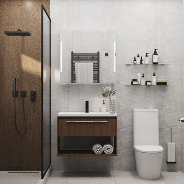
Modern style has its roots in the modernist movement of the early and mid-20th century. Modern architecture and furnishings emphasize form and structure rather than surface ornamentation — think of large expanses of glass; smooth surfaces like concrete, steel, stone and wood; and accents of chrome and black leather.
Modern style is:
- Clean. Excess embellishment is considered a distraction and to be avoided. Think crisp, clean and sculptural. Shapes are strong, with clearly defined lines and planes.
- Architectural. Furnishings echo rather than distract attention from the architecture for a seamless look.
- Minimal. Modern style embraces negative space with spare furnishings and little color or pattern.
Modern style is not:
- Ornamented. A reaction against heavily ornamented traditional styles, this look embraces simplicity of form.
- Trendy. Unlike contemporary style, which taps into up-to-the-minute changes in the design world, modern design feels more securely rooted.
- Cluttered. Furnishings are chosen with care, and accessories are kept to a minimum for a clean, spacious look.
 OCHOA'S NEIGHBORHOOD LANDSCAPING
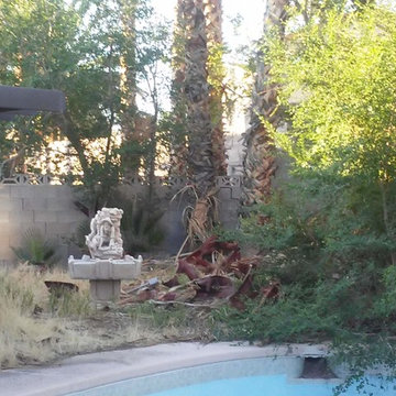
Backyard clean out, excessive palm tree debris, over grown weeds. Removed all debris, trimmed & pruned trees, removed all weeds, blow clean
Photo of a full sun backyard formal garden in Las Vegas.
Photo of a full sun backyard formal garden in Las Vegas.

 Spring Creek Aquatic Concepts
We use rock and stone where it makes hydrologic and ecological sense in our waters. We do not use stone excessively since it is expensive and is very often over-done which results in unnatural appearing ponds.
30 years of experience as Biologists has shown us extensive rock and stone features in the wild. We paid attention and bring that to our projects to incorporate the exact correct materials in elements such as waterfalls, pools, riffles and shorelines. Each element calls for a particular geometry of materials. Using the same rock in a waterfall as in a riffle or stream makes for a contrived artificial appearance. You may not be able to verbalize the error, but when you see the finished habitat, you will feel the difference. Our responsibility is to know the difference and employ it.
Nature may appear chaotic to a casual observer, but there is a very complex order for all natural habitats.
AquaHabitat.com
 Laidlaw Schultz architects
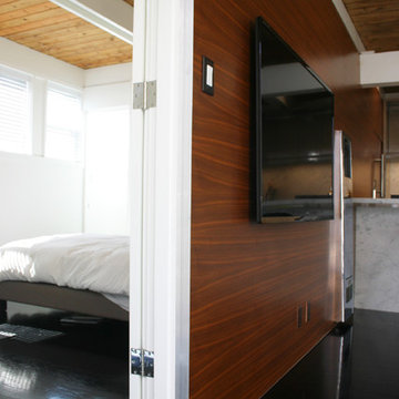
The project’s starting point was to understand the building’s original post and beam structure and to use that internal logic to formulate a sympathetic remodel. With an emphasis on the upper back unit, the owner’s private residence within this recently purchased Edward Killingsworth triplex, the first order of business was to strip the excess out and to return the complex to something that resembled the original. With a limited budget, the tact was to restore where possible, and to insert where needed, but always with a sympathetic eye. The kitchen quickly became the primary focus and it was soon realized that by removing the division between the existing galley and family room that the essence of the structural system could be revealed. Once opened the datum of the layered beams was adhered to with the kitchen reinforcing this overhead water line. The primary internal wall was then highlighted with a new wood veneer with the refrigerator recessed (borrowing a bit of space from the master closet) and the existing heater chromed.
 Modern Citi Group: Renovations & Remodeling
What Is Modern Style?
Modern style has its roots in the modernist movement of the early and mid-20th century. Modern architecture and furnishings emphasize form and structure rather than surface ornamentation — think of large expanses of glass; smooth surfaces like concrete, steel, stone and wood; and accents of chrome and black leather.
Modern style is:
- Clean. Excess embellishment is considered a distraction and to be avoided. Think crisp, clean and sculptural. Shapes are strong, with clearly defined lines and planes.
- Architectural. Furnishings echo rather than distract attention from the architecture for a seamless look.
- Minimal. Modern style embraces negative space with spare furnishings and little color or pattern.
Modern style is not:
- Ornamented. A reaction against heavily ornamented traditional styles, this look embraces simplicity of form.
- Trendy. Unlike contemporary style, which taps into up-to-the-minute changes in the design world, modern design feels more securely rooted.
- Cluttered. Furnishings are chosen with care, and accessories are kept to a minimum for a clean, spacious look.
 SALA Architects
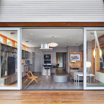
The homeowners sought to create a modest, modern, lakeside cottage, nestled into a narrow lot in Tonka Bay. The site inspired a modified shotgun-style floor plan, with rooms laid out in succession from front to back. Simple and authentic materials provide a soft and inviting palette for this modern home. Wood finishes in both warm and soft grey tones complement a combination of clean white walls, blue glass tiles, steel frames, and concrete surfaces. Sustainable strategies were incorporated to provide healthy living and a net-positive-energy-use home. Onsite geothermal, solar panels, battery storage, insulation systems, and triple-pane windows combine to provide independence from frequent power outages and supply excess power to the electrical grid.
Photos by Corey Gaffer
 San Luis Kitchen Co.
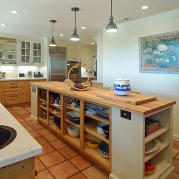
The owners of a charming home in the hills west of Paso Robles recently decided to remodel their not-so-charming kitchen. Referred to San Luis Kitchen by several of their friends, the homeowners visited our showroom and soon decided we were the best people to design a kitchen fitting the style of their home. We were delighted to get to work on the project right away.
When we arrived at the house, we found a small, cramped and out-dated kitchen. The ceiling was low, the cabinets old fashioned and painted a stark dead white, and the best view in the house was neglected in a seldom-used breakfast nook (sequestered behind the kitchen peninsula). This kitchen was also handicapped by white tile counters with dark grout, odd-sized and cluttered cabinets, and small ‘desk’ tacked on to the side of the oven cabinet. Due to a marked lack of counter space & inadequate storage the homeowner had resorted to keeping her small appliances on a little cart parked in the corner and the garbage was just sitting by the wall in full view of everything! On the plus side, the kitchen opened into a nice dining room and had beautiful saltillo tile floors.
Mrs. Homeowner loves to entertain and often hosts dinner parties for her friends. She enjoys visiting with her guests in the kitchen while putting the finishing touches on the evening’s meal. Sadly, her small kitchen really limited her interactions with her guests – she often felt left out of the mix at her own parties! This savvy homeowner dreamed big – a new kitchen that would accommodate multiple workstations, have space for guests to gather but not be in the way, and maybe a prettier transition from the kitchen to the dining (wine service area or hutch?) – while managing the remodel budget by reusing some of her major appliances and keeping (patching as needed) her existing floors.
Responding to the homeowner’s stated wish list and the opportunities presented by the home's setting and existing architecture, the designers at San Luis Kitchen decided to expand the kitchen into the breakfast nook using Wood-Mode cabinetry. This change allowed the work area to be reoriented to take advantage of the great view – we replaced the existing window and added another while moving the door to gain space. A second sink and set of refrigerator drawers (housing fresh fruits & veggies) were included for the convenience of this mainly vegetarian cook – her prep station. The clean-up area now boasts a farmhouse style single bowl sink – adding to the ‘cottage’ charm. We located a new gas cook-top between the two workstations for easy access from each. Also tucked in here is a pullout trash/recycle cabinet for convenience and additional drawers for storage.
Running parallel to the work counter we added a long butcher-block island with easy-to-access open shelves for the avid cook and seating for friendly guests placed just right to take in the view. A counter-top garage is used to hide excess small appliances. Glass door cabinets and open shelves are now available to display the owners beautiful dishware. The microwave was placed inconspicuously on the end of the island facing the refrigerator – easy access for guests (and extraneous family members) to help themselves to drinks and snacks while staying out of the cook’s way.
We also moved the pantry storage away from the dining room (putting it on the far wall and closer to the work triangle) and added a furniture-like hutch in its place allowing the more formal dining area to flow seamlessly into the up-beat work area of the kitchen. This space is now also home (opposite wall) to an under counter wine refrigerator, a liquor cabinet and pretty glass door wall cabinet for stemware storage – meeting Mr. Homeowner’s desire for a bar service area.
And then the aesthetic: an old-world style country cottage theme. The homeowners wanted the kitchen to have a warm feel while still loving the look of white cabinetry. San Luis Kitchen melded country-casual knotty pine base cabinets with vintage hand-brushed creamy white wall cabinets to create the desired cottage look. We also added bead board and mullioned glass doors for charm, used an inset doorstyle on the cabinets for authenticity, and mixed stone and wood counters to create an eclectic nuance in the space. All in all, the happy homeowners now boast a charming county cottage kitchen with plenty of space for entertaining their guests while creating gourmet meals to feed them.
 Mom's Design Build
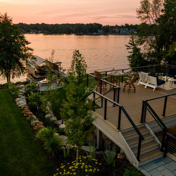
The #LakesideLeisure Project was a comprehensive redesign of a lakefront property that transformed various challenges into stunning solutions. Initially, the property featured a small, high-maintenance cedar deck with minimal lake views, poorly placed stairs, limited flat yard space due to extensive tiered landscaping and excessive plantings, obstructed lake views, and privacy concerns from a neighboring home.
The client’s vision was clear: they wanted a large, flat yard for family activities and hosting, enhanced outdoor living spaces for dining and lounging, increased privacy from neighbors, more shaded hangout areas, improved “curb appeal” from the lake, and reduced maintenance.
 Tile Doctor Ltd
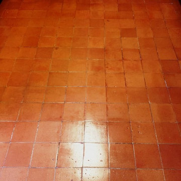
Not too long ago I visited a client who had just moved into a lovely old cottage in Milton, Oxfordshire. She wanted to restore many of the antique features of the building, including a fantastic Quarry tiled floor in the kitchen.
Quarry is typically a robust, hard wearing stone, but in a high traffic area like a kitchen, the tiles will need regular maintenance. These tiles clearly hadn’t seen a thorough clean and fresh seal in a long time, and so I was called in to provide just that.
On the first day of work, I gave the Quarry tiles a deep clean using a strong solution of Tile Doctor Pro-Clean and water. Pro-Clean is a versatile alkaline cleaner that also helps to break down any old and no longer effectual sealer remaining on the tiles.
The solution was applied evenly to the floor and left to dwell for half an hour, allowing time for it to seep into the stone to get underneath and lift out the ingrained dirt. I then removed the dirt by agitating the solution with a scrubbing pad fitted to a rotary floor scrubber. I worked in small sections at first, and gradually finished the entire floor.
After completing the initial clean, I rinsed away the soiled solution and vacuumed up the excess moisture using a wet-vac machine. I then scrubbed the floor an acid wash using a dilution of Tile Doctor Grout Clean-Up to remove grout smears and other mineral type deposits. The resulting solution was then removed in a similar fashion using a wet-vac.
The final step in the cleaning process was to rinse the floor with Tile Doctor pH Neutral Cleaner to remove any trace of product helps to tackle any remaining dirt and reset the pH balance of the tiles before sealing.
After leaving the floor to dry overnight, I returned the next day to the house to seal the floor with Tile Doctor Seal & Go, a water-based topical sealer which gives the floor an aesthetically pleasing sheen and a robust surface seal.
The photos demonstrate the results better than this short account can, needless to say the floor is now transformed.
Barry Woodward
Oxfordshire Tile Doctor

 Camden Grace LLC
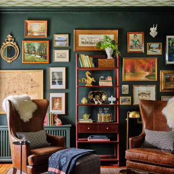
If a Hot Toddy could be a room, this would be it. Warm, cozy, and inviting with a dash of cinnamon to spice it up. The living room before was a blank (think greige) slate. The mantle had lost its grandeur so we rebuilt it with more generous proportions. The ceiling wallpaper really inspired our design and is made by Adelph, a boutique artisanal company that specializes in historically accurate block-printed wallpapers. The pattern is circa 1807 and called “Philadelphia” – such a coincidence given this home is located just 20 miles from the city.

 Jordan Design Build Group
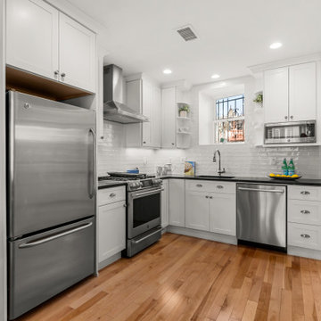
Built in 1910, this charming DC row house is located in the historic Bloomingdale neighborhood. At some point, the home had been converted into two separate apartments and, in doing so, the previous owners had removed the connecting stairs and made some other problematic design decisions. When our clients purchased the home in 2017, it required a full gut renovation in order to bring it up to code and return it to a single family residence. One of the initial challenges was to address the excessive bulkheads, soffits and ceiling height changes that made the rooms feel off kilter. Reconfiguring the HVAC system and ductwork allowed us to minimize bulkheads and raise the ceilings which, in turn made the spaces feel larger and more open. In the kitchen, the extra height meant we could install taller upper cabinets which provided much needed storage. By expanding the kitchen we were able to reconfigure the layout and create additional prep space and a more functional location for the range.
 MARGARITA BRAVO
Our clients wanted a modern mountain getaway that would combine their gorgeous mountain surroundings with contemporary finishes. To highlight the stunning cathedral ceilings, we decided to take the natural stone on the fireplace from floor to ceiling. The dark wood mantle adds a break for the eye, and ties in the views of surrounding trees. Our clients wanted a complete facelift for their kitchen, and this started with removing the excess of dark wood on the ceiling, walls, and cabinets. Opening a larger picture window helps in bringing the outdoors in, and contrasting white and black cabinets create a fresh and modern feel.
---
Project designed by Montecito interior designer Margarita Bravo. She serves Montecito as well as surrounding areas such as Hope Ranch, Summerland, Santa Barbara, Isla Vista, Mission Canyon, Carpinteria, Goleta, Ojai, Los Olivos, and Solvang.
For more about MARGARITA BRAVO, click here: https://www.margaritabravo.com/
To learn more about this project, click here: https://www.margaritabravo.com/portfolio/colorado-nature-inspired-getaway/
 William C Tamburro, Landscape Architect, LLC
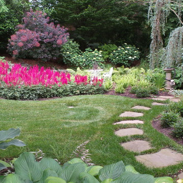
The area was a shady, unused access from the front yard to the rear yard. It was un-inviting and a catch all for excess plants. Fanal Astilbe, Purple Smoke Tree, a Dawn Redwood, Weeping Blue Atlas Cedar, Dwarf Chinese Astilbe, and White Hydrangea accent the natural stepping stone walkway to a secluded sitting area. The antique white iron chair and table set is used as a whimsical setting for climbing annuals. The pea gravel path leads from the rear yard to the front yard. Japanese Painted Ferns, Hay Scented Ferns, Royal Ferns, Ostrich Ferns, and Beech Ferns enhance the edges with soft texture and seasonal structure.
 Architectural Resource LLC
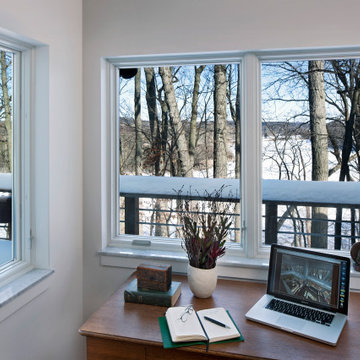
Architectural Resource is extremely excited to share with you the 'River View' house. This very special remodeling project was the first remodeling project in S.E. Michigan to achieve Emerald Certification (the highest level possible) in the National Association of Home Builder’s (NAHB) National Green Building Certification Program. This home combines smart, sustainable design; advanced construction techniques; and integrated solar panels for renewable energy capture. The result… our clients received a Credit for net excess electrical production in July of 2014, the hottest July on record to date! This state of the art remodel and addition project includes a new two-story addition, master suite and kitchen remodel, and a view of the Huron River valley that one reporter exclaimed was "the most beautiful view in Ann Arbor!"
-Beth Singer Photography
77