
Search results for "Excessive" in Home Design Ideas
 Home Builders Association of Greater Des Moines
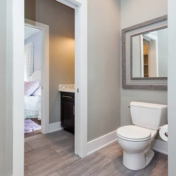
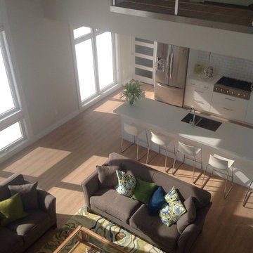
Sundance Homes invites you to tour this 2,600-square-foot walkout ranch. As you enter the home take note of the frosted glass track doors, which offer privacy and seclusion to a home office. The kitchen, dining and great room offer an open concept, while still maintaining their own distinct and defining characteristics. From the hardwood floors carried throughout the house, to the GE Monogram stainless steel appliances and quartz countertop island, this home provides the most usable space for family as well as entertaining. A spacious covered deck extends along the entire back of the house with access to the owner’s retreat. This is the place to relax at the end of the day with a stone fireplace, soaker tub, walk-in shower with digital control rain heads, an abundance of closet space and a bonus of its own washer and dryer. The second and third bedrooms include a Jack & Jill bath with individual vanities. Just steps away are the laundry room and mud room, featuring built-in lockers to give little ones a unique space to store their stuff. This home is equipped with energy-efficient, environmentally friendly geothermal HVAC system and radiant floor heating in the 4-car garages. Additionally, the garage floor drains and outside gutters are tied into an underground gutter system, effectively pulling excess water away from the foundation. This home also has a Control 4 Home Operating System with video and audio, providing the homeowner with a true sense of security – while at home and away.
 User
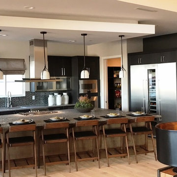
UserExample of a transitional u-shaped light wood floor and beige floor open concept kitchen design in Las Vegas with an undermount sink, dark wood cabinets, gray backsplash, stainless steel appliances, an island, flat-panel cabinets and mosaic tile backsplash
 Laidlaw Schultz architects
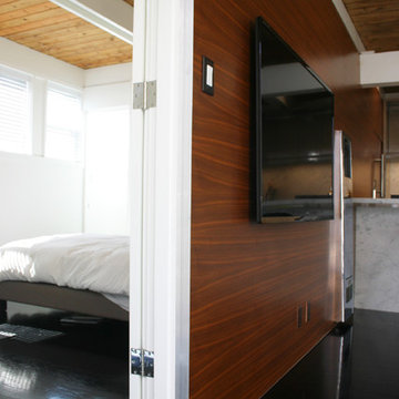
The project’s starting point was to understand the building’s original post and beam structure and to use that internal logic to formulate a sympathetic remodel. With an emphasis on the upper back unit, the owner’s private residence within this recently purchased Edward Killingsworth triplex, the first order of business was to strip the excess out and to return the complex to something that resembled the original. With a limited budget, the tact was to restore where possible, and to insert where needed, but always with a sympathetic eye. The kitchen quickly became the primary focus and it was soon realized that by removing the division between the existing galley and family room that the essence of the structural system could be revealed. Once opened the datum of the layered beams was adhered to with the kitchen reinforcing this overhead water line. The primary internal wall was then highlighted with a new wood veneer with the refrigerator recessed (borrowing a bit of space from the master closet) and the existing heater chromed.
Find the right local pro for your project
 Modern Citi Group: Renovations & Remodeling
What Is Modern Style?
Modern style has its roots in the modernist movement of the early and mid-20th century. Modern architecture and furnishings emphasize form and structure rather than surface ornamentation — think of large expanses of glass; smooth surfaces like concrete, steel, stone and wood; and accents of chrome and black leather.
Modern style is:
- Clean. Excess embellishment is considered a distraction and to be avoided. Think crisp, clean and sculptural. Shapes are strong, with clearly defined lines and planes.
- Architectural. Furnishings echo rather than distract attention from the architecture for a seamless look.
- Minimal. Modern style embraces negative space with spare furnishings and little color or pattern.
Modern style is not:
- Ornamented. A reaction against heavily ornamented traditional styles, this look embraces simplicity of form.
- Trendy. Unlike contemporary style, which taps into up-to-the-minute changes in the design world, modern design feels more securely rooted.
- Cluttered. Furnishings are chosen with care, and accessories are kept to a minimum for a clean, spacious look.
 SALA Architects
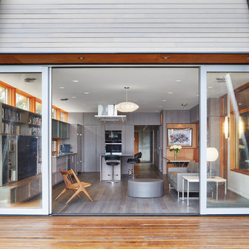
The homeowners sought to create a modest, modern, lakeside cottage, nestled into a narrow lot in Tonka Bay. The site inspired a modified shotgun-style floor plan, with rooms laid out in succession from front to back. Simple and authentic materials provide a soft and inviting palette for this modern home. Wood finishes in both warm and soft grey tones complement a combination of clean white walls, blue glass tiles, steel frames, and concrete surfaces. Sustainable strategies were incorporated to provide healthy living and a net-positive-energy-use home. Onsite geothermal, solar panels, battery storage, insulation systems, and triple-pane windows combine to provide independence from frequent power outages and supply excess power to the electrical grid.
Photos by Corey Gaffer
 San Luis Kitchen Co.
The owners of a charming home in the hills west of Paso Robles recently decided to remodel their not-so-charming kitchen. Referred to San Luis Kitchen by several of their friends, the homeowners visited our showroom and soon decided we were the best people to design a kitchen fitting the style of their home. We were delighted to get to work on the project right away.
When we arrived at the house, we found a small, cramped and out-dated kitchen. The ceiling was low, the cabinets old fashioned and painted a stark dead white, and the best view in the house was neglected in a seldom-used breakfast nook (sequestered behind the kitchen peninsula). This kitchen was also handicapped by white tile counters with dark grout, odd-sized and cluttered cabinets, and small ‘desk’ tacked on to the side of the oven cabinet. Due to a marked lack of counter space & inadequate storage the homeowner had resorted to keeping her small appliances on a little cart parked in the corner and the garbage was just sitting by the wall in full view of everything! On the plus side, the kitchen opened into a nice dining room and had beautiful saltillo tile floors.
Mrs. Homeowner loves to entertain and often hosts dinner parties for her friends. She enjoys visiting with her guests in the kitchen while putting the finishing touches on the evening’s meal. Sadly, her small kitchen really limited her interactions with her guests – she often felt left out of the mix at her own parties! This savvy homeowner dreamed big – a new kitchen that would accommodate multiple workstations, have space for guests to gather but not be in the way, and maybe a prettier transition from the kitchen to the dining (wine service area or hutch?) – while managing the remodel budget by reusing some of her major appliances and keeping (patching as needed) her existing floors.
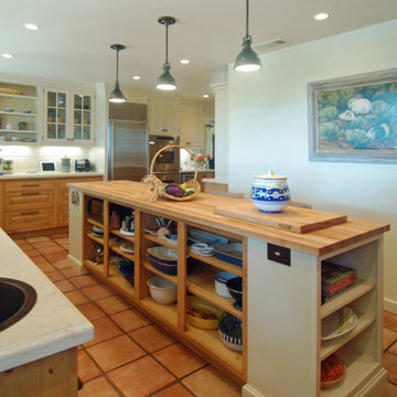
Responding to the homeowner’s stated wish list and the opportunities presented by the home's setting and existing architecture, the designers at San Luis Kitchen decided to expand the kitchen into the breakfast nook using Wood-Mode cabinetry. This change allowed the work area to be reoriented to take advantage of the great view – we replaced the existing window and added another while moving the door to gain space. A second sink and set of refrigerator drawers (housing fresh fruits & veggies) were included for the convenience of this mainly vegetarian cook – her prep station. The clean-up area now boasts a farmhouse style single bowl sink – adding to the ‘cottage’ charm. We located a new gas cook-top between the two workstations for easy access from each. Also tucked in here is a pullout trash/recycle cabinet for convenience and additional drawers for storage.
Running parallel to the work counter we added a long butcher-block island with easy-to-access open shelves for the avid cook and seating for friendly guests placed just right to take in the view. A counter-top garage is used to hide excess small appliances. Glass door cabinets and open shelves are now available to display the owners beautiful dishware. The microwave was placed inconspicuously on the end of the island facing the refrigerator – easy access for guests (and extraneous family members) to help themselves to drinks and snacks while staying out of the cook’s way.
We also moved the pantry storage away from the dining room (putting it on the far wall and closer to the work triangle) and added a furniture-like hutch in its place allowing the more formal dining area to flow seamlessly into the up-beat work area of the kitchen. This space is now also home (opposite wall) to an under counter wine refrigerator, a liquor cabinet and pretty glass door wall cabinet for stemware storage – meeting Mr. Homeowner’s desire for a bar service area.
And then the aesthetic: an old-world style country cottage theme. The homeowners wanted the kitchen to have a warm feel while still loving the look of white cabinetry. San Luis Kitchen melded country-casual knotty pine base cabinets with vintage hand-brushed creamy white wall cabinets to create the desired cottage look. We also added bead board and mullioned glass doors for charm, used an inset doorstyle on the cabinets for authenticity, and mixed stone and wood counters to create an eclectic nuance in the space. All in all, the happy homeowners now boast a charming county cottage kitchen with plenty of space for entertaining their guests while creating gourmet meals to feed them.
 Mom's Design Build
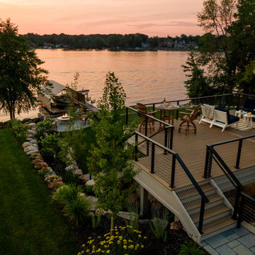
The #LakesideLeisure Project was a comprehensive redesign of a lakefront property that transformed various challenges into stunning solutions. Initially, the property featured a small, high-maintenance cedar deck with minimal lake views, poorly placed stairs, limited flat yard space due to extensive tiered landscaping and excessive plantings, obstructed lake views, and privacy concerns from a neighboring home.
The client’s vision was clear: they wanted a large, flat yard for family activities and hosting, enhanced outdoor living spaces for dining and lounging, increased privacy from neighbors, more shaded hangout areas, improved “curb appeal” from the lake, and reduced maintenance.
 Tile Doctor Ltd
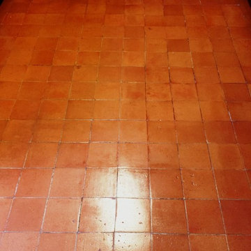
Not too long ago I visited a client who had just moved into a lovely old cottage in Milton, Oxfordshire. She wanted to restore many of the antique features of the building, including a fantastic Quarry tiled floor in the kitchen.
Quarry is typically a robust, hard wearing stone, but in a high traffic area like a kitchen, the tiles will need regular maintenance. These tiles clearly hadn’t seen a thorough clean and fresh seal in a long time, and so I was called in to provide just that.
On the first day of work, I gave the Quarry tiles a deep clean using a strong solution of Tile Doctor Pro-Clean and water. Pro-Clean is a versatile alkaline cleaner that also helps to break down any old and no longer effectual sealer remaining on the tiles.
The solution was applied evenly to the floor and left to dwell for half an hour, allowing time for it to seep into the stone to get underneath and lift out the ingrained dirt. I then removed the dirt by agitating the solution with a scrubbing pad fitted to a rotary floor scrubber. I worked in small sections at first, and gradually finished the entire floor.
After completing the initial clean, I rinsed away the soiled solution and vacuumed up the excess moisture using a wet-vac machine. I then scrubbed the floor an acid wash using a dilution of Tile Doctor Grout Clean-Up to remove grout smears and other mineral type deposits. The resulting solution was then removed in a similar fashion using a wet-vac.
The final step in the cleaning process was to rinse the floor with Tile Doctor pH Neutral Cleaner to remove any trace of product helps to tackle any remaining dirt and reset the pH balance of the tiles before sealing.
After leaving the floor to dry overnight, I returned the next day to the house to seal the floor with Tile Doctor Seal & Go, a water-based topical sealer which gives the floor an aesthetically pleasing sheen and a robust surface seal.
The photos demonstrate the results better than this short account can, needless to say the floor is now transformed.
Barry Woodward
Oxfordshire Tile Doctor
 Camden Grace LLC
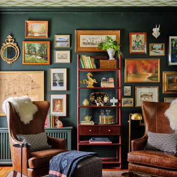
If a Hot Toddy could be a room, this would be it. Warm, cozy, and inviting with a dash of cinnamon to spice it up. The living room before was a blank (think greige) slate. The mantle had lost its grandeur so we rebuilt it with more generous proportions. The ceiling wallpaper really inspired our design and is made by Adelph, a boutique artisanal company that specializes in historically accurate block-printed wallpapers. The pattern is circa 1807 and called “Philadelphia” – such a coincidence given this home is located just 20 miles from the city.

 Spring Creek Aquatic Concepts
We use rock and stone where it makes hydrologic and ecological sense in our waters. We do not use stone excessively since it is expensive and is very often over-done which results in unnatural appearing ponds.
30 years of experience as Biologists has shown us extensive rock and stone features in the wild. We paid attention and bring that to our projects to incorporate the exact correct materials in elements such as waterfalls, pools, riffles and shorelines. Each element calls for a particular geometry of materials. Using the same rock in a waterfall as in a riffle or stream makes for a contrived artificial appearance. You may not be able to verbalize the error, but when you see the finished habitat, you will feel the difference. Our responsibility is to know the difference and employ it.
Nature may appear chaotic to a casual observer, but there is a very complex order for all natural habitats.
AquaHabitat.com
 Jordan Design Build Group
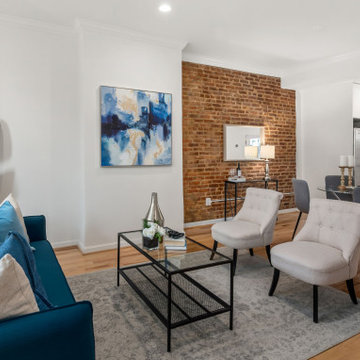
Built in 1910, this charming DC row house is located in the historic Bloomingdale neighborhood. At some point, the home had been converted into two separate apartments and, in doing so, the previous owners had removed the connecting stairs and made some other problematic design decisions. When our clients purchased the home in 2017, it required a full gut renovation in order to bring it up to code and return it to a single family residence. One of the initial challenges was to address the excessive bulkheads, soffits and ceiling height changes that made the rooms feel off kilter. Reconfiguring the HVAC system and ductwork allowed us to minimize bulkheads and raise the ceilings which, in turn made the spaces feel larger and more open. In the kitchen, the extra height meant we could install taller upper cabinets which provided much needed storage. By expanding the kitchen we were able to reconfigure the layout and create additional prep space and a more functional location for the range.
 USI Design & Remodeling
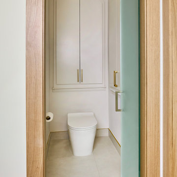
This master bathroom renovation in Frisco was completed for a repeat USI Design & Remodeling client as part of a larger first-floor transformation of the home. The original bathroom reflected a very typical North Texas layout of its era — dark stained cabinetry, granite countertops, compartmentalized vanities, a built-in tub adjoining a framed shower, and separated spaces that no longer aligned with how the homeowners wanted to live. As their aesthetic evolved toward a more transitional and contemporary direction, the goal became less about replacing finishes and more about redefining the experience of the room itself. The project needed to feel calmer, more architectural, and far more intentional in how the space functioned visually and emotionally.
One of the most important changes was removing the original shower curb and pony wall in favor of a fully open curbless shower with ultra-clear ½-inch heavy glass. Achieving that look required recessing the slab, re-floating the shower floor toward a linear drain, and engineering the space so the room would read as visually uninterrupted from end to end. Throughout the project, many of the design decisions were rooted in restraint rather than excess. The oversized 24x48 Porcelanosa flooring carries very little shade variation, creating a quieter visual field, while the cabinetry was executed in rift-sawn white oak specifically because it produces a far more controlled and consistent finish outcome than more common cuts of wood. In luxury projects, consistency itself becomes part of the refinement.
The floating vanity was designed more like custom furniture than traditional cabinetry, utilizing waterfall mitered edges and fully reworked plumbing locations so both homeowners could share in having generous functional countertop space. The original makeup station was repurposed into integrated storage with powered drawers and concealed organization for everyday items such as blow dryers and flat irons. Along the vanity wall, wall-mounted plumbing fixtures were paired with ribbed natural marble surfaces — a detail that required intentional planning long before construction began. Rather than allowing the ribbed material to terminate awkwardly behind the fixtures, the backsplash and stone transitions were specifically designed to resolve those conditions cleanly. Those are the types of details that distinguish highly coordinated design-build work from projects that simply assemble materials together.
While the room contains a significant amount of luxury detailing — from the freestanding tub and geoprism marble focal wall to the custom rift-sawn white oak closet doors and elongated mirrors that leverage the 11-foot ceiling heights — the project was always guided by quiet luxury rather than visual competition. Even the water closet enclosure was handled with restraint through the use of a satin-etched glass door rather than another heavy solid opening. The intent throughout was to create a bathroom that feels restorative and serene rather than overdesigned. In our view, the best luxury spaces are the ones that feel composed long after the initial impression wears off.
 Carter Fox Design Build
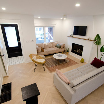
Carter Fox Renovations was hired to do a complete renovation of this semi-detached home in the Gerrard-Coxwell neighbourhood of Toronto. The main floor was completely gutted and transformed - most of the interior walls and ceilings were removed, a large sliding door installed across the back, and a small powder room added. All the electrical and plumbing was updated and new herringbone hardwood installed throughout.
Upstairs, the bathroom was expanded by taking space from the adjoining bedroom. We added a second floor laundry and new hardwood throughout. The walls and ceiling were plaster repaired and painted, avoiding the time, expense and excessive creation of landfill involved in a total demolition.
The clients had a very clear picture of what they wanted, and the finished space is very liveable and beautifully showcases their style.
Photo: Julie Carter
 San Luis Kitchen Co.
The owners of a charming home in the hills west of Paso Robles recently decided to remodel their not-so-charming kitchen. Referred to San Luis Kitchen by several of their friends, the homeowners visited our showroom and soon decided we were the best people to design a kitchen fitting the style of their home. We were delighted to get to work on the project right away.
When we arrived at the house, we found a small, cramped and out-dated kitchen. The ceiling was low, the cabinets old fashioned and painted a stark dead white, and the best view in the house was neglected in a seldom-used breakfast nook (sequestered behind the kitchen peninsula). This kitchen was also handicapped by white tile counters with dark grout, odd-sized and cluttered cabinets, and small ‘desk’ tacked on to the side of the oven cabinet. Due to a marked lack of counter space & inadequate storage the homeowner had resorted to keeping her small appliances on a little cart parked in the corner and the garbage was just sitting by the wall in full view of everything! On the plus side, the kitchen opened into a nice dining room and had beautiful saltillo tile floors.
Mrs. Homeowner loves to entertain and often hosts dinner parties for her friends. She enjoys visiting with her guests in the kitchen while putting the finishing touches on the evening’s meal. Sadly, her small kitchen really limited her interactions with her guests – she often felt left out of the mix at her own parties! This savvy homeowner dreamed big – a new kitchen that would accommodate multiple workstations, have space for guests to gather but not be in the way, and maybe a prettier transition from the kitchen to the dining (wine service area or hutch?) – while managing the remodel budget by reusing some of her major appliances and keeping (patching as needed) her existing floors.
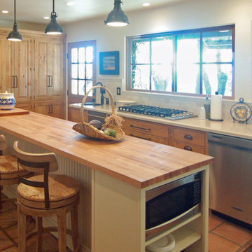
Responding to the homeowner’s stated wish list and the opportunities presented by the home's setting and existing architecture, the designers at San Luis Kitchen decided to expand the kitchen into the breakfast nook using Wood-Mode cabinetry. This change allowed the work area to be reoriented to take advantage of the great view – we replaced the existing window and added another while moving the door to gain space. A second sink and set of refrigerator drawers (housing fresh fruits & veggies) were included for the convenience of this mainly vegetarian cook – her prep station. The clean-up area now boasts a farmhouse style single bowl sink – adding to the ‘cottage’ charm. We located a new gas cook-top between the two workstations for easy access from each. Also tucked in here is a pullout trash/recycle cabinet for convenience and additional drawers for storage.
Running parallel to the work counter we added a long butcher-block island with easy-to-access open shelves for the avid cook and seating for friendly guests placed just right to take in the view. A counter-top garage is used to hide excess small appliances. Glass door cabinets and open shelves are now available to display the owners beautiful dishware. The microwave was placed inconspicuously on the end of the island facing the refrigerator – easy access for guests (and extraneous family members) to help themselves to drinks and snacks while staying out of the cook’s way.
We also moved the pantry storage away from the dining room (putting it on the far wall and closer to the work triangle) and added a furniture-like hutch in its place allowing the more formal dining area to flow seamlessly into the up-beat work area of the kitchen. This space is now also home (opposite wall) to an under counter wine refrigerator, a liquor cabinet and pretty glass door wall cabinet for stemware storage – meeting Mr. Homeowner’s desire for a bar service area.
And then the aesthetic: an old-world style country cottage theme. The homeowners wanted the kitchen to have a warm feel while still loving the look of white cabinetry. San Luis Kitchen melded country-casual knotty pine base cabinets with vintage hand-brushed creamy white wall cabinets to create the desired cottage look. We also added bead board and mullioned glass doors for charm, used an inset doorstyle on the cabinets for authenticity, and mixed stone and wood counters to create an eclectic nuance in the space. All in all, the happy homeowners now boast a charming county cottage kitchen with plenty of space for entertaining their guests while creating gourmet meals to feed them.

 Evergreen Construction
Drainage and erosion management systems play an important role in preserving and safeguarding damage to your home and property. The drainage system's goal is to collect and direct the unwanted amount of water to a suitable location. This will help prevent the landscaping and lawn from being muddy and soggy and remove excessive streams of water during heavy rains that cause erosion of the soil.
 TVL Creative Ltd.
These wonderful clients returned to us for their newest home remodel adventure. Their newly purchased custom built 1970s modern ranch sits in one of the loveliest neighborhoods south of the city but the current conditions of the home were out-dated and not so lovely. Upon entering the front door through the court you were greeted abruptly by a very boring staircase and an excessive number of doors. Just to the left of the double door entry was a large slider and on your right once inside the home was a soldier line up of doors. This made for an uneasy and uninviting entry that guests would quickly forget and our clients would often avoid. We also had our hands full in the kitchen. The existing space included many elements that felt out of place in a modern ranch including a rustic mountain scene backsplash, cherry cabinets with raised panel and detailed profile, and an island so massive you couldn’t pass a drink across the stone. Our design sought to address the functional pain points of the home and transform the overall aesthetic into something that felt like home for our clients.
For the entry, we re-worked the front door configuration by switching from the double door to a large single door with side lights. The sliding door next to the main entry door was replaced with a large window to eliminate entry door confusion. In our re-work of the entry staircase, guesta are now greeted into the foyer which features the Coral Pendant by David Trubridge. Guests are drawn into the home by stunning views of the front range via the large floor-to-ceiling glass wall in the living room. To the left, the staircases leading down to the basement and up to the master bedroom received a massive aesthetic upgrade. The rebuilt 2nd-floor staircase has a center spine with wood rise and run appearing to float upwards towards the master suite. A slatted wall of wood separates the two staircases which brings more light into the basement stairwell. Black metal railings add a stunning contrast to the light wood.
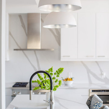
Other fabulous upgrades to this home included new wide plank flooring throughout the home, which offers both modernity and warmth. The once too-large kitchen island was downsized to create a functional focal point that is still accessible and intimate. The old dark and heavy kitchen cabinetry was replaced with sleek white cabinets, brightening up the space and elevating the aesthetic of the entire room. The kitchen countertops are marble look quartz with dramatic veining that offers an artistic feature behind the range and across all horizontal surfaces in the kitchen. As a final touch, cascading island pendants were installed which emphasize the gorgeous ceiling vault and provide warm feature lighting over the central point of the kitchen.
This transformation reintroduces light and simplicity to this gorgeous home, and we are so happy that our clients can reap the benefits of this elegant and functional design for years to come.

 Connecticut Roofcrafters Llc
Cleaning excess mortar after completing the replacement of one of two chimneys on an 1815 North Branford, CT Farmhouse from the attic floor up through the chimney stack. These chimneys were replaced in advance of completely re-roofing this historic Connecticut residence.
 Mastercraft Design Inc.
Refined Everyday Living
Cabinetry design doesn’t stop at the kitchen.
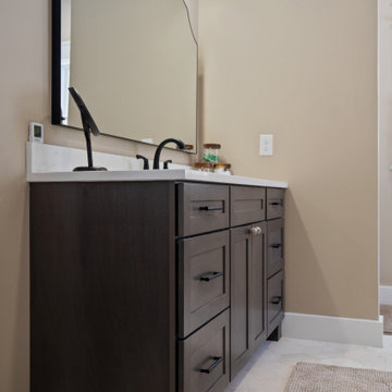
In this Nokesville home, we collaborated with the homeowners to create four thoughtfully designed bathroom vanities — each tailored to its specific space while maintaining a cohesive feel throughout the home.
For the guest bath and two master baths, we selected Mantra Cabinetry in solid wood with the Omni door style, finished in Beachwood stain. The warmth of the stain brings softness and approachability to everyday routines, while the clean-lined door profile keeps the look timeless and uncluttered.
In the Jack and Jill bath, we introduced contrast with the Omni door style in the Admiral paint option — adding depth and character while still maintaining design continuity.
By repeating the same door style across all four spaces, we ensured visual harmony. By varying finish selections, we allowed each bathroom to feel intentional and appropriately scaled to its function.
Refinement isn’t about excess.
It’s about thoughtful decisions that elevate everyday living.
 SM Design
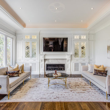
Bridle Path Residence — Family Room & Media Lounge
This Bridle Path Residence family room is conceived as a sophisticated yet comfortable gathering space, balancing the formality of the home's architectural language with a more relaxed approach to everyday living. The design creates a sense of quiet luxury through symmetry, tailored millwork, layered texture, and restrained glamour, rather than relying on excessive decoration.
The built-in fireplace and media wall form the architectural centre of the room. Custom white cabinetry frames the television and fireplace with carefully proportioned panels, glass-front display niches, and decorative moulding. This integrated approach allows technology to become part of the architecture rather than visually dominating the room.
The fireplace surround introduces a natural stone focal point beneath the television, adding subtle movement and material depth to an otherwise crisp white composition. Its placement establishes a strong central axis, while the symmetrical cabinetry on either side reinforces the room's sense of order and balance.
The expansive window along the left side is equally important to the design. It floods the room with natural light and establishes a direct visual connection to the mature landscape outside. This relationship with nature softens the structured architecture and prevents the room from feeling overly formal.
Two generously proportioned sofas are positioned opposite one another to create an intentional conversational arrangement. Their light upholstery keeps the room visually open, while layered cushions introduce warmer tones, pattern, and tactile contrast. The symmetry of the seating arrangement gives the space a composed architectural quality while remaining highly functional for family gatherings and entertaining.
The metallic furniture introduces a subtle note of contemporary glamour. Gold-toned frames, sculptural side tables, and glass surfaces reflect light throughout the room without overwhelming the neutral palette. The combination of transparent glass and polished metal also keeps the furniture visually light against the substantial architectural detailing.
A large area rug anchors the seating group and introduces an organic pattern that contrasts with the linear wall panelling and cabinetry. Its muted tones create continuity between the soft furnishings, wood flooring, and architectural finishes.
The lighting strategy is deliberately layered. Recessed lighting provides functional illumination, while decorative lamps and concealed architectural lighting create a softer atmosphere. The result is a room capable of transitioning easily from bright daytime family use to a more intimate evening setting.
The overall design is an expression of contemporary comfort within a classic architectural framework. Custom millwork, symmetry, traditional detailing, natural stone, warm hardwood, sculptural furniture, and soft textiles come together to create a family room that feels polished without becoming precious. It is designed as a room for both everyday life and elevated entertaining, comfortable enough to live in, yet refined enough to belong naturally within a luxury Bridle Path residence.
82