
Search results for "Exciting element" in Home Design Ideas
 Joy Street Design
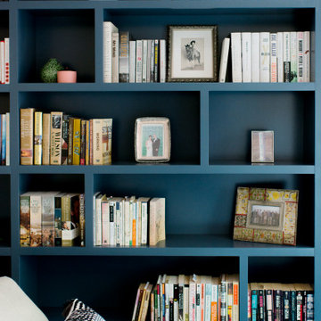
This San Carlos home features exciting design elements like bold, floral wallpaper, and floor-to-ceiling bookcases in navy blue:
---
Designed by Oakland interior design studio Joy Street Design. Serving Alameda, Berkeley, Orinda, Walnut Creek, Piedmont, and San Francisco.
For more about Joy Street Design, click here: https://www.joystreetdesign.com/
To learn more about this project, click here:
https://www.joystreetdesign.com/portfolio/bold-design-powder-room-study

 Barnard Architects
LEED for Homes Certified
Dining room - coastal medium tone wood floor dining room idea in Atlanta
Dining room - coastal medium tone wood floor dining room idea in Atlanta
 Joy Street Design
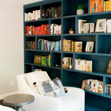
This San Carlos home features exciting design elements like bold, floral wallpaper, and floor-to-ceiling bookcases in navy blue:
---
Designed by Oakland interior design studio Joy Street Design. Serving Alameda, Berkeley, Orinda, Walnut Creek, Piedmont, and San Francisco.
For more about Joy Street Design, click here: https://www.joystreetdesign.com/
To learn more about this project, click here:
https://www.joystreetdesign.com/portfolio/bold-design-powder-room-study
Find the right local pro for your project
 Regency Custom Homes
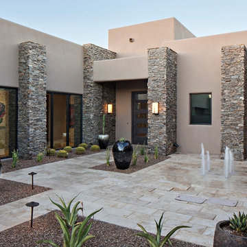
This desert contemporary custom home of 4200 sqft., has a host of exciting elements into one comfortably-sized package. The 320 square feet of motorized, retractable glass overlooks a natural desert preserve along the rear of the custom home, making a seamless, beautiful view. The clean lines of the modern kitchen with various textures and materials are framed by rough-cut ledge stone which complements the extensive use of stone on the exterior. A conversation area centered around a dramatic fire element provides the focus for the back yard, with a playful splash pad and fountain in the front courtyard. The side yard is complete with a formal dining area, BBQ, Green Egg smoker, sink, fridge, TV, and recessed linear heat lamps. Back inside, there is a home theater that provides a retreat during the summer monsoon season.
 LeichtCA / Architectural Kitchens Inc
www.LeichtCA.com
MODO | DESIGN OPTIONS
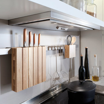
A functional vision for the backsplash. The house of LEICHT has designed the MODO system, focusing on the exciting contrast of metal and natural wood. It will enhance every modern kitchen with it's clear lines and puristic form language. It provides easy access to the required cooking utensils and eases the straight lined kitchen architecture at the same time.
A horizontal square railing of stainless steel colored aluminium screwed directly onto the niche back wall, provides the basic support element. Several function elements in lacquered solid oak are suspended here in various positions. The choice of instruments: shelves, paper roll holders, hook rail, utensil holder and a knife block. Separate function items can also be used as a shelf for smaller items. All lighting developed and designed by LEICHT demonstrates energy efficiency class A+ UL listed and is thus highly efficient. premium LED light with 4100 K (Kelvin) luminous color.

 Pittet Architecturals
Inspiration for a mid-sized timeless white two-story stone house exterior remodel in Dallas
 Amy Troute Inspired Interior Design
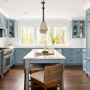
ATIID collaborated with these homeowners to curate new furnishings throughout the home while their down-to-the studs, raise-the-roof renovation, designed by Chambers Design, was underway. Pattern and color were everything to the owners, and classic “Americana” colors with a modern twist appear in the formal dining room, great room with gorgeous new screen porch, and the primary bedroom. Custom bedding that marries not-so-traditional checks and florals invites guests into each sumptuously layered bed. Vintage and contemporary area rugs in wool and jute provide color and warmth, grounding each space. Bold wallpapers were introduced in the powder and guest bathrooms, and custom draperies layered with natural fiber roman shades ala Cindy’s Window Fashions inspire the palettes and draw the eye out to the natural beauty beyond. Luxury abounds in each bathroom with gleaming chrome fixtures and classic finishes. A magnetic shade of blue paint envelops the gourmet kitchen and a buttery yellow creates a happy basement laundry room. No detail was overlooked in this stately home - down to the mudroom’s delightful dutch door and hard-wearing brick floor.
Photography by Meagan Larsen Photography
Sponsored
Columbus, OH

Trish Takacs Design
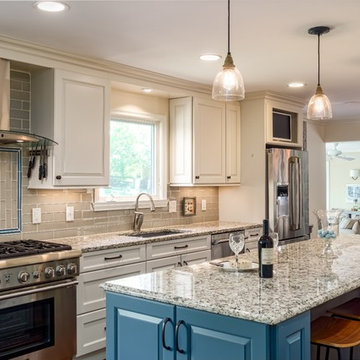
Award Winning & Highly Skilled Kitchen & Bath Designer in Columbus
 Turnbull Griffin Haesloop
David Wakely
Small trendy medium tone wood floor bedroom photo in San Francisco with white walls
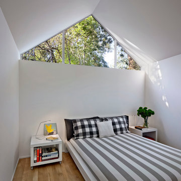
Small trendy medium tone wood floor bedroom photo in San Francisco with white walls
 Regency Custom Homes
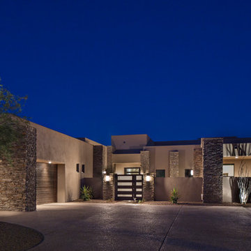
This desert contemporary custom home of 4200 sqft., has a host of exciting elements into one comfortably-sized package. The 320 square feet of motorized, retractable glass overlooks a natural desert preserve along the rear of the custom home, making a seamless, beautiful view. The clean lines of the modern kitchen with various textures and materials are framed by rough-cut ledge stone which complements the extensive use of stone on the exterior. A conversation area centered around a dramatic fire element provides the focus for the back yard, with a playful splash pad and fountain in the front courtyard. The side yard is complete with a formal dining area, BBQ, Green Egg smoker, sink, fridge, TV, and recessed linear heat lamps. Back inside, there is a home theater that provides a retreat during the summer monsoon season.
 Coco Maison Design
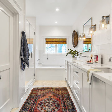
We combined crisp white interiors with exciting elements to enliven this bathroom.
Project designed by Courtney Thomas Design in La Cañada. Serving Pasadena, Glendale, Monrovia, San Marino, Sierra Madre, South Pasadena, and Altadena.
For more about Courtney Thomas Design, click here: https://www.courtneythomasdesign.com/
To learn more about this project, click here:
https://www.courtneythomasdesign.com/portfolio/shepherds-lane-la-canada-residence/
 Skill Construction & Design, LLC
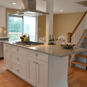
There are so many design elements to this kitchen, I almost don’t know where to start. Bright and airy with crisp clean white cabinets, the kitchen is open and welcoming. Still crisp but gently contrasting, the stainless steel appliance add depth amid the white. To keep this kitchen warm, natural oak covers the floors and a toasted wheat color washes the walls. And then there is the architectural elements. You know. That post and beam in the middle of the room. It’s the center of attention.
When you walk into a room your eyes roam around, establishing the size and shape of the room as your feet take you forward. From the front door of this home straight ahead you encountered this wall. The dining area to the right gives you a glimpse of things to come. Where there is a dining room you will usually find a kitchen.
The architecture of years gone by consistently hides the kitchen, the heart of the home, behind walls. I sympathize with my Mom, and all the other Moms, who have had to spend so much time tucked into a tight kitchen, away from the family. This wall had to go, but it was structural. We needed its support but not its bulk.
So we got rid of the bulk and only the bulk. Instead of a wall we have a post and beam, offering all of the structure we need. We could have installed a huge steel beam and reconfigure the joists to upset the beam, but why? The small beam and post add an incredible architectural element. It’s turning lemons into lemon, we simply made the most of what we had. It may be functional but it’s so fantastic. It looks like we created the effect just for the drama.
The original kitchen may have had a working triangle and some counter space, but it was fairly small, with each area only a step or two away. The dark cabinets made the space feel even smaller and the butcher block patterned laminate counter tops were very dated. The appliances were feeling their age as well, from a coil burner electric stove to a top freezer refrigerator. To keep this kitchen within its space, a half wall separated it from the dining area.
With the wall gone we borrowed some space from the living room and extended what was a U shaped kitchen into an L. At the living room window we start our new kitchen. We kept a small part of the wall to support the other end of our decorative beam. Sandwiched between a large pantry and our new French door refrigerator, the wall disappears. With our new open floor plan a sizable island was in order.
We split our cooking areas and installed a continuous grill gas cooktop into the island. A sleek island hood takes care of exhaust and adds an extra element to our architectural feature. Under the cooktop we added over-sized drawers for pots and pan storage. The frameless cabinets from New River Cabinetry are maple, painted white, with the Herndon door style. With the cooktop safely nestled into our island, we still had to add an oven.
We used the space where the old range sat for a large single oven of stainless steel and glass. If it worked for one, why not two? We created a home for a microwave in the wall cabinets. It’s perfect for heating leftovers so close to the refrigerator.
An important consideration for hot spots in your kitchen is landing zones. Each of our cooking areas have generous landing zones, one on each side of the cooktop and an entire counter area above or below the ovens, depending on which one you’re using.
We wanted to give the sink area more room so the half wall had to come out. We moved the trash and recycle cans into a cabinet, removed the heavy soffits and kept the sink under the window.
With that little bit of extra space we were able to add a larger cabinet above the dishwasher and slide it all down. This used to be where the carpeting met the vinyl floor, but all of it is gone. Long oak planks eliminate that final divide between the kitchen and the dining area, while adding visual length to the area. White wall cabinets on each side of the window reflect the sunlight for a brighter view.
With all of the darker cabinetry the backsplash walls had been painted white. Even still, there was a darkness in the corners and it wasn’t very exciting. We wanted to add visual interest and reflect the new under-cabinet lighting, eliminating the shadows in this corner.
With 1″x 2″ Arabescato Honed marble mosaics and those under-cabinet lights, we achieved the perfect balance. The marble has subtle swirls in gray and beige on a clean white background, but with the honed finish the light is softly reflected instead of glaring. For granite, we chose the soft gray tones of Luna Pearl. The speckles of gray and beige are a gentle contrast to the white cabinets and emulate the color of the stainless steel.
Between the carpet, red half wall, dark railing and dated light fixture, the dining area felt tired. Since the kitchen lacked sufficient storage, a large utility cabinet crowded the table space without adding any decorate elements.
Although it didn’t get any bigger, our dining area feels fresher and more open too. With the oak flooring joining the area to the rest of our space and the toasted wheat on the walls, the white table and chairs compliment the cabinetry while contrasting the warmer colors. We replaced the chandelier with recessed lighting and changed that railing too.
With our new open floor plan, we ended up with a fairly open area in between our foyer closet and the living room window. Not one to miss an opportunity, we filled the space with a multi-functional work space.
With the sunlight streaming in this bright corner works for anything this family needs.
There’s plenty of space for a chair under this large desk drawer. A closed cabinet below, glass doors above and lots of open shelving let you store and or showcase your belongings. We added a lite area at the top to keep away the darker corners.
The transformation is complete. This kitchen and all of its features are truly the center of attention in this home.
http://www.designsbyskill.com/
http://www.rjkconstructioninc.com/
 Joy Street Design
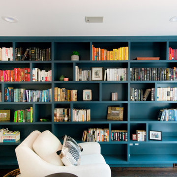
This San Carlos home features exciting design elements like bold, floral wallpaper, and floor-to-ceiling bookcases in navy blue:
---
Designed by Oakland interior design studio Joy Street Design. Serving Alameda, Berkeley, Orinda, Walnut Creek, Piedmont, and San Francisco.
For more about Joy Street Design, click here: https://www.joystreetdesign.com/
To learn more about this project, click here:
https://www.joystreetdesign.com/portfolio/bold-design-powder-room-study
 Integral Design Interiors
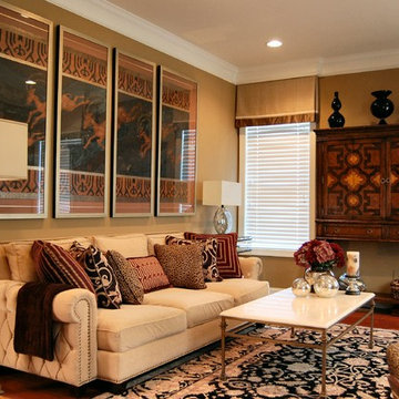
This elegant townhouse is rich in detail and has traditional and contemporary elements which adds a timeless appeal. A mix of oriental and transitional area rugs provide the groundwork for which each room . We provided an interesting mix of patterns and textures on the pillows and upholstery to add excitement to the basically neutral space, with pops of color. Custom molding was applied to the dining room ceiling that is right off the entry. No one enters without commenting on this element. As elegant as it looks the client wanted a comfortable feel and was extremely happy with the results.

Sponsored
Columbus, OH

Wannemacher Interiors
Customized Award-Winning Interior Design Solutions in Franklin Cnty OH
 Regency Custom Homes
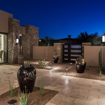
This desert contemporary custom home of 4200 sqft., has a host of exciting elements into one comfortably-sized package. The 320 square feet of motorized, retractable glass overlooks a natural desert preserve along the rear of the custom home, making a seamless, beautiful view. The clean lines of the modern kitchen with various textures and materials are framed by rough-cut ledge stone which complements the extensive use of stone on the exterior. A conversation area centered around a dramatic fire element provides the focus for the back yard, with a playful splash pad and fountain in the front courtyard. The side yard is complete with a formal dining area, BBQ, Green Egg smoker, sink, fridge, TV, and recessed linear heat lamps. Back inside, there is a home theater that provides a retreat during the summer monsoon season.
 TKS Design Group
Download our free ebook, Creating the Ideal Kitchen. DOWNLOAD NOW
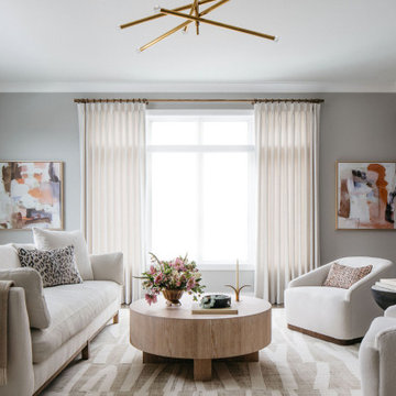
This client came to us to furnish her new home after having hired us for interior design and furnishings for her previous home. This home, located near downtown Elmhurst, IL, needed the works -- furnishings, paint, and art throughout. Since we worked with her previously, we had a good idea of the client’s design aesthetic and were excited to create something new and fresh!
New construction allows a blank slate for interior design, but it can lack in personality. Our client’s goals were to bring warmth and textural elements into her new home. We were most excited to curate artwork for each of the rooms while creating complimentary flow between the pieces and throughout the open floor plan on the main living area.
First, we set the mood with a muted color palette. Next, we added layers of texture with contrasting fabrics and rugs to really make a statement in this new construction home. Add in curated abstract artwork, coordinating lighting, and voila! a welcoming home ready for new memories!
Photographer: @MargaretRajic
Photo stylist: @Brandidevers
Do you have a new home that has great bones but just doesn’t feel comfortable and you can’t quite figure out why? Contact us here to see how we can help!
 Skill Construction & Design, LLC
There are so many design elements to this kitchen, I almost don’t know where to start. Bright and airy with crisp clean white cabinets, the kitchen is open and welcoming. Still crisp but gently contrasting, the stainless steel appliance add depth amid the white. To keep this kitchen warm, natural oak covers the floors and a toasted wheat color washes the walls. And then there is the architectural elements. You know. That post and beam in the middle of the room. It’s the center of attention.
When you walk into a room your eyes roam around, establishing the size and shape of the room as your feet take you forward. From the front door of this home straight ahead you encountered this wall. The dining area to the right gives you a glimpse of things to come. Where there is a dining room you will usually find a kitchen.
The architecture of years gone by consistently hides the kitchen, the heart of the home, behind walls. I sympathize with my Mom, and all the other Moms, who have had to spend so much time tucked into a tight kitchen, away from the family. This wall had to go, but it was structural. We needed its support but not its bulk.
So we got rid of the bulk and only the bulk. Instead of a wall we have a post and beam, offering all of the structure we need. We could have installed a huge steel beam and reconfigure the joists to upset the beam, but why? The small beam and post add an incredible architectural element. It’s turning lemons into lemon, we simply made the most of what we had. It may be functional but it’s so fantastic. It looks like we created the effect just for the drama.
The original kitchen may have had a working triangle and some counter space, but it was fairly small, with each area only a step or two away. The dark cabinets made the space feel even smaller and the butcher block patterned laminate counter tops were very dated. The appliances were feeling their age as well, from a coil burner electric stove to a top freezer refrigerator. To keep this kitchen within its space, a half wall separated it from the dining area.
With the wall gone we borrowed some space from the living room and extended what was a U shaped kitchen into an L. At the living room window we start our new kitchen. We kept a small part of the wall to support the other end of our decorative beam. Sandwiched between a large pantry and our new French door refrigerator, the wall disappears. With our new open floor plan a sizable island was in order.
We split our cooking areas and installed a continuous grill gas cooktop into the island. A sleek island hood takes care of exhaust and adds an extra element to our architectural feature. Under the cooktop we added over-sized drawers for pots and pan storage. The frameless cabinets from New River Cabinetry are maple, painted white, with the Herndon door style. With the cooktop safely nestled into our island, we still had to add an oven.
We used the space where the old range sat for a large single oven of stainless steel and glass. If it worked for one, why not two? We created a home for a microwave in the wall cabinets. It’s perfect for heating leftovers so close to the refrigerator.
An important consideration for hot spots in your kitchen is landing zones. Each of our cooking areas have generous landing zones, one on each side of the cooktop and an entire counter area above or below the ovens, depending on which one you’re using.
We wanted to give the sink area more room so the half wall had to come out. We moved the trash and recycle cans into a cabinet, removed the heavy soffits and kept the sink under the window.
With that little bit of extra space we were able to add a larger cabinet above the dishwasher and slide it all down. This used to be where the carpeting met the vinyl floor, but all of it is gone. Long oak planks eliminate that final divide between the kitchen and the dining area, while adding visual length to the area. White wall cabinets on each side of the window reflect the sunlight for a brighter view.
With all of the darker cabinetry the backsplash walls had been painted white. Even still, there was a darkness in the corners and it wasn’t very exciting. We wanted to add visual interest and reflect the new under-cabinet lighting, eliminating the shadows in this corner.
With 1″x 2″ Arabescato Honed marble mosaics and those under-cabinet lights, we achieved the perfect balance. The marble has subtle swirls in gray and beige on a clean white background, but with the honed finish the light is softly reflected instead of glaring. For granite, we chose the soft gray tones of Luna Pearl. The speckles of gray and beige are a gentle contrast to the white cabinets and emulate the color of the stainless steel.
Between the carpet, red half wall, dark railing and dated light fixture, the dining area felt tired. Since the kitchen lacked sufficient storage, a large utility cabinet crowded the table space without adding any decorate elements.
Although it didn’t get any bigger, our dining area feels fresher and more open too. With the oak flooring joining the area to the rest of our space and the toasted wheat on the walls, the white table and chairs compliment the cabinetry while contrasting the warmer colors. We replaced the chandelier with recessed lighting and changed that railing too.
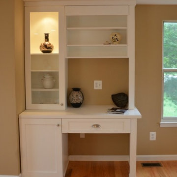
With our new open floor plan, we ended up with a fairly open area in between our foyer closet and the living room window. Not one to miss an opportunity, we filled the space with a multi-functional work space.
With the sunlight streaming in this bright corner works for anything this family needs.
There’s plenty of space for a chair under this large desk drawer. A closed cabinet below, glass doors above and lots of open shelving let you store and or showcase your belongings. We added a lite area at the top to keep away the darker corners.
The transformation is complete. This kitchen and all of its features are truly the center of attention in this home.
http://www.designsbyskill.com/
http://www.rjkconstructioninc.com/
 Coco Maison Design
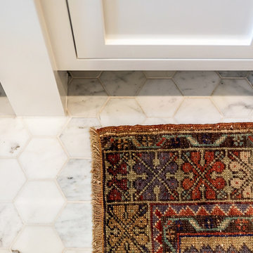
We combined crisp white interiors with exciting elements to enliven this bathroom.
Project designed by Courtney Thomas Design in La Cañada. Serving Pasadena, Glendale, Monrovia, San Marino, Sierra Madre, South Pasadena, and Altadena.
For more about Courtney Thomas Design, click here: https://www.courtneythomasdesign.com/
To learn more about this project, click here:
https://www.courtneythomasdesign.com/portfolio/shepherds-lane-la-canada-residence/
Sponsored
Columbus, OH
Trish Takacs Design
Award Winning & Highly Skilled Kitchen & Bath Designer in Columbus
 Regency Custom Homes
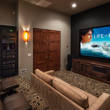
This desert contemporary custom home of 4200 sqft., has a host of exciting elements into one comfortably-sized package. The 320 square feet of motorized, retractable glass overlooks a natural desert preserve along the rear of the custom home, making a seamless, beautiful view. The clean lines of the modern kitchen with various textures and materials are framed by rough-cut ledge stone which complements the extensive use of stone on the exterior. A conversation area centered around a dramatic fire element provides the focus for the back yard, with a playful splash pad and fountain in the front courtyard. The side yard is complete with a formal dining area, BBQ, Green Egg smoker, sink, fridge, TV, and recessed linear heat lamps. Back inside, there is a home theater that provides a retreat during the summer monsoon season.

 Skill Construction & Design, LLC
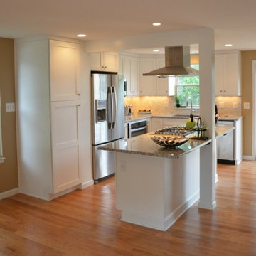
There are so many design elements to this kitchen, I almost don’t know where to start. Bright and airy with crisp clean white cabinets, the kitchen is open and welcoming. Still crisp but gently contrasting, the stainless steel appliance add depth amid the white. To keep this kitchen warm, natural oak covers the floors and a toasted wheat color washes the walls. And then there is the architectural elements. You know. That post and beam in the middle of the room. It’s the center of attention.
When you walk into a room your eyes roam around, establishing the size and shape of the room as your feet take you forward. From the front door of this home straight ahead you encountered this wall. The dining area to the right gives you a glimpse of things to come. Where there is a dining room you will usually find a kitchen.
The architecture of years gone by consistently hides the kitchen, the heart of the home, behind walls. I sympathize with my Mom, and all the other Moms, who have had to spend so much time tucked into a tight kitchen, away from the family. This wall had to go, but it was structural. We needed its support but not its bulk.
So we got rid of the bulk and only the bulk. Instead of a wall we have a post and beam, offering all of the structure we need. We could have installed a huge steel beam and reconfigure the joists to upset the beam, but why? The small beam and post add an incredible architectural element. It’s turning lemons into lemon, we simply made the most of what we had. It may be functional but it’s so fantastic. It looks like we created the effect just for the drama.
The original kitchen may have had a working triangle and some counter space, but it was fairly small, with each area only a step or two away. The dark cabinets made the space feel even smaller and the butcher block patterned laminate counter tops were very dated. The appliances were feeling their age as well, from a coil burner electric stove to a top freezer refrigerator. To keep this kitchen within its space, a half wall separated it from the dining area.
With the wall gone we borrowed some space from the living room and extended what was a U shaped kitchen into an L. At the living room window we start our new kitchen. We kept a small part of the wall to support the other end of our decorative beam. Sandwiched between a large pantry and our new French door refrigerator, the wall disappears. With our new open floor plan a sizable island was in order.
We split our cooking areas and installed a continuous grill gas cooktop into the island. A sleek island hood takes care of exhaust and adds an extra element to our architectural feature. Under the cooktop we added over-sized drawers for pots and pan storage. The frameless cabinets from New River Cabinetry are maple, painted white, with the Herndon door style. With the cooktop safely nestled into our island, we still had to add an oven.
We used the space where the old range sat for a large single oven of stainless steel and glass. If it worked for one, why not two? We created a home for a microwave in the wall cabinets. It’s perfect for heating leftovers so close to the refrigerator.
An important consideration for hot spots in your kitchen is landing zones. Each of our cooking areas have generous landing zones, one on each side of the cooktop and an entire counter area above or below the ovens, depending on which one you’re using.
We wanted to give the sink area more room so the half wall had to come out. We moved the trash and recycle cans into a cabinet, removed the heavy soffits and kept the sink under the window.
With that little bit of extra space we were able to add a larger cabinet above the dishwasher and slide it all down. This used to be where the carpeting met the vinyl floor, but all of it is gone. Long oak planks eliminate that final divide between the kitchen and the dining area, while adding visual length to the area. White wall cabinets on each side of the window reflect the sunlight for a brighter view.
With all of the darker cabinetry the backsplash walls had been painted white. Even still, there was a darkness in the corners and it wasn’t very exciting. We wanted to add visual interest and reflect the new under-cabinet lighting, eliminating the shadows in this corner.
With 1″x 2″ Arabescato Honed marble mosaics and those under-cabinet lights, we achieved the perfect balance. The marble has subtle swirls in gray and beige on a clean white background, but with the honed finish the light is softly reflected instead of glaring. For granite, we chose the soft gray tones of Luna Pearl. The speckles of gray and beige are a gentle contrast to the white cabinets and emulate the color of the stainless steel.
Between the carpet, red half wall, dark railing and dated light fixture, the dining area felt tired. Since the kitchen lacked sufficient storage, a large utility cabinet crowded the table space without adding any decorate elements.
Although it didn’t get any bigger, our dining area feels fresher and more open too. With the oak flooring joining the area to the rest of our space and the toasted wheat on the walls, the white table and chairs compliment the cabinetry while contrasting the warmer colors. We replaced the chandelier with recessed lighting and changed that railing too.
With our new open floor plan, we ended up with a fairly open area in between our foyer closet and the living room window. Not one to miss an opportunity, we filled the space with a multi-functional work space.
With the sunlight streaming in this bright corner works for anything this family needs.
There’s plenty of space for a chair under this large desk drawer. A closed cabinet below, glass doors above and lots of open shelving let you store and or showcase your belongings. We added a lite area at the top to keep away the darker corners.
The transformation is complete. This kitchen and all of its features are truly the center of attention in this home.
http://www.designsbyskill.com/
http://www.rjkconstructioninc.com/
6