
Search results for "Existed" in Home Design Ideas
 Marts & Valentin Architects, LTD
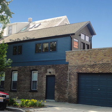
The roof was raised on an existing attic to create a new living dining room space attached to the back of the existing storefront. The existing building was too large for the Bucktown small lot and a zoning variance was required to build the addition. The non-conforming, small lot, big house condition existed before 1957. The variance allowed an additional 15% in square feet.
 Division 9 Inc.
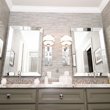
The guest bathroom plays an important role on how your guests will perceive the architecture and style of your home. In this house we totally transformed the outdated bathroom. In collaboration with Roberto Lugo a daring designer from New York, the design process was focused on creating a contemporary space that could be elegant and comfortable.
The initial renovation on this project started with the demolition of entire bathroom including doors, vanity, floor, plumbing and light fixture, toilet, tub, tile switches and outlet. An existing wall between toilet/shower room and vanity room was also removed. The existing door frame was expanded to 27" wide (interior) and the existing floor was inspected to determine a depression on the vanity side.
The existing door frame was converted into a pocket door frame (door opens to the right). To accommodate for standard crown molding the ceiling above the shower was dropped 4".
For the vanity, a furniture-like cabinet style with soft close hardware was installed. The grain stain was paired perfectly with a gray marble countertop.
The shower turned out beautifully. A Shower/Bathtub combination with a sliding door was installed. Porcelain tile was installed vertically on the returns walls, glass mosaic for the long walls, glass mosaic was also used along leading edge of tub enclosure. Porcelain tile was used on the floor.
 Main Street Custom Homes & Remodeling
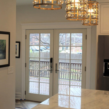
Restorative work was completed on every level of this 4-floor home to make it better suited for modern-day living while retaining the rich character of this historic building. To expand the kitchen and make a designated mudroom/entry area, the back of the house was squared up and fully enclosed. French doors were installed to provide comfortable access into the new space from the existing deck, infusing the remodeled kitchen with much needed natural light.
A 2nd floor spare bedroom was transformed into a spacious on-suite master bathroom with walk-in closet and laundry facilities. The master bathroom features polished white Carrara marble tile, elegant pedestal sinks and an over-sized shower. On the 3rd floor, two existing dormers were connected to form a larger single dormer and adjacent closet areas were re-designed to create a new hall bathroom. A basement level addition was dug out with new foundation to create a small storage and work area off the existing finished space.
In order to add air conditioning to the house, avoiding significant disturbance to the existing structure, a high velocity system was installed which uses narrow tubing rather than the traditional large ductwork. In addition, the entire interior of the home was painted a soft neutral gray, making the home bright and inviting while the original wood floors were refinished in a dark warm contrasting color.
Find the right local pro for your project
 Xtreme Renovations, LLC
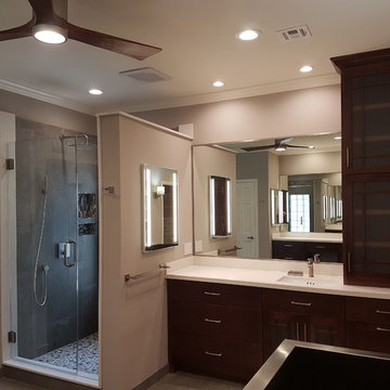
Xtreme Renovations, LLC has completed another amazing Master Bathroom Renovation for our repeat clients in Lakewood Forest/NW Harris County.
This Project required transforming a 1970’s Constructed Roman Themed Master Bathroom to a Modern State-of-the-Art Master Asian-inspired Bathroom retreat with many Upgrades.
The demolition of the existing Master Bathroom required removing all existing floor and shower Tile, all Vanities, Closest shelving, existing Sky Light above a large Roman Jacuzzi Tub, all drywall throughout the existing Master Bath, shower enclosure, Columns, Double Entry Doors and Medicine Cabinets.
The Construction Phase of this Transformation included enlarging the Shower, installing new Glass Block in Shower Area, adding Polished Quartz Shower Seating, Shower Trim at the Shower entry and around the Shower enclosure, Shower Niche and Rain Shower Head. Seamless Glass Shower Door was included in the Upgrade.
New Drywall was installed throughout the Master Bathroom with major Plumbing upgrades including the installation of Tank Less Water Heater which is controlled by Blue Tooth Technology. The installation of a stainless Japanese Soaking Tub is a unique Feature our Clients desired and added to the ‘Wow Factor’ of this Project.
New Floor Tile was installed in the Master Bathroom, Master Closets and Water Closet (W/C). Pebble Stone on Shower Floor and around the Japanese Tub added to the Theme our clients required to create an Inviting and Relaxing Space.
Custom Built Vanity Cabinetry with Towers, all with European Door Hinges, Soft Closing Doors and Drawers. The finish was stained and frosted glass doors inserts were added to add a Touch of Class. In the Master Closets, Custom Built Cabinetry and Shelving were added to increase space and functionality. The Closet Cabinetry and shelving was Painted for a clean look.
New lighting was installed throughout the space. LED Lighting on dimmers with Décor electrical Switches and outlets were included in the Project. Lighted Medicine Cabinets and Accent Lighting for the Japanese Tub completed this Amazing Renovation that clients desired and Xtreme Renovations, LLC delivered.
Extensive Drywall work and Painting completed the Project. New sliding entry Doors to the Master Bathroom were added.
From Design Concept to Completion, Xtreme Renovations, LLC and our Team of Professionals deliver the highest quality of craftsmanship and attention to details. Our “in-house” Design Team, attention to keeping your home as clean as possible throughout the Renovation Process and friendliness of the Xtreme Team set us apart from others. Contact Xtreme Renovations, LLC for your Renovation needs. At Xtreme Renovations, LLC, “It’s All In The Details”.
 Bespoke Builders
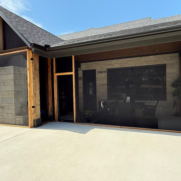
This custom screened-in patio in Central Texas transformed an existing covered outdoor area into a more comfortable and functional living space that can be enjoyed throughout more of the year. Bespoke Builders TX enclosed the patio using stained cedar framing and the ScreenEze screening system, creating a clean, durable finish that complements the home’s existing stone, rooflines, and outdoor architecture.
The enclosure was designed to preserve the open-air feel of the patio while providing protection from mosquitoes, insects, and debris. Large screened openings maintain clear views of the backyard and allow plenty of natural airflow, while the cedar framing adds warmth and architectural character to the space.
The finished patio also retains the existing outdoor fireplace, ceiling fans, recessed lighting, and tongue-and-groove wood ceiling, creating a comfortable outdoor room for relaxing, dining, and entertaining.
Bespoke Builders TX provides screened-in patio construction, ScreenEze installation, cedar framing, patio enclosures, porch remodeling, and outdoor living construction throughout Central Texas. We design custom screen enclosures around the existing home so the finished space feels like an intentional extension of the original architecture rather than an add-on.
 Ronnette Riley Architect
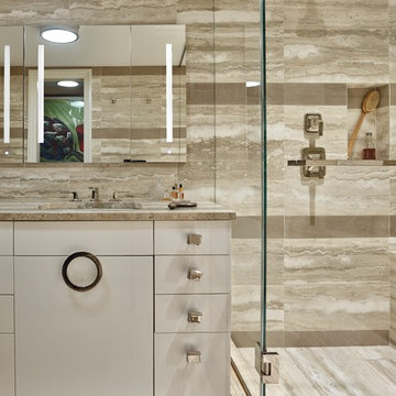
The existing 90 square foot galley kitchen was small and narrow, with limited storage and counterspace. By utilizing the hallway and master closet opposite, we expanded the kitchen across the hall, creating a 5’-6”x 2’-0”x 7’-0” niche for the Subzero refrigerator and under counter wine storage unit. The existing kitchen doorway was widened to unify the two spaces. Separating the tall elements from the original galley, the new design was able to provide uninterrupted counterspace and extra storage. Because of its proximity to the living area, the niche is also able to serve a dual role as an easily accessible bar with glass storage above when the client is entertaining.
Modern, high-gloss cabinetry was extended to the ceiling, replacing the existing traditional millwork and capitalizing on previously unused space. An existing breakfast nook with a view of the East River, which had been one of the client’s favorite features, was awkwardly placed and provided for tight and uncomfortable seating. We rebuilt the banquettes, pushing them back for easier access and incorporating hidden storage compartments into the seats.
 TKS Design Group
Download our free ebook, Creating the Ideal Kitchen. DOWNLOAD NOW
As with most projects, it all started with the kitchen layout. The home owners came to us wanting to upgrade their kitchen and overall aesthetic in their suburban home, with a combination of fresh paint, updated finishes, and improved flow for more ease when doing everyday activities.
A monochromatic, earth-toned palette left the kitchen feeling uninspired. It lacked the brightness they wanted from their space. An eat-in table underutilized the available square footage. The butler’s pantry was out of the way and hard to access, and the dining room felt detached from the kitchen.
Lead Designer, Stephanie Cole, saw an improved layout for the spaces that were no longer working for this family. By eliminating an existing wall between the kitchen and dining room, and relocating the bar area to the dining room, we opened up the kitchen, providing all the space we needed to create a dreamy and functional layout. A new perimeter configuration promoted circulation while also making space for a large and functional island loaded with seating – a must for any family. Because an island that isn’t big enough for everyone (and a few more) is a recipe for disaster. The light white cabinetry is fresh and contrasts with the deeper tones in the wood flooring, creating a modern aesthetic that is elevated, yet approachable for everyday living.
With better flow as the overarching goal, we made some structural changes too. To remove a bottleneck in the entryway, we angled one of the dining room walls to create more natural separation between rooms and facilitate ease of movement throughout the large space.
At The Kitchen Studio, we believe a well-designed kitchen uses every square inch to the fullest. By starting from scratch, it was possible to rethink the entire kitchen layout and design the space according to how it is used, because the kitchen shouldn’t make it harder to feed the family. A new location for the existing range, flanked by a new column refrigerator and freezer on each side, worked to anchor the space. The very large and very spacious island (a dream island if we do say so ourselves) now houses the primary sink and provides ample space for food prep and family gathering.
The new kitchen table and coordinating banquette seating provide a cozy nook for quick breakfasts before school or work, and evening homework sessions. Elegant gold details catch the natural light, elevating the aesthetic.
The dining room was transformed into one of this client’s favorite spaces and we couldn’t agree more. We saw an opportunity to give the dining room a more distinguished identity by closing off the entrance from the foyer. The relocated wet bar enhances the sophisticated vibe of this gathering space, complete with beautiful antique mirror tiles and open shelving encased by moody built-in cabinets.
Updated furnishings add warmth. A rich walnut table is paired with custom chairs in a muted coral fabric. The large, transitional chandelier grounds the room, pairing beautifully with the gold finishes prevalent in the faucet and cabinet hardware. Linen-inspired wallpaper and cream-toned window treatments add to the glamorous feel of this entertainment space.
There is no way around it. The laundry room was cramped. The large washer and dryer blocked access to the sink and left little room for the space to serve its other essential function – as a mudroom. Because we reworked the kitchen layout to create more space overall, we could rethink the mudroom too – an essential for any busy family. The first step was moving the washer and dryer to an existing area on the second floor, where most of the family’s laundry lives (no one wants to carry laundry up and down the stairs if they don’t have to anyway). This is a more functional solution and opened up the space for all the mudroom necessities – including the existing kitchen refrigerator, loads of built-in cubbies, and a bench.
It’s hard to not fall in love with every detail of a new space, especially when it serves your day-to-day life. But that doesn’t mean the clients didn’t have their favorite features they use on the daily. This remodel was focused largely on function with a new kitchen layout. And it’s the functional features that have the biggest impact. The large island provides much needed workspace in the kitchen and is a spot where everyone gathers together – it grounds the space and the family. And the custom counter stools are the icing on the cake. The nearby mudroom has everything their previous space was lacking – ample storage, space for everyone’s essentials, and the beloved cement floor tiles that are both durable and artistic.

Sponsored
Columbus, OH

Hope Restoration & General Contracting
Columbus Design-Build, Kitchen & Bath Remodeling, Historic Renovations
 JRP Design & Remodel
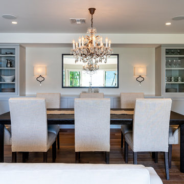
For three years this Westlake Village couple lived in a house that didn't quite fit their needs. With frequent houseguests staying for weeks at a time, the family needed more space, particularly in the cramped kitchen. So began their search for a new home. Though the couple viewed several residences, they realized nothing compared to the space and location of the house they already owned. The family knew JRP by reputation from friends who were JRP clients. After consulting with our team, the couple agreed a whole-home renovation was the way to the dream home they had been searching for. Inspired by top architectural magazines, the couple had a clear vision of how their home should look and feel: a clean, open, modern space with a mix of details that played to the family's lively spirit.
The highlight of this new, open floorplan home is the gorgeous kitchen perfect for hosting. The unified palette is soft and beautiful. Clean, bright surfaces underpin strong visual elements such as polished quartz countertops, brushed oak floors, and glass tiles set in a herringbone pattern. A center-island breakfast bar now sits opposite a giant picture window and a show-stopping view of the Santa Monica mountains. Upstairs, the redesigned master bath is what dreams are made of. The double vanity and freestanding tub were rearranged to maximize space while the wood tile floors and stunning rock backsplash add an elemental feel. Now completely transformed, every detail of this transitional home creates the perfect atmosphere for relaxing and entertaining.
Cabinets (Manufacturer, Door Style, Material, Color/Stain or Finish)
- Dewils, Shaker Frameless, Maple, Just White
- Dewils, Shaker Frameless, Maple, Fashion Grey
- Dewils, Shaker Frameless, Maple, North Sea
Countertops (Material Type - Manufacturer, Collection, Color)
- Quartz – Vadara, Toledo, Calacatta Dorado
Light Fixture (Type - Manufacturer, Collection, Color)
- Dining Chandelier – Existing
- Breakfast Area Pendant – 1213 Madison Collection, Polished Nickel/Royal Cut Crystal
- Dining Wall Mount Sconce – Heart Sconce, Aged Iron with Natural Percale
- Kitchen Island Pendant – Darlana, Polished Chrome
- Master Bath Ceiling – Bling Flushmount
- Master Bath Vanity – Robert Abbey Fine Lighting Double Shade Bath, Polished Nickel over Steel
- Exterior – Primo Lanterns, The Yorkshire Electric Lantern, Custom Graphite Finish
Plumbing Fixture (Type - Manufacturer, Color)
- Freestanding Tub – Existing
- Tubfiller – Existing
- Master Bath Faucets – Existing
- Kitchen Faucets – Hansgrohe, Chrome
Sink (Type – Manufacturer, Material)
- Undermount Single Bowl Kitchen– Kohler, Stainless Steel
- Undermount Single Prep – Elkay, Stainless Steel
- Undermount Bar Sink – Kohler, Stainless Steel
- Ladena Undermount Lavatory – Kohler, Ceramic
Hardware (Type – Manufacturer, Color)
- Deadbolt – Emtek, Satin Nickel
- Dummy - Emtek, Satin Nickel
- Passage & Privacy - Emtek, Stainless Steel
Color of wall:
- Kitchen, Breakfast Area, Family Room – Dunn Edwards Edgecomb Grey
- Master Bath – Dunn Edwards Foggy Day
- Living and Dining – Dunn Edwards Winter Morning
Tile (Location: Material Type – Manufacturer, Collection/Style, Color)
- KITCHEN BACKSPLASH: Glass - Ann Sacks, Jute, Ecru/Gloss
- MASTER BATH FLOORS, TUB ACCENT WALL, & HALL BATH FLOORS: Porcelain – Bedrosians, Tahoe, Frost/Glazed
- ACCENT WALL BEHIND TUB: Mosaic – Daltile, Flat River Pebble, Creamy Sand
- FIREPLACE FLOOR: Porcelain Tile - Agora Surfaces, Almeria, Lava/Matte
Stone/Masonry (Location: Material Type – Manufacturer, Collection/Style, Color)
- FIREPLACE: Stone Veneer – Eldorado, European Ledge, Zinc/Dry Stacked
Wood Floor (Type – Manufacturer, Collection/Style, Color/Wash)
- Siberian Oak – Provenza, Heirloom, Light Wire Brushed
Windows/Exterior Doors (Type - Manufacturer)
- 2 Wide Casement – Jeld-Wen
- 3 Wide Casement – Jeld-Wen
- Awning – Jeld-Wen
- Single Casement – Jeld-Wen
- Stationary – Jeld-Wen
Photographer: Andrew Abouna
 Michael Nash Design, Build & Homes
2012 NATIONAL NARI COTY SOUTHEAST REGIONAL AWARD WINNER, RESIDENTIAL INTERIOR SPECIALTY
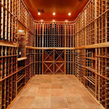
Scope: Creative design in converting a plain basement storage space into a wine cellar and tasting room for a couple that is changing their basement over to an adult “play” space. The basement already has a movie theater, exercise room, and a game table. They have been visiting local wineries and collecting for a future wine cellar of their own.
Needed to work around the existing ductwork for the main level, tie into the electrical panel and HVAC system, move the hot water heater and furnace with associated ductwork, and hide the sump pump in the corner. They also wanted an upgraded look in the cabinetry and shelving. The space needed to be insulated and waterproofed to maintain constant temperature.
We connected to the existing electrical system, adding a split cooling system to their existing HVAC. The HVAC for the cellar has its own ductwork and compressor system, but ties into the existing system for drainage. These needed to be routed through the floor joists above. We ordered cabinetry and modified it to conceal the sump pump in the corner, as well as cut the racks to fit around the overhead duct work that cut across the middle of the ceiling. We installed mini LED lights along the shelving to give a glow so the labels could be read. The tasting table is upgraded to granite with a barrel curved edge, and shelving for larger bottles above.
Small touches added to the cabinetry and racks we ordered make this a custom designed cellar. Textures in the tile pick up on the wood grain of the mahogany racking. The custom insulated door has a frosted design. There are a variety of lights used, all on timer, including the LEDs, recessed and puck lights over the tasting area. The raised tumble limestone and the rest of the design, makes it unique to these homeowners.
 Kaplan Architects, AIA
Kaplan Architects, AIA
Location: Oakland, CA, USA
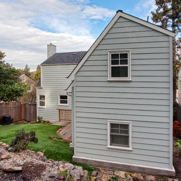
We were asked by the client to design an addition to their existing two story Cape Cod style house. The existing house had two bedrooms with one bath on the second level. They wanted to create an in-law type space for aging parents that would be easily accessible from the main level of the house. We looked at various ways to develop the extra space they wanted, including a separate detached in-law unit. They went with a scheme that has the new space attached to the back of the house. During the planning stage, they also decided to add a second level over the new addition which converted one of the existing bedrooms into a master bedroom suite. The final scheme has a new in-law suite at the ground level and a master bedroom, bath, walk-in closet, and bonus craft room on the second level.
We designed the addition to look like it was part of the original house construction and detailed the interior and exterior with that approach in mind.
New two story addition at the rear of the existing house.
Mitch Shenker Photography
 Jarrett Design
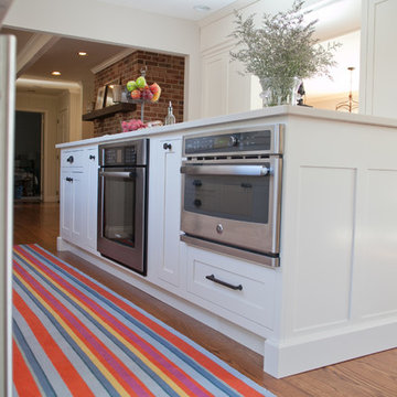
This remodel was a dated 1980s Cape Cod style home that desperately needed updating with the kitchen starting as the foundation for the rest of the home. The owners purchased the property in 2013 with the intent of replacing the existing kitchen installed in 2000, as well as updating most surfaces throughout the home. The space while moderately sized, felt cramped due to the L-shaped design and eat-in island that disrupted traffic flow from the mudroom, dining room and sliding doors to the patio. The owners knew they wanted to bring the light from the southern facing front of the home to the dark cave-like feeling of the kitchen. This was remedied by knocking down the wall between the existing dining room (now a lounge area), widening the entrance to the family room and creating a pathway to the existing formal living room (now the dining room). Also to create better traffic flow into the kitchen, the existing mudroom door was moved to the opposite side of the wall.
A large work island with cooktop, oven and convection/microwave was designed for efficiency and maintaining clean site lines. The work triangle allows for quick and easy meal prep and clean-up for the busy family. Space at the end of the kitchen was perfectly suited for a large kitchen table with views of the back yard, easy conversation with the cook at the island or those hanging in the newly appointed lounge area. The new doorway between the kitchen and dining room showcases the 10ft floor to ceiling bay window, allows more light to flood into the space and creates easy access between the two rooms for family gatherings. Given the home owners relocated to the area for job reasons and are not sure how long they will be in this home, we helped them achieve a balance of a design and finishes that they not only love, but would be appealing to many if another move was in their near future.
Matt Villano Photography
 Kaplan Architects, AIA
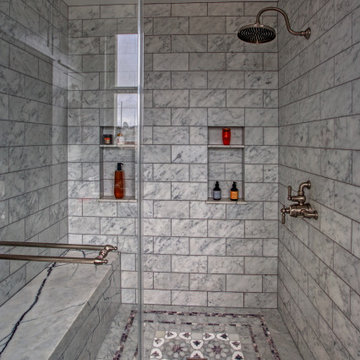
Our client purchased an apartment on the top floor of an old 1930’s building with expansive views of the San Francisco Bay from the palace of Fine Arts, Golden Gate Bridge, to Alcatraz Island. The existing apartment retained some of the original detailing and the owner wished to enhance and build on the existing traditional themes that existed there. We reconfigured the apartment to add another bedroom, relocated the kitchen, and remodeled the remaining spaces.
The design included moving the kitchen to free up space to add an additional bedroom. We also did the interior design and detailing for the two existing bathrooms. The master bath was reconfigured entirely.
We detailed and guided the selection of all of the fixtures, finishes and lighting design for a complete and integrated interior design of all of the spaces.
 TVL Creative Ltd.
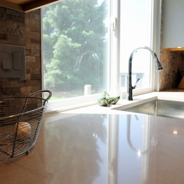
We absolutely love the final result of this unique, two-toned kitchen! Our clients came to us with the need for a lot of love in their kitchen. Their home, situated in the Fox Ridge neighboorhood of Centennial, is a lovely and spacious house with lots of potential. The kitchen, while very sizable, contained a number of super dated elements. Our goal was to give the kitchen a complete aesthetic facelift, but to also encourage better function in the kitchen. Our primary concern was disconnecting the existing (huge) peninsula and replacing it with a centralized island. This busy family of four will benefit from the gathering space the island provides. We worked with the existing ceiling condition to create a unique, recessed wood-clad ceiling that offers a gorgeous rustic aesthetic. The existing linoleum flooring was replaced with beautiful walnut hardwood. New cabinets were installed in a two-toned orientation. The upper cabinets are a soft stone gray and the lowers are a painted hazelnut. We've stacked cabinets next to the range to create a secondary pantry storage area, and repaired portions of the existing pantry to optimize shelving space and appearance. The kitchen also includes a new desk area integrated into the cabinet run for homework and to-do lists. A new large, singe-basin sink and pull-down faucet were installed, and the kitchen is brought together by the mini-stacked stone backsplash that brings texture and warmth to the room. We've offered durable and beautiful working surfaces by topping the cabinets with quartz countertops: MSI Boletus against the window wall and MSI Concerto on the island. We love the look the of this final result, but particularly love the optimized function that it offers this wonderful family!

Sponsored
Columbus, OH
Hope Restoration & General Contracting
Columbus Design-Build, Kitchen & Bath Remodeling, Historic Renovations
 Jarrett Design
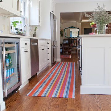
This remodel was a dated 1980s Cape Cod style home that desperately needed updating with the kitchen starting as the foundation for the rest of the home. The owners purchased the property in 2013 with the intent of replacing the existing kitchen installed in 2000, as well as updating most surfaces throughout the home. The space while moderately sized, felt cramped due to the L-shaped design and eat-in island that disrupted traffic flow from the mudroom, dining room and sliding doors to the patio. The owners knew they wanted to bring the light from the southern facing front of the home to the dark cave-like feeling of the kitchen. This was remedied by knocking down the wall between the existing dining room (now a lounge area), widening the entrance to the family room and creating a pathway to the existing formal living room (now the dining room). Also to create better traffic flow into the kitchen, the existing mudroom door was moved to the opposite side of the wall.
A large work island with cooktop, oven and convection/microwave was designed for efficiency and maintaining clean site lines. The work triangle allows for quick and easy meal prep and clean-up for the busy family. Space at the end of the kitchen was perfectly suited for a large kitchen table with views of the back yard, easy conversation with the cook at the island or those hanging in the newly appointed lounge area. The new doorway between the kitchen and dining room showcases the 10ft floor to ceiling bay window, allows more light to flood into the space and creates easy access between the two rooms for family gatherings. Given the home owners relocated to the area for job reasons and are not sure how long they will be in this home, we helped them achieve a balance of a design and finishes that they not only love, but would be appealing to many if another move was in their near future.
Matt Villano Photography
 Jarrett Design
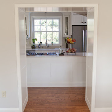
This remodel was a dated 1980s Cape Cod style home that desperately needed updating with the kitchen starting as the foundation for the rest of the home. The owners purchased the property in 2013 with the intent of replacing the existing kitchen installed in 2000, as well as updating most surfaces throughout the home. The space while moderately sized, felt cramped due to the L-shaped design and eat-in island that disrupted traffic flow from the mudroom, dining room and sliding doors to the patio. The owners knew they wanted to bring the light from the southern facing front of the home to the dark cave-like feeling of the kitchen. This was remedied by knocking down the wall between the existing dining room (now a lounge area), widening the entrance to the family room and creating a pathway to the existing formal living room (now the dining room). Also to create better traffic flow into the kitchen, the existing mudroom door was moved to the opposite side of the wall.
A large work island with cooktop, oven and convection/microwave was designed for efficiency and maintaining clean site lines. The work triangle allows for quick and easy meal prep and clean-up for the busy family. Space at the end of the kitchen was perfectly suited for a large kitchen table with views of the back yard, easy conversation with the cook at the island or those hanging in the newly appointed lounge area. The new doorway between the kitchen and dining room showcases the 10ft floor to ceiling bay window, allows more light to flood into the space and creates easy access between the two rooms for family gatherings. Given the home owners relocated to the area for job reasons and are not sure how long they will be in this home, we helped them achieve a balance of a design and finishes that they not only love, but would be appealing to many if another move was in their near future.
Matt Villano Photography

 BK Landscape Design
This garden project began with the demolition of an existing pool and decks cantilevered over a hillside. The garden was originally a Japanese-themed garden retreat and free-form shaped pool. While the client wanted to update and replace many elements, they sought to keep the free-form characteristics of the existing design and repurpose existing materials. BK Landscape Design created a new garden with revetment walls and steps to a succulent garden with salvaged boulders from the pool and pool coping. We built a colored concrete path to access a new wood trellis constructed on the center-line view from the master bedroom. A combination of Bay friendly, native and evergreen plantings were chosen for the planting palette. The overhaul of the yard included low-voltage lighting and minimal drainage. A new wood deck replaced the existing one at the entrance as well as a deck off of the master bedroom that was also constructed from repurposed materials. The style mimics the architectural detail of the mansard roof and simple horizontal wood siding of the house. After removing a juniper (as required by the San Rafael Fire Department within the Wildland-Urban interface) we designed and developed a full front-yard planting plan. All plants are Bay-Friendly, native, and irrigated with a more efficient in-line drip irrigation system to minimize water use. Low-voltage lighting and minimal drainage were also part of the overhaul of the front yard redesign.
 TKS Design Group
Download our free ebook, Creating the Ideal Kitchen. DOWNLOAD NOW
As with most projects, it all started with the kitchen layout. The home owners came to us wanting to upgrade their kitchen and overall aesthetic in their suburban home, with a combination of fresh paint, updated finishes, and improved flow for more ease when doing everyday activities.
A monochromatic, earth-toned palette left the kitchen feeling uninspired. It lacked the brightness they wanted from their space. An eat-in table underutilized the available square footage. The butler’s pantry was out of the way and hard to access, and the dining room felt detached from the kitchen.
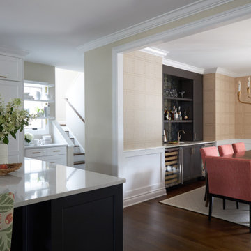
Lead Designer, Stephanie Cole, saw an improved layout for the spaces that were no longer working for this family. By eliminating an existing wall between the kitchen and dining room, and relocating the bar area to the dining room, we opened up the kitchen, providing all the space we needed to create a dreamy and functional layout. A new perimeter configuration promoted circulation while also making space for a large and functional island loaded with seating – a must for any family. Because an island that isn’t big enough for everyone (and a few more) is a recipe for disaster. The light white cabinetry is fresh and contrasts with the deeper tones in the wood flooring, creating a modern aesthetic that is elevated, yet approachable for everyday living.
With better flow as the overarching goal, we made some structural changes too. To remove a bottleneck in the entryway, we angled one of the dining room walls to create more natural separation between rooms and facilitate ease of movement throughout the large space.
At The Kitchen Studio, we believe a well-designed kitchen uses every square inch to the fullest. By starting from scratch, it was possible to rethink the entire kitchen layout and design the space according to how it is used, because the kitchen shouldn’t make it harder to feed the family. A new location for the existing range, flanked by a new column refrigerator and freezer on each side, worked to anchor the space. The very large and very spacious island (a dream island if we do say so ourselves) now houses the primary sink and provides ample space for food prep and family gathering.
The new kitchen table and coordinating banquette seating provide a cozy nook for quick breakfasts before school or work, and evening homework sessions. Elegant gold details catch the natural light, elevating the aesthetic.
The dining room was transformed into one of this client’s favorite spaces and we couldn’t agree more. We saw an opportunity to give the dining room a more distinguished identity by closing off the entrance from the foyer. The relocated wet bar enhances the sophisticated vibe of this gathering space, complete with beautiful antique mirror tiles and open shelving encased by moody built-in cabinets.
Updated furnishings add warmth. A rich walnut table is paired with custom chairs in a muted coral fabric. The large, transitional chandelier grounds the room, pairing beautifully with the gold finishes prevalent in the faucet and cabinet hardware. Linen-inspired wallpaper and cream-toned window treatments add to the glamorous feel of this entertainment space.
There is no way around it. The laundry room was cramped. The large washer and dryer blocked access to the sink and left little room for the space to serve its other essential function – as a mudroom. Because we reworked the kitchen layout to create more space overall, we could rethink the mudroom too – an essential for any busy family. The first step was moving the washer and dryer to an existing area on the second floor, where most of the family’s laundry lives (no one wants to carry laundry up and down the stairs if they don’t have to anyway). This is a more functional solution and opened up the space for all the mudroom necessities – including the existing kitchen refrigerator, loads of built-in cubbies, and a bench.
It’s hard to not fall in love with every detail of a new space, especially when it serves your day-to-day life. But that doesn’t mean the clients didn’t have their favorite features they use on the daily. This remodel was focused largely on function with a new kitchen layout. And it’s the functional features that have the biggest impact. The large island provides much needed workspace in the kitchen and is a spot where everyone gathers together – it grounds the space and the family. And the custom counter stools are the icing on the cake. The nearby mudroom has everything their previous space was lacking – ample storage, space for everyone’s essentials, and the beloved cement floor tiles that are both durable and artistic.
Sponsored
Columbus, OH
Hope Restoration & General Contracting
Columbus Design-Build, Kitchen & Bath Remodeling, Historic Renovations
 Clark Richardson Architects
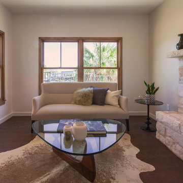
The Goldenwood Guest House is the first phase of a larger estate multi-phase project with the clients are moving into the renovated guest house as we start construction on the main house renovation and addition soon. This is a whole-house renovation to an existing 750sf guest cottage settled near the existing main residence. The property is located West of Austin in Driftwood, TX and the cottage strives to capture a sense of refined roughness. The layout maximizes efficiency in the small space with built-in cabinet storage and shelving in the living room and kitchen. Each space is softly day lit and the open floor plan of the Living, Dining, and Kitchen allows the spaces to feel expansive without sacrificing privacy to the bedroom and restroom. Photo by Ryan Farnau.
See our video walk-through: The Goldenwood Guest House is the first phase of a larger estate multi-phase project with the clients are moving into the renovated guest house as we start construction on the main house renovation and addition soon. This is a whole-house renovation to an existing 750sf guest cottage settled near the existing main residence. The property is located West of Austin in Driftwood, TX and the cottage strives to capture a sense of refined roughness. The layout maximizes efficiency in the small space with built-in cabinet storage and shelving in the living room and kitchen. Each space is softly day lit and the open floor plan of the Living, Dining, and Kitchen allows the spaces to feel expansive without sacrificing privacy to the bedroom and restroom. Photo by Ryan Farnau.
See our video walk-through: http://youtu.be/lx9wTAm7J-8
 Drury Design
THE SETUP
This client lives in a great high-rise condo in downtown Chicago. Alicia has already remodeled a few areas of her home, including her kitchen and home office. The bathroom is one of the last big places the client wanted to update. The existing bathroom had a large, outdated whirlpool tub in the corner. It was a darker space that had a lack of natural light. There are no windows (due to the bathroom’s location within the high-rise building). So, the idea was to brighten up the space and give the client an updated, elegant primary bathroom that is more her style and tailor-made for her routines.
Design Objectives:
- Make the space brighter.
- Create different daily routine stations to maximize functionality while keeping things clutter-free – a makeup station, a blow-dry station, and a sink-needs station.
- Achieve the client’s specific style and function needs while also keeping the look and design open to future possibilities: different users of the space/resale clients.
Design Challenges:
- Toilet cannot be moved. (In a high-rise, you can’t really move plumbing around too much when reimagining a space)
- Existing bathroom had a soffit that hid a lot of electrical wiring, so completely removing the soffit wasn’t an option.
- The blow-dry station needs to accommodate the client’s preference for standing up.
- Finding a place for the make-up station, which the client wants oriented for sitting.
- Create storage within the shower that can eliminate the clutter of personal care products that are actually needed every day. Do this, while keeping the client’s favorite things about the existing shower: the shower bench, a tub filler faucet (for rinsing shaving cream when shaving legs) and a low niche for placing her foot when shaving her legs.
THE RENEWED SPACE
Design Solutions:
- Extended a bit of wall near the toilet to give the commode its own area within the space, but without closing it off into a claustrophobic WC.
- Worked within the reality of the existing soffit situation, reshaping it to align with the new shower. Can lights were also added. Installed a beautiful ceiling light fixture that works within the new soffit shape, commanding attention and adding light, as if the sofit shape was chosen for it.
- Created a nice, furniture-looking 42”-high cabinet with pullout drawers to be the blow-dry station, complete with a mirror and a nice top. The pullout drawers are all powered, concealing a Dyson dryer and curling iron (and all the accoutrements) while keeping them plugged in, which is ideal for easy usage and put away. A stylish mirror on the wall above the cabinet, and proper lighting, make this the perfect blow-dry station. The top has a grommet that can accommodate a power cord should the client ever want to have a powered device on top of the cabinet.
- Put the sit-down makeup station where the tub used to be, putting the mirror back into a new recessed wall just a bit, allowing the area to have more room.
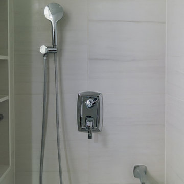
- Created a niche in the shower’s inner wall so that you can’t see it unless you are literally inside the shower. At the client’s request, it also has a hook so she can hang her loofa. Hiding the utility niche in this way allowed us to use the full main wall of the shower as a canvas for a beautiful accent stripe of raised decorative tile. The new shower has her old favorites, too: the tub filler, foot niche and bench.
Alicia’s client loves her new primary bathroom, especially the blow dry area. It is very accommodating for her, as a tall lady, while being very easy to use. The drawers store everything. Being powered, they make using already-plugged in appliances very easy to use and put away.
Her previous makeup station was a freestanding vanity with a single drawer, so beauty products were all over the surface top. With her new makeup station, everything is nicely tucked away and organized in drawers.
The new lighting is fantastic and the colors are light and soft. The clients loves the overall look and feel of her new bathroom and raves about how well the functionality-minded design makes her morning routine – and her life – easier and enjoyable!
 SDM Design, Inc.
This was and still is a 2,700 s.f. brick rancher yet this project resulted in a complete makeover while still maintaining the original footprint and exterior structure. The house was built in 1954 in a lovely location across the street from the Grove Park Inn Golf Club.
During our initial meeting, my clients, who had recently moved to Asheville, expressed that they enjoyed cooking and engaging with their family and friends while doing so. They wanted the bathrooms updated, a more functional master bedroom and a larger kitchen. The house had a traditional layout with 3 bedrooms, 2 baths, a small kitchen, separate dining and living rooms with an adjoining 570 s.f. family room. It didn’t take long before we all agreed that the large family room would be converted to their master bedroom suite. In order to expand the kitchen, a wall between the existing kitchen and dining was removed, stairs leading to the basement were relocated, a bump out in the existing kitchen became a pantry and one of the adjacent bedrooms was opened up to the new kitchen as the new dining room. Both baths were redesigned and a powder room was created by rearranging existing closets. An existing curved wall in the hallway prompted the design of large open arches between the newly created spaces. This concept extended to the design on curved counter surfaces in the kitchen along with a reflected curved dropped ceiling over the cooking area.
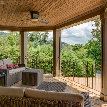
The exterior of the house was enhanced with bay windows, a new copper-roofed front porch overlooking the Grove Park Inn properties with the Blue Ridge Mountains beyond. A circular drive was designed for the convenience of guests. Exterior double-hung windows were replaced with French patio doors in the new kitchen/dining and living areas. This allows easy access to the new front porch and back deck while enhancing the openness of the home.
94