
Search results for "Explained" in Home Design Ideas

 Closet Factory
"When I first visited the client's house, and before seeing the space, I sat down with my clients to understand their needs. They told me they were getting ready to remodel their bathroom and master closet, and they wanted to get some ideas on how to make their closet better. The told me they wanted to figure out the closet before they did anything, so they presented their ideas to me, which included building walls in the space to create a larger master closet. I couldn't visual what they were explaining, so we went to the space. As soon as I got in the space, it was clear to me that we didn't need to build walls, we just needed to have the current closets torn out and replaced with wardrobes, create some shelving space for shoes and build an island with drawers in a bench. When I proposed that solution, they both looked at me with big smiles on their faces and said, 'That is the best idea we've heard, let's do it', then they asked me if I could design the vanity as well.
"I used 3/4" Melamine, Italian walnut, and Donatello thermofoil. The client provided their own countertops." - Leslie Klinck, Designer
See more photos of this project under 'Master Bathroom & Closet Combination'.

 The Phoenix Photography
Photo: Phoenix Photography © 2015 Houzz
Dining room - traditional dining room idea in Louisville
Dining room - traditional dining room idea in Louisville
 TVL Creative Ltd.
This 1910 West Highlands home was so compartmentalized that you couldn't help to notice you were constantly entering a new room every 8-10 feet. There was also a 500 SF addition put on the back of the home to accommodate a living room, 3/4 bath, laundry room and back foyer - 350 SF of that was for the living room. Needless to say, the house needed to be gutted and replanned.
Kitchen+Dining+Laundry-Like most of these early 1900's homes, the kitchen was not the heartbeat of the home like they are today. This kitchen was tucked away in the back and smaller than any other social rooms in the house. We knocked out the walls of the dining room to expand and created an open floor plan suitable for any type of gathering. As a nod to the history of the home, we used butcherblock for all the countertops and shelving which was accented by tones of brass, dusty blues and light-warm greys. This room had no storage before so creating ample storage and a variety of storage types was a critical ask for the client. One of my favorite details is the blue crown that draws from one end of the space to the other, accenting a ceiling that was otherwise forgotten.
Primary Bath-This did not exist prior to the remodel and the client wanted a more neutral space with strong visual details. We split the walls in half with a datum line that transitions from penny gap molding to the tile in the shower. To provide some more visual drama, we did a chevron tile arrangement on the floor, gridded the shower enclosure for some deep contrast an array of brass and quartz to elevate the finishes.
Powder Bath-This is always a fun place to let your vision get out of the box a bit. All the elements were familiar to the space but modernized and more playful. The floor has a wood look tile in a herringbone arrangement, a navy vanity, gold fixtures that are all servants to the star of the room - the blue and white deco wall tile behind the vanity.
Full Bath-This was a quirky little bathroom that you'd always keep the door closed when guests are over. Now we have brought the blue tones into the space and accented it with bronze fixtures and a playful southwestern floor tile.
Living Room & Office-This room was too big for its own good and now serves multiple purposes. We condensed the space to provide a living area for the whole family plus other guests and left enough room to explain the space with floor cushions. The office was a bonus to the project as it provided privacy to a room that otherwise had none before.
Find the right local pro for your project

 Edgewater Design Group
As written in Northern Home & Cottage by Elizabeth Edwards
Sara and Paul Matthews call their head-turning home, located in a sweet neighborhood just up the hill from downtown Petoskey, “a very human story.” Indeed it is. Sara and her husband, Paul, have a special-needs son as well as an energetic middle-school daughter. This home has an answer for everyone. Located down the street from the school, it is ideally situated for their daughter and a self-contained apartment off the great room accommodates all their son’s needs while giving his caretakers privacy—and the family theirs. The Matthews began the building process by taking their thoughts and
needs to Stephanie Baldwin and her team at Edgewater Design Group. Beyond the above considerations, they wanted their new home to be low maintenance and to stand out architecturally, “But not so much that anyone would complain that it didn’t work in our neighborhood,” says Sara. “We
were thrilled that Edgewater listened to us and were able to give us a unique-looking house that is meeting all our needs.” Lombardy LLC built this handsome home with Paul working alongside the construction crew throughout the project. The low maintenance exterior is a cutting-edge blend of stacked stone, black corrugated steel, black framed windows and Douglas fir soffits—elements that add up to an organic contemporary look. The use of black steel, including interior beams and the staircase system, lend an industrial vibe that is courtesy of the Matthews’ friend Dan Mello of Trimet Industries in Traverse City. The couple first met Dan, a metal fabricator, a number of years ago, right around the time they found out that their then two-year-old son would never be able to walk. After the couple explained to Dan that they couldn’t find a solution for a child who wasn’t big enough for a wheelchair, he designed a comfortable, rolling chair that was just perfect. They still use it. The couple’s gratitude for the chair resulted in a trusting relationship with Dan, so it was natural for them to welcome his talents into their home-building process. A maple floor finished to bring out all of its color-tones envelops the room in warmth. Alder doors and trim and a Doug fir ceiling reflect that warmth. Clearstory windows and floor-to-ceiling window banks fill the space with light—and with views of the spacious grounds that will
become a canvas for Paul, a retired landscaper. The couple’s vibrant art pieces play off against modernist furniture and lighting that is due to an inspired collaboration between Sara and interior designer Kelly Paulsen. “She was absolutely instrumental to the project,” Sara says. “I went through
two designers before I finally found Kelly.” The open clean-lined kitchen, butler’s pantry outfitted with a beverage center and Miele coffee machine (that allows guests to wait on themselves when Sara is cooking), and an outdoor room that centers around a wood-burning fireplace, all make for easy,
fabulous entertaining. A den just off the great room houses the big-screen television and Sara’s loom—
making for relaxing evenings of weaving, game watching and togetherness. Tourgoers will leave understanding that this house is everything great design should be. Form following function—and solving very human issues with soul-soothing style.

 FotoGrafik Arts
Photography: FotoGrafik ARTS.
It’s all about the view at the higher levels of the Sovereign in Atlanta. Residents who occupy the 28th to 50th floors in Buckhead Atlanta’s tallest mixed-use building, are treated to a jaw-dropping view from nearly every room.
THIS UNIT, ON THE 39TH FLOOR, WAS ALREADY a spacious, 3300-sq.foot, two-bedroom, two-bath condominium. Still, it was lacking some finishing touches, needing to be refined and polished for efficiency and luxury.
“There’s an abundance of custom features,” explains Lowell Figur, Glazer Design & Construction’s Project Manager for this contract. Automated LED lighting and blinds, newly stained Lauzon floors, venetian plaster walls, ostrich skin-textured wallpaper, custom closets...the deliciously decadent list goes on, even including a custom make-up drawer in the bathroom for the missus. - Design & Build Magazine.

 User
In the last edition of Elle Decoration in March, they published our Mosaic del Sur cement tiles in an innovative project with the interior architect Marianne Evennou.
The challenge was to create a functional and beautiful space with only 11m2. This area was found in an under-roof and transformed with soft and neutral colours. By eliminating the false ceiling the architect gained the 4 meters needed to create a loft where to put the bed.
The Mosaic del Sur encaustic cement tiles were used to make the space seem bigger. “ In such a small space, it can be divided as you please and it will just make the room more spacious” explains the architect. In this way, Marianne marked the transition from the entrance to the kitchen by inverting the colours of the tiles.
REF. 10703 20X20X1.6CM
Interior architect: Marianne Evennou
Photographer: Marie-Pierre Morel

 The Color & Shape (Jamie Nickerson)
Jamie Nickerson
Example of an eclectic dark wood floor dining room design in Dallas with green walls
Example of an eclectic dark wood floor dining room design in Dallas with green walls
Sponsored
Fredericksburg, OH

High Point Cabinets
Columbus' Experienced Custom Cabinet Builder | 4x Best of Houzz Winner

 Kimberley Bryan
Photo: Kimberley Bryan © 2013 Houzz
Family room - contemporary family room idea in Seattle
Family room - contemporary family room idea in Seattle

 Betty Wasserman Art & Interiors: The Hamptons
Modern luxury meets warm farmhouse in this Southampton home! Scandinavian inspired furnishings and light fixtures create a clean and tailored look, while the natural materials found in accent walls, casegoods, the staircase, and home decor hone in on a homey feel. An open-concept interior that proves less can be more is how we’d explain this interior. By accentuating the “negative space,” we’ve allowed the carefully chosen furnishings and artwork to steal the show, while the crisp whites and abundance of natural light create a rejuvenated and refreshed interior.
This sprawling 5,000 square foot home includes a salon, ballet room, two media rooms, a conference room, multifunctional study, and, lastly, a guest house (which is a mini version of the main house).
 Plain & Posh
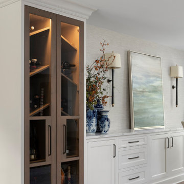
Thse clients came to me for a kitchen refresh. Keeping the existing floor plan but updating as much as possible. After explaining my thoughts, they chose to go with a much larger project. The wall to the garage wash pushed bach 12" to allow for the island to happen. This almost couldn't happen as there is a support post in the garage we had to keep. I designed the last pantry area as on 10" deep, allowing us to conceal that behind the cabinets. Then, we opend up the wall to the dining room to make the rooms one large space. The wall to the family room was also openend up, leaving the half wall to allow for the kitchen eating area. They wanted to incorporate a bar area, without it feeling like a "bar" The fabulous tall custom unit houses their wine collection and then half of the dining room buffet area holds glassware and other bar items. I helped the clients with all of the design choices.We all wanted to keep the space classic, war, functional and with mixed materials. I chose to use the same countertop material for the backsplash, to keep the space feeling as large as possible.
 FotoGrafik Arts
Photography: FotoGrafik ARTS.
It’s all about the view at the higher levels of the Sovereign in Atlanta. Residents who occupy the 28th to 50th floors in Buckhead Atlanta’s tallest mixed-use building, are treated to a jaw-dropping view from nearly every room.
THIS UNIT, ON THE 39TH FLOOR, WAS ALREADY a spacious, 3300-sq.foot, two-bedroom, two-bath condominium. Still, it was lacking some finishing touches, needing to be refined and polished for efficiency and luxury.
“There’s an abundance of custom features,” explains Lowell Figur, Glazer Design & Construction’s Project Manager for this contract. Automated LED lighting and blinds, newly stained Lauzon floors, venetian plaster walls, ostrich skin-textured wallpaper, custom closets...the deliciously decadent list goes on, even including a custom make-up drawer in the bathroom for the missus. - Design & Build Magazine.

 All About the Wow, Inc.
Living room - huge contemporary open concept and formal white floor and ceramic tile living room idea in Miami with white walls, no fireplace and no tv

 Vanco Construction Inc.
Quality craftsmanship, superior service, and communication go hand in hand with cost management and integrity as the key ingredients for building a home.
For over 25 years, Vanco Construction has built the dreams of homeowners in Short Hills, NJ., as well as in the surrounding Morris County communities of Mendham, Bernardsville, Basking Ridge and New Vernon. "Our approach begins with a clear understanding that producing a dream project is a team effort," explains Steve Vanadia, president of Vanco Construction. "The homeowner, builder, architect and interior designer must work as a team."
 Betty Wasserman Art & Interiors: The Hamptons
Modern luxury meets warm farmhouse in this Southampton home! Scandinavian inspired furnishings and light fixtures create a clean and tailored look, while the natural materials found in accent walls, casegoods, the staircase, and home decor hone in on a homey feel. An open-concept interior that proves less can be more is how we’d explain this interior. By accentuating the “negative space,” we’ve allowed the carefully chosen furnishings and artwork to steal the show, while the crisp whites and abundance of natural light create a rejuvenated and refreshed interior.
This sprawling 5,000 square foot home includes a salon, ballet room, two media rooms, a conference room, multifunctional study, and, lastly, a guest house (which is a mini version of the main house).


 Gilley Kitchen + Bath
Example of a mid-sized country l-shaped light wood floor eat-in kitchen design in New York with an undermount sink, beaded inset cabinets, white cabinets, quartz countertops, stainless steel appliances and an island
 User
In the last edition of Elle Decoration in March, they published our Mosaic del Sur cement tiles in an innovative project with the interior architect Marianne Evennou.
The challenge was to create a functional and beautiful space with only 11m2. This area was found in an under-roof and transformed with soft and neutral colours. By eliminating the false ceiling the architect gained the 4 meters needed to create a loft where to put the bed.
The Mosaic del Sur encaustic cement tiles were used to make the space seem bigger. “ In such a small space, it can be divided as you please and it will just make the room more spacious” explains the architect. In this way, Marianne marked the transition from the entrance to the kitchen by inverting the colours of the tiles.
REF. 10703 20X20X1.6CM
Interior architect: Marianne Evennou
Photographer: Marie-Pierre Morel
 Murphy Bros. Design | Build | Remodel
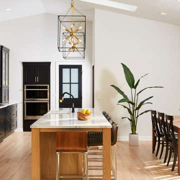
Murphy Bros. deals with a lot of interior projects that involve insurance claims when appliances fail and this was the perfect example of homeowners taking the opportunity to upgrade their space following a disastrous event.
BACK WALL: 30" stainless steel Samsung® combination wall oven (Model NQ70M777ODS)
“Because of our 38 years of experience in the industry, we were able to work with their insurance company to get a realistic and adequate settlement, which laid the foundation for some significant improvements to their kitchen, living area, flooring throughout the main level and the entry area,” explains Mann.
Refinished the water-damaged oak flooring; New custom kitchen island with fluted legs; Repainted all walls (Hirschfield’s Dove’s Wing 0537)
 Cosentino North America
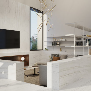
A collection that unites the poetic and unique beauty of stones harnessed by Dekton® technology, as those dreams where we observe and vaguely feel in control but only the deepest part of our mind truly understands. The collection is named in honor of the lavish inspiration of the two worlds conveyed in marbled colors to captivate our eyes and bring to any space a feeling we understand but cannot explain.

 Nautilus Architects
Cathedral ceilings and seamless cabinetry complement this home’s river view.
The low ceilings in this ’70s contemporary were a nagging issue for the 6-foot-8 homeowner. Plus, drab interiors failed to do justice to the home’s Connecticut River view.
By raising ceilings and removing non-load-bearing partitions, architect Christopher Arelt was able to create a cathedral-within-a-cathedral structure in the kitchen, dining and living area. Decorative mahogany rafters open the space’s height, introduce a warmer palette and create a welcoming framework for light.
The homeowner, a Frank Lloyd Wright fan, wanted to emulate the famed architect’s use of reddish-brown concrete floors, and the result further warmed the interior. “Concrete has a connotation of cold and industrial but can be just the opposite,” explains Arelt. Clunky European hardware was replaced by hidden pivot hinges, and outside cabinet corners were mitered so there is no evidence of a drawer or door from any angle.
Photo Credit:
Read McKendree
Cathedral ceilings and seamless cabinetry complement this kitchen’s river view
The low ceilings in this ’70s contemporary were a nagging issue for the 6-foot-8 homeowner. Plus, drab interiors failed to do justice to the home’s Connecticut River view.
By raising ceilings and removing non-load-bearing partitions, architect Christopher Arelt was able to create a cathedral-within-a-cathedral structure in the kitchen, dining and living area. Decorative mahogany rafters open the space’s height, introduce a warmer palette and create a welcoming framework for light.
The homeowner, a Frank Lloyd Wright fan, wanted to emulate the famed architect’s use of reddish-brown concrete floors, and the result further warmed the interior. “Concrete has a connotation of cold and industrial but can be just the opposite,” explains Arelt.
Clunky European hardware was replaced by hidden pivot hinges, and outside cabinet corners were mitered so there is no evidence of a drawer or door from any angle.
69