
Search results for "Explains" in Home Design Ideas
 Simply Home Decorating
This beautiful North Vancouver home belongs to a nature-loving and health-conscious couple, Emma and Vince (names changed), their two young children, and their dog, Jasper. When they contacted us about renovating and furnishing their kitchen and family room, we walked in and saw a world of potential waiting to be uncovered.
Before: Larkhall Crescent Home:
Like many original North Vancouver homes, the interior was definitely dated. We encountered late ‘80s finishes in powder pink and teal green, old carpet, and a kitchen that wasn’t maximized to suit this family’s modern-day lifestyle. However, the size of the rooms offered us a ton of space with which to get creative.
Knowing our clients’ love of cooking, need for work spaces (Emma and Vince both work remotely), and growing family, we developed a design concept that would increase usable space, optimize storage, and create intimacy in this large area. As for the style, we were inspired by their European roots, inventing a new and modern take on “Belgian Farmhouse” style. Now, the home is truly one-of-a-kind.
After: Warm & Cozy Family Room:
Fresh, bright, and comfortable, this living area has been transformed! We started with the fireplace as a focal point, selecting aged brick tiles for added texture and a crisp wood mantle. The taupe-coloured sectional infuses the room with visual warmth and serves the added purpose of separating the family room from the kitchen.
Emma and Vince were also keen on using non-toxic materials in their home, and we were happy to oblige. To meet their needs, we sourced natural wood elements and sought out Canadian-made products - that adhere to high health standards - whenever possible.
Look closer at the elements of this space, and you will find this stunning, honeycomb-patterned rug in earthy gold, beige, and charcoal tones. It’s plush to the touch and full of visual texture that brings this room’s colour palette together. We sourced these two-tone chairs with caning, petrified wood side table, black sconces, and botanical prints in greyscale from local artist, Heather Johnston.
We topped off the space with this dark wood and rattan console that offers storage facing the kitchen and presents an opportunity to display cherished items. The result is a cozy lounging space brimming with comfort and functionality. It’s perfect for enjoying quality family time, or Emma can simply slide the coffee table away to make room for her morning yoga practice.
Now, let’s turn around and give some attention to the kitchen. Do you remember what the original kitchen looked like? If not, scroll back up, because the transformation is shocking…
Moody & Welcoming Kitchen for Healthy Living:
This kitchen looks very different from how it started, right? Though we didn’t touch any walls, the kitchen has almost doubled in usable space! We created a long, extended island with storage, an outlet for small appliances, and seating for comfortable prep, after-school snacking, or mingling among friends.
On the other side of the island, the family has even more storage and an integrated dishwasher within easy reach of the sink, perfect for quick clean-up. From this angle, you can also see the expansive custom Shaker cabinetry in white and the integrated double ovens. These facilitate their cooking experience and gave us the opportunity to add an additional surprise…
A coffee garage station and more hidden storage! Keeping these items located along the perimeter allows them to be accessed by the family or their guests without someone getting under the cook’s feet. These are the little details that make everyday life easier and more enjoyable.
Moving deeper into the kitchen, the seamless induction cooktop topped with a freestanding concealed hood fan commands attention in a soft yet prominent way. The natural wood accent mirrors the fireplace mantle, and the choice of off-black wood-grain cabinets not only continues our black-and-white colour palette but adds a sense of depth and contrast. The corner sink is located to the right and perfectly positioned with a view of their thriving backyard.
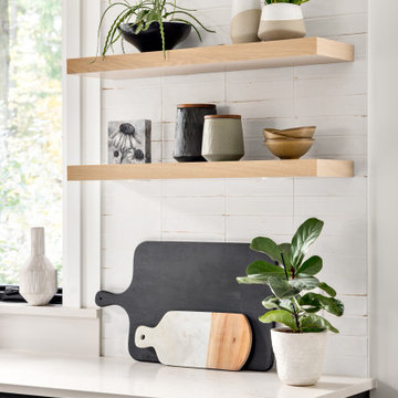
To invite more of this family’s character into the space, we mixed metals for interest — matte black, dark pewter, and warm brass — and created open shelves in white oak for their plants and decor. You can also glimpse the tumbled edge of the backsplash tile, which echoes the rustic brick of the fireplace. It adds that farmhouse charm while still feeling timeless and sophisticated.
Last but not least, we designed this dining banquette in the bay window (with integrated bench storage, of course), where the family can share a meal together, the kids can do homework, or Emma and Vince can work and enjoy a change of scenery from their offices. Like the other spaces in the home, it was designed to be beautiful, multi-functional, and long-lasting.
Praise from Our Clients:
It is clear that we love this home, but what did our clients have to say?
“Lori is a visionary and masters execution to the finest detail all at the same time. When she first met us to know more about who we are and how we live, she could right away envision how we could use the space in our kitchen and living room…The results exceeded our expectations.
Lori and her team were also a delight to work with — coordination with all the trades, fast problem-solving, regular updates, professional and friendly attitude of her entire team — made it the dream team. Thank you SHD for making our space so beautiful!”
In turn, we are so grateful for this family’s trust, their open communication, and for being wonderful people with whom to work. (So, thank you!)
 Paul Lopa Designs
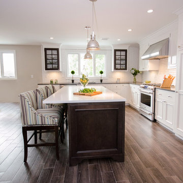
Traditional Kitchen Renovation & Design Of A First Floor Ranch.
See what our client say about Paul Lopa Designs:
It went as smooth as it possibly could go. The only bumps in the road was with what we found during demolition, you never know what your gonna run into when all the walls,floors and fixtures come out. Paul had explained to us that depending on what we found under all the out dated stuff it might take a little longer. Paul was there doing the work with his workers he showed up on time and finished on schedule. It was no problem being in touch with Paul because he answered his phone or got back to us in a timely fashion. He has an excellent sense of design he knows what goes well together and makes the house flow with comfort and usability.
(R)Haw Ron
 Edgewater Design Group
As written in Northern Home & Cottage by Elizabeth Edwards
Sara and Paul Matthews call their head-turning home, located in a sweet neighborhood just up the hill from downtown Petoskey, “a very human story.” Indeed it is. Sara and her husband, Paul, have a special-needs son as well as an energetic middle-school daughter. This home has an answer for everyone. Located down the street from the school, it is ideally situated for their daughter and a self-contained apartment off the great room accommodates all their son’s needs while giving his caretakers privacy—and the family theirs. The Matthews began the building process by taking their thoughts and
needs to Stephanie Baldwin and her team at Edgewater Design Group. Beyond the above considerations, they wanted their new home to be low maintenance and to stand out architecturally, “But not so much that anyone would complain that it didn’t work in our neighborhood,” says Sara. “We
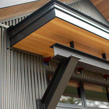
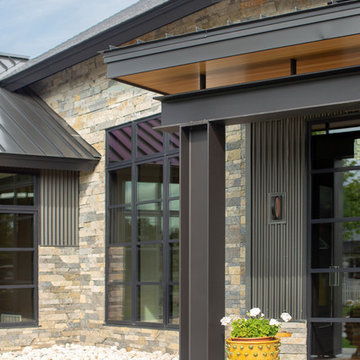
were thrilled that Edgewater listened to us and were able to give us a unique-looking house that is meeting all our needs.” Lombardy LLC built this handsome home with Paul working alongside the construction crew throughout the project. The low maintenance exterior is a cutting-edge blend of stacked stone, black corrugated steel, black framed windows and Douglas fir soffits—elements that add up to an organic contemporary look. The use of black steel, including interior beams and the staircase system, lend an industrial vibe that is courtesy of the Matthews’ friend Dan Mello of Trimet Industries in Traverse City. The couple first met Dan, a metal fabricator, a number of years ago, right around the time they found out that their then two-year-old son would never be able to walk. After the couple explained to Dan that they couldn’t find a solution for a child who wasn’t big enough for a wheelchair, he designed a comfortable, rolling chair that was just perfect. They still use it. The couple’s gratitude for the chair resulted in a trusting relationship with Dan, so it was natural for them to welcome his talents into their home-building process. A maple floor finished to bring out all of its color-tones envelops the room in warmth. Alder doors and trim and a Doug fir ceiling reflect that warmth. Clearstory windows and floor-to-ceiling window banks fill the space with light—and with views of the spacious grounds that will
become a canvas for Paul, a retired landscaper. The couple’s vibrant art pieces play off against modernist furniture and lighting that is due to an inspired collaboration between Sara and interior designer Kelly Paulsen. “She was absolutely instrumental to the project,” Sara says. “I went through
two designers before I finally found Kelly.” The open clean-lined kitchen, butler’s pantry outfitted with a beverage center and Miele coffee machine (that allows guests to wait on themselves when Sara is cooking), and an outdoor room that centers around a wood-burning fireplace, all make for easy,
fabulous entertaining. A den just off the great room houses the big-screen television and Sara’s loom—
making for relaxing evenings of weaving, game watching and togetherness. Tourgoers will leave understanding that this house is everything great design should be. Form following function—and solving very human issues with soul-soothing style.
Find the right local pro for your project
 INSPIRED KITCHEN DESIGN
Elaine says there are many factors to remember during the IKEA design and installation process.
She explains: “First, it’s important to stay calm, and be flexible. Our kitchen was quite large and the IKEA store representative who completed the order made many mistakes. So, I made many trips to IKEA to buy extra parts.”
She continues: “Also, go early to IKEA and don’t wait until the last minute. I couldn’t get to IKEA until the last day of the IKEA kitchen sale but that wasn’t a good idea!”
From a product standpoint, she says that she would not recommend the IKEA push openers for cabinet doors.
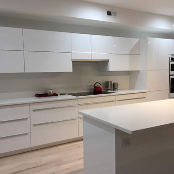
“I wanted a flush look on the tall cabinets and wall cabinets without any knobs or pulls. IKEA’s push openers were not strong enough for the horizontal wall cabinet doors that swing open from the bottom,” she says.
Ultimately though, Elaine says she couldn’t be happier with the results of her modern, white IKEA kitchen.
“My initial concern was whether the kitchen would look as nice as I had envisioned. I have to say that the actual kitchen has exceeded my expectations and looks better than anticipated!” she concludes.

 Interiors by Maite Granda
Feature In: Visit Miami Beach Magazine & Island Living
A nice young couple contacted us from Brazil to decorate their newly acquired apartment. We schedule a meeting through Skype and from the very first moment we had a very good feeling this was going to be a nice project and people to work with. We exchanged some ideas, comments, images and we explained to them how we were used to worked with clients overseas and how important was to keep communication opened.
They main concerned was to find a solution for a giant structure leaning column in the main room, as well as how to make the kitchen, dining and living room work together in one considerably small space with few dimensions.
Whether it was a holiday home or a place to rent occasionally, the requirements were simple, Scandinavian style, accent colors and low investment, and so we did it. Once the proposal was signed, we got down to work and in two months the apartment was ready to welcome them with nice scented candles, flowers and delicious Mojitos from their spectacular view at the 41th floor of one of Miami's most modern and tallest building.
Rolando Diaz Photography
 Betty Wasserman Art & Interiors
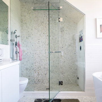
Modern luxury meets warm farmhouse in this Southampton home! Scandinavian inspired furnishings and light fixtures create a clean and tailored look, while the natural materials found in accent walls, casegoods, the staircase, and home decor hone in on a homey feel. An open-concept interior that proves less can be more is how we’d explain this interior. By accentuating the “negative space,” we’ve allowed the carefully chosen furnishings and artwork to steal the show, while the crisp whites and abundance of natural light create a rejuvenated and refreshed interior.
This sprawling 5,000 square foot home includes a salon, ballet room, two media rooms, a conference room, multifunctional study, and, lastly, a guest house (which is a mini version of the main house).
 Custom Design & Construction
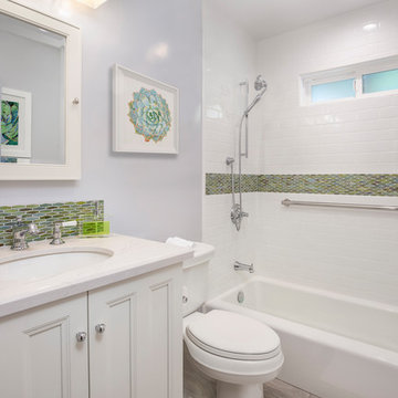
This design / build project in Redondo Beach, CA. focused on a family’s hall bathroom. There were multiple reasons that the homeowners decided to start this project but the issue that was most pressing was water damage from the shower. The homeowners knew it needed to be addressed ASAP. As long as a remodel was going to be completed they felt that it was time to address the layout as well. It was not efficient in its original state. Since bathrooms work so hard it was important that the remodel resolve this issue as well. The homeowners were also interested in new finishes.
Desiring something more light and fresh with a coastal feel we began reimagining the layout. The before and after pictures explain it best but basically the new shower was placed against the wall where there previously was a toilet and window. The location and size of the window was changed as well. The shower is now a three wall alcove with grab bars to allow the homeowners to age in place. The white subway tile is accented by a mosaic tile in the homeowners’ favorite coastal shades. The light and beachy feel is reinforced with the grey ceramic tile floor. The vanity is a furniture-style with details like decorative feet. The space is tied together with a backsplash that matches the border in the shower.
Sponsored
Fredericksburg, OH

High Point Cabinets
Columbus' Experienced Custom Cabinet Builder | 4x Best of Houzz Winner


 Edgewater Design Group
As written in Northern Home & Cottage by Elizabeth Edwards
Sara and Paul Matthews call their head-turning home, located in a sweet neighborhood just up the hill from downtown Petoskey, “a very human story.” Indeed it is. Sara and her husband, Paul, have a special-needs son as well as an energetic middle-school daughter. This home has an answer for everyone. Located down the street from the school, it is ideally situated for their daughter and a self-contained apartment off the great room accommodates all their son’s needs while giving his caretakers privacy—and the family theirs. The Matthews began the building process by taking their thoughts and
needs to Stephanie Baldwin and her team at Edgewater Design Group. Beyond the above considerations, they wanted their new home to be low maintenance and to stand out architecturally, “But not so much that anyone would complain that it didn’t work in our neighborhood,” says Sara. “We
were thrilled that Edgewater listened to us and were able to give us a unique-looking house that is meeting all our needs.” Lombardy LLC built this handsome home with Paul working alongside the construction crew throughout the project. The low maintenance exterior is a cutting-edge blend of stacked stone, black corrugated steel, black framed windows and Douglas fir soffits—elements that add up to an organic contemporary look. The use of black steel, including interior beams and the staircase system, lend an industrial vibe that is courtesy of the Matthews’ friend Dan Mello of Trimet Industries in Traverse City. The couple first met Dan, a metal fabricator, a number of years ago, right around the time they found out that their then two-year-old son would never be able to walk. After the couple explained to Dan that they couldn’t find a solution for a child who wasn’t big enough for a wheelchair, he designed a comfortable, rolling chair that was just perfect. They still use it. The couple’s gratitude for the chair resulted in a trusting relationship with Dan, so it was natural for them to welcome his talents into their home-building process. A maple floor finished to bring out all of its color-tones envelops the room in warmth. Alder doors and trim and a Doug fir ceiling reflect that warmth. Clearstory windows and floor-to-ceiling window banks fill the space with light—and with views of the spacious grounds that will
become a canvas for Paul, a retired landscaper. The couple’s vibrant art pieces play off against modernist furniture and lighting that is due to an inspired collaboration between Sara and interior designer Kelly Paulsen. “She was absolutely instrumental to the project,” Sara says. “I went through
two designers before I finally found Kelly.” The open clean-lined kitchen, butler’s pantry outfitted with a beverage center and Miele coffee machine (that allows guests to wait on themselves when Sara is cooking), and an outdoor room that centers around a wood-burning fireplace, all make for easy,
fabulous entertaining. A den just off the great room houses the big-screen television and Sara’s loom—
making for relaxing evenings of weaving, game watching and togetherness. Tourgoers will leave understanding that this house is everything great design should be. Form following function—and solving very human issues with soul-soothing style.

 InnovationLand
This Houston outdoor kitchen and entertaining area offers a modern take on Mediterranean style.
Designed and built by Outdoor Homescapes of Houston, this fully loaded family and entertaining space echoes the stucco, travertine tile patio and Mediterranean style of the existing home while exuding a more modern, transitional style.
“This was a high-profile client – both VPs of different oil and gas companies who entertain affluent guests on a regular basis – so they wanted to make sure they had high-end appliances and all the latest amenities they could order,” says Lisha Maxey, senior designer for Outdoor Homescapes and owner of LGH Design Services in Houston. “They also have two kids, ages 7 and 10, and wanted a family gathering space that better accompanied their new, luxurious pool.”
What really sets apart this outside kitchen design idea, however, is the way the elements are used throughout the space.
“Usually, outdoor kitchen designs for a backyard are grouped into one island or cabinet,” explains Outdoor Homescapes of Houston owner Wayne Franks. “But here, the patio, roof and fireplace were all in place, separated by stucco columns, and the outdoor kitchen elements had to work around them.”
A 14-foot-long cooking island houses a built-in Fire Magic grill with a Magic View Window (allows the chef to check on food without lifting the lid and losing valuable heat). The island, the countertop of which is "Carnaval" granite from Lackstone, also features a Fire Magic power burner, warming drawer and trash drawer. On one side of the fireplace, forming an “L” with the cooking island, sits a built-in Primo ceramic grill.
On the other side of the fireplace is a 3-foot-long cabinet housing a bar with a wine cooler, ice maker and upper cabinet. And finally, just outside the patio door is a 7-foot-long cabinet with a modern Kohler sink with a high-arc Moen faucet (sink and faucet from Faucets Direct), a trash drawer and another upper cabinet.
Outdoor Homescapes of Houston, by the way, outfitted both cabinets with glass inserts, custom pulls and three-way sensor lighting.
“At the beginning, this was basically a blank space with a fireplace in the middle,” says Maxey. So Outdoor Homescapes upgraded the fireplace with Austin Stack Stone in white (No. 401) from Colorstonescreenshot vickers mosaic tile rectangle. "The stone added that pop,” notes Maxey.
The fireplace’s espresso-colored, distressed wood mantel (from Mantels.com) and upper wood cabinets were both stained with the Minwax color Jacobean. The ceiling fans were also updated with ones featuring similarly espresso-colored, wooden fan blades, to match.
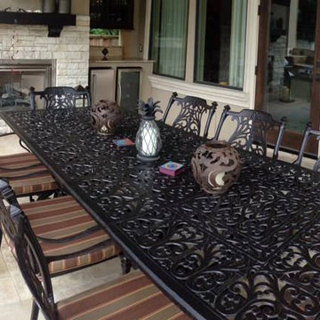
The table in the middle - a cast-iron, Mediterranean style gem with hand-forged scrollwork designs from Patio 1 in Houston – seats 10.
“We wanted this kind of Mediterranean feel,” says Maxey. “We wanted rustic, but the appliance package was so new, with all its stainless steel, so we kept a the cabinets and the columns stucco instead of stone for a more clean, modern look and then did the custom tile backsplash and mosaic in more of a rustic, Mediterranean look."
The backsplash is a 1-inch travertine tile background with 4-inch square metallic insets, both from Floor & Decor. The tile for the 18-by-24-inch rectangle mosaic came from Great Britain Tile Co. and included a Dianno Reale tumbled border and background. The bronze, diamond-shaped insets are tumbled Dark Emperdor tile and the scrolls are tumbled Noce tile.
The client, who admits they have high standards, was more than pleased with the project – especially browsing through Outdoor Homescapes’ vast library of patio kitchen design ideas, the 3D virtual video tour that let them preview the project from every angle before construction. They also liked the personalized design consultation.
"OH provides a very neat service where one of their designers will either shop/buy for you or shop with you for the more detailed pieces that will finish your home," reads the client's review on Houzz. "This was a very positive, personalized feature ... Lisha helped narrow down an enormous marketplace of materials and finishes to a few we could choose from."
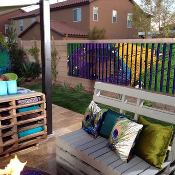
 Green Planet Landscaping Pools & Spa
Damon Lang
Design ideas for a contemporary landscaping in Las Vegas.
Design ideas for a contemporary landscaping in Las Vegas.
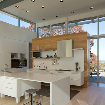
 Dick Clark + Associates
Photo by Paul Bardagjy
Large trendy u-shaped light wood floor eat-in kitchen photo in Austin with an undermount sink, flat-panel cabinets, white cabinets, quartz countertops, white backsplash, stainless steel appliances and an island
Large trendy u-shaped light wood floor eat-in kitchen photo in Austin with an undermount sink, flat-panel cabinets, white cabinets, quartz countertops, white backsplash, stainless steel appliances and an island
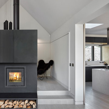
 Platform 5 Architects
Alan Williams Photography
Inspiration for a coastal home design remodel in London
Inspiration for a coastal home design remodel in London
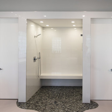
 Sweetlake Interior Design LLC
This amazing bathroom was renovated to have a modern flare. The tile is a shiny gray porcelain that has a rectified edge so it could be butted up tight and the grout lines minimal. My client had previously chosen this tile throughout her home. The Graff Luna freestanding tub filler is mounted on a floating glass mosaic tiled wall. We relocated the tub. Instead of saw cutting into the slab floor we built a platform to hide the plumbing that the tub rests on. The floating vanity cabinets are made of laminate beautifully displaying the quartz countertop with a straight 3" mitered edge. The sides of the countertops drop to the floor on each side of the cabinet, known as a waterfall edge. My client and I designed a cut in wave on the tiled floor leading into the shiny white shower with a floating white quartz bench seat. We built in custom planters made from the quartz countertop material that balance out each side of the floating tub wall in the center of the bathroom. I must say, throughout this design process my client was involved the entire time. She played an integral role in selecting the amazing fixtures seen in this master bathroom remodel. She needed help with the layout so she reached out to us. As you can see in the results we collaborated well together. It was pleasure to work with a client who has such exquisite taste.
 TVL Creative Ltd.
This 1910 West Highlands home was so compartmentalized that you couldn't help to notice you were constantly entering a new room every 8-10 feet. There was also a 500 SF addition put on the back of the home to accommodate a living room, 3/4 bath, laundry room and back foyer - 350 SF of that was for the living room. Needless to say, the house needed to be gutted and replanned.
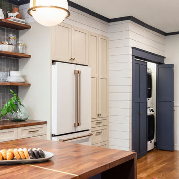
Kitchen+Dining+Laundry-Like most of these early 1900's homes, the kitchen was not the heartbeat of the home like they are today. This kitchen was tucked away in the back and smaller than any other social rooms in the house. We knocked out the walls of the dining room to expand and created an open floor plan suitable for any type of gathering. As a nod to the history of the home, we used butcherblock for all the countertops and shelving which was accented by tones of brass, dusty blues and light-warm greys. This room had no storage before so creating ample storage and a variety of storage types was a critical ask for the client. One of my favorite details is the blue crown that draws from one end of the space to the other, accenting a ceiling that was otherwise forgotten.
Primary Bath-This did not exist prior to the remodel and the client wanted a more neutral space with strong visual details. We split the walls in half with a datum line that transitions from penny gap molding to the tile in the shower. To provide some more visual drama, we did a chevron tile arrangement on the floor, gridded the shower enclosure for some deep contrast an array of brass and quartz to elevate the finishes.
Powder Bath-This is always a fun place to let your vision get out of the box a bit. All the elements were familiar to the space but modernized and more playful. The floor has a wood look tile in a herringbone arrangement, a navy vanity, gold fixtures that are all servants to the star of the room - the blue and white deco wall tile behind the vanity.
Full Bath-This was a quirky little bathroom that you'd always keep the door closed when guests are over. Now we have brought the blue tones into the space and accented it with bronze fixtures and a playful southwestern floor tile.
Living Room & Office-This room was too big for its own good and now serves multiple purposes. We condensed the space to provide a living area for the whole family plus other guests and left enough room to explain the space with floor cushions. The office was a bonus to the project as it provided privacy to a room that otherwise had none before.
 Cummings Architecture + Interiors
Situated along Eagle River, looking across to the mouth of the Ipswich Harbor, this was clearly a little cape house that was married to the sea. The owners were inquiring about adding a simple shed dormer to provide additional exposure to the stunning water view, but they were also interested in what Mathew would design if this beach cottage were his.
Inspired by the waves that came ashore mere feet from the little house, Mathew took up a fat marker and sketched a sweeping, S-shape dormer on the waterside of the building. He then described how the dormer would be designed in the shape of an ocean wave. “This way,” he explained, “you will not only be able to see the ocean from your new master bedroom, you’ll also be able to experience that view from a space that actually reflects the spirit of the waves.”
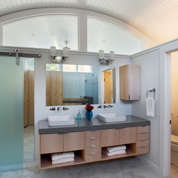
Mathew and his team designed the master suite and study using a subtle combination of contemporary and traditional, beach-house elements. The result was a completely unique and one-of-a-kind space inside and out. Transparencies are built into the design via features like gently curved glass that reflects the water and the arched interior window separating the bedroom and bath. On the exterior, the curved dormer on the street side echoes these rounded shapes and lines to create continuity throughout. The sense of movement is accentuated by the continuous, V-groove boarded ceiling that runs from one ocean-shaped dormer through to the opposite side of the house.
The bedroom features a cozy sitting area with built in storage and a porthole window to look out onto the rowboats in the harbor. A bathroom and closet were combined into a single room in a modern design that doesn't sacrifice any style or space and provides highly efficient functionality. A striking barn door made of glass with industrial hardware divides the two zones of the master suite. The custom, built-in maple cabinetry of the closets provides a textural counterpoint to the unique glass shower that incorporates sea stones and an ocean wave motif accent tile.
With this spectacular design vision, the owners are now able to enjoy their stunning view from a bright and spacious interior that brings the natural elements of the beach into the home.
Photo by Eric Roth
 Renovisions
Our clients needed a much larger kitchen to accommodate their growing family and better functionality for their dream culinary haven.
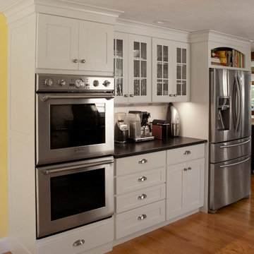
They did not give it a moments notice to contact Cathy and Ed at Renovisions who designed and built a few recent projects and they were delighted with the overall experience. A design of an open floor plan in mind with relocated appliances totally transformed this kitchen space. Space was borrowed from the dining room allowing a much needed work flow and eat-in area for their two small children.
White painted cabinetry that boasts plenty of storage, deep drawers, pull-out trash drawer provided more functional space and the glass mullion doors created an attractive view. The stainless appliances, including a slim Meile hood, along with the stainless steel decorative diamond pattern backsplash reflected a sleek and contemporary style that the clients love for their transitional style home.
Soapstone with white veining countertops compliments the dark wood island with white marble Carrera-look quartz no-maintenance countertops.
The warmth of the hardwood flooring is stunning in contrast to the white painted kitchen cabinets and exudes a comfortable and most welcome feel when you enter the space.
These homeowners now enjoy more natural light from their existing dining room windows and beautiful views of their gardens from their table. This newly remodeled top notch kitchen is a delight for this homeowner’s top notch culinary skills.
 InnovationLand
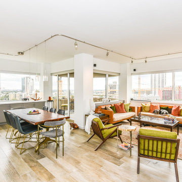
Houston Interior Designer Lisha Maxey took this Museum District condo from the dated, mirrored walls of the 1980s to Mid Century Modern with a gallery look featuring the client’s art collection.
The place was covered with glued-down, floor-to-ceiling mirrors,” says Lisha Maxey, senior designer for Homescapes of Houston and principal at LGH Design Services in Houston. “When we took them off the walls, the walls came apart. We ended up taking them down to the studs."
The makeover took six months to complete, primarily because of strict condo association rules that only gave the Houston interior designers very limited access to the elevator – through which all materials and team members had to go.
“Monday through Friday, we could only be noisy from 10 a.m. to 2 p.m., and if we had to do something extra loud, like sawing or drilling, we had to schedule it with the management and they had to communicate that to the condo owners. So it was just a lot of coordination. But a lot of Inner City Loopers live in these kinds of buildings, so we’re used to handling that kind of thing.”
The client, a child psychiatrist in her 60s, recently moved to Houston from northeast Texas to be with friends. After being widowed three years ago, she decided it was time to let go of the traditionally styled estate that wasn’t really her style anyway. An avid diver who has traveled around the world to pursue her passion, she has amassed a large collection of art from her travels. Downsizing to 1,600 feet and wanting to go more contemporary, she wanted the display – and the look – more streamlined.
“She wanted clean lines and muted colors, with the main focus being her artwork,” says Maxey. “So we made the space a palette for that.”
Enter the white, gallery-grade paint she chose for the walls: “It’s halfway between satin and flat,” explains Maxey. “It’s not glossy and it’s not chalky – just very smooth and clean."
Adding to the gallery theme is the satin nickel track lighting with lamps aimed to highlight pieces of art. “This lighting has no wires,” notes Maxey. “It’s powered by a positive and negative conduit.”
The new flooring throughout is a blended-grey porcelain tile that looks like wood planks. “It’s gorgeous, natural-looking and combines all the beauty of wood with the durability of tile,” says Maxey. “We used it throughout the condo to unify the space.”
After Maxey started looking at the client’s bright, vibrant, colorful artwork, she felt the palette couldn’t stay as muted anymore. Hence the Mid Century Modern orange leather sofas from West Elm and bright green chairs from Joybird, plus the throw pillows in different textures, patterns and shades of gold, orange and green.
The concave lines of the Danish-inspired chairs, she notes, help them look beautiful from all the way around – a key to designing spaces for loft living.
“The table in the living room is very interesting,” notes Maxey. “It was handmade for the client in 1974 and has a signature on it from the artist. She was adamant about including the piece, which has all these hand-painted black-and-white art tiles on the top. I took one look at it and said ‘It’s not really going to go.’”
However, after cutting 6 inches off the bottom and making it look a little distressed, the table ended up being the perfect complement to the sofas.
The dining room table – from Design Within Reach – is a solid piece of mahogany, the chair upholstery a mix of grey velvet and leather and the legs a shiny brass. “The side chairs are leather and the end ones are velvet,” says Maxey. “It’s a nice textural mix that lends depth and texture.”The galley kitchen, meanwhile, has been lightened and brightened, with new, white contemporary cabinetry, quartz countertops mimicking the look of Carrara marble, stainless steel appliances and a velvet green bench seat for a punch of color.The two bathrooms have been updated with contemporary white vanities and vessel sinks and the master bath now features a walk-in shower tiled in Dolomite white marble (the floor is Bianco Carrara marble mosaic, done in a herringbone pattern).In the master bedroom, Homescapes of Houston knocked down a wall between two smaller closets with swing doors to make one large walk-in closet with pocket doors. The closet in the guest bedroom also came out 13 more inches.The client’s artwork throughout personalizes the space and tells the story of a life. There’s a huge bowl of shells from the client’s diving adventures, framed art from her child psychiatry patients and a 16th century wood carving from a monastery that’s been in her family forever.
“Her collection is quite impressive,” says Maxey. “There’s even a framed piece of autographed songs written by John Lennon.” (You can see this black-framed piece of art on the wall in the photo above of two green chairs).
“We’re extremely happy with how the project turned out, and so is the client,” says Maxey. “No expense was spared for her. It was a labor of love and we were excited to do it.”
57