
Search results for "Extended periods" in Home Design Ideas
 Riverside Construction, LLC
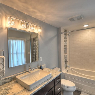
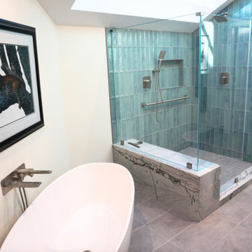
Having lived in her home for an extended period of time before embarking on a remodel meant that this homeowner had a clear idea of how she uses her space, the shortcomings of the layout, and how she would like to improve it. Her challenges started with a non-functional master bathroom that was dark and dated.
By reducing the size of a closet in the adjoining bedroom and removing a full closet from the inside of the bathroom, Riverside Construction was able to open up the space and allow for a larger vanity. New, functional closet space was designed into the bedroom and added to another wall.
Replacing the dark tub/shower wall tile with crisp white Subway tile brightened up the space and created the crisp, fresh look that the homeowner wanted. A vertical mosaic accent was also used for visual interest, and a built-in shower niche was created to keep bath essentials within easy reach. A honed marble countertop and a platinum crystal vanity light fixture by Quoizel complete this lovely transitional master bathroom transformation.
 Granit Architects + Interiors
Our clients for this project are a professional couple with a young family. They approached us to help with extending and improving their home in London SW2 to create an enhanced space both aesthetically and functionally for their growing family. We were appointed to provide a full architectural and interior design service, including the design of some bespoke furniture too.
A core element of the brief was to design a kitchen living and dining space that opened into the garden and created clear links from inside to out. This new space would provide a large family area they could enjoy all year around. We were also asked to retain the good bits of the current period living spaces while creating a more modern day area in an extension to the rear.
It was also a key requirement to refurbish the upstairs bathrooms while the extension and refurbishment works were underway.
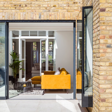
The solution was a 21m2 extension to the rear of the property that mirrored the neighbouring property in shape and size. However, we added some additional features, such as the projecting glass box window seat. The new kitchen features a large island unit to create a workspace with storage, but also room for seating that is perfect for entertaining friends, or homework when the family gets to that age.
The sliding folding doors, paired with floor tiling that ran from inside to out, created a clear link from the garden to the indoor living space. Exposed brick blended with clean white walls creates a very contemporary finish throughout the extension, while the period features have been retained in the original parts of the house.
 Architectural Collaborative
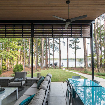
We designed this 3,162 square foot home for empty-nesters who love lake life. Functionally, the home accommodates multiple generations. Elderly in-laws stay for prolonged periods, and the homeowners are thinking ahead to their own aging in place. This required two master suites on the first floor. Accommodations were made for visiting children upstairs. Aside from the functional needs of the occupants, our clients desired a home which maximizes indoor connection to the lake, provides covered outdoor living, and is conducive to entertaining. Our concept celebrates the natural surroundings through materials, views, daylighting, and building massing.
We placed all main public living areas along the rear of the house to capitalize on the lake views while efficiently stacking the bedrooms and bathrooms in a two-story side wing. Secondary support spaces are integrated across the front of the house with the dramatic foyer. The front elevation, with painted green and natural wood siding and soffits, blends harmoniously with wooded surroundings. The lines and contrasting colors of the light granite wall and silver roofline draws attention toward the entry and through the house to the real focus: the water. The one-story roof over the garage and support spaces takes flight at the entry, wraps the two-story wing, turns, and soars again toward the lake as it approaches the rear patio. The granite wall extending from the entry through the interior living space is mirrored along the opposite end of the rear covered patio. These granite bookends direct focus to the lake.
Find the right local pro for your project

 Westminster Teak
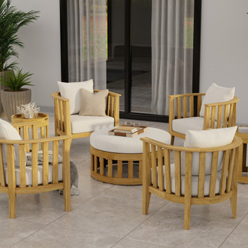
The welcoming shape, whimsical slats, and the warmth of premium Grade A Teak makes the Kafelonia Teak Club Chair difficult to resist. Deep, plush seat and back cushions on generously proportioned frame allows ”unrestricted movement” for comfort in seating over extended periods of time. Lavish use of teak in the frame of the furniture with 5/8”slats ensures maximum structural strength while providing warmth and beauty in any space.
The 7 pc Kafelonia Lounge Set features:
4 x Kafelonia Barrel Chairs
1 x Kafelonia Teak Coffee Table
2 x Kafelonia Side Tables
Cushions made with Quick Dry Foam® core and 100% solution dyed Sunbrella Fabrics.
Exclusively designed for Westminster, the Kafelonia Collection epitomizes the beautiful marrying of traditional craftsmanship and the clean lines of modern design. The pure forms and modern simplicity of each piece is a true reflection in timelessness. With the appropriate finish on the teak frames and fitting fabric selection on the cushions, the entire collection would fit beautifully indoors or out. Made to commercial specifications.
 Craftsman Design and Renovation
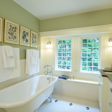
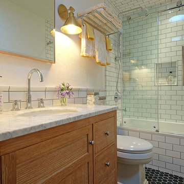
The homeowners desired a more usable layout with timeless appeal in keeping with their historic home. New vanity cabinets with smart storage replaced pedestal sinks. The custom built-in medicine cabinets provide additional spots for bathroom necessities. Classic finishes, black and white hex tile floors, and a soothing green keep the space looking fresh while tying it into the historic roots of the home.
 Arcisan | Streamline Products
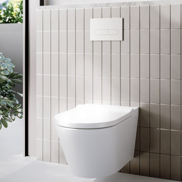
The Neion Plus incorporates a lot of the features of the Neion whilst including the features of a heated seat and prewetting of the bowl. The design is strictly modern with the straight lines fitting in with any contemporary bathroom design.
The Neion Plus has an extensive list of features as shown below:
• Simplified installation - RPZ valve not required
• Comfort front and rear washing functions
• Water pressure and temperature control
• Drying function with air temperature control
• LED ambient light
• Deodorisor
• Heated seat with adjustable temperature
• Prewetting of the bowl
• Removable self-cleaning nozzle
• Backlit glass status panel
Boasting a hard wearing, rimless ceramic pan and a nozzle that is self-cleaning before and after every use plus the tank runs a self-cleaning mode if left in standby for an extended period of time.
NOTE: IMPORTANT – refer to the spec sheet on the website for correct inlet points for the power and water.


 Dimensions in Wood Inc
This Historical Home was built in the Columbia Country Club in 1925 and was ready for a new, modern kitchen which kept the traditional feel of the home. A previous sunroom addition created a dining room, but the original kitchen layout kept the two rooms divided. The kitchen was a small and cramped c-shape with a narrow door leading into the dining area.
The kitchen and dining room were completely opened up, creating a long, galley style, open layout which maximized the space and created a very good flow. Dimensions In Wood worked in conjuction with the client’s architect and contractor to complete this renovation.
Custom cabinets were built to use every square inch of the floorplan, with the cabinets extending all the way to the ceiling for the most storage possible. Our woodworkers even created a step stool, staining it to match the kitchen for reaching these high cabinets. The family already had a kitchen table and chairs they were happy with, so we refurbished them to match the kitchen’s new stain and paint color.
Crown molding top the cabinet boxes and extends across the ceiling where they create a coffered ceiling, highlighting the beautiful light fixtures centered on a wood medallion.
Columns were custom built to provide separation between the different sections of the kitchen, while also providing structural support.
Our master craftsmen kept the original 1925 glass cabinet doors, fitted them with modern hardware, repainted and incorporated them into new cabinet boxes. TASK LED Lighting was added to this china cabinet, highlighting the family’s decorative dishes.
Appliance Garage
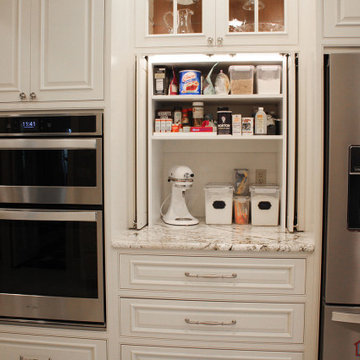
On one side of the kitchen we built an appliance garage with doors that slide back into the cabinet, integrated power outlets and door activated lighting. Beside this is a small Galley Workstation for beverage and bar service which has the Galley Bar Kit perfect for sliced limes and more.
Baking Cabinet with Pocket Doors
On the opposite side, a baking cabinet was built to house a mixer and all the supplies needed for creating confections. Automatic LED lights, triggered by opening the door, create a perfect baker’s workstation. Both pocket doors slide back inside the cabinet for maximum workspace, then close to hide everything, leaving a clean, minimal kitchen devoid of clutter.
Super deep, custom drawers feature custom dividers beneath the baking cabinet. Then beneath the appliance garage another deep drawer has custom crafted produce boxes per the customer’s request.
Central to the kitchen is a walnut accent island with a granite countertop and a Stainless Steel Galley Workstation and an overhang for seating. Matching bar stools slide out of the way, under the overhang, when not in use. A color matched outlet cover hides power for the island whenever appliances are needed during preparation.
The Galley Workstation has several useful attachments like a cutting board, drying rack, colander holder, and more. Integrated into the stone countertops are a drinking water spigot, a soap dispenser, garbage disposal button and the pull out, sprayer integrated faucet.
Directly across from the conveniently positioned stainless steel sink is a Bertazzoni Italia stove with 5 burner cooktop. A custom mosaic tile backsplash makes a beautiful focal point. Then, on opposite sides of the stove, columns conceal Rev-a-Shelf pull out towers which are great for storing small items, spices, and more. All outlets on the stone covered walls also sport dual USB outlets for charging mobile devices.
Stainless Steel Whirlpool appliances throughout keep a consistent and clean look. The oven has a matching microwave above it which also works as a convection oven. Dual Whirlpool dishwashers can handle all the family’s dirty dishes.
The flooring has black, marble tile inlays surrounded by ceramic tile, which are period correct for the age of this home, while still being modern, durable and easy to clean.
Finally, just off the kitchen we also remodeled their bar and snack alcove. A small liquor cabinet, with a refrigerator and wine fridge sits opposite a snack bar and wine glass cabinets. Crown molding, granite countertops and cabinets were all customized to match this space with the rest of the stunning kitchen.
Dimensions In Wood is more than 40 years of custom cabinets. We always have been, but we want YOU to know just how much more there is to our Dimensions.
The Dimensions we cover are endless: custom cabinets, quality water, appliances, countertops, wooden beams, Marvin windows, and more. We can handle every aspect of your kitchen, bathroom or home remodel.
 Hearthstone Inc
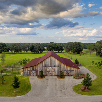
Richard Herman is in the hospitality business and owns several upscale hotels in Florida and in other states as well as cattle ranches in both Florida and Missouri. Their farm in Ocala is by farm their most unique. The property serves as a 4-H demonstration project for the purpose of children’s education. They have been working with the Academy Prep of St. Pete which is dedicated to inner-city youths that are selected on the basis of need and achievement. Wife Diane spends her time on the farm raising Gypsy Vanners, a diminutive draft horse named after the job they did in Eastern Europe, pulling the wagons (vans) for gypsies that wandered across the continent. On the Ocala farm, there are several mules with a unique profession.
Richard had visited the Hearthstone display at a Log & Timber Home Shows at the Orlando Convention Center many years ago. He was impressed that Hearthstone had stayed in touch with him over the years by mailings, invitations to shows, and periodic phone calls. When the time came to start serious consideration of the design of barn, Hearthstone responded promptly and professionally to Richard and Diane’s requests for information and a review of their ideas for their barn, which would serve as the centerpiece for their new farm.
They wanted a multipurpose facility that could accommodate an educational environment and a large hall suitable for the fundraising events for his charities. Richard wanted a barn that reflected the look and feel of barns built at the dawn of the 20th century. Besides the rustic chicken houses and vegetable gardens, they have completely renovated a 1020’s era farmhouse to be as historically correct as possible and serves as the entry to the farm.
“They very careful to feel us out, get comfortable with our capabilities, and be convinced that we could perform as promised,” said Project Manager John Ricketson of Hearthstone.
Design Process
There were some initial drawings that gave us a start on the basic shape and size of the barn. From there, it was a process of narrowing down the uses of each area and the spans that could be achieved. The barn was going to have the traditional “board & batten” exterior siding and a metal roof. There is a cantilevered ‘hay hood” on the north gable end above the large sliding barn doors that open into the foyer and horse stalls. The wings house a combination of areas, beginning with the large restrooms to accommodate crowds for events. Other parts of the wings have garage areas for the farm vehicles, feed room, tack room, wash rack, storage, offices, and smaller restrooms.
Keeping with the look and feel of the turn of the century, Hearthstone developed a process for giving the timbers a surface texture that mimicked the circular cuts of timbers that had just come out of an old sawmill. This was easier said than done. Randy Giles guided his millwright (Wolfgang) in designing a machine that would do this effectively.
The barn was delivered in October of 2014 and was erected over the course of two weeks, thanks to a hardworking crew (Eric Foster) and near-perfect weather. After the Hearthstone crew completed the erection and roof dry-in, it was time for the local carpenters to step up and install some light conventional framing on the gable ends before applying the roof fascia and exterior board & batten siding. Next came the big sliding barn doors, plumbing, electrical, heating, and cooling. Large rustic fixtures were hung from the great hall roof timbers.
Exterior
The board & batten siding was cypress and allowed to turn color naturally as rain hit it and the sun started working on it with UV rays. This method causes a much grayer look closer to the ground and less so where the roof overhang provides protection. The North end has some large limestone boulders and planters arranged around the pad with tall pampas grass. The planters provide casual seating before events and during outside receptions. The entire area was sodded with lush St. Augustine grass and split rail fences were added to enclose the barn area. The corrugated metal roof was a special order material that immediately rusted after being exposed to moisture. The layer of rust protects the metal from the elements.
Interior
The board & batten theme was carried throughout most of the interior with the timbers left natural to show off the circular saw texture. All of the tongue & groove decking was shipped in advance to allow the local painter to pre-stain it with a dark brown transparent stain that is a beautiful background to the light color Eastern White Pine timbers.
“Everything was unique in this project” said Project Manager John Ricketson. “The setting on a small demonstration farm close to Ocala, the multipurpose design, the circular saw texture on the timbers.”
The Hermans are very proud of their farm’s outcome. Richard sent a note to Randy Giles, owner of Hearthstone: “The Barn is fantastic, not a single problem, period. Next month, we have Jo Dee Messina coming in to help with a fundraiser for a local center for abused kids. Folks love the farm, ...... but that barn gets all of the attention. I would encourage you to use me as a reference for your sales team, feel free to extend my cell phone to any prospective purchasers.”


 LaRue Architects
Photo Credit: Paul Bardagjy
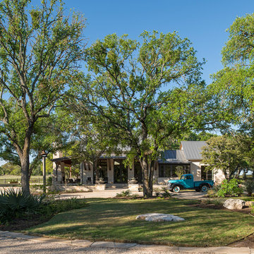
This is an example of a mid-sized farmhouse beige one-story stone landscaping in Austin with a metal roof.
This is an example of a mid-sized farmhouse beige one-story stone landscaping in Austin with a metal roof.

 TKS Design Group
Free ebook, Creating the Ideal Kitchen. DOWNLOAD NOW
The Klimala’s and their three kids are no strangers to moving, this being their fifth house in the same town over the 20-year period they have lived there. “It must be the 7-year itch, because every seven years, we seem to find ourselves antsy for a new project or a new environment. I think part of it is being a designer, I see my own taste evolve and I want my environment to reflect that. Having easy access to wonderful tradesmen and a knowledge of the process makes it that much easier”.
This time, Klimala’s fell in love with a somewhat unlikely candidate. The 1950’s ranch turned cape cod was a bit of a mutt, but it’s location 5 minutes from their design studio and backing up to the high school where their kids can roll out of bed and walk to school, coupled with the charm of its location on a private road and lush landscaping made it an appealing choice for them.
“The bones of the house were really charming. It was typical 1,500 square foot ranch that at some point someone added a second floor to. Its sloped roofline and dormered bedrooms gave it some charm.” With the help of architect Maureen McHugh, Klimala’s gutted and reworked the layout to make the house work for them. An open concept kitchen and dining room allows for more frequent casual family dinners and dinner parties that linger. A dingy 3-season room off the back of the original house was insulated, given a vaulted ceiling with skylights and now opens up to the kitchen. This room now houses an 8’ raw edge white oak dining table and functions as an informal dining room. “One of the challenges with these mid-century homes is the 8’ ceilings. I had to have at least one room that had a higher ceiling so that’s how we did it” states Klimala.
The kitchen features a 10’ island which houses a 5’0” Galley Sink. The Galley features two faucets, and double tiered rail system to which accessories such as cutting boards and stainless steel bowls can be added for ease of cooking. Across from the large sink is an induction cooktop. “My two teen daughters and I enjoy cooking, and the Galley and induction cooktop make it so easy.” A wall of tall cabinets features a full size refrigerator, freezer, double oven and built in coffeemaker. The area on the opposite end of the kitchen features a pantry with mirrored glass doors and a beverage center below.
The rest of the first floor features an entry way, a living room with views to the front yard’s lush landscaping, a family room where the family hangs out to watch TV, a back entry from the garage with a laundry room and mudroom area, one of the home’s four bedrooms and a full bath. There is a double sided fireplace between the family room and living room. The home features pops of color from the living room’s peach grass cloth to purple painted wall in the family room. “I’m definitely a traditionalist at heart but because of the home’s Midcentury roots, I wanted to incorporate some of those elements into the furniture, lighting and accessories which also ended up being really fun. We are not formal people so I wanted a house that my kids would enjoy, have their friends over and feel comfortable.”
The second floor houses the master bedroom suite, two of the kids’ bedrooms and a back room nicknamed “the library” because it has turned into a quiet get away area where the girls can study or take a break from the rest of the family. The area was originally unfinished attic, and because the home was short on closet space, this Jack and Jill area off the girls’ bedrooms houses two large walk-in closets and a small sitting area with a makeup vanity. “The girls really wanted to keep the exposed brick of the fireplace that runs up the through the space, so that’s what we did, and I think they feel like they are in their own little loft space in the city when they are up there” says Klimala.
Designed by: Susan Klimala, CKD, CBD
Photography by: Carlos Vergara
For more information on kitchen and bath design ideas go to: www.kitchenstudio-ge.com
 Architectural Collaborative
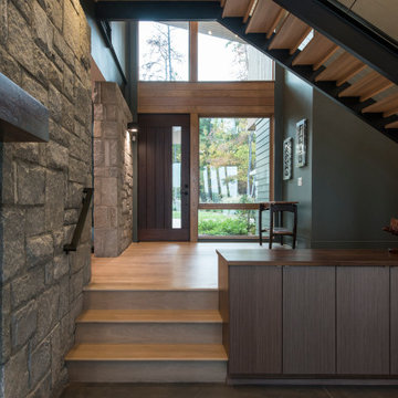
We designed this 3,162 square foot home for empty-nesters who love lake life. Functionally, the home accommodates multiple generations. Elderly in-laws stay for prolonged periods, and the homeowners are thinking ahead to their own aging in place. This required two master suites on the first floor. Accommodations were made for visiting children upstairs. Aside from the functional needs of the occupants, our clients desired a home which maximizes indoor connection to the lake, provides covered outdoor living, and is conducive to entertaining. Our concept celebrates the natural surroundings through materials, views, daylighting, and building massing.
We placed all main public living areas along the rear of the house to capitalize on the lake views while efficiently stacking the bedrooms and bathrooms in a two-story side wing. Secondary support spaces are integrated across the front of the house with the dramatic foyer. The front elevation, with painted green and natural wood siding and soffits, blends harmoniously with wooded surroundings. The lines and contrasting colors of the light granite wall and silver roofline draws attention toward the entry and through the house to the real focus: the water. The one-story roof over the garage and support spaces takes flight at the entry, wraps the two-story wing, turns, and soars again toward the lake as it approaches the rear patio. The granite wall extending from the entry through the interior living space is mirrored along the opposite end of the rear covered patio. These granite bookends direct focus to the lake.
 Advance Design Studio, Ltd.
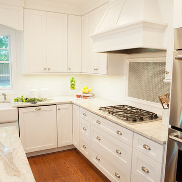
The design challenge was to enhance the square footage, flow and livability in this 1,442 sf 1930’s Tudor style brick house for a growing family of four. A two story 1,000 sf addition was the solution proposed by the design team at Advance Design Studio, Ltd. The new addition provided enough space to add a new kitchen and eating area with a butler pantry, a food pantry, a powder room and a mud room on the lower level, and a new master suite on the upper level.
The family envisioned a bright and airy white classically styled kitchen accented with espresso in keeping with the 1930’s style architecture of the home. Subway tile and timely glass accents add to the classic charm of the crisp white craftsman style cabinetry and sparkling chrome accents. Clean lines in the white farmhouse sink and the handsome bridge faucet in polished nickel make a vintage statement. River white granite on the generous new island makes for a fantastic gathering place for family and friends and gives ample casual seating. Dark stained oak floors extend to the new butler’s pantry and powder room, and throughout the first floor making a cohesive statement throughout. Classic arched doorways were added to showcase the home’s period details.
On the upper level, the newly expanded garage space nestles below an expansive new master suite complete with a spectacular bath retreat and closet space and an impressively vaulted ceiling. The soothing master getaway is bathed in soft gray tones with painted cabinets and amazing “fantasy” granite that reminds one of beach vacations. The floor mimics a wood feel underfoot with a gray textured porcelain tile and the spacious glass shower boasts delicate glass accents and a basket weave tile floor. Sparkling fixtures rest like fine jewelry completing the space.
The vaulted ceiling throughout the master suite lends to the spacious feel as does the archway leading to the expansive master closet. An elegant bank of 6 windows floats above the bed, bathing the space in light.
Photo Credits- Joe Nowak
 Jaeger & Ernst Custom Cabinetmakers
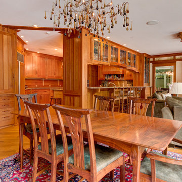
This is a breathtaking work of inclusive design and spirited craftsmanship. Within the renovation and additional space designed by Paskevich & Associates Architecture from Cleveland, Ohio, Jaeger & Ernst cabinetmakers designed and made the trim, doors, lighting, cabinetry and furniture for the space in the Greene and Greene style. The project unfolded over the course of several years - kitchen and trim one year, furniture design and creation over an extended period. Cherry was used for the trim and prime cabinetry. Claro Walnut was utilized for all of the furniture. Custom stained glass was provided by Wayne Cain from Bremo Bluff, Virginia, and the wall colors and painting provided by Andrew Cobb, Interior Designer from Charlottesville, VA. Great craftsman and exceptional designers have created a room of beauty, family utility and enduring appeal. Custom work by Jaeger & Enrst cabinetmakers - 434-973-7018 www.jaegerandernst.com
 Westover Landscape Design
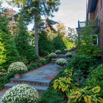
Not everyone would see the hidden beauty in the Yonkers property destined for the wrecking ball in 2000. But one family took the serious fixer-upper under their wing. Crumbling walls, overgrown maples (indeed, saplings were busting through the brick walls), and deer living in the basement was the state of affairs when Westover Landscape Design initially arrived on the scene. A year of intensive, meticulous, thoughtful renovation by the homeowner followed while the house was brought up to speed. When the last construction machine finally rumbled out, that’s when Robert Welsch and his crew began their odyssey.
The goal was to honor the newly restored relic and deliver it into the future with fitting surroundings. “We wanted to bring that treasure back to life,” Robert Welsch explains. Working closely with the homeowner as well as the city of Yonkers to guide the restoration, their first feat was to install a proper drainage system with catchments capable of keeping storm water from the massive roof flowing away. Before anything was visible on the surface, extensive work was accomplished underground. Meanwhile, a plan was drafted to honor the era of the house. Westover chose bluestone as the primary path material for its easy maintenance and simplicity when laying the swank configuration of pathways around the house and outward to an entertaining pavilion. By cleverly hemming the bluestone with period brick that echoes the building material for the house for continuity, the result is a smart and sophisticated finish to a promenade that constantly draws the family and their pets outdoors. Brick was also used to rebuild the walled gardens for the much-needed privacy in a close-knit Yonkers community. And a graceful wrought iron gate enhances the arrival experience. But walls and gates were not the only element to screen and reveal views—plant selection was critical.
Few landscapers would go the extra mile to find period perfect plants for a 19th Century restoration, but Robert Welsch saw the importance of authenticity in creating the mood. He repeated large trees—such as an exquisite London plane tree in the front yard—to balance the expression in the back. Recognizing the need for immediate stature, he selected a weeping willow to gain instant volume, giving the landscape a sense of deep roots. A weeping Camperdown elm adds sophisticated drama to the walled stroll gardens. Hydrangeas were incorporated for their billowy stature, easy maintenance, and long blooming season. Similarly, all the plants in residence play their part in the display that goes beyond the usual spring fling to extend throughout the growing season—offering visual interest even when they are not performing. From spring bulbs to autumn perennials, there is never a dull moment. Meanwhile, every step along the way was a collaboration working hand-in-hand with the homeowner and the city to make certain that the historic landmark status of the property was upheld and honored.
The result goes beyond a landscape that is just old faithful. It adds life to the picture, creating a jewel-like setting for the newly proud house. In a word, it is sublime. By planting wisely and using sustainable elements, the restored house and its surroundings are ready for the next generation and beyond. This Yonkers gem remains meticulously groomed under the watchful eye and skill of Westover Landscape Design’s team of gardeners—It’s a keeper.
 K&B Interiors
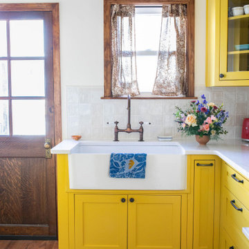
Located in Philadelphia’s Fairmount neighborhood, this 1930s-inspired kitchen remodel proves that small spaces can still live large. Working within just 80 square feet, the layout was reimagined from the inside out to maximize storage, function, and flow. By relocating the entryway to the center of the wall, removing the soffit, and thoughtfully closing off a window, we were able to extend custom cabinetry to full height and unlock valuable storage without sacrificing character.
A bold Gambol Gold cabinet palette anchors the space, balanced by warm, grounding elements that honor the home’s history: walnut-finished floors, a refurbished original 1930s walnut door, creamy zellige backsplash tiles, warm white walls, and traditional bronze cabinet hardware. A vintage-inspired bronze bridge faucet paired with a classic farmhouse sink reinforces the period feel, while a timeless Schoolhouse light fixture adds warmth and character overhead. High-end Fisher & Paykel appliances — including a sleek induction range — bring modern performance to the heart of the home. The result is a true revival: compact, storied, and designed to be lived in.
 K&B Interiors
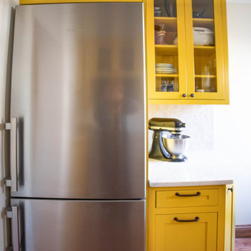
Located in Philadelphia’s Fairmount neighborhood, this 1930s-inspired kitchen remodel proves that small spaces can still live large. Working within just 80 square feet, the layout was reimagined from the inside out to maximize storage, function, and flow. By relocating the entryway to the center of the wall, removing the soffit, and thoughtfully closing off a window, we were able to extend custom cabinetry to full height and unlock valuable storage without sacrificing character.
A bold Gambol Gold cabinet palette anchors the space, balanced by warm, grounding elements that honor the home’s history: walnut-finished floors, a refurbished original 1930s walnut door, creamy zellige backsplash tiles, warm white walls, and traditional bronze cabinet hardware. A vintage-inspired bronze bridge faucet paired with a classic farmhouse sink reinforces the period feel, while a timeless Schoolhouse light fixture adds warmth and character overhead. High-end Fisher & Paykel appliances — including a sleek induction range — bring modern performance to the heart of the home. The result is a true revival: compact, storied, and designed to be lived in.
 K&B Interiors
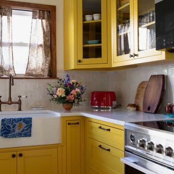
Located in Philadelphia’s Fairmount neighborhood, this 1930s-inspired kitchen remodel proves that small spaces can still live large. Working within just 80 square feet, the layout was reimagined from the inside out to maximize storage, function, and flow. By relocating the entryway to the center of the wall, removing the soffit, and thoughtfully closing off a window, we were able to extend custom cabinetry to full height and unlock valuable storage without sacrificing character.
A bold Gambol Gold cabinet palette anchors the space, balanced by warm, grounding elements that honor the home’s history: walnut-finished floors, a refurbished original 1930s walnut door, creamy zellige backsplash tiles, warm white walls, and traditional bronze cabinet hardware. A vintage-inspired bronze bridge faucet paired with a classic farmhouse sink reinforces the period feel, while a timeless Schoolhouse light fixture adds warmth and character overhead. High-end Fisher & Paykel appliances — including a sleek induction range — bring modern performance to the heart of the home. The result is a true revival: compact, storied, and designed to be lived in.
16