
Search results for "Extra extremely" in Home Design Ideas
 Gallery KBNY
The owner of this historic and landmarked town-home renovation in Hudson Square, originally built in 1826, hired Gallery Kitchen and Bath to fully gut-renovate this 3-unit row-home. The scope of work included a full-scale renovation of the owners unit, including the renovation of the kitchen, one 4-piece master ensuite bathroom, one 3-piece bathroom with a walk-in steam shower, and a beautiful powder room. Additional work in the owners unit also included flooring, electrical upgrade, major plumbing work, new HVAC system, restoration of a fireplace, installation of a fully integrated smart home system and landmarked approved windows.
CELLAR RENOVATION IN NYC LANDMARKED TOWN-HOME
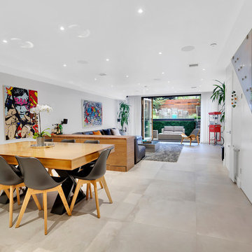
Rounding out the owners unit we renovated the cellar, which was converted into an entertainment space and featured a custom glass curtain wall, along with a custom staircase with an exposed brick wall. During the demolition phase of the cellar, our team discovered 56 wine jugs filled with wine from the prohibition era, leading us to name this project the prohibition house. For the two tenant units, Gallery Kitchen and Bath undertook the renovation of 2 kitchens, 4 bathrooms, new hardwood flooring throughout, along with detailed carpentry work in the entire home.
WHY GALLERY KITCHEN AND BATH
After interviewing multiple contractors, our client decided on Gallery Kitchen and Bath primarily because of our turnkey design, selection, and build process. In a renovation of this magnitude it is crucial to have a centralized full service contractor under one roof to handle all of the aspects and simultaneous moving parts of the project. Decentralizing the entire process by having multiple unaffiliated vendors handle various parts of the process can easily become chaotic, time consuming, and costly.
Because Gallery Kitchen and Bath undertook the entire process, from the design of the entire space to the selection and procurement of all finishes and fixtures, down to the procurement of all permits and LPC filings, it made a seemingly chaotic project a’lot more manageable.
PHASE 1: DESIGN, SELECTION, PROCUREMENT
Our client wanted the renovation to incorporate a fully modern design into his Hudson Square town-house. Being that this is a landmarked property, the exterior facade had to be restored and kept with the original aesthetic, the interior of the home however was a whole different story.
In keeping up with the modern aesthetic, our designers went to work to design a custom kitchen that included fully custom flat panel base cabinets in a white high gloss finish and an absolute matte black appliance/pantry wall. The kitchen design also included a white quartz countertop and backsplash with a waterfall edge island. To bring warmth to the modern kitchen, our designers incorporated a rifted and quartered select oak wood floor in a herringbone pattern, and custom blended stain with matte polyurethane finish. For continuity, the wood floor was also extended throughout the entire owners unit.
In the ensuite bathroom we created a “wet area” which houses a standalone soaking tub as well as a beautiful rainfall shower, completely leveled with the rest of the floor in the bathroom. Some highlights within this space include a tiled square drain, large niche cutouts with a carrera marble accents. Once again, to bring warmth to this modern bathroom, our designers incorporated a floating rustic oak vanity and carrera marble mosaic floor tile.
Last on the list on the owners unit floor was the cellar, which our client wanted to utilize as an entertainment space for his friends and family. During the design phase, we incorporated an open concept layout, wedding the indoor and outdoor space with a custom glass curtain wall. The design also included custom walnut built-ins that serve as a custom wet bar and storage piece.
With the design approved and selections made our office liaisons moved to procure all of the material selections and finishes.
PHASE 2: DEMO
Because this home is almost two centuries old, we had to take extra precaution during the interior demolition phase of the project. One specific area that we had to pay special attention to was the existing brick. Over time the mortar in old brick homes deteriorates and turns into dust – for this reason it was extremely important that a thorough and ongoing inspection of the exteriors and interior walls took place during the demolition of the space.
After 14 30-yard debris containers and 56 wine filled jugs from the prohibition era later , the demolition of this historic Hudson Square town-home came to an end. If you are wondering whether we tried the wine? After notifying the owner we agreed to open one of the jugs and try them together – nothing but vinegar.
PHASE 3: BUILD
One of the challenges in a renovation project of this scope is nailing down the logistics and delivery of fixtures and finish material. Adding to this challenge was a narrow entry door that required us to use a boom truck in order to deliver some of the larger materials on site. To ensure a succinct time schedule, we boomed all of the materials through the 3rd floor for the entire project and worked our renovation work from top floor to cellar. This technique also insured that any unexpected water issues during the renovation process would not damage a finished floor.
With all roughing and framing complete, the Gallery KBNY team proceeded to execute on the design plan.
THE REVEAL
From what was once a dilapidated town-home with nothing but potential, to a glamorous and luxurious modern interior space – the prohibition house was complete. Ready to speak with us about your renovation project? Contact us to schedule your free consultation and let Gallery KBNY show you why our all-inclusive approach to your renovation is the smartest way to renovating in NYC.
 InnovationLand
Houston Interior Designer Lisha Maxey took this Museum District condo from the dated, mirrored walls of the 1980s to Mid Century Modern with a gallery look featuring the client's art collection.
"The place was covered with glued-down, floor-to-ceiling mirrors," says Lisha Maxey, senior designer for Homescapes of Houston and principal at LGH Design Services in Houston. "When we took them off the walls, the walls came apart. We ended up taking them down to the studs."
The makeover took six months to complete, primarily because of strict condo association rules that only gave the Houston interior designers very limited access to the elevator - through which all materials and team members had to go.
"Monday through Friday, we could only be noisy from 10 a.m. to 2 p.m., and if we had to do something extra loud, like sawing or drilling, we had to schedule it with the management and they had to communicate that to the condo owners. So it was just a lot of coordination. But a lot of Inner City Loopers live in these kinds of buildings, so we're used to handling that kind of thing."
The client, a child psychiatrist in her 60s, recently moved to Houston from northeast Texas to be with friends. After being widowed three years ago, she decided it was time to let go of the traditionally styled estate that wasn't really her style anyway. An avid diver who has traveled around the world to pursue her passion, she has amassed a large collection of art from her travels. Downsizing to 1,600 feet and wanting to go more contemporary, she wanted the display - and the look - more streamlined.
"She wanted clean lines and muted colors, with the main focus being her artwork," says Maxey. "So we made the space a palette for that."
Enter the white, gallery-grade paint she chose for the walls: "It's halfway between satin and flat," explains Maxey. "It's not glossy and it's not chalky - just very smooth and clean."
Adding to the gallery theme is the satin nickel track lighting with lamps aimed to highlight pieces of art. "This lighting has no wires," notes Maxey. "It's powered by a positive and negative conduit."
The new flooring throughout is a blended-grey porcelain tile that looks like wood planks. "It's gorgeous, natural-looking and combines all the beauty of wood with the durability of tile," says Maxey. "We used it throughout the condo to unify the space."
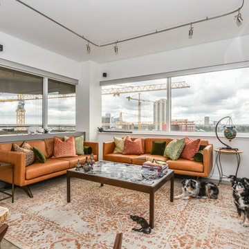
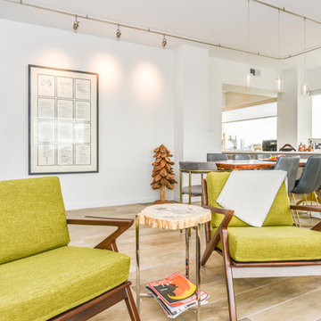
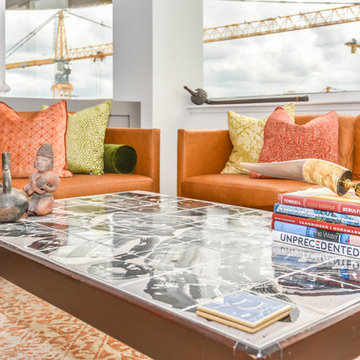
After Maxey started looking at the client's bright, vibrant, colorful artwork, she felt the palette couldn't stay as muted anymore. Hence the Mid Century Modern orange leather sofas from West Elm and chartruese chairs from Joybird, plus the throw pillows in different textures, patterns and shades of gold, orange and green.
The concave lines of the Danish-inspired chairs, she notes, help them look beautiful from all the way around - a key to designing spaces for loft living.
"The table in the living room is very interesting," notes Maxey. "It was handmade for the client in 1974 and has a signature on it from the artist. She was adamant about including the piece, which has all these hand-painted black-and-white art tiles on the top. I took one look at it and said 'It's not really going to go.'"
However, after cutting 6 inches off the bottom and making it look a little distressed, the table ended up being the perfect complement to the sofas.
The dining room table - from Design Within Reach - is a solid piece of mahogany, the chair upholstery a mix of grey velvet and leather and the legs a shiny brass. "The side chairs are leather and the end ones are velvet," says Maxey. "It's a nice textural mix that lends depth and texture."
The galley kitchen, meanwhile, has been lightened and brightened, with white quartz countertops and backsplashes mimicking the look of Carrara marble, stainless steel appliances and a velvet green bench seat for a punch of color. The cabinets are painted a cool grey color called "Silverplate."
The two bathrooms have been updated with contemporary white vanities and vessel sinks and the master bath now features a walk-in shower tiled in Dolomite white marble (the floor is Bianco Carrara marble mosaic, done in a herringbone pattern.
In the master bedroom, Homescapes of Houston knocked down a wall between two smaller closets with swing doors to make one large walk-in closet with pocket doors. The closet in the guest bedroom also came out 13 more inches.
The client's artwork throughout personalizes the space and tells the story of a life. There's a huge bowl of shells from the client's diving adventures, framed art from her child psychiatry patients and a 16th century wood carving from a monastery that's been in her family forever.
"Her collection is quite impressive," says Maxey. "There's even a framed piece of autographed songs written by John Lennon." (You can see this black-framed piece of art on the wall in the photo above of two green chairs).
"We're extremely happy with how the project turned out, and so is the client," says Maxey. "No expense was spared for her. It was a labor of love and we were excited to do it."
 alairhomesdecatur
Photography by Jeff Herr
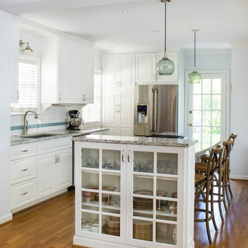
Kitchen - transitional medium tone wood floor kitchen idea in Atlanta with stainless steel appliances, white cabinets, quartzite countertops, white backsplash and an island
Kitchen - transitional medium tone wood floor kitchen idea in Atlanta with stainless steel appliances, white cabinets, quartzite countertops, white backsplash and an island
Find the right local pro for your project
 InnovationLand
Houston Interior Designer Lisha Maxey took this Museum District condo from the dated, mirrored walls of the 1980s to Mid Century Modern with a gallery look featuring the client's art collection.
"The place was covered with glued-down, floor-to-ceiling mirrors," says Lisha Maxey, senior designer for Homescapes of Houston and principal at LGH Design Services in Houston. "When we took them off the walls, the walls came apart. We ended up taking them down to the studs."
The makeover took six months to complete, primarily because of strict condo association rules that only gave the Houston interior designers very limited access to the elevator - through which all materials and team members had to go.
"Monday through Friday, we could only be noisy from 10 a.m. to 2 p.m., and if we had to do something extra loud, like sawing or drilling, we had to schedule it with the management and they had to communicate that to the condo owners. So it was just a lot of coordination. But a lot of Inner City Loopers live in these kinds of buildings, so we're used to handling that kind of thing."
The client, a child psychiatrist in her 60s, recently moved to Houston from northeast Texas to be with friends. After being widowed three years ago, she decided it was time to let go of the traditionally styled estate that wasn't really her style anyway. An avid diver who has traveled around the world to pursue her passion, she has amassed a large collection of art from her travels. Downsizing to 1,600 feet and wanting to go more contemporary, she wanted the display - and the look - more streamlined.
"She wanted clean lines and muted colors, with the main focus being her artwork," says Maxey. "So we made the space a palette for that."
Enter the white, gallery-grade paint she chose for the walls: "It's halfway between satin and flat," explains Maxey. "It's not glossy and it's not chalky - just very smooth and clean."
Adding to the gallery theme is the satin nickel track lighting with lamps aimed to highlight pieces of art. "This lighting has no wires," notes Maxey. "It's powered by a positive and negative conduit."
The new flooring throughout is a blended-grey porcelain tile that looks like wood planks. "It's gorgeous, natural-looking and combines all the beauty of wood with the durability of tile," says Maxey. "We used it throughout the condo to unify the space."
After Maxey started looking at the client's bright, vibrant, colorful artwork, she felt the palette couldn't stay as muted anymore. Hence the Mid Century Modern orange leather sofas from West Elm and chartruese chairs from Joybird, plus the throw pillows in different textures, patterns and shades of gold, orange and green.
The concave lines of the Danish-inspired chairs, she notes, help them look beautiful from all the way around - a key to designing spaces for loft living.
"The table in the living room is very interesting," notes Maxey. "It was handmade for the client in 1974 and has a signature on it from the artist. She was adamant about including the piece, which has all these hand-painted black-and-white art tiles on the top. I took one look at it and said 'It's not really going to go.'"
However, after cutting 6 inches off the bottom and making it look a little distressed, the table ended up being the perfect complement to the sofas.
The dining room table - from Design Within Reach - is a solid piece of mahogany, the chair upholstery a mix of grey velvet and leather and the legs a shiny brass. "The side chairs are leather and the end ones are velvet," says Maxey. "It's a nice textural mix that lends depth and texture."
The galley kitchen, meanwhile, has been lightened and brightened, with white quartz countertops and backsplashes mimicking the look of Carrara marble, stainless steel appliances and a velvet green bench seat for a punch of color. The cabinets are painted a cool grey color called "Silverplate."
The two bathrooms have been updated with contemporary white vanities and vessel sinks and the master bath now features a walk-in shower tiled in Dolomite white marble (the floor is Bianco Carrara marble mosaic, done in a herringbone pattern.
In the master bedroom, Homescapes of Houston knocked down a wall between two smaller closets with swing doors to make one large walk-in closet with pocket doors. The closet in the guest bedroom also came out 13 more inches.
The client's artwork throughout personalizes the space and tells the story of a life. There's a huge bowl of shells from the client's diving adventures, framed art from her child psychiatry patients and a 16th century wood carving from a monastery that's been in her family forever.
"Her collection is quite impressive," says Maxey. "There's even a framed piece of autographed songs written by John Lennon." (You can see this black-framed piece of art on the wall in the photo above of two green chairs).
"We're extremely happy with how the project turned out, and so is the client," says Maxey. "No expense was spared for her. It was a labor of love and we were excited to do it."
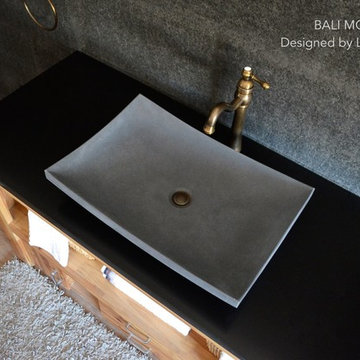
 User
UserReference: BB512A-US
Model: BALI MOON
Color: Gray
Shape: rectangular
Finish: honed-matte outside and inside
US Dimensions: 23-2/3" x 15-2/3" x 4-1/3"
US Drain size: standard hole size (1.5")
Shipping: CA=$39 - NY=$79 - FL=$73 - IL=$51...
Weight: 53 lbs - 24 Kgs
Material: Andesite grade A ( basalt family)
Our BALI MOON model is a rectangular single vessel sink stone - 23-2/3" x 15-2/3" x 4-1/3" made in genuine interior decoration gray andesite ( basalt). The "Exceptional" cut in the block without any comparison with plastic and other chemical resin market often unaffordable.
The outstanding opportunity to make your world unique! Add great value to your home by installing LivingRoc Creations and tell your stone story through the years of conception. Could you imagine one day installing a single vessel sink made from gray basalt, sought after by specialists around the world? We put the extra into the extraordinary by using this noble material.
You will definitely not let anyone feel indifferent with this 100% natural stone unique in the US and exclusively available on Living'ROC.net. This creation will give your bathroom a stunning look. Its gray color and its irresistible look ( trendy concrete look) make it one of the most incredible bathroom sink of the moment.
It is a superb design vanity vessel sink with beautiful, pure and elegant lines. BALI MOON will add class to your bathroom. Our talented masons work shows BALI MOON perfect curves, its Asian-style look and the quality of handcrafted work. BALI MOON's generous perfect proportion will bring you great comfort. It is double waterproofed so the maintenance is easy. We have selected only the most beautiful stones for an exceptional quality.
This vessel sink is ready to use, sitting on a vanity counter top and Highly resistant to chipping and scratching, Withstands hot temperatures, Tolerant to very high temperature changes. All exposed parts of the stone have been double waterproofed.
At LivingRoc we have chosen the most beautiful stones. All our basins are made from high quality, pure genuine materials that will last for years to come. Granite, Basalt, Marble are materials perfectly adapted to bathroom use.
Our creation is delivered without an overflow drain (not included) - every US drains models you can find on the market will fit perfectly on Living'ROC vessel sink. This model is ready to use over the countertop.
The photos you see online have been taken with extreme care by our Founder CEO - Florent LEPVREAU, because without them we would not be one of the natural stone business key player of the online European continent. Once you have encountered the product in your home you will always have pure happiness for the love of the materials. It will be beyond your expectations because what you see online at livingroc.net is what you will receive. This is why we always guarantee a degree of quality (Grade A) and impeccable finish as can attest with the reviews filed by our customers. We also draw your attention to the fact that veining, flames, small variations of colors and various stone particularities make all the charm of the stone and distinguish it from non-natural materials! Simply our living'ROC style.
 Molidor Custom Builders, Inc.
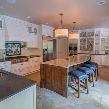
This Kitchen located in a traditional Tudor-style home in Lake Forest, IL needed a drastic change to reflect the sophisticated style and personality of the young, modern family with its executive yet family-oriented lifestyle. Our clients presented us with multiple design and functionality challenges including, but not limited to their kitchen feeling dark and enclosed even with their wonderful 9’ ceilings. There was a true lack of connection between their family room and kitchen, which made it difficult for them to enjoy their time together as a young family. The kitchen lacked storage, included a small desk area used for storing china, and a broken working triangle between appliances and prep areas.
From the client’s lackluster kitchen we set out to provide them with functional and attractive solutions to maximize their storage, space and provide quality that would stand the test of time.
We started by changing the orientation of the kitchen in turn opening up the exterior wall with beautiful French sliding patio doors that originally housed an under-sized window where under perched the kitchen sink. Instantly ample light poured into the space connecting the wooded lot to the kitchen as well as large deck for entertaining. We also opened the adjoining wall to the family room, which allotted open passage and a clear view to join the family space together. A bar height countertop was added for entertaining yet allowed for some visual separation between the spaces. We added spice drawers, towel pull outs at the sink and a wall of display and china cabinetry that mimic the cabinetry designed in the family room with beautiful, serpentine curved mullions by a floating banquette in the breakfast nook.
The exterior runs of the kitchen cabinetry are custom-made and hand finished with a beautiful warm white paint and café latte glaze. With espresso brown marble counters. The center ten-foot island is a rustic alder furniture-grade beauty with hand-turned legs and beautiful shaker panel doors and green marble top that brings in the tones of the teals, creams and browns running through the space. All of this sets on top of a beautiful twelve by twenty-four stone tile laid in an angled herringbone pattern. The kitchen backsplash is a custom tone crackle subway tile with a custom colored hand-cut Ann Sacks glass mosaic representing escargot over the professional-grade oven, surrounded by a hand-poured teal glass border.
The great room appeared extremely dark despite having large windows that reached towards the vaulted ceilings. The client felt attention was not drawn to the outside. The solution we drafted included pulling the mullions out of the windows and painting the trim work white. The fireplace was on one wall and the television on another. With the current furniture arrangements the back would have been to the fireplace. We changed the orientation of the room by placing the television over the fireplace in a recessed niche trimmed with stone and faced the upper portion in silk and the lower in large-format travertine. In creating a more intriguing fireplace façade we provided a focus for the furniture grouping to sit within. An oversized section with extra deep seating allows for a comfortable place to perch and spend family time while watching movies. The lighting in the space prior was not adequate so we created the addition of a small chandelier over the game table near the windows and added volume to the ceiling by including a larger chandelier central within the room with more candles. These changes helped update the formerly outdated dark and dreary space.
With the bones of the room uplifted we drew our attention to adding detail in furnishings and window treatments. We accented the room with subtle patterning on top of bold color choices. The chairs offer depth and dimension with the green citron accented seats and peacock-patterned back fabric that help tone the colors down. To lighting the space we added an oversized cocktail ottoman that floats beautifully within the space and brings in the blue accents with button tufts as a peek-a-boo effect within. The sliding tray works perfectly to function as both a cocktail table and place to rest one’s feet. The game table in the rear of the room has an inlaid cross-cut branch marquis within the top and is surrounded by clean-lined chairs and a curved banquette perfect for a family to play games at and spend their quality time. Beautiful bounding window treatments drape the two-story window wall with an over-sized medallion patterned top treatment cascading into solid blue striated fabric trimmed with beaded shell trim for an appropriately dynamic finishing touch to the space.
The kitchen and family room meld beautifully together and offer a crisp yet welcoming feel to the home in keeping with the Tudor styling and modern family needs. It’s a space truly to be enjoyed by all who visit.
Katherine Elizabeth Designs

Sponsored
Columbus, OH

HomeCraft Remodeling
Custom Craftsmanship & Build Solutions in Franklin County, Ohio
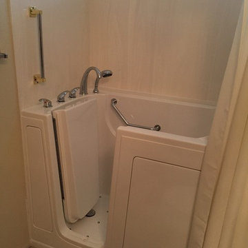
 Independent Home Walk in Tubs of Florida
Independent Home just recently completed a Florida walk in tub installation in the city of Pensacola for our customer Claire S. Learn about the process and why it may be a good idea to add one to your home!
Our installation process starts with a pre-installation meeting with the customer to go over what type of walk in tub is best for their needs, what the best location would be, and what type of the finish the customer wants. At the meeting with Claire, she told us that she wanted a tub that could prove a safe bathing experience but also help with her arthritis and leg pain. Our installation experts decided that the celebrity walk in tub was the best option for Claire.
The celebrity walk in tub was the best option for Claire’s Florida home because of the safety features it is able to provide. Claire’s previous bathtub had a 15 inch edge, which made her nervous of getting in and out. Her old tub also had a non-secure seat giving Claire the fear that she may fall. The celebrity walk in tub has a low threshold eliminating the high edge. It also has a 17” ADA compliant seat, giving Claire that extra security that she needed.
As stated before Claire suffers from arthritis and leg pain and she wanted her new tub to help with the pain. The celebrity walk in tub was a great choice because you are able to add hydrotherapy features. Hydrotherapy is the use of water to help decrease physical discomfort. It works by the jets greater range of motion. The jets waves allow an increase in circulation causing the joint inflammation to decrease, which will help eliminate Claire’s pain.
Installing Claire’s walk in tub took just a couple of days to complete. The process included removing Claire’s old tub including the foundation, putting in the proper plumbing, connecting the water, making sure there weren’t any leaks, and finally building the shelf area around the tub.
Claire is extremely happy with her new walk in tub. Her worries of falling are behind her. She enjoys that when she is in a hurry and can’t enjoy a full soak there is an extendable shower wand. Overall, every time Claire gets a bath she feels like she is at her own private spa.
 InnovationLand
Houston Interior Designer Lisha Maxey took this Museum District condo from the dated, mirrored walls of the 1980s to Mid Century Modern with a gallery look featuring the client's art collection.
"The place was covered with glued-down, floor-to-ceiling mirrors," says Lisha Maxey, senior designer for Homescapes of Houston and principal at LGH Design Services in Houston. "When we took them off the walls, the walls came apart. We ended up taking them down to the studs."
The makeover took six months to complete, primarily because of strict condo association rules that only gave the Houston interior designers very limited access to the elevator - through which all materials and team members had to go.
"Monday through Friday, we could only be noisy from 10 a.m. to 2 p.m., and if we had to do something extra loud, like sawing or drilling, we had to schedule it with the management and they had to communicate that to the condo owners. So it was just a lot of coordination. But a lot of Inner City Loopers live in these kinds of buildings, so we're used to handling that kind of thing."
The client, a child psychiatrist in her 60s, recently moved to Houston from northeast Texas to be with friends. After being widowed three years ago, she decided it was time to let go of the traditionally styled estate that wasn't really her style anyway. An avid diver who has traveled around the world to pursue her passion, she has amassed a large collection of art from her travels. Downsizing to 1,600 feet and wanting to go more contemporary, she wanted the display - and the look - more streamlined.
"She wanted clean lines and muted colors, with the main focus being her artwork," says Maxey. "So we made the space a palette for that."
Enter the white, gallery-grade paint she chose for the walls: "It's halfway between satin and flat," explains Maxey. "It's not glossy and it's not chalky - just very smooth and clean."
Adding to the gallery theme is the satin nickel track lighting with lamps aimed to highlight pieces of art. "This lighting has no wires," notes Maxey. "It's powered by a positive and negative conduit."
The new flooring throughout is a blended-grey porcelain tile that looks like wood planks. "It's gorgeous, natural-looking and combines all the beauty of wood with the durability of tile," says Maxey. "We used it throughout the condo to unify the space."
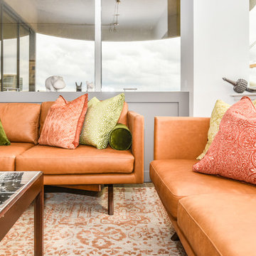
After Maxey started looking at the client's bright, vibrant, colorful artwork, she felt the palette couldn't stay as muted anymore. Hence the Mid Century Modern orange leather sofas from West Elm and chartruese chairs from Joybird, plus the throw pillows in different textures, patterns and shades of gold, orange and green.
The concave lines of the Danish-inspired chairs, she notes, help them look beautiful from all the way around - a key to designing spaces for loft living.
"The table in the living room is very interesting," notes Maxey. "It was handmade for the client in 1974 and has a signature on it from the artist. She was adamant about including the piece, which has all these hand-painted black-and-white art tiles on the top. I took one look at it and said 'It's not really going to go.'"
However, after cutting 6 inches off the bottom and making it look a little distressed, the table ended up being the perfect complement to the sofas.
The dining room table - from Design Within Reach - is a solid piece of mahogany, the chair upholstery a mix of grey velvet and leather and the legs a shiny brass. "The side chairs are leather and the end ones are velvet," says Maxey. "It's a nice textural mix that lends depth and texture."
The galley kitchen, meanwhile, has been lightened and brightened, with white quartz countertops and backsplashes mimicking the look of Carrara marble, stainless steel appliances and a velvet green bench seat for a punch of color. The cabinets are painted a cool grey color called "Silverplate."
The two bathrooms have been updated with contemporary white vanities and vessel sinks and the master bath now features a walk-in shower tiled in Dolomite white marble (the floor is Bianco Carrara marble mosaic, done in a herringbone pattern.
In the master bedroom, Homescapes of Houston knocked down a wall between two smaller closets with swing doors to make one large walk-in closet with pocket doors. The closet in the guest bedroom also came out 13 more inches.
The client's artwork throughout personalizes the space and tells the story of a life. There's a huge bowl of shells from the client's diving adventures, framed art from her child psychiatry patients and a 16th century wood carving from a monastery that's been in her family forever.
"Her collection is quite impressive," says Maxey. "There's even a framed piece of autographed songs written by John Lennon." (You can see this black-framed piece of art on the wall in the photo above of two green chairs).
"We're extremely happy with how the project turned out, and so is the client," says Maxey. "No expense was spared for her. It was a labor of love and we were excited to do it."

 Melanie Rekola Landscape Design
Landscape design and photography by Melanie Rekola
This lovely landscape sports a poured in place concrete slab patio with drought tolerant sedum plants between the slabs. This sedum mix is sold in sheets then cut to fit but it’s actually grown for green-roof application. It works perfectly in this hot environment too as it is extremely drought tolerant and can go a month without water. Because the water runoff is absorbed between the slabs the patio drainage works perfectly and there are no need for drains.The swimming pool is of the fiberglass variety. Though the initial investment is greater than that of vinyl pools the ROI is greater over a 10 year period. Fiberglass pools retains more heat as the pool shell is all one piece and they don’t ever require a new liner.. This fiberglass pool has cool built-in benching and steps. And there is even a swim jet built into one side great for those cardio blasting swims. The pool interior colour is grey though it shows a soft blue/grey when water is added due to the reflection of the sky and other surroundings. The pool coping is natural stone with rock face edge. The steel arbour was custom made. Metal (steel) was chosen for it’s slim strength as wood placed here would have been too chunky. The best rooms (indoors or our) have a subtle layering of textural elements. To me this landscape needed a structure here to define the “rooms” It will look even better in a few years when the vines reach the top and the Miscanthus on either side reaches its 7′ height!The 12′ x 16′ pavilion is also made of steel and houses an alfresco dining table and sofa set. The pavilions built in cupola makes the warm breezes comfortably pass through with no need for a fan. It’s also sunken 2′ from the pool/patio height and nestled nicely in the corner. I must also mention the large slim planters with “Red Shades” Canna lily within. They are the perfect boldness/balance!Step through the arbor and a linear pond with “floating” natural stone step is revealed! Two smooth flow scuppers are responsible for the quiet waterfalls either side. A wood deck overhangs the pond adding softness to the setting. A modern retaining wall with natural stone cap runs the full width of the pond and pool adding interest and dimension. In the covered outdoor living area this wall is the perfect seat wall - adding lots of extra party seating!
 InnovationLand
Houston Interior Designer Lisha Maxey took this Museum District condo from the dated, mirrored walls of the 1980s to Mid Century Modern with a gallery look featuring the client’s art collection.
The place was covered with glued-down, floor-to-ceiling mirrors,” says Lisha Maxey, senior designer for Homescapes of Houston and principal at LGH Design Services in Houston. “When we took them off the walls, the walls came apart. We ended up taking them down to the studs."
The makeover took six months to complete, primarily because of strict condo association rules that only gave the Houston interior designers very limited access to the elevator – through which all materials and team members had to go.
“Monday through Friday, we could only be noisy from 10 a.m. to 2 p.m., and if we had to do something extra loud, like sawing or drilling, we had to schedule it with the management and they had to communicate that to the condo owners. So it was just a lot of coordination. But a lot of Inner City Loopers live in these kinds of buildings, so we’re used to handling that kind of thing.”
The client, a child psychiatrist in her 60s, recently moved to Houston from northeast Texas to be with friends. After being widowed three years ago, she decided it was time to let go of the traditionally styled estate that wasn’t really her style anyway. An avid diver who has traveled around the world to pursue her passion, she has amassed a large collection of art from her travels. Downsizing to 1,600 feet and wanting to go more contemporary, she wanted the display – and the look – more streamlined.
“She wanted clean lines and muted colors, with the main focus being her artwork,” says Maxey. “So we made the space a palette for that.”
Enter the white, gallery-grade paint she chose for the walls: “It’s halfway between satin and flat,” explains Maxey. “It’s not glossy and it’s not chalky – just very smooth and clean."
Adding to the gallery theme is the satin nickel track lighting with lamps aimed to highlight pieces of art. “This lighting has no wires,” notes Maxey. “It’s powered by a positive and negative conduit.”
The new flooring throughout is a blended-grey porcelain tile that looks like wood planks. “It’s gorgeous, natural-looking and combines all the beauty of wood with the durability of tile,” says Maxey. “We used it throughout the condo to unify the space.”
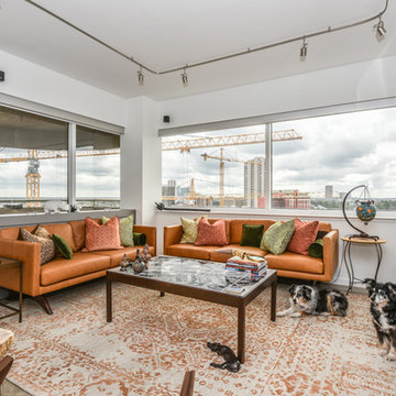
After Maxey started looking at the client’s bright, vibrant, colorful artwork, she felt the palette couldn’t stay as muted anymore. Hence the Mid Century Modern orange leather sofas from West Elm and bright green chairs from Joybird, plus the throw pillows in different textures, patterns and shades of gold, orange and green.
The concave lines of the Danish-inspired chairs, she notes, help them look beautiful from all the way around – a key to designing spaces for loft living.
“The table in the living room is very interesting,” notes Maxey. “It was handmade for the client in 1974 and has a signature on it from the artist. She was adamant about including the piece, which has all these hand-painted black-and-white art tiles on the top. I took one look at it and said ‘It’s not really going to go.’”
However, after cutting 6 inches off the bottom and making it look a little distressed, the table ended up being the perfect complement to the sofas.
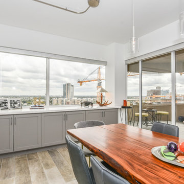
The dining room table – from Design Within Reach – is a solid piece of mahogany, the chair upholstery a mix of grey velvet and leather and the legs a shiny brass. “The side chairs are leather and the end ones are velvet,” says Maxey. “It’s a nice textural mix that lends depth and texture.”The galley kitchen, meanwhile, has been lightened and brightened, with new, white contemporary cabinetry, quartz countertops mimicking the look of Carrara marble, stainless steel appliances and a velvet green bench seat for a punch of color.The two bathrooms have been updated with contemporary white vanities and vessel sinks and the master bath now features a walk-in shower tiled in Dolomite white marble (the floor is Bianco Carrara marble mosaic, done in a herringbone pattern).In the master bedroom, Homescapes of Houston knocked down a wall between two smaller closets with swing doors to make one large walk-in closet with pocket doors. The closet in the guest bedroom also came out 13 more inches.The client’s artwork throughout personalizes the space and tells the story of a life. There’s a huge bowl of shells from the client’s diving adventures, framed art from her child psychiatry patients and a 16th century wood carving from a monastery that’s been in her family forever.
“Her collection is quite impressive,” says Maxey. “There’s even a framed piece of autographed songs written by John Lennon.” (You can see this black-framed piece of art on the wall in the photo above of two green chairs).
“We’re extremely happy with how the project turned out, and so is the client,” says Maxey. “No expense was spared for her. It was a labor of love and we were excited to do it.”
 InnovationLand
Houston Interior Designer Lisha Maxey took this Museum District condo from the dated, mirrored walls of the 1980s to Mid Century Modern with a gallery look featuring the client’s art collection.
The place was covered with glued-down, floor-to-ceiling mirrors,” says Lisha Maxey, senior designer for Homescapes of Houston and principal at LGH Design Services in Houston. “When we took them off the walls, the walls came apart. We ended up taking them down to the studs."
The makeover took six months to complete, primarily because of strict condo association rules that only gave the Houston interior designers very limited access to the elevator – through which all materials and team members had to go.
“Monday through Friday, we could only be noisy from 10 a.m. to 2 p.m., and if we had to do something extra loud, like sawing or drilling, we had to schedule it with the management and they had to communicate that to the condo owners. So it was just a lot of coordination. But a lot of Inner City Loopers live in these kinds of buildings, so we’re used to handling that kind of thing.”
The client, a child psychiatrist in her 60s, recently moved to Houston from northeast Texas to be with friends. After being widowed three years ago, she decided it was time to let go of the traditionally styled estate that wasn’t really her style anyway. An avid diver who has traveled around the world to pursue her passion, she has amassed a large collection of art from her travels. Downsizing to 1,600 feet and wanting to go more contemporary, she wanted the display – and the look – more streamlined.
“She wanted clean lines and muted colors, with the main focus being her artwork,” says Maxey. “So we made the space a palette for that.”
Enter the white, gallery-grade paint she chose for the walls: “It’s halfway between satin and flat,” explains Maxey. “It’s not glossy and it’s not chalky – just very smooth and clean."
Adding to the gallery theme is the satin nickel track lighting with lamps aimed to highlight pieces of art. “This lighting has no wires,” notes Maxey. “It’s powered by a positive and negative conduit.”
The new flooring throughout is a blended-grey porcelain tile that looks like wood planks. “It’s gorgeous, natural-looking and combines all the beauty of wood with the durability of tile,” says Maxey. “We used it throughout the condo to unify the space.”
After Maxey started looking at the client’s bright, vibrant, colorful artwork, she felt the palette couldn’t stay as muted anymore. Hence the Mid Century Modern orange leather sofas from West Elm and bright green chairs from Joybird, plus the throw pillows in different textures, patterns and shades of gold, orange and green.
The concave lines of the Danish-inspired chairs, she notes, help them look beautiful from all the way around – a key to designing spaces for loft living.
“The table in the living room is very interesting,” notes Maxey. “It was handmade for the client in 1974 and has a signature on it from the artist. She was adamant about including the piece, which has all these hand-painted black-and-white art tiles on the top. I took one look at it and said ‘It’s not really going to go.’”
However, after cutting 6 inches off the bottom and making it look a little distressed, the table ended up being the perfect complement to the sofas.
The dining room table – from Design Within Reach – is a solid piece of mahogany, the chair upholstery a mix of grey velvet and leather and the legs a shiny brass. “The side chairs are leather and the end ones are velvet,” says Maxey. “It’s a nice textural mix that lends depth and texture.”The galley kitchen, meanwhile, has been lightened and brightened, with new, white contemporary cabinetry, quartz countertops mimicking the look of Carrara marble, stainless steel appliances and a velvet green bench seat for a punch of color.The two bathrooms have been updated with contemporary white vanities and vessel sinks and the master bath now features a walk-in shower tiled in Dolomite white marble (the floor is Bianco Carrara marble mosaic, done in a herringbone pattern).In the master bedroom, Homescapes of Houston knocked down a wall between two smaller closets with swing doors to make one large walk-in closet with pocket doors. The closet in the guest bedroom also came out 13 more inches.The client’s artwork throughout personalizes the space and tells the story of a life. There’s a huge bowl of shells from the client’s diving adventures, framed art from her child psychiatry patients and a 16th century wood carving from a monastery that’s been in her family forever.
“Her collection is quite impressive,” says Maxey. “There’s even a framed piece of autographed songs written by John Lennon.” (You can see this black-framed piece of art on the wall in the photo above of two green chairs).
“We’re extremely happy with how the project turned out, and so is the client,” says Maxey. “No expense was spared for her. It was a labor of love and we were excited to do it.”
 User
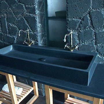
UserModel: LOOAN SHADOW - Color: Black
Shape: rectangular
Finish: honed inside and outside
US Dimensions: 47-1/4" x 18-1/5" x 5-1/5"
US Drain size: standard hole size (1.5") x 1
Holes Faucets: With
Faucet holes size: 1.38" X2 (back side of the sink is hollow)
Material: granite grade A
Weight: 218 lbs
Double Bathroom natural stone trough Sink LOOAN SHADOW - 47-1/4" x 18-1/5" x 5-1/5" with two faucets hole and one drain is made and carved from a genuine Trendy pure black granite. The "Exceptional" cut in the block without any comparison with plastic and other chemical resin market often unaffordable. Simply our living'ROC USA style.
The outstanding opportunity to make your world unique! Add great value to your home by installing LivingRoc Creations and tell your stone story through the years of conception. Could you imagine one day installing a double basin made from pure black granite, sought after by specialists around the world (simply to more expensive black granite in the world to buy). We put the extra into the extraordinary by using this noble material. Discover the well–being provided by this beautiful piece. Sleek lines and Zen-style LOOAN SHADOW give a simple but chic look to your bathroom. Cut from a rare and invaluable black granite block you will love its generous length size 47".
LOOAN SHADOW is a unique product in the U.S.A. and You will not let anyone feel indifferent with this very design living'ROC creation designed by our CEO Florent LEPVREAU.
if you wish to standardize your project, you can choose among a wide range of black shower bases in Shanxi Pure Black granite or black mongolia basalt (very similar color) carved from the same material (similar tones and finishes) as for example black granite models Spacium Shadow, Palaos Shadow, Quasar Shadow or Dalaos Shadow and mongolia black models Serena Black, Corail Black
This vessel sink is Highly resistant to chipping and scratching, withstands hot temperatures, tolerant to very high temperature changes.
Our creation is delivered without an overflow drain and faucet (not included) - every US drains and faucets models you can find on the market will fit perfectly on Living'ROC vessel sink. This model is ready to use over the countertop.
The photos you see online have been taken with extreme care by our Founder CEO - Florent LEPVREAU to give our visitors the best idea on how it might looks like. However our creation may vary from block to block as only mother nature will decides what you may receive (each sink is unique) even if our Gray and black Granite are very stable and are super close to our porfolio photos. We also draw your attention to the fact that veining, crystallization, that may appear to be cracks, but are actually indigenous to the stone, variations of colors (more on marble and onyx) and various stone features make all the charm of the stone and distinguish it from non-natural materials!. The Quality Inspection photos example shown on our portfolio are not available to choose by numbers. Our Customer service would be more than happy to share any additional photos with you if you would like... Simply Our Living'ROC Style
 Apex Design & Drafting
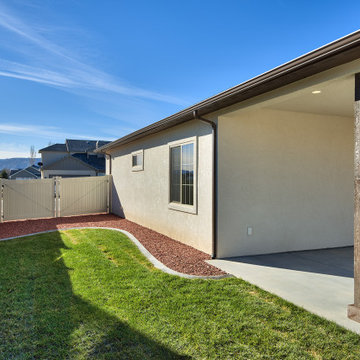
This exquisite design is overflowing with exciting extras. Blending stone with stucco this attractive exterior features a covered porch, wood pillars, stone, decorative windows, and metal roof accents. Inside every room and living space was given very careful thought and functions extremely well for perfect livability. The secondary bedrooms are provided with a jack and jill bathroom and the master suite is arranged for plenty of privacy from the secondary bedrooms.
 InnovationLand
Houston Interior Designer Lisha Maxey took this Museum District condo from the dated, mirrored walls of the 1980s to Mid Century Modern with a gallery look featuring the client’s art collection.
The place was covered with glued-down, floor-to-ceiling mirrors,” says Lisha Maxey, senior designer for Homescapes of Houston and principal at LGH Design Services in Houston. “When we took them off the walls, the walls came apart. We ended up taking them down to the studs."
The makeover took six months to complete, primarily because of strict condo association rules that only gave the Houston interior designers very limited access to the elevator – through which all materials and team members had to go.
“Monday through Friday, we could only be noisy from 10 a.m. to 2 p.m., and if we had to do something extra loud, like sawing or drilling, we had to schedule it with the management and they had to communicate that to the condo owners. So it was just a lot of coordination. But a lot of Inner City Loopers live in these kinds of buildings, so we’re used to handling that kind of thing.”
The client, a child psychiatrist in her 60s, recently moved to Houston from northeast Texas to be with friends. After being widowed three years ago, she decided it was time to let go of the traditionally styled estate that wasn’t really her style anyway. An avid diver who has traveled around the world to pursue her passion, she has amassed a large collection of art from her travels. Downsizing to 1,600 feet and wanting to go more contemporary, she wanted the display – and the look – more streamlined.
“She wanted clean lines and muted colors, with the main focus being her artwork,” says Maxey. “So we made the space a palette for that.”
Enter the white, gallery-grade paint she chose for the walls: “It’s halfway between satin and flat,” explains Maxey. “It’s not glossy and it’s not chalky – just very smooth and clean."
Adding to the gallery theme is the satin nickel track lighting with lamps aimed to highlight pieces of art. “This lighting has no wires,” notes Maxey. “It’s powered by a positive and negative conduit.”
The new flooring throughout is a blended-grey porcelain tile that looks like wood planks. “It’s gorgeous, natural-looking and combines all the beauty of wood with the durability of tile,” says Maxey. “We used it throughout the condo to unify the space.”
After Maxey started looking at the client’s bright, vibrant, colorful artwork, she felt the palette couldn’t stay as muted anymore. Hence the Mid Century Modern orange leather sofas from West Elm and bright green chairs from Joybird, plus the throw pillows in different textures, patterns and shades of gold, orange and green.
The concave lines of the Danish-inspired chairs, she notes, help them look beautiful from all the way around – a key to designing spaces for loft living.
“The table in the living room is very interesting,” notes Maxey. “It was handmade for the client in 1974 and has a signature on it from the artist. She was adamant about including the piece, which has all these hand-painted black-and-white art tiles on the top. I took one look at it and said ‘It’s not really going to go.’”
However, after cutting 6 inches off the bottom and making it look a little distressed, the table ended up being the perfect complement to the sofas.
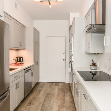
The dining room table – from Design Within Reach – is a solid piece of mahogany, the chair upholstery a mix of grey velvet and leather and the legs a shiny brass. “The side chairs are leather and the end ones are velvet,” says Maxey. “It’s a nice textural mix that lends depth and texture.”The galley kitchen, meanwhile, has been lightened and brightened, with new, white contemporary cabinetry, quartz countertops mimicking the look of Carrara marble, stainless steel appliances and a velvet green bench seat for a punch of color.The two bathrooms have been updated with contemporary white vanities and vessel sinks and the master bath now features a walk-in shower tiled in Dolomite white marble (the floor is Bianco Carrara marble mosaic, done in a herringbone pattern).In the master bedroom, Homescapes of Houston knocked down a wall between two smaller closets with swing doors to make one large walk-in closet with pocket doors. The closet in the guest bedroom also came out 13 more inches.The client’s artwork throughout personalizes the space and tells the story of a life. There’s a huge bowl of shells from the client’s diving adventures, framed art from her child psychiatry patients and a 16th century wood carving from a monastery that’s been in her family forever.
“Her collection is quite impressive,” says Maxey. “There’s even a framed piece of autographed songs written by John Lennon.” (You can see this black-framed piece of art on the wall in the photo above of two green chairs).
“We’re extremely happy with how the project turned out, and so is the client,” says Maxey. “No expense was spared for her. It was a labor of love and we were excited to do it.”
 Kitchen Solvers of Fort Lauderdale
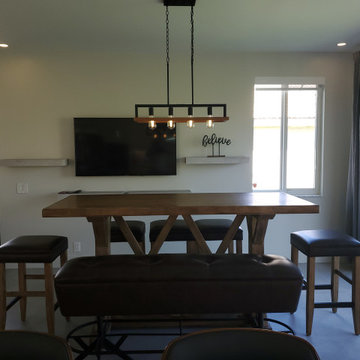
Our client commissioned us to remodel her home. She wanted an open plan concept and for the kitchen to be integrated with the living room and dining room. She also needed a space in which she could work. So we decided to remove the walls that separated the kitchen from the living room and the dining room. We expanded the kitchen space on both sides and made an "L" layout with cabinets on both walls. To complement and establish a virtual limit of space, we placed a large island 10 feet long by 4 feet wide with drawers on the kitchen side and storage cabinets on the sitting side. The cabinets are all prefinished plywood with acrylic doors, white for the cabinets on the walls and gray for the center island. All base cabinets have soft close pullouts. The drawers were complemented with accessories to organize all the kitchen utensils. The corner cabinet was custom made extra long to accommodate a large swing-out and spice rack next to it. At the extreme end of the kitchen cabinets, we placed a "coffee station" with dark gray floating shelves on top, their respective pullouts on the base cabinets. Under the wall and base cabinets we place LED lights that enhance and highlight the kitchen day and night. All ceiling lights were also replaced with recessed LED lights. Over the island and the dining table hanging lights were placed along them. Power strip outlets with USB ports were also placed under the wall cabinets and in the headboards of the island, these are hidden giving a clean aesthetic to the backsplash and very functional on a day-to-day basis. The countertops of the cabinets on the walls were done in gray porcelain as well as the full backsplash that also covers the central area of the hood. The central island countertop was made in Quarzite. The floors were replaced with 48" by 48" rectified porcelain tile. Now this homeowner has the kitchen of their dreams.
 InnovationLand
Houston Interior Designer Lisha Maxey took this Museum District condo from the dated, mirrored walls of the 1980s to Mid Century Modern with a gallery look featuring the client's art collection.
"The place was covered with glued-down, floor-to-ceiling mirrors," says Lisha Maxey, senior designer for Homescapes of Houston and principal at LGH Design Services in Houston. "When we took them off the walls, the walls came apart. We ended up taking them down to the studs."
The makeover took six months to complete, primarily because of strict condo association rules that only gave the Houston interior designers very limited access to the elevator - through which all materials and team members had to go.
"Monday through Friday, we could only be noisy from 10 a.m. to 2 p.m., and if we had to do something extra loud, like sawing or drilling, we had to schedule it with the management and they had to communicate that to the condo owners. So it was just a lot of coordination. But a lot of Inner City Loopers live in these kinds of buildings, so we're used to handling that kind of thing."
The client, a child psychiatrist in her 60s, recently moved to Houston from northeast Texas to be with friends. After being widowed three years ago, she decided it was time to let go of the traditionally styled estate that wasn't really her style anyway. An avid diver who has traveled around the world to pursue her passion, she has amassed a large collection of art from her travels. Downsizing to 1,600 feet and wanting to go more contemporary, she wanted the display - and the look - more streamlined.
"She wanted clean lines and muted colors, with the main focus being her artwork," says Maxey. "So we made the space a palette for that."
Enter the white, gallery-grade paint she chose for the walls: "It's halfway between satin and flat," explains Maxey. "It's not glossy and it's not chalky - just very smooth and clean."
Adding to the gallery theme is the satin nickel track lighting with lamps aimed to highlight pieces of art. "This lighting has no wires," notes Maxey. "It's powered by a positive and negative conduit."
The new flooring throughout is a blended-grey porcelain tile that looks like wood planks. "It's gorgeous, natural-looking and combines all the beauty of wood with the durability of tile," says Maxey. "We used it throughout the condo to unify the space."
After Maxey started looking at the client's bright, vibrant, colorful artwork, she felt the palette couldn't stay as muted anymore. Hence the Mid Century Modern orange leather sofas from West Elm and chartruese chairs from Joybird, plus the throw pillows in different textures, patterns and shades of gold, orange and green.
The concave lines of the Danish-inspired chairs, she notes, help them look beautiful from all the way around - a key to designing spaces for loft living.
"The table in the living room is very interesting," notes Maxey. "It was handmade for the client in 1974 and has a signature on it from the artist. She was adamant about including the piece, which has all these hand-painted black-and-white art tiles on the top. I took one look at it and said 'It's not really going to go.'"
However, after cutting 6 inches off the bottom and making it look a little distressed, the table ended up being the perfect complement to the sofas.
The dining room table - from Design Within Reach - is a solid piece of mahogany, the chair upholstery a mix of grey velvet and leather and the legs a shiny brass. "The side chairs are leather and the end ones are velvet," says Maxey. "It's a nice textural mix that lends depth and texture."
The galley kitchen, meanwhile, has been lightened and brightened, with white quartz countertops and backsplashes mimicking the look of Carrara marble, stainless steel appliances and a velvet green bench seat for a punch of color. The cabinets are painted a cool grey color called "Silverplate."
The two bathrooms have been updated with contemporary white vanities and vessel sinks and the master bath now features a walk-in shower tiled in Dolomite white marble (the floor is Bianco Carrara marble mosaic, done in a herringbone pattern.
In the master bedroom, Homescapes of Houston knocked down a wall between two smaller closets with swing doors to make one large walk-in closet with pocket doors. The closet in the guest bedroom also came out 13 more inches.
The client's artwork throughout personalizes the space and tells the story of a life. There's a huge bowl of shells from the client's diving adventures, framed art from her child psychiatry patients and a 16th century wood carving from a monastery that's been in her family forever.
"Her collection is quite impressive," says Maxey. "There's even a framed piece of autographed songs written by John Lennon." (You can see this black-framed piece of art on the wall in the photo above of two green chairs).
"We're extremely happy with how the project turned out, and so is the client," says Maxey. "No expense was spared for her. It was a labor of love and we were excited to do it."
 Kaoud Carpet & Rugs
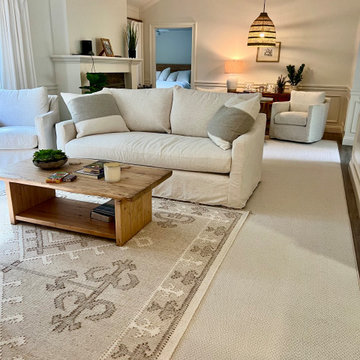
Layering rugs, one on top of the other can add a lot of interest to a space. Layering a smaller rug on top of larger rug offers a simple way to add extra texture to your living space. Here is a combination of a handmade wool Kilim area rug already providing a textured look, layered on top of a larger neutral colored area rug. Our goal was to have the larger rug extend the space while providing a cohesive look. It is a fantastic look and our client is extremely happy.
 Cassoni Furniture & Accessories
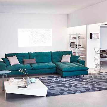
- AVARIT SOFA. Sectional and sofa in wood and wood chipboard with elastic strips. Joints between the various components by means of “fork” mechanism. Matt painted metal feet. Fully removable fabric or leather covers.
Also sectional available in different modules.
https://cassoni.com/Avarit-sofa-03
- VOILA COFFEE TABLE. Voilà is an original coffee table. In the plexiglas version, it stands out for the appeal of its transparency and for a range of colours of doubtless vivacity: it is available transparent, smoked, orange, yellow or blue. The sheet metal version is painted matt in white, anthracite grey and dove grey and emphasizes instead the interest in its geometrical structure.
Dimensions: 39"3/8W x 39"3/8D x 9"7/8H.
https://cassoni.com/Voila_coffee_table-01
- TIE COFFEE TABLE. The slim bent sheet metal feet support the table top, affording an extremely light-weight appearance. The base of Tie, which is made of painted metal (white, anthracite grey, dove-grey or amaranth) or brass, copper or pickled effect, contrasts with the different textured materials of the table tops, in biomalta, glossy lacquered, heat-treated oak-wood or ceramic. Tie is available in the version with a round or hexagonal table top.
Available in different sizes and shapes.
https://cassoni.com/Tie_coffee_table-01
- NOTE BOOKCASE. A pentagram where the notes are the books which are arranged to the owner's liking to reflect the image of a personal melody. The Note bookcase is visually distinguished by the combination of the horizontal element, the shelves, with the vertical element, the beams. The shelves and beams are made of wood and are arranged in specific color combinations.
Dimensions: 61"W x 16"1/2D x 68"1/8H.
https://cassoni.com/Note_bookcase-01
- BLAZER LOUNGE CHAIR. Versatile and original relax armchair available in two different heights. Painted steel frame Seat with feather padding and backrest with high density shrink-resistant polyurethane, removable upholstery available in fabric or leather. With an extra charge, the outer upholstery of the backrest is available in another fabric category. Optional ottoman.
Available with high or low back.
https://cassoni.com/Blazer_lounge_chair-01
 Orbit Homes
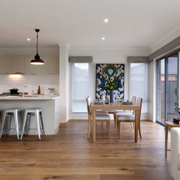
The Burnley 243 makes smart use of its extra space by adding a multi-purpose room upstairs that gives the whole design even more lifestyle flexibility. With that enhanced versatility, this is a luxurious layout the whole family will be extremely happy to call home. http://orbithomes.com.au/qld-homes/burnley-26/?range=abode
12