
Search results for "Extra extremely" in Home Design Ideas
 Jackson Design Build
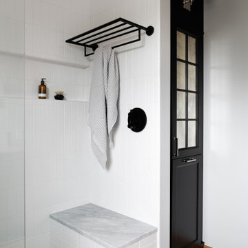
Example of a transitional master mosaic tile floor, multicolored floor and double-sink alcove shower design in Seattle with raised-panel cabinets, medium tone wood cabinets, an undermount sink, marble countertops, gray countertops and a built-in vanity

 Flooret
Weathered and refined. Grey floors have become the hottest design trend, but not all greys are the same. For Nevis, we aim to provide a pattern that errs to the modern side, while still evoking some rustic elements. This isn’t outright reclaimed, but it’s just wild enough to not be monotone either.
The most important specification for determining the durability of vinyl flooring is the thickness of the wear-layer. The best wear-layers are made of thick, clear virgin PVC, which covers the paper print-film that gives the floor its unique appearance. Once the wear-layer wears through, the paper is damaged and the floor will need replacement.
Most vinyl floors come with a 8-12 mil wear-layer (0.2-3 mm). The top commercial specs in the industry are higher, at 20-22 mil (0.5 mm). A select few manufacturers offer a “super” commercial spec of 28 mil (0.7 mm).
For Modin, we decided to set a new standard: 40 mil (1.0 mm) of premium virgin PVC. This allows us to offer an industry-leading 20 year Commercial Warranty (Lifetime Residential), compared to nearly all other commercial vinyl floors’ 10 year Commercial Warranty.
Beyond our superior wear-layer, we also use a patented click mechanism for superior hold, and a ceramic-bead coating.
SIZE MATTERS
Wider and longer planks create a sense of space and luxury. Most vinyl floors come in 6” or 7” widths, and 36” or 48” lengths.
For Modin, we designed our planks to be 9” wide, and 60” long. This extra large size allows our gorgeous designs to be fully expressed.
DETAILS THAT COUNT
We made sure to get all the details right. Real texture, to create the feel of wire-brushed wood. Low sheen level, to ensure a natural look that wears well over time. 4-sided bevels, to more accurately emulate the look of real planks. When added together they help create the unique look that is Modin.
DESIGNS THAT INSPIRE
We spent nearly a year just focusing on our designs, to ensure they provide the right mix of color and depth. Focusing on timeless wire-brush and European Oak styles, as well as more contemporary modern washes, our collection offers truly beautiful design that is both functional and inspiring.
 Anthology Woods
Products making their television debut in this project were Anthology Woods Northwest Blend (a naturally weathered wood installed on a section of the ceiling, unfinished) and the extremely hard & durable Left Coast White Oak, a unique species growing only in a narrow strip of Oregon and bit in California & Washington (installed for the flooring, finished with Rubio Monocoat White natural oil). The homeowners were able to easily apply the finish themselves prior to installing the floor, and the zero VOC nature of the oil insured it was safe to move right in! The White tint to the oil gives a subtle white-washed look to the floors while maintaining a natural look and a supple feel underfoot.
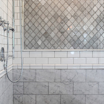
The couple participating in the episode loved their floor so much they decided to add more, installing it in their master bedroom, as well! The rich character of this natural Oak in a flat sawn (the old "European" way to cut Oak) wood product adds a timeless element & warmth to the feel of the space. Looking closely at the grain, you'll see cathedral patterns in many boards, along with a great mix of flat grain with rift areas as well. Finishing out the details of the room, the Bath Crashers team added natural carerra marble in the shower with tones of white & gray, and apron-front vanity sinks for extra charm.
Find the right local pro for your project
 Valet Custom Cabinets & Closets
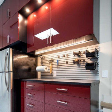
“I boxed it to the ceiling, added base trim to the bottom, and added a gorgeous lighting detail, all to complement the beautiful glossy cabinets. The cabinets needed to be as deep as possible so I used 24-inch-deep sizing on the tall cabinets as well as on the stacked cabinets above. But I only wanted a 16-inch-deep cabinet above the workbench, and I had 24-inch-deep stacked cabinet above that. Instead of a set-back, this became an opportunity: I added an amazing lighting detail using 4 puck lights to highlight this unique feature. It was something you’d wouldn’t typically do in a garage. They loved it because there is nothing typical about this remodel. I also used a specialty pantry cabinet with roll-outs, added tons of drawers in the workbench, and built-out every inch of space on the two walls. The third wall I left open allowing access for the driver to get out of the car. There, we made use of the space by adding Omni track around the multiple utility obstacles on the wall. The result? The client now has an extremely functional and extraordinarily beautiful garage.”
Photography by Karine Weiller
 Inchoate
Photos by Brian Reitz, Creative Vision Studios
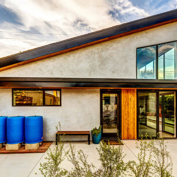
Example of a small trendy gray one-story stucco house exterior design in Los Angeles with a shed roof
Example of a small trendy gray one-story stucco house exterior design in Los Angeles with a shed roof
 Melanie Rekola Landscape Design
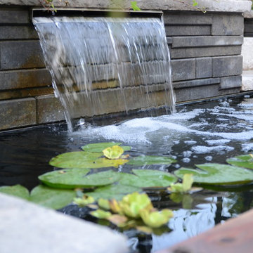
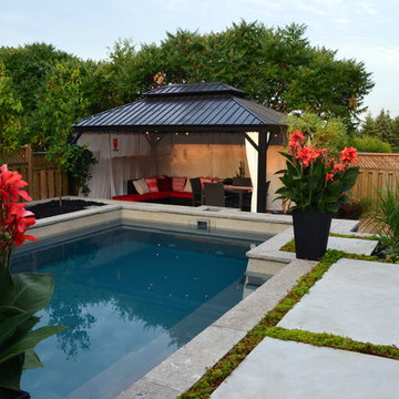
This lovely landscape sports a poured in place concrete slab patio with drought tolerant sedum plants between the slabs. This sedum mix is sold in sheets then cut to fit but it’s actually grown for green-roof application. It works perfectly in this hot environment too as it is extremely drought tolerant and can go a month without water. Because the water runoff is absorbed between the slabs the patio drainage works perfectly and there are no need for drains.The swimming pool is of the fiberglass variety. Though the initial investment is greater than that of vinyl pools the ROI is greater over a 10 year period. Fiberglass pools retains more heat as the pool shell is all one piece and they don’t ever require a new liner.. This fiberglass pool has cool built-in benching and steps. And there is even a swim jet built into one side great for those cardio blasting swims. The pool interior colour is grey though it shows a soft blue/grey when water is added due to the reflection of the sky and other surroundings. The pool coping is natural stone with rock face edge. The steel arbour was custom made. Metal (steel) was chosen for it’s slim strength as wood placed here would have been too chunky. The best rooms (indoors or our) have a subtle layering of textural elements. To me this landscape needed a structure here to define the “rooms” It will look even better in a few years when the vines reach the top and the Miscanthus on either side reaches its 7′ height!The 12′ x 16′ pavilion is also made of steel and houses an alfresco dining table and sofa set. The pavilions built in cupola makes the warm breezes comfortably pass through with no need for a fan. It’s also sunken 2′ from the pool/patio height and nestled nicely in the corner. I must also mention the large slim planters with “Red Shades” Canna lily within. They are the perfect boldness/balance!Step through the arbor and a linear pond with “floating” natural stone step is revealed! Two smooth flow scuppers are responsible for the quiet waterfalls either side. A wood deck overhangs the pond adding softness to the setting. A modern retaining wall with natural stone cap runs the full width of the pond and pool adding interest and dimension. In the covered outdoor living area this wall is the perfect seat wall - adding lots of extra party seating!
The lesson to be learned here is that good design can be applied to any space. This backyard is only 50′ x 45′ and look what can be achieved! Landscape design and photography by Melanie Rekola
 MasterBrand Cabinets
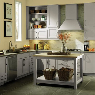
A modern look with a simple but sophisticated feel, this contemporary kitchen uses Elston cabinet doors in a Cloud finish on Maple wood to make the most out of the light, neutral hues in a bright, sunny space. The wide-railed, Shaker-style frame of the Elston cabinet door style from Schrock Cabinetry has a flat center panel and complements any home setting. The matching-color Linear Wood Hood over the stove is also by Schrock, and rounds the room out perfectly. http://www.schrock.com/
Sponsored
Columbus, OH

HomeCraft Remodeling
Custom Craftsmanship & Build Solutions in Franklin County, Ohio
 The Cabinet Studio LLC
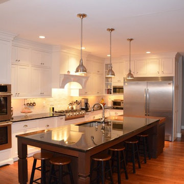
A transitional mix at its best! Inset cabinets in a soft white finish. Complimented by black pearl granite countertops and Sonoma star tile backsplash in creamy crackle color. Very functional Cherry wood island with seating, Kohler Vinnata faucet and sink. Perfectly finished with high quality energy efficient appliances including Frigidaire Professional Series Refrigerator, Electrolux Icon Designer Series Wall oven and Thermador cooktop
 Flooret
Nordic simplicity. White floors can be challenging to use, but when pulled off correctly are extremely rewarding. An instant statement-maker, they often present the challenge of maintenance. For Nordland, we specifically created a slightly weathered pattern with darker knots, so that they do not reveal dirt as quickly.
The most important specification for determining the durability of vinyl flooring is the thickness of the wear-layer. The best wear-layers are made of thick, clear virgin PVC, which covers the paper print-film that gives the floor its unique appearance. Once the wear-layer wears through, the paper is damaged and the floor will need replacement.
Most vinyl floors come with a 8-12 mil wear-layer (0.2-3 mm). The top commercial specs in the industry are higher, at 20-22 mil (0.5 mm). A select few manufacturers offer a “super” commercial spec of 28 mil (0.7 mm).
For Modin, we decided to set a new standard: 40 mil (1.0 mm) of premium virgin PVC. This allows us to offer an industry-leading 20 year Commercial Warranty (Lifetime Residential), compared to nearly all other commercial vinyl floors’ 10 year Commercial Warranty.
Beyond our superior wear-layer, we also use a patented click mechanism for superior hold, and a ceramic-bead coating.
SIZE MATTERS
Wider and longer planks create a sense of space and luxury. Most vinyl floors come in 6” or 7” widths, and 36” or 48” lengths.
For Modin, we designed our planks to be 9” wide, and 60” long. This extra large size allows our gorgeous designs to be fully expressed.
DETAILS THAT COUNT
We made sure to get all the details right. Real texture, to create the feel of wire-brushed wood. Low sheen level, to ensure a natural look that wears well over time. 4-sided bevels, to more accurately emulate the look of real planks. When added together they help create the unique look that is Modin.
DESIGNS THAT INSPIRE
We spent nearly a year just focusing on our designs, to ensure they provide the right mix of color and depth. Focusing on timeless wire-brush and European Oak styles, as well as more contemporary modern washes, our collection offers truly beautiful design that is both functional and inspiring.
 The Inside Story Design, LLC
Jennifer Siu-Rivera, photographer
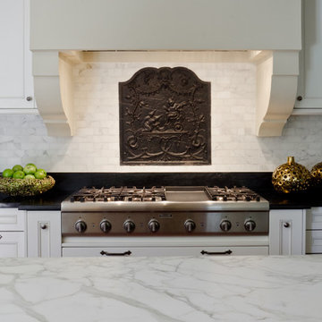
Example of a classic kitchen design in Austin with beaded inset cabinets, white cabinets, marble countertops, white backsplash and an island
Example of a classic kitchen design in Austin with beaded inset cabinets, white cabinets, marble countertops, white backsplash and an island
 InnovationLand
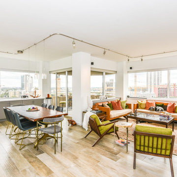
Houston Interior Designer Lisha Maxey took this Museum District condo from the dated, mirrored walls of the 1980s to Mid Century Modern with a gallery look featuring the client’s art collection.
The place was covered with glued-down, floor-to-ceiling mirrors,” says Lisha Maxey, senior designer for Homescapes of Houston and principal at LGH Design Services in Houston. “When we took them off the walls, the walls came apart. We ended up taking them down to the studs."
The makeover took six months to complete, primarily because of strict condo association rules that only gave the Houston interior designers very limited access to the elevator – through which all materials and team members had to go.
“Monday through Friday, we could only be noisy from 10 a.m. to 2 p.m., and if we had to do something extra loud, like sawing or drilling, we had to schedule it with the management and they had to communicate that to the condo owners. So it was just a lot of coordination. But a lot of Inner City Loopers live in these kinds of buildings, so we’re used to handling that kind of thing.”
The client, a child psychiatrist in her 60s, recently moved to Houston from northeast Texas to be with friends. After being widowed three years ago, she decided it was time to let go of the traditionally styled estate that wasn’t really her style anyway. An avid diver who has traveled around the world to pursue her passion, she has amassed a large collection of art from her travels. Downsizing to 1,600 feet and wanting to go more contemporary, she wanted the display – and the look – more streamlined.
“She wanted clean lines and muted colors, with the main focus being her artwork,” says Maxey. “So we made the space a palette for that.”
Enter the white, gallery-grade paint she chose for the walls: “It’s halfway between satin and flat,” explains Maxey. “It’s not glossy and it’s not chalky – just very smooth and clean."
Adding to the gallery theme is the satin nickel track lighting with lamps aimed to highlight pieces of art. “This lighting has no wires,” notes Maxey. “It’s powered by a positive and negative conduit.”
The new flooring throughout is a blended-grey porcelain tile that looks like wood planks. “It’s gorgeous, natural-looking and combines all the beauty of wood with the durability of tile,” says Maxey. “We used it throughout the condo to unify the space.”
After Maxey started looking at the client’s bright, vibrant, colorful artwork, she felt the palette couldn’t stay as muted anymore. Hence the Mid Century Modern orange leather sofas from West Elm and bright green chairs from Joybird, plus the throw pillows in different textures, patterns and shades of gold, orange and green.
The concave lines of the Danish-inspired chairs, she notes, help them look beautiful from all the way around – a key to designing spaces for loft living.
“The table in the living room is very interesting,” notes Maxey. “It was handmade for the client in 1974 and has a signature on it from the artist. She was adamant about including the piece, which has all these hand-painted black-and-white art tiles on the top. I took one look at it and said ‘It’s not really going to go.’”
However, after cutting 6 inches off the bottom and making it look a little distressed, the table ended up being the perfect complement to the sofas.
The dining room table – from Design Within Reach – is a solid piece of mahogany, the chair upholstery a mix of grey velvet and leather and the legs a shiny brass. “The side chairs are leather and the end ones are velvet,” says Maxey. “It’s a nice textural mix that lends depth and texture.”The galley kitchen, meanwhile, has been lightened and brightened, with new, white contemporary cabinetry, quartz countertops mimicking the look of Carrara marble, stainless steel appliances and a velvet green bench seat for a punch of color.The two bathrooms have been updated with contemporary white vanities and vessel sinks and the master bath now features a walk-in shower tiled in Dolomite white marble (the floor is Bianco Carrara marble mosaic, done in a herringbone pattern).In the master bedroom, Homescapes of Houston knocked down a wall between two smaller closets with swing doors to make one large walk-in closet with pocket doors. The closet in the guest bedroom also came out 13 more inches.The client’s artwork throughout personalizes the space and tells the story of a life. There’s a huge bowl of shells from the client’s diving adventures, framed art from her child psychiatry patients and a 16th century wood carving from a monastery that’s been in her family forever.
“Her collection is quite impressive,” says Maxey. “There’s even a framed piece of autographed songs written by John Lennon.” (You can see this black-framed piece of art on the wall in the photo above of two green chairs).
“We’re extremely happy with how the project turned out, and so is the client,” says Maxey. “No expense was spared for her. It was a labor of love and we were excited to do it.”
 ZeroEnergy Design
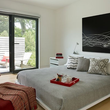
ZeroEnergy Design (ZED) created this modern home for a progressive family in the desirable community of Lexington.
Thoughtful Land Connection. The residence is carefully sited on the infill lot so as to create privacy from the road and neighbors, while cultivating a side yard that captures the southern sun. The terraced grade rises to meet the house, allowing for it to maintain a structured connection with the ground while also sitting above the high water table. The elevated outdoor living space maintains a strong connection with the indoor living space, while the stepped edge ties it back to the true ground plane. Siting and outdoor connections were completed by ZED in collaboration with landscape designer Soren Deniord Design Studio.
Exterior Finishes and Solar. The exterior finish materials include a palette of shiplapped wood siding, through-colored fiber cement panels and stucco. A rooftop parapet hides the solar panels above, while a gutter and site drainage system directs rainwater into an irrigation cistern and dry wells that recharge the groundwater.
Cooking, Dining, Living. Inside, the kitchen, fabricated by Henrybuilt, is located between the indoor and outdoor dining areas. The expansive south-facing sliding door opens to seamlessly connect the spaces, using a retractable awning to provide shade during the summer while still admitting the warming winter sun. The indoor living space continues from the dining areas across to the sunken living area, with a view that returns again to the outside through the corner wall of glass.
Accessible Guest Suite. The design of the first level guest suite provides for both aging in place and guests who regularly visit for extended stays. The patio off the north side of the house affords guests their own private outdoor space, and privacy from the neighbor. Similarly, the second level master suite opens to an outdoor private roof deck.
Light and Access. The wide open interior stair with a glass panel rail leads from the top level down to the well insulated basement. The design of the basement, used as an away/play space, addresses the need for both natural light and easy access. In addition to the open stairwell, light is admitted to the north side of the area with a high performance, Passive House (PHI) certified skylight, covering a six by sixteen foot area. On the south side, a unique roof hatch set flush with the deck opens to reveal a glass door at the base of the stairwell which provides additional light and access from the deck above down to the play space.
Energy. Energy consumption is reduced by the high performance building envelope, high efficiency mechanical systems, and then offset with renewable energy. All windows and doors are made of high performance triple paned glass with thermally broken aluminum frames. The exterior wall assembly employs dense pack cellulose in the stud cavity, a continuous air barrier, and four inches exterior rigid foam insulation. The 10kW rooftop solar electric system provides clean energy production. The final air leakage testing yielded 0.6 ACH 50 - an extremely air tight house, a testament to the well-designed details, progress testing and quality construction. When compared to a new house built to code requirements, this home consumes only 19% of the energy.
Architecture & Energy Consulting: ZeroEnergy Design
Landscape Design: Soren Deniord Design
Paintings: Bernd Haussmann Studio
Photos: Eric Roth Photography
 InnovationLand
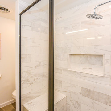
Houston Interior Designer Lisha Maxey took this Museum District condo from the dated, mirrored walls of the 1980s to Mid Century Modern with a gallery look featuring the client's art collection.
"The place was covered with glued-down, floor-to-ceiling mirrors," says Lisha Maxey, senior designer for Homescapes of Houston and principal at LGH Design Services in Houston. "When we took them off the walls, the walls came apart. We ended up taking them down to the studs."
The makeover took six months to complete, primarily because of strict condo association rules that only gave the Houston interior designers very limited access to the elevator - through which all materials and team members had to go.
"Monday through Friday, we could only be noisy from 10 a.m. to 2 p.m., and if we had to do something extra loud, like sawing or drilling, we had to schedule it with the management and they had to communicate that to the condo owners. So it was just a lot of coordination. But a lot of Inner City Loopers live in these kinds of buildings, so we're used to handling that kind of thing."
The client, a child psychiatrist in her 60s, recently moved to Houston from northeast Texas to be with friends. After being widowed three years ago, she decided it was time to let go of the traditionally styled estate that wasn't really her style anyway. An avid diver who has traveled around the world to pursue her passion, she has amassed a large collection of art from her travels. Downsizing to 1,600 feet and wanting to go more contemporary, she wanted the display - and the look - more streamlined.
"She wanted clean lines and muted colors, with the main focus being her artwork," says Maxey. "So we made the space a palette for that."
Enter the white, gallery-grade paint she chose for the walls: "It's halfway between satin and flat," explains Maxey. "It's not glossy and it's not chalky - just very smooth and clean."
Adding to the gallery theme is the satin nickel track lighting with lamps aimed to highlight pieces of art. "This lighting has no wires," notes Maxey. "It's powered by a positive and negative conduit."
The new flooring throughout is a blended-grey porcelain tile that looks like wood planks. "It's gorgeous, natural-looking and combines all the beauty of wood with the durability of tile," says Maxey. "We used it throughout the condo to unify the space."
After Maxey started looking at the client's bright, vibrant, colorful artwork, she felt the palette couldn't stay as muted anymore. Hence the Mid Century Modern orange leather sofas from West Elm and bright green chairs from Joybird, plus the throw pillows in different textures, patterns and shades of gold, orange and green.
The concave lines of the Danish-inspired chairs, she notes, help them look beautiful from all the way around - a key to designing spaces for loft living.
"The table in the living room is very interesting," notes Maxey. "It was handmade for the client in 1974 and has a signature on it from the artist. She was adamant about including the piece, which has all these hand-painted black-and-white art tiles on the top. I took one look at it and said 'It's not really going to go.'"
However, after cutting 6 inches off the bottom and making it look a little distressed, the table ended up being the perfect complement to the sofas.
The dining room table - from Design Within Reach - is a solid piece of mahogany, the chair upholstery a mix of grey velvet and leather and the legs a shiny brass. "The side chairs are leather and the end ones are velvet," says Maxey. "It's a nice textural mix that lends depth and texture."
The galley kitchen, meanwhile, has been lightened and brightened, with white quartz countertops and backsplashes mimicking the look of Carrara marble, stainless steel appliances and a velvet green bench seat for a punch of color. The cabinets are painted a cool grey color called "Silverplate."
The two bathrooms have been updated with contemporary white vanities and vessel sinks and the master bath now features a walk-in shower tiled in Dolomite white marble (the floor is Bianco Carrara marble mosaic, done in a herringbone pattern.
In the master bedroom, Homescapes of Houston knocked down a wall between two smaller closets with swing doors to make one large walk-in closet with pocket doors. The closet in the guest bedroom also came out 13 more inches.
The client's artwork throughout personalizes the space and tells the story of a life. There's a huge bowl of shells from the client's diving adventures, framed art from her child psychiatry patients and a 16th century wood carving from a monastery that's been in her family forever.
"Her collection is quite impressive," says Maxey. "There's even a framed piece of autographed songs written by John Lennon." (You can see this black-framed piece of art on the wall in the photo above of two green chairs).
"We're extremely happy with how the project turned out, and so is the client," says Maxey. "No expense was spared for her. It was a labor of love and we were excited to do it."
 Advance Design Studio, Ltd.
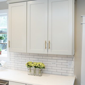
After six years of living in their Huntley IL home, Chris and Meghan were tired of their dark, dingy, outdated kitchen and it was finally time for a long-anticipated change. “The kitchen is the place where we live, it’s where we do everything,” Meghan said. “It was important that it be a space where we wanted to be.” Meghan loves cooking and enjoys including their girls in healthy meal prepping, this led them to want a brighter, more enjoyable kitchen with increased functionality and improved storage.
For Chris especially, the laundry room was an entirely dysfunctional eyesore. “We had a washer and a dryer, but it was all kind-of cobbled together!” Chris said. “There were always laundry piles everywhere, we weren’t really sure what we wanted to do in there, but it was time for us to make a change.” The mess of the space was stressful every time they walked in the door from the garage each day. Kids’ backpacks and shoes piled up haphazardly in the makeshift boot-bench closet left the family feeling disorganized and stressed. They needed space for folding clothes and locker cubbies to help keep the family organized.
Having known Christine and Todd in the Huntley community for years, Chris and Meghan were familiar with their work. “We already trusted them personally and having seen their projects for years we knew they did top notch work. After we reviewed the initial round of designs, we knew that hiring them was definitely the right choice,” Meghan and Chris said. Although Chris had done a lot of work in their home himself, the kitchen and laundry room renovation was such a large undertaking that he didn’t want to steal time away from his family to spend what would surely be many long weekends doing the job himself. “That would not have been a wise choice for us,” Chris laughed.
“Our designer, Michelle was very, very, easy to work with; anything we wanted to see or weren’t sure about, she went above and beyond to make this easy for us. She was easy to get hold of and always quick to respond,” the couple said. Michelle pulled ideas that mirrored the couple’s taste and style and was adept at directing the couple to limited choices that didn’t overwhelm them and kept the process moving. “I have a hard time making decisions. Michelle made the decision-making process so easy. I loved how she listened to what I liked and then presented three great options for me to choose from,” Meghan said.
The main objectives for the kitchen were better storage solutions, they wanted the space to reflect their lifestyle and taste, and they wanted it to last for years with low maintenance. One of the first steps in creating a more functional kitchen was relocating the refrigerator, creating an improved workflow for the busy family.
“We didn’t know that we could even move the refrigerator to a new location where it is now, that was something that we never would have thought of,” Chris said. “The new refrigerator location makes the kitchen feel so much bigger. We didn’t add any space, but our whole kitchen with the new design just seems like it’s so much larger than before!” Meghan said.
The perimeter mist colored cabinets helped warm and brighten the entire room, while the graphite colored cabinets on the island added contrast. Using this fresh, clean color palette satisfied the couple’s desire for a bright space that was the exact opposite of what they had before. Organization accessories were also added to the cabinets such as a spice drawer tray and roll outs to create hidden convenience.
“I absolutely love the hidden spices – it makes cooking so much more enjoyable!” Chris said. “And all the pull outs, and the double trash bin, who would think you could get so excited about organization!” the couple said in unison.
One thing they hated in their original kitchen was how dark the space felt. Added lighting on the ceiling with the new light fixtures combined with the lighter cabinetry colors throughout solved this problem. “Our new kitchen has this warm, almost cozy feeling that our old kitchen never had, it’s just a space that I love spending my time in now,” Meghan said. The light airy feeling was accentuated with the use of floating white shelves on either side of the decorative range hood. “We have so much cabinetry space, the new design is amazing we actually have more storage space than we will ever need,” Meghan said.
The island was extended to create more work surface and added space for stool seating. “The new island changes how we live. Now the kids can be in the kitchen with us, doing homework, eating breakfast, and the three of us have special dinners there when Chris is working late,” Meghan said.
The Carrara Marmi Quartz countertops were chosen because they are, not only beautiful, but are made from hard-working material that doesn’t require maintenance. The white subway tile backsplash that wraps to the ceiling behind the focal point cooktop range/hood compliments the crisp white countertops perfectly, while brushed brass hardware and light fixtures keep the design fresh and new.
The couple had a few fears at the beginning of the project, as most homeowners do. Their biggest fear was being out of their kitchen and laundry room for an extended time. The crew made it very easy for the family to work in a limited space keeping the washer and dryer hooked up the majority of the time, and also getting appliances working with minimal downtime.
“They above and beyond accommodated us to get us through the process,” Meghan said. “They did a great job making sure we were as comfortable as possible throughout the process,” Chris added.
“Our project manager DJ did a great job. He was very good at updating us on schedule changes, getting guys in as quickly as possible. Everyone that stepped in the house was nice and did great work,” said Chris. They thought Advance’s carpenter was phenomenal and were impressed when he took a conceptual idea from a photograph and worked with designer Michelle to create a one of a kind range/hood that has become the topic of conversation with friends and family who visit the new kitchen. “He was in our house literally every day for several weeks. He was easy to work with and good at what he did,” Meghan and Chris said.
The focal point of the kitchen; a hand-crafted, custom-built ventilation hood was clad with handpicked reclaimed barnwood. Advance Design’s carpenter built the framework and the cladding to create a one-of-a-kind design element that the couple loves.
“I think it was especially fun for him to create something unique from scratch, showcasing his talent in this area,” Meghan said. “I love that my kitchen is not like everyone else’s. I got to pick out the wood on my hood and watch it being built and was able to choose what pieces of wood went where on it. It’s totally unique.”
Red Oak flooring was toothed-in throughout the kitchen and the rest of the first floor anywhere changes were made. Then the whole floor was refinished to tone down the orange undertones in the existing floor stain, ultimately changing the color complexion of the entire first floor. The result is a completely new feeling to the entire home.
Renovating the laundry room was extremely important to Meghan and Chris, but they had trouble visualizing what the possibilities were for the seemingly small space. Michelle produced beautiful 3D illustrations that helped them envision the space in a whole new way.
“I must have told Michelle 100 times that I am a visual person, seeing the designs in 3D made it so easy to make decisions and see what we could really do with our space,” Meghan said.
A dividing wall and doorway were removed between the existing laundry room and hallway formerly containing a coat closet, providing space to design specialized graphite colored cabinetry matching the kitchen island to house custom storage cubbies for each family member. Adding the tall utility cabinetry in the new laundry area helped solve the storage issue, tucking away cleaning supplies, household items, and even the cat got its own cubby.
“I love how everything is now hidden in its own space. I can’t tell you how much I hated coming home and seeing everything sitting around on counters,” Chris said.
Electrical outlets were planned for the inside of utility cabinets, so devices could charge in hidden locations. Stacking the washer and dryer allowed for wider countertop space to provide a folding area and a special space for clothes to hang. “The way I do laundry has been completely transformed! I can actually fold clothes and hang them now right out of the washer and dryer,” Meghan said.
“The end result in the kitchen and the laundry/mud room was an updated light and bright space, with a smarter work flow that better meets the needs of this family,” Michelle said.
“I would totally recommend Advance Design,” Meghan said. “Sometimes I sit and just look at my kitchen and laundry room and think ‘Wow, I can’t believe I get to live here!’ It’s an understatement to say we love our new space.”
 Lentz Kitchen & Bath
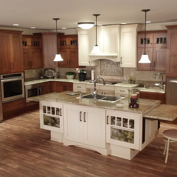
The on-set of a neuromuscular disorder was the basis for this custom kitchen and required the complete customization of this space to the specific needs of the client, as well as to his wife who does most the cooking on a daily basis. The layout was designed for the couple to be able to work together in the kitchen, or independently.
The Crystal Keyline island, range-hood and cooktop area are focal points, finished in Antique Ivory w/Brown Highlights, that contrast nicely with Crystal Keyline Toasted Rye w/Brown Highlights cabinetry. The Bayfield door style unifies the design.
The Typhoon Bordeaux granite countertops are layered in staggered heights for added visual interest.
The Kohler Cruette single-hole faucet with pull-down spout and lever handle service a Kohler "Vault" double-bowl sink (in 8" depth to allow for wheelchair accessibility).
A Northland Cast Iron undermount sink in Biscuit makes for a perfect fruit & vegetable prep area, allowing plenty of room for multiple cooks in the kitchen - and yes, it's accessible too!
Although largely dictated by the husband's need for accessibility, the universal design of this kitchen is also extremely friendly for a person of smaller stature (his wife!)
The couple feels at home in this kitchen yet, it’s not obvious that someone with physical limitations utilizes this space.

 Donald Pell - Gardens
This is an example of a mid-sized farmhouse drought-tolerant and partial sun hillside stone retaining wall landscape in Philadelphia.
 Alair Homes Plano
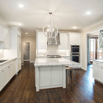
The layout and feel of the old kitchen wasn't working for these homeowners. We transitioned this kitchen from traditional with awkward layout to a bright modern space with traditional touches. The island was squared up and got more counter seating. We moved the sink and range top for a better work triangle. The space now has better flow and storage with a built in pantry and larger cabinets. They also got display areas with a built in hutch. We refinished the hardwood floors with a rich brown to complement the white kitchen. Floor plan & Design by Hatfield Builders & Remodelers | Photography by Versatile Imaging
 Anthology Woods
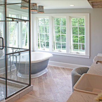
Products making their television debut in this project were Anthology Woods Northwest Blend (a naturally weathered wood installed on a section of the ceiling, unfinished) and the extremely hard & durable Left Coast White Oak, a unique species growing only in a narrow strip of Oregon and bit in California & Washington (installed for the flooring, finished with Rubio Monocoat White natural oil). The homeowners were able to easily apply the finish themselves prior to installing the floor, and the zero VOC nature of the oil insured it was safe to move right in! The White tint to the oil gives a subtle white-washed look to the floors while maintaining a natural look and a supple feel underfoot.
The couple participating in the episode loved their floor so much they decided to add more, installing it in their master bedroom, as well! The rich character of this natural Oak in a flat sawn (the old "European" way to cut Oak) wood product adds a timeless element & warmth to the feel of the space. Looking closely at the grain, you'll see cathedral patterns in many boards, along with a great mix of flat grain with rift areas as well. Finishing out the details of the room, the Bath Crashers team added natural carerra marble in the shower with tones of white & gray, and apron-front vanity sinks for extra charm.
 Melanie Rekola Landscape Design
Landscape design and photography by Melanie Rekola
This lovely landscape sports a poured in place concrete slab patio with drought tolerant sedum plants between the slabs. This sedum mix is sold in sheets then cut to fit but it’s actually grown for green-roof application. It works perfectly in this hot environment too as it is extremely drought tolerant and can go a month without water. Because the water runoff is absorbed between the slabs the patio drainage works perfectly and there are no need for drains.The swimming pool is of the fiberglass variety. Though the initial investment is greater than that of vinyl pools the ROI is greater over a 10 year period. Fiberglass pools retains more heat as the pool shell is all one piece and they don’t ever require a new liner.. This fiberglass pool has cool built-in benching and steps. And there is even a swim jet built into one side great for those cardio blasting swims. The pool interior colour is grey though it shows a soft blue/grey when water is added due to the reflection of the sky and other surroundings. The pool coping is natural stone with rock face edge. The steel arbour was custom made. Metal (steel) was chosen for it’s slim strength as wood placed here would have been too chunky. The best rooms (indoors or our) have a subtle layering of textural elements. To me this landscape needed a structure here to define the “rooms” It will look even better in a few years when the vines reach the top and the Miscanthus on either side reaches its 7′ height!The 12′ x 16′ pavilion is also made of steel and houses an alfresco dining table and sofa set. The pavilions built in cupola makes the warm breezes comfortably pass through with no need for a fan. It’s also sunken 2′ from the pool/patio height and nestled nicely in the corner. I must also mention the large slim planters with “Red Shades” Canna lily within. They are the perfect boldness/balance!Step through the arbor and a linear pond with “floating” natural stone step is revealed! Two smooth flow scuppers are responsible for the quiet waterfalls either side. A wood deck overhangs the pond adding softness to the setting. A modern retaining wall with natural stone cap runs the full width of the pond and pool adding interest and dimension. In the covered outdoor living area this wall is the perfect seat wall - adding lots of extra party seating!
 Chi Renovation & Design
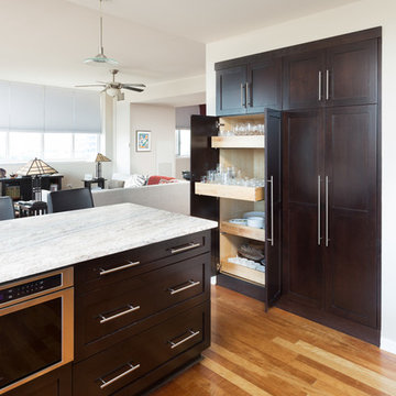
We gave these clients plenty of storage space in their open kitchen by installing a large linen closet with a built-in pantry as well as extra large cabinets. We also wanted to give their home a modern and trendy look, so for a contrast to the bright and airy design, we installed dark stained cabinets. Our clients were extremely happy with the end result as well as our ability to work around their busy schedules.
Home located in South Loop, Chicago. Designed by Chi Renovation & Design who also serve the Chicagoland area and it's surrounding suburbs, with an emphasis on the North Side and North Shore. You'll find their work from the Loop through Lincoln Park, Evanston, Skokie, Humboldt Park, Wilmette, and all the way up to Lake Forest.
For more about Chi Renovation & Design, click here: https://www.chirenovation.com/
To learn more about this project, click here: https://www.chirenovation.com/portfolio/south-loop-kitchen-renovation/
10