
Search results for "Extra layer" in Home Design Ideas
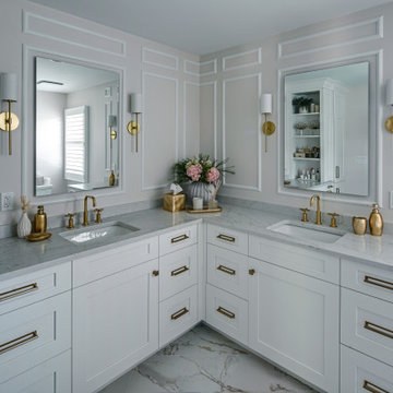
 Drury Design
THE SETUP
The original primary bathroom was characterized by a disjointed and segmented layout. The shower featured a bulky glass-block enclosure that overwhelmed the space visually. There was a considerable amount of open, unused space, and despite having a his and hers vanity, the arrangement lacked personal space for each user, as they shared the conjoined space between the sinks. The toilet was inconveniently located right by the door, with a half-wall partition meant to provide privacy but instead contributing to a cramped and unbalanced feel. Overall, the bathroom’s layout and design were fragmented, failing to make the most of the available space and lacking adequate storage solutions.
Design objectives:
- Reconfigure the layout to enhance functionality and flow.
- Create an elegant, upscale aesthetic that is light and bright.
- Incorporate specialized storage solutions for female hair care needs.
- Increase overall storage capacity.
- Develop a spa-like shower experience.
- Provide a significant wow factor to the space.
THE REMODEL
Design challenges to be solved:
- Repositioning the toilet to a more suitable location.
- Designing hair care storage solutions without cluttering the elegant space.
- Balancing an upscale, elegant design with a feminine touch in the color palette.
- Increasing the brightness of the room without adding windows.
- Completely replacing the existing shower to create a spa-like experience.
- Planning new storage solutions without adding bulkiness or clutter to the cabinetry.
THE RENEWED SPACE
Design solutions:
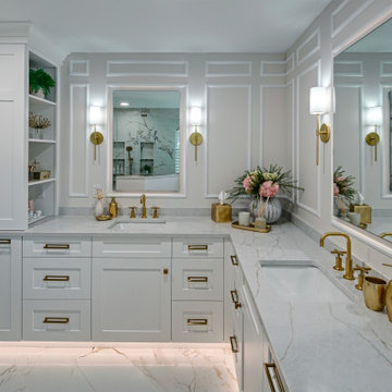
Toilet Relocation: Moved the toilet by the window, creating a better overall layout that also opened up two full walls for cabinetry and storage solutions.
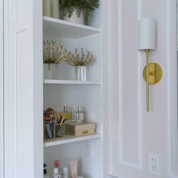
Specialized Vanity Storage: The left side of the left vanity is the wife’s. Open shelves facing across the vanity can be used for decorative or daily needs items. Pull-out docking drawers with power outlets and metal basins handle hot hair appliances.
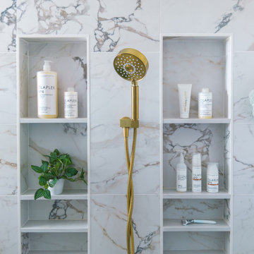
Bright and Elegant Color Scheme: White cabinets, countertops, floors, and shower walls keep the space bright. The just-off-white wall color with a hint of pink adds a feminine touch. Thin wainscoting with white trim offers traditional-leaning elegance.
Layered Lighting Strategy: Ceiling can lights, sconces, lighted mirrors, and toe-kick lighting were installed. Natural light-rated bulbs keep the space bright and natural-feeling.
Spa-Like Shower: An extra-large shower was created using the same floor tile materials for continuity. Equipped with a Kohler Anthem system with a shower head, hand-held, and four body sprays. His and Hers niches for separate body care product storage.
Enhanced Storage Solutions: Added a linen cabinet within the vanity area for efficient storage of towels and bathroom essentials.
This elegant bathroom feels incredibly spacious now. The color palette and lights keep the room bright and cheery. Gold fixtures, the herringbone pattern on the floor, and exquisite trim work add an elegant touch. With the husband and wife having their own vanity wall sections joined at the corner, each user truly has their own space within the space. The clients are very happy with the final result.
 Bilotta Kitchen & Home
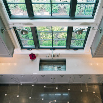
This two-toned kitchen was designed by Paula Greer, CKD of Bilotta Kitchens with Robin Zahn of Robin Prince Zahn Architecture. The u-shaped space has perimeter cabinets in Bilotta’s own line, the Bilotta Collection in a custom gray paint. The island is Wood-Mode Cabinetry in cherry with a stain. Countertops are Caesarstone’s London Grey with a built-in walnut cutting board on one corner of the island from Brooks Custom. The custom Madison Hood by Rangecraft is in a Dark Antique Steel finish and extends up accentuating the high ceiling above the cooking triangle. Two of the most interesting elements of this space are the banquette area and the coffered ceilings. By far, the most frequent installation of banquettes is tucking them into a corner of the room, regardless of how much seating is available at the island. In this kitchen, the island provides enough space for four to five stools. But because the space is separated from the rest of the house, the client wanted to ensure there was sufficient seating for their frequent entertaining. Also, the house is situated in a secluded wooded area; the new kitchen includes an abundance of unobstructed windows to fully experience the beautiful outdoor surroundings. The corner banquette (under more windows!) makes it feel like you’re dining in the trees. The bonus feature is that there’s extra storage below for table linens or seldom-used serving pieces. This really functions like a couch, complete with throw pillows and a TV, where the empty-nesters love spending time even when it isn’t mealtime. As for the ceiling, coffers don’t necessarily have to be large and intricately detailed with layers of moldings in order to be effective. This kitchen features two different ceiling heights: a small section of an addition contains a vaulted ceiling, while the larger island and eating area are tucked under a 2nd floor balcony and bedrooms. The client wanted to distinguish the lower area from the vaulted section, but in a subtle manner. The architect chose to implement shallow coffers with minimal trim for a softer result. The geometric pattern also reflects the floor tile and other lines within the room. The most interesting aspect, though, is that the vaulted area is actually concealed from view when you’re standing in the breakfast area; but as you approach the sink and window, the ceiling explodes above you for a visual surprise. And lastly, of course during this time of “work from home” the desk tucked in a nook opposite the banquette creates the perfect space for Zoom meetings, email checking and just the day-to-day activities we used to go into the office to do. The kitchen is an all-around perfect space for cooking, entertaining, relaxing or working!
Bilotta Designer: Paula Greer
Photographer: Philip Jensen-Carter
Architect: Robin Prince Zahn Architecture
 TKS Design Group
Download our free ebook, Creating the Ideal Kitchen. DOWNLOAD NOW
For many, extra time at home during COVID left them wanting more from their homes. Whether you realized the shortcomings of your space or simply wanted to combat boredom, a well-designed and functional home was no longer a want, it became a need. Tina found herself wanting more from her Old Irving Park home and reached out to The Kitchen Studio about adding function to her kitchen to make the most of the available real estate.
At the end of the day, there is nothing better than returning home to a bright and happy space you love. And this kitchen wasn’t that for Tina. Dark and dated, with a palette from the past and features that didn’t make the most of the available square footage, this remodel required vision and a fresh approach to the space. Lead designer, Stephanie Cole’s main design goal was better flow, while adding greater functionality with organized storage, accessible open shelving, and an overall sense of cohesion with the adjoining family room.
The original kitchen featured a large pizza oven, which was rarely used, yet its footprint limited storage space. The nearby pantry had become a catch-all, lacking the organization needed in the home. The initial plan was to keep the pizza oven, but eventually Tina realized she preferred the design possibilities that came from removing this cumbersome feature, with the goal of adding function throughout the upgraded and elevated space. Eliminating the pantry added square footage and length to the kitchen for greater function and more storage. This redesigned space reflects how she lives and uses her home, as well as her love for entertaining.
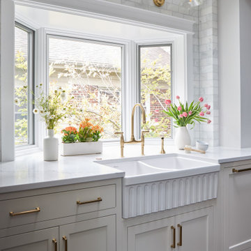
The kitchen features a classic, clean, and timeless palette. White cabinetry, with brass and bronze finishes, contrasts with rich wood flooring, and lets the large, deep blue island in Woodland’s custom color Harbor – a neutral, yet statement color – draw your eye.
The kitchen was the main priority. In addition to updating and elevating this space, Tina wanted to maximize what her home had to offer. From moving the location of the patio door and eliminating a window to removing an existing closet in the mudroom and the cluttered pantry, the kitchen footprint grew. Once the floorplan was set, it was time to bring cohesion to her home, creating connection between the kitchen and surrounding spaces.
The color palette carries into the mudroom, where we added beautiful new cabinetry, practical bench seating, and accessible hooks, perfect for guests and everyday living. The nearby bar continues the aesthetic, with stunning Carrara marble subway tile, hints of brass and bronze, and a design that further captures the vibe of the kitchen.
Every home has its unique design challenges. But with a fresh perspective and a bit of creativity, there is always a way to give the client exactly what they want [and need]. In this particular kitchen, the existing soffits and high slanted ceilings added a layer of complexity to the lighting layout and upper perimeter cabinets.
While a space needs to look good, it also needs to function well. This meant making the most of the height of the room and accounting for the varied ceiling features, while also giving Tina everything she wanted and more. Pendants and task lighting paired with an abundance of natural light amplify the bright aesthetic. The cabinetry layout and design compliments the soffits with subtle profile details that bring everything together. The tile selections add visual interest, drawing the eye to the focal area above the range. Glass-doored cabinets further customize the space and give the illusion of even more height within the room.
While her family may be grown and out of the house, Tina was focused on adding function without sacrificing a stunning aesthetic and dreamy finishes that make the kitchen the gathering place of any home. It was time to love her kitchen again, and if you’re wondering what she loves most, it’s the niche with glass door cabinetry and open shelving for display paired with the marble mosaic backsplash over the range and complimenting hood. Each of these features is a stunning point of interest within the kitchen – both brag-worthy additions to a perimeter layout that previously felt limited and lacking.
Whether your remodel is the result of special needs in your home or simply the excitement of focusing your energy on creating a fun new aesthetic, we are here for it. We love a good challenge because there is always a way to make a space better – adding function and beauty simultaneously.
Find the right local pro for your project
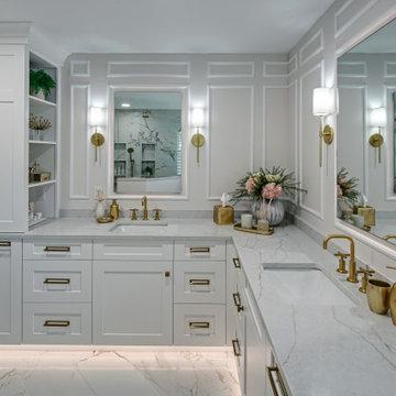 Drury Design
THE SETUP
The original primary bathroom was characterized by a disjointed and segmented layout. The shower featured a bulky glass-block enclosure that overwhelmed the space visually. There was a considerable amount of open, unused space, and despite having a his and hers vanity, the arrangement lacked personal space for each user, as they shared the conjoined space between the sinks. The toilet was inconveniently located right by the door, with a half-wall partition meant to provide privacy but instead contributing to a cramped and unbalanced feel. Overall, the bathroom’s layout and design were fragmented, failing to make the most of the available space and lacking adequate storage solutions.
Design objectives:
- Reconfigure the layout to enhance functionality and flow.
- Create an elegant, upscale aesthetic that is light and bright.
- Incorporate specialized storage solutions for female hair care needs.
- Increase overall storage capacity.
- Develop a spa-like shower experience.
- Provide a significant wow factor to the space.
THE REMODEL
Design challenges to be solved:
- Repositioning the toilet to a more suitable location.
- Designing hair care storage solutions without cluttering the elegant space.
- Balancing an upscale, elegant design with a feminine touch in the color palette.
- Increasing the brightness of the room without adding windows.
- Completely replacing the existing shower to create a spa-like experience.
- Planning new storage solutions without adding bulkiness or clutter to the cabinetry.
THE RENEWED SPACE
Design solutions:
Toilet Relocation: Moved the toilet by the window, creating a better overall layout that also opened up two full walls for cabinetry and storage solutions.
Specialized Vanity Storage: The left side of the left vanity is the wife’s. Open shelves facing across the vanity can be used for decorative or daily needs items. Pull-out docking drawers with power outlets and metal basins handle hot hair appliances.
Bright and Elegant Color Scheme: White cabinets, countertops, floors, and shower walls keep the space bright. The just-off-white wall color with a hint of pink adds a feminine touch. Thin wainscoting with white trim offers traditional-leaning elegance.
Layered Lighting Strategy: Ceiling can lights, sconces, lighted mirrors, and toe-kick lighting were installed. Natural light-rated bulbs keep the space bright and natural-feeling.
Spa-Like Shower: An extra-large shower was created using the same floor tile materials for continuity. Equipped with a Kohler Anthem system with a shower head, hand-held, and four body sprays. His and Hers niches for separate body care product storage.
Enhanced Storage Solutions: Added a linen cabinet within the vanity area for efficient storage of towels and bathroom essentials.
This elegant bathroom feels incredibly spacious now. The color palette and lights keep the room bright and cheery. Gold fixtures, the herringbone pattern on the floor, and exquisite trim work add an elegant touch. With the husband and wife having their own vanity wall sections joined at the corner, each user truly has their own space within the space. The clients are very happy with the final result.
 Drury Design
THE SETUP
The original primary bathroom was characterized by a disjointed and segmented layout. The shower featured a bulky glass-block enclosure that overwhelmed the space visually. There was a considerable amount of open, unused space, and despite having a his and hers vanity, the arrangement lacked personal space for each user, as they shared the conjoined space between the sinks. The toilet was inconveniently located right by the door, with a half-wall partition meant to provide privacy but instead contributing to a cramped and unbalanced feel. Overall, the bathroom’s layout and design were fragmented, failing to make the most of the available space and lacking adequate storage solutions.
Design objectives:
- Reconfigure the layout to enhance functionality and flow.
- Create an elegant, upscale aesthetic that is light and bright.
- Incorporate specialized storage solutions for female hair care needs.
- Increase overall storage capacity.
- Develop a spa-like shower experience.
- Provide a significant wow factor to the space.
THE REMODEL
Design challenges to be solved:
- Repositioning the toilet to a more suitable location.
- Designing hair care storage solutions without cluttering the elegant space.
- Balancing an upscale, elegant design with a feminine touch in the color palette.
- Increasing the brightness of the room without adding windows.
- Completely replacing the existing shower to create a spa-like experience.
- Planning new storage solutions without adding bulkiness or clutter to the cabinetry.
THE RENEWED SPACE
Design solutions:
Toilet Relocation: Moved the toilet by the window, creating a better overall layout that also opened up two full walls for cabinetry and storage solutions.
Specialized Vanity Storage: The left side of the left vanity is the wife’s. Open shelves facing across the vanity can be used for decorative or daily needs items. Pull-out docking drawers with power outlets and metal basins handle hot hair appliances.
Bright and Elegant Color Scheme: White cabinets, countertops, floors, and shower walls keep the space bright. The just-off-white wall color with a hint of pink adds a feminine touch. Thin wainscoting with white trim offers traditional-leaning elegance.
Layered Lighting Strategy: Ceiling can lights, sconces, lighted mirrors, and toe-kick lighting were installed. Natural light-rated bulbs keep the space bright and natural-feeling.
Spa-Like Shower: An extra-large shower was created using the same floor tile materials for continuity. Equipped with a Kohler Anthem system with a shower head, hand-held, and four body sprays. His and Hers niches for separate body care product storage.
Enhanced Storage Solutions: Added a linen cabinet within the vanity area for efficient storage of towels and bathroom essentials.
This elegant bathroom feels incredibly spacious now. The color palette and lights keep the room bright and cheery. Gold fixtures, the herringbone pattern on the floor, and exquisite trim work add an elegant touch. With the husband and wife having their own vanity wall sections joined at the corner, each user truly has their own space within the space. The clients are very happy with the final result.

 Lori Jolin Design, LLC.
Sutter Photographers
The Hardware Studio - hardware
Martinwood Cabinetry - millwork
Studio GlassWorks - glass countertop
Window Design Center - awning window
Nonn's Showplace - quartz, granite countertops
• The most difficult part of the project was figuring out all the technical details to install the glass counter-top, which would weigh about 300 pounds!
• One goal was to avoid seeing the cabinet supports through the glass. The glass itself proposed problems because it had a wavy texture and separate confetti glass that could be added to the bottom. Therefore, we needed to add something below it.
• A custom steel base was designed to carry the weight yet float the glass so you are able to see the beauty of the glass itself. A small 1/2 inch trim piece on the steel was added to accomplish this task.
• Once the steel was made, we took it to the glass distributor. We turned the very heavy base upside down, traced the 1/2 inch trim piece on a full size piece of paper, and sent it to the glass manufacturer.
• After this, the base was sent to a powder coater and the raw steel was transformed into a beautiful champagne color.
• In the meantime, the glass manufacturer molded a channel for the glass to rest that would suspend the glass 1/2 inch higher than the powder coated steel base.
• The glass manufacturer was instructed to make the top of the glass smooth, so it would hold a plate without rocking; they added an extra layer of 1/4 inch glass after it was fired the first time to accomplish this.
• When the base was brought to the job site, the carpenter installed a thick 6 inch block of wood through the tile and into the floor joists. The hollow 6 inch square base of the steel table was glued and screwed into the wood. The base was leveled and ready for the top to arrive several days later.
• The glass installers put it over the base, and it fit PERFECTLY! (whew)
• The steel base is 3 inches smaller than the glass, creating a see-through effect around the entire perimeter of the kidney bean shape.
• The granite was then templated by using a specialized camera that measured the curve of the glass. However, upon arrival, the fit was less than perfect. Thanks to a patient and skilled granite installer from Nonn's Showplace spent several hours hand grinding and polishing the curve on site until it fit perfectly.
• A small bead of silicone between the granite and the glass was all that was needed to complete the perfect installation.
• With a few shims under the end of the granite, the top is perfectly level!
• Our client was extremely excited and very patient with the process because they trusted our abilities so that the end result would be spectacular.
 Drury Design
THE SETUP
The original primary bathroom was characterized by a disjointed and segmented layout. The shower featured a bulky glass-block enclosure that overwhelmed the space visually. There was a considerable amount of open, unused space, and despite having a his and hers vanity, the arrangement lacked personal space for each user, as they shared the conjoined space between the sinks. The toilet was inconveniently located right by the door, with a half-wall partition meant to provide privacy but instead contributing to a cramped and unbalanced feel. Overall, the bathroom’s layout and design were fragmented, failing to make the most of the available space and lacking adequate storage solutions.
Design objectives:
- Reconfigure the layout to enhance functionality and flow.
- Create an elegant, upscale aesthetic that is light and bright.
- Incorporate specialized storage solutions for female hair care needs.
- Increase overall storage capacity.
- Develop a spa-like shower experience.
- Provide a significant wow factor to the space.
THE REMODEL
Design challenges to be solved:
- Repositioning the toilet to a more suitable location.
- Designing hair care storage solutions without cluttering the elegant space.
- Balancing an upscale, elegant design with a feminine touch in the color palette.
- Increasing the brightness of the room without adding windows.
- Completely replacing the existing shower to create a spa-like experience.
- Planning new storage solutions without adding bulkiness or clutter to the cabinetry.
THE RENEWED SPACE
Design solutions:
Toilet Relocation: Moved the toilet by the window, creating a better overall layout that also opened up two full walls for cabinetry and storage solutions.
Specialized Vanity Storage: The left side of the left vanity is the wife’s. Open shelves facing across the vanity can be used for decorative or daily needs items. Pull-out docking drawers with power outlets and metal basins handle hot hair appliances.
Bright and Elegant Color Scheme: White cabinets, countertops, floors, and shower walls keep the space bright. The just-off-white wall color with a hint of pink adds a feminine touch. Thin wainscoting with white trim offers traditional-leaning elegance.
Layered Lighting Strategy: Ceiling can lights, sconces, lighted mirrors, and toe-kick lighting were installed. Natural light-rated bulbs keep the space bright and natural-feeling.
Spa-Like Shower: An extra-large shower was created using the same floor tile materials for continuity. Equipped with a Kohler Anthem system with a shower head, hand-held, and four body sprays. His and Hers niches for separate body care product storage.
Enhanced Storage Solutions: Added a linen cabinet within the vanity area for efficient storage of towels and bathroom essentials.
This elegant bathroom feels incredibly spacious now. The color palette and lights keep the room bright and cheery. Gold fixtures, the herringbone pattern on the floor, and exquisite trim work add an elegant touch. With the husband and wife having their own vanity wall sections joined at the corner, each user truly has their own space within the space. The clients are very happy with the final result.
Sponsored
Columbus, OH

Wannemacher Interiors
Customized Award-Winning Interior Design Solutions in Franklin Cnty OH

 Envision Web
Becky Hulsey, Envision Virtual Tours
The Lodge at Gold Mine Falls
A Once in a Lifetime Opportunity Awaits….
Have you dreamed of owning your own spectacular waterfall, a serene trout pond, or a one of a kind mountain lodge filled with high end touches, all near Lake Burton? If the answer is yes…..then “The Lodge at Gold Mine Falls” is for you!
Located just off HW 76 .3 miles to Anchorage Marina, this unique 2.8 acre property borders the National Forest, boasts a fully remodeled 3 bedroom, 3 bath, 2000+ square foot rock lodge that is adjacent to its own private, spectacular 60 foot waterfall all surrounded by native landscape such as rhododendron and mountain laurel. Tumbling under the 40 foot suspension bridge, the pristine, crystal clear water continues to ramble on its way to large pond ready to be stocked with trout. Picture yourself fly fishing for a trout dinner right at your front door, or delight your friends or family while entertaining on your new porch or extensive, multi-level deck that connects your new home to your own waterfall. The kids or grandkids will be entertained for hours wading in the pool at the base of the waterfall, exploring the crooks and crannies among the stream’s boulders while looking for salamanders, or panning for “fool’s gold” in the stream. Just imagine….The Lodge at Gold Mine Falls has all this and more!
As you walk up the front steps to The Lodge at Gold Mine Falls, you will notice the craftsmanship of this uniquely one of a kind home made from local stone and granite from a period gone by. If you look closely at some of the stones, you will find raw garnets, some the size of a nail head. Upon opening the front door constructed of solid oak and a tasteful piece of leaded glass, you will be amazed at the spaciousness of the lodge room. Once upon a time, the 20 x 30 foot room with 10 foot ceilings was the entire home. The focal piece of the room is the new floor to ceiling field stone fireplace, hand honed solid maple mantel, rounded hearth, accentuated by a hand-cut keystone, and flanked by raw cedar columns. The new gas logs can be remotely controlled with programmable heat. A built-in floor to ceiling cherry wood wall unit, with granite serving surface, highlights a side wall and is topped off with a large piece of stained glass from an English pub. The mood lighting behind the stained glass and the antique library ladder really highlights this unique bookcase. Distinctive lighting fixtures and fans provide dining area lighting and circulation from the cool breezes off of Lake Burton. On the bottom, the solid oak 1.5 inch flooring is a remnant of the past on the top, the height of the ceilings is enhanced by double crown moldings throughout and a touch of the outdoors is brought indoors by the three new skylights. Surrounded by rustic cedar window boxes, additional ambient light streams through the four windows facing south, and the new French doors.
As you open the French doors to the new porch, you are immediately struck by the sights and sound produced by the rushing water as it cascades over the spectacular multilevel waterfall. You will also notice that the mountain has literally been carved away as you view the layers and striations in the granite that surround the back of the porch. The peaked cathedral ceiling sports a glass apex and the bead board on the ceiling accentuated by the raw cedar plank framing and the five cedar trees used as cornerstones all bring the outdoors within your reach. The addition of “E-Z Breeze” vinyl windows along with the cast iron gas stove will allow you and your family to enjoy the beauty and continually changing scenery at The Lodge at Gold Mine Fall during all four seasons.
Opening the Adirondack style door on the other side of the lodge room allows you to step into the Lodge’s addition built at a later date. The four foot wide hallway boasts stained glass light fixtures and an architectural feature from the new stairwell that divides the living and the bedroom spaces. Knowing that the east wall in the kitchen and study were once on the home’s exterior allowed us to investigate and reveal the true character of these walls by removing the two layers of drywall and 4 inches of plaster exposing a striking addition to both rooms…… beautiful granite rock walls. The hallway flows into the granite breakfast bar which fully complements the newly exposed granite wall. From the Viking SS refrigerator to gas Jenn Air ceramic cooktop and microwave the appliances are a chef’s delight. Lighting is a critical component in a gourmet kitchen and the light from the double window is enhanced by two spotlights over the cooking area, LED task lighting under the cabinets, mood lighting over the top cabinets, and four “Murano” hand blown glass pendant lights over the sink and bar area. Scoring points in the design category, the full wood “Thomasville” two tone glazed cabinets that are country white and palomino scream style and sophistication, and are accentuated by the cool copper glass backsplash and refined stainless steel hardware. The porcelain, two bowl farmhouse sink is large enough for your biggest pots while the stainless steel sink guards will protect it from scratches. The SS faucet is professional quality and the Insinkerator will help the chef in the house save time with instant 190 degree water. An eight foot long exposed cedar tree trunk hangs over the cooking area allowing the chef to hang his/her favorite utensils and pots or pans in full lodge style. And who wouldn’t crave a large walk in pantry with commercial grade slides that will up to 120 pounds. With all these features, the cook/cooks in the family will love spending time in this room.
Across from the kitchen is a study/office area which can be closed off from the hallway by a double barn door. Except for the remarkable exposed granite rock wall mentioned earlier, the entire room has been paneled with raw cedar boards treated with Australian Tree Oil for true lodge feel. The triple crank out window provides a superb view of the pond and blazing Japanese maple trees in the fall. Outside, the hallway leads to the utility room which has been fully upgraded with all the modern amenities. The oak cabinetry with granite tops also has an extra deep sink with commercial kitchen sprayer. The sink area is surrounded by white subway tile while slate and green glass mini tile accents bring the outdoor colors inside. The doggy door, new exterior door and crank out window provide access to the back yard and additional light. From the new “Rinnai” point of use, gas hot water heater to the new “LG” full size, stackable washer and dryer, this utility room delivers.
The master bedroom has four windows which provide outstanding light and air circulation. To take the chill off of nippy evenings, this bedroom also has its own romantic fireplace with travertine marble surround, remote controlled gas logs, and a beautiful antique oak and mirror mantle. To top it off, the en-suite bath contains high end fixtures, a spacious vanity, and floor to ceiling rain shower with independent valves allowing you to turn on the shower and not get wet. Multiple safety handrails and a fold down shower seat give bathers assurance and provide an additional measure of safety. The earthy color tiles, glass tile accents and hand blown light fixtures continue the lodge theme in this end of the house. Located across the hall, the guest bedroom is light and airy with its white window boxes and double crown molding, and also has an attached bathroom. This bathroom also has an entrance door leading to the hallway and doubles as the guest bathroom for the house. Its antique oak vanity and mirror, stained glass lights and wrought iron accents remind me of a past era while the vessel sink, modern fixtures, and floor to ceiling travertine and glass tile rain shower all bring the bathroom up to modern standards.
Located at the end of the hallway, and next to the guest bathroom, is the handcrafted stairwell leading to the sleeping loft. The distinctive maple stair treads with their grain and raw edge being displayed, were milled locally in Clayton and then installed from underneath so that no screw or nail heads are visible. The staircase was completed with wrought iron spindles, raw cedar handrail and floor to ceiling end post. Upon your entry into the sleeping loft, you will notice the amount of light that enters through the two skylights and large window facing the pond. The sound of water rushing over the pond’s spillway is a delightful addition to this large sleeping loft. Finished with engineered hardwood flooring and two built in double beds with tree trunks for legs, the room can accommodate four additional twin beds. The sleeping loft is also equipped with a kitchenette and a distinctive cedar and rock walled bathroom. The bath features an antique dresser vanity with marble vessel sink, distinctive fixtures and a floor to ceiling polished travertine marble shower with rain head. This bathroom also has an exterior door leading to a secondary upstairs staircase in the back yard. Just envision the great sleepovers the kids or grandkids will have here or how your out of town friends or family will just love this special area designed with their comfort and needs in mind.
Originally constructed in 1925 by “off Broadway” star Rose Grant, this property is rich in history. In the early years, this home was one of the first in Rabun County to generate its own electric from the waterfall. Several small cabins were also built on the property and rented out to guests who came for the waterfall, swim in the pond and connect with nature. Other notable residents were Mrs. and Doctor Fowler who was a local pediatrician. According to an aged newspaper article, Mrs. Fowler was very interested in the indigenous flora and fauna and grew a variety of native plants on the property including some that were rare or endangered. Many metal name tags still remain along the various paths on the property thus reminding you of times gone by and the true beauty of property.
Lastly, this solidly built home has just been structurally solidified, become more energy efficient, and reconfigured to further usable space all while retaining the Lodge’s original charm. After removing the flooring in the kitchen, hall and both bathrooms, the home’s structure and roof were fortified with numerous concrete footers to support both bathrooms, kitchen, and stairwell walls that extend from floor to roof. To make this home more comfortable, energy efficient, and bring it up to modern standards, the electrical system was upgraded to 220 service with the wiring, outlets, electrical panels and fixtures replaced throughout the entire home. A whole house surge protector was also installed to protect against damage that may occur with lightning strikes. Speaking of electric…..the pond’s newly poured formed concrete wall contains a pipe enabling you to install your own hydro-electric system. And whether you might decide to tie into the grid or store you energy in a battery system, you could generate your own electric 24/7. The homes plumbing was also replaced with new pipes, energy/water efficient fixtures in each bathroom (including three Toto toilets), and a new cistern was installed behind the garage with a laboratory grade water filtration system. The task of water heating was completed by a gas Rinnai point of use hot water heater in the utility room and all windows were replaced with Anderson thermal pane and 6 Velux skylights were mounted to bring the outdoors inside. The home’s HVAC system was top of the line several years ago and both sets of new gas logs are controlled with remotes. Formerly a summer home, all exterior walls were studded out with insulation added, and whole house fans were installed in the attic and upstairs bathroom. Although many of these upgrades may not be visible, they allow the home to be more energy efficient and more comfortable……allowing The Lodge at Gold Mine Falls to become your four season retreat.

 Architect
One of the biggest shifts in home design over the past few years has been a move away from matchy-matchy, big-box decor toward spaces that feel personal, layered, and collected over time. If you've been searching for ways to add that "collected" quality to your own home, hand-carved wooden accent pieces are one of the most effective — and most overlooked — tools for achieving it.
Here's how to use them well, where they work best, and what to avoid.
Why Collected Spaces Read as More Designed
Design professionals often talk about the difference between a "decorated" room and a "collected" one. A decorated room looks like it was purchased all at once from a single catalog. A collected room looks like it evolved — pieces gathered over time, each with its own texture, material, and story.
Wooden objects, such as these hand-carved wooden ducks, contribute to that collected feeling almost instantly, for a simple reason: no two pieces are exactly alike. Unlike resin or plastic decor cast from a single mold, hand-carved pieces carry small variations — a slightly different grain pattern, a unique brushstroke, a subtle asymmetry — that read as authentic rather than mass-produced. That authenticity is what separates a space that feels curated from one that feels furnished.
Where Hand-Carved Wooden Accents Work Best
Entry tables and consoles. A single carved piece paired with a stack of books or a low bowl creates an intentional first impression without overwhelming a small surface.
Open shelving. Bookshelves benefit enormously from three-dimensional objects breaking up rows of spines. Tuck a carved piece between book stacks at varying heights to create visual rhythm.
Mantels. Grouping in odd numbers — three or five — with varied heights creates a naturally balanced display. Mix in a taper candle or two for additional height variation.
Kitchen windowsills. Smaller carved pieces catch natural light beautifully and add warmth to an otherwise utilitarian space.
Nightstands and dressers. A single small piece here adds personality without requiring extra surface space.
Styling Principles That Make the Difference
- Let one material contrast do the work.Wood against smooth ceramic, matte metal, or glass creates textural interest without needing additional colors or patterns. If your space already has a lot of wood tones (flooring, cabinetry, furniture), look for carved pieces in a slightly different wood finish to keep them from disappearing into the background.
- Odd numbers, varied heights.This is a foundational styling rule for a reason — it works. Groupings of three tend to feel more intentional than pairs, and varying the height of each object (using books or small risers if needed) prevents a flat, lined-up look.
- Give each piece breathing room.One of the most common styling mistakes is overcrowding a surface. A single well-chosen carved piece with negative space around it reads as more expensive and more intentional than five pieces crammed together.
- Rotate seasonally.Because hand-carved pieces are often designed as individual characters or figures, many collections include seasonal or themed variations. Swapping a neutral piece for a seasonal one is a low-effort way to refresh a space without a full redesign.
- Mix textures, not just objects.Pair a carved wooden piece with something soft (a linen table runner), something reflective (a brass tray), and something organic (fresh greenery or dried botanicals) to build a layered vignette rather than a single-note display.
 Drury Design
THE SETUP
The original primary bathroom was characterized by a disjointed and segmented layout. The shower featured a bulky glass-block enclosure that overwhelmed the space visually. There was a considerable amount of open, unused space, and despite having a his and hers vanity, the arrangement lacked personal space for each user, as they shared the conjoined space between the sinks. The toilet was inconveniently located right by the door, with a half-wall partition meant to provide privacy but instead contributing to a cramped and unbalanced feel. Overall, the bathroom’s layout and design were fragmented, failing to make the most of the available space and lacking adequate storage solutions.
Design objectives:
- Reconfigure the layout to enhance functionality and flow.
- Create an elegant, upscale aesthetic that is light and bright.
- Incorporate specialized storage solutions for female hair care needs.
- Increase overall storage capacity.
- Develop a spa-like shower experience.
- Provide a significant wow factor to the space.
THE REMODEL
Design challenges to be solved:
- Repositioning the toilet to a more suitable location.
- Designing hair care storage solutions without cluttering the elegant space.
- Balancing an upscale, elegant design with a feminine touch in the color palette.
- Increasing the brightness of the room without adding windows.
- Completely replacing the existing shower to create a spa-like experience.
- Planning new storage solutions without adding bulkiness or clutter to the cabinetry.
THE RENEWED SPACE
Design solutions:
Toilet Relocation: Moved the toilet by the window, creating a better overall layout that also opened up two full walls for cabinetry and storage solutions.
Specialized Vanity Storage: The left side of the left vanity is the wife’s. Open shelves facing across the vanity can be used for decorative or daily needs items. Pull-out docking drawers with power outlets and metal basins handle hot hair appliances.
Bright and Elegant Color Scheme: White cabinets, countertops, floors, and shower walls keep the space bright. The just-off-white wall color with a hint of pink adds a feminine touch. Thin wainscoting with white trim offers traditional-leaning elegance.
Layered Lighting Strategy: Ceiling can lights, sconces, lighted mirrors, and toe-kick lighting were installed. Natural light-rated bulbs keep the space bright and natural-feeling.
Spa-Like Shower: An extra-large shower was created using the same floor tile materials for continuity. Equipped with a Kohler Anthem system with a shower head, hand-held, and four body sprays. His and Hers niches for separate body care product storage.
Enhanced Storage Solutions: Added a linen cabinet within the vanity area for efficient storage of towels and bathroom essentials.
This elegant bathroom feels incredibly spacious now. The color palette and lights keep the room bright and cheery. Gold fixtures, the herringbone pattern on the floor, and exquisite trim work add an elegant touch. With the husband and wife having their own vanity wall sections joined at the corner, each user truly has their own space within the space. The clients are very happy with the final result.
 Drury Design
THE SETUP
The original primary bathroom was characterized by a disjointed and segmented layout. The shower featured a bulky glass-block enclosure that overwhelmed the space visually. There was a considerable amount of open, unused space, and despite having a his and hers vanity, the arrangement lacked personal space for each user, as they shared the conjoined space between the sinks. The toilet was inconveniently located right by the door, with a half-wall partition meant to provide privacy but instead contributing to a cramped and unbalanced feel. Overall, the bathroom’s layout and design were fragmented, failing to make the most of the available space and lacking adequate storage solutions.
Design objectives:
- Reconfigure the layout to enhance functionality and flow.
- Create an elegant, upscale aesthetic that is light and bright.
- Incorporate specialized storage solutions for female hair care needs.
- Increase overall storage capacity.
- Develop a spa-like shower experience.
- Provide a significant wow factor to the space.
THE REMODEL
Design challenges to be solved:
- Repositioning the toilet to a more suitable location.
- Designing hair care storage solutions without cluttering the elegant space.
- Balancing an upscale, elegant design with a feminine touch in the color palette.
- Increasing the brightness of the room without adding windows.
- Completely replacing the existing shower to create a spa-like experience.
- Planning new storage solutions without adding bulkiness or clutter to the cabinetry.
THE RENEWED SPACE
Design solutions:
Toilet Relocation: Moved the toilet by the window, creating a better overall layout that also opened up two full walls for cabinetry and storage solutions.
Specialized Vanity Storage: The left side of the left vanity is the wife’s. Open shelves facing across the vanity can be used for decorative or daily needs items. Pull-out docking drawers with power outlets and metal basins handle hot hair appliances.
Bright and Elegant Color Scheme: White cabinets, countertops, floors, and shower walls keep the space bright. The just-off-white wall color with a hint of pink adds a feminine touch. Thin wainscoting with white trim offers traditional-leaning elegance.
Layered Lighting Strategy: Ceiling can lights, sconces, lighted mirrors, and toe-kick lighting were installed. Natural light-rated bulbs keep the space bright and natural-feeling.
Spa-Like Shower: An extra-large shower was created using the same floor tile materials for continuity. Equipped with a Kohler Anthem system with a shower head, hand-held, and four body sprays. His and Hers niches for separate body care product storage.
Enhanced Storage Solutions: Added a linen cabinet within the vanity area for efficient storage of towels and bathroom essentials.
This elegant bathroom feels incredibly spacious now. The color palette and lights keep the room bright and cheery. Gold fixtures, the herringbone pattern on the floor, and exquisite trim work add an elegant touch. With the husband and wife having their own vanity wall sections joined at the corner, each user truly has their own space within the space. The clients are very happy with the final result.

 Robin's Nest Interiors
Updated Spec Home: Foyer and Great Room
In our last post, we introduced you to my mom and sister’s Updated Spec Home; the Foyer and Great Room will be featured in this post.
Foyer
As you enter their home, to the right is a hall closet and a french door which leads to the Basement. To the left is a long wall which was perfect for an extra long console table in a rustic finish that served as a sofa table in their previous home. I love repositioning furniture, and by using this table in the entry, it makes it feel new.
Additionally, we placed a vibrant piece of art previously used in my sister’s Bedroom above the table. This piece not only sets the tone for our color palette, it also makes the kind of statement you want in your Foyer – Wow! We added accessories and an unique lamp to complete the space.
Great Room
In the Great Room which is open to the Foyer, we installed our inspiration artwork in the place of honor over the mantel. Since the piece was vertical, it did not take up enough space. I do not like a “fussy” mantel with lots of accessories so we found these two vases in a silver leaf finish. They were perfect because they were large enough, but not too deep. Accessorizing mantels can be tricky because the majority of them are not deep. We went to Jan’s Floral Design to add vibrant color and interesting textures to the vases.
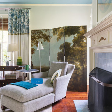
The original mantel was too small and uninspired. Therefore, we had our contractor Brad Anderson built a new one based on a photo of a mantel we liked. The new mantel has lots of great detail and is the appropriate proportion for the fireplace. We replaced beige 12×12 ceramic tiles with gorgeous large pieces of smoked carrara marble for a striking fireplace surround. Check out this other mantel that we updated.
For furniture, we purchased a shorter sofa in a gray tweed fabric. Typically, two throw pillows come with a sofa.We added a fun fringe to the pillows that came with the sofa. I recommend ordering pillows that match your sofa fabric and layering with custom pillows that support your color palette. We added a patterned custom pillow and a striped throw.
Next, we got a small scale recliner in a yummy gray leather for my mom and a chair and ottoman in a small scale mint and gray geometric pattern for my sister. We added an accent chair in a fun small scale stripe to fill a corner and add additional seating – which is always a good thing.
Remember that this was a Spec Home so there were no built-ins. As a result, we needed a media cabinet for the television and some bookcases to display my mom’s decorative box collection and my sister’s collection of blown colored glass. This set from Ballard Designs fit the bill perfectly. The back is open and airy with nice detail. The wood finish also adds a richness to the space.
My mom needed a space for her computer, and this small writing desk fit the space perfectly.
Finally, for finishing touches, we added a patterned rug, cornice boards in a mint leaf fabric, and great lamps for ambient lighting. These two rooms are stunning, vibrant and livable. Can’t wait to show you more in our next post! Enjoy!
Photo by Tim Furlong Jr.
 Bilotta Kitchen & Home
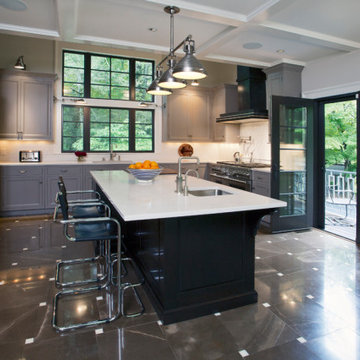
This two-toned kitchen was designed by Paula Greer, CKD of Bilotta Kitchens with Robin Zahn of Robin Prince Zahn Architecture. The u-shaped space has perimeter cabinets in Bilotta’s own line, the Bilotta Collection in a custom gray paint. The island is Wood-Mode Cabinetry in cherry with a stain. Countertops are Caesarstone’s London Grey with a built-in walnut cutting board on one corner of the island from Brooks Custom. The custom Madison Hood by Rangecraft is in a Dark Antique Steel finish and extends up accentuating the high ceiling above the cooking triangle. Two of the most interesting elements of this space are the banquette area and the coffered ceilings. By far, the most frequent installation of banquettes is tucking them into a corner of the room, regardless of how much seating is available at the island. In this kitchen, the island provides enough space for four to five stools. But because the space is separated from the rest of the house, the client wanted to ensure there was sufficient seating for their frequent entertaining. Also, the house is situated in a secluded wooded area; the new kitchen includes an abundance of unobstructed windows to fully experience the beautiful outdoor surroundings. The corner banquette (under more windows!) makes it feel like you’re dining in the trees. The bonus feature is that there’s extra storage below for table linens or seldom-used serving pieces. This really functions like a couch, complete with throw pillows and a TV, where the empty-nesters love spending time even when it isn’t mealtime. As for the ceiling, coffers don’t necessarily have to be large and intricately detailed with layers of moldings in order to be effective. This kitchen features two different ceiling heights: a small section of an addition contains a vaulted ceiling, while the larger island and eating area are tucked under a 2nd floor balcony and bedrooms. The client wanted to distinguish the lower area from the vaulted section, but in a subtle manner. The architect chose to implement shallow coffers with minimal trim for a softer result. The geometric pattern also reflects the floor tile and other lines within the room. The most interesting aspect, though, is that the vaulted area is actually concealed from view when you’re standing in the breakfast area; but as you approach the sink and window, the ceiling explodes above you for a visual surprise. And lastly, of course during this time of “work from home” the desk tucked in a nook opposite the banquette creates the perfect space for Zoom meetings, email checking and just the day-to-day activities we used to go into the office to do. The kitchen is an all-around perfect space for cooking, entertaining, relaxing or working!
Bilotta Designer: Paula Greer
Photographer: Philip Jensen-Carter
Architect: Robin Prince Zahn Architecture
Sponsored
Columbus, OH
Wannemacher Interiors
Customized Award-Winning Interior Design Solutions in Franklin Cnty OH
 Drury Design
THE SETUP
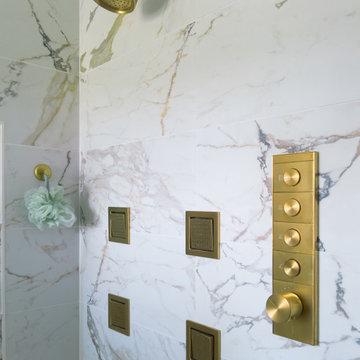
The original primary bathroom was characterized by a disjointed and segmented layout. The shower featured a bulky glass-block enclosure that overwhelmed the space visually. There was a considerable amount of open, unused space, and despite having a his and hers vanity, the arrangement lacked personal space for each user, as they shared the conjoined space between the sinks. The toilet was inconveniently located right by the door, with a half-wall partition meant to provide privacy but instead contributing to a cramped and unbalanced feel. Overall, the bathroom’s layout and design were fragmented, failing to make the most of the available space and lacking adequate storage solutions.
Design objectives:
- Reconfigure the layout to enhance functionality and flow.
- Create an elegant, upscale aesthetic that is light and bright.
- Incorporate specialized storage solutions for female hair care needs.
- Increase overall storage capacity.
- Develop a spa-like shower experience.
- Provide a significant wow factor to the space.
THE REMODEL
Design challenges to be solved:
- Repositioning the toilet to a more suitable location.
- Designing hair care storage solutions without cluttering the elegant space.
- Balancing an upscale, elegant design with a feminine touch in the color palette.
- Increasing the brightness of the room without adding windows.
- Completely replacing the existing shower to create a spa-like experience.
- Planning new storage solutions without adding bulkiness or clutter to the cabinetry.
THE RENEWED SPACE
Design solutions:
Toilet Relocation: Moved the toilet by the window, creating a better overall layout that also opened up two full walls for cabinetry and storage solutions.
Specialized Vanity Storage: The left side of the left vanity is the wife’s. Open shelves facing across the vanity can be used for decorative or daily needs items. Pull-out docking drawers with power outlets and metal basins handle hot hair appliances.
Bright and Elegant Color Scheme: White cabinets, countertops, floors, and shower walls keep the space bright. The just-off-white wall color with a hint of pink adds a feminine touch. Thin wainscoting with white trim offers traditional-leaning elegance.
Layered Lighting Strategy: Ceiling can lights, sconces, lighted mirrors, and toe-kick lighting were installed. Natural light-rated bulbs keep the space bright and natural-feeling.
Spa-Like Shower: An extra-large shower was created using the same floor tile materials for continuity. Equipped with a Kohler Anthem system with a shower head, hand-held, and four body sprays. His and Hers niches for separate body care product storage.
Enhanced Storage Solutions: Added a linen cabinet within the vanity area for efficient storage of towels and bathroom essentials.
This elegant bathroom feels incredibly spacious now. The color palette and lights keep the room bright and cheery. Gold fixtures, the herringbone pattern on the floor, and exquisite trim work add an elegant touch. With the husband and wife having their own vanity wall sections joined at the corner, each user truly has their own space within the space. The clients are very happy with the final result.
 Fiorito Interior Design
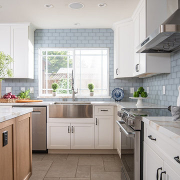
My clients approached this kitchen remodel hoping not only for improved functionality but for a space that invited comfort, warmth, and daily enjoyment. Their existing kitchen was limited in both layout and atmosphere where a small island barely larger than a podium offered little utility. An oversized double-width doorway at the rear of the room leading into the adjacent living space disrupted the flow, making furniture placement nearly impossible. They longed for a kitchen where cooking felt easy and intuitive, but also one where they could sit at the table with a book and a cup of tea, or host friends without feeling cramped or awkwardly positioned.
One of the most impactful decisions we made early on was to close off that extra-wide opening to the living room. Doing so allowed us to reclaim the wall, which not only improved circulation but also gave us the freedom to rethink the spacing of the kitchen and eat-in area. With that change, we could introduce a much larger island—truly functional this time—complete with generous workspace and storage. It became a true centerpiece for meal prep, casual dining, and gathering.
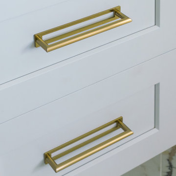
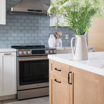
From there I turned my attention to layering in comfort, personality, and style. I curated a color palette of soft white, pale blue, light wood tones, and touches of sunshine yellow. This fresh and uplifting combination feels timeless and relaxed. We chose cabinetry with traditional Shaker-style doors, accented by black forged iron hardware for a subtle hint of contrast and authenticity. For the countertops we chose a Gold Calacatta-look quartz, bringing elegance and warmth with its soft veining and classic appeal.
To elevate the kitchen walls I selected a soft matte glass tile in a moody, sky-blue that blankets the backsplash, providing a gentle wash of color that’s calming and cohesive. On the floors I chose a limestone-look porcelain tile in a classic Versailles pattern as an homage to old English manor houses—bringing character and texture underfoot while remaining durable and low-maintenance for modern life.
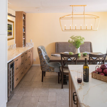
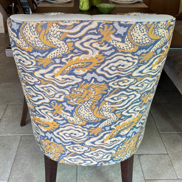
Lastly I transformed the adjacent eat-in area into a cozy, multifunctional space. We added custom built-in bookshelves and a sideboard for serving and display—perfect for entertaining or simply making daily routines feel more special. A black iron picture light softly illuminates the buffet, lending a warm, ambient glow in the evenings. I carefully planned the seating arrangement to include a space-saving banquette along the wall, paired with a trestle-style dining table and side chairs. At either end I placed tufted host chairs upholstered in an exquisite, tonal Chinoiserie dragon pattern that are comfortable enough to sit on for hours. Whether sharing a leisurely meal, reading in the sunlight, or gazing out at the greenery just beyond the windows, this spot now invites my clients to truly enjoy their home in a new, deeper way.
Photo: Bernardo Grijalva
 Drury Design
THE SETUP
The original primary bathroom was characterized by a disjointed and segmented layout. The shower featured a bulky glass-block enclosure that overwhelmed the space visually. There was a considerable amount of open, unused space, and despite having a his and hers vanity, the arrangement lacked personal space for each user, as they shared the conjoined space between the sinks. The toilet was inconveniently located right by the door, with a half-wall partition meant to provide privacy but instead contributing to a cramped and unbalanced feel. Overall, the bathroom’s layout and design were fragmented, failing to make the most of the available space and lacking adequate storage solutions.
Design objectives:
- Reconfigure the layout to enhance functionality and flow.
- Create an elegant, upscale aesthetic that is light and bright.
- Incorporate specialized storage solutions for female hair care needs.
- Increase overall storage capacity.
- Develop a spa-like shower experience.
- Provide a significant wow factor to the space.
THE REMODEL
Design challenges to be solved:
- Repositioning the toilet to a more suitable location.
- Designing hair care storage solutions without cluttering the elegant space.
- Balancing an upscale, elegant design with a feminine touch in the color palette.
- Increasing the brightness of the room without adding windows.
- Completely replacing the existing shower to create a spa-like experience.
- Planning new storage solutions without adding bulkiness or clutter to the cabinetry.
THE RENEWED SPACE
Design solutions:
Toilet Relocation: Moved the toilet by the window, creating a better overall layout that also opened up two full walls for cabinetry and storage solutions.
Specialized Vanity Storage: The left side of the left vanity is the wife’s. Open shelves facing across the vanity can be used for decorative or daily needs items. Pull-out docking drawers with power outlets and metal basins handle hot hair appliances.
Bright and Elegant Color Scheme: White cabinets, countertops, floors, and shower walls keep the space bright. The just-off-white wall color with a hint of pink adds a feminine touch. Thin wainscoting with white trim offers traditional-leaning elegance.
Layered Lighting Strategy: Ceiling can lights, sconces, lighted mirrors, and toe-kick lighting were installed. Natural light-rated bulbs keep the space bright and natural-feeling.
Spa-Like Shower: An extra-large shower was created using the same floor tile materials for continuity. Equipped with a Kohler Anthem system with a shower head, hand-held, and four body sprays. His and Hers niches for separate body care product storage.
Enhanced Storage Solutions: Added a linen cabinet within the vanity area for efficient storage of towels and bathroom essentials.
This elegant bathroom feels incredibly spacious now. The color palette and lights keep the room bright and cheery. Gold fixtures, the herringbone pattern on the floor, and exquisite trim work add an elegant touch. With the husband and wife having their own vanity wall sections joined at the corner, each user truly has their own space within the space. The clients are very happy with the final result.
 Fiorito Interior Design
My clients approached this kitchen remodel hoping not only for improved functionality but for a space that invited comfort, warmth, and daily enjoyment. Their existing kitchen was limited in both layout and atmosphere where a small island barely larger than a podium offered little utility. An oversized double-width doorway at the rear of the room leading into the adjacent living space disrupted the flow, making furniture placement nearly impossible. They longed for a kitchen where cooking felt easy and intuitive, but also one where they could sit at the table with a book and a cup of tea, or host friends without feeling cramped or awkwardly positioned.
One of the most impactful decisions we made early on was to close off that extra-wide opening to the living room. Doing so allowed us to reclaim the wall, which not only improved circulation but also gave us the freedom to rethink the spacing of the kitchen and eat-in area. With that change, we could introduce a much larger island—truly functional this time—complete with generous workspace and storage. It became a true centerpiece for meal prep, casual dining, and gathering.
From there I turned my attention to layering in comfort, personality, and style. I curated a color palette of soft white, pale blue, light wood tones, and touches of sunshine yellow. This fresh and uplifting combination feels timeless and relaxed. We chose cabinetry with traditional Shaker-style doors, accented by black forged iron hardware for a subtle hint of contrast and authenticity. For the countertops we chose a Gold Calacatta-look quartz, bringing elegance and warmth with its soft veining and classic appeal.
To elevate the kitchen walls I selected a soft matte glass tile in a moody, sky-blue that blankets the backsplash, providing a gentle wash of color that’s calming and cohesive. On the floors I chose a limestone-look porcelain tile in a classic Versailles pattern as an homage to old English manor houses—bringing character and texture underfoot while remaining durable and low-maintenance for modern life.
Lastly I transformed the adjacent eat-in area into a cozy, multifunctional space. We added custom built-in bookshelves and a sideboard for serving and display—perfect for entertaining or simply making daily routines feel more special. A black iron picture light softly illuminates the buffet, lending a warm, ambient glow in the evenings. I carefully planned the seating arrangement to include a space-saving banquette along the wall, paired with a trestle-style dining table and side chairs. At either end I placed tufted host chairs upholstered in an exquisite, tonal Chinoiserie dragon pattern that are comfortable enough to sit on for hours. Whether sharing a leisurely meal, reading in the sunlight, or gazing out at the greenery just beyond the windows, this spot now invites my clients to truly enjoy their home in a new, deeper way.
Photo: Bernardo Grijalva
Sponsored
Columbus, OH
Wannemacher Interiors
Customized Award-Winning Interior Design Solutions in Franklin Cnty OH
 Fiorito Interior Design
My clients approached this kitchen remodel hoping not only for improved functionality but for a space that invited comfort, warmth, and daily enjoyment. Their existing kitchen was limited in both layout and atmosphere where a small island barely larger than a podium offered little utility. An oversized double-width doorway at the rear of the room leading into the adjacent living space disrupted the flow, making furniture placement nearly impossible. They longed for a kitchen where cooking felt easy and intuitive, but also one where they could sit at the table with a book and a cup of tea, or host friends without feeling cramped or awkwardly positioned.
One of the most impactful decisions we made early on was to close off that extra-wide opening to the living room. Doing so allowed us to reclaim the wall, which not only improved circulation but also gave us the freedom to rethink the spacing of the kitchen and eat-in area. With that change, we could introduce a much larger island—truly functional this time—complete with generous workspace and storage. It became a true centerpiece for meal prep, casual dining, and gathering.
From there I turned my attention to layering in comfort, personality, and style. I curated a color palette of soft white, pale blue, light wood tones, and touches of sunshine yellow. This fresh and uplifting combination feels timeless and relaxed. We chose cabinetry with traditional Shaker-style doors, accented by black forged iron hardware for a subtle hint of contrast and authenticity. For the countertops we chose a Gold Calacatta-look quartz, bringing elegance and warmth with its soft veining and classic appeal.
To elevate the kitchen walls I selected a soft matte glass tile in a moody, sky-blue that blankets the backsplash, providing a gentle wash of color that’s calming and cohesive. On the floors I chose a limestone-look porcelain tile in a classic Versailles pattern as an homage to old English manor houses—bringing character and texture underfoot while remaining durable and low-maintenance for modern life.
Lastly I transformed the adjacent eat-in area into a cozy, multifunctional space. We added custom built-in bookshelves and a sideboard for serving and display—perfect for entertaining or simply making daily routines feel more special. A black iron picture light softly illuminates the buffet, lending a warm, ambient glow in the evenings. I carefully planned the seating arrangement to include a space-saving banquette along the wall, paired with a trestle-style dining table and side chairs. At either end I placed tufted host chairs upholstered in an exquisite, tonal Chinoiserie dragon pattern that are comfortable enough to sit on for hours. Whether sharing a leisurely meal, reading in the sunlight, or gazing out at the greenery just beyond the windows, this spot now invites my clients to truly enjoy their home in a new, deeper way.
Photo: Bernardo Grijalva
 Fiorito Interior Design
My clients approached this kitchen remodel hoping not only for improved functionality but for a space that invited comfort, warmth, and daily enjoyment. Their existing kitchen was limited in both layout and atmosphere where a small island barely larger than a podium offered little utility. An oversized double-width doorway at the rear of the room leading into the adjacent living space disrupted the flow, making furniture placement nearly impossible. They longed for a kitchen where cooking felt easy and intuitive, but also one where they could sit at the table with a book and a cup of tea, or host friends without feeling cramped or awkwardly positioned.
One of the most impactful decisions we made early on was to close off that extra-wide opening to the living room. Doing so allowed us to reclaim the wall, which not only improved circulation but also gave us the freedom to rethink the spacing of the kitchen and eat-in area. With that change, we could introduce a much larger island—truly functional this time—complete with generous workspace and storage. It became a true centerpiece for meal prep, casual dining, and gathering.
From there I turned my attention to layering in comfort, personality, and style. I curated a color palette of soft white, pale blue, light wood tones, and touches of sunshine yellow. This fresh and uplifting combination feels timeless and relaxed. We chose cabinetry with traditional Shaker-style doors, accented by black forged iron hardware for a subtle hint of contrast and authenticity. For the countertops we chose a Gold Calacatta-look quartz, bringing elegance and warmth with its soft veining and classic appeal.
To elevate the kitchen walls I selected a soft matte glass tile in a moody, sky-blue that blankets the backsplash, providing a gentle wash of color that’s calming and cohesive. On the floors I chose a limestone-look porcelain tile in a classic Versailles pattern as an homage to old English manor houses—bringing character and texture underfoot while remaining durable and low-maintenance for modern life.
Lastly I transformed the adjacent eat-in area into a cozy, multifunctional space. We added custom built-in bookshelves and a sideboard for serving and display—perfect for entertaining or simply making daily routines feel more special. A black iron picture light softly illuminates the buffet, lending a warm, ambient glow in the evenings. I carefully planned the seating arrangement to include a space-saving banquette along the wall, paired with a trestle-style dining table and side chairs. At either end I placed tufted host chairs upholstered in an exquisite, tonal Chinoiserie dragon pattern that are comfortable enough to sit on for hours. Whether sharing a leisurely meal, reading in the sunlight, or gazing out at the greenery just beyond the windows, this spot now invites my clients to truly enjoy their home in a new, deeper way.
Photo: Bernardo Grijalva
 Tile Doctor Ltd
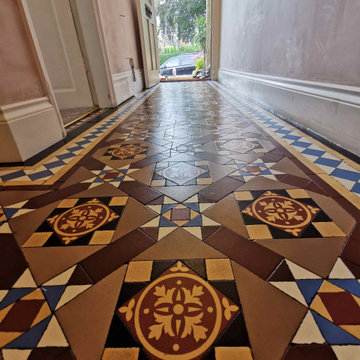
A young couple recently bought a house in Barnsley and were renovating it from top to bottom, included in the plan was the desire to have the previously unloved Victorian floor made beautiful again. The house stands in an area of Barnsley famous for its’ big Victorian villas and quite rightly they felt it was important to ensure period features like this original floor were correctly maintained.
Due to the floor being covered up for many years the floor had developed damp staining, it also had a lot of paint splattered on it. There were also some loose tiles that needed fixing back in place and the layer of old floor polish was present which would need removing.
I started by protecting all the skirting boards, doors and carpets bordering the tiles from splashing. The loose tiles were then cleaned up and then secured back in place using a fast-setting adhesive.
Once the adhesive was set, I turned my attention to stripping and cleaning the floor starting with the application of a coarse 200-grit diamond pad fitted to a weighted rotary buffing machine. The pad was lubricated using a dilution of Tile Doctor Remove & Go which was applied to small sections of the floor and left to soak in for ten minutes first. I run the buffing machine at a slow speed to minimise splashing. Remove & Go is amazing at removing old floor coatings (i.e. sealers), dirt and grime from the floor. When the diamond pad had been used on each section of the floor for five minutes the slurry was vacuumed up using a wet vac machine and I moved onto the next section. Once the whole floor had been cleaned in this way it was time to start the next step.
Old floors like this which don’t have the benefit of a damp proof membrane, and have been covered up for a long time, can suffer from efflorescence issues due to moisture being trapped in the tile. This will result in white salt staining appearing on the tiles for days, weeks and sometimes months afterwards. To counter this the alkaline salts are neutralised by giving the floor an acid rinse using Tile Doctor Acid Gel and leaving it to dwell for five minutes before going over the floor again with the coarse diamond pad. The slurry was again removed with a wet vacuum and the floor was scrubbed clean with damp cloths.
I returned a few days later once the floor had dried to seal the floor. The client wanted a satin finish so knowing the floor had damp and efflorescence issues I opted for Tile Doctor Seal and Go Extra. This is a topical sealer which leaves a lovely satin finish but also allows for the floor to breathe. six coats were required to make the floor look perfect, allowing the lovely colours to come through.
Once complete the floor looked much brighter and the colours really shone through. The owners were really happy with the renovation we carried out and before leaving I took time to discuss how best to maintain the tiles going forward including the use of Neutral Tile cleaner.
Matthew Lovett
South Yorkshire Tile Doctor
110